Skip to content

Archive for

#4 Statistics of illumination, part 2

This is the second post in my “Statistics of illumination” series, in which I present examples to illustrate that statistics can shed light on important questions.  I use these examples on the first day of a statistical literacy course and also in presentations to high school students.  The methods used are quite simple, but the ideas involved are fairly sophisticated.  Click here for the first post in this series.  Questions that I pose to students appear in italics below.

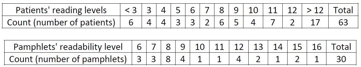
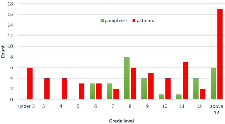
This example is based on a consulting project undertaken by my friend Tom Short, which he and his collaborators described in a JSE article (here).  The research question is whether cancer pamphlets are written at the appropriate level to be understood by cancer patients.  The data collection involved two aspects.  A sample of cancer patients were given a reading test, and a sample of cancer pamphlets were analyzed for their readability.  The data for both patients and pamphlets are on the same grade level scale; for example, 8 means that a patient could read at the 8th grade level, or that a pamphlet’s readability was at the 8th grade level.  The data are summarized in the following two tables:

How might you go about measuring these characteristics: reading level of patients and readability of pamphlets?

Your students have probably taken lots of reading tests, but the idea of measuring readability of text might be new to them.  Measuring readability can involve aspects such as the average length of a sentence, average length of a word, and rate of polysyllabic words.*

* I often joke that my favorite polysyllabic word is “polysyllabic.”  That one word has more syllables than my entire teaching philosophy: Ask good questions.

Explain why it’s not possible to calculate the mean reading level of a patient, based on how the data are presented here.

Most students correctly note that this is not possible because we need numerical values to calculate a mean, so the “below 3” and “above 12” categories prevent that.

Is it possible to calculate the median reading level of a patient?

Many students correctly respond that this is indeed possible, because we simply need ordered data to determine the middle value.  The non-numeric categories are on the two extremes and not in the middle, so they do not impede calculating the median.

Calculate the median reading level of a patient and the median readability level of a pamphlet.

For the patients, students need to determine the (63+1)/2 = 32nd value in order.  This gives some students pause, until they realize that they need to add up the counts for each grade level until they reach the 32nd value.  I point out that they can count from the top or bottom; that’s the whole point that the median is in the middle!  Because there are an even number of pamphlets (30), students need to calculate the average of the 15th and 16th values in order.  The median values turn out to be grade level 9 for both the patients’ reading levels and the pamphlets’ readability levels.

Now we arrive at the key question:

Does the two medians being the same indicate that the patients’ reading levels and the pamphlets’ readability levels are well matched up with each other?

Many students have an initial reaction of yes.  I suppose I’m guilty of leading them to think this by asking them to calculate the medians before getting to this question.  For these students, I offer a substantial hint to point in a helpful direction:

What proportion of patients have a reading level below that of the simplest pamphlet?

The answer is 17/63 ≈ .270.  This means that 27% of the patients have a reading level below that of the simplest pamphlet.  This is clearly a problem, indicating that the patients’ reading levels and pamphlets’ readability levels are not well aligned.  Granted, it might not be possible to present cancer pamphlet information below sixth grade readability, but something has to be done to help the 27% of patients who cannot read at the sixth grade level or higher.

As I argued with the first example in this series, I think this small example illustrates statistical thinking.  More specifically, I emphasize four take-home messages for students from this example:

1. Start with a graph.  In this activity I purposefully led students into a bad habit: calculating summary statistics (medians, in this case) without first making a graph to look at the data.  The graph below clearly shows that the patients and pamphlets are not well aligned, because there’s a lot of red (representing patients) and no green (representing pamphlets) at the bottom of the scale.  In other words, the left side of the graph makes clear that many patients do not have a pamphlet that they can read.

2. Think about variability.  The discipline of statistics is all about variability, which is an obvious but easy to overlook fact of life.  Not everyone is the same: different people read at different levels.  Not all pamphlets are the same: some are easier to read than others.  Whereas measures of center, such as mean and median, are often very helpful, they tell us nothing about variability.

3. Think in terms of distribution.   It’s easy for us instructors to under-estimate how hard this is for students.  It’s much easier for students to see 63 reading levels, but understanding the distribution of those 63 values as a single entity, rather than as 63 separate things, is a very challenging cognitive step for many students.  Why is this so important here?  The question of whether pamphlets are well-aligned to patients is about how well the two distributions (of patients’ reading levels, of pamphlets’ readability levels) match up with each other across all reading levels.

4. Address the research question in context.  I sometimes use this example as a very open-ended question on a final exam, if I have not presented it earlier in the course.  Some students try to apply a two-sample t-test to these data.  I suspect this is because they think it’s somehow better to use more sophisticated methods rather than simpler ones.  But even if a two-sample t-test could be performed here (it can’t because the sample mean reading level of the patients cannot be calculated), such a test would not address the motivating question, just like calculating medians above did nothing to address the question.  Always make sure that your analysis of data addresses the reason that the data were collected.

P.S. I mentioned at the outset that Tom Short introduced me to these data, early in his career when he was teaching at Villanova University.  Tom and I became friends in graduate school.  From there we embarked on careers focused on teaching statistics.  He and I frequently attended conferences and workshops together, and we collaborated on several education projects.  I learned a lot about both statistics and teaching from Tom, often through conversations that we had while walking in places as varied as the streets of San Francisco and the beaches of Daytona.  We also enjoyed talking about sports and competing in a fantasy baseball league, in which Tom managed the wonderfully-named Markov Fielders.  Tom died unexpectedly in November of 2018, a great loss to the many friends, colleagues, and students who were enriched by knowing him.  On Wednesday of this week I will be chairing a memorial session for Tom at the Joint Statistical Meetings.  I dedicate this blog post to him.

#3 Statistics of illumination, part 1

Perhaps you’ve heard this expression:

Most people use statistics as a drunk uses a lamppost – more for support than for illumination.

I do not doubt that there is some truth in this clever saying, but I try to convince my students that statistics can shed light on important questions.  I have given talks to high school students with the title “Statistics of Illumination,” in which I present several examples to make this point.  In this post I will present one of the examples, and I will present other examples in later posts.  Questions that I pose to students will appear in italics.

Consider the following table of counts, based on data from the University of California at Berkeley’s graduate admissions process in 1973:

MenWomen
Accepted533113
Denied665336
Total1198449

Why is it not reasonable to simply consider the counts 533 and 113 in order to compare admissions decisions of men and women?

This question leads students to consider the importance of proportional reasoning.  Because many more men than women applied to these programs, we need to calculate proportions (or percentages, or rates).

Calculate the proportion of male applicants who were accepted.  Also calculate the proportion of female applicants who were accepted.

These proportions can be calculated as:

  • Men: 533/1198 ≈ .445 were accepted
  • Women: 113/449 ≈ .252 were accepted

Comment on how these proportions compare. Does this difference appear to be substantial?

The acceptance rate* for men is almost 20 percentage points higher than the acceptance rate for women (44.5% vs. 25.2%).  This certainly seems like a big enough difference to indicate that something worth investigating further is going on here.

* Saying “acceptance rate” is much simpler language than saying “proportion who were accepted”  or even “proportion of acceptance,” but I suggest taking the time to explain to students that the term “acceptance rate” refers to a proportion here.

Let’s proceed to dig a little deeper.  The counts in the table above came from combining data from two programs that we’ll call A and F.  The following tables show the counts for these two programs separately:

Men acceptedMen deniedWomen acceptedWomen denied
Prog A5113148919
Prog F2235124317
Total533665113336

Before analyzing these data, first convince yourself that there’s no cheating here: The bottom row reveals that counts for programs A and F really do add up to the counts given earlier

Within each program, calculate the proportion of male applicants who were accepted and the proportion of female applicants who were accepted.  Comment on how the proportions compare within each program.

This requires students to think a bit harder than the earlier calculation of proportions did, because they need to calculate for themselves the total number of applicants for each (program, sex) pair.  These acceptance proportions can be calculated as:

  • Program A, men: 511/(511+314) = 511/825 ≈ .619
  • Program A, women: 89/(89+19) = 89/108 ≈ .824
  • Program F, men: 22/(22+351) = 22/373 ≈ .059
  • Program F, women: 24/(24+317) = 24/341 ≈ .070

Now when we compare the acceptance rates between men and women, we see a very different picture than before: Women have a higher acceptance rate than men in both programs!  The difference is slight in program F (7.0% vs. 5.9%) and considerable in program A (82.4% vs. 61.9%).

Based on this more in-depth analysis, is there evidence of discrimination against women in the graduate admissions process?

No.  At the program level, where admissions decisions are made, there’s no evidence to suggest that men have a higher acceptance rate than women. If anything, the acceptance rates appear to favor women in both programs.  Perhaps program A should have done more to recruit women applicants (only 108 of their 933 applicants were women), but they accepted a substantially higher proportion of women applicants than men.

Some students will comment on the weird thing that has happened here.  If not, you can ask them what’s odd about their calculations.  If that prompt does not work, go ahead and point out the oddity: Women have a higher acceptance rate than men in both programs, but men have a higher acceptance rate than women when you combine the two programs together.

Explain, based on the data provided, how this oddity occurs.

This is the hard part.  This question requires students to think through what’s happening here.  Typically, the first response I hear is: More men than women applied.  To which I respond: Yes, but that’s why we calculated proportions in the first place.  I hasten to add: That’s not completely off-track, but there’s more to it.  I often need to give a hint, so I ask students:

Think about two ways in which programs A and F differ from each other, with regard to applicants’ sex and acceptance rates.

Many students still struggle to discern what’s going on at this point.  But I resist telling them the explanation, because I think their struggle is worthwhile.  I also encourage them to work with nearby students to figure this out together.  Eventually students come to realize that :

  • Most men applied to program A, and most women applied to program F.
  • Program A had much higher acceptance rates than program F.

These two points, taken together, explain the oddity.  We can summarize this explanation more succinctly in one sentence: Men applied mostly to the program that’s easy to get into, whereas women applied mostly to the program that’s very hard to get into. This explains how it happens that women have a higher acceptance rate than men in both programs but a lower acceptance rate than men when the programs are combined.

I believe that this example/activity illustrates statistical thinking, which is the first recommendation in the GAISE (link) report.  The math/arithmetic involved here is quite straightforward, but the thinking required to explain this phenomenon is fairly sophisticated.  Moreover, this example/activity illustrates the new emphasis in the 2016 GAISE report about giving students experience with multivariable thinking.  The observational units here are the applicants, and the three variables are sex, admission decision, and program.  All three of these variables are related to each other, and understanding the oddity* requires understanding those relationships. You might refer to sex as the explanatory variable, admission decision as the response variable, and program as the confounding variable.

* This oddity is often known as Simpson’s paradox. When I started teaching 30 years ago, I joked with my students that it’s unclear whether Simpson’s paradox was named for Lisa or Bart.  I would not have guessed that Lisa and Bart would still be appearing in new episodes 30 years later!

I have used this example on the first day of class in a statistical literacy course.  In that setting I do not bother to introduce any terminology but instead focus on the statistical thinking involved.  You could also use it when discussing the analysis of two-way tables, or really at any point in a course.  The key idea to emphasize is that a relationship between two variables might be explained by considering how both could be related to a third variable.  And that statistics can be illuminating!

P.S. For a fun but difficult follow-up challenge, ask students to create their own made-up example for which Simpson’s paradox occurs.  For example, ask them to create an example with two softball players (call them Amy and Barb), where Amy has a higher proportion of successes (hits) than Barb in June and also in July, but Barb has a higher proportion of hits than Amy when June and July are combined.  This sounds weird, perhaps impossible, but it could happen. To succeed in creating such an example, you need to think through the two conditions needed to make this paradox happen.  Encourage students to think of how this example could be analogous to the admissions example, because if they just start making up some numbers and hope that the paradox will occur, they will be at it for a very long time!

The key here is that Amy has to get most of her attempts when it’s easy to get a hit, and Barb must get most of her attempts when it’s hard to get a hit.  Here’s one way to make this happen:

  • June: Amy gets 9 hits in 10 attempts (90%), Barb gets 80 hits in 100 attempts (80%)
  • July: Amy gets 20 hits in 100 attempts (20%), Barb gets 1 hit in 10 attempts (10%)

Sure enough, Amy does better than Barb in both months.  But when we combine the two months:

  • June and July combined: Amy gets 29 hits in 110 attempts (26.4%), Barb gets 81 hits in 110 attempts (73.6%)

Why does Barb do (much) better than Amy overall despite doing worse in each month?  Because she was lucky enough to get most of her attempts when it was easy to get a hit.  (The pitching was really lousy in June!!)

If you’d rather avoid the sports context, you could say that Amy and Barb are college roommates, with the oddity that Amy has a higher proportion of A grades than Barb in humanities courses and also in science courses, but Barb has a higher proportion of A grades than Barb when these two kinds of courses are combined.

Further reading: The Berkeley graduate admissions data are from a well-known example that has been presented in many textbooks.  I’ve used only programs A and F in order to keep things simpler.  The original article is here. An interesting follow-up is here. The Berkeley data, more examples, and more information about Simpson’s paradox are also presented in a Wikipedia entry here.

#2 My favorite question

This blog is about asking good questions to teach introductory statistics, so let me tell you about my all-time favorite question.  I want to emphasize from the outset that I had nothing to do with writing it. I’m just a big fan.

I am referring to question #6, called an investigative task, on the 2009 AP Statistics exam.  I’ll show you the question piece-by-piece, snipped from the College Board website. You can find this question and many other released AP Statistics exams here.

Here’s how the question begins:

Oh dear, I have to admit that this is an inauspicious start.  Frankly, I think this a boring, generic context for a statistics question.  Even worse, there’s no mention of real data. What’s so great about this? Nothing at all, but please read on …

I think this is a fine question, but I admit that it’s a fairly routine one. Describing the parameter in a study is an important step, and I suspect that students find this much more challenging than many instructors realize.  I would call this an adequate question, perhaps a good question, certainly not a great question. So, I don’t blame you if you’re wondering why this is my all-time favorite question.  Please read on …

Now we’re getting somewhere.  I think this is pretty clever: presenting students with a statistic that they have almost certainly never encountered before, and asking them to figure out something about the unknown statistic based on what they know.  The question is not particularly hard, but it does ask students to apply something they know to a new situation. Students should realize that right-skewed distributions tend to have a larger mean than median, so the ratio mean/median should be greater than 1 with these data.

Part (b) also helps students to prepare for what comes next …

Now we’re talking!  I think part (c) makes this a great question.  To answer this part well, students have to understand the reasoning process of statistical significance, and they have to apply that reasoning process in a situation that they have almost surely never encountered or even thought about: making an inference about the symmetry or skewness of a population distribution.  This is extremely challenging, but I think this assesses something very important: whether students can apply what they have learned to a novel situation that goes a bit beyond what they studied.

Notice that this question does not use words such as hypothesis or test or reject or strength of evidence or p-value.  The key word in the question is plausible.  Students have to realize that the simulation analysis presented allows them to assess the plausibility of the assumption underlying the simulation: that the population follows a normal distribution.  Then they need to recognize that they can assess plausibility by seeing whether the observed value of the sample statistic is unusual in the simulated (null) distribution of that statistic. It turns out that the observed value of the mean/median ratio (1.03) is not very unusual in the simulated (null) distribution, because 14/100 of the simulated samples produced a statistic more extreme than the observed sample value.  Therefore, students should conclude that the simulation analysis reveals that a normally distributed population could plausibly have produced the observed sample.

A common student error is not recognizing the crucial role that the observed value (1.03) of the statistic plays.  More specifically, two common student errors are:

  • Commenting that the simulated distribution is roughly symmetric, and concluding that it’s plausible that the population distribution is normal.  Students who make this error are failing to notice the distinction between the simulated distribution of sample statistics and the population distribution of mpg values.
  • Commenting that the simulated distribution of sample statistics is centered around the value 1, which is the expected value of the statistic from a normal population, and concluding that it’s plausible that the population distribution is normal.  Students who make this error are failing to realize that the simulation assumed a normal population in the first place, which is why the distribution of simulated sample statistics is centered around the value 1.

If this question ended here, it would be one of my all-time favorites.  But it doesn’t end here. There’s a fourth part, which catapults this question into the exalted status of my all-time favorite.  Once again (and for the last time!), please read on…

Wow, look at what’s happening here!  Students are being told that they don’t have to restrict their attention to common statistics that they have been taught.  Rather, this question asks students to exercise their intellectual power to create their own statistic! Moreover, they should know enough to predict how their statistic will behave in a certain situation (namely, a right-skewed distribution).  This part of the question not only asks students to synthesize and apply what they have learned, but it also invites students to exercise an intellectual capability that they probably did not even realized they possess. Some common (good) answers from students include the following statistics, both of which should take a value greater than 1 with a right-skewed distribution:

  • (maximum – median) / (median – minimum)
  • (upper quartile – median) / (median – lower quartile)

There you have it: my all-time favorite question from an introductory statistics exam.  I encourage you to ask this question, or some variation of it*, of your students. I suggest asking this in a low-stakes setting and then discussing it with students afterward.  Encourage them to realize that the reasoning processes they learn in class can be applied to new situations that they have not explicitly studied, and also help them to recognize that they are developing the intellectual power to create new analyses of their own.

* Even though this is my all-time favorite question, I suggest three revisions related to part (c).  First, I would provide students with sample values of the mean and median and ask them to calculate the value of the ratio for themselves.  I think this small extra step might help some students to realize the importance of seeing where the observed value of the statistic falls in the simulated distribution.  Second, I recommend altering the sample data a bit to make the observed value of the sample statistic fall quite far out in the tail of the simulated (null) distribution of the statistic.  This would lead to rejecting the plausibility of a normally distributed population in favor of concluding that the population distribution was right-skewed.  I think this conclusion might be a bit easier for students to recognize, while still assessing whether students understand how to draw an appropriate conclusion from the simulation analysis.  Third, I would prefer to use 1000 or 10,000 repetitions for the simulation, which would require using a histogram rather than a dotplot for the display.

P.S. I mentioned at the top that I had nothing to do with writing this question.  Three people who played a large role in writing it and developing a rubric for grading it were Bob Taylor, Chris Franklin, and Josh Tabor.  They all served on the Test Development Committee for AP Statistics at the time. Bob chaired the committee, Chris served as Chief Reader, and Josh was the Question Leader for the grading of this question. Josh also wrote a JSE article (here) that analyzed various choices for the skewness statistic in part (d).

#1 Ten questions about this blog

Legend has it that when asked for advice about becoming a successful singer, Frank Sinatra replied: Sing good songs.  My advice for becoming an effective teacher of statistics is similarly succinct: Ask good questions.

In this blog I will present ideas for teaching statistics, based on this three-word teaching philosophy: ask good questions.  Let me pose and answer ten “w” questions about this blog:

  1. Who is the audience?  I am writing this for teachers of statistics, particularly introductory statistics, at all levels.  I hope to present ideas that will be relevant and helpful to high school teachers and two- and four-year college teachers of statistics.  I especially hope that relatively new teachers, and those whose primary training was not in statistics, will find this blog to be beneficial.
  2. What is the content?  This blog will provide ideas for teaching statistics, especially introductory statistics.  Most of the posts will describe activities that you can use in class, or questions that you can use on assessments, to help students learn statistics.  Other posts will feature discussions of what and how to teach in statistics courses.
  3. Who am I?  (Why, thanks for asking!)  I have been teaching statistics, primarily at the introductory level to undergraduate students, for thirty years.  I have taught at both Dickinson College, a liberal arts college in Pennsylvania, and in the Statistics Department at Cal Poly in San Luis Obispo.  I have given more than 100 conference presentations and conducted more than 100 faculty development workshops about teaching statistics.  Click on “about me” if you’d like to read more.
  4. What is the style?  I am aiming for a very conversational style in this blog.  This will not be academic writing by any stretch.  I hope to convey in writing a style that I try to adopt in workshops – speaking directly to other teachers and proposing concrete suggestions for teaching statistics.  I may even try for humor on occasion.
  5. Why should you read this?  Because you’re interested in picking up ideas and activities and questions that you can use for teaching statistics.  I’d like to think that some of my suggestions are worthwhile, and I’m counting on you to identify which ones they are.
  6. Was that one of my attempts at humor?  Well, I suppose so, but please stick around – I can do better.
  7. Where and when will posts appear?  For the next year I plan to post one blog entry per week, most likely on Monday mornings, right here at askgoodquestions.blog.  You can use the button on the right to sign up as a follower and receive email notifications about new posts.
  8. Will this blog gradually build suspense, like a great novel or movie or television series, until a climactic moment at which the secret to successful teaching of statistics will be revealed?  No.  The secret has already been revealed.  In case you missed it, please see the name of this blog and re-read the first and second paragraphs.  In fact, why not, I’ll repeat it again: Ask good questions.  That’s the take-home message.  If I have any wisdom to impart, that’s it.  The rest is just details.  But I’ll do my best to make the details relevant, thought-provoking, and fun.
  9. What makes a question good?  Now that’s an excellent question!  But I am going to respectfully decline to answer at first.  Instead I will provide lots of examples of what I think are good questions for teaching/learning statistics in coming posts.  Then I will try to address this by discerning some general characteristics of good questions from those examples.
  10. Whoa, wait a minute!  Why should you waste your time with such obvious advice as “ask good questions”?  I admit that you’ve probably never been advised to ask bad questions, or not to ask questions at all.  Nevertheless, I don’t think my advice is unhelpful.  I suspect that we teachers spend too much of our most precious commodity – time – on creating presentations for students to hear and writing exposition for them to read.  I think we serve our students’ learning much better by investing our time into crafting good questions that lead students to develop and deepen their understanding of what we want them to learn.  Please join me as I try to persuade you of this in coming posts.