Skip to content

Archive for

#30 Minimize what?

What does least squares mean?  Students in an introductory statistics course typically encounter this term in the context of fitting a line to bivariate numerical data.  We tell students that among all possible lines, the least squares line is the one that makes the sum of squared vertical deviations (i.e., the sum of squared residuals) from the line as small as possible. 

In this post I explore how students can use least squares and other criteria to determine optimal measures of center for a single numerical variable.  I will describe an activity that I use with mathematically inclined students, primarily those majoring in statistics, mathematics, or economics.  I do not use this activity with typical Stat 101 students, but I do hope that this activity might be fun and worthwhile as a “beyond the exam” topic in an AP Statistics course. As always, questions that I pose to students appear in italics.


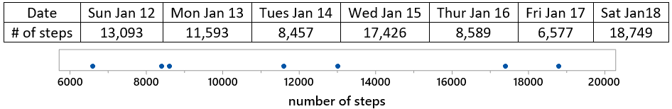
I carry a pedometer in my pocket to record the number of steps that I take each day.  Below are the data for a recent week, along with a dotplot (generated with the applet here):

Let’s start with a question meant to provoke students’ thought: Propose a number to represent the center of this distribution.  This is a very vague question, so I encourage students to just pick a value based on the graph, without giving it too much thought, and certainly without performing any calculations.  I also emphasize that there’s not a right-or-wrong answer here.

Then I ask a few students to share the values that they selected, which leads to the question: How can we decide whether one value (for the center of this distribution) is better than another?  This is a very hard question.  I try to lead students to understand that we need a criterion (a rule) for deciding.  Then I suggest that the criterion should take into account the differences (or deviations) between the data values and the proposed measure of center.  Do we prefer that these differences be small or large?  Finally, this is an easy question with a definitive answer: We prefer small differences to large ones.  I point out that with seven data values, we’ll have seven deviations to work with for each proposed measure of center.  How might we combine those seven deviations?  Would it work to simply add them?  Some students respond that this would not work, because we could have positive and negative differences cancelling out.  How can we get around that problem?  We could take absolute values of the deviations, or square them, before we add them.

Let’s get to work, starting with the least squares criterion.  Let m represent a generic measure of center.  Write out the function for sum of squares deviations (call this SSD) as a function of m.  When students need a hint, I say that there’s nothing clever about this, just a brute-force calculation.  In general terms, we could express this function as:

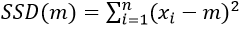
For these particular data values, this function becomes:

Predict what the graph of this function will look like.  If students ask for a hint, I suggest that they think about whether to expect to see a line, parabola, exponential curve, or something else.  Then I either ask students to use Excel, or ask them to talk me through its use, to evaluate this function.  First enter the seven data values into column A.  Then set up column B to contain a whole bunch of (integer) values of m, from 8000 to 16000, making use of Excel’s fill down feature.  Finally, enter this formula into column C*:

* The $ symbol in the formula specifies that those data cells are fixed, as opposed to the B2 cell that fills down to produce a different output for all of the m values.

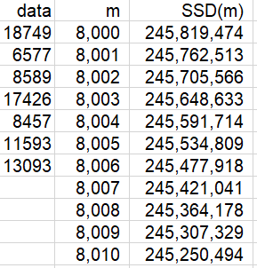
The first several rows of output look like this:

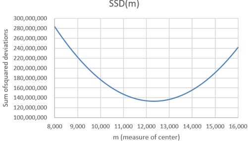
A graph of this function follows:

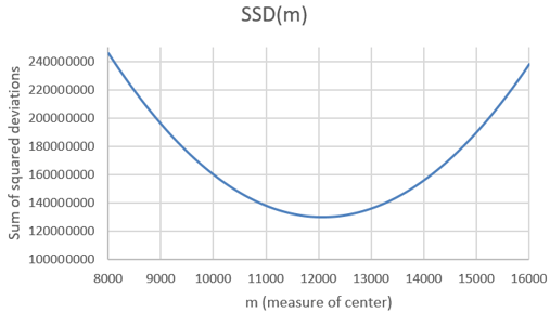
What is the shape of this graph?  A parabola.  Explain why this makes sense.  Because the function is quadratic, of the form a×m^2 + b×m + cWhere does the function appear to be minimized?  Slightly above 12,000 steps.  How can we determine where the minimum occurs more precisely?  We can examine the SSD values in the Excel file to see where the minimum occurs.  Here are the values near the minimum:

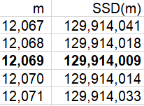
We see that the minimum occurs at 12,069 steps.  Is it possible that SSD is minimized at a non-integer value of m?  Sure, that’s possible.  Can we zoom in further to identify the value of m that minimizes this function more exactly?   Yes, we can specify that Excel use multiples of .001, rather than integers, for the possible values of m, restricting our attention to the interval from 12,068 to 12,070 steps.  This produces the following graph:

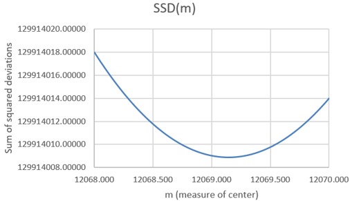
Now we can examine the SSD values in the Excel file to identify where the minimum occurs:

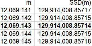
The sum of squared deviations is minimized at the value 12,069.143.  Is this one of the seven data values?  No.  Is this the value of a common measure of center for these data?  Yes, it turns out that this is the mean of the data.  Do you think this is a coincidence?  No way, with so many decimal places of accuracy here, that would be an amazing coincidence!

If your students have studied a term of calculus, you can ask them to prove that SSD(m) is minimized by the mean of the data.  They can take the derivative, with respect to m, of the general form of SSD(m), set that derivative equal to zero, and solve for m.


Why should we confine our attention to least squares?  Let’s consider another criterion.  Instead of minimizing the sum of squared deviations between the data values and the measure of center, let’s minimize the sum of absolute deviations.

We’ll call this function SAD(m)*.  When written out, this function looks just like SSD(m) but with absolute values instead of squares.  Again we can use Excel to evaluate this function for a wide range of values of m, using the formula:

* Despite the name of this function, I implore students to be happy, not sad, as they expand their horizon beyond least squares.

What do you expect the graph of this SAD(m) function to look like?  This is a much harder question than with the SSD(m) function.  Students could have realized in advance that the SSD(m) function would follow a parabola.  But what will they expect the graph of a function that sums absolute values to look like?  What do you expect this to look like?  Ready?  Here’s the result:

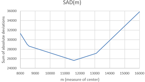
Describe the behavior of this function.  This graph can be described as piece-wise linear.  It consists of connected line segments with different slopes.  Where do the junction points (where the line segments meet) of this function appear to occur?  Examining the SAD values in the Excel file, we find that the junction points in this graph occur at the m values 8457, 8589, 11593, and 13093*.

* The values 8457 and 8589 are so close together that it’s very hard to distinguish their junction points in the graph.  If we expanded the range of m values, we would see that all seven data values produce junction points.

Where does the minimum occur?  The minimum clearly occurs at one of these junction points: m = 11,593 steps.  Does this value look familiar?  Yes, this is one of the data values, specifically the median of the data.  Does this seem like a coincidence?  Again, no way, this would be quite a coincidence!  The sum of absolute deviations is indeed minimized at the median of the data values*. 

* The mathematical proof for this result is a bit more involved than using calculus to prove that the mean minimizes the sum of squared deviations.


Some students wonder: What if there had been an even number of data values?  I respond: What a terrific question!  What do you predict will happen?  Please explore this question and find out.

Let’s investigate this question now.  On Sunday, January 19, I walked for 14,121 steps.  Including this value in the dataset gives the following ordered values:

How will the mean and median change?  The mean will increase, because we’ve included a value larger than the previous mean.  The median will also increase, as it will now be the average of the 4th and 5th values, and the value we’ve inserted is larger than those values.  It turns out that the mean is now 12,325.625 steps, and the median is (11,593 + 13,093) / 2 = 12,343 steps.

Predict what will change in the graphs of these functions and the values of m that minimize these functions.  Ready to see the results?  Here is the graph for the SSD function:

This SSD function behaves as you expected, right?  It’s still a parabola, and it’s still minimized at the mean, which is now a bit larger than the previous mean.  Now let’s look at the SAD function:

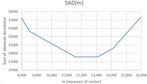
Whoa, did you expect this?  We still have a piece-wise linear function, with junction points still at the data values.  The median does still minimize the function, but the median no longer uniquely minimizes the function.  The SAD function is now minimized by any value between the two middle values of the dataset.  For this dataset, all values from 11,593 → 13,093 steps minimize the SAD function*.

* While the common convention is to declare the median of an even number of values to be the midpoint of the middle two values, an alternative is to regard any value between the two middle values as a median.


Are these two criteria (sum of squared or absolute deviations) the only ones that we could consider?  Certainly not.  These are the two most popular criteria, with least squares the most common by far, but we can investigate others.  For example, if you’re a very cautious person, you might want to minimize the worst-case scenario.  So, let’s stick with absolute deviations, but let’s seek to minimize the maximum of the absolute deviations rather than their sum.  We’ll call this function MAXAD(m), and we can evaluate it in Excel with:

What do you predict this function to look like?  The resulting graph (based on the original seven data values) is:

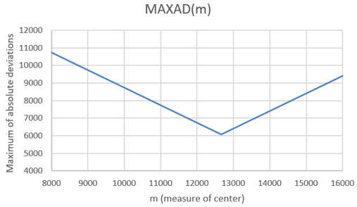
This MAXAD function is piece-wise linear, just as the SAD function was.  But there are only two linear pieces to this function.  The unique minimum occurs at m = 12,663 steps.  How does this minimum value relate to the data values?  It turns out that the minimum occurs at the average of the minimum and maximum values, also known as the midrange. It makes sense that we use the midpoint of the most extreme values in order to minimize the worst-case scenario.

Now let’s continue with the idea of minimizing a worst-case scenario, but let’s work with squared differences rather than absolute values.  What do you expect the maximum of squared deviations function to look like, and where do you expect the minimum to occur?

Here’s the graph, again based on the original seven data values:

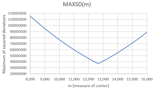
It’s hard to see, but the two pieces are not quite linear this time.  Because we are minimizing the worst-case scenario, the minimum again occurs at the midrange of the data values: m = 12,663 steps.

Would including the 8th data value that we used above affect the midrange?  No, because that 8th value did not change the minimum or maximum.  Is the midrange resistant to outliers?  Not at all!  The midrange is not only strongly affected by very extreme values, it takes no data values into account except for the minimum and maximum.

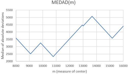
Could we ask students to investigate other criteria?  Sure.  Here’s a weird one: How about the median of the absolute deviations, rather than the sum or maximum of them?  I have no idea why you would want to minimize this function, but it produces a very interesting graph, and the median occurs at m = 10,775 steps:


The concept of least squares can apply to one-variable data as well as its more typical use with lines for bivariate data.  Students can use software to explore not only this concept but other minimization criteria, as well.  Along the way they can make some surprising (and pretty) graphs, and also discover some interesting results about summary statistics.

P.S. This activity was inspired by George Cobb and David Moore’s wonderful article “Mathematics, Statistics, and Teaching” (available here), which appeared in The American Mathematical Monthly in 1997.  The last section of the article discussed optimization properties of measures of center, mentioning several of the criteria presented in this post.

The very last sentence of George and David’s article (This is your take-home exam: design a better one-semester statistics course for mathematics majors) inspired Beth Chance and me to develop Investigating Statistical Concepts, Applications, and Methods (more information available here).

P.P.S. You can download the Excel file that I used in these analyses from the link below.  Notice that the file contains separate tabs for the original analysis of seven data values, a zoomed-in version of that analysis, and the analysis of eight data values.

#29 Not enough evidence

We statistics teachers often ask students to draw a conclusion, in the context of the data and research question provided, from the p-value of a hypothesis test.  Do you think a student is more likely to provide a response that earns full credit if the p-value is .02 or .20?

You may respond that it doesn’t matter.  You may believe that a student either knows how to state a conclusion from a p-value or not, regardless of whether the p-value is small or not-so-small.

I think it does matter, a lot.  I am convinced that students are more likely to give a response that earns full credit from a small p-value like .02 than from a not-so-small p-value like .20.  I think it’s a lot easier for students to express a small p-value conclusion of strong evidence against the null than a not-so-small p-value conclusion of not much evidence against the null.  Why?  In the not-so-small p-value case, it’s very easy for students to slip into wording about evidence for the null hypothesis (or accepting the null hypothesis), which does not deserve full credit in my book.

In this post I will explore this inclination to mis-state hypothesis test conclusions from a not-so-small p-value.  I will suggest two explanations for convincing students that speaking of evidence for the null, or deciding to accept the null, are not appropriate ways to frame conclusions.  I will return to an example that we’ve seen before and then present two new examples.  As always, questions that I pose to students appear in italics.


Let’s revisit the infamous 1970 draft lottery, which I discussed in post #9 (Statistics of illumination, part 3, here).  To recap: All 366 birthdays of the year were assigned a draft number.  The scatterplot on the left below displays the draft numbers vs. sequential day numbers.  At first glance, the graph appears to show nothing but random scatter, as we would expect from a truly random lottery.  But when we explored the data further, we found a bit of negative association between draft number and day number, with a correlation coefficient of -0.226.  We used simulation to investigate how surprising such a correlation would be with a truly random lottery.  The graph on the right shows the results for 10,000 random lotteries.  We see that none of the 10,000 simulated correlation coefficients is as large (in absolute value) as the -0.226 value that was achieved with the actual 1970 draft lottery.  Therefore, because a result as extreme as the one observed would be very unlikely to occur with a truly random lottery, we concluded that the observed data provide very strong evidence that the lottery process was not truly random.  (The explanation turned out to be insufficient mixing of the capsules containing the birthdays.)

This reasoning process is by no means trivial, but I think it makes sense to most students.  Without using the terminology, we have conducted a hypothesis test.  The null hypothesis is that the lottery process was truly random.  The alternative hypothesis is that the process was not truly random.  The p-value turns out to be very close to zero, less than 1 in 10,000.  Therefore, we have very strong evidence against the null hypothesis in favor of the alternative.

In the following year’s (1971) draft lottery, additional steps were taken to try to produce a truly random process.  The correlation coefficient (between draft number and day number) turned out to be 0.014.  The graph of simulation results above* shows that such a correlation coefficient is not the least bit unusual or surprising if the lottery process was truly random.  The two-sided p-value turns out to be approximately 0.78.  What do you conclude about the 1971 lottery process?

* This 1971 draft lottery involved 365 birthdays, as compared to 366 birthdays in the 1970 draft lottery.  This difference is so negligible that using the same simulation results is reasonable.

After they provide their open-ended response, I also ask students: Which of the following responses are appropriate and which are not?

  • A: The data do not provide enough evidence to conclude that the 1971 lottery process was not truly random.
  • B: The data do not provide much evidence for doubting that the 1971 lottery process was truly random.
  • C: The data provide some evidence that the 1971 lottery process was truly random.
  • D: The data provide strong evidence that the 1971 lottery process was truly random.

Responses A and B are correct and appropriate.  But they are challenging for students to express, in large part because they include a double negative.  It’s very tempting for students to avoid the double negative construction and write a more affirmative conclusion. But the affirmative responses (C and D) get the logic of hypothesis testing wrong by essentially accepting the null hypothesis.  That’s a no-no, so those responses deserve only partial credit in my book.

Students naturally ask: Why is this wrong?  Very good question.  I have two answers, one fairly philosophical and the other more practical.  I will lead off with the philosophical answer, even though students find the practical answer to be more compelling and persuasive.


The philosophical answer is: Accepting a null hypothesis, or assessing evidence in favor of the null hypothesis, is simply not how the reasoning process of hypothesis testing works.  The reasoning process only assesses the strength of evidence that the data provide against the null hypothesis.  Remember how this goes: We start by assuming that the null hypothesis is true.  Then we see how surprising the observed data would be if the null hypothesis were true.  If the answer is that the observed data would be very surprising, then we conclude that the data provide strong evidence against the null hypothesis.  If the answer is that the observed data would be somewhat surprising, then we conclude that the data provide some evidence against the null hypothesis.  But what if the answer is that the observed data would not be surprising?  Well, then we conclude that the data provide little or no evidence against the null hypothesis.

This reasoning process is closely related to the logical argument called modus tollens:

  • If P then Q
  • Not Q
  • Therefore: not P

For example, the Constitution of the United States stipulates that if a person is eligible to be elected President in the year 2020 (call this P), then that person must have been born in the U.S. (call this Q).  We know that Queen Elizabeth was not born in the U.S. (not Q).  Therefore, Queen Elizabeth is not eligible to be elected U.S. President in 2020 (not P).

But what if Q is true?  The following, sometimes called the fallacy of the converse, is NOT VALID:

  • If P then Q
  • Q
  • Therefore: P

For example, Taylor Swift was born in the U.S. (Q).  Does this mean that she is eligible to be elected President in 2020 (P)?  No, because she is younger than 35 years old, which violates a constitutional requirement to serve as president.

For the draft lotteries, P is the null hypothesis that the lottery process was truly random, and Q is that the correlation coefficient (between day number and draft number) is between about -0.1 and 0.1.  Notice that (If P, then Q) is not literally true here, but P does make Q very likely.  This is the stochastic* version of the logic.  For the 1970 lottery, we observed a correlation coefficient (-0.226) that is not Q, so we have strong evidence for not P, that the lottery process was not truly random.  For the 1971 lottery, we obtained a correlation coefficient (0.014) that satisfies Q.  This leaves us with no evidence for not P (that the lottery process was non-random), but we also cannot conclude P (that the lottery process was random).

* I don’t use this word with introductory students.  But I do like the word stochastic, which simply means involving randomness or uncertainty.

I only discuss modus tollens in courses for mathematics and statistics majors.  But for all of my students I do mention the common expression: Absence of evidence does not constitute evidence of absence.  For the 1971 draft lottery, the correlation coefficient of 0.014 leaves us with an absence of evidence that anything suspicious (non-random) was happening, but that’s not the same as asserting that we have evidence that nothing suspicious (non-random) was happening.


My second answer, the more practical one, for why it’s inappropriate to talk about evidence in favor of a null hypothesis, or to accept a null hypothesis, is: Many different hypotheses are consistent with the observed data, so it’s not appropriate to accept any one of these hypotheses.  Let me use a new example to make this point.

Instead of flipping a coin, tennis players often determine who serves first by spinning a racquet and seeing whether it lands with the label facing up or down.  Is this really a fair, 50/50 process?  A student investigated this question by spinning her racquet 100 times, keeping track of whether it landed with the label facing up or down.

  • a) What are the observational units and variable?  The observational units are the 100 spins of the racquet.  The variable is whether the spun racquet landed with the label facing up or down.  This is a binary, categorical variable.
  • b) Identify the parameter of interest.  The parameter is the long-run proportion of all spins for which the racquet would land with the label up*.  This could also be expressed as the probability that the spun racquet would land with the label facing up.
  • c) State the null and alternative hypotheses in terms of this parameter.  The null hypothesis is that the long-run proportion of all spins that land up is 0.5.  In other words, the null hypothesis states that racquet spinning is a fair, 50/50 process, equally likely to land up or down.  The alternative hypothesis is that the long-run proportion of all spins that land up is not 0.5.  This is a two-sided alternative.

* We could instead define a down label as a success and specify the parameter to be the long-run proportion of all spins that would land down.

The 100 racquet spins in the sample resulted in 44 that landed with the label up, 56 that landed with the label down.  The two-sided p-value turns out to be 0.271, as shown in the following graph of a binomial distribution*:

* You could also (or instead) present students with an approximate p-value from a simulation analysis or a normal distribution.

  • d) Interpret this p-value.  If the racquet spinning process was truly fair (equally likely to produce an up or down result), there’s a 27.1% chance that a random sample of 100 spins would produce a result as extreme as the actual one: 44 or fewer, or 56 or more, spins landing with the label up.
  • e) Summarize your conclusion.  The sample data (44 landing up in 100 spins) do not provide much evidence against the hypothesis that racquet spinning is a fair, 50/50 process.
  • f) Explain how your conclusion follows from the p-value.  The p-value of 0.271 is not small, indicating that the observed result (44 landing up in 100 spins), or a result more extreme, would not be surprising if the racquet spinning process was truly fair.  In other words, the observed result is quite consistent with a fair, 50/50 process.

Once again this conclusion in part (e) is challenging for students to express, as it involves a double negative.  Students are very tempted to state the conclusion as: The sample data provide strong evidence that racquet spinning is a fair, 50/50 process.  Or even more simply: Racquet spinning is a fair, 50/50 process.

To help students understand what’s wrong with these conclusions, let’s focus on the parameter, which is the long-run proportion of racquet spins that would land with the label facing up.  Concluding that racquet spinning is a fair, 50/50 process means concluding that the value of this parameter equals 0.5. 

I ask students: Do we have strong evidence against the hypothesis that 45% of all racquet spins would land up?  Not at all!  This hypothesized value (0.45) is very close to the observed value of the sample proportion of spins that landed up (0.44).  The p-value for testing the null value of 0.45 turns out to be 0.920*.

* All of the p-values reported for this example are two-sided, calculated from the binomial distribution.

Let’s keep going: Do we have strong evidence against the hypothesis that 40% of all racquet spins would land up?  Again the answer is no, as the p-value equals 0.416.  What about 52%?  Now the p-value is down to 0.111, but that’s still not small enough to rule out 0.52 as a plausible value of the parameter.

Where does this leave us?  We cannot reject that the racquet spinning process is fair (parameter value 0.5), but there are lots and lots* of other parameter values that we also cannot reject.  Therefore, it’s inappropriate to accept one particular value, or to conclude that the data provide evidence in favor of one particular value, because there are many values that are similarly plausible for the parameter.  The racquet spinning process might be fair, but it also might be biased slightly in favor of up or considerably against up.

* Infinitely many, in fact


Now let’s consider a new example, which addresses the age-old question: Is yawning contagious?  The folks at the popular television series MythBusters investigated this question by randomly assigning 50 volunteers to one of two groups:

  • Yawn seed group: A confederate of the show’s hosts purposefully yawned as she individually led 34 subjects into a waiting room.
  • Control group: The person led 16 other subjects into a waiting room and was careful not to yawn.

All 50 subjects were observed by hidden camera as they sat in the room, to see whether or not they yawned as they waited for someone to come in.  Here is the resulting 2×2 table of counts:

The hosts of the show calculated that 10/34 ≈ 0.294 of the subjects in the yawn seed group yawned, compared to 4/16 = 0.250 of the subjects in the control group.  The hosts conceded that this difference is not dramatic, but they noted that the yawn seed group had a higher proportion who yawned than the control group, and they went on declare that the data confirm the yawning is contagious hypothesis.

We can use an applet (here) to simulate a randomization test* on these data.  The p-value turns out to be approximately 0.513, as seen in the following graph of simulation results:

* See post #27 (Simulation-based inference, part 2, here) for an introduction to such an analysis.

  • a) State the null and alternative hypothesis, in words.
  • b) Do you agree with the conclusion reached by the show’s hosts? Explain.
  • c) How would you respond to someone who concluded: “The hosts are completely wrong.  The data from this study actually provide strong evidence that yawning is not contagious.”

a) The null hypothesis is that yawning is not contagious.  In other words, the null hypothesis is that people exposed to a yawn seed group have the same probability of yawning as people not so exposed.  The alternative hypothesis is that yawning is contagious, so people exposed to a yawn seed group are more likely to yawn than people not so exposed.

b) The conclusion of the show’s hosts is not supported by the data.  Such a small difference in yawning proportions between the two groups could easily have occurred by the random assignment process alone, even if yawning is not contagious.  The data do not provide nearly enough evidence for concluding that yawning is contagious.

c) This conclusion goes much too far in the other direction.  It’s not appropriate to conclude that yawning is not contagious.  A hypothesis test only assesses evidence against a null hypothesis, not in favor of a null hypothesis.  It’s plausible that yawning is not contagious, but the observed data are also consistent with yawning being a bit contagious or even moderately contagious.


As I wrap up this lengthy post, let me offer five pieces of advice for helping students to avoid mis-stating conclusions from not-so-small p-values:

1. I strongly advise introducing hypothesis testing with examples that produce very small p-values and therefore provide strong evidence against the null hypothesis.  The blindsight study that I used in post #12 (Simulation-based inference, part 1, here) is one such example.  I think a very small p-value makes it much easier for students to hang their hat on the reasoning process behind hypothesis testing.

2. Later be sure to present several examples that produce not-so-small* p-values, giving students experience with drawing “not enough evidence to reject the null” conclusions.

* You have no doubt noticed that I keep saying not-so-small rather than large.  I think this also indicates how tricky it is to work with not-so-small p-values.  A p-value of .20 does not provide much evidence against a null hypothesis, and I consider a p-value of .20 to be not-so-small rather than large.

3. Emphasize that there are many plausible values of the parameter that would not be rejected by a hypothesis test, so it’s not appropriate to accept the one particular value that appears in the null hypothesis.

4. Take a hard line when grading students’ conclusions.  Do not give full credit for a conclusion that mentions evidence for a null hypothesis or accepts a null hypothesis.

5. In addition to asking students to state their own conclusions, provide them with a variety of mis-stated and well-stated conclusions, and ask them to identify which are which.

Do you remember the question that motivated this post? Are students more likely to earn full credit for stating a conclusion from a p-value of .02 or .20?  Are you persuaded to reject the hypothesis that students are equally likely to earn full credit with either option? Have I provided convincing arguments that drawing an appropriate conclusion is easier for students from a p-value of .02 than from a p-value of .20?

#28 A pervasive pet peeve

Let’s suppose that you and I are both preparing to teach our next class.  Being easily distracted, I let my mind (and internet browser) wander to check on my fantasy sports teams, so I only devote 60% of my attention to my class preparation.  On the other hand, you keep distractions to a minimum and devote 90% of your attention to the task.  Let’s call these values (60% for me, 90% for you) our focus percentages.  Here’s the question on which this entire post hinges: Is your focus percentage 30% higher than mine?

I have no doubt that most students would answer yes.  But that’s incorrect, because 90 is 50% (not 30%) larger than 60.  This mistaking of a difference in percentages as a percentage difference is the pet peeve that permeates this post.

I will describe some class examples that help students learn how to work with percentage differences.  Then I’ll present some assessment items for giving students practice with this tricky idea.  Along the way I’ll sneak in a statistic that rarely appears in Stat 101 courses: relative risk.  As always, questions for students appear in italics.


A rich source of data on high school students in the United States is the Youth Risk Behavior Surveillance Survey (YRBSS).  Here are counts from the 2017 YRBSS report, comparing youths in Arizona and California on how often they wear a seat belt when riding in a car driven by someone else:

For each state, calculate the proportion (to three decimal places) of respondents who rarely or never wear a seat belt.  These proportions are 173/2139 ≈ 0.081 for Arizona, 103/1778 ≈ 0.058 for California.  Convert these proportions to percentages, and use these percentages in sentences*.  Among those who were surveyed, 8.1% of the Arizona youths and 5.8% of the California youths said that they rarely or never wear a seat belt when riding in a car driven by someone else.

* I think it’s worthwhile to explicitly ask students to convert proportions to percentages.  It’s more common to speak about percentages than proportions, and this conversion is non-trivial for some students.

Is it correct to say that Arizona youths in the sample were 2.3% more likely to wear a seat belt rarely or never than California youths in the sample?  Some students need a moment to press 8.1 – 5.8 into their calculator or cell phone to confirm the value 2.3, and then almost all students respond yes.

Let me pause here, because I want to be very clear: This is my pet peeve.  I explain that the difference between the two states’ percentages (8.1% and 5.8%) is 2.3 percentage points, but that’s not the same thing as a 2.3 percent difference.


At this point I ask students to indulge me in a brief detour.  Percentage difference between any two values is often tricky for people to understand, but working with percentages as the two values to be compared makes the calculation and interpretation all the more confusing. The upcoming detour simplifies this by using more generic values than percentages.

Suppose that my IQ is 100* and Beth’s is 140.  These IQ scores differ by 40 points.  What is the percentage difference in these IQ scores?  I quickly admit to my students that this question is not as clear as it could be.  When we talk about percentage difference, we need to specify compared to what.  In other words, we need to make clear which value is the reference (or baseline).  Let me rephrase: By what percentage does Beth’s IQ exceed mine?  Now we know that we are to treat my IQ score as the reference value, so we divide the difference by my IQ score: (140 – 100) / 100 = 0.40.  Then to express this as a percentage, we multiply by 100% to obtain: 0.40×100% = 40%.  There’s our answer: Beth’s IQ score is 40% larger than mine.

* I joked about my IQ score in post #5, titled A below-average joke, here.

Why did this percentage difference turn out to be the same as the actual difference?  Because the reference value was 100, and percent means out of 100.  Let’s make the calculation slightly harder by bringing in Tom, whose IQ is 120.  By what percentage does Beth’s IQ exceed Tom’s?  Using Tom’s IQ score as the reference gives a percentage difference of: (140 – 120) / 120 × 100% ≈ 16.7%.  Beth’s IQ score, which is 20 points higher than Tom’s, is 16.7% greater than Tom’s.

Does this mean that Tom’s IQ score is 16.7% below Beth’s?  Many students realize that the answer is no, because this question changes the reference value to be Beth’s rather than Tom’s.  The calculation is now: (120 – 140) / 140 × 100% ≈ -14.3%.  Tom’s IQ score is 14.3% lower than Beth’s.

Calculate and interpret the percentage difference between Tom’s IQ score and mine, in both directions.  Comparing Tom’s IQ score to mine is the easier one, because we’ve seen that a reference value of 100 makes calculations easier: (120 – 100) / 100 × 100% ≈ 20%.  Tom’s IQ score is 20% higher than mine.  Comparing my score to Tom’s gives: (100 – 120) / 120 × 100% ≈ -16.7%.  My IQ score is 16.7% lower than Tom’s*.

* I think I can hear what many of you are thinking: Wait a minute, this is not statistics!  I agree, but I nevertheless think this topic, which should perhaps be classified as numeracy, is relevant and important to teach in introductory statistics courses.  Otherwise, many students will continue to make mistakes throughout their professional and personal lives when working with and interpreting percentages.  I will end this detour and return to examining real data now.

Let’s return to the YRBSS data.  Calculating a percentage difference can seem more complicated when dealing with proportions, but the process is the same.  Calculate the percentage difference by which the Arizona youths’ proportion who rarely or never use a seat belt exceeds that for California youths.  Earlier we calculated the difference in proportions to be: 0.081 – 0.058 = 0.023. Now we divide by California’s baseline value to obtain: 0.023/0.058 ≈ .396, and finally we convert this to a percentage difference by taking: 0.396 × 100% = 39.6%.  Write a sentence interpreting this value in context.  Arizona youths in this sample were 39.6% more likely to rarely or never wear a seat belt than California youths.  Finally, just to make sure that my pet peeve is not lost on students: Is this percentage difference of 39.6% close to the absolute difference of 2.3 percentage points?  Not at all!


Next I take students on what appears to be a tangent but will lead to a connection with a different statistic for comparing proportions between two groups.  Calculate the ratio of proportions who rarely or never use a seat belt between Arizona and California youths in the survey.  This calculation is straightforward: 0.081/0.058 ≈ 1.396.  Write a sentence interpreting this value in context.  Arizona youths in the survey are 1.396 times more likely to rarely or never wear a seat belt than California youths.  I emphasize that the word times is a crucial one in this sentence.  The word times is correct here because we calculated a ratio in the first place.

Then I reveal to students that this new statistic (ratio of proportions) is important enough to have its own name: relative risk.  The relative risk of rarely or never wearing a seat belt, comparing Arizona to California youths, is 1.396.  The negative word risk is used here because this statistic is often reported in medical studies, comparing proportions with a negative result such as having a disease.  The convention is to put the larger proportion in the numerator, using the smaller proportion to indicate the reference group.

Does the number 1.396 look familiar from our earlier analysis?  Most students respond that the percentage difference was 0.396, which seems too strikingly similar to 1.396 to be a coincidence.  Make a conjecture for the relationship between percentage difference and relative risk.  Many students propose: percentage difference = (relative risk – 1) × 100%.

I ask students to test this conjecture with YRBSS data on seat belt use from Pennsylvania and California youths:

Calculate and interpret the difference and ratio of proportions who rarely or never use seat belts.  The “rarely or never” proportion in Pennsylvania is 425/3761 ≈ 0.113.  We’ve already calculated that the proportion in California is 103/1778 ≈ 0.058.  The difference in proportions is 0.113 – 0.058 = 0.055.  The percentage of Pennsylvania youths in the sample who said that they rarely or never wear a seat belt is 5.5 percentage points higher than the percentage of California youths who answered “rarely or never.”  The ratio of proportions is 0.113/0.058 ≈ 1.951*.  A Pennsylvania youth in the sample was 1.951 times more likely than a California youth to rarely or never wear a seat belt.

* I performed this calculation on the actual counts, not the proportions rounded to three decimal places in the numerator and denominator.

Verify that the conjectured relationship between percentage difference and relative risk holds.  The percentage difference in the proportions can be calculated as: (0.113 – 0.058) / 0.058 × 100% ≈ 95.1%.  This can also be calculated from the ratio as: (1.951 – 1) × 100% ≈ 95.1%.

I am not necessarily proposing that relative risk needs to be taught in Stat 101 courses.  I am urging a very careful treatment of percentage difference, and it takes just an extra 15 minutes of class time to introduce relative risk.


Let’s follow up with a confidence interval for a difference in proportions.  If we go back to comparing the responses from Arizona and California youths, a 95% confidence interval for the difference in population proportions turns out to be: .023 ± .016, which is the interval (.007 → .039).

Interpret what this interval reveals.  First recall that the order of subtraction is Arizona minus California, and notice that the interval contains only positive values.  We are 95% confident that the proportion of all Arizona youths who would answer that they rarely or never wear a seat belt is between .007 and .039 larger than the proportion of all California who would give that answer.  We can translate this answer to percentage points by saying that the Arizona percentage (of all youths who would answer that they rarely or never wear a seat belt) is between 0.7 and 3.9 percentage points larger than the California percentage.  But many students trip themselves up by saying that Arizona youths are between 0.7% and 3.9% more likely than California youths to answer that they rarely or never wear a seat belt.  This response is incorrect, for it succumbs to my pet peeve of mistakenly interpreting a difference in percentages as a percentage difference.

What parameter do we need to determine a confidence interval for, in order to estimate the percentage difference in population proportions (who rarely or never wear a seat belt) between Arizona and California youths?  A confidence interval for the population relative risk will allow this.  Such a procedure exists, but it is typically not taught in an introductory statistics course*.  For the YRBBS data on seat belt use in Arizona and California, a 95% confidence interval for the population relative risk turns out to be (1.103 → 1.767).

* The sampling distribution of a sample relative risk is skewed to the right, but the sampling distribution of the log transformation of the sample relative risk is approximately normal.  So, a confidence interval can be determined for the log of the population relative risk, which can then be transformed back to a confidence interval for the population relative risk.

What aspect of this interval indicates strong evidence that Arizona and California have different population proportions?  This can be a challenging question for students, so I often offer a hint: What value would the relative risk have if the two population proportions were the same?  Most students realize that the relative risk (ratio of proportions) would equal 1 in this case.  That the interval above is entirely above 1 indicates strong evidence that Arizona’s population proportion (who rarely or never wear a seat belt) is larger than California’s.

Interpret this confidence interval.  We are 95% confident that Arizona youths are between 1.103 and 1.767 times more likely than California youths to answer that they rarely or never wear a seat belt.  Convert this to a statement about the percentage difference in the population proportions.  We can convert this to percentage difference by saying: We are 95% confident that Arizona youths are between 10.3% and 76.7% more likely than California youths to answer that they rarely or never wear a seat belt.

I am not suggesting that students learn how to calculate a confidence interval for a relative risk in Stat 101, but I do think students should be able to interpret such a confidence interval.


Now we return to the YRBSS data for a comparison that illustrates another difficulty that some students have with percentages.  The YRBSS classifies respondents by race, and the 2017 report says that 9.8% of black youths and 4.3% of white youths responded that they rarely or never wear a seat belt.  Calculate the ratio of these percentages.  This ratio is: .098/.043 ≈ 2.28.  Write a sentence interpreting the relative risk.  Black youths who were surveyed were 2.28 times more likely than white youths to rarely or never wear a seat belt.  Complete this sentence: Compared to white youths who were surveyed, black youths were ______ % more likely to rarely or never wear seat belts.  To calculate the percentage difference, we can use the relative risk as we discovered above: (2.28 – 1) × 100% = 128%.  Black youths who were surveyed were 128% more likely to rarely or never wear seat belts, as compared to white youths.

Hold on, can a percentage really be larger than 100%?  Yes, a percentage difference (or a percentage change or a percentage error) can exceed 100%.  If one value is exactly twice as big as another, then it is 100% larger.  So, if one value is more than twice as big as another, then it is more than 100% larger.  In this case, the percentage (who rarely or never use a seat belt) for black youths is more than twice the percentage for white youths, so the relative risk exceeds 2, and the percentage difference between the two percentages therefore exceeds 100%.


Here is a quiz containing five questions, all based on real data, for giving students practice working with percentage differences:

  • a) California’s state sales tax rate in early 2019 was 7.3%, compared to Hawaii’s state sales tax rate of 4.0%.  Was California’s state sales tax rate 3.3% higher than Hawaii’s?  If not, determine the correct percentage difference to use in that sentence.
  • b) Alaska had a 0% state sales tax rate in early 2019.  Could Hawaii match Alaska’s rate by reducing theirs by 4%?  If not, determine the correct percentage reduction to use in that sentence.
  • c) Steph Curry successfully made 354 of his 810 (43.7%) three-point shots in the 2018-19 NBA season, and Russell Westbrook successfully made 119 of his 411 (29.0%) three-point shots.  Could Westbrook have matched Curry’s success rate with a 14.7% improvement in his own success rate?  If not, determine the correct percentage improvement to use in that sentence.
  • d) Harvard University accepted 4.5% of its freshman applicants for Fall 2019, and Duke University accepted 7.4% of its applicants.  Was Harvard’s acceptance rate 2.9% lower than Duke’s?  If not, then determine the correct percentage difference to use in that sentence.
  • e) According to the World Bank Development Research Group, 10.0% of the world’s population lived in extreme poverty in 2015, compared to 35.9% in 1990.  Did the percentage who lived in extreme poverty decrease by 25.9% in this 25-year period?  If not, determine the correct percentage decrease to use in that sentence.

The correct answer to all of these yes/no questions is no, not even close.  Correct percentage differences are: a) 82.5% b) 100% c) 50.9% d) 39.2% e) 72.1%.


I briefly considered titling this post: A persnickety post that preaches about a pervasive, persistent, and pernicious pet peeve concerning percentages.  That title contains 15 words, 9 of which start with the letter P, so 60% of the words in that title begin with P.  Instead I opted for the much simpler title: A pervasive pet peeve, for which 75% of the words begin with P. 

Does this mean that I increased the percentage of P-words by 15% when I decided for the shorter title?  Not at all, that’s the whole point!  I increased the percentage of P-words by 15 percentage points, but that’s not the same as 15%.  In fact, the percentage increase is (75 – 60) / 60 × 100% = 25%, not 15%. 

Furthermore, notice that 25% is 66.67% larger than 15%, so the percentage increase (in percentage of P-words) that I achieved with the shorter title is 66.67% greater than what many would mistakenly believe the percentage increase to have been.

No doubt I have gotten carried away*, as that last paragraph is correct but positively** ridiculous.  I’ll conclude with two points: 1) Misunderstanding percentage difference (or change) is very common, and 2) Teachers of statistics can help students to calculate and interpret percentage difference correctly.

* You might have come to that conclusion far earlier in this post.

** I couldn’t resist using another P word here. I really need to press pause on this preposterous proclivity.

P.S. The 2017 YRBSS report can be found here.  You might ask students to select their own questions and variables to analyze and compare. Data on state sales tax rates appear here, basketball players’ shooting percentages here, college acceptance rates here, and poverty rates here.

#27 Simulation-based inference, part 2

I believe that simulation-based inference (SBI) helps students to understand the underlying concepts and logic of statistical inference.  I described how I introduce SBI back in post #12 (here), in the scenario of inference for a single proportion.  Now I return to the SBI theme* by presenting a class activity that concerns comparing proportions between two groups.  As always, questions that I pose to students appear in italics.

* Only 15 weeks after part 1 appeared!


I devote most of a 50-minute class meeting to the activity that I will describe here.  The research question is whether metal bands* used for tagging penguins are actually harmful to their survival.

* Some students, and also some fellow teachers, tell me that they initially think that I am referring to penguins listening to heavy metal bands.

I begin by telling students that the study involved 20 penguins, of which 10 were randomly assigned to have a metal band attached to their flippers, in addition to an RFID chip for identification.  The other 10 penguins did not receive a metal band but did have an RFID chip.  Researchers then kept track of which penguins survived for the 4.5-year study and which did not.

I ask students a series of questions before showing any results from the study: Identify and classify the explanatory and response variables.  The explanatory variable is whether or not the penguin had a metal band, and the response is whether or not the penguin survived for at least 4.5 years.  Both variables are categorical and binary.  Is this an experiment or an observational study?  This is an experiment, because penguins were randomly assigned to wear a metal band or not.  Did this study make use of random sampling, random assignment, both,or neither?  Researchers used random assignment to put penguins in groups but (presumably) did not take a random sample of penguins.  State the null and alternative hypotheses, in words.  The null hypothesis is that metal bands have no effect on penguin survival.  The alternative hypothesis is that metal bands have a harmful effect on penguin survival.

Then I tell students that 9 of the 20 penguins survived, 3 with a metal band and 6 without.  Organize these results into the following 2×2 table:

The completed table becomes:

Calculate the conditional success proportions for each group.  The proportion in the control group who survived is 6/10 = 0.6, and the proportion in the metal band group who survived is 3/10 = 0.3*.  Calculate the difference in these success proportions.  I mention that students could subtract in either order, but I want us all to be consistent so I instruct them to subtract the proportion for the metal band group from that of the control group: 0.6 – 0.3 = 0.3.

* I cringe when students use their calculator or cell phone for these calculations.

Is it possible that this difference could have happened even if the metal band had no effect, simply due to the random nature of assigning penguins to groups (i.e., the luck of the draw)?  I often give my students a silly hint that the correct answer has four letters.  Realizing that neither no nor yes has four letters, I get many befuddled looks before someone realizes: Sure, it’s possible!  Joking aside, this is a key question.  This question gets at why we need to conduct inference in the first place.  We cannot conclude that metal bands are harmful simply because a smaller proportion survived with metal bands than without them.  Why not?  Because this result could have happened even if metal bands are not harmful.

What question do we need to ask next?  Students are surprised that I ask them to propose the next question.  If they ask for a hint, I remind them of our earlier experience with SBI.  To analyze a research study of whether a woman with brain damage experienced a phenomenon known as blindsight, we investigated how surprising it would be to correctly identify the burning house in 14 of 17 pairs of drawings, if in fact she was choosing randomly between the two houses (one burning, one not) presented.  For this new context I want students to suggest that we ask: How likely, or how surprising, is it to obtain a difference in success proportions of 0.3 or greater, if in fact metal bands are not harmful?

How will we investigate this question?  With simulation!


Once again we start with by-hand simulation before turning to technology.  Like always, we perform our simulation assuming that the null hypothesis is true: that the metal band has no effect on penguin survival.  More specifically, we assume that the 9 penguins who survived would have done so with the metal band or not, and the 11 penguins who did not survive would have perished with the metal band or not.

We cannot use a coin to conduct this simulation, because unlike with the blindsight study, we are not modeling a person’s random selections between two options.  Now we want our simulation to model the random assignment of penguins to treatment groups.  We can use cards to do this.

How many cards do we need?  Each card will represent a penguin, so we need 20 cards.  Why do we need two colors of cards?  How many cards do we need of each color?  We need 9 cards of one color, to represent the 9 penguins who survived, and we need 11 cards of the other color, to represent the 11 penguins who perished.  After shuffling the cards, how many will we deal into how many groups?  One group of cards will represent the control group, and a second group of cards will represent penguins who received a metal band.  We’ll deal out 10 cards into each group, just as the researchers randomly assigned 10 penguins to each group.  What will we calculate and keep track of for each repetition?  We will calculate the success proportion for each group, and then calculate the difference between those two proportions.  I emphasize that we all need to subtract in the same order, so students must decide in advance which group is control and which is not, and then subtract in the same order: (success proportion in control group minus success proportion in metal band group).

I provide packets of 20 ordinary playing cards to my students, pre-arranged with 9 red cards and 11 black ones per packet.  Students shuffle the cards and deal them into two piles of 10 each.  Then they count the number of red and black cards in each pile and fill in a table in which we already know the marginal totals:

Next we need to decide: What (one) statistic should we calculate from this table?  A very reasonable choice is to use the difference in survival proportions as our statistic*.  I remind students that it’s important that we all subtract in the same order: (proportion who survived in control group) minus (proportion who survived in metal band group).  Students then come to the whiteboard to put the value of their statistic (difference in proportions) on a dotplot.  A typical result for a class of 35 students looks like**:

* I will discuss some other possible choices for this statistic near the end of this post.

** Notice that the distribution of this statistic (difference in proportions) is discrete.  Only a small number of values are possible, because of the fixed margins of the 2×2 table.  When I draw an axis on the board, I put tick marks on these possible values before students put their dots on the graph.  Occasionally a student will obtain a value that does not fall on one of these tick marks, because they have misunderstood the process or made a calculation error.

Where is this distribution centered?  Why does this make sense?  This distribution is centered near zero.  This makes sense because the simulation assumed that there’s no effect of the metal band, so we expect this difference to be positive about half the time and negative about half the time*.

* Some students are tempted to simply take the larger proportion minus the smaller proportion, so I repeat often that they should subtract in the agreed order: (control minus metal band).  Otherwise, the center of this distribution will not be near zero as it should be.

What is important to notice in this graph, to address the key question of whether the data provide strong evidence that the metal bands are harmful to penguin survival?  This brings students back to the goal of the simulation analysis: to investigate whether the observed result would have been surprising if metal bands have no effect.  Some students usually point out that the observed value of the statistic was 0.3, so we want to see how unusual it is to obtain a statistic of 0.3 or greater.  Does the observed value of the statistic appear to be very unusual in our simulation analysis?  No, because quite a few of the repetitions produced a value of 0.3 or more.  What proportion of the repetitions produced a statistic at least as extreme as the observed value?  Counting the occurrences at 0.3 and higher reveals that 9/35 ≈ 0.257 of the 35 repetitions produced a difference in success proportions of 0.3 or more.  What does this reveal about the strength of evidence that metal bands are harmful?  Because a result as extreme as in the actual study occurred about 26% of the time in our simulation, and 26% is not small enough to indicate a surprising result, the study does not provide strong evidence that metal bands are harmful.

By what term is this 0.257 value known?  This is the (approximate) p-value.  How can we produce a better approximation for the p-value?  Repeat the process thousands of times rather than just 35 times.  In order to produce 10,000 repetitions, should we use cards or technology?  Duh!


Now we turn to an applet (here) to conduct the simulation analysis.  First we click on 2×2 and then enter the table of counts and then click on Use Table:

Next we check Show Shuffle Options on the right side of the applet screen.  I like to keep the number of shuffles set at 1 and click “Shuffle” several times to see the results.  By leaving the Cards option selected, you see 20 colored cards (blue for survival, green for perishing) being shuffled and re-randomized, just as students did with their own packet of 20 cards in class.  You can also check Data or Plot to see different representations of the shuffling.  You might remind students that the underlying assumption behind the simulation analysis is that the metal bands have no effect on penguin survival (i.e., that the null hypothesis is true).

Eventually I ask for 10,000 shuffles, and the applet produces a graph such as:

Once again I ask students to notice that the distribution (of shuffled differences in proportions) is centered near zero.  But again the key question is: Does the simulation analysis indicate that the observed value of the statistic would be very surprising if metal bands have no effect?  Students are quick to say that the answer is no, because the observed value (0.3) is not very far out in the tail of this distribution.  How can we calculate the (approximate) p-value?  By counting the number of repetitions that produced a difference of 0.3 or more, and then dividing by 10,000.  The applet produces something like:

What conclusion do you draw?  Results as extreme as the one observed (a difference in survival proportions between the two groups of 0.3 or more) would not be surprising (p-value ≈ 0.1827) if the metal band had no effect on penguin survival.  Therefore, the experimental data do not provide strong evidence that metal bands are harmful to penguin survival.


I have a confession to make.  I confess this to students at this point in the class activity, and I also confess this to you now as you read this.  The sample size in this experiment was not 20 penguins.  No, the researchers actually studied 100 penguins, with 50 penguins randomly assigned to each group.  Why did I lie*?  Because 100 cards would be far too many for shuffling and counting by hand.  This also gives us an opportunity to see the effect of sample size on such an analysis.

* I chose my words very carefully above, saying I begin by telling students that the study involved 20 penguins …  While I admit to lying to my students, I like to think that I avoided telling an outright lie to you blog readers. If you don’t want to lie to your students, you could tell them at the outset that the data on 20 penguins are based on the actual study but do not comprise the complete study.

Now that I have come clean*, let me show the actual table of counts:

* Boy, does my conscience feel better for it!

We need to redo the analysis, but this goes fairly quickly in class because we have already figured out what to do.  Calculate the survival proportions for each group and their difference (control minus metal band).  The survival proportions are 31/50 = 0.62 in the control group and 16/50 = 0.32 in the metal band group, for a difference of 0.62 – 0.32 = 0.30*.  Before we re-run the simulation analysis, how do you expect the p-value to change, if at all?  Many students have good intuition that the p-value will be much smaller this time.  Here is a typical result with 10,000 repetitions:

* I try to restore my credibility with students by pointing out that I did not lie about the value of this statistic.

What conclusion would you draw?  Explain.  Now we have a very different conclusion.  This graph shows that the observed result (a difference in survival proportions of 0.3) would be very surprising if the metal band has no harmful effect.  A difference 0.3 or larger occurred in only 23 of 10,000 repetitions under the assumption of no effect.  The full study of 100 penguins provides very strong evidence that metal bands are indeed harmful to penguin survival.

Before concluding this activity, a final question is important to ask: The word harmful in that conclusion is a very strong one.  Is it legitimate to draw a cause-and-effect conclusion here?  Why or why not?  Yes, because researchers used random assignment, which should have produced similar groups of penguins, and because the results produced a very small p-value, indicating that such a big difference between the survival proportions in the two groups would have been unlikely to occur if metal bands had no effect.


That completes the class activity, but I want to make two additional points for teachers, which I also explain to mathematically inclined students:

1. We could have used a different statistic than the difference in success proportions.  For a long time I advocated using simply the number of success in group A (in this case, the number of survivors in the control group).  Why are these two statistics equivalent?  Because we are fixing the counts in both margins of the 2×2 table (9 who survived and 11 who perished, 10 in each treatment group), there’s only one degree of freedom.  What does this mean?  Once you specify the count in the upper left cell of the table (or any other cell, for that matter), the rest of the counts are then determined, and so the difference in success proportions is also determined.  In other (mathematical) words, there’s a one-to-one correspondence between the count in the upper left cell and the difference in success proportions.

Why did I previously use the count in the upper left cell as the statistic in this activity?  It’s easier to count than to calculate two proportions and the difference between them, so students are much more likely to make a mistake when they calculate a difference in success proportions.  Why did I change my mind, now favoring the difference in success proportions between the two groups?  My colleagues persuaded me that calculating proportions is always a good step when dealing with count data, and considering results from both groups is also a good habit to develop.

Those two statistics are not the only possible choices, of courses.  For example, you could calculate the ratio of success proportions rather than the difference; this ratio is called the relative risk.  You could even calculate the value of a chi-square statistic, but I certainly do not recommend that when you are introducing students to 2×2 tables for the first time.  Because of the one degree of freedom, all of these statistics would produce the same (approximate) p-value from a given simulation analysis.  The applet used above allows for choosing any of these statistics, in case you want students to explore this for themselves.

2. Just as we can use the binomial distribution to calculate an exact p-value in the one-proportion scenario, we can also calculate an exact p-value for the randomization test in this 2×2 table scenario.  The relevant probability distribution is the hypergeometric distribution, and the test is called Fisher’s exact test.  The calculation involves counting techniques, namely combinations.  The exact p-values can be calculated as (on the left for the sample size of 20 penguins, on the right for the full sample of 100 penguins):


There you have it: simulation-based inference for comparing success proportions between two groups.  I emphasize to students throughout this activity that the reasoning process as the same as it was with one proportion (see post #12 here).  We simulate the data-collection process assuming that the null (no effect) hypothesis is true.  Then if we find that the observed result would have been very surprising, we conclude that the data provide strong evidence against the null hypothesis.  In this case we saw that the observed result would not have been surprising, so we do not have much evidence against the null hypothesis.

This activity can reinforce what students learned earlier in the course about the reasoning process of assessing strength of evidence.  You can follow up with more traditional techniques, such a two-sample z-test for comparing proportions or a chi-square test.  I think the simulation-based approach helps students to understand what a p-value means and how it relates to strength of evidence.

P.S. You can read about the penguin study here.

P.P.S. I provided several resources and links about teaching simulation-based inference at the end of post #12 (here).