Skip to content

Archive for

#47 My favorite problem, part 1

I described my favorite question in post #2 (here) and my favorite theorem in post #10 (here). Now I present my favorite problem and show how I present this to students.  I have presented this to statistics and mathematics majors in a probability course, as a colloquium for math and stat majors at other institutions, and for high school students in a problem-solving course or math club.  I admit that the problem is not especially important or even realistic, but it has a lot of virtues: 1) easy to understand the problem and follow along to a Key Insight, 2) produces a Remarkable Result, 3) demonstrates problem-solving under uncertainty, and 4) allows me to convey my enthusiasm for probability and decision-making.  Mostly, though, this problem is: 5) a lot of fun!

I take about 50 minutes to present this problem to students.  For the purpose of this blog, I will split this into a three-part series.  To enable you to keep track of where we’ve been and where we’re going, here’s an outline:

I believe that students at all levels, including middle school, can follow all of part 1, and the Key Insight that emerges in section 3 is not to be missed.  The derivation in section 4 gets fairly math-y, so some students might want to skim or skip that section.  But then sections 6 and 7 are widely accessible, providing students with practice applying the optimal strategy and giving a hint at the Remarkable Result to come.  Sections 8 and 9 require some calculus, both derivatives and integrals.  Students who have not studied calculus could skip ahead to the confirmation of the Remarkable Result at the end of section 9.

As always, questions that I pose to students appear in italics.


1. A personal story

Before we jump in, I’ll ask for your indulgence as I begin with an autobiographical digression*.

* Am I using this word correctly here – is it possible to digress even before the story begins?  Hmm, I should look into that.  But I digress …

In the fall of 1984, I was a first-year graduate student in the Statistics Department at Carnegie Mellon University.  My professors and classmates were so brilliant, and the coursework was so demanding, that I felt under-prepared and overwhelmed.  I was questioning whether I had made the right decision in going to graduate school.  I even felt intimidated in the one course that was meant to be a cakewalk: Stat 705, Perspectives on Statistics.  This course consisted of faculty talking informally to new graduate students about interesting problems or projects that they were working on, but I was dismayed that even these talks went over my head.  I was especially dreading going to class on the day that the most renowned faculty member in the department, Morrie DeGroot, was scheduled to speak.  He presented a problem that he called “choosing the best,” which is more commonly known as the “secretary problem.”  I thought it was a fascinating problem with an ingenious solution.  Even better, I understood it!  Morrie’s talk went a long way in convincing me that I was in the right place after all.

When I began looking for undergraduate teaching positions several years later, I used Morrie’s “choosing the best” problem for my teaching demonstration during job interviews.  It didn’t go very well.  One reason is that I did not think carefully enough about how to adapt the problem for presenting to undergraduates.  Another reason is that, being a novice teacher, I had not yet come to realize the importance of structuring my presentation around … (wait for it) …. asking good questions!

A few years later, I revised my “choosing the best” presentation to make it accessible and (I hope) engaging for students at both undergraduate and high school levels.  Since the, I have enjoyed giving this talk to many groups of students.  This is my first attempt to put this presentation in writing.


2. The problem statement, and making predictions

Here’s the background of the problem: Your task is to hire a new employee for your company.  Your supervisor imposes the following restrictions on the hiring process:

  1. You know how many candidates have applied for the position.
  2. The candidates arrive to be interviewed in random order.
  3. You interview candidates one at a time.
  4. You can rank the candidates that you have interviewed from best to worst, but you have no prior knowledge about the quality of the candidates.  In other words, after you’ve interviewed one person, you have no idea whether she is a good candidate or not.  After you’ve interviewed two people, you know who is better and who is worse (ties are not allowed), but you do not know how they compare to the candidates yet to be interviewed.  And so on …
  5. Once you have interviewed a candidate, you must decide immediately whether to hire that person.  If you decide to hire, the process ends, and all of the other candidates are sent home.  If you opt not to hire, the process continues, but you can no longer consider any candidates that you have previously interviewed.  (You might assume that some other company has snatched up the candidates that you decided to pass on.)
  6. Your supervisor will be satisfied only if you hire the best candidate.  Hiring the second best candidate is no better than hiring the very worst.

The first three of these conditions seem very reasonable.  The fourth one is a bit limiting, but the last two are incredibly restrictive!  You have to make a decision immediately after seeing each candidate?  You can never go back and reconsider a candidate that you’ve seen earlier?  You’ve failed if you don’t hire the very best candidate?  How can you have any chance of succeeding at this seemingly impossible task?  That’s what we’re about to find out.


To prompt students to think about how daunting this task is, I start by asking: For each of the numbers of candidates given in the table, make a guess for the optimal probability that you will succeed at hiring the best candidate.

Many students look at me blankly when I first ask for their guesses.  I explain that the first entry means that only two people apply for the job.  Make a guess for the probability that you successfully select the best candidate, according to the rules described above.  Then make a guess for this probability when four people apply.  Then increase the applicant pool to 12 people, and then 24 people.  Think about whether you expect this probability to increase, decrease, or stay the same as the number of candidates increases.  Then what if 50, or 500, or 5000 people apply – how likely are you to select the very best applicant, subject to the harsh rules we’ve discussed?  Finally, the last entry is an estimate of the total number of people in the world (obtained here on May 24, 2020).  What’s your guess for the probability of selecting the very best candidate if every single person on the planet applies for the job?

I hope that students guess around 0.5 for the first probability and then make smaller probability guesses as the number of candidates increases.  I expect pretty small guesses with 24 candidates, extremely small guesses with 500 candidates, and incredibly small guesses with about 7.78 billion candidates*.

* With my students, I try to play up the idea of how small these probabilities must be, but some of them are perceptive enough to realize that this would not be my favorite problem unless it turns out that we can do much, much better than most people expect.


We’ll start by using brute-force enumeration to analyze this problem for small numbers of candidates. 

Suppose that only one candidate applies: What will you do?  What is your probability of choosing the best candidate?

This is a great situation, right?  You have no choice but to hire this person, and they are certainly the best candidate among those who applied, so your probability of successfully choosing the best is 1!*

* I joke with students that the exclamation point here really does mean one-factorial.  I have to admit that in a typical class of 35 or so students, the number who appreciate this joke is usually no larger than 1!

Now suppose that two candidates apply.  In how many different orderings can the two candidates arrive?  There are two possible orderings: A) The better candidate comes first and the worse one second, or B) the worse candidate comes first and the better one second.  Let me use the notation 12 for ordering A, 21 for the ordering B.

What are your options for your decision-making process here?  Well, you can hire the first person in line, or you can hire the second person in line.  Remember that rule #4 means that after you have interviewed the first candidate, you have no idea as to whether the candidate was a strong or weak one.  So, you really do not gain any helpful information upon interviewing the first candidate. 

What are the probabilities of choosing the best candidate with these options?  There’s nothing clever or complicated here.  You succeed if you hire the first person with ordering A, and you succeed if you hire the second person with ordering B.  These two orderings are equally likely, so your probability of choosing the best is 0.5 for either option.

I understand that we’re not off to an exciting start.  But stay tuned, because we’re about to discover the Key Insight that will ratchet up the excitement level.


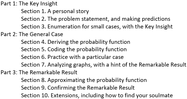
Now suppose that three candidates apply.  How many different orderings of the three candidates are possible?  Here are the six possible orderings:

What should your hiring strategy be?  One thought is to hire the first person in line.  Then what’s your probability of choosing the best?  Orderings A and B lead to success, and the others do not, so your probability of choosing the best is 2/6, also known as 1/3.  What if you decide to hire the second person in line?  Same thing: orderings C and E produce success, so the probability of choosing the best is again 2/6.  Okay, then how about deciding to hire the last person in line?  Again the same: 2/6 probability of success (D and F produce success).

Well, that’s pretty boring.  At this point you’re probably wondering why in the world this is my favorite problem.  But I’ll let you in on a little secret: We can do better.  We can adopt a more clever strategy that achieves a higher success probability than one-third.  Perhaps you’ve already had the Key Insight. 

Let’s think through this hiring process one step at a time.  Imagine yourself sitting at your desk, waiting to interview the three candidates who have lined up in the hallway.  You interview the first candidate.  Should you hire that person?  Definitely not, because you’re stuck with that 1/3 probability of success if you do that.  So, you should thank the first candidate but say that you will continue looking.  Move on to interview the second candidate. 

Should you hire that second candidate?  This is the pivotal moment.  Think about this.  The correct answer is …  Wait, I really want you to think about this before you read on.  You’ve interviewed the second candidate. What should you decide? Are you ready with your answer?  Okay, then …  Wait, have you really thought this through before you read on?

The optimal answer to whether you should hire the second candidate consists of two words : It depends.  On what does it depend?  On whether the second candidate is better or worse than the first one.  If the second person is better than the first one, should you hire that person?  Sure, go ahead.  But if the second person is worse than the first one, should you hire that person?  Absolutely not!  In this case, you know for sure that you’re not choosing the best if you hire the second person knowing that the first one was better.  The only sensible decision is to take your chances with the third candidate.

You caught that, right?  That was the Key Insight I’ve been promising.  You learn something by interviewing the first candidate, because that enables you to discern whether the second candidate is better or worse than the first.  You can use this knowledge to increase your probability of choosing the best.

To make sure that we’re all clear about this, let me summarize the strategy: Interview the first candidate but do not hire her.  Then if the second candidate is better than the first, hire the second candidate.  But if the second candidate is worse than the first, hire the third candidate.

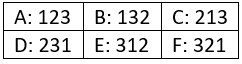
Determine the probability of successfully choosing the best with this strategy.  For students who need a hint: For each of the six possible orderings, determine whether or not this strategy succeeds at choosing the best.

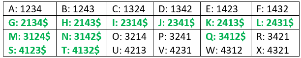
First notice that orderings A (123) and B (132) do not lead to success, because the best candidate is first in line.  But ordering C (213) is a winner: The second candidate is better than the first, so you hire her, and she is in fact the best.  Ordering D (231) takes advantage of the key insight: The second candidate is worse than the first, so you keep going and hire the third candidate, who is indeed the best.  Ordering E (312) is also a winner.  But with ordering F (321), you hire the second person, because she is better than the first person, not knowing that the best candidate is still waiting in the wings.  The orderings for which you succeed in choosing the best are shown with + in bold green here:

The probability of successfully choosing the best is therefore 3/6 = 0.5.  Increasing the number of candidates from 2 to 3 does not reduce the probability of choosing the best, as long as you use the strategy based on the Key Insight.


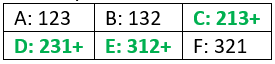
Now let’s consider the case with 4 candidates.  How many different orderings are possible?  The answer is 4! = 24, as shown here:

Again we’ll make use of the Key Insight.  You should certainly not hire the first candidate in line.  Instead use the knowledge gained from interviewing that candidate to assess whether subsequent candidates are better or worse.  Whenever you find a candidate who is the best that you have encountered, hire her. We still need to decide between these two hiring strategies:

  • Let the first candidate go by.  Then hire the next candidate you see who is the best so far.
  • Let the first two candidates go by.  Then hire the next candidate you see who is the best so far.

How can we decide between these two hiring strategies?  For students who need a hint, I offer: Make use of the list of 24 orderings.  We’re again going to use a brute force analysis here, nothing clever.  For each of the two strategies, we’ll go through all 24 orderings and figure out which lead to successfully choosing the best.  Then we’ll count how many orderings produce winners for the first strategy and how many do so for the second strategy. 

Go ahead and do this.  At this point I encourage students to work in groups and give them 5-10 minutes to conduct this analysis.  I ask them to mark the ordering with * if it produces a success with the first strategy and with a # if it leads to success with the second strategy.  After a minute or two, to make sure that we’re all on the same page, I ask: What do you notice about the first row of orderings?  A student will point out that the best candidate always arrives first in that row, which means that you never succeed in choosing the best with either of these strategies.  We can effectively start with the second row.

Many students ask about ordering L (2431), wondering whether either strategy calls for hiring the third candidate because she is better than the second one.  I respond by asking whether the third candidate is the best that you have seen so far.  The answer is no, because the first candidate was better.  Both strategies say to keep going until you find a candidate who is better than all that you have seen before that point.

When most of the student groups have finished, I go through the orderings one at a time and ask them to tell me whether or not it results in success for the “let 1 go by” strategy.  As we’ve already discussed, the first row, in which the best candidate arrives first, does not produce any successes.  But the second row tells a very different story.  All six orderings in the second row produce success for the “let 1 go by” strategy.  Because the second-best candidate arrives first in the second row, this strategy guarantees that you’ll keep looking until you find the very best candidate.  The third row is a mixed bag.  Orderings M and N are winners because the best candidate is second in line.  Orderings O and P are instructive, because we are fooled into hiring the second-best candidate and leave the best waiting in the wings.  Ordering Q produces success but R does not.  In the fourth row, the first two orderings are winners but the rest are not.  Here’s the table, with successes marked by $ in bold green:

How about the “let 2 go by” strategy?  Again the first row produces no successes.  The first two columns are also unlucky, because the best candidate was second in line and therefore passed over.  Among the orderings that are left, all produce successes except R and X, where we are fooled into hiring the second-best candidate.  Orderings O, P, U, V, and W are worth noting, because they lead to success for the “let 2 go by” strategy but not for “let 1 go by.”  Here’s the table for the “let 2 go by” strategy, with successes marked by # in bold green:

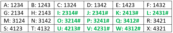
So, which strategy does better?  It’s a close call, but we see 11 successes with “let 1 go by” (marked with $) and 10 successes with ”let 2 go by” (indicated by #).  The probability of choosing the best is therefore 11/24 ≈ 0.4583 by using the optimal (let 1 go by) strategy with 4 candidates.

How does this probability compare to the optimal strategy with 3 candidates?  The probability has decreased a bit, from 0.5 to 0.4583.  This is not surprising; we knew that the task gets more challenging as the number of candidates increases.  What is surprising is that the decrease in this probability has been so small as we moved from 2 to 3 to 4 candidates.  How does this probability compare to the naïve strategy of hiring the first person in line with 4 candidates?  We’re doing a lot better than that, because 45.83% is a much higher success rate than 25%.

These examples with very small numbers of candidates suggest the general form of the optimal* strategy:

  • Let a certain number of candidates go by. 
  • Then hire the first candidate you see who is the best among all you have seen thus far.

* I admit to mathematically inclined students that I have not formally proven that this strategy is optimal.  For a proof, see Morrie DeGroot’s classic book Optimal Statistical Decisions.


Ready for one more? Now suppose that there are 5 candidates.  What’s your guess for the optimal strategy – let 1 go by, or let 2 go by, or let 3 go by?  In other words, the question is whether we want to garner information from just one candidate before we seriously consider hiring, or if it’s better to learn from two candidates before we get serious, or perhaps it’s best to take a look at three candidates.  I don’t care what students guess, but I do want them to reflect on the Key Insight underlying this question before they proceed.  How many possible orderings are there?  There are now 5! =120 possible orderings.  Do you want to spend your time analyzing these 120 orderings by brute force, as we did with 24 orderings in the case of 4 candidates?  I am not disappointed when students answer no, because I hope this daunting task motivates them to want to analyze the general case mathematically.  Just for fun, let me show the 120 orderings:

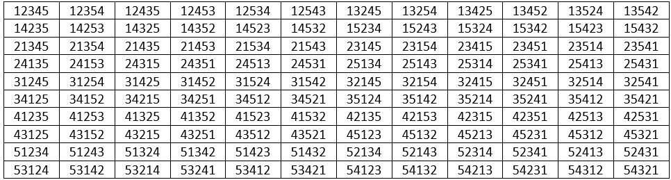
We could go through all 120 orderings one at a time. For each one, we could figure out whether it’s a winner or a loser with the “let 1 go by” strategy, and then repeat for “let 2 go by,” and then again for “let 3 go by.”  I do not ask my students to perform such a tedious task, and I’m not asking you to do that either.  How about if I just tell you how this turns out?  The “let 1 go by” strategy produces a successful outcome for 50 of the orderings, compared to 52 orderings for “let 2 go by” and 42 orderings for “let 3 go by.” 

Describe the optimal strategy with 5 candidates.  Let the first 2 candidates go by.  Then hire the first candidate you see who is the best you’ve seen to that point.  What is the probability of success with that strategy?  This probability is 52/120 ≈ 0.4333.  Interpret this probability.  If you were to use the optimal strategy with 5 candidates over and over and over again, you would successfully choose the best candidate in about 43.33% of those situations.  Has this probability decreased from the case with 4 candidates?  Yes, but only slightly, from 45.83% to 43.33%.  Is this probability larger than a naïve approach of hiring the first candidate?  Yes, a 43.33% chance is much greater than a 1/5 = 20% chance.


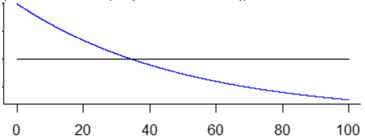
We’ve accomplished a good bit, thanks to the Key Insight that we discovered in the case with three candidates.  Here is a graph of the probability of choosing the best with the optimal strategy, as a function of the number of candidates:

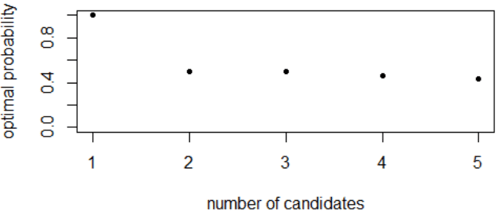
Sure enough, this probability is getting smaller as the number of candidates increases.  But it’s getting smaller at a much slower pace than most people expect.  What do you think will happen as we increase the number of candidates?  I’ll ask you to revise your guesses from the beginning of this activity, based on what we have learned thus far.  Please make new guesses for the remaining values in the table:

I hope you’re intrigued to explore more about this probability function.  We can’t rely on a brute force analysis any further, so we’ll do some math to figure out the general case in the next post.  We’ll also practice applying the optimal strategy on the 12-candidate case, and we’ll extend this probability function as far as 5000 candidates.  This will provide a strong hint of the Remarkable Result to come.

#46 How confident are you? Part 3

How confident are you that your students can explain:

  • Why do we use a t-distribution (rather than the standard normal z-distribution) to produce a confidence interval for a population mean? 
  • Why do we check a normality condition, when we have a small sample size, before calculating a t-interval for a population mean? 
  • Why do we need a large enough sample size to calculate a normal-based confidence interval for a population proportion?

I suspect that my students think we invent these additional complications – t instead of z, check normality, check sample size – just to torment them.  It’s hard enough to understand what 95% confidence means (as I discussed in post #14 here), and that a confidence interval for a mean is not a prediction interval for a single observation (see post #15 here).

These questions boil down to asking: What goes wrong if we use a confidence interval formula when the conditions are not satisfied?  If nothing bad happens when the conditions are not met, then why do we bother checking conditions?  Well, something bad does happen.  That’s what we’ll explore in this post.  Once again we’ll use simulation as our tool.  In particular, we’ll return to an applet called Simulating Confidence Intervals (here).  As always, questions for students appear in italics.


1. Why do we use a t-distribution, rather than a z-distribution, to calculate a confidence interval for a population mean? 

It would be a lot easier, and would seem to make considerable sense, just to plug in a z-value, like this*:

* I am using standard notation: x-bar for sample mean, s for sample standard deviation, n for sample size, and z* for a critical value from a standard normal distribution.  I often give a follow-up group quiz in which I simply ask students to describe what each of these four symbols means, along with μ.

Instead we tell students that we need to use a different multiplier, which comes from a completely different probability distribution, like so:

Many students believe that we do this just to make their statistics course more difficult.  Other students accept that this adjustment is necessary for some reason, but they figure that they are incapable of understanding why.

We can inspire better reactions than these.  We can lead students to explore what goes wrong if we use the z-interval and how the t-interval solves the problem.  As we saw in post #14 (here), the key is to use simulation to explore how confidence intervals behave when we randomly generate lots and lots of them (using the applet here).

To conduct this simulation, we need to assume what the population distribution looks like.  For now let’s assume that the population has a normal distribution with mean 50 and standard deviation 10.  We’ll use a very small sample size of 5, a confidence level of 95%, and we’ll simulate selecting 500 random samples from the population.  Using the first formula above (“z with s”), the applet produces output like this:

The applet reports that 440 of these 500 intervals (88.0%, the ones colored green) succeed in capturing the population mean.  The success percentage converges to about 87.8% after generating tens and hundreds of thousands of these intervals.  I ask students:

  • What problem with the “z with s” confidence interval procedure does this simulation analysis reveal?  A confidence level of 95% is supposed to mean that 95% of the confidence intervals generated with the procedure succeed in capturing the population parameter, but the simulation analysis reveals that this “z with s” procedure is only succeeding about 88% of the time.
  • In order to solve this problem, do we need the intervals to get a bit narrower or wider?  We need the intervals to get a bit wider, so some of the intervals that (barely) fail to include the parameter value of 50 will include it.
  • Which of the four terms in the formula – x-bar, z*, s, or n – can we alter to produce a wider interval?  In other words, which one does not depend on the data?  The sample mean, sample standard deviation, and sample size all depend on the data.  We need to use a different multiplier than z* to improve this confidence interval procedure.
  • Do we want to use a larger or smaller multiplier than z*?  We need a slightly larger multiplier, in order to make the intervals a bit wider.

At this point I tell students that a statistician named Gosset, who worked for Guinness brewery, determined the appropriate multiplier, based on what we call the t-distribution.  I also say that:

  • The t-distribution is symmetric about zero and bell-shaped, just like the standard normal distribution.
  • The t-distribution has heavier tails (i.e., more area in the tails) than the standard normal distribution.
  • The t-distribution is actually an entire family of distributions, characterized by a number called its degrees of freedom (df).
  • As the df gets larger and larger, the t-distribution gets closer and closer to the standard normal distribution.
  • For a confidence interval for a population mean, the degrees of freedom is one less than the sample size: n – 1.

The following graph displays the standard normal distribution (in black) and a t-distribution with 4 degrees of freedom (in blue).  Notice that the blue curve has heavier tails than the black one, so capturing the middle 95% of the distribution requires a larger critical value.

With a sample size of 5 and 95% confidence, the critical value turns out to be t* = 2.776, based on 4 degrees of freedom.  How does this compare to the value of z* for 95% confidence?  Students know that z* = 1.96, so the new t* multiplier is considerably larger, which will produce wider intervals, which means that a larger percentage of intervals will succeed in capturing the value of the population mean.

That’s great that the new t* multiplier produces wider intervals, but: How can we tell whether this t* adjustment is the right amount to produce 95% confidence?  That’s easy: Simulate!  Here is the result of taking the same 500 samples as above, but using the t-interval rather than the z-interval:

How do these intervals compare to the previous ones?  We can see that these intervals are wider.  Do more of them succeed in capturing the parameter value?  Yes, more are green, and so fewer are red, than before.  In fact, 94.6% of these 500 intervals succeed in capturing the value of 50 that we set for the population mean.  Generating many thousands more samples and intervals reveals that the long-run success rate is very close to 95.0%.

What happens with larger sample sizes?  Ask students to explore this with the applet.  They’ll find that the percentage of successful intervals using the “z with s” method increases as the sample size does, but continues to remain less than 95%.  The coverage success percentages increase to approximately 93.5% with a sample size of n = 20, 94.3% with n = 40, and 94.7% with n = 100.  With the t-method, these percentages hover near 95.0% for all sample sizes.

Does t* work equally well with other confidence levels?  You can ask students to investigate this with simulation also.  They’ll find that the answer is yes.

By the way, why do the widths of these intervals vary from sample to sample?  I like this question as a check on whether students understand what the applet is doing and how these confidence interval procedures work.  The intervals have different widths because the value of the sample standard deviation (s in the formulas above) varies from sample to sample.

Remember that this analysis has been based on sampling from a normally distributed population.  What if the population follows a different distribution?  That’s what we’ll explore next …


2. What goes wrong, with a small sample size, if the normality condition is not satisfied?

Students again suspect that we want them to check this normality condition just to torment them.  It’s very reasonable for them to ask what bad thing would happen if they (gasp!) use a procedure even when the conditions are not satisfied.  Our strategy for investigating this will come as no surprise: simulation!  We’ll simulate selecting samples, and calculating confidence intervals for a population mean, from two different population distributions: uniform and exponential.  A uniform distribution is symmetric, like a normal distribution, but is flat rather than bell-shaped.  In contrast, an exponential distribution is sharply skewed to the right.  Here are graphs of these two probability distributions (uniform in black, exponential in blue), both with a mean of 50:

The output below displays the resulting t-intervals from simulating 500 samples from a uniform distribution with sample sizes of 5 on the left, 20 on the right:

For these 500 intervals, the percentages that succeed are 92.8% on the left, 94.4% on the right.  Remind me: What does “succeed” mean here?  I like to ask this now and then, to make sure students understand that success means capturing the actual value (50, in this case) of the population mean.  I went on to use R to simulate one million samples from a uniform distribution with these sample sizes.  I found success rates of 93.4% with n = 5 and 94.8% with n = 20.  What do these percentages suggest?  The t-interval procedure works well for data from a uniform population even with samples as small as n = 20 and not badly even with sample sizes as small as n = 5, thanks largely to the symmetry of the uniform distribution.

Sampling from the highly-skewed exponential distribution reveals a different story.  The following output comes from sample sizes (from left to right) of 5, 20, 40, and 100:

The rates of successful coverage in these graphs (again from left to right) are 87.8%, 92.2%, 93.4%, and 94.2%.  The long-run coverage rates are approximately 88.3%, 91.9%, 93.2%, and 94.2%.  With sample data from a very skewed population, the t-interval gets better and better with larger sample sizes, but still fails to achieve its nominal (meaning “in name only”) confidence level even with a sample size as large as 100.

The bottom line, once again, is that when the conditions for a confidence interval procedure are not satisfied, that procedure will successfully capture the parameter values less often than its nominal confidence level.  How much less often depends on the sample size (smaller is worse) and population distribution (more skewed is worse). 

Also note that there’s nothing magical about the number 30 that is often cited for a large enough sample size.  A sample size of 5 from a uniform distribution works as well as a sample size of 40 from an exponential distribution, and a sample size of 20 from a uniform distribution is comparable to a sample size of 100 from an exponential distribution.

Next we’ll shift gears to explore a confidence interval for a population proportion rather than a population mean …


3. What goes wrong when the sample size conditions are not satisfied for a confidence interval for a population proportion?

The conventional method for estimating a population proportion π is*:

* I adhere to the convention of using Greek letters for parameter values, so I use π (pi) for a population proportion.

We advise students not to use this procedure with a small sample size, or when the sample proportion is close to zero or one.  A typical check is that the sample must include at least 10 “successes” and 10  “failures.”  Can students explain why this check is necessary?  In other words, what goes wrong if you use this procedure when the condition is not satisfied?  Yet again we can use simulation to come up with an answer.

Let’s return to the applet (here).  Now we’ll select Proportions, Binomial, and the Wald method (which is one of the names for the conventional method above).  Let’s use a sample size of n = 15 and a population proportion of π = 0.1.  Here is some output for 500 simulated samples and the resulting confidence intervals:

Something weird is happening here.  I only see two red intervals among the 500, yet the applet reports that only 78.6% of these intervals succeeded in capturing the value of the population proportion (0.1).  How do you explain this?  When students are stymied, I direct their attention to the graph of the 500 simulated sample proportions that also appears in the applet:

For students who need another hint: What does the red bar at zero mean?  Those are simulated samples for which there were zero successes.  The resulting confidence “interval” from those samples consists only of the value zero.  Those “intervals” obviously do not succeed in capturing the value of the population proportion, which we stipulated to be 0.1 for the purpose of this simulation.  Because those “intervals” consist of a single value, they cannot be seen in the graph of the 500 confidence intervals.

Setting aside the oddity, the important point here is that less than 80% of the allegedly 95% confidence intervals succeeded in capturing the value of the population parameter: That is what goes wrong with this procedure when the sample size condition is not satisfied.  It turns out that the long-run proportion* of intervals that would succeed, with n = 15 and π = 0.1, is about 79.2%, far less than the nominal 95% confidence level.

* You could ask mathematically inclined students to verify this from the binomial distribution.

Fortunately, we can introduce students to a simple alternative procedure, known as “plus-four,” that works remarkably well.  The idea of the plus-four interval is to pretend that the sample contained two more “successes” and two more “failures” than it actually did, and then carry on like always.  The plus-four 95% confidence interval* is therefore:

The p-tilde symbol here represents the modified sample proportion, after including the fictional successes and failures.  In other words, if x represents the number of successes, then p-tilde = (x + 2) / (n + 4). 

How does p-tilde compare to p-hat?  Often a student will say that p-tilde is larger than p-hat, or smaller than p-hat.  Then I respond with a hint: What if p-hat is less than 0.5, or equal to 0.5, or greater than 0.5?  At this point, some students realize that p-tilde is closer to 0.5 than p-hat, or equal to 0.5 if p-hat was already equal to 0.5.

Does this fairly simple plus-four adjustment really fix the problem?  Let’s find out with … simulation!  Here are the results for the same 500 simulated samples that we looked at above:

Sure enough, this plus-four method generated a 93.8% success rate among these 500 intervals.  In the long run (with this case of n = 15 and π = 0.1), the success rate approaches 94.4%.  This is very close to the nominal confidence level of 95%, vastly better than the 79.2% success rate with the conventional (Wald) method.  The graph of the distribution of 500 simulated p-tilde values on the right above reveals the cause for the improvement: The plus-four procedure now succeeds when there are 0 successes in the sample, producing a p-tilde value of 2/19 ≈ 0.105, and this procedure fails only with 4 or more successes in the sample.

Because of the discrete-ness of a binomial distribution with a small sample size, the coverage probability is very sensitive to small changes.  For example, increasing the sample size from n = 15 to n = 16, with a population proportion of π = 0.1, increases the coverage rate with the 95% plus-four procedure from 94.4% to 98.3%.  Having a larger coverage rate than the nominal confidence level is better than having a smaller one, but notice that the n = 16 rate misses the target value of 95% by more than the n = 15 case.  Still, the plus-four method produces a coverage rate much closer to the nominal confidence level than the conventional method for all small sample sizes.

Let’s practice applying this plus-four method to sample data from the blindsight study that I described in post #12 (Simulation-based inference, part 1, here).  A patient who suffered brain damage that caused vision loss on the left side of her visual field was shown 17 pairs of house drawings.  For each pair, one of the houses was shown with flames coming out of the left side.  The woman said that the houses looked identical for all 17 pairs.  But when she was asked which house she would prefer to live in, she selected the non-burning house in 14 of the 17 pairs.

The population proportion π to be estimated here is the long-run proportion of pairs for which the patient would select the non-burning house, if she were to be shown these pairs over and over.  Is the sample size condition for the conventional (Wald) confidence interval procedure satisfied?  No, because the sample consists of only 3 “failures,” which is considerably less than 10.  Calculate the point estimate for the plus-four procedure.  We pretend that the sample consisted of two additional “successes” and two additional “failures.”  This gives us p-tilde = (14 + 2) / (17 + 4) = 16/21 ≈ 0.762.  How does this compare to the sample proportion?  The sample proportion (of pairs for which she chose the non-burning house) is p-hat = 14/17 ≈0.824.  The plus-four estimate is smaller, as it is closer to one-half.  Use the plus-four method to determine a 95% confidence interval for the population proportion.  This confidence interval is: 0.762 ± 1.96×sqrt(0.762×0.238/21), which is 0.762 ± 0.182, which is the interval (0.580 → 0.944).  Interpret this interval.  We can be 95% that in the long run, the patient would identify the non-burning house for between 58.0% and 94.4% of all showings.  This interval lies entirely above 0.5, so the data provide strong evidence that the patient does better than randomly guessing between the two drawings.  Why is this interval so wide?  The very small sample size, even after adding four hypothetical responses, accounts for the wide interval.  Is this interval valid, despite the small sample size?  Yes, the plus-four procedure compensates for the small sample size.


We have tackled three different “what would go wrong if a condition was not satisfied?” questions and found the same answer every time: A (nominal) 95% confidence interval would succeed in capturing the actual parameter value less than 95% of the time, sometimes considerably less.  I trust that this realization helps to dispel the conspiracy theory among students that we introduce such complications only to torment them.  On the contrary, our goal is to use procedures that actually succeed 95% of the time when that’s how often they claim to succeed.

As a wrap-up question for students on this topic, I suggest asking once again: What does the word “succeed” mean when we speak of a confidence interval procedure succeeding 95% of the time?  I hope they realize that “succeed” here means that the interval includes the actual (but unknown in real life, as opposed to a simulation) value of the population parameter.  I frequently remind students to think about the green intervals, as opposed to the red ones, produced by the applet simulation, and I ask them to remind me how the applet decided whether to color the interval as green or red.

#45 Simulation-based inference, part 3

I’m a big believer in introducing students to concepts of statistical inference through simulation-based inference (SBI).  I described activities for introducing students to the concepts of p-value and strength of evidence in posts #12 (here) and #27 (here).  The examples in both of these previous posts concerned categorical variables.  Now I will describe an activity for leading students to use SBI to compare two groups with a numerical response.  As always, questions that I pose to students appear in italics.


Here’s the context for the activity: Researchers randomly assigned 14 male volunteers with high blood pressure to one of two diet supplements – fish oil or regular oil.  The subjects’ diastolic blood pressure was measured at the beginning of the study and again after two weeks.  Prior to conducting the study, researchers conjectured that those with the fish oil supplement would tend to experience greater reductions in blood pressure than those with the regular oil supplement*.

* I read about this study in the (wonderfully-titled) textbook The Statistical Sleuth (here).  The original journal article can be found here.

a) Identify the explanatory and response variables.  Also classify each as categorical or numerical.

I routinely ask this question of my students at the start of each activity (see post #11, Repeat after me, here).  The explanatory variable is type of diet supplement, which is categorical and binary.  The response variable is reduction in diastolic blood pressure, which is numerical.

b) Is this a randomized experiment or an observational study?  Explain.

My students know to expect this question also.  This is a randomized experiment, because researchers assigned each participant to a particular diet supplement.

c) State the hypotheses to be tested, both in words and in symbols.

I frequently remind my students that the null hypothesis is typically a statement of no difference or no effect.  In this case, the null hypothesis stipulates that there’s no difference in blood pressure reductions, on average, between those who could be given a fish oil supplement as compared a regular oil supplement.  The null hypothesis can also be expressed as specifying that the type of diet supplement has no effect on blood pressure reduction.  Because of the researchers’ prior conjecture, the alternative hypothesis is one-sided: Those with a fish oil supplement experience greater reduction in blood pressure, on average, than those with a regular oil supplement. 

In symbols, these hypotheses can be expressed as H0: mufish = mureg vs. Ha: mufish > mureg.  Some students use x-bar symbols rather than mu in the hypotheses, which gives me an opportunity to remind them that hypotheses concern population parameters, not sample statistics.

I try to impress upon students that hypotheses can and should be determined before the study is conducted, prior to seeing the data.  I like to reinforce this point by asking them to state the hypotheses before I show them the data.

Here are dotplots showing the sample data on reductions in systolic blood pressure (measured in millimeters of mercury) for these two groups (all data values are integers):

d) Calculate the average blood pressure reduction in each group. What symbols do we use for these averages?  Also calculate the difference in these group means (fish oil group minus regular oil group).  Are the sample data consistent with the researchers’ conjecture?  Explain.

The group means turn out to be: x-barfish = 46/7 ≈ 6.571 mm for the fish oil group, x-barreg = -8/7 ≈ -1.143 for the regular oil group.  This difference is 54/7 ≈ 7.714 mm.  The data are consistent with the researchers’ conjecture, because the average reduction was greater with fish oil than with regular oil.

e) Is it possible that there’s really no effect of the fish oil diet supplement, and random chance alone produced the observed differences in means between these two groups?

I remind students that they’ve seen this question, or at least its very close cousin, before.  We asked this same question about the results of the blindsight study, in which the patient identified the non-burning house in 14 of 17 trials (see post #12, here).  We also asked this about the results of the penguin study, in which penguins with a metal band were 30 percentage points more likely to die than penguins without a metal band (see post #27, here).  My students know that the answer I’m looking for has four letters: Sure, it’s possible.

But my students also know that the much more important question is: How likely is it?  At this point in class I upbraid myself for using the vague word and ask: What does it mean here?  I’m very happy when a student explains that I mean to ask how likely it is to obtain sample mean reductions at least 7.714 mm apart, favoring fish oil, if type of diet supplement actually has no effect on blood pressure reduction.

f) How can we investigate how surprising it would be to obtain results as extreme as this study’s, if in fact there were no difference between the effects of fish oil and regular oil supplements on blood pressure reduction?

Students have seen different versions of this question before also.  The one-word answer I’m hoping for is: Simulate!

g) Describe (in detail) how to conduct the simulation analysis to investigate the question in part f).

Most students have caught on to the principle of simulation at this point, but providing a detailed description in this new scenario, with a numerical response variable, can be challenging.  I follow up with: Can we simply toss a coin as we did with the blindsight study?  Clearly not.  We do not have a single yes/no variable.  Can we shuffle and deal out cards with two colors?  Again, no.  The two colors represented success and failure, but we now have numerical responses.  How can we use cards to conduct this simulation?  Some students have figured out that we can write the numerical responses from the study onto cards.  What does each card represent?  One of the participants in the study.  How many cards do we need?  Fourteen, one for each participant.  What do we do with the cards?  Shuffle them.  And then what?  Separate them into two groups of 7 cards each.  What does this represent?  Random assignment of the 14 subjects into one of the two diet supplement groups.  Then what?  Calculate the average of the response values in each group.  And then?  Calculate the difference in those two averages, being careful to subtract in the same order that we did before: fish oil group minus regular oil group.  Great, what next?  This one often stumps students, until they remember that we need to repeat this process, over and over again, until we’ve completed a large number of repetitions.

Before we actually conduct this simulation, I ask:

h) Which hypothesis are we assuming to be true as we conduct this simulation?  This gives students pause, until they remember that we always assume the null hypothesis to be true when we conduct a significance test.  They can also state this in the context of the current study: that there’s no difference, on average, between the blood pressure reductions that would be achieved with a fish oil supplement versus a regular oil supplement.  I also want them to think about how it applies in this case: How does this assumption manifest itself in our simulation process?  This is a hard question.  I try to tease out the idea that we’re assuming the 14 participants were going to experience whatever blood pressure reduction they did no matter which group they had been assigned to.


Now, finally, having answered all of these preliminary questions, we’re ready to do something.  Sometimes I provide index cards to students and ask them to conduct a repetition or two of this simulation analysis by hand.  But I often skip this part* and proceed directly to conduct the simulation with a computer. 

* I never skip the by-hand simulation with coins in the blindsight study or with playing cards in the penguin study, because I think the tactile aspect helps students to understand what the computer does.  But the by-hand simulation takes considerably more time in this situation, with students first writing the 14 response values on 14 index cards and later having to calculate two averages.  My students have already conducted tactile simulations with the previous examples, so I trust that they can understand what the computer does here.

I especially like that this applet (here), designed by Beth Chance, illustrates the process of pooling the 14 response values and then re-randomly assigning them between the two groups.  The first steps in using the applet are to clear the default dataset and enter (or paste) the data for this study.  (Be sure to click on “Use Data” after entering the data.)  The left side of the screen displays the distributions and summary statistics.  Then clicking on “Show Shuffle Options” initiates simulation capabilities on the right side of the screen.  I advise students to begin with the “Plot” view rather than the “Data” view.

i) Click on “Shuffle Responses” to conduct one repetition of the simulation.  Describe what happens to the 14 response values in the dotplots.  Also report the resulting value of the difference in group means (again taking the fish oil group minus the regular oil group).

This question tries to focus students’ attention on the fact that the applet is doing precisely what we described for the simulation process: pooling all 14 (unchanging) response values together and then re-randomizing them into two groups of 7.

j) Continue to click on “Shuffle responses” for a total of 10 repetitions.  Did we obtain the same result (for the difference in group means) every time?  Are any of the difference in groups means as large as the value observed in the actual study: 7.714 mm?

Perhaps it’s obvious that the re-randomizing does not produce the same result every time, but I think this is worth emphasizing.  I also like to keep students’ attention on the key question of how often the simulation produces a result as extreme as the actual study.

k) Now enter 990 for the number of shuffles, which will produce a total of 1000 repetitions.  Consider the resulting distribution of the 1000 simulated differences in group means.  Is the center where you would expect?  Does the shape have a recognizable pattern?  Explain.

Here is some output from this simulation analysis:

The mean is very close to zero.  Why does this make sense?  The assumption behind the simulation is that type of diet supplement has no effect on blood pressure reduction, so we expect the difference in group means (always subtracting in the same order: fish oil group minus regular oil group) to include about half positive values and half negative values, centered around zero.  The shape of this distribution is very recognizable at this point of the course: approximately normal.

l) Use the Count Samples feature of the applet to determine the approximate p-value, based on the simulation results.  Also describe how you determine this.

The applet does not have a “Calculate Approximate P-value” button.  That would have been easy to include, of course, but the goal is for students to think through how to determine this for themselves.  Students must realize that the approximate p-value is the proportion of the 1000 simulated differences in group means that are 7.714 or larger.  They need to enter the value 7.714 in the box* next to “Count Samples Greater Than” and then click on “Count.”  The following output shows an approximate p-value of 0.006:

* If a student enters a different value here, the applet provides a warning that this might not be the correct value, but it proceeds to do the count.

m) Interpret what this (approximate) p-value means.

This is usually a very challenging question.  But based on simulation-based inference, students need not memorize this interpretation of a p-value.  Instead, they simply have to describe what’s going on in the graph of simulation results: If there were no effect of diet supplement on blood pressure reductions, then about 0.6% of random assignments would produce a difference in sample means, favoring the fish oil group, of 7.714 or greater.  I also like to model conveying this idea with a different sentence structure, such as: About 0.6% of random assignments would produce a difference in sample means, favoring the fish oil group, of 7.714 or greater, assuming that there were no effect of diet supplement on blood pressure reductions.  The hardest part of this for most students is remembering to include the if or assuming part of this sentence.


Now we are ready to draw some conclusions.

n) Based on this simulation analysis, do the researchers’ data provide strong evidence that the fish oil supplement produces a greater reduction in blood pressure, on average, than the regular oil supplement?  Also explain the reasoning process by which your conclusion follows from the simulation analysis.

The short answer is yes, the data do provide strong evidence that the fish oil supplement is more helpful for reducing blood pressure than the regular oil supplement.  I hope students answer yes because they understand the reasoning process, not because they’ve memorized that a small p-value means strong evidence of …  I do not consider “because the p-value is small” to be an adequate explanation of the reasoning process.  I’m looking for something such as: “It would be very unlikely to obtain a difference in group mean blood pressure reductions of 7.714mm or greater, if fish oil were no better than regular oil.  But this experiment did find a difference in group means of 7.714mm.  Therefore, we have strong evidence against the hypothesis of no effect, in favor of concluding that fish oil does have a beneficial effect on blood pressure reduction.”

At this point I make a show of pointing out that I just used the important word effect, so I then ask:

o) Is it legitimate to draw a cause-and-effect conclusion between the fish oil diet and greater blood pressure reductions?  Justify your answer.

Yes, a cause-and-effect conclusion is warranted here, because this was a randomized experiment and the observed difference in group means is unlikely to occur by random assignment alone if there were no effect of diet supplement type on blood pressure reduction.

Now that I’ve asked about causation, I follow up with a final question about generalizability:

p) To what population is it reasonable to generalize the results of this study?

Because the study included only men, it seems unwise to conclude that women would necessarily respond to a fish oil diet supplement in the same way.  Also, the men in this study were all volunteers who suffered from high blood pressure.  It’s probably best to generalize only to men with high blood pressure who are similar to those in this study. 


Whew, that was a lot of questions*!  I pause here to give students a chance to ask questions and reflect on this process.  I also reinforce the idea, over and over, that this is the same reasoning process they’ve seen before, with the blindsight study for a single proportion and with the penguin study for comparing proportions.  The only difference now is that we have a numerical response, so we’re looking at the difference in means rather than proportions.  But the reasoning process is the same as always, and the interpretation of p-value is the same as always, and the way we assess strength of evidence is the same as always.

* We didn’t make it to part (z) this time, but this post is not finished yet …

Now I want to suggest three extensions that you could consider, either in class or on assignments, depending on your student audience, course goals, and time constraints.  You could pursue any or all of these, in any order.

Extension 1: Two-sample t-test

q) Conduct a two-sample t-test of the relevant hypotheses.  Report the value of the test statistic and p-value.  Also summarize your conclusion.

The two-sample (unpooled) test statistic turns out to be t = 3.06, with a (one-sided) p-value of ≈ 0.007*.  Based on this small p-value, we conclude that the sample data provide strong evidence that fish oil reduced blood pressure more, on average, than regular oil.

* Whenever this fortunate occurrence happens, I tell students that this is a p-value of which James Bond would be proud!

r) How does the result of the t-test compare to that of the simulation analysis?

The result are very similar.  The approximate p-value from the simulation analysis above was 0.006, and the t-test gave an approximate p-value of 0.007. 

Considering how similar these results are, you might be wondering why I recommend bothering with the simulation analysis at all.  The most compelling reason is that the simulation analysis shows students what a p-value is: the probability of obtaining such a large (or even larger) difference in group means, favoring the fish oil group, if there were really no difference between the treatments.  I think this difficult idea comes across clearly in the graph of simulated results that we discussed above.  I don’t think calculating a p-value from a t-distribution helps to illuminate this concept.


Extension 2: Comparing medians

Another advantage of simulation-based inference is that it provides considerable flexibility with regard to the choice of statistic to analyze.  For example, could we compare the medians of the two groups instead of their means?  From the simulation-based perspective: Sure!  Do we need to change the analysis considerably?  Not at all!  Using the applet, we simply select the difference in medians rather than the difference in means from the pull-down list of statistic options on the left side.  If we were writing our own code, we would simply replace mean with median

s) Before we conduct a simulation analysis of the difference in median blood pressure reductions between the two groups, first predict what the distribution of 1000 simulated differences in medians will look like, including the center and shape of the distribution. 

One of these is much easier to anticipate than the other: We can expect that the center will again be near zero, again because the simulation operates under the assumption of no difference between the treatments.  But medians often do not follow a predictable, bell-shaped curve like means often do, especially with such small sample sizes of 7 per group.

t) Use the applet to conduct a simulation analysis with 1000 repetitions, examining the difference in medians between the groups.  Describe the resulting distribution of the 1000 simulated differences in medians.

Here is some output:

The center is indeed close to zero.  The shape of this distribution is fairly symmetric but very irregular.  This oddness is due to the very small sample sizes and the many duplicate data values.  In fact, there are only eight possible values for the difference in medians: ±8, ±7, ±2, and ±1. 

u) How do we determine the approximate p-value from this simulation analysis?  Go ahead and calculate this.

This question makes students stop and think.  I really want them to be able to answer this correctly, because they’re not really understanding simulation-based inference if they can’t.  I offer a hint: Do we plug in 7.714 again and count beyond that value?  Most students realize that the answer is no, because 7.714 was the difference in group means, not medians, in the actual study.  Then where do we count?  Many students see that we need to count how often the simulation gave a result as extreme as the difference in medians in the actual study, which was 8mm.

Here’s the same graph, with results for which the difference in sample medians is 8 or greater colored in red:

v) Compare the results of analyzing medians rather than means.

We obtained a much smaller p-value when comparing means (0.006) than when comparing medians (0.029).  In both cases, we have reasonably strong evidence that fish oil is better than regular oil for reducing blood pressure, but we have stronger evidence based on means than on medians.


Extension 3: Exact randomization test

What we’ve simulated above is often called a randomization test.  Could we determine the p-value for the randomization test exactly rather than approximately with simulation?  Yes, in principle, but this would involve examining all possible ways to randomly assign subjects between the treatment groups.  In most studies, there are often too many combinations to analyze efficiently.  In this study, however, the number of participants is small enough that we can determine the exact randomization distribution of the statistic.  I only ask the following questions in courses for mathematically inclined students.

w) In many ways can 14 people be assigned to two groups of 7 people each?

This is what the combination (also called a binomial coefficient) 14-choose-7 tells us.  This is calculated as: 14! / (7! ×7!) = 3432.  That’s certainly too many to list out by hand, but that’s a pretty small number to tackle with some code.

x) Describe what to do, in principle, to determine the exact randomization distribution.

We continue to assume that the 14 participants were going to obtain the same blood pressure reduction values that they did, regardless of which diet supplement group they had been assigned to.  For each of these 3432 ways to split the 14 participants into two groups of 7 each, we calculate the mean/median of data values in each group, and then we calculate the difference in means/medians (fish oil group minus regular oil group).  I’ll spare you the coding details.  Here’s what we get, with difference in means on the left, difference in medians on the right:

y) How would you calculate the exact p-values?

For the difference in means, we need to count how many of the 3432 possible random assignments produce a difference in means of 7.714 or greater.  It turns out that only 31 give such an extreme difference, so the exact p-value is 31/3432 ≈ 0.009.

If we instead compare medians, it turns out that exactly 100 of the 3432 random assignments produce a difference in medians of 8 or greater, for a p-value of 100/3432 ≈ 0.029.  Interestingly, 8 is the largest possible difference in medians, but there are 100 different ways to achieve this value from the 14 data values.

z) Did the simulation results come close to the exact p-values?

Yes.  The approximate p-value based on comparing means was 0.006, very close to the exact p-value of 0.009.  Similarly, the approximate p-value based on comparing medians was 0.029, the same (to three decimal places) as the exact p-value.


If you’re intrigued by simulation-based inference but reluctant to redesign your entire course around this idea, I recommend sprinkling a bit of SBI into your course.  Depending on how many class sessions you can devote to this, I recommend these sprinkles in this order:

  1. Inference for a single proportion with a 50/50 null, as with the blindsight study of post #12 (here)
  2. Comparing two proportions, as with the penguin study of post #27 (here)
  3. Comparing two means or medians, as with the fish oil study in this post
  4. Inference for correlation, as with the draft lottery toward the end of post #9 (here)

For each of these scenarios, I strongly suggest that you introduce the simulation-based approach before the conventional method.  This can help students to understand the logic of statistical inference before getting into the details.  I also recommend emphasizing that the reasoning process is the same throughout these scenarios.  After leading students through the simulation-based approach, you can impress upon students that the conventional methods are merely shortcuts that predict what the simulation results would look like without bothering to conduct the simulation.


P.S. Here is a link to the datafile for this activity:

P.P.S. I provided a list of textbooks that prominently include simulation-based inference at the end of post #12 (here).

P.P.P.S. I dedicate this post to George Cobb, who passed away in the last week.  George had a tremendous impact on my life and career through his insightful and thought-provoking writings and also his kind mentoring and friendship. 

George’s after-dinner address at the inaugural U.S. Conference on Teaching Statistics in 2005 inspired many to pursue simulation-based inference for teaching introductory statistics.  His highly influential article based on this talk, titled “The Introductory Statistics Course: A Ptolemaic Curriculum?,” appeared in the inaugural issue of Technology Innovations in Statistics Education (here).  George wrote: “Before computers statisticians had no choice. These days we have no excuse. Randomization-based inference makes a direct connection between data production and the logic of inference that deserves to be at the core of every introductory course.”

George’s writings contributed greatly as my Ask Good Questions teaching philosophy emerged.  At the beginning of my career, I read his masterful article “Introductory Textbooks: A Framework for Evaluation,” in which he simultaneously reviewed 16 textbooks for the Journal of the American Statistical Association (here).  Throughout this review George repeated the following mantra over and over: Judge a textbook by its exercises, and you cannot go far wrong.  This sentence influenced me not only for its substance – what teachers ask students to do is more important than what teachers tell students – but also for its style – repeating a pithy phrase can leave a lasting impression. 

Another of my favorite sentences from George, which has stayed in my mind and influenced my teaching for decades, is: Shorn of all subtlety and led naked out of the protective fold of education research literature, there comes a sheepish little fact: lectures don’t work nearly as well as many of us would like to think (here).

I had the privilege of interviewing George a few years ago for the Journal of Statistics Education (here).  His wisdom, humility, insights, and humor shine throughout his responses to my questions.

#44 Confounding, part 2

Many introductory statistics students find the topic of confounding to be one of the most confounding topics in the course.  In the previous post (here), I presented two extended examples that introduce students to this concept and the related principle that association does not imply causation.  Here I will present two more examples that highlight confounding and scope of conclusions.  As always, this post presents many questions for posing to students, which appear in italics.


3. A psychology professor at a liberal arts college recruited undergraduate students to participate in a study (here).  Students indicated whether they had engaged in a single night of total sleep deprivation (i.e., “pulling an all-nighter”) during the term.  The professor then compared the grade point averages (GPAs) of students who had and who had not pulled an all-nighter.  She calculated the following statistics and determined that the difference in the group means is statistically significant (p-value < 0.025):

a) Identify the observational units and variables.  What kinds of variables are these?  Which is explanatory, and which is response?

My students know to expect these questions at the outset of every example, to the point that they sometimes groan.  The observational units are the 120 students.  The explanatory variable is whether or not the student pulled at least one all-nighter in the term, which is categorical.  The response variable is the student’s grade point average (GPA), which is numerical.

b) Is this a randomized experiment or an observational study?  Explain how you can tell.

My students realize that this is an observational study, because the students decided for themselves whether to pull an all-nighter.  They were not assigned, randomly or otherwise, to pull an all-nighter or not.

c) Is it appropriate to draw a cause-and-effect conclusion between pulling an all-nighter and having a lower GPA?  Explain why or why not.

Most students give a two-letter answer followed by a two-word explanation here.  The correct answer is no.  Their follow-up explanation can be observational study or confounding variables.  I respond that this explanation is a good start but would be much stronger if it went on to describe a potential confounding variable, ideally with a description of how the confounding variable provides an alternative explanation for the observed association.  The following question asks for this specifically.

d) Identify a (potential) confounding variable in this study.  Describe how it could provide an alternative explanation for why students who pulled an all-nighter have a smaller mean GPA than students who have not.

Students know this context very well, so they are quick to propose many good explanations.  The most common suggestion is that the student’s study skills constitute a confounding variable.  Perhaps students with poor study skills resort to all-nighters, and their low grades are a consequence of their poor study skills rather than the all-nighters.  Another common response is coursework difficulty, the argument being that more difficult coursework forces students to pull all-nighters and also leads to lower grades.  Despite having many good ideas here, some students struggle to express the confounding variable as a variable.  Another common error is to describe the link between their proposed confounding variable and the explanatory variable, neglecting to describe a link with the response.

e) Is it appropriate to rule out a cause-and-effect relationship between pulling an all-nighter and having a lower GPA?  Explain why or why not.

This may seem like a silly question, but I think it’s worth asking.  Some students go too far and think that not drawing a cause-and-effect conclusion is equivalent to drawing a no-cause-and-effect conclusion.  The answer to this question is: Of course not!  It’s quite possible that pulling an all-nighter is harmful to a student’s academic performance, even though we cannot conclude that from this study.

f) Describe how (in principle) you could design a new study to examine whether pulling an all-nighter has a negative impact on academic performance (as measured by grades).

Many students give the answer I’m looking for: Conduct a randomized experiment.  Then I press for more details: What would a randomized experiment involve?  The students in the study would need to be randomly assigned to pull an all-nighter or not. 

g) How would your proposed study control for potential confounding variables? 

I often need to expand on this question to prompt students to respond: How would a randomized experiment account for the fact that some students have better study skills than others, or are more organized than others, or have more time for studying than others?  Some students realize that this is what random assignment achieves.  The purpose of random assignment is to balance out potential confounding variables between the groups.  In principle, students with very good study skills should be balanced out between the all-nighter and no-all-nighter groups, just as students with poor study skills should be similarly balanced out.  The explanatory variable imposed by the researcher should then constitute the only difference between the groups.  Therefore, if the experiment ends up with a significant difference in mean GPAs between the groups, we can attribute that difference to the explanatory variable: whether or not the student pulled an all-nighter.

I end this example there, but you could return to this study later in the course.  You could ask students to conduct a significance test to compare the two groups and calculate a confidence interval for the difference in population means.  At that point, I strongly recommend asking about causation once again.  Some students seem to think that inference procedures overcome concerns from earlier in the course about confounding variables.  I think we do our students a valuable service by reminding them* about issues such as confounding even after they have moved on to study statistical inference. .

* Even better than reminding them is asking questions that prompt students to remind you about these issues.


4. Researchers interviewed parents of 479 children who were seen at a university pediatric ophthalmology clinic.  They asked parents whether the child slept primarily in room light, darkness, or with a night light before age 2.  They also asked about the child’s eyesight diagnosis (near-sighted, far-sighted, or normal vision) from their most recent examination. 

a) What are the observational units and variables in this study?  Which is explanatory, and which is response?  What kind of variables are they?

You knew this question was coming first, right?  The observational units are the 479 children.  The explanatory variable is the amount of lighting in the child’s room before age 2.  The response variable is the child’s eyesight diagnosis.  Both variables are categorical, but neither is binary.

b) Is this an observational study or a randomized experiment?  Explain how you can tell.

Students also know to expect this question at this point.  This is an observational study.  Researchers did not assign the children to the amount of light in their rooms.  They merely recorded this information.

The article describing this study (here) included a graph similar to this:

c) Does the graph reveal an association between amount of lighting and eyesight diagnosis?  If so, describe the association.

Yes, the percentage of children who are near-sighted increases as the amount of lighting increases.  Among children who slept in darkness, about 10% were near-sighted, compared to about 34% among those who slept with a night light and about 55% among those who slept with room light.  On the other hand, the percentage with normal vision decreases as the amount of light increases, from approximately 65% to 50% to 30%.

Here is the two-way table of counts:

d) Were most children who slept in room light near-sighted?  Did most near-sighted children sleep in room light?  For each of these questions, provide a calculation to support your answer. 

Some students struggle to recognize how these questions differ.  The answer is yes to the first question, because 41/75 ≈ 0.547 of those who slept in room light were near-sighted.  For the second question, the answer is no, because only 41/137 ≈ 0.299 of those who were near-sighted slept in room light.

e) Is it appropriate to conclude that light in a child’s room causes near-sightedness?  Explain your answer. 

No.  Some students reflexively say observational study for their explanation.  Others simply say confounding variables.  These responses are fine, as far as they go, but the next question prompts students to think harder and explain more fully.

f) Some have proposed that parents’ eyesight might be a confounding variable in this study.  How would that explain the observed association between the bedroom lighting condition and the child’s eyesight? 

Asking about this specific confounding variable frees students to concentrate on how to explain the confounding.  Most students point out that eyesight is hereditary, so near-sighted parents tend to have near-sighted children.  Unfortunately, many students stop there.  But this falls short of explaining the observed association, because it says nothing about the lighting in the child’s room.  Completing the explanation requires adding that near-sighted parents may tend to use more light in the child’s room than other parents, perhaps so they can more easily check on the child during the night.


The next set of questions continues this example by asking about how one could (potentially) draw a cause-and-effect conclusion on this topic.

g) What would conducting a randomized experiment to study this issue entail?

Children would need to be randomly assigned to have a certain amount of light (none, night light, or full room light) in their bedroom before the age of 2.

h) How would a randomized experiment control for parents’ eyesight? 

This question tries to help students focus on the goal of random assignment: to balance out all other characteristics of the children among the three groups.  For example, children with near-sighted parents should be (approximately) distributed equally among the three groups, as should children of far-sighted parents and children of parents with normal vision.  Even better, we also expect random assignment to balance out factors that we might not think of in advance, or might not be able to observe or measure, that might be related to the child’s eyesight.

i) What would be the advantage of conducting a randomized experiment to study this issue?

If data from a randomized experiment show strong evidence of an association between a child’s bedroom light and near-sightedness, then we can legitimately conclude that the light causes an increased likelihood of near-sightedness.  This cause-and-effect conclusion would be warranted because random assignment would (in principle) account for other potential explanations.

j) Would conducting such a randomized experiment be feasible in this situation?  Would it be ethical?

To make this feasible, parents would need to be recruited who would agree to allow random assignment to determine how much light (if any) to use in their child’s bedroom.  It might be hard to recruit parents who would give up this control over their child’s environment.  This experiment would be ethical as long as parents were fully informed and consented to this agreement.


You can return to this example, and the observational data from above, later in the course to give students practice with conducting a chi-square test.  This provides another opportunity to ask them about the scope of conclusions they can draw.

l) Conduct a chi-square test.  Report the test statistic and p-value.  Summarize your conclusion.  The test statistic turns out to be approximately 56.5.  With 4 degrees of freedom, the p-value is extremely close to zero, about 7.6×10^(-12).  The data provide overwhelming evidence against the null hypothesis of no association, in favor of the alternative that there is an association between amount of light in the child’s room before age 2 and eyesight diagnosis later in childhood.

m) In light of the very large test statistic and extremely small p-value, is it reasonable to conclude that light in a child’s room causes an increased chance of the child becoming near-sighted?  I think it’s very important to ask this again after conducting the hypothesis test.  Some students mistakenly think that hypothesis tests are so advanced that they can override what they learned earlier in the course.  The extremely small p-value in no way compensates for the observational nature of these data and the possibility of confounding variables.  A cause-and-effect conclusion between bedroom light and near-sightedness still cannot be drawn.

n) Why do you think the researchers bothered to collect and analyze these data, considering that no causal conclusion can be drawn?

Some students believe that a cause-and-effect conclusion is the only kind worth drawing. I ask this question to help them realize that establishing evidence of association can be a worthy goal in its own right, apart from the question of causation.

o) Is it reasonable to generalize this study’s finding about an association between room lighting and near-sightedness to the population of all children in the United States?  Explain.

Most students realize that the correct answer is no, but many mistakenly attribute this to the observational nature of the data.  With regard to generalizability, the key point is that the children in this study were not randomly selected from any population.  They were all patients at a university pediatric ophthalmology clinic, so they are not likely to be representative of all U.S. children with regard to issues involving eyesight.  The finding of an association between increased bedroom light and near-sightedness may or may not hold in the larger population of U.S. children in general.

Asking this question can help students who confuse bias and confounding, or who believe that bias and confounding are the same idea.  This can also remind students of the important distinction between random sampling and random assignment, which I discussed in posts #19 and #20 (Lincoln and Mandela, here and here).


Observational studies abound in many fields.  They often produce intriguing results that are discussed in news media.  Accordingly, it’s important for students to understand the topic of confounding and especially how confounding affects the scope of conclusions that can be drawn from observational studies.  The four examples in this two-part series introduce students to these ideas.  They also provide an opportunity to make connections among different parts of the course, spanning topics of data exploration and statistical inference as well as design of studies and scope of conclusions.

P.S. The topic of drawing cause-and-effect conclusions legitimately from observational studies has become widely studied.  I confess that I do not address this topic in my introductory statistics courses, but some argue strongly that I am doing my students a disservice in this regard.  After all, the most important causal conclusion of the twentieth century may have been that smoking causes cancer, which was not determined by randomly assigning humans to smoke or not.

One of the most prominent advocates for causal inference is Judea Pearl, who has co-authored a general-audience book titled The Book of Why: The New Science of Cause and Effect (information and excerpts can be found here).  Statistics educators who argue for including this topic prominently include Milo Schield (here), Danny Kaplan (here), and Jeff Witmer (here).  A recent article in the Journal of Statistics Education by Cummiskey et al (here) also makes this case.

P.P.S. for teachers of AP Statistics: I’ll be conducting some one-hour sessions via zoom in which I lead students through the first five questions on the 2011 exam, discussing what graders looked for and highlighting common student errors.  I hope this provides some helpful practice and preparation for the upcoming 2020 AP Statistics exam.  Please contact me (allanjrossman@gmail.com) if you would like to invite your students to attend one of these sessions.