Skip to content

Archive for

#91 Still more final exam questions

In my previous post (here), I discussed two open-ended questions that I asked on a recent final exam.  Now I will discuss eight auto-graded, multiple-choice questions that I asked on that final exam.  As with last week’s question, my goal here is to assess students’ big-picture understanding of fundamental ideas rather than their ability to apply specific procedures.  As always, you can judge how well you think these questions achieve that goal.  Also as always, questions that I pose to students appear in italics.


1. Suppose that Cal Poly’s Alumni Office wants to collect sample data to investigate whether Cal Poly graduates from the College of Business differ from Cal Poly graduates from the College of Engineering with regard to average annual salary.

a) What are the observational units?  [Options: Cal Poly graduates; Annual salaries; Colleges]

b) What is the response variable?  [Options: Annual salary; Which college the person graduated from; Whether or not the average annual salary differs between graduates of the two colleges]

c) Should you advise the alumni office to use random sampling to collect the data?  [Options: Yes, no]

d) Should you advise the alumni office to use random assignment to collect the data?  [Options: No, yes]

e) What is the alternative hypothesis to be tested?  [Options: That the population mean salaries are different between the two colleges; That the population mean salaries are the same between the two colleges; That the sample mean salaries are different between the two colleges; That the sample mean salaries are the same between the two colleges]

This question covers a lot of basics: observational units and variables, random sampling and random assignment, parameters and statistics.  I think this provides a good example of emphasizing the big picture rather than specific details.  The toughest question is part d), because many students instinctively believe that random assignment is a good thing that should be used as much as possible.  But it’s not feasible to randomly assign students to major in a particular college, and it’s certainly not possible to randomly assign college graduates to have majored in a particular college in retrospect.

2. Suppose that a student collects sample data on how long (in seconds) customers wait to be served at two fast-food restaurants.  Based on the sample data, the student calculates a 95% confidence interval for the difference in population mean wait times to be (-20.4, -6.2).  What can you conclude about the corresponding p-value for testing whether the two restaurants have different population mean wait times?  [Options: Smaller than 0.05; Smaller than 0.01; Larger than 0.05; Larger than 0.10; Impossible to say from this confidence interval]

I could have asked students to calculate a confidence interval for a difference in population means.  But this question tries to assess a big-picture idea: how a confidence interval relates to a hypothesis test.  Because the confidence interval does not include zero, the sample data provide substantial evidence that the population mean wait times differ between the two restaurants.  How much evidence?  Well, this is a 95% confidence interval, so the difference must be significant at the analogous 5% significance level.  This means that the (two-sided) p-value must be less than 0.05.

I’m not usually a fan of including options such as “impossible to say.”  But that’s going to be the correct answer for the next question, so I realized that I should occasionally include this as an incorrect option.

3. The following output comes from a multiple regression model for predicting a car’s overall MPG (miles per gallon) rating from its weight and cargo volume:

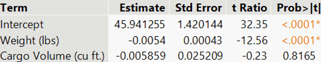
If you were to use the same data to fit a regression model for predicting a car’s MPG rating based on only its cargo volume, what (if anything) can you say about whether cargo volume would be a statistically significant predictor?  [Options: Impossible to say from this output; Yes; No]

This question tries to assess a big-picture idea with multiple regression. The result of a t-test for an individual predictor variable only pertains to the set of predictor variables used in that model.  This output reveals that cargo volume is not a helpful predictor of MPG rating when used in conjunction with weight.  But cargo volume may or may not be a useful predictor of MPG rating on its own.

4. Suppose that you select a random sample of people and ask for their political viewpoint and whether or not they support a particular policy proposal.  Suppose that 60% of liberals support the proposal, compared to 35% of moderates and 25% of conservatives.  For which sample size will this result provide stronger evidence that the three political groups do not have the same population proportions who support the proposal?  [Options: Sample size of 200 for each group; Sample size of 20 for each group; The strength of evidence will be the same for both of these sample sizes.]

Students may have recognized this as a situation calling for a chi-square test, because we’re comparing proportions across three groups.  But this question is assessing a more fundamental idea about the impact of sample size on strength of evidence.  Students needed only to realize that, all else being the same, larger sample sizes produce stronger evidence of a difference among the groups.

5. Suppose that you select a random sample of 50 Cal Poly students majoring in Business, 50 majoring in Engineering, and 50 majoring in Liberal Arts.  You ask them to report how many hours they study in a typical week.  You calculate the average responses to be 25.6 hours in Business, 32.2 hours in Engineering, and 21.8 hours in Liberal Arts.  For which standard deviation will this result provide stronger evidence that the three majors do not have the same population mean study time?  [Options: Standard deviation of 4.0 hours in each group; Standard deviation of 8.0 hours in each group; The strength of evidence will be the same for both of these standard deviations.]

This question is very much like the previous one.  Now the response variable (self-reported study time) is numerical rather than categorical, so we are comparing means rather than proportions, and ANOVA is the relevant procedure.  This question asks about the role of within-group variability, without using that term.  Students should recognize that, all else being equal, less within-group variability provides stronger evidence of a difference among the groups.

6. Why do we not usually use 99.99% confidence intervals?  [Options: The high confidence level generally produces very wide intervals; The technical conditions are much harder to satisfy with such a high confidence level; The calculations become quite time-consuming with such a high confidence level; The high confidence level generally produces very narrow intervals.]

This question addresses a very basic and fundamental issue about confidence intervals.  I believe that if a student cannot answer this correctly, then they are misunderstanding something important about confidence intervals.  In the past, I have asked this as a free-response question, and I have asked students to limit their response to a single sentence.  I’m not very satisfied with the options that I presented here, so I’m not sure that this question works well as multiple-choice.

7. The United States has about 255 million adult residents.  Which of the following comes closest to the sample size needed to estimate the proportion of American adults who traveled more than one mile from their home yesterday with a margin-of-error of plus-or-minus 2 percentage points?  [Options: 255; 2550; 25,500; 255,000; 2,550,000]

I ask a variation of this question on almost every final exam that I give.  I presented a very similar version in post #21 (here).  Just to mix things up a bit, I changed this version to refer to adult Americans rather than all Americans.  Mostly for fun, I used options that all begin with the same digits 255, so the question asks about order of magnitude.  Many students mistakenly believe that the necessary sample size is larger than the correct response of 2550.  Students could perform a calculation to determine this answer, but I have in mind that they should remember that many class examples of real surveys had sample sizes in the range of 1000-1500 people and produced margins-of-error close to 3 percentage points*.

* I suspect that you have noticed that this is the first question for which the correct answer was not the first option given.  Of course, students see the options in random order determined by the learning management system (LMS).  I find it convenient to enter the options into the LMS with the correct answer first, so I thought I would do the same in this post.  I altered that for question #7 just to keep you on your toes.

8. Which of the following procedures would you use to investigate whether Cal Poly students tend to prefer milk chocolate or dark chocolate when offered a choice between the two?  [Options: One-sample z-test for a proportion; Two-sample z-test for comparing proportions; One-sample t-test for a mean; Paired t-test for comparing means; Chi-square test for two-way tables]

I included several questions of this “which procedure would you use” form on my final exam.  I especially like this one, the context for which I borrowed from Beth Chance.  This scenario is the most basic one of all, and the very first inference setting that I present to students: testing a 50/50 hypothesis about a binary categorical variable.  Some students mistakenly believe that this is a two-sample comparison.  The “between the two” language at the end of the question probably contributes to this confusion.  I used that wording on purpose to see whether some students would mistakenly conclude that this suggests a comparison between two groups rather than a comparison between two categories of a single variable.


Last week I received a comment asking whether I worry that my students might read my blog posts to discover some exam questions that I like to ask, along with discussion about the answers.  I have to admit that I do not worry about that at all.  If my students are motivated enough to read this blog, I’ll be delighted.

I promise that next week’s blog post address something other than exam questions.  I always feel like writing about exam questions is somewhat lazy on my part, but I’ve invested so much time in writing and grading these questions that it’s very helpful to double-dip by using them in blog posts as well.  The Spring term at Cal Poly begins today, so I’m hoping that will inspire some new ideas for blog posts.

#90 Two more final exam questions

As they prepare for a final exam, I always advise my students to try to focus on the big picture rather than small details.  I’m pretty sure that they find this advice to be unsatisfying, perhaps worthless.  I don’t think they know what I mean when I say to focus on the big picture.  I also admit that this is much easier said than done. 

I just gave a final exam to my students, as the Winter quarter has now ended at Cal Poly*.  I think I asked some final exam questions that succeed at focusing on the big picture.  I will present and discuss two such free-response questions here.  As always, questions that I pose to students appear in italics.

* Well, perhaps I should clarify that the Winter quarter has ended for students, but it continues for faculty like me who still have final exams to grade and course grades to assign.


My students were randomly assigned to receive one or the other of these two versions:

1a. Suppose that a friend of yours says that they were reading about confidence intervals, and they encountered the symbols x-bar and mu (μ).  How would you respond if they ask: What’s the difference between what these symbols represent, and what does that have to do with confidence intervals?

1b. Suppose that a friend of yours says that they were reading about confidence intervals, and they encountered the symbols p-hat and pi (π).  How would you respond if they ask: What’s the difference between what these symbols represent, and what does that have to do with confidence intervals?

My goal here was to assess whether students could provide a big-picture overview of the distinction between parameter and statistic, along with explaining how that distinction relates to the topic of confidence intervals.  I’m fairly pleased with how this question turned out.

Before I continue, let me say that students were allowed to use their notes and my handouts on this exam.  This is not a new policy of mine related to the pandemic and remote teaching; I have used open-notes exams for a long time.  It’s also possible, of course, that some students also performed google searches during my unproctored final exam.

As I’m sure you can imagine, many students copied sentences directly from their noted or my handouts into their response.  As you can also imagine, this question was not a routine one to grade.  The grading went fairly smoothly, though, once I settled on the four things that I would look for:

  1. that  p-hat/x-bar represents sample proportion/mean;
  2. that pi/mu represents population proportion/mean;
  3. that the goal of a confidence interval is to estimating the unknown value of pi/mu with a high level of confidence;
  4. that the confidence interval uses p-hat/x-bar as its midpoint and then extends a certain amount on either side of that midpoint.

Each of these four aspects was worth one point.  The first two of these should have been easy points.  Most students earned these points successfully, but some did not.  For example, one student wrote that p-hat represents a population proportion and pi represents a population mean.

For the third component, I awarded a half-point for conveying the idea that a confidence interval estimates the value of pi/mu.  The word “estimates” was not needed for this half-point.  Many students earned this half-point with fairly loose language such as “the confidence interval is for mu.”  The other half-point was for communicating the idea that the value of the parameter is unknown, or estimated with a high level of confidence.  This half-point proved elusive for many students.

Students could earn a half-point for the fourth component by saying that the confidence interval is calculated from the value of the statistic.  The response needed to mention the midpoint, which most responses failed to do, in order to earn full credit.

I had also wanted to insist upon a fifth aspect for full credit.  I had hoped that strong responses would say something about “proportion of the sample having a characteristic of interest” or “sample mean value for the variable of interest.”  But very few responses included something along these lines, so I decided against requiring it.

I was skeptical about whether this question would provide helpful information about students’ understanding, but I decided that it worked well.  Grading the question was not easy, but I think the four aspects described above provided a good rubric.  When I use a variation of this question again, I might explicitly say not to use formulas as part of the response, and I also might say that responses should be limited to 3-5 sentences.


Here is one of six versions of another question on my students’ final exam:

2a. Suppose that the manager of a Walmart store collects data on the following variables for a random sample of transactions/receipts at the store:

  • Total amount spent
  • Number of items purchased
  • Day of week
  • Time of day (morning, afternoon, evening)
  • Payment type (credit card, cash, other)

a) State a research question that could be addressed by applying analysis of variance (ANOVA) to (some of) the data. 

b) State an additional variable for which data could be collected, and classify it as categorical or numerical.

Two other versions presented similar scenarios followed by the same questions (a) and (b):

2b. Suppose that a restaurant manager collects data on the following variables for a random sample of parties who dine at the restaurant:

  • Total amount spent on meal
  • Time of day (breakfast, lunch, dinner)
  • Day of week
  • Amount spent on drinks
  • Number of people in the party
  • Number of children (younger than age 18) in the party

2c. Suppose that a hotel manager collects data on the following variables for a random sample of customers’ stays at the hotel:

  • Number of people staying in the room
  • Distance from their home
  • Total amount spent at the hotel during the stay
  • Type of reservation (online, telephone, none)
  • Day of week on which stay began

The other three versions arose by repeating the same scenarios and variables, but with simple linear regression replacing ANOVA as the procedure in in part (a).

I often give my students practice with identifying which procedure is the relevant one to address a particular research question.  In fact, we spent the last day of class this term doing nothing else, as we discussed 15 questions for which my students were to identify the appropriate analysis procedure.  I always tell my students that the key to identifying the correct procedure is to identify the variables and their types.

This final exam question asks students to do the opposite: state a research question for which a particular procedure would be appropriate.  The same key applies here.  For example, students needed to realize that ANOVA applies when the explanatory variable is categorical and the response variable is numerical.  With that in mind, a reasonable answer for part (a) of version 2a is: “do Walmart customers tend to spend different amounts on their transaction, on average, depending on whether they shop in the morning, afternoon, or evening?”

Coming up with a research question is often challenging for students.  I made it easier this time by presenting many variables to them.  I suspect that part (a) of this question would have been substantially harder if students had needed to think of variables for themselves. 

Part (b) is meant to be fairly easy, but some students struggle with the ideas of observational units and variables despite my emphasizing those ideas frequently.  Two common, correct answers for the Walmart scenario have been:

  • the amount of time spent in the store prior to completing the transaction, which is numerical
  • whether the transaction was completed with a cashier or self-service, which is categorical

This question was worth four points, two points for each part.  Students generally did very well on this question.  I graded fairly strictly; incorrect responses received zero points.  For example, an answer of “does payment type help to predict total amount spent?” for the regression version of the question earned zero points, because the explanatory variable given is categorical, not numerical.  Examples of incorrect responses for part (b) often followed from mis-understanding the observational units, such as “how many customers shopped at Walmart that day?” and “what part of the country was the Walmart located in?”

For essentially correct responses with poor or unclear wording, I deducted a half-point.  For example, some students answered the regression version of part (a) with: “what is the correlation between number of items and total amount paid?”  I deducted a half-point for this response, on the grounds that there’s a lot more to regression than calculating the value of a single statistic.  I also deducted a half-point for using causal language inappropriately, for example by answering the ANOVA version of part (a) with: “does type of payment affect total amount spent?”

In hindsight, I wish that I had worded these questions a bit more clearly myself.  I should have been more clear that responses to part (a) were to be based only on the variables that I presented.  Part (b) could have been more clear by specifying that the variable proposed needed to be based on the same observational units as the ones presented.


I provide my students with practice questions before midterm exams but not for the final exam, mostly because I try to keep final exam questions secure.  But I might consider providing these questions to students before the final exam in the future, to help them understand my advice about focusing on the big picture.  The drawback is that I’ll then have to come up with new and better questions to use on the final exam.

#89 An exam question

It’s hard to imagine a more boring title for a blog post, isn’t it?  I’m going to present an open-ended, five-part exam question that I used in the past week.  I will describe my thought process behind writing and grading the question, and I will discuss what I learned from common student responses.  I think the question turned out to be quite revealing, so I hope that this post will turn out to be less boring that its title and first paragraph.

This was my third exam of the term.  I was not entirely pleased with how the first two exams worked out.  In hindsight the first exam was too hard, the second one too easy.  I was really hoping for a Goldilocks result (just right) for the third exam.  It can be quite challenging to write and grade exams, and assessments in general, that distinguish between students with a very thorough understanding of fundamental ideas from those with a modest level of understanding.

The topic of this exam question is multiple regression.  I do not teach this topic very often, so I have not developed a large bank of questions that I like to pose.  Also, I am less aware of common student misunderstandings than I am with more introductory topics.  I spent a lot of time writing this exam, and now I am taking a break from grading it* to write this post.

* In post #66 (here), I proposed that the first step of grading exams is: Procrastinate!

This question is based on the same dataset about prices for pre-owned Prius cars that I described in post #86 (here).  My students should have been familiar with the dataset from the assignment that I described in that post.  But in that assignment I asked students to predict a car’s price based on a single variable: its age in years, or its number of miles driven.  For this exam question, I asked students to consider a multiple regression model for predicting price from both age and miles.

The exam question presented students with output but did not provide the datafile or ask students to analyze the data themselves.  Students were allowed to use their notes on the exam.  Here’s the background and output for the question:

Consider the following output from a multiple regression model that uses both age (in years) and number of miles driven to predict price (in dollars), based on a sample of 32 pre-owned Prius cars advertised for sale in February of 2021:

Now I will present and discuss one part of the question at a time.  The entire question was worth 10 points, on a 40-point exam.  Each of the five parts was worth 2 points.


a) Write out the regression equation for predicting price from the two predictor variables.

This is as basic as it gets, right?  I would not quite consider this part as free points, but I intended this to provide two easy points to students who simply learned how to read computer output well enough to express a regression equation.  The correct answer is: predicted price = 22,076.66 – 0.0619 × miles – 579.21 × age

Most, but not all, of my students earned full credit for this part.  The most common error surprised me a bit: neglecting to include the left-hand side of the equation.  Several students only wrote: 22,076.66 – 0.0619 × miles – 579.21 × age.  I don’t like to be a stickler for mathematical notation, but omitting the response variable strikes me as failing to communicate that the goal of this regression analysis is to predict price.  I deducted a half-point for this error.

A few students wrote: The regression equation = 22,076.66 – 0.0619 × miles – 579.21 × age.  I also deducted a half-point for this, because of the missing response variable.  But I did give full credit to responses that included a colon rather than an equal sign: predicted price: 22,076.66 – 0.0619 × miles – 579.21 × age.

I usually insist on using the word predicted or a carat (“hat”) symbol with the response variable, but this time I did not deduct a half-point for omitting that.


b) Identify and interpret the value of the residual standard error.

Almost all students identified the correct value in the output, the root mean square error value of 1841.708.  A few students mistakenly answered the standard error of the intercept term, 651.9749.

I was looking for an interpretation along the lines of: A typical predicted price from this model differs from the actual price of a Prius in this sample by about $1841.71.  I realize that “typical” is a vague word, but using a more precise word like “average” is not technically correct.  I did award full credit to students who used “average” or “on average” in their response, though.

This question makes me worry that I am rewarding students simply for copying phrases from their notes without thinking.  (In fact, one student expressed the interpretation in terms of age and number of bidders for an auction of grandfather clocks, which was one of the examples we had worked through in class.)  But I hope that students demonstrate some understanding by selecting the correct interpretation and also by revising the generic interpretation to fit the context.

Some students mistakenly said that the residual standard error is a typical amount by which the regression line deviates from predicted values.  I did not penalize them for referring to a line instead of a plane, but I did deduct a half-point for not talking about deviations from the actual prices.

A few students did not use the measurement units (dollars) in their interpretation.  I only deducted a half-point once if they also failed to mention dollars in their response to part (c). 

I did not ask for an interpretation of R2 in this question, only because I asked for that on the previous exam that included simple linear regression among its topics.


c) Interpret what the value -579.2092 means in this context.

This is the coefficient of the age variable.  I was looking for students to say something like: The predicted price of a Prius decreases by about $579.21 for each additional year of age on the car, after accounting for number of miles driven. Another version is: Among pre-owned Prius cars with the same number of miles, we predict the price to decrease by about $579.21 for each additional year of age.

Many students neglected to include the caveat about accounting for the number of miles driven.  This is the key difference between interpreting coefficients with multiple versus simple regression.  Such responses earned 1 of 2 points.  Some gave a more generic interpretation that mentioned accounting for all other variables.  I deducted a half-point for this, on the grounds that this response did not describe context fully. 

A few students did not include direction (decreased) in their interpretation, and some did not express the “for each additional year of age” part of the interpretation clearly.  Each of these errors earned a half-point deduction.


d) JMP produced the following under “Mean Confidence Interval” with a setting of 95%, for input values of 5 and 50,000: ($15,321, $16,854).  Interpret what this interval means.

I really wrestled with how to word this question.  My main goal was to assess whether a student can distinguish between a confidence interval for a mean, as opposed to a prediction interval for an individual observation.  I worried that I was giving too much away by using the word mean in my statement about the output.  But I couldn’t figure out how else to identify which confidence interval I was providing.

I need not have worried.  Many of my students interpreted this interval in terms of the price of an individual car.  Such a response earned 1 of 2 points, if the other components of the response were correct.  Of course, I don’t know whether such responses indicated a lack of understanding or simply poor communication by omitting the word mean or average.  Needless to say, there’s a big difference between an average and an individual value.  I regret that so many of my students failed to answer this part correctly, but this is a big idea that is worthy of assessing, so I’m glad that I asked the question.

When writing this part of the question, I also struggled with how to express that the confidence interval was generated for 5-year-old cars with 50,000 miles.  At the last minute, I decided to make that wording more vague by simply referring to input values of 5 and 50,000.  I figured that I could reasonably expect students to realize that 5 referred to age in years, and 50,000 pertained to miles. 

I’m glad that I made this change, because it revealed that some of my students did not understand that these were inputs for two different predictor variables.  A few responses talked about cars with between 5 and 50,000 miles.

I was surprised by a somewhat common error in which students did not refer to the input values at all. Several responses interpreted the interval as estimating the population mean price of all pre-owned Prius cars listed for sale online in February 2021, with no regard for the car’s age or number of miles.

A few students made clear that they thought the interpretation applied to a sample mean rather than a population mean.  I only deducted a half-point for this error, if the rest of the interpretation was fine, because they at least recognized that the interval estimates a mean rather than an individual value.


e) How would you respond to someone who says: “Age and miles must be related to each other, because older cars have been driven for more miles than newer cars.  Therefore, it’s not necessary or helpful to include both age and miles together in a model for predicting price.”

This is, by far, my favorite part of this question.  I think this gets addresses a very important aspect of multiple regression analysis: investigating whether including an additional variable is worthwhile to include in a model.

I wanted students to notice that individual t-tests for both predictor variables produce very large (in absolute value) test statistics and therefore very small p-values: t = -5.77 and t = -4.83 for miles and age, respectively, with p-values considerably less than 0.0001.  Those test results reveal that each variable is helpful to include in the model, even in the presence of the other.  Even though age and miles may very well be positively correlated, the individual t-tests reveal that both variables are worth including in the model for predicting a car’s price.

Again I struggled mightily with how to word this part of the question.  In particular, I debated with myself about whether to prompt students to refer to output in their response.  As you can see, I decided against including that, and I’m glad that I did. 

Many students did not refer to output at all.  I think it’s telling that these students opted to rely on their own impressions of the context rather than look at what the data revealed.  In the words of David Moore: Data beat anecdotes.  I’m pleased that I asked this question in a way that assessed whether students would look to data, rather than their own opinions or suppositions, to answer the question.  I graded this fairly harshly: Students who did not refer to output could only earn 0.5/2 points for this part. 

Some students used this part of the question to remind me of some things I had said in class.  For example, several repeated my comment that fitting regression models is an inexact science, and a few cited George Box’s famous saying: All models are wrong; some models are useful.  I’m glad that this saying made enough of an impression that some students wanted to write it on an exam, but I wish that they had instead looked at the data, as reflected in the output provided.


I suspect that few students have any idea how much time and thought goes into writing and grading exam questions.  Speaking of which, I need to get back to grading the second question on this exam.  I’ll spare you a 2000-word analysis* of that one.

* Actually, in case you are keeping track,, I believe that this post fell just short of containing 2000 words, until this sentence put it over the top.

#88 It’s about time, part 2

In last week’s post (here), I presented some examples and questions through which I introduce my students to time series data.  I left off with a bit of a cliff-hanger, as I presented the following graph of national average prices, by month, for a gallon of unleaded gasoline:

As you can see, this series begins in January of 1981, during my first year of college*, and concludes in January of 2021, the first year of college for most of my current students. 

* I mentioned last time that January of 1981 feels like a frighteningly long time ago.  I’m sorry to report that this feeling has not subsided in the past week.  In fact, January of 1981 feels even longer ago this week than it did last week.

The national average price of a gallon of unleaded gasoline increased from $1.298 in January of 1981 to $2.326 forty years later.  I ask my students: Calculate the percentage increase.  This works out to be a (2.326 – 1.298) / 1.298 × 100% ≈ 79.2% increase.  Then I ask: Does gasoline really cost this much more now than in my first year of college?  This is where last week’s post ended.

The answer I am seeking for that question is: Not really.  To which I respond with: Why not?  Because a dollar was worth more, in terms of what it could buy, back in 1981 than it is worth now.  This realization leads into the topic of converting from current to constant dollars, also known as adjusting for inflation.

I have to admit that this is one of my favorite topics to teach.  I truly feel like I’m teaching my students a valuable skill when I show them how to adjust and compare monetary values at different points in time.  Why do I feel somewhat guilty about enjoying this topic?  Because it’s not really statistical.  I have learned to assuage my guilt with three thoughts:

  1. Analyzing time series data about prices that cover multiple years requires adjusting for inflation to make meaningful comparisons.
  2. The U.S. Bureau of Labor Statistics (BLS) uses lots of statistical methods, primarily associated with sampling, to determine the Consumer Price Index (CPI) on which such adjustments depend.
  3. If I’m helping my students to learn an idea and skill that are valuable, interesting, and even fun, who cares about whether it’s labeled as math or statistics or something else?

The Consumer Price Index (CPI) is based on prices for items that most people buy on a regular basis, gathered from urban areas around the U.S.  Monthly values of the CPI back to January of 1913 can be found from the BLS site here*.  The key idea for converting a monetary value from one time to its equivalent value at another time is to multiply by the ratio of the CPI values: value at time B = value at time A × (CPI at time B) / (CPI at time A).

* I provide a link to an Excel file containing these monthly CPI values at the end of this post.

Convert the $1.298 average national price of a gallon of gasoline in January 1981 into the equivalent price in January 2021.  The value of the CPI was 87.0 in January 1981 and 261.582 in January 2021.  This conversion is: $1.298 × (261.582/87.0) ≈ $1.298 × 3.007 ≈ $3.903. 

Interpret what the converted value means.  In terms of the buying power of today’s (well, January 2021’s) dollar, the amount of $1.298 in January of 1981 is equivalent to $3.903 now. 

In which month – January 1981 or January 2021 – did it really cost more for a gallon of unleaded gasoline, after adjusting for inflation?  Explain your answer.  The January 2021 average price of $2.326 is considerably less than the January 1981 price after its conversion to the equivalent of January 2021 dollars.  So, gasoline actually cost more, in terms of the buying power of currency at the time, in January 1981 than in January 2021.

Calculate the percentage difference of the two prices, after adjusting for inflation, using January 1981 as the baseline.  Also write a sentence interpreting this value.  This calculation is:(2.326 – 3.903) / 3.903 × 100% ≈ -40.4%.  In terms of constant dollars, the January 2021 price is about 40.4% less than the January 1981 price.


Next I ask students: Convert the entire time series of gasoline prices into constant dollars as of January 2021.  Produce a graph of these converted prices, along with the original prices.  Comment on what the graph reveals about how the price of gasoline has changed over these four decades. 

This conversion is conceptually straight-forward: We simply need to apply the same calculation as for January 1981 to all 481 months in the series.  This task requires using software and is well-suited for a spreadsheet package such as Excel*.

* The data on gasoline prices can be found in an Excel file at the end of this post.

On the left is the formula for using Excel to perform the conversion of the January 1981 price into constant dollar as of January 2021.  On the right is the result of entering that formula:

Filling that formula down for the entire column produces the following results at the bottom:

I often encourage students to ask questions of themselves to check their work.  A good example is: Does the adjusted price for January 2021 make sense?  Yes!  Because we’re converting all prices to constant dollars as of January 2021, the price should (and does) stay the same for that month.

Produce graphs of these two series for easy comparison. This results in:

Describe what the graph reveals. Whereas the original series (in blue) shows a fairly constant price for gasoline through the 1980s and 1990s, the series of converted prices (in orange) shows that the inflation-adjusted prices decreased in these decades.  Both series reveal an increase in the price of gasoline in the first decade of the 2000s, aside from a fairly dramatic price drop in 2008.  Notice that the two series converge in the 2010s, because much less of an adjustment for inflation is needed as the time gets closer to the present.


I also like to ask students to use CPI values to calculate and compare inflation rates by decade.  First: Starting with the 1910s and ending with the 2010s, which decade do you predict to have the lowest rate of inflation?  Which do you predict to have the highest rate of inflation?  Then I give them the following table and ask: Calculate the inflation rate for each decade.  If they need a hint: Calculate the percentage change in the CPI for each decade.

Here are the inflation rates for these decades:

Describe how the inflation rate has varied over the past ten decades.  The 1920s and 1930s experienced negative inflation.  Inflation surged in the 1940s and then slowed in the 1950s and 1960s.  Inflation exploded in the 1970s, as the CPI more than doubled in that decade.  Since then, the inflation rate has decreased more and more with each passing decade.


Now for some exam questions that I have asked on this topic:

My annual salary when I began my career as a college professor in September of 1989 (when the CPI was 125.00) was $27,000.  If my salary kept pace with inflation but otherwise did not increase, what would my salary be today (as of January 2021)?  This calculation is straight-forward: $27,000 × (261.582 / 125.0) ≈ $27,000 × 2.093 ≈ $56,501.71.

In the television series The Rockford Files, private investigator Jim Rockford charged $200/day for his services in the year 1975 (when the CPI was 53.8).  In the novel P is for Peril by Sue Grafton, detective Kinsey Millhone charged $400/day for her services in the year 1986 (in which the CPI was 109.6).  After adjusting for inflation, who charged more for their daily fee – Rockford or Millhone?  Justify your answer with a sentence accompanied by appropriate calculations.

This question is more challenging than the previous one, because it does not specifically ask students to perform a particular price adjustment.  Students need to decide for themselves what to calculate to answer this question.  Several reasonable options are available.  Students could convert Rockford’s fee into constant 1986 dollars, or they could convert Millhone’s fee into constant 1975 dollars.  A third option is to convert both fees into constant dollars for some other time, such as January 2021.  This gives $200 × (261.582 / 53.8) ≈ $972.42 for Rockford’s fee in constant January 2021 dollars, compared to $400 × (261.582 / 109.6) ≈ $954.68 for Millhone’s fee.  These are remarkably similar, but Rockford’s fee is slightly larger than Millhone’s after converting to comparable dollars.

Finally, mostly for fun but also to award a point for paying minimal attention, I sometimes ask: What does CPI stand for?  [Options: Consumer price index, Capital product inflation, Cats project integrity]


I always find adjusting for inflation to be a fun topic to teach, worthwhile for students to learn.  I take advantage of a brief unit on time series to sneak this topic into my course.  I also enjoy the opportunity to give students practice with basic spreadsheet skills.  I hope their quantitative and computational skills will help them to earn starting salaries that exceed $27,000 from 1989, even after adjusting for inflation.

P.S. Files containing data on CPI values and gasoline prices can be accessed from the links below:

#87 It’s about time, part 1

Today’s post is about a fun topic that I teach only occasionally.  I’ll be introducing my students to this topic a few minutes after this post appears on Monday morning. 

Let me dispense with any more of a preamble and jump right in with the first of 3.5 examples.  As always, questions that I pose to students appear in italics.


This post will feature many graphs that I consider to be interesting and informative, but this is not one of them:

This histogram displays the distribution of number of vehicles (in thousands) crossing the Peace Bridge, a scenic bridge connecting the United States and Canada near Niagara Falls, for each month from January 2003 through December 2019.

Describe what this histogram reveals about this distribution. This distribution is skewed to the right, with a center near about 500,000 vehicles per month.  Some months had as few as 300,000 vehicles making the crossing; on the other extreme one month had about 850,000 vehicles making the crossing.

But none of that is very interesting.  Remember that I said this is monthly data over many years, so it would be much more informative to look for patterns in month-to-month and year-to-year variation of the crossing numbers over time:

Describe and explain the recurring pattern that this graph reveals.  The most obvious feature of this graph is the consistent pattern of increasing and then decreasing numbers of bridge crossings, over and over.  Looking a bit more closely reveals that each of these cycles occurs over a one-year period.  The increase occurs every spring, culminating in a peak in the summer.  The decrease occurs every fall, reaching a nadir in the winter.  Examining the actual data (available at the end of this post) indicates that the maximum occurs in August for most years, the minimum in February.  This pattern makes sense, of course, because people tend to travel more in summer months than winter months.

After taking the recurring pattern into account, has the number of bridge crossings been increasing or decreasing over time? The number of bridge crossings has been decreasing slightly but steadily over these years.  For example, the peak number of crossings exceeded 800,000 in the summer of 2003 but fell short of 600,000 in the summer of 2019.  This is more than a 25% decrease over this 16-year period.  The numbers of crossing seem to have levelled off in the five most recent years.

In which year does the decrease appear to be most pronounced?  Can you offer an explanation based on what was happening in the world then?  The biggest drop occurred between 2008 and 2009, during the global financial crisis that followed the bursting of the U.S. housing bubble.


When introducing a new topic, I typically start a class session with an example like this before I define terms for my students.  At this point I tell them that data such as these are called time series data, which is a fairly self-explanatory term.  The two most important aspects to look for in a graph of time series data are trend and seasonality.  These data on monthly numbers of vehicles crossing the Peace Bridge provide a good example of both features.

I have mentioned before that I am currently teaching the second course in a two-course introductory sequence for first-year business students.  This course includes a brief introduction to time series data.  I enjoy teaching this topic, because it gives rise to interesting examples like this, and I think students see the relevance. 

A downside of this topic for me is that it requires more preparation time, partly because I only teach time series every few years and so have to re-learn things each time.  Another reason is that I feel a stronger obligation to find and present current data when teaching this topic. 

Speaking of keeping time series examples up-to-date: What do you expect to see when the Peace Bridge crossing data are updated to include the year 2020?  I don’t think any of my students will be surprised to see this:

A slightly harder question is: What do you expect the histogram to look like, when data for the year 2020 are included?  Here is the updated histogram, with a cluster of values on the low end:

A moral here is that even long-established and consistent trends may not continue forever.  Extraordinary events can and do occur.  We and our students have lived through one such event for the past year.


Another of my favorite examples is this graph of a country’s life expectancy for the years 1960 – 2018:

Describe what the graph reveals.  There are three distinct patterns here.  Life expectancy increased steadily, from about 48 to 64 years, between 1960 and 1990.  Then life expectancy decreased dramatically until 2005, falling back to about 53 years.  The years since 2005 have seen another increase, more steep than the gradual increase from the 1960s through 1980s, although the rate of increase has levelled off a bit since 2015.  Life expectancy in 2018 slightly surpassed the previous high from 1990.

Make a guess for which country this is.  It usually takes a few guesses before a student thinks of the African continent, and then a few more guesses until they arrive at the correct country: South Africa.

What might explain the dramatic decrease in life expectancy for this country between 1990-2005?  Why do you think the trend has reversed again since then?  Some students guess that apartheid is the cause, but then someone suggests the more pertinent explanation: Sub-Saharan Africa experienced an enormous and catastrophic outbreak of HIV/AIDS in the 1990s.  Things have improved considerably in large part because of effective and inexpensive treatments.

When I present this example to my students this week, I plan to point out three morals that are quite relevant to our current situation:

  1. Trends don’t always continue indefinitely.
  2. Bad things happen.  (This includes devastating viruses.)
  3. Good things happen.  (Medical innovations can help a lot.)

Especially because I am teaching business students, I like to include some time series examples of stock prices, which are easy to download from many sites including the Yahoo finance site (here).  Let’s make this another guessing game: The daily closing prices of what company’s stock are represented in the following graph?  I’ll give you a hint: I know that all of my students use this company’s product.  I’m also willing to bet that all of your students have heard of this company, even if they have not used its product.

Would you have liked to have owned stock in this company in 2020?  Duh!  By what percentage did the closing price change from the last day of 2019 (closing price: $68.04) to the last day of 2020 (closing price: $337.32)?  I really like my students to become comfortable working with percentage changes*.  This example provides another good opportunity.  The percentage increase in this company’s stock price during 2020 works out to be a (337.31 – 68.04) / 68.04 × 100% ≈ 395.75% increase!  Make a guess for what company this is.  I bet you guessed correctly: Zoom**.

* See posts #28 (A pervasive pet peeve, here) and #83 (Better, not necessarily good, here).

** When I published my first blog post on July 8, 2019, I meant to include a postscript advising all of my readers to invest in Zoom.  I just re-read that post (here) and am dismayed to realize that I forgot to include that stock tip.  Oh well, I also forgot to invest in Zoom myself.


Data on consumer prices obtained by the Bureau of Labor Statistics (BLS) can make for interesting time series data and are also easy to download (for example, from here).  Below is a graph from the BLS website, displaying the national average price for a gallon of unleaded gasoline, by month, starting with January of my first year in college* and ending with January of my students’ first year in college:

* Another downside to teaching time series is that it draws attention to how much time has gone by in your life!

The national average price of a gallon of unleaded gasoline increased from $1.298 in January of 1981 to $2.326 forty years later.  Calculate the percentage increase*.  This works out to be a (2.326 – 1.298) / 1.298 × 100% ≈ 79.2% increase.  Does gasoline really cost this much more now than in my first year of college?

* Like I said, I seldom pass up an opportunity to ask about this.

For now, the answer I’d like for that last question is: Hold on, not so fast.  This leads to another of my favorite topics to teach, but I am going to stop now and pick up here next week in part 2 of this post.


P.S. Data on crossing of the Peace Bridge can be found here.  Data on life expectancy in South Africa was obtained here. Links to all of the datafiles in this post appear below.

P.P.S. Many thanks to Robin Lock for giving me a personalized crash course on the  fundamentals of time series analysis when I first started to teach this topic. Robin also introduced me to the Peace Bridge data, a more thorough analysis of which can be found in the chapter on time series that he wrote for the Stat2 textbook (here).