Skip to content

Archive for

#39 Batch testing

One of my favorite examples for studying discrete random variables and expected values involves batch testing for a disease.  I would not call this a classic probability problem, but it’s a fairly common problem that appears in many probability courses and textbooks.  I did not intend to write a blog post about this, but I recently read (here) that the Nebraska Public Health Lab has implemented this idea for coronavirus testing.  I hope this topic is timely and relevant, as so many teachers meet with their students remotely in these extraordinary circumstances.  As always, questions that I pose to students appear in italics.


Here are the background and assumptions: The idea of batch testing is that specimens from a group of people are pooled together into one batch, which then undergoes one test.  If none of the people has the disease, then the batch test result will be negative, and no further tests are required.  But if at least one person has the disease, then the batch test result will be positive, and then each person must be tested individually.  Let the random variable X represent the total number of tests that are conducted.  Let’s start with a disease probability of p = 0.1 and a sample size of n = 8.  Assume that whether or not a person has the disease is independent from person to person.

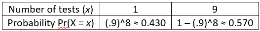
a) What are the possible values of X?  When students need a hint, I say that there are only two possible values.  If they need more of a hint, I ask about what happens if nobody in the sample has the disease, and what happens if at least one person in the sample has the disease.  If nobody has the disease, then the process ends after that 1 test. But if at least one person has the disease, then all 8 people need to undergo individual tests.  The possible values of X are therefore 1 and 9.

b) Determine the probability that only one test is needed.  For students who do not know where to start, I ask: What must be true in order that only one test is needed?  They should recognize that only one test is needed when nobody has the disease.  Because we’re assuming independence, we calculate the probability that nobody has the disease by multiplying each person’s probability of not having the disease.  Each person has probability 0.9 of not having the disease, so the probability that nobody has the disease is (0.9)^8 ≈ 0.430.

c) Determine the probability for the other possible value of X.  Because there are only two possible values, we can simply subtract the other probability from 1, giving 1 – (0.9)^8 ≈ 0.570.  I point out to students that this is the probability that at least one person in the sample has the disease. I also note that it’s often simplest to calculate such a probability with the complement rule: Pr(at least one) = 1 – Pr(none).

d) Interpret these probabilities with sentences that begin “There’s about a _____ % chance that __________ .”  I like to give students practice with expressing probabilities in sentence form: There’s about a 43% chance that only one test is needed, and about a 57% chance that nine tests are needed.

e) Display the probability distribution of X in a table.  For a discrete random variable, a probability distribution consists of its possible values and their probabilities.  We can display this probability distribution as follows:

f) Determine the expected value of the number of tests that will be conducted.  With only two possible values, this is a very straightforward calculation: E(X) = 1×[(.9)^8] + 9×[1–(.9)^8] = 9 – 8×[(.9)^8] ≈ 5.556 tests.

g) Interpret what this expected value means.  In post #18 (What do you expect, here), I argued that we should adopt the term long-run average in place of expected value.  The interpretation is that if we were to repeat this batch testing process for a large number of repetitions, the long-run average number of tests that we would need would be very close to 5.556 tests.

h) Which is more likely – that the batch procedure will require one test or nine tests?  This is meant to be an easy one: It’s more likely, by a 57% to 43% margin, that the procedure will require nine tests.

i) In what sense is batch testing better than simply testing each individual at the outset?  This is the key question, isn’t it?  Part (h) suggests that perhaps batch testing is not helpful, because in any one situation you’re more likely to need more tests with batch testing than you would with individual testing from the outset.  But I point students who need a hint back to part (g): In the long run, you’ll only need an average of 5.562 tests with batch testing, which is fewer than the 8 tests you would always need with individual testing.  If you need to test a large number of people, and if tests are expensive or in limited supply, then batch testing provides some savings on the number of tests needed.


The questions above used particular values for the number of people (n) and the probability that an individual has the disease (p).  Next I ask students to repeat their analysis for the general case.

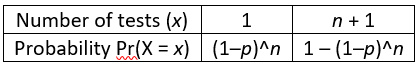
j) Specify the probability distribution of X, in terms of n and p.  If students need a hint, I remind them that there are still only two possible values of X.  If nobody has the disease, only 1 test is needed.  If at least one person has the disease, then (n+1) tests are needed.  The probability that only 1 test is needed is the product of each individual’s probability of not having the disease: (1–p)^n.  Then the complement rule establishes that the probability of needing (n+1) tests is: 1–(1–p)^n.  The probability distribution of X is shown in the table:

k) Determine the expected value of the number of tests, as a function of n and p.  The algebra gets a bit messy, but setting this up is straightforward: E(X) = 1×[(1–p)^n] + (n+1)×[1–(1-p)^n], which simplifies to n+1–n×[(1–p)^n].

l) Verify that this function produces the expected value that you calculated above when n = 8 and p = 0.1.  I want students to develop the habit of mind to check their work like this on their own, but I can model this practice by asking this question explicitly.  Sure enough, plugging in n = 8 and p = 0.1 produces E(X) = 5.556 tests.

m) Graph E(X) as a function of n, for values from 2 to 50, with a fixed value of p = 0.1.  Students can use whatever software they like to produce this graph, including Excel:

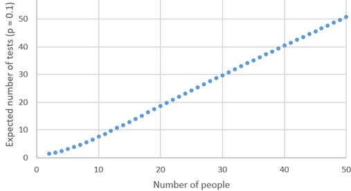
n) Describe the behavior of this function.  This is an increasing function.  This makes sense because having more people produces a greater chance that at least one person has the disease, so this increases the expected number of tests.  The behavior of the function is most interesting with a small sample size.  The function is slightly concave up for sample sizes less than 10, and then close to linear for larger sample sizes.

o) Determine the values of n for which batch testing is advantageous compared to individual testing, in terms of producing a smaller expected value for the number of tests.  Here’s the key question again.  We are looking in the graph for values of n (number of people) for which the expected number of tests (represented by the dots) is less than the value of n.  The gray 45-degree line in the following graph makes this comparison easier to see:

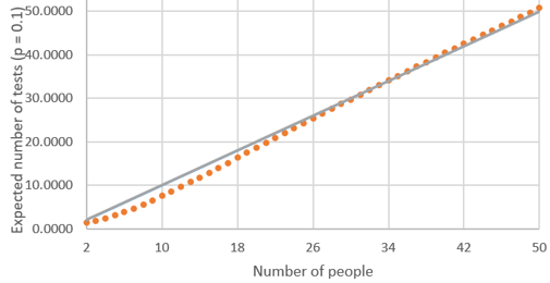
From this graph, we see that the expected number of tests with 25 people is a bit less than 25, and the expected number of tests with 35 people is slightly greater than 35, but it’s hard to tell from the graph with 30 people.  We can zoom in on some values to see where the expected number of tests begins to exceed the sample size:

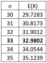
This zoomed-in table reveals that the expected number of tests is smaller with batch testing, as compared to individual testing, when there are 33 or fewer people.  (Remember that we have assumed that the disease probability is p = 0.1 here.)

p) Now graph E(X) as a function of p, for values from 0.01 to 0.50 in multiples of 0.01, with a fixed value of n = 8.  Here is what Excel produces:

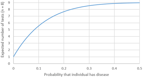
q) Describe the behavior of this function.  This function is also increasing, indicating that we expect to need more tests as the probability of an individual having the disease increases.  The rate of increase diminishes gradually as the probability increases, approaching a limit of 9 tests.

r) Determine the values of p for which batch testing is advantageous compared to individual testing.  Looking at the graph, we see that the expected number of tests is less than 8 for values of p less than 0.2.  We also see that the exact cutoff value is a bit larger than 0.2, but we need to perform some algebra to solve the inequality:

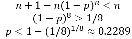
s) Express your finding from the previous question in a sentence.  I ask this question because I worry that students become so immersed with calculations and derivations that they lose sight of the big picture.  I hope they’ll say something like: With a sample size of 8 people, the expected number of tests with batch testing is less than for individual testing whenever the probability that an individual has the disease is less than approximately 0.2289.


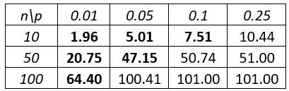
Here’s a quiz question that I like to ask following this example, to assess whether students understood the main idea: The following table shows the expected value of the number of tests with batch testing, for several values of n and p:

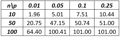
a) Show how the value 47.15 was calculated.  b) Circle all values in the table for which batch testing is advantageous compared to individual testing.

Students should answer (a) by plugging n = 50 and p = 0.05 into the expected value formula that we derived earlier: 50 + 1 – 50×[(1–0.05)^50] ≈ 47.15.  To answer part (b), students should circle the values in bold below, because the expected number of tests is less than n, the number of people who need testing:


Here is an extension of this example that I like to use on assignments and exams: Suppose that 8 people to be tested are randomly split into two groups of 4 people each.  Within each group of 4 people, specimens are combined into a single batch to be tested.  If anyone in the batch has the disease, then the batch test will be positive, and those 4 people will need to be tested individually.  Assume that each person has probability 0.1 of having the disease, independently from person to person.  a) Determine the probability distribution of Y, the total number of tests needed.  b) Calculate and interpret E(Y).  c) Is this procedure better than batch-testing all 8 people in this case?  Justify your answer.

Some students struggle with the most basic step here, recognizing that the possible values for the total number of tests are 2, 6, and 10.  The total number of tests will be just 2 if nobody has the disease.  If one batch has nobody with the disease and the other batch has at least one person with the disease, then 4 additional tests are needed, making a total of 6 tests.  If both batches have at least one person with the disease, then 8 additional tests are needed, which produces a total of 10 tests.

The easiest probability to calculate is the best-case scenario Pr(Y = 2), because this requires that none of the 8 people have the disease: (.9)^8 ≈ 0.430.  Now students do not have the luxury of simply subtracting this from one, so they must calculate at least one of the other probabilities.  Let’s calculate the worst-case scenario Pr(Y = 10) next, which means that at least one person in each batch has the disease: (1–.9^4)×(1–.9^4) ≈ 0.118. 

At this point students can determine the remaining probability by subtracting the sum of the other two probabilities from one: Pr(Y = 6) = 1 – Pr(Y = 2) – Pr(Y = 10) ≈ 0.452.  For students who adopt the good habit of solving such problems in multiple ways as a check on their calculations, they could also calculate Pr(Y = 6) as: 2×(.9^4)×(1–.9^4).  It’s easy to forget the 2 here, which is necessary because either of the two batches could be the one with the disease. 

The following table summarizes these calculations to display the probability distribution of Y:

The expected value turns out to be: E(Y) = 2×0.430 + 6×0.452 + 8×0.118 ≈ 4.751 tests*.  If we were to repeat this testing procedure a large number of times, then the long-run average number of tests needed would be very close to 4.751.  This is smaller than the expected value of 5.556 tests when all eight specimens are batched together.  This two-batch strategy is better than the one-batch plan, and also better than simply conducting individual tests. In the long run, the average number of tests is smallest with the two-batch plan.

* An alternative method for calculating this expected value is to double the expected number of tests with 4 people from our earlier derivation: 2×[4+1–4×(.9^4)] ≈ 4.751 tests.

This is a fairly challenging exam question, so I give generous partial credit.  For example, I make part (a) worth 6 points, and students earn 3 points for correctly stating the three possible values.  They earn 1 point for any one correct probability, and they also earn a point if their probabilities sum to one.  Part (b) is worth 2 points.  Students can earn full credit on part (b) by showing how to calculate an expected value correctly, even if their part (a) is incorrect.  An exception is that I deduct a point if their expected value is beyond what I consider reasonable in this context.  Part (c) is also worth 2 points, and students can again earn full credit regardless of whether their answer to part (b) is correct, by comparing their expected value to 5.556 and making the appropriate decision.


As I conclude this post, let me emphasize that I am not qualified to address how practical (or impractical) batch testing might be in our current situation with coronavirus.  My point here is that students can learn that probabilistic thinking can sometimes produce effective strategies for overcoming problems.  More specifically, the batch testing example can help students to deepen their understanding of probability rules, discrete random variables, and expected values. 

This example also provides an opportunity to discuss timely and complex issues about testing for a disease when tests are scarce or expensive.  One issue is the difficulty of estimating the value of p, the probability than an individual to be tested has the disease.  In the rapidly evolving case of coronavirus, this probability varies considerably by place, time, and health status of the people to be tested.  Here are some data about estimating the probability that an individual to be tested has the disease:

  • The COVID Tracking Project (here) reports that as of March 29, the United States has seen 139,061 positive results in 831,351 coronavirus tests, for a percentage of 16.7%.  The vast majority who have taken a test thus far have displayed symptoms or been in contact with others who have tested positive, so this should not be regarded as an estimate of the prevalence of the disease in the general public.  State-by-state data can be found here.
  • Also as of the afternoon of March 29, the San Luis Obispo County (where I live) Public Health Department has tested 404 people and obtained 33 positive results (8.2%).  Another 38 positive test results in SLO County have been reported by private labs, but no public information has been released about the number of tests conducted by these private labs.  Information for SLO is updated daily here.
  • Iceland has conducted tests much more broadly than most countries, including individuals who do not have symptoms (see here).  As of March 29, Iceland’s Directorate of Health is reporting (here) that 1020 of 15,484 people (6.6%) have tested positive for coronavirus.

Also note that the assumption of independence in the batch testing example is unreasonable if the people to be tested have been in contact with each other.  In the early days of this pandemic, one criterion for being tested has been proximity to others who have tested positive.  Another note is that the batch testing analysis does not take into account that test results may not always be correct.

Like everyone, I hope that more and more tests for coronavirus become widely available in the very near future.

P.S. For statistics teachers who are making an abrupt transition to teaching remotely, I recommend the StatTLC (Statistics Teaching and Learning Corner) blog (here), which has recently published several posts with helpful advice on this very timely topic.

#38 Questions from prospective teachers

My Cal Poly colleague Anelise Sabbag recently asked me to meet with students in her undergraduate course for prospective teachers of statistics.  Most of the students in the class are majoring in Statistics, Mathematics, or Liberal Studies, the last of which is for students preparing to teach at the elementary or middle school level.

Prior to my visit, Anelise asked her students to pose a question to me about teaching statistics.  I was very impressed with the thoughtfulness of their questions, so much that I decided to write this blog post with some of my responses and reflections.  Breaking from this blog’s custom, questions in italics in this post were posed to me by these students.


1. What is the hardest topic to teach in introductory statistics? 

This is a great question, one that I’ve thought about a lot.  My answer is: how the value of a sample statistic varies from sample to sample, if we were to repeatedly take random samples from a population

Of course, I could have expressed this answer with just two words: sampling distributions.  But while this two-word phrase provides a very handy shorthand for people who already understand the concept, I’m not convinced that using this term is helpful to students who are first learning the idea.

In fact, let me back up and split my answer into two parts: Before we can ask students to learn and understand sampling distributions, we need to begin with the more basic notion of sampling variability.  In other words, first we must help students recognize that the value of a sample statistic varies from sample to sample, before we tackle the more challenging* idea that this variability displays a predictable, long-run pattern.  That predictable, long-run pattern is what we mean by the term sampling distribution.

* This idea is not only challenging, it’s remarkable!  Isn’t it amazing that the long-run variability of a sample mean or a sample proportion turns out (in many circumstances, anyway) to follow a beautiful bell-shaped curve?!

Why is this topic so hard?  I suggest two reasons: First, it’s always difficult to comprehend a hypothetical: What would happen if …?  This hypothetical is central to many concepts in statistics, including probability, p-value, and confidence level, as well as sampling distribution.  Second, we’re asking students to think beyond a sample statistic (such as a mean or a proportion) as a straight-forward calculation that produces a number, to thinking of the statistic as a random variable that varies from sample to sample.  This is a very big cognitive step that requires a lot of careful thought*.

* An analogy from calculus is the large cognitive step from thinking of the slope of a tangent line to a curve at a point as a number, to then considering the slope of the tangent line to the curve at all points as a function.

What can be done to help students overcome their difficulties with this concept?  I will explore this question in a future post, but my one-word answer will come as no surprise: Simulate!


2. What do math majors struggle with when studying statistics?

First, I want to emphasize that math majors, and other students who are comfortable with math, struggle with the same challenging concepts that other students do, such as sampling distributions.  I rely on simulations to introduce math majors to sampling distributions, just as with students who are less mathematically inclined*. 

* I also explore this concept in more mathematical ways with math majors.  For example, I lead them to determine the exact sampling distribution of a sample mean in a sample of size 2 or 3 from a small population or discrete probability distribution.

Math majors can also struggle with the fundamental ideas of uncertainty and variability.  Probabilistic thinking can provide a bit of a shock from the deterministic thinking with which they are likely more comfortable.  A related issue is tolerance for ambiguity, as math majors (and all students) can be uncomfortable with the lack of certainty associated with statistical conclusions.  In their statistics courses, students must learn to write conclusions such as “there is strong evidence that …” and “we can be very confident that …” and “the data reveal a general tendency that …”  These conclusions stand in stark contrast to the kind that might be more in the comfort zone for math majors, such as “the exact answer is …” and “we have therefore proven that …”

Speaking of writing, that’s another aspect of statistics courses that can frustrate some math majors.  Assessments in statistics courses often require students to write sentences, perhaps even paragraphs, rather than provide a single number as an answer.  These questions often begin with verbs – such as describe, compare, explain, justify, interpret – that might intimidate students who are more comfortable responding to prompts that begin with verbs such as calculate, derive, show, or even prove

Another potential source of frustration is that much of mathematics involves abstraction, whereas statistics depends heavily on context.


3. How can teachers provide students with enough knowledge to prepare them to investigate good questions?

This question is a close cousin of one that Beth Chance and I are often asked by teachers who attend our workshops: How do you find time to include activities in class? 

I think many teachers under-estimate students’ ability to create their own understanding through well-designed learning activities.  I do not accept that teachers need to lecture on a topic, or have students watch a video or read a chapter on the topic, before they turn students loose on an activity.  The questions in the activities can lead students to new knowledge.  Necessary terminology and notation can be embedded in the activity.  Teachers can lead a discussion following the activity that reinforces key take-away lessons for students.

Here are three examples:

  • The Gettysburg Address activity described in post #19 (here) is a long one that can take most or all of a 50-minute class session.  But this activity introduces students to many concepts, including sampling bias, random sampling, sampling variability, sampling distribution, and effect of sample size on sampling variability
  • The Random Babies activity described in posts #17 and #18 (here and here) leads students to fundamental ideas of probability as a long-run proportion and expected value as a long-run average, along with topics such as sample space, equally likely outcomes, mutually exclusive events, and the complement rule.
  • The simulation-based inference activities of posts #12 and #27 (here and here) enable students to discover the reasoning process of statistical inference, specifically hypothesis tests and p-values.  Teachers do not need to provide a multi-step outline for how to conduct a hypothesis test prior to engaging students with these activities.  They do not even need to define a null hypothesis or a p-value in advance.  Instead, teachers can introduce those terms after students have encountered the ideas in the context of real data from a genuine study.  

4. What lessons have I learned from students?

I did not expect this question.  I think this is one of the best I’ve ever been asked.  This question truly caused me to pause and reflect. 

But I must admit that despite this considerable reflection, my answer is not the least bit clever or insightful.  Here’s my list of very basic things that I believe students value and teachers should prioritize:

  • Show respect.
  • Be organized.
  • Make expectations clear.
  • Provide timely feedback. 
  • Stay humble. 

The first four items in this list are so obvious that they need no explanation.  About the last one: I like to believe that I have continued to learn more and more as time has gone by.  One thing I have surely learned is that there is so much that I don’t know.  I’m referring to the subject matter, and to how students learn, and everything else involved with teaching statistics.  I have also come to realize that my course is certainly not the center of my students’ world.  I also need to remember that no students will master every detail or retain every skill that they develop in my course.  It’s fine for me to set high expectations for my students, but I also need to keep my expectations reasonable.


5. What advice do I offer to prospective teachers of statistics?

My #1 piece of advice is no secret, but first I’ll offer two other suggestions, which I hope are less predictable.

At the beginning of my teaching career, I learned a great deal about statistics, and formed a lot of ideas about how to teach students about statistical concepts, from reading textbooks for a basic course in statistical literacy: David Moore’s Statistics: Concepts and Controversies, Freedman, Pisani, and Purves’s Statistics, and Jessica Utts’s Seeing Through Statistics.  I have also enjoyed and learned a lot from books aimed at broader audiences that involve statistics and data.  Two examples on the history of statistics are David Salsburg’s The Lady Tasting Tea and Sharon Bertsch McGrayne’s The Theory That Would Not Die.  Examples from other fields include Freakonomics by Steven Levitt and Stephen Dubner and Thinking: Fast and Slow by Daniel Kahneman.  My first piece of advice is: Read non-technical books.

More than two decades ago, I invited Jim Bohan, a high school math teacher and math coordinator for his school district, to speak to students at my college who were considering whether to pursue math teaching as a career.  I’ll never forget Jim’s advice to these students: Don’t go into teaching because you love math; go into teaching because you love working with kids.  He reinforced his point by adding: When people ask me what I teach, I don’t say that I teach math; I say that I teach kids.  Jim’s message resonated with me and leads to my second piece of advice: Pay attention to the human side of teaching and learning.  

Now for the anti-climax …  The final piece of advice that I offered to the prospective teachers in Anelise’s class, the three words that I hoped to impress upon them more than any others, will surprise no one who is reading this blog*: Ask good questions! 

* If this is my first post that you’ve read, please consider reading post #1 (here) that provided an overview of this blog and my teaching philosophy. You can also find a convenient list of all posts (here).

#37 What’s in a name?

Delivered by Juliet on her iconic balcony, Shakespeare’s poetic what’s in a name speech is one of the most famous in the English language. 

What does this have to do with teaching introductory statistics?  Well, there’s a lot of data that one could collect on students’ names.  An obvious but boring example is to count the number of letters in a name.  A more fun, albeit silly, option is to determine the number of Scrabble points in a name.  I often collected these data from students early in my teaching career.

I have abandoned this practice in recent years, primarily because I want students to analyze more important and consequential datasets.  But I am starting to rethink this for two reasons.  First, there’s nothing wrong with occasionally using a dataset that’s silly and fun.  Second, this dataset is rich with potential for achieving pedagogical goals, such as exploring the seemingly simple but actually challenging concept of a statistical tendency

I mentioned in post #35 (Statistics of illumination, part 4, here) that psychologist Keith Stanovich has called probabilistic reasoning “the Achilles heel of human cognition.”  Data on Scrabble points in students’ names can help students to confront misunderstandings about this topic.  The research question to be investigated is: Do people with longer names have more Scrabble points?  The answer is yes, as long as we are careful to regard this as a statistical tendency and not a hard-and-fast rule.  What does this mean?  We’ll explore that question in this post.  As always, questions for posing to students appear in italics.


Here are the Scrabble point values of the 26 letters:

Just to make sure that we’re all clear: Shakespeare has 11 letters and 20 Scrabble points (1 + 4 + 1 + 5 + 1 + 1 + 3 + 1 + 1 + 1 + 1 = 20) in his name.  Juliet has 6 letters and 13 points, and Romeo has 5 letters and 7 points*.  Among these three names, a name with more letters than another always has more Scrabble points.  So far this is a rule and not just a tendency.  But one need not look far to find an exception to this rule: Romeo’s friend Mercutio has 8 letters but only 12 points, so his name has more letters but fewer points than Juliet’s.

* This website (here) is helpful for speeding up these calculations.

Because longer names do tend to produce more points than shorter names, I propose examining the ratio of a name’s points to letters as a measure of the name’s Scrabble-strength.  These ratios are approximately 1.818 for Shakespeare, 2.167 for Juliet, 1.400 for Romeo, and 1.500 for Mercutio.  By this measure, Juliet has the Scrabble-strongest name and Romeo the least.


For the purpose of this post, I will use the names of the fifty states in the U.S. to illustrate the kinds of questions that can be asked and analyses that can be performed.  Before I show you the data: Make a guess for the state with the most letters, the state with the most points, and the state with the largest ratio.  Are your guesses made?  Ready for the answers?  Here’s the list of states, along with region of the country, number of words in the name, number of letters, number of Scrabble points, and ratio of points to letters:

Which states win bragging rights?  As indicated in bold in the table, Massachusetts, North Carolina, and South Carolina tie for the most letters with 13.  New Hampshire takes first place in number of Scrabble points with 25.  In the most coveted ratio category, the winner is Kentucky with 2.625 points per letter.

Now let’s return to the original question: Do states with more letters tend to have more points?  But first we can ask students a more basic question: What kind of graph would you produce to investigate this question?  Because both variables are numerical, we can examine a scatterplot of points versus letters:

Does this graph reveal a tendency for states with more letters to have more points?  How can you tell?  Yes, this graph displays a positive association between points and letters.  For example, states with 10 or more letters all have 15 or more points, whereas states with 6 or fewer letters all have 12 or fewer points.

What statistic could we calculate to quantify this tendency?  Make an educated guess for its value with these data.  Again because these are both numerical variables, we can calculate the correlation coefficient between points and letters.  Its value turns out to be 0.735, indicating a fairly strong, positive association.

Can you identify a pair of states for which the state with more letters has fewer points?  Indicate one such pair of states on the graph.  Many pairs of states buck the overall trend in this way.  One example is that Kentucky has fewer letters (8 vs. 9) but more points (21 vs. 15) than California, as shown here:

Another way to think about a statistical tendency is: Suppose that we select two of the fifty states at random.  Make an educated guess for the probability that the state with more letters also has more points.  This is equivalent to asking: Among all pairs of states, in what percentage does the state with more letters also have more points?  There are 50×49/2 = 1225 pairs of states.  I wrote a small program in R to analyze these 1225 pairs.  It turns out that 161 of the pairs have the same number of letters or the same number of points.  Of the remaining 1064 pairs, 802 satisfy the overall tendency (the state with more letters also has more points), and 262 run counter to that tendency.  So, the probabilities for a randomly selected pair of states are 802/1225 ≈ 0.655 that the state with more letters also has more points, 262/1225 ≈ 0.214 that the state with more letters has fewer points, and 161/1225 ≈ 0.131 that the states have the same number of letters or points.  If we restrict our attention to the pairs of states without ties, the probability is 802/1064 ≈ 0.754 that the state with more letters also has more points.  To simplify: The overall probability is about two-thirds that the state with more letters has more points, and this increases to three-fourths if we eliminate ties.

The following graph displays the least squares regression line for predicting number of points from number of letters:

How many points would this line predict for Puerto Rico, if it were to become a state?  Puerto Rico has 10 letters, so the line would predict 1.611 + 1.460 × 10 = 16.211 points.  Assess the accuracy of this prediction.  Puerto Rico actually has 14 Scrabble points, so the prediction overestimates by 2.211 points, which is an overestimate of about 15.8%.  Repeat for Guam.  Guam has 4 letters, so the line would predict 1.611 + 1.460 × 4 = 7.451 points, compared to 7 actual points for Guam.  This is an overestimate of only 0.451 points, for a percentage error of just 6.4%.


We can also use these data to look for a statistical tendency in comparing two groups.  Do you expect that states with two words in their name will tend to have more Scrabble points than states with one-word names?

Before we investigate this question, here’s a more basic one: What kind of graph can we use to answer these questions?  Most students recognize that this question involves comparing two groups on a numerical response, so we can use comparative dotplots or boxplots.  Consider these graphs:

Do these graphs reveal that two-word states tend to have more points than one-word states?  Yes, absolutely.  From the boxplots, we see that every value in the five-number summary of points is higher for the two-word states than the one-word states.  In particular, the median number of points is 19 for the two-word states, 11.5 for the one-word states.  The dotplots also reveal that every two-word state has at least 16 points, but only 10 of 40 one-word states have 16 or more points. 

Can you identify a pair of states that do not satisfy the overall tendency?  Certainly, there are many such pairs.  The most extreme example is that (one-word) Kentucky has 21 points and (two-word) Rhode Island has 16 points.  I wrote some R code to analyze the 40×10 = 400 pairs of states (with a one-word and a two-word state) and found that 305 follow the overall tendency (meaning that the two-word state has more points than the one-word state), 68 run counter to the tendency, and 27 have a tie for number of points.

Could we incorporate information on number of words in the state’s name into the scatterplot of points versus letters?  If so, how?  What do you expect to see?  Yes, here is a coded scatterplot, with one-word states represented by blue circles and two-word states by red squares:

What does this graph reveal?  As expected, the two-word states appear in the top right part of the graph, indicating that they tend to have more letters and more points than one-word states.  Also, perhaps surprisingly, the association between points and letters is much weaker among the two-word states than the one-word states.


Now let’s bring the ratio (points to letters) variable into the analysis.  Which group – one-word states or two-word states – do you expect to have larger ratio values, on average?  Do you expect the difference between the groups to be substantial or small?  Ready to see the graphs?  Here you go:

Compare and contrast the distributions of ratio values between these groups.  The two-word states have slightly larger ratios, on average, than one-word states.  The medians are approximately 1.73 and 1.57 for the two-word and one-word states, respectively.  The two-word states also have more variability in ratio values than one-word states.  Both distributions appear to be slightly skewed to the right, more so for the two-word states.  The one-word states have two outliers on the high end of the ratio values – Kentucky (2.625 points per letter) and Texas (2.400 points per letter).

Now: What kind of relationship (if any) do you expect to see in a scatterplot of ratio versus letters?  How about in a scatterplot of ratio versus points?  Ready to find out?  Here are the graphs:

Describe what these graphs reveal.  Also make educated guesses for the values of the two correlation coefficients.  As expected, we see that the ratio is positively associated with number of points.  But the association is slightly negative with number of letters.  It turns out that correlation coefficients are 0.554 between ratio and points, -0.142 between ratio and letters.

Which variable – points or letters – would be more helpful for predicting ratio?  Determine the equation of this least squares line.  Also calculate and interpret the value of r-squared.  Number of points will clearly be more helpful for predicting ratio than number of letters.  The equation of the least squares line turns out to be: predicted ratio = 1.034 + 0.04674 × points.  The value of r-squared is 30.7%, indicating that 30.7% of the variability in states’ ratios is explained by knowing their number of points.  This value is perhaps surprisingly small, considering that number of points is used directly in the calculation of ratio.

Do you think the regression model would be substantially improved by adding number of letters, as well as number of points, to the predictors of ratio?  Some students think that the answer is clearly yes, because number of letters is included in the calculation of ratio, just as number of points is included.  Other students believe that the answer is clearly no, because the scatterplot reveals a very weak association (correlation -0.142) between ratio and letters.  Software tells us that the regression model with both predictors is: predicted ratio = 1.6723 + 0.12095 × points – 0.20029 × letters.  It makes sense that the coefficient is positive for number of points and negative for number of letters.  The value of r-squared for this regression model is 96.4%, dramatically greater than the value of 30.7% based only on number of points as a single predictor.  The two predictors together do much better at predicting a state’s ratio value than the sum of their usefulness as individual predictors.


Some students might ask themselves: Hold on, we can calculate a state’s ratio exactly from its number of points and number of letters, so why is r-squared not 100%?  The answer is that multiple regression incorporates variables in the model additively, whereas the calculation of ratio involves dividing points by letters.

Can we find a clever work-around that uses multiple regression to predict ratio from points and letters exactly, with an r-squared value of 100%?  Yes, we can.  The key is to transform all three variables by taking logarithms.  Here are scatterplots of the transformed data:

What do these graphs reveal?  We see a moderate positive association between log(ratio) and log(points), and there’s very little association between log(ratio) and log(letters).  These graphs provide no hint of what the multiple regression model will reveal.

The multiple regression model with these transformed variables turns out to be: log(ratio) = log(points) – log(letters).  The value of r-squared with this model is 100%!  What happens when you back-transform this equation to get rid of the logs*?  The right-hand side of the equation can be expressed as: log(points/letters).  Then exponentiating both sides of the equation produces what we knew it would: ratio = points/letters.

* How about that: a chance to work with properties of logarithms!


Asking your students to analyze data from their own names is more fun than analyzing states’ names.  Let me show you some results from data on my colleagues rather than students.  The following graph comes from data on the 33 faculty members listed on the faculty directory webpage (here) for the Statistics Department at Cal Poly – San Luis Obispo in the Winter quarter of 2020:

The graph reveals who wins bragging rights: Maddie Schroth-Glanz has the most letters (18) and Scrabble points (40) in her name, while Jimmy Doi has the largest ratio of points to letters (23/8 = 2.875 points per letter)*.  The smallest values were proudly achieved by Soma Roy for the fewest letters (7) and Dennis Sun for the fewest points (10) and smallest ratio (1.111)**.

* I used names as they appeared on the faculty directory webpage.  I realize that using James instead of Jimmy, or Madeleine instead of Maddie, would have changed the data.

** Where is my name?  I have slightly more letters than average (12, average 11.4) but many fewer points than average (14, average 21.4).  Needless to say, this makes my points-to-letters ratio one of the smallest among my colleagues (1.167, third smallest of 33 names).

Again we see a statistical tendency here, as names with more letters tend to have more points.  But a longer name does not guarantee more points, which is what makes this a tendency rather than a rule.   Among the 33×32/2 = 528 pairs of names, 327 follow the tendency and 127 run counter to it, with 74 ties.

The regression line for predicting points from letters is also given in the graph, along with the r-squared value of 41.0%.  The line is a bit steeper than with the states’ names (slope 1.773 points per letter for faculty, compared to 1.460 points per letter for the states).  The value of r-squared is smaller for the faculty than for the states: 41.0% versus 54.1%.

Analyzing people’s names provides an opportunity to analyze paired data.  The following graph displays Scrabble points of last names versus first names for these faculty, along with a 45 degree line:

What tendency is revealed by most of the names falling above the 45 degree line? A slight tendency for more points in a faculty member’s last name than first name.


Depending on your course goals and student audience, you could also ask students to do some coding associated with data on Scrabble points.  Such an activity could include scraping names from a webpage, and it might also use a mapping of letters-to-points for games other than Scrabble, such as Words with Friends. I recently attended an inspiring presentation by Paul Myers (9 letters, 16 points, 1.778 ratio), who asks high school students in a data science* class to write code (in both Excel and R) for calculating numbers of letters and Scrabble points in names. 

* Have you noticed that data science has more letters, more Scrabble points, and a larger points-to-letters ratio than statistics?

Recommendation #3 of the GAISE report (here) is: Integrate real data with a context and purpose.  These data on Scrabble points do not have much purpose, other than being fun, but they do provide opportunities to explore statistical concepts.  Chief among these is the concept of a statistical tendency, which is quite fundamental but can prove elusive to many students.

Perhaps if Shakespeare had been a (far-ahead-of-his-time) statistician or data scientist, he might have asked: What tends to be in a name?

P.S. An Excel file with the data on states’ names can be found below.  Graphs in this post were produced with Minitab statistical software.

P.P.S. As so many teachers prepare to teach remotely in the coming weeks, I regret that I have no experience with online teaching and so have no advice to offer*.  Because I am on leave this academic year, I am not embarking on this foray into a brave new world alongside so many of you.  I wish you and your students well in these challenging circumstances.

* Other than: Ask good questions! 🙂

P.P.P.S. I’m a big fan of simulations*.  I highly recommend this article (here) by Harry Stevens, which shows simulations of virus spread under four conditions, illustrating the potential impact of social distancing.

* See posts #12, #13, and #27 (here, here, and here) on simulation-based inference, post #14 (here) on interpreting confidence level, and posts #23 and #24 (here and here) for simulation analyses of a probability problem.

#36 Nearly normal

Some students mistakenly believe that everything follows a normal* distribution.  Much closer to the truth is that nothing follows a normal distribution.  George Box famously said: All models are wrong; some models are useful.  The normal distribution provides a useful model for the pattern of variation in many numerical variables.  It also provides a valuable model for how many sample statistics vary, under repeated random sampling from a population.

* This normal word is not quite as objectionable and misleading as expected value (see post #18 here), but it’s still an unfortunate term.  I try to convince students that so-called normal distributions are not all that normal in any sense, and they certainly do not provide the inevitable shape for the distribution of all, or even most, numerical variables.  I realize that I could use the term Gaussian distribution, but that’s too math-y.  Some people capitalize Normal to distinguish the distribution from the everyday word, but that’s quite subtle.  I’d prefer to simply called them bell-shaped distributions, although I know that’s too vague, for example because t-distributions are also bell-shaped.

In this post, I present questions about normal distributions that my students answer in class.  The first is a straightforward introduction to the basics of normal distribution calculations.  The second tries to make clear that a normal distribution is not an appropriate model for all numerical data.  The third asks students to think through how the mean and standard deviation affect a normal distribution in a manufacturing context.  As always, questions that I pose to students appear in italics.


I use the context of birthweights to lead students through basic questions involving calculations of probabilities and percentiles from normal distributions.  I like to draw students’ attention to two different wordings for these kinds of questions.  You’ll notice that question (b) asks about a proportion of a population, whereas question (c) asks for a probability involving a randomly selected member of the population.

1. Suppose that birthweights of newborn babies in the United States follow a normal distribution with mean 3300 grams and standard deviation 500 grams.  Babies who weigh less than 2500 grams at birth are classified as low birthweight.

  • a) How many standard deviations below the mean is a baby classified as low birthweight?

I realize that calculating a z-score can be considered an unnecessary intermediate step when students are using technology rather than an old-fashioned table of standard normal probabilities.  But I think a z-score provides valuable information*, so I like to start with this question.  Because (2500 – 3300) / 500 = -1.60, a low birthweight baby is at least 1.60 standard deviations below the mean birthweight.

* I discussed z-scores at some length in post #8 (End of the alphabet, here).

Based on the normal model:

  • b) What percentage of newborn babies weigh less than 2500 grams? 
  • c) What is the probability that a randomly selected newborn baby weighs more than 10 pounds?
  • d) What percentage of newborn babies weigh between 3000 and 4000 grams?
  • e) How little must a baby weight to be among the lightest 2.5% of all newborns?
  • f) How much must a baby weigh to be among the heaviest 10%?

Frankly, I don’t care much about whether students carry out these calculations with an old-fashioned table of standard normal probabilities or with technology.  I give my students access to an old-fashioned table and describe how to use it.  I also show students several choices for using technology (e.g., applet, Minitab, R, Excel).  I always encourage students to start with a well-labeled sketch of a normal curve, with the probability of interest shaded as an area under the normal curve.

The answer to part (b) is that the normal model predicts that 5.48% of newborns are of low birthweight, as shown in this applet (here) output:

I like that this applet draws a well-labeled sketch with the correct percentage shown as the shaded (dark blue) under the curve.  I also like that the applet reports the z-score as well as the probability. 

Part (c) requires that students first convert 10 pounds into grams.  They are welcome to use the internet to help with this conversion to approximately 4536 grams.  If they are using a standard table of cumulative probabilities, students must realize that they need to subtract the probability given in the table from one.  The applet reports that this probability that a baby weighs more than ten pounds is only 0.0067, as shown here:

Part (d) requires students to subtract two probabilities if they are using a table.  The applet shows this percentage to be 64.50%, as shown here:

I emphasize to students that parts (e) and (f) ask fundamentally different questions from parts (b)-(d).  The previous parts asked for probabilities from given values; the upcoming parts ask for the birthweight values that produce certain probabilities.  In other words, parts (e) and (f) ask for percentiles, a term with which students are aware but probably need some reinforcement to understand well.

Students can answer part (e) approximately, without a table or software, by remembering the empirical rule.  The cut-off value for the bottom 2.5% of a normal distribution is approximately 2 standard deviations below the mean, which gives 3300 – 2×500 = 2300 grams.  A more precise answer comes from using a z-score of -1.96 rather than -2, which gives 2320 grams, as shown here:

To answer part (f) with a table, students need to realize that the question asks for the 90th percentile.  The applet shows that this value is approximately 3941 grams:

These questions are quite routine.  The more interesting part comes from thinking about this normal distribution as a model for actual birthweight data.  At this point, I show students this table from the National Vital Statistics Reports (here):

  • (g) According to this table, what percentage of newborns in 2018 weighed between 3000 and 3999 grams?  How does this compare with what the normal model predicted in part (d)?

The table reports that 38.76% + 26.44% = 65.20% of newborns weighed between 3000 and 3999 grams, which is very close to the normal model’s prediction of 64.50% from part (d).

  • (h) Compare the predictions from the normal model in parts (b) and (c) to the actual counts.

The normal model’s predictions are less good in the tails of the distribution than near the middle.  The normal model predicted that 5.48% would be of low birthweight, but the actual counts show that 8.28% were of low birthweight.  If we use 4500 rather than 4536 for the approximate ten-pound value, we find that 0.94% + 0.11% = 1.05% of newborns weighed more than 4500 grams, compared to a prediction of about 0.67% from the normal model using 4536 grams.

What’s the bottom line here: Do birthweights follow a normal distribution?  Certainly not exactly, but closely enough that the normal model provides a useful approximation.

I want students in more mathematical courses to become comfortable with the concept of a cumulative distribution function (cdf).  So, I ask these students to use the pnorm (cdf) and qnorm (inverse cdf) commands in R, in addition to using the more visual applet, to perform these calculations.  The following output shows how to answer parts (b)-(f) with these R commands:


2. I recorded the game time (in minutes) until first goal for a sample of 41 National Hockey League games played on October 16-22, 2017.  The distribution of these times is displayed in the following histogram, for which the mean is 11.4 minutes and standard deviation is 10.6 minutes:

  • a) Would it be appropriate to use a normal model for the distribution of times until first goal?  Explain.
  • b) If you were to model these times with a normal distribution (using the sample mean and standard deviation), what is the probability that the time until first goal would be negative?
  • c) Comment on what the calculation in part (b) indicates about the suitability of using a normal model for time until first goal.

Students recognize immediately that this distribution is highly skewed, not bell-shaped in the least, so a normal model is completely inappropriate here.  The calculation in part (b) produces a z-score of (0 – 11.4) / 10.6 ≈ -1.08 and a probability of 0.141.  This means that a normal model would predict that about 1 in 7 hockey games would have a goal scored before the game began!  This calculation provides further evidence, as if any were needed, that a normal model would be highly inappropriate here.

This example takes only 10 minutes of class time, but I think it’s important to remind students that many numerical variables follow distributions that are not close to normal.  I also like that part (b) gives more practice with a routine calculation, even while the focus is on the inappropriateness of the normal model in this case.


The next series of questions asks students to think more carefully about properties of normal curves, particularly how the mean and standard deviation affect the distribution. 

3. Suppose that a candy bar advertises on its wrapper that its weight is 54.5 grams.  The actual weights vary a bit from candy bar to candy bar.  Let’s suppose that the actual weights follow a normal distribution with mean μ = 55.0 grams and standard deviation σ = 0.3 grams.

a) What percentage of candy bars weigh less than advertised?  This is a very routine calculation.  The z-score is -1.67, and the probability is .0478, so 4.78% of candy bars weigh less than advertised, as shown here:

b) Now suppose that the manufacturer wants to reduce this percentage so only 1% of candy bars weigh less than advertised.  If the standard deviation remains at 0.3 grams, would the mean need to increase or decrease?  Explain.  I encourage students to think about this visually: To get a smaller percentage below 54.5 grams, does the mean (and therefore the distribution) need to shift to the right or the left?  Most students realize that the curve needs to shift to the right, so the mean needs to be larger.

c) Determine the value of the mean that would achieve the goal that only 1% of candy bars weigh less than advertised.  Students cannot easily plug given numbers into an applet and press a button to answer this question.  They need to think through how to solve this.  The first step is to determine the z-score for the bottom 1% of a normal distribution, which turns out to be -2.326.  This tells us that the advertised weight (54.5 grams) must be 2.326 standard deviations below the mean.  We can then calculate the mean by adding 2.326 standard deviations to the advertised weight: 54.5 + 2.326 × 0.3 ≈ 55.20 grams.

Normal curves with the original mean (in blue) and the new mean (red dashes) are shown below.  The area to the left of the value 54.5, representing the percentage of candy bars that weigh less than advertised, is smaller with the new mean:

d) What is the downside to the manufacturer of making this change?  I want students to realize that increasing the mean weight means putting more candy in each bar, which will have a cost, perhaps substantial, to the manufacturer.

e) Now suppose that the manufacturer decides to keep the mean at 55.0 grams.  Instead they will change the standard deviation to achieve the goal that only 1% of candy bars weigh less than advertised.  Would the standard deviation need to increase or decrease to achieve this goal?  Explain.  When students need a hint, I ask: Does the original normal curve need to get taller and narrower, or shorter and wider, in order to reduce the area to the left of the value 54.5 grams?  This question is harder than the one about shifting the mean, but most students realize that the curve needs to become taller and narrower, which means that the standard deviation needs to decrease.

f) Determine the value of the mean that would achieve the goal that only 1% of candy bars weigh less than advertised.  Once again we need a z-score of -2.326 to determine the bottom 1% of the distribution, which again means that the advertised weight needs to be 2.326 standard deviations below the mean.  We can express this algebraically as: (54.5 – 55.0) / σ = -2.326.  Solving gives: σ = (55.0 – 54.5) / 2.326 ≈ 0.215 grams.

Normal curves with the original standard deviation (in blue) and the new one (red dashes) are shown below.  The area to the left of the value 54.5 is smaller with the new standard deviation:

g) Why might this be a difficult change for the manufacturer to make?  Decreasing the standard deviation of the weights requires making the manufacturing process less variable, which means achieving more consistency in the weights from candy bar to candy bar.  Reducing variability in a manufacturing setting can be a daunting task.

h) By what percentage does the manufacturer need to decrease the standard deviation of the weights in order to achieve this goal?  Percentage change is a challenging topic for students, so I look for opportunities to ask about it often*.  The manufacturer would need to decrease the standard deviation of the weights by (0.215 – 0.3) /  0.3 × 100% ≈ 28.3% to achieve this goal.

* See post #28 (A persistent pet peeve, here) for many more examples.


Teachers of introductory statistics must decide:

  • Whether to teach normal distributions as models for numerical data or only as approximations for sampling distributions;
  • Whether to include the process of standardization to z-scores when performing calculations involving normal distributions;
  • Whether to ask students to use a table of standard normal probabilities or use only technology for calculating probabilities and percentiles from normal distributions.

You can tell from the examples above that my answers are yes to the first two of these, and I don’t much care about whether students learn to read an old-fashioned normal probability table.  I do care that students learn that a normal curve only provides a model (approximation) for a distribution of real data, and that many numerical variables have a distribution that is not close to normal.  I also expect students to learn how to think carefully through normal distribution calculations that go beyond the basics.

In a follow-up post, I will describe an activity that gives students more practice with normal distribution calculations while also introducing the topic of classification and exploring the concept of trade-offs between different kinds of classification errors.

#35 Statistics of illumination, part 4

In previous posts (here, here, and here), I described examples that I present on the first day of a statistical literacy course and also when I give talks for high school students.  These activities show how data analysis can shed light on important questions and illustrate statistical thinking.

This post returns to this theme and completes the series.  Today’s example highlights multivariable thinking, much like post #3 (here) that introduced Simpson’s paradox.  One difference is that today’s example includes two numerical variables rather than all categorical ones.  A similarity is that we begin with a surprising finding about two variables that makes perfect sense after we consider a third variable.

As always, questions that I pose to students appear in italics.


We will examine data on lung capacity, as measured by a quantity called forced expiratory volume (to be abbreviated FEV), the amount of air an individual can exhale in the first second of forceful breath (in liters).  The following graph displays the distributions of FEV values for 654 people who participated in a research study, comparing smokers and non-smokers:

Which group – smokers or non-smokers – tends to have larger lung capacities?  Does this surprise you?  Students are quick to point out that although the two groups’ FEV values overlap considerably, smokers generally have higher FEV values, and therefore greater lung capacities, than non-smokers.  Next I tell students that the average FEV values for the two groups are 2.57 liters and 3.28 liters.  Which average is for smokers and which for non-smokers? Students realize from the graph that the larger average FEV belongs to the smokers.

Then I show boxplots of the distributions of FEV values.  Without going into any of the calculation details, I simply explain that the boxplots present the 25th, 50th, and 75th percentiles of the distributions, along with the minimum and maximum, with outliers shown as asterisks:

Describe how the distributions of FEV values compare between smokers and non-smokers.  The key point here is that smokers have higher FEV values than non-smokers throughout the distributions (at the minimum, 25th and 50th and 75th percentiles), except near the maximum values.  Non-smokers also have more variability in FEV values, including several outliers on the large side.

Does every smoker have a larger FEV value than every non-smoker?  No, many non-smokers have a larger FEV value than many smokers.  In others words, the FEV values overlap considerably between the two groups.  What is meant by a statistical tendency in this context?  This question is difficult but crucial to statistical thinking.  I don’t make a big deal of this on the first day of class, but I point out that a statistical tendency is not a hard-and-fast rule.  I emphasize phrases like on average and tend to and generally, in the hope that students will begin to catch on to probabilistic rather than deterministic thinking*. 

* I am reminded of a book called How to Think Straight About Psychology, by Keith Stanovich, which includes a chapter titled “The Achilles Heel of Human Cognition: Probabilistic Reasoning.” 

At this point I want students to focus on the big question: What in the world is going on here??  Why do smokers tend to have larger lung capacities than non-smokers?


I have withheld a very important piece of information until now: These 654 people were all children!  Their ages varied from 3 to 19 years old, as shown in the following histogram:

Before we analyze the data further, I ask students to think about this question in the back of their minds: How might this revelation about ages explain the surprising finding that smokers tend to have larger lung capacities than non-smokers?


Now, for the front of students’ minds, I ask: How do you expect the distribution of age to differ between smokers and non-smokers?  They naturally expect the smokers to be older children, while non-smokers include all of the younger and some of the older children.  This prediction is confirmed by this graph:

Then we consider the remaining pair of variables that we have not yet analyzed: What do you expect to see in a graph of lung capacity (FEV) vs. age?  Most students anticipate that lung capacity tends to increase as age increases.  This is confirmed by the following graph:

Do these last two graphs reveal a statistical tendency rather than a hard-and-fast rule?  Yes, absolutely.  Smokers tend to be older than non-smokers, but some smokers are younger than some non-smokers.  Furthermore, older children tend to have greater lung capacities than younger children, but the scatterplot also reveals that some older children have smaller lung capacities than younger ones.


Now let’s analyze a graph that displays all three of these variables simultaneously.  But first I ask students to take a step back and make sure that we’re all on the same page: What are the observational units, and what are the three variables here?  Also classify each variable as categorical or numerical.  The observational units are the 654 children.  The three variables are age (numerical), lung capacity as measured by FEV (numerical), and whether or not the person is a smoker (categorical). 

How can we include all three variables in one graph?  This is a harder question, but some students astutely suggest that we can code the dots in the scatterplot of FEV vs. age with different colors or symbols to indicate smoking status. 

Here’s the coded scatterplot, with blue circles for non-smokers and red squares for smokers:

This graph contains a lot of noise, so it’s hard to discern much.  We can see the overall patterns much more clearly by including lines of best fit* for the two groups:

* I’m not a fan of this phrase, but I don’t want to introduce least squares on the first day of class.

What does this graph reveal about lung capacities of smokers and non-smokers?  I am hoping for two particular responses to this question, so after some initial discussion I often need to ask more pointed questions, starting with: For those older than age 12, which line predicts greater lung capacity: smokers or non-smokers?  Does this surprise you?  Students realize, of course, that the non-smokers’ line falls above the smokers’ line for children older than 12.  This means that for a given age above 12, smokers are predicted to have smaller lung capacities than non-smokers.  This makes a lot more sense than our initial finding that smokers had larger lung capacities than non-smokers, on average, before we took age into account. 

A second pointed question: How do the slopes of the two lines compare?  What does that mean in this context?  Does this surprise you?  Clearly the solid blue line for non-smokers is steeper, and therefore has a greater slope, than the dashed red line for smokers.  This means that predicted lung capacity increases more quickly, for each additional year of age, for non-smokers than for smokers.  In fact, the line for smokers is almost flat, indicating that teenagers who smoke gain little increase in lung capacity as they age.  Again this finding is in line with what we would have expected beforehand, contrary to our surprising initial finding.

Succinctly put, the two take-away messages are:

  • At a given age, smokers tend to have smaller lung capacities than non-smokers.
  • The rate of increase in lung capacity, for each additional year of age, tends to be much slower for smokers than for non-smokers.

Oh, and just to make sure that no one missed this, I remind students of the question that I previously asked them to put at the back of their mind: How does the age variable explain the oddity that smokers in this dataset tend to have larger lung capacities than non-smokers?  At this point most students know the answer to this, but expressing it well can still be a challenge.  A full explanation requires making a connection between age and both of the other variables: smoking status and lung capacity.  Smokers tend to be older children, and older children tend to have greater lung capacities than younger ones.


How might we assess whether students can apply the same kind of multivariable thinking to new contexts?   I present two assessment questions here.  The first is based on a wonderful activity that Dick De Veaux has described about estimating how much a fireplace is worth to the value of a house in New England (see below for links).  He produced the following graph of house prices (in dollars) and living areas (in square feet), where the red dots and line represent houses with a fireplace:

How much is a fireplace worth?  De Veaux answers: It depends.  I ask students: Explain what this answer means.  At this early point in the course, I am looking for students to say two things: A fireplace does not add much or any value for modest-sized houses (smaller than 2000 square feet or so).  For houses larger than about 2000 square feet, the value of a fireplace (as seen by the distance between the red and blue lines) increases as the size of the house increases. For a 3000-square foot house, the worth of a fireplace is approximately $50,000.

A second follow-up assessment question, based on completely hypothetical data, presents the following graphs that display employees’ salary vs. experience at four companies (called A, B, C, and D) with 100 employees each.  The blue circles and lines represent cat lovers, and the red squares and lines represent dog lovers*.

* With such an obviously made-up example, I decided to use a ridiculous categorical variable rather than a more realistic one such as gender or race or education level.

A free-response question for students is: Describe the relationship between salary and experience at each company.  Also describe how the relationship varies (if at all) with regard to whether the employee works with cats or dogs. Reading and grading their responses can take a while, though.  A multiple-choice version could present students with four descriptions and ask them to match each description to a graph.  Here are some descriptions:

  • (a) Salary increases much more quickly, for each additional year of experience, for cat lovers than for dog lovers.  But dog lovers start out with much higher salaries than cat lovers, so much that it takes a bit more than 30 years of experience for cat lovers to catch up.
  • (b) Salary increases by about $2000 for each additional year of experience, essentially the same for both cat and dog lovers, but cat lovers earn about $10,000 more than dog lovers at every experience level.
  • (c) Salary increases by about $2000 for each additional year of experience, essentially the same for both cat and dog lovers.
  • (d) Salary increases much more quickly, for each additional year of experience, for cat lovers than for dog lovers.  Cat lovers generally earn less than dog lovers if they have less than about 20 years of experience, but cat lovers generally earn more than dog lovers beyond 20 years of experience.

Which graph goes with which description?  (a): Graph D; (b): Graph B; (c): Graph A; (d): Graph C


Multivariable thinking is a core component of statistical thinking.  The 2016 GAISE recommendations (here) explicitly called for introductory students to experience multivariable thinking in a variety of contexts.  I think this example about smoking and lung capacity provides a rich context for such a learning activity.  The surprising aspect of the initial finding captures students’ attention, and the resulting explanation involving age is both understandable and comforting.

Statistics and data truly can illuminate important questions about the world.  Introductory students can experience this on the first day of class.


P.S. Michael Kahn wrote about this dataset for Stats magazine in 2003, when Beth Chance and I edited that magazine, and also for the Journal of Statistics Education in 2005 (here).  The JSE article describes the source of the data and also contains a link to the datafile (near the end of the article).

A recent JSE article (here), written by Kevin Cummiskey and co-authors, uses this dataset for introducing students to causal inference.

De Veaux’s article and dataset about the worth of a fireplace can be found among ASA’s Stats 101 resources (here).  This example is also mentioned in the 2016 GAISE report (here).

Minitab statistical software (here) was used to produce the graphs in this post.