#52 Top thirteen topics
After I present an activity on a particular statistical topic while conducting a workshop for teachers, I often say something like: I think this is one of the top ten things for students to learn in introductory statistics. Naturally enough, a workshop participant always asks me to provide my complete “top ten” list. My sheepish response has always been to beg off, admitting that I have never taken the time to sit down and compile such a list*.
* Workshop participants have always been too polite to ask how, in that case, I can be so sure that the topic in question is actually on that imaginary list of mine.
To mark the 52nd post and one-year milestone for this weekly blog, I have finally persuaded myself to produce my list of most important topics for students to learn in introductory statistics. I hope you will forgive me for expanding the number of topics to a lucky thirteen*. Commenting on this list also provides an opportunity for me to reflect on several earlier posts from my year of blogging. * I also recommend the “top seven” list produced by Jessica Utts in an article for The American Statistician in 2003 (here), to which she added an additional four topics at an ICOTS presentation in 2010 (here).
Unlike previous posts, this one poses no questions for students to appear in italics. Instead I focus on the question that has often been asked of me: What are the most important topics for students to learn in introductory statistics?
1. Identifying observational units and variables points the way.
In post #11 (Repeat after me, here), I repeated over and over again that I ask students to identify observational units and variables for almost every example that we study throughout the entire course. Along with identifying the variables, I ask students to classify them as categorical or numerical, explanatory or response. Thinking through these aspects of a statistical study helps students to understand how the study was conducted and what its research questions were. These questions also point the way to knowing what kind of graph to produce, what kind of statistic to calculate, and what kind of inference procedure to conduct. I have found that identifying observational units and variables is more challenging for students than I used to think.
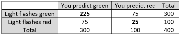
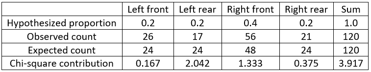
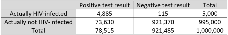
One of my favorite examples to illustrate this concerns the murder trial of Kristen Gilbert, a nurse accused of being a serial killer of patients. The following data were presented at her trial:
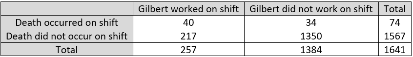
The observational units here are hospital shifts, not patients. The explanatory variable is whether or not Gilbert was working on the shift, which is categorical and binary. The response variable is whether or not a patient died on the shift, which is also categorical and binary. Students need to understand these basic ideas before they can analyze and draw conclusions from these data.
2. Proportional reasoning, and working with percentages, can be tricky but are crucial.
I suspect that at least two-thirds of my blog posts have included proportions or percentages*. Proportions and percentages abound in everyday life. Helping students to work with percentages, and to recognize the need for proportional reasoning, is a worthy goal for introductory statistics courses.
* This very sentence contains a proportion, even if it is only a guess.
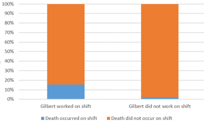
Look back at the table of counts from the Kristen Gilbert trial. Students who do not think proportionally simply compare the counts 40 and 34, which suggests a small difference between the groups. But engaging in proportional reasoning reveals a huge discrepancy: 40/257 ≈ 0.156 and 34/1384 ≈ 0.025. In other words, 15.6% of shifts on which Gilbert worked saw a patient death, compared to 2.5% of shifts on which Gilbert did not work. These percentages are displayed in the segmented bar graph:
What’s so tricky about this? Well, converting the proportions to statements involving percentages is non-trivial, particularly as these are conditional percentages. More challenging is that many students are tempted to conclude that the death rate on Gilbert shifts is 13.1% higher than the death rate on non-Gilbert shifts, because 0.156 – 0.025 = 0.131. But that’s not how percentage difference works, as I ranted about at length in post #28 (A pervasive pet peeve, here). The actual percentage difference in the death rates between these groups is (0.156 – 0.025) / 0.025 × 100% ≈ 533.6%. Yes, that’s right: The death rate on a Gilbert shift was 533.6% higher than the death rate on a non-Gilbert shift! This gives quite a different impression that the incorrect claim of a 13.1% difference.
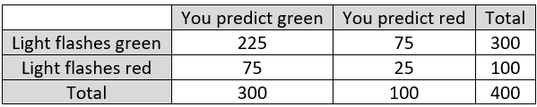
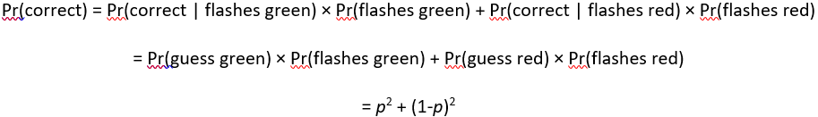
The importance of proportional reasoning also arises when working with probabilities. I strongly recommend producing a table of hypothetical counts to help students work with conditional probabilities. For example, I used that technique in post #10 (My favorite theorem, here) to lead students to distinguish between two conditional probabilities: (1) the probability that a person with a positive test result has the disease, and (2) the probability that the test result is positive among people who have the disease, as shown in the table:
3. Averages reveal statistical tendencies.
The concept of a statistical tendency is a fundamental one that arises in all aspects of life. What do we mean when we say that dogs are larger than cats? We certainly do not mean that every dog is larger than every cat. We mean that dogs tend to be larger than cats. We also express this idea by saying that dogs are larger than cats on average. We can further explain that if you encounter a dog and a cat at random, it’s more likely than not that the dog will be larger than the cat*.
Understanding statements of statistical tendencies, and learning to write such statements clearly, is an important goal for introductory statistics students. Is this an easy goal to achieve? Not at all. I mentioned in post #37 (What’s in a name? here) that psychologist Keith Stanovich has described this skill, and probabilistic reasoning more generally, as the “Achilles Heel” of human cognition.
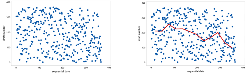
The dogs and cats example is an obvious one, but averages can also help us to see a signal in the midst of considerable noise. Post #9 (Statistics of illumination, part 3, here) about the infamous 1970 draft lottery illustrates this point. The scatterplot on the left, displaying draft number versus day of the year, reveals nothing but random scatter (noise) on first glance. But calculating the median draft number for each month reveals a clear pattern (signal), as shown on the right:
You might be thinking that students study averages beginning in middle school or even sooner, so do we really need to spend time on averages in high school or college or courses? In post #5 (A below-average joke, here), I argued that we can help students to develop a deeper understanding of how averages work by asking questions such as: How could it happen that the average IQ dropped in both states when I moved from Pennsylvania to California?
4. Variability, and distributional thinking, are fundamental.
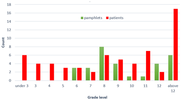
Averages are important, but variability is at the core of statistical thinking. Helping students to regard a distribution of data as a single entity is important but challenging. For example, post #4 (Statistics of illumination, part 2, here) described an activity based on data about readability of cancer pamphlets. I ask students to calculate medians for a dataset on pamphlet readability and also for a dataset on patient reading levels. The medians turn out to be identical, but that only obscures the more important point about variability and distribution. Examining a simple graph reveals the underlying problem that many patients lack the skill to read the simplest pamphlet:
In posts #6 and #7 (Two dreaded words, here and here), I suggested that we can help students to overcome their dread of the words standard deviation by focusing on the concept of variability rather than dreary calculations that are better performed by technology. I also argued in post #8 (End of the alphabet, here) that z-scores are an underappreciated idea that enable us to compare proverbial apples and oranges by taking variability into account.
5. Visual displays of data can be very illuminating.
In light of the graphs presented above, I trust that this point needs no explanation.
6. Association is not causation; always look for other sources of variability.
Distinguishing causation from association often prompts my workshop comment that I mentioned in the first sentence of this post. I want students to emerge from their introductory statistics course knowing that inferring a cause-and-effect relationship from an observed association is often unwarranted. Posts #43 and #44 (Confounding, here and here) provide many examples.
The idea of confounding leads naturally to studying multivariable thinking. Post #3 (Statistics of illumination, part 1, here) introduced this topic in the context of graduate admission decisions. Male applicants had a much higher acceptance rate than female applicants, but the discrepancy disappeared, and even reversed a bit, after controlling for the program to which they applied. For whatever reason, most men applied to the program with a high acceptance rate, while most women applied to the program with a very low acceptance rate.
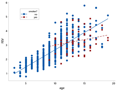
Post #35 (Statistics of illumination, part 4, here) continued this theme in the context of comparing lung capacities between smokers and non-smokers. Surprisingly enough, smokers in that study tended to have larger lung capacities than non-smokers. This perplexing result was explained by considering the ages of the people, who were all teenagers and younger. Smokers were much more likely to be older than younger, and older kids tended to have larger lung capacities than younger ones. The following graph reveals the relationships among all three variables:
7. Randomized experiments, featuring random assignment to groups, allow for cause-and-effect conclusions.
Some students take the previous point too far, leaving their course convinced that they should never draw cause-and-effect conclusions. I try to impress upon them that well-designed randomized experiments do permit drawing cause-and-effect conclusions, as long as the difference between the groups turns out to be larger than can plausibly be explained by random chance. Why are the possible effects of confounding variables less of a concern with randomized experiments? Because random assignment of observational units to explanatory variable groups controls for other variables by balancing them out among the groups.
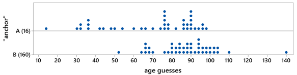
Post #20 (Lincoln and Mandela, part 2, here) describes a class activity that investigates the psychological phenomenon known as anchoring by collecting data from students with a randomized experiment. Students are asked to guess the age at which Nelson Mandela died, but some students first see the number 16 while others see the number 160. The following graph displays the responses for one of my classes. These data strongly suggest that those primed with 160 tend to make larger guesses than those primed with 16:
Posts #27 and #45 (Simulation-based inference, parts 2 and 3, here and here) also featured randomized experiments. We used simulation-based inference to analyze and draw conclusions from experiments that investigated effects of metal bands on penguin survival and of fish oil supplements on weight loss.
8. Random sampling allows for generalizing, but it’s very hard to achieve.
Random sampling is very different from random assignment. These two techniques share an important word, but they have different goals and consequences. Random sampling aims to select a representative sample from a population, so results from the sample can be generalized to the population.
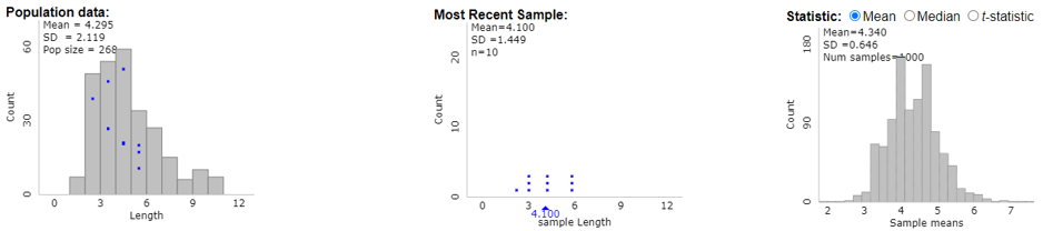
I described how I introduce random sampling to my students in post #19 (Lincoln and Mandela, part 1, here). In this activity, students select samples of words from the Gettysburg Address. First students select their sample simply by circling ten words that appeal to them. They come to realize that this sampling method is biased toward longer words. Then they use genuine random sampling to select their sample of words, finding that this process is truly unbiased. The following graphs (from the applet here) help students to recognize the difference between three distributions: 1) the distribution of word lengths in the population, 2) the distribution of word lengths in a random sample from that population, and 3) the distribution of sample mean word lengths in 1000 random samples selected from the population:
I emphasize to students that while selecting a random sample of words from a speech is straight-forward, selecting a random sample of human beings is anything but. Standing in front of the campus library or recreation center and selecting students in a haphazard manner does not constitute random sampling. Even if you are fortunate enough to have a list of all people in the population of interest from which to select a random sample, some people may choose not to participate, which leaves you with a non-random sample of people for your study.
9. Analyzing random phenomena requires studying long-run behavior.
There’s no getting around the fact that much of statistics, and all of probability, depends on asking: What would happen in the long run? Such “long run” concepts are hard to learn because they are, well, conceptual, rather than concrete. Fortunately, we can make these concepts more tangible by employing the most powerful tool in our pedagogical toolbox: simulation!
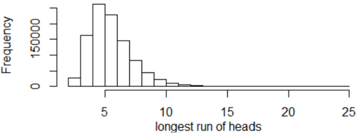
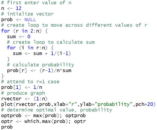
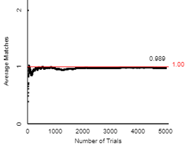
Post #17 (Random babies, here) presents an activity for introducing students to basic ideas of randomness and probability. Students use index cards to simulate the random process of distributing four newborn babies to their mothers at random. Then they use an applet (here) to conduct this simulation much more quickly and efficiently. Post #18 (What do you expect? here) follows up by introducing the concept of expected value. The following graph shows how the average number of correct matches (of babies to mothers) changes for the first 1000 repetitions of simulating the random process, gradually approaching the long-run average of 1.0:
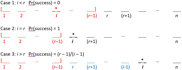
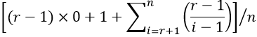
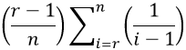
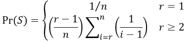
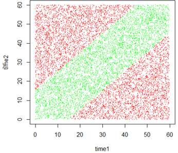
The usefulness of simulation for studying and visualizing randomness permeates all of the posts about probability. For example, post #23 (Random rendezvous, part 1, here) presents the following graph of simulation results to display the probability that two people successfully meet for lunch, when their arrival times are independent uniform distributions and they agree to wait fifteen minutes for each other:
10. Sampling distributions lay the foundation for statistical inference.
One of the questions posed by prospective teachers in post #38 (here) asked me to identify the most challenging topic for introductory statistics students. My response was: how the value of a sample statistic varies from sample to sample, if we were to repeatedly take random samples from a population. Of course, for those who know the terminology*, I could have answered with just to words: sampling distributions. I expanded on this answer in posts #41 and #42 (Hardest topic, here and here).
* Dare I say jargon?
Understanding how a sample statistic varies from sample to sample is crucial for understanding statistical inference. I would add that the topic of randomization distributions deserves equal status with sampling distributions, even though that term is much less widely used. The difference is simply that whereas the sampling distribution of a statistic results from repeated random sampling, the randomization distribution of a statistic results from repeated random assignment. In his classic article titled The Introductory Statistics Course: A Ptolemaic Curriculum? (here), George Cobb argued that statistics teachers have done a disservice to students by using the same term (sampling distributions) to refer to both types, which has obscured the important distinction between random sampling and random assignment.
You will not be surprised that I consider the key to studying both sampling distributions and randomization distributions to be … drumroll, please … simulation!
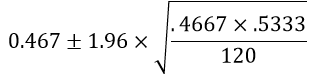
11. Confidence intervals estimate parameters with a margin-of-error.
The need for interval estimation arises from the fundamental idea of sampling variability, and the concept of sampling distributions provides the underpinning on which confidence interval procedures lie. I described activities and questions for investigating confidence intervals in a three-part series of posts #14, #15, and #46 (How confident are you? here, here, and here).
In post #15 (here), I argued that many students fail to interpret confidence intervals correctly because they do not think carefully about the parameter being estimated. Instead, many students mistakenly interpret a confidence interval as a prediction interval for an individual observation. Helping students to recognize and define parameters clearly is often overlooked but time well spent.
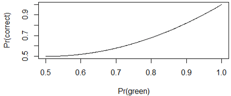
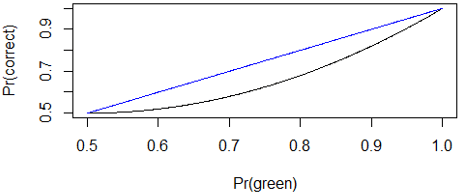
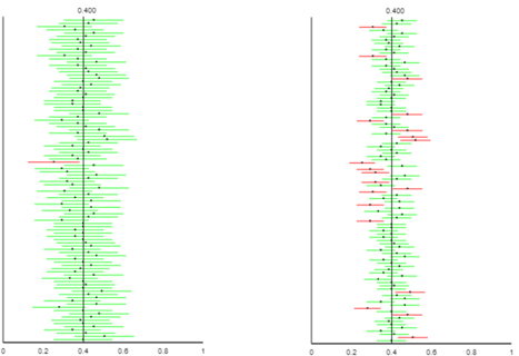
As with many other topics, interactive applets can lead students to explore properties of confidence intervals. The following graph, taken from post #14 (here) using the applet here, illustrates the impact of confidence level, while revealing that confidence level refers to the proportion of intervals (in the long run, under repeated random sampling) that successfully capture the value of the population parameter:
12. P-values indicate how surprising the sample result would be if a hypothesized model were true.
The p-value has been the subject of much criticism and controversy in recent years (see the 2019 special issue of The American Statistician here). Some have called for eliminating the use of p-values from scientific inquiry and statistical inference. I believe that p-values are still essential to teach in introductory statistics, along with the logic of hypothesis testing. I think the controversy makes clear the importance of helping students to understand the concept of p-value in order to avoid misuse and misinterpretation.
Yet again I advocate for using simulation as a tool for introducing students to p-values. Many posts have tackled this topic, primarily the three-part series on simulation-based inference in posts #12, #27, and #45 (here, here, and here). This topic also featured in posts #2 (My favorite question, here), #9 (Statistics of illumination, part 3, here), and #13 (A question of trust, here).
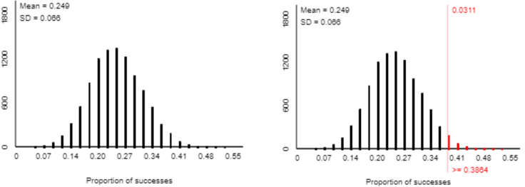
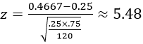
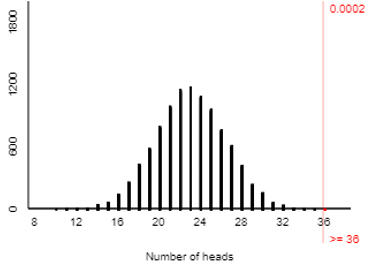
The basic idea behind a p-value is to ask how likely an observed sample result would be if a particular hypothesis about a parameter were true. For example, post #12 (here) described a study that investigated whether people are more likely to attach the name Tim (rather than Bob) to the face on the left below:

When I asked this question of my students in a recent class, 36 of 46 students associated Tim with the face on the left. A simulation analysis of 10,000 coin flips (using the applet here) reveals that such an extreme result would happen very rarely with a 50-50 random process, as shown in the graph below. Therefore, we conclude that the sample result provides strong evidence against the 50-50 hypothesis in favor of the theory that people are more likely to attach the name Tim to the face on the left.
13. Statistical inference does not reveal, or account for, everything of interest.
It’s imperative that we statistics teachers help students realize that statistical inference has many, many limitations. This final topic on my list is a catch-all for many sub-topics, of which I describe a few here.
I mentioned the importance of interval estimates earlier, but margin-of-error does not account for many things that can go wrong with surveys. Margin-of-error pertains to variability that arises from random sampling, and that’s all. For example, margin-of-error does not take into account the possibility of a biased sampling method. I described one of my favorite questions for addressing this, with an admittedly ridiculous context, in post #14 (How confident are you? Part 1, here). If an alien lands on earth, sets out to estimate the proportion of humans who identify as female, and happens upon the U.S. Senate as its sample, then the resulting confidence interval will drastically underestimate the parameter of interest.
Margin-of-error also fails to account for other difficulties of conducting surveys, such as the difficulty of wording questions in a manner that does not influence responses, and the distinct possibility that some people may exaggerate or lie outright in their response.
The distinction between statistical significance and practical importance is also worth emphasizing to students. One of my favorite questions for addressing this is a somewhat silly one from post #16 (Questions about cats, here). Based on a large survey of households in the U.S., the proportion of households with a pet cat differs significantly from one-third but is actually quite close to one-third. Reporting a confidence interval is much more informative than simply producing a p-value in this context and many others.
Another misuse of p-values is to mindlessly compare them to 0.05 as a “bright line” that distinguishes significant results from insignificant ones. In fact, the editorial (here) in the special issue of The American Statistician mentioned above calls for eliminating use of the term statistical significance in order to combat such “bright line” thinking.
A related and unfortunately common misuse is the practice of p-hacking, which means to conduct a very large number of hypothesis tests on the same dataset and then conclude that those with a p-value less than 0.05 are noteworthy. A terrific illustration of p-hacking is provided in the xkcd comic here (with explanation here).
Writing this blog for the past year and compiling this list have helped me to realize that my own teaching is lacking in many respects. I know that if I ever feel like I’ve got this teaching thing figured out, it will be time for me to retire, both from teaching and from writing this blog.
But I am far from that point. I look forward to returning to full-time teaching this fall after my year-long leave*. I also look forward to continuing to write blog posts that encourage statistics teachers to ask good questions.
* I picked a very, shall we say, eventful academic year in which to take a leave, didn’t I?
In the short term, though, I am going to take a hiatus in order to catch my breath and recharge my batteries. I am delighted to announce that this blog will continue uninterrupted, featuring weekly posts by a series of guest bloggers over the next couple of months.
Oh wait, I just realized that I still have not answered a question that I posed in post #1 (here) and promised to answer later: What makes a question good? I hope that I have illustrated what I think makes a question good with lots and lots and lots of examples through the first 51 posts. But other than providing examples, I don’t think I have a good answer to this question yet. This provides another motivation for me to continue writing this blog. I will provide many, many more examples of what I think constitute good questions for teaching and learning introductory statistics. I will also continue to reflect on this thorny question (what makes a question good?), and I vow once again to answer the question in a later* post.
* Possibly much later
P.S. I greatly appreciate Cal Poly’s extending a professional leave to me for the past year, which has afforded me the time to write this blog.
I extend a huge thanks to Beth Chance and Tom Moore, who have read draft posts and offered helpful comments every week*.
* Well, except for the weeks in which I was unable to produce a draft in time.
My final and sincere thanks go to all of you who have read this blog and encouraged me over the past year.