Skip to content

Archive for

#65 Matching variables to graphs

On Friday of last week I asked my students to engage with an activity in which I presented them with these seven graphs:

I’m sure you’ve noticed that these graphs include no labels or scales on the axes.  But you can still discern some things about these seven distributions even without that crucial information.  I told my students the seven variables whose distributions are displayed in these graphs:

  • (A) point values of letters in the board game Scrabble
  • (B) prices of properties on the Monopoly game board
  • (C) jersey numbers of Cal Poly football players
  • (D) weights of rowers on the U.S. men’s Olympic team
  • (E) blood pressure measurements for a sample of healthy adults
  • (F) quiz percentages for a class of students (quizzes were quite straight-forward)
  • (G) annual snowfall amounts for a sample of cities taken from around the U.S.

But I did not tell students which variable goes with which graph.  Instead I asked them to work in groups* with these instructions: Make educated guesses for which variable goes with which graph.  Be prepared to explain the reasoning behind your selections.

* This being the year 2020, the students’ groups were breakout rooms in Zoom.

Before I invited the students to join breakout rooms, I emphasized that it’s perfectly fine if they know nothing about Scrabble or Monopoly or rowing or even snowfall*.  For one thing, that’s why they’re working with a group.  Maybe they know about some of these things and a teammate knows about others.  For another thing, I do not expect every group to match all seven pairs perfectly, and this activity is not graded.

* Most of my students are natives of California, and some have never seen snowfall.

I think you can anticipate the next sentence of this blog post: Please take a few minutes to match up the graphs and variables for yourself before you read on*.

* Don’t worry, I do not expect you to get them all right, and remember – this is not for a grade!

Also before I continue, I want to acknowledge that I adapted this activity from Activity-Based Statistics, a wonderful collection based on an NSF-funded project led by Dick Scheaffer in the 1990s.  This variation is also strongly influenced by Beth Chance’s earlier adaptations of this activity, which included generating the graphs from data collected from her students on various variables.


I only gave my students 5-6 minutes to discuss this in their breakout rooms.  When they came back to the main Zoom session, I asked for a volunteer to suggest one graph/variable pair that they were nearly certain about, maybe even enough to wager tuition money.  The response is always the same: Graph #4 displays the distribution of football players’ jersey numbers.  I said this is a great answer, and it’s also the correct answer, but then I asked: What’s your reasoning for that?  One student pointed out that there are no repeated values, which is important because every player has a distinct jersey number.  Another student noted that there are a lot of dots, which is appropriate because college football teams have a lot of players.

Next I asked for another volunteer to indicate a pairing for which they are quite confident, perhaps enough to wager lunch money.  I received two different answers to this.  In one session, a student offered that graph #1 represents the quiz percentages.  What’s your reasoning for that?  The student argued that quizzes were generally straight-forward, so there should be predominatly high scores.  The right side of graph #1 could be quiz percentages in the 80s and 90s, with just a few low values on the left side. 

In the other session, a student suggested that graph #2 goes with point values of letters in Scrabble.  What’s your reasoning for that?  The student noticed that the spacing between dots on the graph is very consistent, so the values could very well be integers.  It also makes sense that the leftmost value on the graph could be 1, because many letters are worth just 1 point in Scrabble.  This scale would mean that the large values on the right side of the graph are 8 (for 2 letters) and 10 (also for 2 letters).  Another student even noted that there are 26 dots in graph #2, which matches up with 26 letters in the alphabet.

When I asked for another volunteer, a student suggested that graph #7 corresponds to Monopoly prices.  What’s your reasoning for that?  The student commented that Monopoly properties often come in pairs, and this graph includes many instances of two dots at the same value.  Also, the distance between the dots is mostly uniform, suggesting a common increment between property prices.  I asked about the largest value on this graph, which is separated a good bit from the others, and a student responded that this dot represents Boardwalk.

After those four variables and graphs were matched up, students got much quieter when I asked for another volunteer.  I wish that I had set up a Zoom poll in advance to ask them to express their guesses for the rest, but I did not think of that before class.  Instead I asked for a description of graph #3.  A student said that there are a lot of identical values on the low end, and then a lot of different values through the high end.  When I asked about which variable that pattern of variation might make sense for, a student suggested snowfall amounts.  What’s your reasoning for that?  The student wisely pointed out that I had said that the cities were taken from around the U.S., so that should include cities such as Los Angeles and Miami that see no snow whatsoever.

Then I noted that the only graphs left were #5 and #6, and the only variables remaining were blood pressure measurements and rower weights.  I asked for a student to describe some differences between these graphs to help us decide which is which.  This is a hard question, so I pointed out that the smallest value in graph #6 is considerably smaller than all of the others, and there’s also a cluster of six dots fairly well separated from the rest in graph #6.  One student correctly guessed that graph #6 displays the distribution of rower weights.  What’s your reasoning for that?  The student knew enough about rowing to say that one member of the team calls out the instructions to help the others row in synch, without actually rowing himself.  Why does the team want that person to be very light?  Because he’s adding weight to the boat but not helping to row!

That leaves graph #5 for the blood pressure measurements.  I suggested that graph #5 is fairly unremarkable and that points are clustered near the center more than on the extremes.


You might be wondering why I avoided using the terms skewness, symmetry, and even outlier in my descriptions above.  That’s because I introduced students to these terms at the conclusion of this activity.  Then I asked students to look back over the graphs and: Identify which distributions are skewed to the left, which are skewed to the right, and which are roughly symmetric.  I gave them just three minutes to do this in the same breakout rooms as before.  Some students understandably confused skewed to the left and skewed to the right at first, but they quickly caught on.  We reached a consensus as follows:

  • Skewed to the left: quiz percentages (sharply skewed), rower weights (#1, #6)
  • Skewed to the right: Scrabble points, snowfall amounts (#2, #3)
  • Symmetric (roughly): jersey numbers, blood pressure measurements, Monopoly prices (#4, #5, #7)

I admitted to my students that while I think this activity is very worthwhile, it’s somewhat contrived in that we don’t actually start a data analysis project by making guesses about what information a graph displays.  In practice we know the context of the data that we are studying, and we produce well-labelled graphs that convey the context to others.  Then we examine the graphs to see what insights they provide about the data in context.

With that in mind, I followed the matching activity with a brief example based on the following graph of predicted high temperatures for cities around California, as I found them in my local newspaper (San Luis Obispo Tribune) on July 8, 2012:

I started with some basic questions about reading a histogram, such as what temperatures are contained in the rightmost bin and how many cities had such temperatures on that date.  Then I posed three questions that get to the heart of what this graph reveals:

  • What is the shape of this distribution?
  • What does this shape reveal about high temperatures in California in July?
  • Suggest an explanation for the shape of this distribution, using what you know about the context.

Students responded that the temperature distribution displays a bimodal shape, with one cluster of cities around 65-80 degrees and another cluster from about 90-100 degrees.  This reveals that California has at least two distinct kinds of locations with regard to high temperatures in July. 

For the explanation of this phenomenon, a student suggested that there’s a split between northern California and southern California.  I replied that this was a good observation, but I questioned how this split would produce the two clusters of temperature values that we see in the graph.  The student quickly followed up with a different explanation that is spot-on: California has many cities near the coast and many that are inland.  How would this explain the bimodality in the graph?  The student elaborated that cities near the coast stay fairly cool even in July, while inland and desert cities are extremely hot.


My students and I then worked through three more examples to complete the one-hour session.  Next I showed them the following boxplots of daily high temperatures in February and July of 2019 for four cities*:

* I discuss these data in more detail in post #7, Two dreaded words, part 2, here.

The students went back to their breakout rooms with their task to: Arrange these four cities from smallest to largest in terms of:

  • center of February temperature distributions;
  • center of July temperature distributions;
  • variability of February temperature distributions; and
  • variability of July temperature distributions

After we discussed their answers and reached a consensus, I then briefly introduced the idea of a log transformation in the context of closing prices of Nasdaq-100 stocks on September 15, 2020:

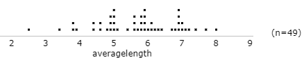
Finally, we discussed the example of cancer pamphlets’ readability that I described in post #4, Statistics of illumination, part 2, here.


As you can tell, the topic of the class session that I have described here was graphing numerical data.  I think the matching activity set the stage well, providing an opportunity for students to talk with each other about data in a fun way.  I also hope that this activity helped to instill in students a mindset that they should always think about context when examining graphs and analyzing data.

#64 My first week

Many thanks to all who sent encouragement in response to last week’s post (here) about my harrowing experience with creating my first video for my students.  I’m happy to report that my first-ever week of remote teaching went well.  I promise not to turn this blog into a personal diary, but I’d like to share some reflections based on this past week.


I woke up last Monday excited and nervous for the first day of the school year.  That was a good and familiar, even comforting, feeling.  Some unfamiliar feelings followed for the rest of the day.  It was very strange not to leave my house for the first day of school, and it was also weird to realize at the end of the day that I had not changed out of my sweat pants.

I was very glad that many students showed up for my first live zoom session at 8am on Monday.  I also appreciated that many of them turned their cameras on, so I could see their faces on the screen.  A large majority of my students are beginning their first term at Cal Poly, and they seemed eager to get started.  I was excited that these students were beginning the academic coursework of their college experience with me.

One fun thing is that the very first student to join the zoom session turned out to have her birthday on that day.  I know this because we worked through the infamous draft lottery example (see post #9, here), so I asked students to find their own birthday’s draft number, and it turned out that this student’s birthday had draft number 1, which meant that she was born on September 14, last Monday.


I have used three different zoom tools to interact with students:

  1. Breakout rooms provide an opportunity for students to discuss questions with each other.  For example, we used breakout rooms at the beginning of the first session for groups of 5-6 students to introduce themselves to each other.  Then we used the same breakout rooms later for students to discuss possible explanations for the apparent paradox with the famous Berkeley graduate admissions data (see post #3 here).
  2. Polls provide immediate feedback on students’ understanding (see Roxy Peck’s guest post #55 about clicker questions here).  For example, I used polls to ask students to identify variables as categorical or numerical and to indicate whether a number was a parameter or a statistic.
  3. Chat allows students to ask questions of me, and I’ve also asked them to type in responses to some questions in the chat window.  For example, students determined the median draft number for their birth month and typed their finding into the chat.

During Friday’s live zoom session, we studied ideas related to sampling, and we worked through the Gettysburg Address activity (see post #19, Lincoln and Mandela, part 1, here).  I was apprehensive about how this activity would work remotely, but I was pleasantly surprised that it went smoothly.  I prepared a google form in advance and pasted a link in the chat window, through which students entered the average word length in their self-selected sample of ten words from the speech.  This allowed me to see their responses in real time and paste the results into an applet (here), so we could examine a dotplot of the distribution of their sample averages.  Because a large majority of the students’ sample averages exceeded the population average of 4.3 letters per word, the resulting graph illustrated sampling bias:

I also created videos for students who could not attend the optional live sessions.  I’m even getting slightly more comfortable with making videos.  But making corrections to the auto-captioning takes a while, perhaps because the software has trouble translating words from my peculiar voice.  Some unfortunate mis-translations of what I have said include:

  • “grandmother” for “parameter”
  • “in America” for “a numerical variable”
  • “selected a tree” for “selected at random”
  • “once upon a time” for “one sample at a time”
  • “sample beans” for “sample means”

I have already given many quizzes to my students, even after just one week.  I give a quiz based on each handout, just to make sure that they were paying attention as they worked through the examples, either in a live session with me or on their own or by watching a video.  I also assign an application quiz for each handout, in which students apply what they have learned to a new context.  I have also asked students to complete several miscellaneous quizzes, for example by answering questions about a Hans Rosling video on visualizing human progress (here) that I asked them to watch.   I regard these quizzes as low-stakes assessments, and I encourage students to work together on them.


I conclude this brief post by offering five take-aways from my first week of remote teaching.  I realize that none of these is the least bit original, and I suspect that none will provide any insights for those who taught remotely in the spring or started remote teaching in the fall earlier than I did.

  1. Remote teaching can be gratifying.  Rather than thinking about how much I would prefer to be in a classroom with my students and down the hall from my colleagues, I hope to concentrate on my happy discovery that interacting with students virtually can be fun.
  2. Remote teaching can be engaging.  I greatly appreciate my students’ being such good sports about answering my questions and participating in activities.  (See Kelly Spoon’s guest post #60, here, for several ideas about connecting with students online.)
  3. Asking good questions is central to helping students learn*, remotely as well as in-person.
  4. Remote teaching requires considerable preparation**.  For me, some of this preparation has involved planning when to use breakout rooms and polls and chat.  Collecting data from students also requires more preparation than simply asking students to put their result on the board.  Writing quizzes also requires entering the questions into the learning management system after crafting the questions in the first place.
  5. Remote teaching is very tiring.***  I have found the combination of having to prepare so extensively, integrate different technologies at the same time, and stare at a screen for many hours per day to be exhausting!

* You did not see this one coming, did you?

** But on the positive side of the ledger, my commute time has been reduced by nearly 100%.

*** Of course, perhaps age is a confounding variable that explain my fatigue.  Never before have I been as old to start a new school year as I am now.

Here’s one more takeaway, one that I regret: I have much less time and thought to devote to this blog than I had last year.  That’s why this post is so brief and perhaps unhelpful.  As always, thanks for reading and bearing with me.

#63 My first video

I recently endured a harrowing, horrifying, humbling, even humiliating experience.  That’s right: I recorded my first video.

My first-ever online teaching experience begins today, September 14*.  In preparation, I thought I’d record a brief video to introduce myself to my students, hoping to begin the process of establishing a bit of a connection even though I’ll probably never meet these students in person.  I wanted the video to be brief, about five minutes or so.  I’ve never followed a script in class, so I did not write a script for the video, hoping that non-scripted spontaneity would make it more appealing.  But I did prepare some PowerPoint slides, partly to remember what I wanted to say, and also so the slides would occupy most of the screen with my face appearing only in a small corner.  I wanted to use Zoom to make the video, just because I like to keep things simple.  I’ve already used Zoom a bit, and I’ll be using Zoom for live sessions with my students this fall.

* This is the same date that was selected first and received draft number 1 in the infamous 1970 draft lottery.  In post #9 (here), I describe a class activity that illustrates statistical thinking by analyzing those lottery results.

So, I entered the room that now serves as my home office, started my computer, opened Zoom, launched a new meeting, shared my screen, put my PowerPoint file in presentation mode, looked into the camera, pressed the record button, and started talking to myself …

I finished about seven-and-a-half minutes later, only 50% beyond my target time of five minutes*.  I waited for Zoom to produce the recording, and then I eagerly pressed the play button.  This is when the experience turned harrowing.

* Post #28 (here) pertains to my pervasive pet-peeve involving student misunderstandings of percentage differences.


I really don’t like watching myself on a screen, but I understand that many people feel this way about themselves, and Zoom use over the past six months has somewhat inured me to this unpleasant feeling.  That wasn’t the harrowing part.

Those of you who know me, or have heard me give presentations, can probably anticipate that I found the horrifying part to be listening to my voice.  For those of you who have never heard me: I have a very unusual and peculiar* speaking voice.  It doesn’t sound nearly as odd to me in real life as it does on a recording.  After listening to just the first few seconds of the Zoom recording, I was overcome by a desire to apologize to everyone who’s ever had to listen to me – students, colleagues, friends, wife, cats, …  I only hope that this is something that you get used to and barely notice after a while.

* Friends use the word distinctive here to spare my feelings.

To be more specific, my voice tends to rise rather than fall at the end of sentences.  This vocal pattern is sometimes referred to as “upspeak.”  This is apparently a serious topic of research inquiry among linguists, and a Google search will provide a lot of information, references, and advice about upspeak.  My favorite anecdote about this phenomenon is that novelist Richard Russo invested one of his characters with upspeak in his delightful satire of academic life Straight Man.  Russo’s main character, the reluctant chairman of a college’s English department, describes the speaking voice of the department secretary as follows: Most of Rachel’s statements sound like questions.  Her inability to let her voice fall is related to her own terrible insecurity and lack of self-esteem.  To emphasize this aspect of her speaking voice, Russo uses a question mark at the end of Rachel’s sentences throughout the book?*

* Yes, I used that punctuation on purpose to demonstrate Russo’s technique.

In case you’re wondering whether I’m exaggerating about my own upspeaking, I’ll point out that during conference and workshop presentations, I often ask those in attendance to guess where I’m from.  Just asking the question is usually good for a laugh, as people realize that I am acknowledging my unusual vocal inflections, and they’re often curious to know the answer.  Common guesses often include Ireland, Scotland, Scandinavia, Canada, and the upper Midwest.  None of those is correct*.  I believe that my peculiar voice is more of an individual quirk than a regional dialect.

* I will reveal the answer later in this post.


After I overcame my revulsion at hearing my own voice enough to get back to work on my first video, I made and discarded several attempts due to mis-speakings and awkward pauses and the like.  Then as I went through the fifth take, I thought I had a keeper.  I successfully avoided the mis-speaking and pauses.  I was saying what I wanted to say in a reasonable manner.  As I got to the end, I was almost looking forward to playing it back to confirm that this would be the final take, the one to be posted for my students.  It probably would have been, except for one flaw: I realized to my horror that I had been sharing and recording the wrong screen!  I was sharing and recording my laptop screen rather than my monitor screen*, which was the one with the Powerpoint presentation! 

* I’ve actually used just a laptop for the past 20 years until recently.  Seeing that I would need to teach online in the fall, my wife very kindly bought me a new monitor a few months ago.  As this story reveals, I’m still getting used to it.

A few takes later, I again thought I had a keeper, and I was certain that I had shared and recorded the correct screen this time.  I was feeling very proud of myself, downright excited as I got to the last slide, in which I thanked students for taking the time to watch my first video.  But then …  My brain completely froze, and I couldn’t find the button to stop the recording!  I don’t know whether the Zoom control bar was hidden behind the PowerPoint presentation or behind some other application or what, but I flailed about for a full 30 seconds, muttering to myself (and, of course, to the microphone) the whole time.  I know this should be no big deal; it can’t be hard to edit out those last 30 seconds, but I didn’t know how to do that*!

* Now I wish that I had kept all of these outtakes.  But I didn’t realize at the time that there would be so many, or that the experience would make such an impact on me that I would write a full, self-indulgent blog post about it.

I know that none of this was Zoom’s fault, but at this point I decided to learn the basics and record the next few takes with Screencast-o-matic.  These actually went fairly well, and it only took a few more takes to end up with the final version that I posted for my students.  All together, I spent many, many hours making a 7.5-minute video.


Just for fun, let me show you some of the slides from my first video presentation.  I start by telling students where I’m from and pointing out that I slowly ventured a bit farther from home as I went to college and then graduate school and then my first teaching position:

I also wanted to let students know that while I am a very experienced teacher of statistics, I am a complete novice when it comes to teaching online courses:

To reveal a more personal side, I told students about some of my hobbies, along with some photos:

I have mentioned before (see posts #25 and #26 here and here) that I give lots of quizzes to my students.  I plan to do that again with my online course this fall.  In fact, I suspect that very frequent quizzes will be all the more useful in an online setting for helping to keep students on task, indicating what they should be learning, and providing them with feedback on their progress.  I even decided to give them a quiz based on my self-introduction video.  This is an auto-graded, multiple-choice quiz administered in our course management system Canvas.  I expect this quiz to provide students with easy points to earn, because all of the answers appear in the video, and they can re-watch the video after they see the quiz questions.  Here are the questions:

  1. In which state did I live for the first 39 years of my life? [Options: Arizona, California, Hawaii, Mississippi, Pennsylvania]
  2. How many states have I been in? [Options: 1, 13, 47, 50]
  3. What kind of pets have I had? [Options: Birds, Cats, Dogs, Fish, Snakes]
  4. Which of the following is NOT the name of one of my pets? [Options: Cosette, Eponine, Punxsutawney Phil, Puti]
  5. What is the name of my fantasy sports teams? [Options: Cache Cows, Domestic Shorthairs, Markov Fielders, Netminders, Sun Cats]
  6. For how many years have I been at Cal Poly? [Options: 2, 19, 31, 58]
  7. How much experience do I have with online teaching? [Options: None, A little, A lot]
  8. What was my primary project while on leave from Cal Poly for the past academic year? [Options: Playing online games, Proving mathematical theorems, Reading mystery novels, Starting a business, Writing a blog]
  9. What is my teaching philosophy? [Options: Ask good questions, Insist on perfection, Learn by viewing, Rely on luck]
  10. Am I funny? [Option: Well I try to be but I may not succeed often]

So, how did you do?  The correct answers are: Pennsylvania, 47 (all but Arkansas, Mississippi, North Dakota), Cats, Punxsutawney Phil, Domestic Shorthairs, 19, None, Writing a blog, Ask good questions, Well I try to be but I may not succeed often.


P.S. If you would like to watch my first video for yourself, please bear in mind my warning about the peculiarity of my speaking voice.  But if that does not dissuade you, the video can be found here.

#62 Moral of a silly old joke

I have always liked this silly old joke, which I first heard decades ago:

A man takes his dog to see a talent scout, proudly claiming that his dog can talk.  Of course, the talent scout is very skeptical. To convince her, the man asks the dog: What’s on top of a house?  The dog eagerly responds: “Roof, roof!”  The unimpressed talent scout rolls her eyes and tells the man to leave.  The man seizes a second chance and asks the dog: How does sandpaper feel?  The dog gleefully responds: “Rough, rough!”  The scout gets out of her chair and moves to escort the man out of her office.  Begging for one last chance, the man asks the dog: Who was the greatest baseball player of all time?  The dog enthusiastically responds: “Ruth, Ruth!”  The fed-up talent scout removes the man and dog from her office.  Out in the hallway, looking up at the man with a confused and crestfallen expression on his face, the dog says: “DiMaggio?”

Part of why I like this joke is that “DiMaggio?” strikes me as the perfect punch line.  I have seen versions of the joke in which the dog says: “Maybe I should have said DiMaggio?”  I don’t think that’s as funny as the single-word response.  I also don’t think the joke would work nearly as well with Mays* or Aaron or Williams or Trout as the punch line, because those names are so much easier to pronounce than DiMaggio**.

* Joe Posnanski, from whom I have copied this footnoting technique that he calls a Pos-terisk, ranks Willie Mays as the only baseball player better than Babe Ruth (here).

** A name that works nearly as well is Clemente.  Having grown up in western Pennsylvania in the 1960s and 1970s, my favorite baseball player will always be Roberto Clemente.


What in the world does this have to do with teaching statistics, which is the whole point of this blog?!

Please forgive me, as I’m a bit out of practice with writing blog posts*.  Now I will try to connect this silly old joke to the whole point of this blog.

* I again thank the nine guest bloggers who contributed posts during my hiatus in July and August.  If you missed any of these posts, please check them out from the list here

Please consider: What is the moral of this joke?  Let me rephrase that: What did the man do wrong?  Or, to put this in a more positive light: What should the man have done differently?

I’ll give you a hint, as I often do with my own students: The answer that I’m fishing for contains three words.  Want another hint?  Those three words contain a total of 16 letters.  One more hint? The first word has the fewest letters (3), and the last word has the most letters (9).

All right, I’ve dragged this on long enough.  I suspect that you’ve figured out what I think the moral of this silly old joke is.  In order to achieve his (and his dog’s) lifelong dream, all the man needed to do was: Ask good questions.

That’s where the man messed up, right?  His obvious mistake was asking questions for which the answers correspond so well with sounds that an ordinary dog makes.  The man’s incredibly poor choice of questions prevented the dog from demonstrating his remarkable ability.


I repeat: What does this have to do with teaching statistics?!  I suspect that my moral is abundantly clear at this point, but please allow me to summarize:

  • To help our students learn, we need to ask good questions. 
  • To enable our students to demonstrate what they can do, we need to ask good questions. 
  • To empower our students to achieve their potential, we need to ask good questions.

I said in my very first post (see question #8 here) that these three words capture whatever wisdom I may have to offer for teachers of statistics: Ask good questions.  I tried to provide many specific examples over the next 51 posts (here).  That is the whole point of this blog.  I think that’s how we teachers should focus most of our time, effort, and creativity.  Whenever I start to forget this, for example when I momentarily succumb to the temptation to believe that it’s more important to master intricacies of Canvas or Zoom or Powerpoint or Camtasia or Flipgrid or Discord or LockDown Browser or Github or even R, I remember the moral of a silly old joke.


P.S. My professional leave for the 2019-2020 academic year has come to an end, and I am preparing to return to my full-time teaching role*.  I’m hoping to find time to resume writing weekly blog posts, because I greatly enjoy this and hope that these essays have some value.  But I won’t have nearly as much time to devote to blogging for the next nine months, so I’ll need to make the essays shorter or fewer.  Please stick around, and we’ll see how it goes.  For the month of September, I ask for your indulgence as I write some short and unusual blog posts that are less directly applicable to teaching statistics than my typical essays.  As always, thanks very much for reading!

* Our fall classes at Cal Poly will begin on Monday, September 14.  I’ll be teaching online for the first time in my 30+-year career.  Wish me luck!

P.P.S. Thanks to Julie Clark for providing a photo of her dog Tukey. As far as I know, this Tukey cannot talk, but I would not bet against him being able to draw boxplots.