Skip to content

Archive for

#8 End of the alphabet

As you might imagine, considering the first letter of my first name, I am rather partial to the first letter of the alphabet.  Students also seem to be quite fond of this letter, perhaps because it represents the grade that they are working toward.  Nevertheless, despite the attractions of the letter A, I often draw my students’ attention to the very end of the alphabet, because I think z-scores represent an important and underappreciated concept in introductory statistics.

Some believe that the sole purpose of a z-score is to provide an intermediate step in a normal probability calculation.  Moreover, this step has been rendered obsolete by technology.  But the idea of measuring distance in terms of number of standard deviations is very useful and relevant in many situations.  This is what z-scores do, and this enables us to compare proverbial apples and oranges.  Four examples follow. As always, my questions to students appear in italics.

1. I introduce students to this concept in a context that they are quite familiar with: standardized exams such as the SAT and ACT.  Suppose that Bob achieves a score of 1250 on the SAT, and his sister Kathy scores 29 on the ACT.  Who did better, relative to their peers?  What more information do you need?

Students realize that it’s meaningless to compare scores of 1250 and 29, because the two exams are scored on completely different scales.  I provide some more information:

  • SAT scores have a mound-shaped distribution with a mean of about 1050 and a standard deviation (SD) of about 200.
  • ACT scores have a mound-shaped distribution with a mean of about 21 and an SD of about 5.5.

Now what can you say about who did better relative to their peers – Bob or Kathy?

At this point some students come up with the key insight: compare the two siblings in terms of how many standard deviations above the mean their test scores are.  It’s fairly easy to see that Bob’s score is exactly 1 SD above the mean on the SAT.  We can also see that Kathy’s score is more than 1 SD above the mean on the ACT, because 21 + 5.5 = 26.5 is less than Kathy’s score of 29.  With a little more thought and effort, we can calculate that Kathy’s score is (29 – 21) / 5.5 ≈ 1.45 SDs above the mean.  Therefore, it’s reasonable to conclude that Kathy did better than Bob relative to their peers.

Next I introduce the term z-score (also known as a standard score or standardized score) for what we have calculated here: the number of standard deviations above or below the mean a value is.  I’m tempted not to give a formula for calculating a z-score, but then I succumb to orthodoxy and present: z = (x – mean) / SD.

Now let’s consider two more siblings, Peter and Kellen.  Peter scores 650 on the SAT, and Kellen scores 13 on the ACT.  Who did better, relative to their peers?  Explain.

Having figured out a reasonable approach with Bob and Kathy, students are on much firmer ground now.  Peter’s score is exactly 2 SDs below the mean on the SAT, and Kellen’s score is between 1 and 2 SDs below the mean on the ACT.  In fact, Kellen’s z-score can be calculated to be (13 – 21) / 5.5 ≈ -1.45, so his ACT score is 1.45 SDs below average.  Because Kellen’s score is closer to average than Peter’s, and because both scored below average, Kellen did somewhat better relative to his peers than Peter.

We could produce graphs to compare these distributions and siblings:

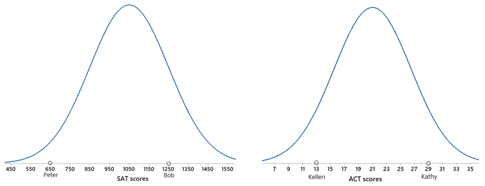
The graphs help to make clear that Kathy’s score is farther out than Bob’s in the right tail of their distributions and that Peter’s score is farther out in the left tail than Kellen’s.  You could take the natural next step here and calculate percentiles from normal distributions for each sibling, but I usually stop short of that step to keep the focus on z-scores.

Next I’d like to show you one of my favorite* questions from an AP Statistics exam.  This question, taken from the 2011 exam, is about evaluating players based on speed and strength.  Even though the question mentions no particular sport or position, I’ll always think of this as the “linebacker” question.

* I discussed my all-time favorite question in post #2 (link).

Here’s the first part of the question:

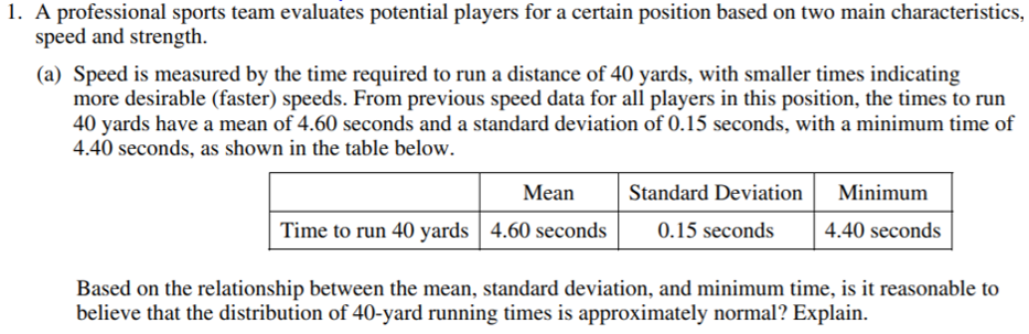
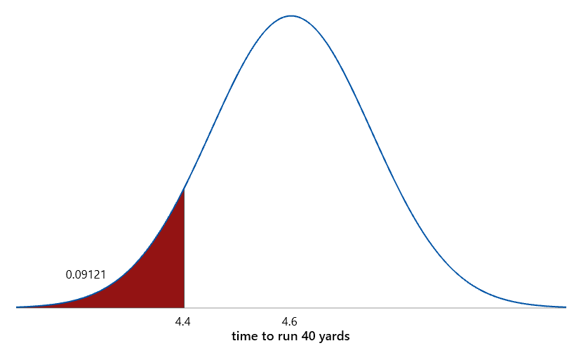
This is a very challenging question to start the exam.  Rather than ask for a routine calculation or interpretation, this question requires students to think things through.  Students need to realize that the minimum time is too close to the mean for the normal distribution to provide a reasonable model.  What does “too close” mean here?  That’s the whole point: Let’s measure that closeness in number of standard deviations.  In other words, let’s look to the end of the alphabet and calculate a z-score for the minimum time: z = (4.40 – 4.60) / 0.15 ≈ -1.33.  What does this z-score tell us?  The minimum time is only 1.33 standard deviations below the mean.  Why does this indicate that a normal distribution would be unreasonable?  As shown in the graph below, with a normal distribution, about 9% of the data would fall more than 1.33 SDs below the mean, so we would expect the minimum time to be farther below the mean than that.

On to the second part of the question:

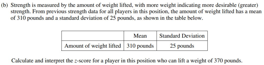
This part is very straight-forward, allowing students to do something routine that they might have practiced repeatedly, and there’s certainly nothing wrong with that.  This z-score can be calculated to be: z = (370 – 310) / 25 = 2.40.   Notice that the interpretation is as important as the calculation: This z-score tells us that a player who can lift 370 pounds is lifting 2.4 SDs more than average.  Saying that this weight is 2.4 SDs away from the average would leave out important information about direction; students who gave this response did not receive full credit.

Here’s the final part of the question:

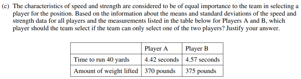
Most students saw that Player A was faster but less strong than Player B.  Students then needed to realize that z-scores would be an effective way to compare the players on the two criteria.  Some students had the intuition that a 5-pound difference in weightlifting amount (B’s advantage over A) is less impressive than a 0.15-second difference in running time (A’s advantage over B), but they needed to justify this conclusion by looking at SDs.  A savvy student might have recognized that part (b) pointed them in a helpful direction by asking explicitly for a z-score calculation and interpretation.

The z-scores for speed turn out to be -1.2 for Player A, -0.2 for Player B.  (Smaller values for time are better, indicating faster speed.)  The z-scores for strength turn out to be 2.4 for Player A, 2.6 for Player B.  Comparing these allows us to say that Player B is only slightly stronger than Player A, but Player A is considerably faster than Player B.  Because the question advised us to consider both criteria as equally valuable, Player A is the better choice.

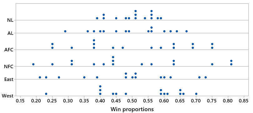
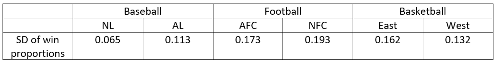
3. I also want students to have a sense for what constitutes a large z-score.  For example, z-scores larger than 3 in absolute value do not come along very often.  This is especially relevant when conducting significance tests for population proportions.  It’s easy for students (and instructors) to get so caught up in blindly following the steps of a significance test that they lose sight of interpreting and drawing a conclusion from a z-score.  A favorite example of mine concerns Hans Rosling, who dedicated his life to increasing public awareness of global health issues and achieved some internet fame for his entertaining and informative TED talks (link).  Rosling and his colleagues liked to ask groups of people: Has the percentage of the world’s population who live in extreme poverty doubled, halved, or remained about the same over the past twenty years?  The correct answer is that this percentage has halved, but only 5% of a sample of 1005 U.S. adults in 2017 got this right.  Rosling liked to say that chimpanzees would do better than people: With only three options, we would expect 33.33% of chimpanzees to answer correctly.

I ask students: How far apart are these proportions: .05 for a sample of U.S. adults versus .3333 for blind guessing? What conclusion about Rosling’s hypothesis can you draw?  Explain how your conclusion follows from that calculation.

This is exactly what a z-score can tell us.  First we need to know the standard deviation of the sample proportion, assuming that people are guessing among the three options.  We could use a simulation analysis to estimate this standard deviation, or we could use the familiar formula that results in:

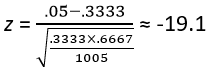
At this point many students would not pause for a moment before proceeding to use software or a graphing calculator or a normal probability table to determine the p-value, but I strongly encourage pausing to think about that enormous z-score!   The observed value of the sample proportion (5% who answered correctly) is 19.1 standard deviations below the value one-third that would be expected from random guessers such as chimpanzees!!*  We don’t need statistical software or an applet or a normal probability table to tell us that this is a HUGE discrepancy.  This means that there’s (essentially) no way in the world that as few as 5% of a random sample would have answered correctly in a population where everyone blindly guesses.  We have overwhelming evidence in support of Rosling’s claim that humans (at least U.S. adults) do worse than guessing (like chimpanzees would) on this question.

* With a z-score of -19.1, I joke with students that writing a correct interpretation with no exclamation points is only worth half-credit.

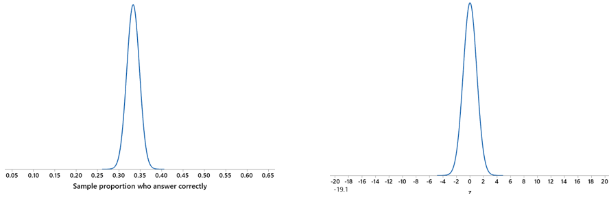
Some normal curve graphs might help to put this in perspective.  The graph on the left below shows the distribution of sample proportions with a sample size of 1005, assuming that the population proportion equals one-third.  We can see that a sample proportion of .05 is extremely far out in the tail.  Equivalently, the graph on the right shows a z-score of -19.1 with a standard normal distribution:

4. Suppose that Arturo and Bella take an exam for which the mean score is 70 and standard deviation of scores is 8.  Arturo’s score on the exam is 75, and Bella’s score is 1.5 standard deviations above Arturo’s score.  What is Bella’s score on the exam?  Show your work.

Notice that this question is not asking for a z-score calculation.  I have recently started to ask this question on exams, because I began to worry that students were simply memorizing the mechanics of calculating a z-score and interpreting the result by rote.  I figured that they might be able to do that without really understanding the concept of “number of standard deviations” away.  By asking for a value that is 1.5 standard deviations away from a value that is not the mean, I think this question assesses student understanding.  I’m happy to say that most of my students were able to answer this question correctly: Bella’s score is 75 + 1.5×8 = 75 + 12 = 87.

Where does this leave us?  Whether your first name is Abel or Allison, Zachary or Zoya, or (most likely) something in between, I hope we can agree that when it comes to teaching introductory statistics, the last letter of the alphabet is not least important.

#7 Two dreaded words, part 2

Last week (here) I suggested that the term standard deviation inspires the most dread in introductory statistics students.  I argued that this is very unfortunate because standard deviation (SD) is simply a measure of variability, the most fundamental concept in statistics.  I proposed some questions that might help students to develop a better understanding of what SD measures.  But none of my questions made use of real data, so l will fix that deficiency here in part two.

But first I want to mention a textbook exercise with real data that I encountered near the beginning of my teaching career in the early 1990s.  The question gave seat belt usage percentages for each of the fifty states.  The data were real, and the context was interesting.  The textbook question asked: Calculate the standard deviation of these 50 seat belt usage percentages.  That’s it.  Students were not asked to interpret the value of the SD.  They were not asked to graph the data and describe the distribution.  They were just asked to calculate the value of an SD for some unspecified reason.  I joked to myself that a student would deserve full credit for answering this textbook exercise not with the requested calculation but with a one-word response: Why?

This reminds me that I used to collect data from my students by asking how many keys they were carrying.  My students would then analyze the data and describe the distribution.  A friend eventually worked up the nerve to ask me that devastating one-word question: Why?  I had to admit that I had no motivating question in mind behind collecting these data, so I realized that it was a pointless exercise and abandoned it.

What’s my point behind these digressions?  First, as I tried to demonstrate in the previous post, I think you can ask good questions without real data.  Second, my point now is that you can ask bad questions with real data. In mathematicians’ words, I believe that using real data is neither necessary nor sufficient for asking good* questions.

* I have not forgotten that I promised in my first post (link) to consider the issue of what makes a question good.  I still promise to come back to that eventually.

Don’t get me wrong: I’m a big proponent of using real data.  Let’s get to some good questions using real data that address the dreaded topic of standard deviation (SD).  As always, questions that I pose to students appear in italics.

People love to talk about the weather as one of the most variable, changeable aspects of the world around us.  In many locations around the world one can hear local residents advise: “If you don’t like the weather right now, just wait an hour.”  But how variable is the weather in different locations?  I went to weather.com to look up the high temperatures for the 28 days of February 2019 for four locations: San Luis Obispo, California; Juneau, Alaska; Princeville, Hawaii; and Sedona, Arizona.  Before we look at the data, make a prediction for the ordering of these four locations in terms of the SD of their February high temperatures.

I don’t really care whether students know much about the weather in these places, although I encourage them to discuss this with each other.  Then I show them this graph of the data:

Based on what this graph reveals, put these locations in order from smallest to largest SD of their daily February temperatures.

Now I do care that students can read the graphs properly and understand the relative amounts of variability in these distributions.  San Luis Obispo (SLO) and Princeville clearly have less variability in temperatures than Juneau and Sedona, despite having higher temperatures on average.  Princeville has slightly less variability than SLO.  If you do not like high temperatures between 70 and 80 degrees, then do not spend February in Princeville!  On the other hand, if you want to experience a variety of temperatures, consider spending February in Sedona, where high temperatures ranged from 35 to 66 degrees, giving Sedona the most variability among these locations.  Here are the SDs, in order from smallest to largest:

What if we looked at daily high temperatures in July instead of February?  Would we see a very different story or a similar one?  More specifically: Which of these four locations would you predict to have a larger SD in July than in February?  Which would you predict to have a smaller SD?  What is your predicted ordering of the four locations by SD of daily July temperatures?

Let’s look at a graph of the data:

With the benefit of seeing this graph, re-answer the previous questions.

Now you’d better avoid Princeville if you cannot abide high temperatures between 82 and 85 degrees!  In fact, the variability in Princeville’s high temperatures has gone from small in February to miniscule in July, with an SD of less than 1 degree.  Sedona’s variability has also decreased considerably, even as its temperatures have soared into the 90s and low 100s.  On the flip side, temperatures in San Luis Obispo and Juneau are more variable (substantially for SLO, slightly for Juneau) in July than they were in February.

Here are the new SDs, which reveal that Sedona’s temperature variability has dropped from the highest to second lowest:

One final observation and question for students before we leave these data behind: Sedona’s smallest high temperature in July 2019 was 82 degrees, which occurred on the very last day of the month.  What would happen to Sedona’s SD of July temperatures – decrease or increase or remain pretty much the same – if we were to remove the 82 value?

Removing that outlier would decrease the variability considerably and so would decrease the SD.  It turns out that the decrease in SD would be from 4.69 degrees to 3.73 degrees, less than half of the SD value from February in Sedona.

Students can be encouraged to extend this analysis outside of class.  They could use weather.com to collect their own data to analyze, perhaps from other locations across the country or other parts of the world.  They could also analyze temperatures for different months, or for the same month across different years.  They could also analyze weather data other than daily high temperatures.

Now let’s move to sports, where a popular word is parity.  This means that teams in a league are roughly evenly matched, which allows fans of many teams to entertain somewhat realistic hopes of winning a championship.  Do some sports and some leagues/conferences have more parity than others?

I investigated this question by recording the win proportion* for each team in the 2018 Major League Baseball season.  Then I grouped the teams according to whether they are in the National League (NL) or American League (AL).  The purpose is to see whether one league or the other has substantially more parity among its teams’ win proportions.

* For example, the Boston Red Sox achieved the best win-loss record of 108-54, for a win proportion of 108/162 ≈ 0.667.  On the other extreme, the Baltimore Orioles had the worst win-loss record of 47-115, for a win proportion of 47/162 ≈ 0.290.

The first question for students is: Would a smaller or larger SD of win proportions indicate greater parity in a sports league?  Most students realize that greater parity means less variability, which requires a smaller SD.

The next question is for baseball fans only: Make an educated guess for which league – NL or AL – had a smaller SD of its teams’ win proportions in the 2018 season.

Let’s look at a graph of the distributions of win proportions for the two leagues:

Now we arrive at the key question for all students, not just baseball fans: Based on the graph, which league had a smaller SD of win proportions?

Most students correctly realize that the National League (NL) has a considerably smaller SD of win proportions, and therefore more parity, than the American League (AL).  Teams were generally much closer in their win proportions, and therefore more middle-of-the-pack in quality, in the NL.  In fact, 14 of 15 teams in the NL won between 40% and 60% of their games.  (Only the Miami Marlins missed out, and just barely, with their 0.391 win proportion.)  In contrast, only 8 of 15 AL teams won between 40% and 60% of their games.  The AL was more of a feast-or-famine league, as it was home to the four teams with the best win proportions (Boston Red Sox, Houston Astros, New York Yankees, Oakland Athletics) and the three teams with the worst win proportions (Baltimore Orioles, Kansas City Royals, Chicago White Sox).

The SDs of the win proportions turn out to be .065 in the NL, .113 in the AL.  Then I ask students: Calculate the percentage difference in these SD values.  This is not trivial for most introductory students, and I plan to devote a future post to this under-appreciated topic.  The calculation of this percentage difference is: (.113 – .065) / .065 ≈ .738 × 100% = 73.8%.  Interpret this value in this context.  The SD of win proportions in the AL was 73.8% larger than the SD of win proportions in the NL.  This seems like a very large discrepancy in parity between the two leagues.

Let’s look at two other sports: football and basketball.  I gathered the same kind of data on win proportions for the 2018 National Football League (NFL) season and the 2018-19 National Basketball Association (NBA) season.  Let’s start with some questions for sports fans: How do you expect the SDs of win proportions to compare across the three sports: baseball, football, basketball?  Within football and basketball, do you expect to see much of a difference in the SDs of win proportions between the two conferences?  In which of the three sports do you expect to see the largest discrepancy in SDs of win proportions between the two leagues/conferences?

Then I ask all students to answer these questions based on the following graph of the data (where the top two dotplots are for the two baseball leagues, the next two are for the two football conferences, and the bottom two are for the two basketball conferences):

What do we see here?  First, baseball has the least variability in win proportions, and football has the most variability. This makes sense in terms of the number of games in each sport’s season: Baseball has the longest season (162 games), followed by basketball (82 games) and finally football (16 games).  Second, football and basketball do not have the large discrepancy in SDs between their conferences that baseball has between its leagues.  The AFC appears to have a slightly smaller SD than the NFC in football, and the Western conference appears to have a slightly smaller SD than the Eastern conference in basketball.  The following SD values bear this out:

As with the weather data, students could be encouraged to extend this analysis to other sports data that they could collect.  They could analyze other sports, perhaps at college or high school levels, or other years, or use a different variable than win proportions.

Almost all of these questions, for both weather and sports, have boiled down to asking: Look at the graph of the distributions, and arrange the groups in order according to magnitude of their SDs.  So, if that’s all the questions asked, why is the length of this post surpassing 2000 words?  I like to think that this illustrates one of the great things about using real data: The context can pull you in, inspiring you* to explore more aspects and analyze additional data in the hope of gaining more insights.

* And your students!

P.S. The datasets that I analyzed in this post can be downloaded from the links below.

#6 Two dreaded words, part 1

Which two-word term produces more anxiety and negative feelings among introductory statistics students than any other?

I don’t think correlation coefficient produces the most negative feelings, or confidence interval, or even hypothesis test.  I don’t think random sample achieves maximum anxiety, or observational study, or expected value, or even confounding variable.  No, my bet is that standard deviation makes students shiver with fear and cringe with distaste more than any other two-word term, perhaps even long after they have completed their statistics course*.

Why is this so unfortunate?  Because variability is the single most fundamental concept in statistics, and the most common measure of variability is … (brace yourself) … standard deviation.

* If you would vote for sampling distribution, I see your point.  But I don’t think sampling distribution comes up outside of a statistics classroom nearly as much as standard deviation.  Trust me: I’ll have lots to say about teaching sampling distributions in later posts.

The formula for standard deviation (allow me to abbreviate this as SD for the rest of this post) can certainly look intimidating:

Expressing this as an algorithm does not make it any more palatable:

  1. Subtract the mean from each data value.
  2. Square each difference.
  3. Add them up.
  4. Divide by one less than the sample size.
  5. Take the square root.

What to do?  I recommend asking questions that help students to understand what SD is all about, rather than wasting their time with calculating SD by hand.  Here are ten questions that try to do this:

1. Suppose that Samira records the ages of customers at the Snack Bar on a college campus from 12-2pm tomorrow, while Mary records the ages of customers at the McDonald’s near the highway at the same time.  Who will have the larger SD of their ages – Samira or Mary?  Explain why.

Mary is likely to encounter people of all ages at McDonald’s – from toddlers to senior citizens and every age in between.  Samira might run into some toddlers and senior citizens at the on-campus snack bar, but she’ll mostly find a lot of people in the 18-25-year-old age group.  Because the ages of McDonald’s customers will vary more than ages of Snack Bar customers, Mary will have a larger SD of ages than Samira will.

2. Suppose that Carlos and Hector visit their local humane society animal shelter.  Carlos records the weights of the 25 cats that they find there, and Hector records the weights of the 25 human beings that they encounter.  Who will have the larger SD of their weights Carlos or Hector?

This question is getting at the same understanding as the previous one*. Most students are quick to realize that the weights of human beings vary much more than the weights of ordinary domestic cats, so Hector will have a larger SD than Carlos.

* But this question involves cats, and I like cats!  I plan to devote a future post to nothing but questions that involve cats in one way or another.

3. Draw four rectangles so that the SD of their widths is greater than the SD of their heights.  This question was sent to me by Camille Fairbourn and John Keane in their proposal to conduct a breakout session at the 2019 U.S. Conference on Teaching Statistics* (link).  They later told me that the original source for the question is the Illustrative Mathematics project (link). I especially like this question because if you understand the concept of SD, you can answer this question correctly with a moment’s thought and less than a minute of time to draw the rectangles.  But if you do not understand the concept, you’re not going to succeed by (accidentally) drawing the rectangles correctly by random chance.

* If you want to impress me with a proposal for a session in a conference that I am chairing: Ask good questions!

4. Consider the following dotplots of customer ratings (on a scale of 1 – 5) of four restaurants (A – D).  Arrange the four restaurants in order from smallest SD to largest SD, without performing any calculations.

First notice that all four restaurants have an average (mean) rating of 3, right in the middle of the scale.  I hope that this helps students to focus on variability as the key idea here.

Let’s start with ratings of restaurant B, which display no variability whatsoever, because all 10 customers gave a mediocre rating of 3.  On the other extreme, customers disagree very strongly about restaurant C, with half giving a stellar rating of 5 and the other half giving a lousy rating of 1.  These extreme cases reveal that the SD is smallest for B and largest for C.

What about restaurants A and D?  Remember that the average (mean) rating is 3 for both, and notice that A has more ratings near the middle while D has more ratings on the ends.  In fact, you could produce the distribution for A by starting with D and moving one of the 1s and one of the 5s to 3.  Therefore, the SD is smaller for A than for D.   The correct ordering, from smallest SD to largest SD, is: B – A – D – C.

Many students struggle with this question, even when I encourage them to discuss it in groups.  I think one of their primary difficulties is appreciating that I am asking about the variability in the ratings.  Some students seem to think that the question is about variability in the frequencies (counts), so they think D shows no variability because the frequency is the same for each rating score (2 customers gave each possible rating score from 1 – 5).  Other students seem to think that variability refers to the number of different rating scores used, so they think that A has more variability than C because A’s customers used all five ratings scores whereas C’s customers only used the values 1, 3, and 5.

If you’re really intent on having students calculate an SD or two by hand, you might do that for the ratings of restaurants B and C here.  The calculation is very easy for B, because every customer gave a rating of 3, so the mean is 3, so all of the deviations from the mean are 0, so the SD = 0.  For restaurant C, the five ratings of 5 all have a squared deviation of 22 = 4, and the five ratings of 1 all have a squared deviation of (-2)2 = 4.  The sum of squared deviations is therefore 10×4 = 40.  Dividing by one less than the sample size gives 40/9 ≈ 4.444.  Taking the square root gives SD ≈ 2.108.  We often say the SD “sorta-kinda” represents a typical deviation from the mean, so close to 2 seems about right for the SD of ratings in restaurant C.

The numerical values of these SDs turn out to be 0.000 for B, 1.115 for A, 1.491 for D, and 2.108 for C.

5. Now let’s throw a fifth restaurant into the mix.What about the SD of ratings for restaurant E below – where does that fall in the ordering among restaurants A-D?

Some students are fooled by the “bumpiness” of the distribution of ratings for restaurant E, because the frequencies/counts bounce up from a rating of 1 to a rating of 2, and then down to a rating of 3, and then back up to 4 and back down to 5.  But as we noted above, we need to focus on the variability of the ratings, not the variability of the frequencies.  Restaurant E’s ratings have more variability than B’s and less than C’s, but how do they compare to A and D?  Notice that you could create E’s distribution from D’s by moving a rating of 1 to a rating of 2 and a rating of 5 to a rating of 4.  So, E has less variability than D.  But E has more variability than A, because you could also create E’s distribution from A’s by moving one rating of 3 to 2 and another rating of 3 to 4.  The SD of the ratings for restaurant E turns out to be 1.247.

6. Can SD ever equal zero?  Under what circumstances?

Sure.  All that’s needed for an SD to equal zero is for the data to display no variability whatsoever.  In other words, SD = 0 when all of the data values equal the same value, as we saw with ratings of restaurant B above.

7. Can SD ever be negative?  Under what circumstances?

No, an SD value can never be negative.  Data cannot have less than no variability, so 0 is the smallest possible value for an SD.  Mathematically, the formula for SD involves squaring deviations from the mean; those squared values can never be negative.

8. If I were to add 5 points to the exam score of every student in my class, would the SD of the exam scores increase, decrease, or remain the same?  Explain why.

Adding 5 points to every exam score would shift the distribution of scores to the right by 5 points, and it would increase the average (mean) score by 5 points.  But the amount of variability in the exam scores would not change, so the SD would not change.

9. If I were to double the exam score of every student in my class, would the SD of the exam scores increase, decrease, or remain the same?  Explain why.

Doubling the exam scores increase their variability, so the SD would increase*.  To be more precise, the SD would double.  If you’re teaching a course for mathematically inclined students, you could ask them to derive this result from the formula, but I don’t recommend that for students in a typical “Stat 101” course.

* Some of you may be thinking that if every student earned identical exam scores in the first place, then doubling the scores would not increase the SD, because the SD would still equal zero.

10. If I were to add 500 points to the exam score for one lucky student in my class, would the SD of the exam scores change very much?  Explain your answer.

Yes, such an incredibly extreme outlier would have a massive impact on the SD.  How can you tell?  Because the mean would be greatly affected by the enormous outlier, and so deviations from the mean would also be affected, and so squared deviations would be all the more affected.  In other words, SD is not at all resistant to outliers.

There you have it – ten questions to help students make sense of standard deviation.  But wait a minute – there’s no real data in any of these examples!  That’s a fair criticism, but I think these questions can nevertheless be effective for developing conceptual understanding (recommendation #2 in the GAISE report, link).  Of course, we can ask good questions that develop conceptual understanding and use real data (GAISE recommendation #3).  But this post has already gotten pretty long.  Please stay tuned for next week’s installment, which will feature questions with real data that seek to develop students’ understanding of the dreaded standard deviation.

#5 A below-average joke

I sometimes joke that when I moved from Pennsylvania to California, the average IQ dropped in both states*.  Then I follow up in class with my students (after the uproarious laughter subsides) by asking:

Is it actually possible, in principle anyway, for the average IQ to decrease in both states when a person moves from Pennsylvania to California?  If so, what would have to be true for this to happen?

I encourage students to think about this for a minute and then discuss it with someone nearby.  I want students to realize that this phenomenon could in fact happen, provided that my IQ was greater than the average IQ in Pennsylvania and less than the average IQ in California.

* For my friends and blog followers in Pennsylvania, please forgive me!  You are quite welcome to tell your students that the average IQ increased in both states when I moved.  You might begin the story by saying “a statistics-teacher-who-seems-to-think-he’s-funny-but-actually-isn’t sometimes jokes that when he moved …”.

Here’s a follow-up question:

Let’s say that my average class size in Pennsylvania was 24 students per class, and my average class size in California has been 36 students per class.  Does it therefore follow that the average class size across my teaching career has been 30 students, the average of 24 and 36?  What additional information (if any) is needed to determine the overall average?

This question is more challenging than the previous one.  Again I urge students to discuss this with each other, and most come to recognize that calculating an overall average by taking the average of two group averages will only work if the two groups have the same sample size.

Then I tell my students that I have taught for more years in California (18) than in Pennsylvania (12), and I also teach more classes per year in California than I did in Pennsylvania.  This leads to my asking:

Is the average class size for my career is closer to 24 or 36 students per class?

Because I have taught more classes in California than I did in Pennsylvania, the average class size for my career will be closer to the California average of 36 students per class than the Pennsylvania average of 24.

I realize that these questions might not work as well for you, lacking the autobiographical element.  My point is that even though students begin to learn about averages in early grades, we can ask good questions that lead students to understand more subtle properties of how averages work.  Here are some more questions along these lines:

Suppose that the average (mean) house price in a community is $425,000.  Does it follow that half of the houses cost more than $425,000?

No, this does not follow.  Half of the houses would cost more than the median, but the mean could be quite different from the median.

Do you suspect that more or less than 50% of the houses cost more than the average (mean), and why?  (Hint: Think about the likely shape for the distribution of house prices.)

This question requires a lot more thought than the previous one. The distribution of house prices is likely to be skewed to the right, because some houses cost millions of dollars whereas there’s a lower bound on how little a house can cost (zero, for an extreme lower bound).  With a skewed right distribution, the mean is typically greater than the median, so less than 50% of the houses would cost more than the mean.

Is it possible for 90% of a company’s employees to earn less than the average (mean) salary in the company?

Yes.  A few outliers on the high end, or a strong enough right skew of the salary distribution, could pull up the mean so much that a large majority of employees earn less than the average salary.

Is this possibility only a mathematical curiosity, or is it actually quite plausible?

This is quite plausible, because the salaries of a few highly paid executives could make this happen.

Construct a hypothetical example for a company with ten employees to illustrate this property.

Some students find this to be challenging, and I again encourage them to discuss it in groups.  We can construct a fairly simple example by supposing that the company president earns a salary of $500K (K = thousand) per year and her nine employees each earn a salary of $100K per year.  Then the sum of these salaries (in thousands of dollars) is 500K + 9×100K = 1400K, which produces an average of 1400K/10 = 140K dollars.  All nine of the employees earning $100K earn less than the average, so 90% of the employees earn less than the average.

Now let’s consider a more challenging set of questions in a context with which students have considerable experience: class sizes.  Suppose that a total of 150 students at a college are taking a statistics course.  The college offers five sections of the course, each taught by a different instructor.  The class sizes are shown in the following table and graph:

SectionABCDE
Number of students1515151590

Think about the average class size (number of students in a class) at the college.

What is the average class size, per instructor, across the five instructors?

This one is easy: The total number of students is 90 + 15 + 15 + 15 + 15 = 150, so the average class size per instructor (or per section) is 150/50 = 30 students.  The college can truthfully advertise 30 as its average class size.

Now look at class size from the students’ perspective.  Across these 150 students, what is the average size, per student, of their statistics class?

This is much harder. We now need to consider 150 data values, with each student reporting how many students are in their statistics class.  The graph of this distribution is very different from the previous one:

Whereas the previous graph (with sections/instructors as the observational units) was heavily weighted toward the low end of 15 students in a class, this new graph (with individual students as the observational units) is weighted more toward the high end with 90 students in a class.   We can anticipate that the average class size will now be much larger than it was before.  You might want to remind students at this point that the mean/average can be thought of as the balance point of the distribution.

Calculating the average requires adding up the 150 values, which sounds quite daunting, but let’s think it through:

  • The 90 students in Class A all have 90 students in their class, so all 90 of these students will report the value 90.  Adding up these 90 values of 90 gives 90×90  = 8100.
  • The other 60 students (in Classes B-E) all have 15 students in their class, so all 60 of these students will report the value 15.  Adding up these 60 values of 15 gives 60×15 = 900.
  • The sum of these class size values for the entire group of 150 students is therefore 8100 + 900 = 9000.
  • Dividing by 150 to calculate the average gives 9000/150 = 60 students in an average class, from the students’ perspective.

Comment on how these two average class sizes compare, and explain why they differ as they do.  Which average would you say is more relevant?

From the students’ perspective, the average class size is not even close to 30!  In fact, it’s twice that size.  Some students (60 of them, which is 40% of the total of 150 students) have the benefit of a small class size of 15.  But most students (90 of them, which is 60% of the students) are stuck in a large class of 90 students.  In other words, most students would be pretty seriously misled if they chose this college based on the advertised average class size of 30 students per class.  From the students’ perspective, it seems that 60 is the more relevant average to report.

How many of the 150 students are in a class with the average class size, for either version of the average?

Zero.  None of the 150 students are in a 30-student class or a 60-student class.  They are all in either a 90-student class or a 15-student class.  This again illustrates, as we emphasized in the previous post (here), that averages are of limited value because they say nothing about variability and nothing about the distribution.

Calculate the median class size from each perspective.  Comment on how the medians compare to each other and to the averages (means).

From the perspective of the five instructors, the median class size is 15.  From the perspective of the 150 students, the median class size is 90.  The median is considerably less than the mean from the instructors’ perspective, and the median is much greater than the mean from the students’ perspective.

What’s the point of my asking these questions about class size?

  1. We can ask questions about averages that get beyond basic calculations, leading students to explore and develop an understanding of the concept of averages.  Focusing on conceptual understanding is the second GAISE recommendation (here), after the recommendation to teach statistical thinking that was emphasized in posts #3 and #4.
  2. We always need to be careful with our language, especially to make clear what the observational units in a statistical study are.  In this case, we need to be clear about whether the observational units are the five instructors/sections or the 150 students.  The analysis of average class size differs considerably depending on which perspective we take We can ask questions about averages that get beyond basic calculations and lead students to explore and understand more complicated aspects of averages.
  3. As I emphasized in the previous post about cancer pamphlets (here), measures of center don’t tell the whole story.  Variability is crucial to consider, and distribution also matters a lot. We can ask questions about averages that get beyond basic calculations and lead students to explore and understand more complicated aspects of averages.

P.S. I first read about calculating average class sizes from both students’ and instructors’ perspectives in a review of introductory textbooks by George Cobb that appeared in JASA in 1987.  George praised a textbook by Wonnacott and Wonnacott for including questions about this.  George’s review made a big impact on my teaching career, particularly his mantra, repeated throughout the review: Judge a book by its exercises, and you cannot go far wrong.  This sage advice strongly influenced the development of my teaching philosophy*.

* In case you missed it: Ask good questions.