Skip to content

Archive for

#61 Text as data

This guest post has been contributed by Dennis Sun.  You can contact him at dsun09@calpoly.edu

Dennis Sun is a colleague of mine in the Statistics Department at Cal Poly. He teaches courses in our undergraduate program in data science* as well as statistics. Dennis also works part-time as a data scientist for Google. Dennis is a terrific and creative teacher with many thought-provoking ideas. I am very glad that he agreed to write this guest post about one aspect of his introductory course in data science that distinguishes it from most introductory courses in statistics.

* My other department colleague who has taught for our data science program is Hunter Glanz, who has teamed with Jo Hardin and Nick Horton to write a blog about teaching data science (here).


I teach an “Introduction to Data Science” class at Cal Poly for statistics and computer science majors. Students in my class are typically sophomores who have at least one statistics course and one computer science course under their belt. In other words, my students arrive in my class with some idea of what statistics can do and the programming chops to execute those ideas. However, many of them have never written code to analyze data. My course tries to bring these two strands of their education together.

Of course, many statisticians write code to analyze data. What makes data science different? In my opinion, one of the most important aspects is the variety of data. Most statistics textbooks start by assuming that the data is already in tabular form, where each row is an observation and each column is a variable. However, data in the real world comes in all shapes and sizes. For example, an audio file of someone speaking is data. So is a photograph or the text of a book. These types of data are not in the ready-made tabular form that is often assumed in statistics textbooks. In my experience, there is too much overhead involved to teach students how to work with audio or image data in an introductory course, so most of my non-standard data examples come from the world of textual data.


I like to surprise students with my first example of textual data: Dr. Seuss books. Observations in this “dataset” include:

  1. “I am Sam. I am Sam. Sam I am….”
  2. “One fish, two fish, red fish, blue fish….”
  3. “Every Who down in Whoville liked Christmas a lot….”

and so on. To analyze this data using techniques they learned in statistics class, it first must be converted into tabular form. But how?

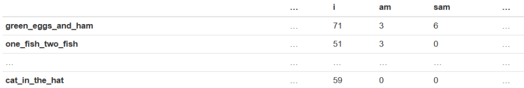
One simple approach is a bag of words. In the bag of words representation, each row is a book (or, more generally, a “document”), and each column is a word (or, more generally, a “term”). Each entry in the table is a frequency representing the number of times a term appears in a document. This table, called the “term-frequency matrix,” is illustrated below:

The resulting table is very wide, with many more columns than rows and most entries equal to 0. Can we use this representation of the data to figure out which documents are most similar? This sparks a class discussion about how and why a data scientist would do this.

How might we quantify how similar two documents are? Students usually first propose calculating some variation of Euclidean distance. If xi represents the vector of counts in document i, then the Euclidean distance between two documents i and j is defined as:

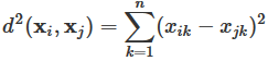
This is just the formula for the distance between two points that students learn in their algebra class (and is essentially the Pythagorean theorem), but the formula is intimidating to some students, so I try to explain what is going on using pictures. If we think of xi and xj as vectors, then d(xi, xj) measures the distance between the tips of the arrows.

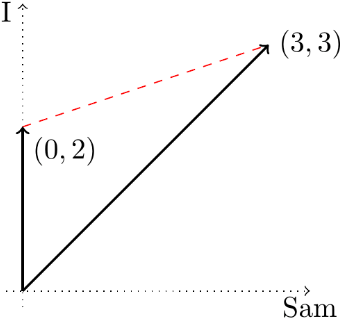
For example, suppose that the two documents are:

  1. “I am Sam. I am Sam. Sam I am.”
  2. “Why do I like to hop, hop, hop? I do not know. Go ask your Pop.”

and the words of interest are “Sam” and “I.” Then the two vectors are x1 = (3,3) and x2 = (0,2), because the first document contains 3 of each word, and the second includes no “Sam”s and two “I”s.  These two vectors, and the distance between them, are shown here:

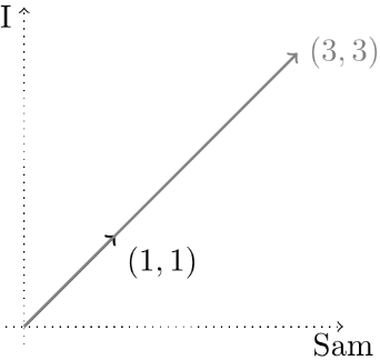
At this point, a student will usually observe that the frequencies scale in proportion to the length of the document. For example, the following documents are qualitatively similar:

  1. “I am Sam.”
  2. “I am Sam. I am Sam. Sam I am.”

yet their vectors are not particularly close, since one vector is three times the length of the other:

How could we fix this problem?  There are several ways. Some students propose making the vectors the same length before comparing them, while others suggest measuring the angles between the vectors. What I like about this discussion is that students are essentially invoking ideas from linear algebra without realizing it or using any of the jargon. In fact, many of my students have not taken linear algebra yet at this point in their education. It is helpful for them to see vectors, norms, and dot products in a concrete application, where they arise naturally.

Why would anyone want to know how similar two documents are? Students usually see that such a system could be used to recommend books: “If you liked this, you might also like….”* Students also suggest that it might be used to cluster documents into groups**. However, rarely does anyone suggest the application that I assign as a lab.

* This is called a “recommender system” in commercial applications.

** Indeed, a method of clustering called “hierarchical clustering” is based on distances between observations.


We can use similarity between documents to resolve authorship disputes. The most celebrated example concerns the Federalist Papers, first analyzed by statisticians Frederick Mosteller and David Wallace in the early 1960s (see here). Yes, even though the term “data science” has only become popular in the last 10 years, many of the ideas and methods are not new, dating back over 50 years. However, whereas Mosteller and Wallace did quite a bit of probability modeling, our approach is simpler and more direct.

The Federalist Papers are a collection of 85 essays penned by three Founding Fathers (Alexander Hamilton, John Jay, and James Madison) to drum up support for the new U.S. Constitution.* However, the essays were published under a pseudonym “Publius.” The authors of 70 of the essays have since been conclusively identified, but there are still 15 papers whose authorship is disputed.

* When I first started using this example in my class, few students were familiar with the Federalist Papers. However, the situation has greatly improved with the immense popularity of the musical Hamilton.

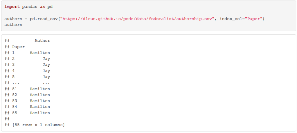
I give my students the texts of all 85 Federalist papers (here), along with the authors of the 70 undisputed essays:

Their task is to determine, for each of the 15 disputed essays, the most similar undisputed essays. The known authorships of these essays are then used to “vote” on the authorship of the disputed essay.

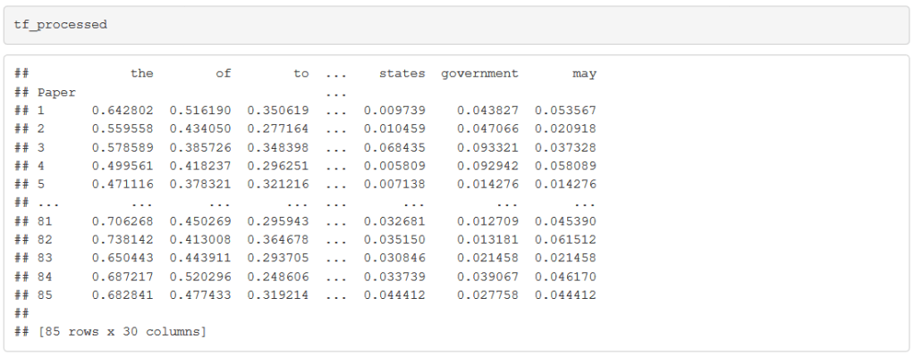
After writing some boilerplate code to read in and clean up the texts of the 85 papers, we split each document into a list of words and count up the number of times each word appears in each document. My students would implement this in the programming language Python, which is a general-purpose language that is particularly convenient for text processing, but the task could be carried out in any language, including R.

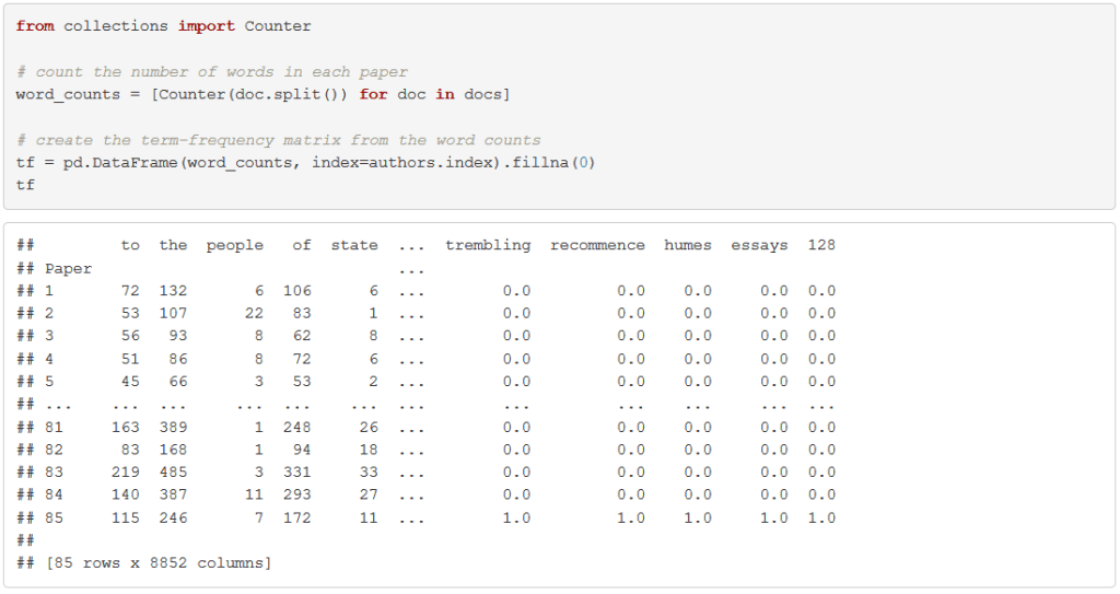
Rare context-specific words, like “trembling,” are less likely to be a marker of a writer’s style than general words like “which” or “as.” We restrict to the 30 most common words. We also normalize the vectors to be the same length so that distances are invariant to the length of the document. We end up with a table like the following:

Now, let’s look at one of the disputed papers: Federalist Paper #18. We calculate the Euclidean distance between this document and every other document:

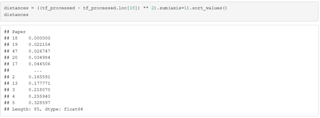
Of course, the paper that is most similar to Paper #18 is … itself. But the next few papers should give us some useful information. Let’s grab the authors of these most similar papers:

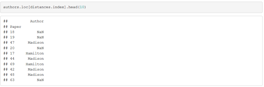
Although the second closest paper, Paper #19, is also disputed (which is why its author is given as the missing value NaN), the third closest paper was definitively written by Madison. If we look at the 3 closest papers with known authorship, 2 were written by Madison. This suggests attributing Paper #18 to Madison.

What the students just did is machine learning—training a K=3-nearest neighbors classifier on the 70 undisputed essays to predict the authorship Paper #18 — although we do not use any of that terminology. I find that students rarely have trouble understanding conceptually what needs to be done in this concrete problem, even if they struggle to grasp more abstract machine learning ideas such as training and test sets. Thus, I have started using this lab as a teaser for machine learning, which we study later in the course.


Next I ask students: How could you validate whether these predictions are any good? Of course, we have no way of knowing who actually wrote the disputed Federalist Papers, so any validation method has to be based on the 70 papers whose authorship is known.

After a few iterations, students come up with some variant of the following: for each of these 70 papers, we can find the 3 closest papers among the other 69 papers. Then, we can validate the prediction using these 3 closest papers against the known author of the paper, producing a table like the following:

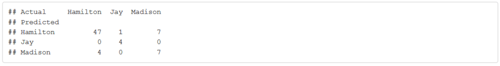
In machine learning, this table is known as a “confusion matrix.” From the confusion matrix, we try to answer questions like:

  1. How accurate is this method overall?
  2. How accurate is this method for predicting documents written by Madison?

Most students assess the method overall by calculating the percentage of correct (or incorrect) predictions, obtaining an accuracy of 67/70 ≈ 96%.

However, I usually get two different answers to the second question:

  • The method predicted 15 documents to be written by Madison, but only 13 were. So the “accuracy for predicting Madison” is 13/15 ≈ 87%.
  • Madison actually wrote 14 of the documents, of which 13 were identified correctly. So the “accuracy for predicting Madison” is 13/14 ≈ 93%.

Which answer is right? Of course, both are perfectly valid answers to the question. These two different interpretations of the question are called “precision” and “recall” in machine learning, and both are important considerations.

One common mistake that students make is that they will include paper i itself as one of the three closest papers to paper i. They realize immediately why this is wrong when this is pointed out. If we think of our validation process as an exam, it is like giving away the answer key on an exam! This provides an opportunity to discuss ideas such as overfitting and cross-validation, again at an intuitive level, without using jargon.*

* The approach of finding the closest papers among the other 69 papers is formally known as “leave-one-out cross validation.”


I have several more labs in my data science class involving textual data. For example, I have students verify Zipf’s Law (learn about this from the video here) for different documents. A student favorite, which I adapted from my colleague Brian Granger (follow him on twitter here) is the “Song Lyrics Generator” lab, where students scrape song lyrics from their favorite artist from the web, train a Markov chain on the lyrics, and use the Markov chain to generate new songs by that artist. One of my students even wrote a Medium post (here) about this lab.

Although I am not an expert in natural language processing, I use textual data often in my data science class, because it is both rich and concrete. It has just enough complexity to stretch students’ imaginations about what data is and can do, but not so much that it is overwhelming to students with limited programming experience. The Federalist Papers lab in particular intersects with many technical aspects of data science, including linear algebra and machine learning, but the concreteness of the task allows us to discuss key ideas (such as vector norms and cross-validation) at an intuitive level, without using jargon. It also touches upon non-technical aspects of data science, including the emphasis on prediction (note the conspicuous absence of probability in this blog post) and the need for computing (the texts are long enough that the term frequencies are not feasible to count by hand). For students who know a bit of programming, this provides them with an end-to-end example of how to use data to solve real problems.

This guest post has been contributed by Dennis Sun.  You can contact him at dsun09@calpoly.edu

#60 Reaching students online

This guest post has been contributed by Kelly Spoon.  You can contact her at kspoon@sdccd.edu.

Kelly Spoon teaches statistics in San Diego, at a two-year college (San Diego Mesa College) and for an AP Statistics class (Torah High School of San Diego).  I met Kelly through twitter (@KellyMSpoon), where she shares lots of ideas about teaching statistics and mathematics, and at the AMATYC conference in Milwaukee last fall.  Kelly has since hosted me to give a workshop for her colleagues in San Diego and to conduct a review session for her AP Statistics students via zoom.  Kelly is very passionate about teaching statistics, dedicated to helping all students succeed, and knowledgeable about content and pedagogy.  I am very glad that she agreed to contribute this guest blog post on the very timely topic of teaching statistics (and reaching students) online*.

* Speaking of timely, my first taste of online teaching will begin three weeks from today.


When Allan asked if I would write a guest blog post, I didn’t hesitate to email back with an emphatic yes. Not only because I owe him for presenting to faculty at my college AND doing a review for my AP Statistics students, but because I’m always excited to share my passion for teaching statistics.

Then the actual writing started, and I immediately regretted this decision. There’s just too much to share in such a short space. In the end, I wrote an entirely too long blog post for which Allan suggested some minor edits to fit a theme of fearlessness. I asked myself: What does it mean to teach fearlessly?

To me, the broadest definition is a willingness to thoughtfully try new things – whether tools, policies, assessments, or formats. And at this point, most of us fit that definition by the circumstances of distance learning that have been thrust upon us. Now that I’m a week into a new completely online semester, my previous draft felt like it was missing what most of us want to know right now: How do we teach statistics online?

After having a successful first week of the new fall term that mostly gave me energy rather than leaving me feeling drained (as most of last spring’s emergency remote classes did), I thought I’d share some insights as to how I made that first week work for me. To keep with the theme of this blog, these insights are presented as answers to questions that you might ask yourself as you’re designing your online statistics course. I hope these questions are generic enough to stand the test of time to remain relevant when we’re back in a classroom.


1. Cultivating curiosity

Knowing where you want to end up (your desired outcomes) is crucial when designing a course or individual lesson, but the starting point is sometimes overlooked. As you think about your course, whether you’re meeting in person, on Zoom, or you don’t have scheduled meetings, ask yourself: Does my lesson plan make students want to learn more?

This is where Allan’s blog comes in handy. He has many great examples of good questions that truly spark curiosity, often without requiring a deep understanding of the subject matter to start. However, simply including good questions in a lecture allows students to opt out and wait for the professor or another student to do the thinking for them. Simulation-based inference and the many awesome applets that exist in that same vein are one great way to build curiosity for theory-based inference. Regardless of class modality, one of my favorite tools for sparking curiosity is the activity builder in Desmos.

If you haven’t tried out the Desmos Activity Builder (here), you’re missing out. This one tool can answer questions such as: How do I do activities if I’m teaching online? What if I want to assign activities as homework? What if I don’t want to buy Hershey’s Kisses to make confidence intervals for the proportion that land on their base? The Desmos activity builder allows you to add math, graphs, tables, video, images, text to slides for students to work through. You can have students input math, graphs, tables, text, answer multiple choice, multiple selection, reorder selections, even doodle on a graph or image. That was quite the list. See the image below for a visual of all the things you can add to an activity in Desmos:

On the instructor end, you can see exactly where students are (so it’s great to use if you’re meeting with students at a particular time which we all now know is called synchronous) – I use this to pause the activity and debrief when most students have reached a particular point or nudge those students who seem to be stalled. You can also see student work in real-time and provide them feedback directly in the activity. And many activities have been designed to combine data from across the entire class, allowing you to recreate some favorite in-person activities in an online space.

Here are a few Desmos activities that I’ve created, used, or plan to use to build curiosity:

a) Reading Graphs (here)

This activity was inspired by a workshop on culturally responsive teaching. These graphs and questions appear in my lecture notes before we discuss displays for data. Typically, I have students work in groups of four to answer all of the questions for their graph. Then we do a numbered-head protocol (they number themselves 1-4, and I use a random number generator on the projector to choose a victim to report out) to debrief the activity.  I show them that they already know most everything in that section of the lecture notes, with the added bonus of being able to bring in topical graphs*, including ones on social justice issues. For my asynchronous classes, students go through this activity on their own but can see other student responses once they share. For my synchronous class, I occasionally “pause” the activity to discuss some of the responses to a particular graph.  For instance, the following bar chart of children in poor families leads to so many more questions than answers: What defines a family as poor? Are the observational units the children or the families? Does it matter? What if the parents have different education levels? Where are the other 8%?!

* Please ignore the titanic mosaic plot; I really haven’t found better.

b) Skew the Script – Lesson 1.1 (here)

I just found this activity, despite being a longtime fangirl of @AnkerMath on twitter. Skew the Script (here) has a great curriculum created for AP Statistics with student and instructor resources that strive to make the content relevant. It focuses on using real-world examples and creating equity-driven lessons. This particular exercise has students analyze and describe the problems with a lot of bad graphs. I plan on starting off the 2nd week with this one! I’ll tweet how it goes.

c) Does Beyoncé Write Her Own Songs? (here)

This activity is taken entirely from StatsMedic (here) and adapted for Desmos by Richard Hung (find him on twitter here). StatsMedic is built on a framework of “experience first, formalize later” (EFFL), so their entire curriculum – which they provide for free on their site – is inherently designed to build curiosity. For this particular activity, I’ve edited it a bit to bring in some Allan-inspired questions, like identifying observational units and variables (see post #11, Repeat after me, here). This activity is a variation of Allan’s Gettysburg Address activity (see post #19, Lincoln and Mandela, part 1, here) or the Random Rectangles* activity, and is great for building understanding of sampling bias, random sampling, and sampling distributions.

*I first did the Random Rectangles activity in a workshop conducted by Roxy Peck ; it apparently originated in Activity-Based Statistics by Scheaffer et al.

I believe lectures inherently kill curiosity – even a lecture with questions interspersed for this purpose. Students know that eventually you will tell them the answer, and many will sit and wait until someone else does the work. At least in my flipped classroom, these types of activities incentivize my students to go watch those lectures by making them curious enough to want to know more. As a bonus, I can keep referring back to that tangible activity: Remember when you placed your magnet on the class dotplot in the Random Rectangles activity?


2. Building a collaborative and safe learning environment

So, we can present good questions or well-designed activities to ignite that sense of wonder in our students, but we also need the students to feel connected to each other and to us as educators, especially in an online environment. That brings me to my next question: Am I providing opportunities for students to connect with and learn from one another?

In a traditional classroom, these opportunities may happen organically. Students may chat before class or set up study groups, even if our classes don’t explicitly carve out time for collaboration. In an online class, these moments need to be constructed and provided for students. 

Using Google slides with breakout rooms in Zoom is my go-to for collaboration between students in an online environment. For those of you unfamiliar with Google Slides, they are essentially Google’s version of PowerPoint. The bonus is that you can get a shareable link that allows anyone to edit the slides – even if they don’t have a google account! They just have to click the link, and then they are editing simultaneously. My typical setup is to create a slide for each group within one shared presentation. The slides contain the instructions about what the students should add to the slide to complete the activity. Here are a few of the activities I’ve already used in class:

a) Personality Coordinates

This activity is an ice-breaker – before you roll your eyes, let me finish! – where students put their names on four points and then have to work together to label the X and Y axes. I personally can tolerate this particular ice-breaker because it serves as a needed review of a coordinate plane that I can reference again when we start looking at scatterplots. You can read more about this activity where I originally found out about it on Dan Meyer’s blog (here).

In the image below, you’ll see the circle representing students on slides of the presentation and the highlighted areas are what students are working on. Slides make it easy at a glance to check that students are making progress and let you know which groups you should check in on. There’s even a comment feature so you can provide quick feedback without being too intrusive. If you want to know more about how I ran this activity, check out this twitter thread (here), where I provide the links to the slidedeck and instructions I presented before putting students in breakout rooms.

b) Sampling IRL

This particular activity is a discussion board in my fully online asynchronous class. However, in my synchronous class that meets on Zoom, I saved myself a lot of grading by creating a slide deck in the same vein. On day 1, students worked with a group to fill in a slide with how they would attempt to collect a sample from a given population (students at my college, students at all area community colleges, Starbucks customers, adults in our city).

Based on timing, the second half of this activity happened on the following day, which also allowed me to reformat the slides and add new questions. On Day 2, I moved each breakout room to a new slide and they had to answer two questions:

  1. Could you follow the sampling scheme that the group laid out? If not, what is unclear?
  2. Are there any groups of people who might be left out based on their sampling scheme? Who are they? What type of people from the population will be under/over represented?

In this particular example, I didn’t reinvent anything, I just took an existing prompt and turned it into a collaborative activity by having students answer these questions in groups. And again, the added bonus was that I only needed to grade 8 slides as opposed to 32 discussion posts!

I have loved using this type of activity in my classes. Previously I did a lot of similar activities in face-to-face classes utilizing giant post-its or just the whiteboards around class. I do like that Google slides allows these contributions to be saved to come back to. Here are some things I’ve found that help this run smoothly:

  • Provide roles for the breakout rooms – students don’t have to use them, but it sets expectations. You can see my slide with roles below:
  • Emphasize that someone must share their screen in the breakout rooms. I say this at least three times before opening breakout rooms and then broadcast it to all breakout rooms a few minutes in.
  • Aim for twenty minutes as the sweet spot in terms of length.
  • Monitor progress on the slides, and use the comments to give quick feedback.
  • Join each breakout room to check that all members are contributing.
  • Make your instructions the background image, so students don’t accidentally delete the stuff they need.
  • Know how to access version history, in case a student deletes a slide or encounters an equally devastating problem.
  • If you want to run an activity that requires more than one slide per group, use a slide as a landing page (shared as view only) with the edit links to all the group slides:
  • If you’re using Canvas, you can create a Google Cloud assignment (see a video here) to assign the slides to students who missed class. 

3. Connecting with students

Another key to student success is that students feel a connection to you. That brings us to my third question: How can I ensure that students feel connected to me?

For me, it’s about sharing things I’m interested in. I tried a “liquid syllabus” (see here) this semester rather than my traditional welcome letter, but they both contain the same information that is missing from a traditional syllabus:

  • A section about me and my extracurricular interests – which I try to keep varied so that each student might see some small thing we have in common.
  • My teaching philosophy.
  • What a typical week looks like in our course.

I also respond to each student’s introduction in my asynchronous classes. On our first quiz of the semester, I ask all of my students to ask one question about the course, statistics, or myself and tell me something about themselves. I make sure to respond to each and every one. Yes, my first week of classes is a challenge, but I find that connection pays off later. And it never hurts to interject something you’re passionate about into your lectures and examples – much like Allan, most of my examples are about cats (see blog post #16, Questions about cats, here), and my Canvas pages are adorned with cats too.


4. Creating a safe place for mistakes

If you creep on my welcome site for students, you would see this section: “My course is built on the idea that we aren’t perfect the first time we do something and those mistakes are how we improve and learn. Every assignment (with the exception of exams) can be redone after you receive some guidance from me on how to improve it. There are multiple ways for you to demonstrate your understanding – discussions, projects, exams, creative assignments… If you’ve struggled in a traditional classroom, I hope we’ll find a way to get through this together.” This brings me to my next question: How am I demonstrating to students the value in making mistakes?

I don’t know about you, but I have countless students who are frozen into inaction by their fear of failure. Students that I know understood the material will turn in tests with blank pages. When I ask them about it, they profess that they just weren’t sure they were on the right track. I try to demonstrate how useful mistakes are with my policies (see above), as well as in how I highlight student work and respond to students. I try to bring up “good mistakes” in class or in video debriefs, focusing on the thinking that led the student to that answer and all the understanding that their work shows. I hope that by applauding those efforts and working hard to build those connections with and between students, they will be more willing to share their thinking without fear.*

* This letter from a former student shows that I’m on the right track, but I need to add a question about this to my end-of-semester survey to make sure all students feel this way.


5. Assessing understanding

Online assessments are a tricky beast. It’s nearly impossible to be sure our students are the ones taking our assessments and that they are doing so without some outside aid. I feel like I have to include this section because it’s the most common question I get from faculty – how can I make sure my students aren’t cheating? Short answer, you can’t. So here’s the question to ask yourself: Are exams the best way to assess student knowledge?

Consider projects or other tasks where students can demonstrate that they understand the course content. Projects have the added bonus of letting students see how statistics is actually used to answer questions, relevant to what they are interested in, and connected to the other courses they are taking. I personally do a variation on the ASA Project Competition (here), where students can either submit a written report or record a presentation.

I still have exams, too. I’ve just lessened their weight so that student don’t have any real incentive to cheat. And I have embraced open-ended questions. For years, I avoided these types of questions because they were harder to grade and truly required students to have a better understanding and communication skills than the same question cleverly written as a multiple choice. On my latest exam, here’s one of the options for a particular question pool:

Many colleges were scrambling to provide resources for students with the switch to remote learning. They surveyed students by reaching out via the students’ listed email addresses to see what resources they would need to continue to attend classes in the switch to online. Do you believe this is a good survey technique? Explain why or why not. What are some issues that may arise from this survey option?

Four years of reading the AP Statistics exam has trained me not to fear reading free response questions like the one above. Even three years ago, I’d probably be shaking in my boots at the prospect of grading over a hundred free response questions on a given exam. I cannot emphasize enough how useful participating in the AP reading has been for me as an educator. Empowered by that experience, my “complete” student response to the question has four components:

  1. States that the voluntary response method described is not a good technique.
  2. Notes and provides a reason students may not be included in the survey responses – such as they choose not to take it, don’t check their email, or …
  3. Notes that students without resources are less likely to respond to the survey.
  4. Concludes that the schools will underestimate the resources needed as a result of (3).

Much like an AP scoring rubric, students must get component 1 in order to earn any points for the problem. And for full credit, they must include all four components. If you’re looking for some great questions, beyond those that Allan has provided us here over the past year, previous AP Statistics free response questions are a great place to get inspiration as you write assessments and corresponding rubrics*.

* StatsMedic has very helpfully categorized all of these questions by topic here.


6. The Real Question

All of the questions I’ve asked you to reflect on throughout this post come down to a common theme: Am I reaching ALL of my students?

I’m lucky enough to work at a campus that has provided me with data on my classes’ success rates disaggregated by gender, age, and ethnicity. I know what groups I need to work harder to reach. If possible, get these data from your school. If not, have students self report and then see if you notice any trends throughout the semester/year. If you’re new to the idea of culturally responsive teaching, I strongly recommend Zaretta Hammond’s Culturally Responsive Teaching and the Brain – it’s a great mix of research, practical tips, and reflection.


I hope you found something you can use in your classrooms in this post. Take what works for you, leave what doesn’t. And keep continuously reflecting on your own teaching practices.

Here are Allan’s own words (from post #52, Top thirteen topics, here), because I think they bear repeating: “I know that if I ever feel like I’ve got this teaching thing figured out, it will be time for me to retire, both from teaching and from writing this blog.”

This is my mantra*. Keep reflecting on your choices. Keep trying new things. Keep being fearless. Hopefully along the way, we’ll do better for all of our students.

* Minus the blog part, because I have no idea how he did this for 52 weeks!

This guest post has been contributed by Kelly Spoon.  You can contact her at kspoon@sdccd.edu.

#59 Popularity contest

This guest post has been contributed by Anna Fergusson. You can contact her at a.fergusson@auckland.ac.nz.

Anna Fergusson is a Professional Teaching Fellow in the Department of Statistics at the University of Auckland.  I met Anna at the 2019 Joint Statistical Meetings, where she gave a terrific talk about introducing statistics students to data science, which is the topic of her Ph.D. research.  I admit that part of the appeal of Anna’s presentation was that her activity involved photos of cats.  But more impressive is that Anna described a fascinating activity through which she introduces introductory students to modern computational tools while emphasizing statistical thinking throughout.  I am delighted that Anna agreed to write this guest post about her activity, which also highlights her admirable and effective “sneaky” approach to student learning.  I also encourage you to follow Anna’s blog, with the not-so-subtle title of Teaching Statistics is Awesome and which has become one of my favourites*, here.

* I am using this non-conventional (for Americans) spelling in appreciation for Anna’s becoming my first guest contributor from outside the U.S.


I am thrilled to write this week’s guest post, not just because I get to add another activity to Allan’s examples of “stats with cats” (see post #16 here), but also because I strongly believe in asking good questions to guide students to discover “new-to-them” ideas or methods.

A current focus for my teaching and research is the design of accessible and engaging learning activities that introduce statistics students to new computational ideas or tools.  For these “first exposure” type learning tasks, I use What if..? style questions to encourage curiosity-driven learning. I also use the “changing stuff and seeing what happens” approach for introducing computational concepts, rather than starting the task with formal definitions and examples.

It’s an approach that has been described by both students and teachers as “sneaky,” but I think that it is a pretty good strategy for designing tasks that support the participation of a wide range of students. To pull off this undercover approach, you need a good cover story – something that is engaging, interesting and fun! A really “popular” task I have used to introduce APIs (Application Programming Interfaces) for accessing data involves searching for photos of cats and dogs online. I’ve tried out several versions of this task over the last few years with a range of school-level students and teachers, but this particular version of the task is from the introductory-level university course I’ve designed for students who have not completed Grade 12 mathematics or statistics. The overall question for the exploration is: What is more popular on Pixabay – photos of cats or photos of dogs?


I usually start the activity by asking students: What is your favourite type of animal, cats or dogs? I would like to say that there is a deeper learning point being made here, for example getting students to acknowledge their own personal biases before they attempt to learn from data, but really I ask this question so I can pretend to be offended when more students state that they prefer dogs than cats! And also so I can use this meme:

Source: https://cheezburger.com/7754132480

I then ask students to go to pixabay.com and explore what they can find out about whether photos of cats or dogs are more popular on this website. The only direction I give students is to make sure they have selected “photos” when they search and to point out that the first row of photos are sponsored ones. I encourage students to work in pairs or small groups for this activity.

While finding pretty adorable photos of cats and dogs, students are familiarising themselves with the website and what data might be available for analysis, which will come in handy later in the task. It also helps that popularity metrics such as likes and views are already familiar to students thanks to social media. I generally give students about five minutes to explore and then ask groups to share with the class what they have learned about the popularity of cat and dog photos, including what their “hunch” is about which animal is more popular on Pixabay.

There are a lot of approaches that students can take to explore and compare popularity, and it’s helpful to have some questions up your sleeve to ask each group as they share what they learned. For example, one approach is to determine how many photos are returned when you search for “cat” and compare this to the number of photos that are returned when you search for “dog”. You can ask students who use this approach What happens when you search for “cat” compared to “CAT” compared to “cats”? Students may or may not have noticed that their search terms are being “manipulated” in some way by the website.

Another good question is: Were all the photos returned the kind of “cat” that you expected? This can lead into a discussion about how photos are uploaded and given “tags” by the photographer, and whether the website checks whether the tags are appropriate or correct. Most students discover that if you hover over a photo returned in the search query, you can see some metrics associated with the photo, such as its top three tags and the number of likes, favourites and comments the photo has (see an example below).

To encourage students to think about how the photos are ordered in the search results, I ask students: What photos are being shown to you first when you search for “cat”? Can you spot a pattern to the order of the photos? Initially, students might think that it is just the number of likes (the thumbs-up count) that is determining the order, but if they look across the first 20 or so photos, they should notice that the pattern of decreasing like counts as you move “down the rank” doesn’t always hold.

I also prompt discussion about the nature of the “metrics” by asking: What is another reason why one photo might have more likes than another photo? Clearly, you can’t like a photo if you’ve never viewed it! Additionally, some photos may have been on the website for longer than others and some of these variables require more effort on the part of the “searcher” than others e.g. viewing a photo versus liking a photo.

This phase of the task works well because students are exploring data, generating questions, and integrating statistical and computational thinking, all without any requirements to perform calculations or write precise statistical statements. However, there is only so much you can learn from the website before needing a way to access more of the data faster than viewing each photo individually. Fortunately, Pixabay offers an API service to access photos and data related to the photos (you can find the documentation about the API here).


Don’t know anything about APIs? Don’t worry, neither do my students, and in keeping with my sneaky approach, we’re not going to jump into the API documentation. Instead, I ask students to pay attention to the URL when they search for different photos. I then use a sequence of questions to guide students towards structuring an API request for a particular search:

  • What do you notice changes about the URL each time you try a new search?
  • Can you change the photos searched for and displayed on the page by changing the URL directly?
  • Can you work out how to search for “dog costume” by changing the URL rather than using the search box?

For example, the screenshot below shows that the URL contains fixed information like “photos” and “search” but the last part changes depending on what you search for:

Through this sequence of questions, students start to notice the structure of the URL, and they also learn just a little bit about URL encoding when they try a search based on two words. For example, a search for “cat costume” will result in (1) cute photos of cats, but also (2) a URL where the spaces have been replaced with “%20”: https://pixabay.com/photos/search/cat%20costume/.

I then ask students to find a photo of a cat or a dog that they really like and to click on this photo to open its webpage. I then use a sequence of questions to guide students towards structuring an API request for a particular photo:

  • What do you notice about the URL for a specific photo?
  • How is it different from the URL when we were searching for photos?
  • Which part do you think is the ID for the photo?
  • What happens if you delete all the words describing the photo and leave just the ID number, such as: https://pixabay.com/photos/551554?
  • Is there a photo that has an ID based on your birth date?
  • What was the first photo uploaded to the website?
  • How could we randomly select one photo from all the photos on Pixabay?

That last question is a sneaky way to bring in a little bit of discussion about sampling frames, which will be important later in the task if/when we discuss inference.

Once students have played around with changing the URL to change what is displayed on the webpage, I congratulate them on becoming “URL hackers.” Now it’s time to look more closely at what data about the photo is available on its webpage. I typically ask students to write down all the variables they could “measure” about their chosen photo. Depending on time, we can play a quick round of “Variable Boggle,” where each pair of students tries to describe another variable that no other pair has already described before them.


I then tell the students that the Pixabay API is basically a way to grab data about each photo digitally rather than us copying and pasting the data ourselves into a spreadsheet, and that to get data from the API we have to send a request. I then introduce them to an app that I have developed that allows students to: (1) play around with constructing and testing out Pixabay API requests, and (2) obtain samples of photos as datasets.

The app is available here.  Clicking on the top left button that says “API explorer” takes you to the screen shown below:

The API explorer is set up to show a request for an individual photo/image, and students only need to change the number to match the id of the photo they have selected. When they send the request, they will get data back about their photo as JSON (JavaScript Object Notation). As students have already recorded the data about their photo earlier in the task, they don’t seem to be intimidated by this new data structure. I then ask students to compare what we could view about the photo on its webpage with the data we can access about each photo from the API, asking: What is the same? What is missing? What is new?

For example, a comparison of the information available for a photo on the webpage and the JSON returned for an individual photo reveals that only the first three tags about a photo are provided by the API, that the date the photo was created is not provided, and that a new variable called imageSize is provided by the API:

Reminding them of earlier discussion about how long a photo has been online for, I point out that the date the image was uploaded is not directly available from the API (if students have not already identified this is missing when sharing the similarities and differences between data on the webpage and data from the API). I ask them: Is there another variable about the photo that we could use to estimate how long the photo has been online? Do any of these variables appear to contain date information? Once we’ve narrowed it down to two potential candidates – previewURL and userImageURL – I ask students to compare the dates shown in the URL to the date uploaded on the webpage for the photo. This mini-exploration leads to a discussion that we could use the date from the previewURL to estimate the date the photo was uploaded, and that while the dates don’t always match up, the date from previewURL appears to be a reasonable proxy.

One of the limitations of the Pixabay API is that you only get a maximum of 500 results for any request. You do have a choice of ordering the results in terms of popularity or date uploaded, and for my app I have chosen to return the results in terms of popularity (hence the title of the activity!). To help students discover this and also a little more about how JSON is structured, we can use the API explorer to search photos based on a keyword. To connect back to our initial search for “cat” or “dog”, I tell students they can change the API request from “id=” to “q=” to search for photos based on a key word or words. I ask them to use the API explorer to search for photos of cats, and to compare the first three results from their API request (q=cat) to the first three results from searching for “cat” on the Pixabay website (see screenshots below).


Now that we’ve learned a little how we can use the Pixabay API to access data about photos, it’s time to refocus on our overall question: What is more popular on Pixabay – photos of cats or photos of dogs? To do this, we’ll use another feature of the app that allows students to obtain random samples of the most popular photos. I direct students to use the app to take a random sample of 100 cats and 100 dogs from the most popular photos on Pixabay, and the app then displays all the photos in the sample on the left side of the screen:

The interface is designed to allow for a new categorical variable to be created, based on dragging the photos across the page in two groups (see later for examples of explorations of this nature). For this exploration, we don’t need a new categorical variable because we searched for photos of dogs and cats, and the search term used is one of the variables. To use all the photos under “No group” students need to re-label the “No group” heading to something else like “All.” Clicking the “Show data table” button allows students to see the data about each photo as a rectangular data structure (each row is a different photo):

Clicking the “Get links to data” button allows students a quick way to “jump with the data” into an online tool for exploring the data, as well as the option to download the data as a CSV file. I use this task with students after they have already used a tool like iNZight lite (here) to explore data. This means I can just ask my students to use the data to check their hunch about whether photos of cats or dogs are more popular on Pixabay, and give them time to explore their data with their partner/group. Similar to earlier in the task, after about 10 minutes I ask the different pairs/groups of students to share what they have learned. Most groups make plots comparing likes by the search term, as shown here:

Some students create a new variable, for example the number of likes per days online, and compare this for the cat and dog photos in the sample, as below:

Depending on where the class is at in terms of learning about sample-to-population inference, we can talk about more formal approaches for comparing the popularity of cat and dog photos on Pixabay. An important aspect to that discussion is that the population is not all photos on Pixabay, but the most popular photos as determined by Pixabay using some sort of algorithm unknown to us.

The activity ends with asking students to carry out their own exploration to compare the popularity of two types of photos on Pixabay. The huge advantage we have with introducing an API as a source of data to students, and providing an app that allows easy access to that API, is that students get to choose what they want to explore. By using an API connected to a photo-sharing website with search capabilities, students also have a way of building familiarity with the data before accessing the data set. Beyond comparisons of popularity, other interesting investigations involve using what is shown in the photo to create a new categorical variable. For example, I’ve had students explore whether most photos of dogs are outside shots (see earlier discussion and screenshot of creating new categorical variables using the popularity contest app). Other interesting research questions from students have included: Are most of the popular Pixabay photos tagged as “cat,” photos of domestic cats?


Often my students form their ‘hunch” for a research question based on viewing the first 20 or so photos from the website search.  Then they are surprised not to find a similar result when taking a random sample of popular photos. I think there’s something nice in this idea of not jumping to conclusions from searches generated by an algorithm designed to give prominence to some photos over others! My students have also written about how the task helps expand their ideas of where they can get data from and makes them more aware of how much data is being collected from them as they interact with websites.

I commented at the beginning of this post that tasks like these have been described by others as “sneaky.” I’ve also been accused of tricking students into learning because I made the activities so much fun. In fact, my students’ enjoyment continues even when I extend this task to introduce them to using R code to interact with Pixabay photos and the API. I say “even” because so many of my students have pre-determined negative views about learning computer programming, so they really are genuinely surprised to find that the experience of “coding with data” can be fun. Especially if you use a “cover story” of creating memes, using Pixabay photos as a sneaky way to learn about arguments for functions!

When we design activities that introduce students to new computational ideas or tools, it’s only natural to make the “new thing” the star of the show. Although the overall learning goal of this task is to introduce students to some new ideas related to APIs, the immersive experience of searching for photos to find out whether cats are more popular than dogs is the real star of every act of this show. By structuring and asking good questions to drive learning rather than focusing on formal definitions initially, I believe a wide range of students are supported to engage with the many statistical and computational ideas that they discover along the way. What else makes this task successfully sneaky? Cats, of course, lots and lots of photos of cats!

This guest post has been contributed by Anna Fergusson. You can contact her at a.fergusson@auckland.ac.nz.

#58 Lizards and ladybugs: illustrating the role of questioning

This guest post has been contributed by Christine Franklin.  You can contact her at chris_franklin@icloud.com.

Chris Franklin has been one of the strongest advocates for statistics education at the K-12 level for the past 25 years.  She has made a tremendous impact in this area through her writings and presentations, and also with her mentorship and leadership on individual levels.  Her work includes the PreK-12 GAISE report (here), the Statistical Education of Teachers report (here), and a college-level textbook (here).  Chris also served as Chief Reader of the AP Statistics program.  Chris is retired from the Statistics Department at the University of Georgia, and she currently serves as the inaugural K-12 Statistical Ambassador for the American Statistical Association (read more about this here).  I am very pleased that Chris agreed to write this guest blog post about the role of questioning described in the forthcoming revision of the PreK-12 GAISE report.


It has been my great fortune to be part of the writing teams for both the Pre-K-12 GAISE Framework published in 2005 (here) and the soon-to-be published Pre-K-12 GAISE II (tentatively planned for autumn release 2020)*. The GAISE Framework of essential concepts is built around the four-step statistical problem-solving process: formulate statistical investigative question, collect/consider data, analyze the data, and interpret the results.  This framework involves three levels of statistical experience, with Level A roughly equivalent to elementary, B to middle, and C to high school. Question-posing throughout the statistical problem-solving process and at each of the progressive levels is essential:

* The GAISE II writing team, which also developed the examples presented in this post, includes Anna Bargagliotti (co-chair), Pip Arnold, Rob Gould, Sheri Johnson, Leticia Perez, and Denise Spangler.

This four-step statistical problem-solving process typically begins with formulating a statistical investigative question. When analyzing secondary data from an available source, the process might start with considering the data. The problem-solving process is not linear, and it is important to interrogate continuously throughout analyzing the data and interpreting the results. Posing good questions and knowing when to question is a skill that we must constantly hone. The GAISE II report presents 22 examples across the three levels to illustrate the necessity of being able to reason statistically and to make sense of data. Key within all these examples is the role of questioning. I will present two of my favorite examples from GAISE II to illustrate the crucial role of questioning.


Example 1: Those Adorable Ladybugs

1. Formulate Statistical Investigative Questions

One of the new more science-focused investigations presented at Level A in GAISE II is about ladybugs. With beginning students, teachers might provide guidance when coming up with a statistical investigative question, the overarching question that begins the investigation. As students advance from Level A to Level B, students take more ownership in posing questions through the process. A statistical investigative question a student might pose is: What does a ladybug usually look like? or How many spots do ladybugs typically have? that ask for a summary. The statistical investigative question the student poses might also be comparative such as: Do red ladybugs tend to have more spots than black ladybugs?  Questions for this step of the process are shown here:

To answer these questions, we need to observe some ladybugs. Students might collect them outdoors. Teachers can also mail-order live ladybugs. An alternative is to use photo cards that allow students to observe a variety of ladybugs:

2. Collect/Consider Data – Data Collection Questions

To answer the statistical investigative questions posed by the students, data collection questions are developed. Some examples are given in the figure below:

These questions collect data for one numerical variable (number of spots) and two categorical variables (color of body and color of spots).  Collecting data requires careful measurement and even at this level, students will have to wrestle with questions such as: What is a spot versus a blemish? The class needs to agree upon some criteria as to what constitutes a spot. For example, they might decide not to count spots that are on the margins of the elytra, which is the hard wing cover.

How might young students organize the data? They could use data cards to organize the variable values for each ladybug, where each data card represents a case (the ladybug), as shown above. These physical data cards can assist beginning students to develop understanding on what is a ‘case’, a challenging concept for even advanced students. The students might next create a table, also as shown above.

3. Analyze the Data – Analysis Questions

How do the students now make sense of the data?  Beginning Level A students might use a picture graph that allows each ladybug to be identified. As students advance to Level B, they can use a dotplot. Teachers should support Level A students in thinking about the distribution and asking analysis questions. Analysis questions might prompt different representations or prompt the need for different data collection questions.  This step is depicted here:

4. Interpret – Connecting to the Statistical Investigative Question

As the analysis questions are answered, the results of the data analysis aid in answering the statistical investigative question(s). Level A students are not expected to reason beyond the sample, and the teacher should encourage the students to state their conclusion in terms of the sample. Some possible student responses are shown here:

The ladybug investigation allows students at a young age to experience the statistical problem- solving process, recognize the necessity of always questioning throughout the process, and learn how to make sense of data by developing understanding of cases, variables, data types, and a distribution. These young students can also begin to experience that questioning through the statistical problem process is not necessarily linear – a typical upper-end Level B and Level C experience as illustrated with the following example.


Example 2: Those Cute Lizards

As students transition from Level B to Level C, they are becoming more advanced with the types of questions posed throughout the statistical problem-solving process, considering datasets that are larger and not necessarily clean for analysis, and using more tools and methods for analyzing the data.

1. Formulate Statistical Investigative Questions

Suppose students in a science class are investigating the impact of human development on wildlife. In an earlier analysis of a small pilot dataset, the students concluded that lizards in “disturbed” habitats (those with human development) tended to have greater mass than lizards in natural habitats. This led the students to pose and investigate the following question: Can a lizard’s mass be used to predict whether it came from a disturbed or a natural habitat?

2. Collect/Consider Data – Data Collection Questions

The students searched for available data that might help answer this statistical investigative question. They found a dataset where a biologist randomly captured individual lizards of one species across these two different habitats on four islands in the Bahamas (see research article here). The biologist found 81 lizards from natural habitats and 78 from disturbed habitats and recorded measurements on several different variables, as shown here:

Students should explore and interrogate the dataset, asking what variables are included, what unit of measurement was used for each variable, and whether the variables will be useful and appropriate for answering the statistical investigative question. If the data are reasonable for investigating the posed statistical question, then the students will move to the analysis stage. If the data are not reasonable, they need to search for other data.

3. Analyze Data – Analysis Questions and Interpret

Recall the initial statistical investigative question:  Can a lizard’s mass be used to predict whether it came from a disturbed or a natural habitat?

Students at Level B/C might first consider the distribution of mass for each of the two groups, asking appropriate analysis questions to compare the characteristics of those groups with respect to shape, center, variability, and possible unusual observations. The dotplots below, created in the Common Online Data Analysis Platform (CODAP, available here), display the distributions of mass (in grams) for the two types of lizards:

Students see considerable overlap in the two distributions but some separation. We want students to recognize that the more separation in the distributions, the better we can predict lizard habitat from mass. In thinking about how they can use these distributions to predict lizard habitat from mass, a student can consider a classification approach by asking: Where would you draw a cutoff line for the two distributions of mass to predict type of habitat?

Students might see a separation of the two distributions at around 6.25 grams, thus proposing the classification rule: If the lizard’s mass is less than 6.25 grams, then classify the lizard as from a natural habitat; otherwise, classify the lizard as from a disturbed habitat. Due to the significant overlap, many lizards would be mis-classified with this rule. Students can then count the number of mis-classifications with this rule, as shown here:

Students can then create a table/matrix and calculate the mis-classification rate to be 55/159 ≈ 0.346, or 34.6%:

Should we be satisfied with a mis-classification rate of 35%, or can we improve with a different classification rule? We want students to revisit the two distributions of mass and consider finding a different cutoff point that will lower the mistakes made and reduce the mis-classification rate. Students may notice that if the cutoff point is lowered to 5 grams, we will mis-classify a few “natural” lizards but will correctly classify many more “disturbed” lizards:

The mis-classification rate becomes (32+11)/159 = 43/159 ≈ 0.270, or 27.0%, so this new classification rule reduces the mis-classification rate from 35% to 27%. Students can continue to develop other rules that further reduce the mis-classification rate.


Encourage students to be inventive as they develop more classification rules. They may soon be asking if there are others variables in the data set that may help in predicting the type of habitat in addition to mass. Thus, they now return to posing another possible statistical investigative question: Can a lizard’s mass and head depth be used to predict whether it came from a natural or disturbed habitat? 

Now back at the analysis component of the statistical problem-solving process, a student at Level B/C may first explore the bivariate relationship between the two numerical variables, mass and head depth, by examining a scatterplot. Utilizing output from a web applet in ArtofStat (here), we notice a moderate positive linear relationship between mass and head depth.  A line of best fit to the data yields the equation: predicted mass (grams) = -5.27 + 2.01×head depth (centimeters):

An analysis question at this stage could be: What is the interpretation of the slope 2.01?  Since this is a probabilistic rather than deterministic model, we want students to say: For each one centimeter increase in head depth, the mass of the lizard is predictedto increase by 2.01 grams, on average.”

This analysis provides useful information, but it does not allow us to address our statistical investigative question to use mass and head depth to predict whether a randomly chosen lizard is from a natural or a disturbed habitat. How might we refine our analysis to incorporate type of habitat?

Instead of displaying the lizards in the scatterplot together ignoring their type of habitat, we can display the lizards using different symbols for natural and disturbed habitat. This provides a multivariate analysis where we have incorporated a third variable. The following graph displays the output from this analysis with separate lines of best fit for the two habitats:

Now suppose a randomly chosen lizard has mass 3.6 grams and head depth 5.5 centimeters. Would you predict this lizard to be from a natural or disturbed habitat? How would you use the multivariate analysis to make this prediction?

Again, let students explore and try different approaches, asking students to justify their approach statistically. Some student approaches might be:

  1. A graphical approach: Plot the point (5.5, 3.6) on the scatterplot. This point lies closer to the prediction line for natural habitat than the prediction line for disturbed habitat. This point also falls more within the cluster of points for lizards from a natural than from a disturbed habitat.
  2. A computational approach: Evaluate the predicted mass based on a head depth of 5.5 cm for each of the two lines. The predictions turn out to be 5.05 grams for the “disturbed” line, 4.575 for the “natural” line.   The residuals for these predictions are (3.6 – 5.05) = -1.45 for the “disturbed” group, (3.6 – 4.575) = -0.975 for the “natural” group. Because the residual for “natural” is closer to zero than the residual for “disturbed,” we predict that this lizard came from a natural habitat.

All of these analyzes will result in some mis-classifications. Our goal is to minimize the mis-classification rate. Looking back at the dataset of variables measured on the lizards by the biologists, students might consider if more variables could be included to improve classification accuracy. Again, students might return in the process to posing a new statistical investigation question: How can different features of a lizard (e.g., head depth, hind limb length, mass) be best used to predict whether it came from a natural or a disturbed habitat? 

The analyses we have explored thus far can be generalized to more than two predictor variables, but developing classification rules becomes tedious without the use of computer technology. An algorithm known as Classification and Regression Tree (CART) produce a series of rules for making classifications based on a number of predictor variables. Below is a CART using mass, head depth, and hind limb length to predict type of habitat. The goal is that Level C students understand how to interpret output from the CART algorithm, not learn details of how the algorithm works.


Whether you are working with small samples from a population, experimental data, or vast datasets such as those found on public data repositories, questioning throughout the statistical problem-solving process is essential. This process typically starts with a statistical investigative question, followed by a study designed to collect data that aligns with answering the question. Analysis of the data is also guided by asking analysis questions. Constant interrogation of the data throughout the statistical problem-solving process can lead to the posing of new statistical investigative questions. When considering secondary data, the data first need to be interrogated.

The ladybug and lizard examples attempted to illustrate the essential role of questioning throughout the statistical process.  Notice that the ladybug example involves summary and comparative investigative questions, while the investigative questions posed and explored in the lizard example are associative – looking for relationships among two or more variables to aid in making predictions.

Now more than ever, questioning is a vital part of being able to reason statistically. In carrying out the statistical problem-solving process, we want students and adults to always be asking good questions. The Pre-K-12 GAISE II documents advocates that this role of questioning begin at a very young age and gain maturity with age and experience.

To conclude with a quote from the GAISE II document: It is critical that statisticians, or anyone who uses data, be more than just data crunchers. They should be data problem solvers who interrogate the data and utilize questioning throughout the statistical problem-solving process to make decisions with confidence, understanding that the art of communication with data is essential.


P.S. A file containing the lizard data is available from the link here:

This guest post has been contributed by Christine Franklin.  You can contact her at chris_franklin@icloud.com.

#57 Some well-meaning but misguided questions

This guest post has been contributed by Emily Tietjen. You can contact her at etietjen@mcoe.org.

Emily was a student of mine as a statistics major at Cal Poly.  She was an invaluable help to me as an exceptional teaching assistant for several years*.  I was delighted when Emily decided to pursue a teaching career.  She has taught AP Statistics and other math courses at high schools in and near Merced in the central valley of California.  Since the beginning of her teaching career, I have very much enjoyed visiting Emily and her students every spring.  Emily has quickly moved into an administrative role, as she now serves as one of two math coordinators for the county of Merced. In this role she helps teachers throughout the county to teach mathematics (and statistics!) well.  I greatly appreciate Emily’s writing this guest blog post about some questions that she encounters in her position.

* In addition to very helpfully supporting students’ learning, Emily also displayed an indispensable but unteachable quality for a TA: She laughed at my jokes no matter how many times she heard me tell them in different classes over many terms**.

** I’ll be curious to know whether she laughs at this one as she reads for the first time.


The first thing that you should know about me is that I could easily be referred to as a fangirl of both Allan Rossman and Jo Boaler.  I had the distinct privilege of sitting through six years worth of Dr. Rossman’s courses as both a student and as his TA.  Six years included both a statistics degree and a math credential, but honestly, who doesn’t want to spend as much time as they can in San Luis Obispo?

I can confidently say that I gleaned more from sitting through repeated classes from Dr. Rossman than I ever got from any professional development.  Ideas that were intrinsic to his style of teaching, although we never directly discussed his philosophy, are concepts that as a new math coordinator I’m only beginning to have a name for.  Ask good questions?  I used to think that had more to do with the person asking the question: Were they articulate and educated and thoughtful enough to ask a really good question?  What I’ve come to understand is that asking a good question means to give the learner the authority to come to an understanding of a concept through their own intuition.

But asking a good question is intimidating for someone (yes, me) who regularly harbors the feelings of imposter syndrome.  In this post I will pose some well-intentioned but ultimately misguided questions about how students, educators, and adults view mathematics and primary and secondary mathematics education.  I will also discuss why I consider these well-meaning questions to be problematic.


1. Are you a math person?

Many people ask this question of each other and of children.  I have been asked this question often. 

I grew up in what you might describe as a humanities family.  My mom studied English and German and taught both but primarily German.  My dad and brother both majored in history, read voraciously, and after teaching the subject both went into administration.  I’m like them.  I was a teacher, and I’m now an administrator.  But I was also never quite like them.  It shows in the directness I expect in an answer given to a question and in the long (interesting, albeit) stories my mom tells before finally getting to the point.  It shows in my ability to remember numbers and to quickly solve problems and their ability to remember historical events and the interwoven understanding of how they overlay onto each other.  Math basically always came easy to me, and reading basically was always quick and comprehensible to them.  Clearly, I’m a math person, right? Wrong.  As a child, I enjoyed puzzles.  My parents praised my efforts.  In school, I liked math and they constantly reinforced my abilities.  Despite that, each of my elementary teachers (female, for the record) would talk about their favorite subject, which never included math, while I rolled my eyes at the thought that girls could not be as good at math as boys. 

Over the years, thanks to many privileges I had, none more powerful than my parents’ faith in me, I took honors and AP math courses with many inspiring teachers.  Even more incredibly, I had two particularly wonderful math teachers who were women for geometry and AP Statistics.  Both teachers brought math to life.  They made our classes collaborative and relevant to the world around us.  In both, I was asked to collect data from the outside world and apply meaning to what I had gathered.  They gave me manipulatives and visuals and allowed my classmates and me to formulate our understandings of the math.  They provided context that made the math meaningful to me.  Most of all I had fun. 

On the other hand, in most of my language, literature, and social science classes, teachers overwhelmed me with reading, taught history by having us read chapters aloud from a textbook, each student reading one paragraph at a time, followed by showing movies that partnered with the time period (yes, Mulan was shown with our unit on Chinese history).  I had a much more meaningful experience in school with math.  And I realize that others have stories like mine but completely in reverse. 

The work of Jo Boaler (see her book Mathematical Mindsets and her website here) has brought forth research about how brains learn and grow. Her work demonstrates how there is no research that makes someone have a “math brain.” Additionally, everyone has the capacity to continue learning any subject. A combination of factors led to my positive experiences with math.  My parents reinforced my ability.  I had teachers who empowered me and my learning. There’s no need for the question of whether or not you’re a math person, because there is no such thing. All students can learn math.


2. What class best meets the needs of the student?

This question is often considered as a student is being placed with a particular teacher or in a particular course.  Will it be “grade level” or “honors” or “remedial” or …? This one is so hard for me.  We want to do the best thing for our students, right? We want to make sure that students who are exceeding expectations are given enrichment and  opportunities to accelerate learning and students who are struggling are provided with support and remediation.  That sounds good, right?

I have classified this as a problematic question because even though it sounds innocent, it’s really about a practice called tracking. The problem is that research doesn’t back this up.  Ability grouping and tracking lead to differential outcomes for students.  At the secondary level, trying to meet the needs of where students are at means that teachers spend barely over a third of the year on grade-level material.  When students are given grade-level material they succeed more often than not yet they aren’t given the opportunity most of the time.  By tracking a student below grade-level content, a district is ensuring that those student’s will never be able to fill the gap between where they are and the grade-level content they deserve to see.  Students can be provided opportunities for advancement without needing to create specialized courses and should demonstrate that they have mastered the material before they advance rather than skipping concepts.  (You can read more about tracking issues in the reports here and here and also in the NCTM’s Catalyzing Change book series here.)

Another area where we suffer with this question is our undying race to Calculus in high school.  Too often we focus on how to prepare students to study calculus rather than consider what courses and skills would best serve their overall education and potential career. The vast majority of jobs in this country will depend on data literacy or statistics, yet statistical topics are typically found in the last chapter of the books and treated as the content that they’ll get to if they have time which they very rarely do.  Many of the above links also discuss the need for statistics and data literacy in the TK-12* educational system as well as the problematic nature of tracking.  Understanding data and statistics provides students relevance both to their current lives, through contexts that are inherent to subjects they are studying, and also relevance to their future careers.  When I was teaching math, students constantly asked when they would use the subject in their “real lives.”  When I was teaching statistics, students  never asked that question.

* TK stands for Transitional Kindergarten, a preliminary class to Kindergarten offered to children born in September – December.

Fortunately, there are efforts being made to encourage the prioritizing statistics and data literacy at the TK-12 level.  For example, Jo Boaler and her team have released a set of lessons on data science for grades 6-10 (here) along with an online teacher course (here) for data science and 21st Century Teaching and Learning. California university systems have considered adding quantitative reasoning courses as an addition to their subject requirements (see here) for applying to their schools (minimum course requirements to be accepted to public universities in California).  High school courses have been designed to address the needs of having a more relevant, equitable math course that highlights the use of data and statistics.  School districts and states have restructured their pathways that work to remove the tracking that is prevalent within our educational systems which leads to more equitable outcomes with specific inclusion of a statistics pathway.

This work must continue, as we know that data literacy will be crucial for our society to understand.  We face the need to comprehend data in multiple ways as we are constantly facing the collection of our own personal data on a daily basis and mostly have no practical access to knowing the ways in which it is used, for the good and the bad. On top of that, more often than not, the careers our students will go into will require the utilization of data and being able to analyze it.


3. Why do we have to do word problems?

Students often ask this of their math teachers.  I’m imagining my former students’ voices as I consider this topic. Heck, I hear my teenage self still wondering this.

Assigning word problems is sure to create anxiety, at least with the typical way that we approach them.  However, students often struggle with word problems for the wrong reason. The very prospect of word problems ignites so much fear in students that they are hesitant to even read them in the first place. Speed is all too often valued in the classroom and struggle is not, so confronting a word problem is asking students to work on a concept they’re likely still grappling while adding an additional complicating layer. Anyway, students see it as complicated because of the typical way we present it to them. While the traditional pressures of math still exist in many classrooms, or even worse, at home with little to no support. They’ll need to read, decode, create, and image or model, and transform that into something that they can then solve. I’d argue that we teachers haven’t done a sufficient job of preparing students for these situations.  It doesn’t have to feel this way. 

For example, we can expose students to a context and help them make sense of it before they even know what the question is. By initially excluding the question, students are relieved of the solution-finding inclination that we all too quickly jump to.  One of my favorite routines (see here) encourages students to suggest questions that would be a mathematically reasonable question given the context before presenting them with a question. After students have engaged in the context without the time pressure anticipated by typical math problems, they’re able to intuit what could and should be tested. This process gives meaning and helps us to understand the value of the problem.

When students have had this opportunity, word problems don’t feel so hard.  Word problems should pique interest and provide opportunities to make connections to the world around us.  They give us a reason to do math in the first place.  My assumption is that they feel hard because we feel rushed to solution finding.  Students are infrequently challenged to think slowly about a problem.  The pace of the class is often at the speed by which the first correct answer is given.  Word problems can instill fear and yet I think they’re truly key to making math feel relevant for our students as long as they aren’t arbitrary for the grade level.

For an example of what this might look like, consider the following background information from free-response question #3 on the 2018 AP Statistics exam (here): Approximately 3.5 percent of all children born in a certain region are from multiple births (that is, twins, triplets, etc.). Of the children born in the region who are from multiple births, 22 percent are left-handed.  Of the children born in the region who are from single births, 11 percent are left-handed.

At this point, a class might have a conversation about clarifications they may need for accessing the language used or understanding the context.  Then, the teacher could ask students to come up with a question for the context.  Depending on age (or maturity level), students may ask questions like, “Where do they live?” or “How old are the kids?” Those questions need to be redirected, because we are looking for mathematical questions.  For this context, students may ask, “What is the probability that a student born in the region is right-handed?”  This isn’t the ultimate question asked of students on the AP exam, but having students consider their own questions engages them in the context and gives them ownership of the question.  A class of students will often come up with the intended question after only a few suggestions*.  Pausing to consider other questions will also be helpful to give students insight into other aspects that may be important for solving the problem.  These aspects include what types of variables are present, how the information may be organized or depicted graphically, and what given information may be useful in determining the solution. 

* The first part of this particular AP question asked: What is the probability that a randomly selected child born in the region is left-handed?


4. What does good teaching sound and look like?

Okay this isn’t technically a bad question. Teachers and administrators ponder this year after and it continues throughout the career of everyone involved.  It’s in consideration when hiring, when deciding if a teacher should receive permanent status, and as the years pass and the field evolves and we learn more about equity and what methods work best.

The problem is that it’s very common for people to think of good teaching like how Trunchbull, from the film adaptation of Matilda, thought of an ideal school as “one in which there are no children at all.” Sadly, many teachers and administrators still consider a well-run class to be filled with students who are silent, only speaking when spoken to, and with students who sit down and stay there almost as if they don’t get to exist there as a person. 

We should instead nurture classrooms where students are given the authority to take ownership of their learning because students’ learning is more important than the teaching of lessons.  Teachers should be talking no more than half of the time.  Students should be talking.  Mostly to each other.  They should be positioned in a way where collaboration is convenient and encouraged. 

In my current role, I support mathematics teaching and learning for school districts within Merced county.  My office serves students from twenty school districts as well as our internal programs.  This accounts for about 60,000 students, of whom more than three-quarters are eligible for free and reduced lunch. Relative to the state, we have high populations of poverty and students who are classified as English learners. My office uses the following framework, developed by my colleague Duane Habecker based on Maslow’s hierachy of needs, to advocate for an effective mathematics program for all students:

  • Material Needs: Every student has a teacher with appropriate mathematics content knowledge and knowledge for teaching mathematics.  Math lessons are rooted in a solid understanding of the standards through rigorous, high-quality curriculum and meaningful tools. 
  • Mindset & Culture: Every student is immersed in a mindset and culture that intentionally communicates all students can learn math at high levels while being responsive culturally and personally in a learning environment that considers each and every student’s unique background, experiences, cultural perspectives, traditions, and knowledge.  Mistakes in mathematics are normalized. Students regularly experience high-quality, grade-appropriate lessons and assignments.
  • Student-Centered Instruction: Every student regularly experiences instruction that is student-centered and designed to maximize students’ use of language. Lessons create space for students to participate in discourse to promote conceptual understanding, which then leads to procedural fluency, problem-solving, and application. 
  • Equitable Assessment: Every student is regularly and humanely assessed in order to understand their own growth and to receive productive feedback for next steps in learning.  Students use the feedback to know where they are in their learning, assess any misconceptions that need to be addressed, and then use the results to drive the next level of learning.

I hope that these well-meaning but misguided questions have illustrated the misdirected focus that many have about how best to support our students in their mathematics education.  When we pigeonhole students into our own fixed beliefs, it’s no wonder that we consistently turn out students who underperform in mathematics as compared with other countries.  I believe we will see incredible growth by making mathematics more relevant to students at all ages, discontinuing the use of ability grouping and tracking, and offering more equitable pathways for college and career readiness.  Focusing on statistics and data science is a necessary and important part of the solution, as this leads to productive and supportive classroom environments and helps students to acquire essential skills for a modern workplace and world.

This guest post has been contributed by Emily Tietjen. You can contact her at etietjen@mcoe.org.