Skip to content

Archive for

#56 Two questions to ask before making causal conclusions

This guest post has been contributed by Kari Lock Morgan.  You can contact her at klm47@psu.edu.

Kari Lock Morgan teaches statistics at Penn State. Along with other members of her family, she is co-author of Statistics: Unlocking the Power of Data, an introductory textbook that emphasizes simulation-based inference. Kari is an excellent and dynamic presenter of statistical ideas for both students and teachers. She gave a terrific presentation about evaluating causal evidence at the 2019 U.S. Conference on Teaching Statistics (a recording of which is available here), and I greatly appreciate Kari’s sharing some of her ideas as a guest blog post.

* I always implore students to read carefully to notice that causal is not casual.


How do we get introductory students to start thinking critically about evaluating causal evidence?  I think we can start by teaching them to ask good questions about potential explanations competing with the true causal explanation.

Let’s start with a generic example. (Don’t worry, we’ll add context soon, but for now just fill in your favorite two group comparison!).  Suppose we are comparing group A versus group B (A and B could be two treatments, two levels of an explanatory variable, etc.).  Suppose that in our sample, the A group has better outcomes than the B group.  I ask my students to brainstorm about: What are some possible explanations for this?  As we discuss their ideas, I look for (and try to tease out) three possible explanations:

  1. Just random chance (no real association)
  2. The A group differed from the B group to begin with (association, but due to confounding)
  3. A causes better outcomes than B (causal association)

This framework then leads naturally into what I think are the two key questions students should ask and answer when evaluating causal evidence:

  • Key question 1: Do we have convincing evidence against “just random chance”?  Why or why not?
  • Key question 2: Do we have convincing evidence against the groups differing to being with?  Why or why not?

If the answers to both of the above questions are “yes,” then we can effectively eliminate the first two alternatives in favor of the true causal explanation.  If the answer to either of the above questions is “no,” then we are left with competing explanations and cannot determine whether a true causal association exists.   

As teachers of introductory statistics, where do we come in? 

  • Step 1: We have to help students understand why each of these questions is important to ask.
  • Step 2: We have to help students learn how to answer these questions intelligently.

As a concrete example, let’s look at the health benefits of eating organic.  We’ll investigate this question with two different datasets:

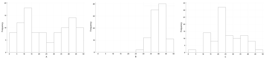
1.  Data from the National Health and Nutrition Examination Survey (NHANES), a large national random sample.  Our explanatory variable is whether or not the respondent bought anything with the word organic on the label in the past 30 days, and the response variable is a dichotomized version of self-reported health status: poor/fair/good versus very good/excellent.  The sample data are visualized below:

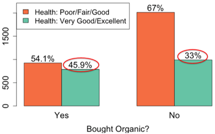
In the sample, 45.9% of organic buyers had very good or excellent health, as compared to only 33% of people who hadn’t bought organic, for a difference in proportions of 0.459 – 0.33 = 0.129. 

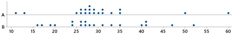
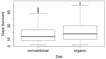
In the second dataset, fruit flies were randomly divided into two groups of 1000 each; one group was fed organic food and the other group was fed conventional (non-organic) food*. The longevity of each fly by group is visualized below:

* Fun fact: This study was conducted by a high school student!  The research article is available here.

Organic-fed flies lived an average of 20.31 days, as compared to an average of 17.06 days for conventional-fed flies, giving a difference in means of 3.25 days (which is long in the lifespan of a fruit fly!).

In both of these datasets, the organic group had better outcomes than the non-organic group.  What are the possible explanations?

  1. Just random chance (no real association)
  2. The organic group differed from the non-organic group to begin with (association, but due to confounding)
  3. Eating organic causes better health status/longevity than not eating organic (causal association)

Do we have convincing evidence against alternative explanations (1) and (2)? How can we decide?


As I mentioned above, we teachers of introductory statistics have two jobs for each of these questions: first helping students understand why the question needs to be asked, and then helping students learn how to answer the question.  I’ll address these in that order:

STEP 1: Help students understand why each of the key questions is important to ask – why it’s important to consider them as potential competing explanations for why outcomes may be higher in one group than another.  (This is non-trivial!)

Key question 1: Do we have convincing evidence against “just random chance”?  Why or why not?

Why is this question needed?  We have to take the time to help students understand – deeply understand – the idea of statistical inference, at its most fundamental level.   Results vary from sample to sample.  Just because a sample statistic is above 0 (for example) doesn’t necessarily imply the same for the population parameter or the underlying truth.   This is NOT about illustrating the Central Limit Theorem and deriving the theoretical distribution for a sample mean – it is about illustrating to students the inherent variability in sample statistics.  While this can be illustrated directly from sample data, I think this is best conveyed when we actually have a population to sample from and know the underlying truth (which isn’t true for either of the datasets examined here).

Key question 2: Do we have convincing evidence against the groups differing to being with?  Why or why not?

Why is this question needed?  We have to take the time to help students understand – deeply understand – the idea of confounding, and why it’s dangerous to jump straight to the causal explanation if the groups differ to begin with. If the groups differ to begin with, we have no way of knowing whether this baseline difference or the A versus B distinction is causing the better outcomes.  I think that both talking through intuitive examples* and showing them real examples with measured data on the confounding variableare both important to help students grapple with this concept.  This is, inherently, reliant on multivariable thinking, and examples must go beyond bivariate context. 

* See posts #43 and #44 (here and here) for several examples.

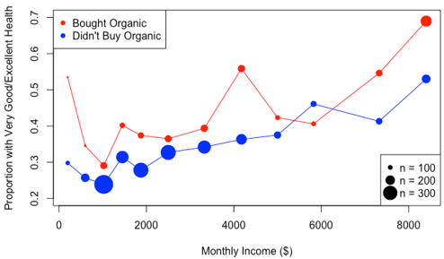
In our NHANES organic example, I ask students to brainstorm: How might people who buy organic differ from the non-organic buyers?  Intuition is easy here, and students are good at this!  A common student answer is income, because organic food is more expensive. I respond by showing a real-data visualization of the relationship between eating organic and income, and between income and health status:

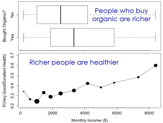
The sample data reveal that people who buy organic are richer, and richer people are healthier, so we would expect organic buyers to be healthier, even if buying organic food provided no real health benefit.  This is a concrete example of confounding, one that students can grasp.  Of course, income is not the only difference between people who buy organic and those who don’t, as students are quick to point out.  Given all of the differences, it is impossible to determine whether the better health statuses among organic buyers are actually due to buying organic food, or simply to other ways in which the groups differ. 

The key takeaway is that directly comparing non-comparable groups cannot yield causal conclusions; thus it is essential to think about whether the groups are comparable to begin with.


STEP 2: Help students learn how to reason intelligently about each of the key questions.

Key question 1: Do we have convincing evidence against “just random chance”?  Why or why not?

While we can assess this with any hypothesis test, I strongly believe that the most natural and intuitive way to help students learn to reason intelligently about this question is via simulation-based inference*.  We can directly simulate the values of statistics we would expect to see, just by random chance.  Once we have this collection of statistics, it’s relatively straightforward to assess whether we would expect to see the observed value of the sample statistic, just by random chance. 

* See posts #12, #27, and #45 (here, here, and here) for more on simulation-based inference.

I suggest that we can help students to initially reason about this in very extreme examples where a visual assessment is sufficient:

  • either the value of the sample statistic is close to the middle of the distribution of simulated statistics: could easily see such a statistic just by chance, so no, we don’t have convincing evidence against just random chance; or
  • the value of the sample statistic is way out in the tail: it would be very unlikely to see such a statistic just by chance, so yes, we have convincing evidence against just random chance.

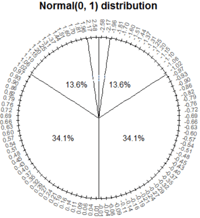
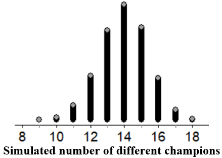
In the case of the organic fruit flies dataset, we can use StatKey (here) to obtain the following distribution of simulated differences in sample means:

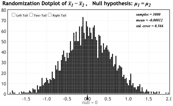
We notice that the observed difference in sample means of 3.25 days is nowhere to be seen on this distribution, and hence very unlikely to occur just by random chance.  (The sample statistic is even farther out in the tail for the NHANES dataset.)  We have convincing evidence against just random chance! 

Of course, not all examples are extreme one way or another, so eventually we quantify this extremity with the p-value (a natural concept once we have students thinking this way!), but this quantification can follow after developing the intuition of “would I expect a sample statistic this extreme just by chance?”.    

Key question 2: Do we have convincing evidence against the groups differing to being with?  Why or why not?

The best evidence against the groups differing to begin with is the use of random assignment to groups.  If the groups are randomly assigned, those groups should be similar regarding both observed and unobserved variables!  Although some differences may persist, any differences are purely random (by definition!).  You can simulate random assignment to convince students of this, which also makes a nice precursor to simulation-based inference!. 

Random assignment is not just an important part of study design, but a key feature to check for when evaluating causal evidence.  If my introductory students take only one thing away from my course, I want them to know to check for random assignment when evaluating causal evidence, and to know that random assignment is the best evidence against groups differing to begin with. 

Because the fruit flies were randomly assigned to receive either organic or non-organic food, we have convincing evidence against groups differing to begin with!   For the fruit flies we’ve now ruled out both competing explanations, and are left with the causal explanation – we have convincing evidence that eating organic really does cause fruit flies to live longer!!  Time to go buy some organic food*!!

* If you’re a fruit fly.

Because the NHANES respondents were not randomly assigned to buy organic food or not, it’s not surprising that we do observe substantial differences between the groups, and we would suspect differences even if we could not observe them directly.  This doesn’t mean that buying organic food doesn’t improve health status*, but this does mean that we cannot jump to the causal conclusion from these data alone.  We have no way of knowing whether the observed differences in reported health were due to a causal effect of buying organic food or due to the fact that the organic buyers differed from non-organic buyers to begin with.

* Make sure that students notice the double negative there.


Now I’ll offer some extra tidbits for those who want to know more about questioning causal conclusions.

When thinking about key question #2 about the groups differing to begin with, I want introductory students to understand (a) why we can’t make causal conclusions when comparing groups that differ to begin with, (b) without random assignment, groups will almost always naturally differ to begin with, and (c) with random assignment groups will probably look pretty similar.  These are important enough concepts that I try not to muddy them too much in an introductory course, but in reality it’s possible (in some situations) to create similar groups without randomization, and it’s also possible to obtain groups that differ even after randomization, just by chance.

Random assignment is not the only way to rule out groups differing to begin with; one could also collect data on all possible confounding variables (hard!) and force balance on them such as with propensity score matching or subclassification, but this is beyond the scope of an introductory course.  If you want to move towards this idea, you could compare units within similar values of an observed confounder (stratification).  For example, in the NHANES example, the organic buyers were healthier even compared to non-organic buyers within the same income bracket:

However, while this means the observed difference is not solely due to income, we still cannot rule out the countless other ways in which organic eaters differ from non-organic eaters.   We could extend this to balance multiple variables by stratifying by the propensity score, the probability of being in one group given all measured baseline variables (it can be estimated by logistic regression).  While this is a very powerful tool for making groups similar regarding all observed variables, it still can’t do anything to balance unobserved variables, leaving random assignment as the vastly superior option whenever possible.

While random assignment creates groups that are similar on average, in any particular randomization groups may differ just due to random variation.  In fact, my Ph.D. dissertation was on rerandomization – the idea that you can, and should, rerandomize (if you do it in a principled way) if randomization alone does not yield adequate balance between the groups.  In an introductory course, we can touch on some classical experimental designs aimed to help create groups even more similar than pure randomization, for example, by randomizing within similar blocks or pairs.  One classic example is identical twin studies, which I can’t resist closing with because I can show a picture of my identical twin sons Cal and Axel in their treatment and control shirts!


Questioning causal evidence involves evaluating evidence against competing explanations by asking the following key questions:

  1. Do we have convincing evidence against “just random chance”?  Why or why not?
  2. Do we have convincing evidence against the groups differing to being with?  Why or why not?

By the time students finish my introductory course, I hope that they have internalized both of these key questions –both why the questions need to be asked when evaluating causal evidence, and also how to answer them.

P.S. Below are links to datafiles for the examples in this post:

This guest post has been contributed by Kari Lock Morgan.  You can contact her at klm47@psu.edu.

#55 Classroom assessment with clicker questions

This guest post has been contributed by Roxy Peck.  You can contact her at rpeck@calpoly.edu.

I consider Roxy Peck to be one of the most influential statistics educators of the past 30 years.  Her contributions extend beyond her widely used and highly regarded textbooks, encompassing the teaching and learning of statistics at secondary and undergraduate levels throughout California, the United States, and beyond.  Roxy has been an inspiration and role model throughout my career (and for many others, I’m sure). I greatly appreciate Roxy’s taking the time to write this guest post about the use of clicker questions for classroom assessment.


Asking good questions is key to effective and informative assessment. Faculty use tests and quizzes to help them assess student learning, often for the purposes of assigning course grades. In post #25 of this blog (Group quizzes, part 1, here), Allan says he uses lots of quizzes in his classes because they also provide students with the opportunity to improve their understanding of the material and to assess how well they understand the material, and no one would argue with the importance of those assessment goals. But in this blog post, I want to talk about another form of assessment – classroom assessment. Classroom assessment is the systematic collection and analysis of information for the purpose of improving instruction. The more you know about what your students know and understand, the better you can plan and adjust your classroom practice.

I think that the best types of classroom assessments are timely and inform teaching practice, sometimes in real time. For me, the worst-case scenario is to find out when I am grading projects or final exams that students didn’t get something important. That’s too late for me to intervene or to do anything about it but hang my head and pout. That’s why I think good classroom assessment is something worth thinking carefully about.

My favorite tool for classroom assessment is the use of “clicker questions.” These are quick, usually multiple choice, questions that students can respond to in real time. The responses are then summarized and displayed immediately to provide quick feedback to both students and the instructor. There are many ways to implement the use of clicker questions, ranging from low tech to high tech. I will talk a little about the options toward the end of this post, but first I want to get to the main point, and that’s what I think makes for a good clicker question.


Clicker questions can be used to do real-time quizzes, and also as a way create and maintain student engagement and to keep students involved during class even in situations where class sizes are large. But if the goal is to also use them to inform instruction, they need to be written to reveal more than just whether a student knows or understands a particular topic. They need to be written in a way that will help in the decision of what to do next, especially if more than a few students answer incorrectly. That means that if I am writing a clicker question, I need to write “wrong” answers that capture common student errors and misconceptions.

Clicker questions can be quick and simple. For example, consider the following question:

Seventy-five (75) college students were asked how many units of coursework they were enrolled in during the current semester. The resulting data are summarized in the following frequency table:

What is the median for this dataset?  Options: A) 10; B) 11; C) 12

For this question, the correct answer is 12. What are students who answer 10 or 11 thinking? A common student error is for students to confuse the frequencies with the actual data. A student who makes this error would find the median of the frequencies, which is 10. Another common student error is to confuse the possible values for number of units given in the frequency table with the actual data. A student who makes this error would find the median of the possible values (the numbers in the “Number of Units” column) and answer 11. The main thing to think about when putting a question like this together are these common student errors. That’s not a new idea when writing good multiple choice questions for student assessment, but the goal in writing for classroom assessment is to also think about what I am going to do if more than a few students pick one of the incorrect options. With this question, if almost all students get this correct, I can move on. But if more than a few students select incorrect answer (A), I can immediately adapt instruction to go back and address the particular student misunderstanding that leads to that incorrect answer. And I can do that in real time, not two weeks later after I have graded the first midterm exam.

Another example of a good clicker question that is related to the same student misunderstanding where frequencies are mistaken for data values is the following:

Which of the three histograms summarizes the dataset with the smallest standard deviation?

Students choosing either answers (A) or (C) are focusing on variability in the frequencies rather than variability in the data values. If I see students going for those answers, I can address that immediately, either through classroom discussion or by having students talk in small groups about the possibilities and come to an understanding of why answer choice (B) is the correct one.

Here is another example of a simple question that gets at understanding what is being measured by the interquartile range:

Which of the two dotplots displays the dataset with the smaller IQR?

What is the error in thinking for the students who choose answer (B)? What would you do next if you asked this question in class and more than a few students selected this incorrect option?


I will only use a clicker question if I have a plan for what I will do as an immediate reaction to how students respond. Often, I can see that it is safe to move on, knowing that students are with me and that further discussion is not needed. In other cases, I find that I have some work to do!

So what is the difference between a clicker question and a multiple choice question? I think that pretty much any well-written multiple choice question can be used as a clicker question, so strategies for writing good multiple choice questions apply here as well. But I think of a good clicker question as a good multiple choice question that I can deliver in real time AND that is paired with a plan for how student responses will inform and change what I do next in class. I have used multiple choice questions from sources like the LOCUS and ARTIST projects (described at the end of this post) as clicker questions.

Consider the following question from the ARTIST question bank:

A newspaper article claims that the average age for people who receive food stamps is 40 years. You believe that the average age is less than that. You take a random sample of 100 people who receive food stamps, and find their average age to be 39.2 years. You find that this is significantly lower than the age of 40 stated in the article (p < 0.05). What would be an appropriate interpretation of this result?

  • (A) The statistically significant result indicates that the majority of people who receive food stamps is younger than 40.
  • (B) Although the result is statistically significant, the difference in age is not of practical importance.
  • (C) An error must have been made. This difference is too small to be statistically significant.

This is a multiple choice question that makes a great clicker question because students who choose answer (A) or answer (C) have misconceptions (different ones) that can be addressed in subsequent instruction.

The same is true for the following clicker question:

In order to investigate a claim that the average time required for the county fire department to respond to a reported fire is greater than 5 minutes, county staff determined the response times for 40 randomly selected fire reports.  The data was used to test H0:  μ = 5 versus Ha:  μ > 5 and the computed p-value was 0.12.  If a 0.05 level of significance is used, what conclusions can be drawn?

  • (A) There is convincing evidence that the mean response time is 5 minutes (or less).
  • (B) There is convincing evidence that the mean response time is greater than 5 minutes.
  • (C) There is not convincing evidence that the mean response time is greater than 5 minutes.

If very many students choose response (A), I need to revisit the meaning of “fail to reject the null hypothesis.” If many students go for (B), I need to revisit how to reach a conclusion based on a given p-value and significance level. And if everyone chooses (C), I am happy and can move on. Notice that there is a reason that I put the incorrect answer choice (A) before the correct answer choice (C). I did that because I need to know that students recognize answer choice (A) as wrong and want to make sure that they understand that answer is incorrect. If the correct choice (C) came first, they might just select that because it sounds good without understanding the difference between what is being said in (A) – convincing evidence for the null hypothesis – and what is being said in answer choice (C) – not convincing evidence against the null hypothesis.


I have given some thought about whether to have clicker question responses count toward the student’s grade and have experimented a bit with different strategies. Some teachers give participation points for answering a clicker question, whether the answer is correct or not. But because the value of clicker questions to me is classroom assessment, I really want students to try to answer the question correctly and not just click a random response. I need to know that students are making a sincere effort to answer correctly if I am going to adapt instruction based on the responses. But I also don’t want to put a heavy penalty for an incorrect answer. If students are making an effort to answer correctly, then I share partial responsibility for incorrect answers and may need to declare a classroom “do-over” if many students answer incorrectly. I usually include 3 to 4 clicker questions in a class period, so what I settled on is that students could earn up to 2 points for correct responses to clicker questions in each class period where I use clicker questions. While I use them in most class meetings, some class meetings are primarily activity-based and may not incorporate clicker questions (although clicker questions can sometimes be a useful in the closure part of a classroom activity as a way to make sure that students gained the understanding that the activity was designed to develop). Of course, giving students credit for correct answers assumes that you are not using the low-tech version of clicker questions described below, because that doesn’t keep track of individual student responses to particular questions.


Teachers can implement clicker questions in many ways. For example, ABCD cards can be used for clicker questions if you are teaching in a low tech or no tech environment:

With ABCD cards, each student has a set of cards (colored cards make it easier to get a quick read on the responses). The instructor poses a question, provides time to think, and then has each student hold up the card corresponding to the answer. By doing a quick look around the classroom, the instructor gets a general idea of how the students responded.

The downside of ABCD cards is that there is no way to collect and display the responses or to record the responses for the purpose of awarding credit for correct responses. Students can also see which students chose which answers, so the responses are not anonymous to other students. In a big lecture class, it is also difficult for the instructor to “read” the class responses.

Physical clickers are small devices that students purchase. Student responses are picked up by a receiver and once polling is closed responses can be summarized and displayed immediately to provide quick feed back to both students and instructor. Several companies market clickers with educational discounts, such as TurningPoint (here) and iClickers (here).

There are also several web apps for polling that can be used for clicker questions if your students have smart phones or web access. A free app that is popular with teachers is Kahoot! (free for multiple choice; more question types, tools and reports for $3 or $6 per month, here). Another possibility is Poll Everywhere (free up to 25 students, then $120 per year for up to 700 students, here).

And finally, Zoom and some classroom management systems have built-in polling. I have used Zoom polls now that I am delivering some instruction online, and Zoom polls allow you to summarize and share results of polling questions. Zoom also has a setting that tracks individual responses if you want to use it for the purposes of assigning credit for correct answers.


I think incorporating good clicker questions has several benefits. It provides immediate feedback to students (they can see the correct answer and how other students answered), and it has changed the way that I interact with students and how students interact with the course. Students are more engaged and enjoy using this technology in class. They pay more attention because they never know when a clicker question is coming, and they want to get it right. And if they get it wrong, they want to see how other students answered.

But one important final note: If you are going to use clicker questions, it is really important to respond to them and be willing to modify instruction based on the responses. If students see that many did not get the right answer and you just say “Oh wow. Lots of you got that wrong, the right answer is C” and then move on as if you had never asked the question, students will be frustrated. On the other hand, if you respond and adjust instruction, students see that you are making student understanding a top priority!


P.S. LOCUS (Levels of Conceptual Understanding in Statistics, here) is a collection of multiple-choice and free-response assessment items that assess conceptual understanding of statistics. Items have all been tested with a large group of students, and the items on the website include commentary on student performance and common student errors. Designed to align with the Common Core State Standards, they follow the K-12 statistics curriculum. Because there is a great deal of overlap in the high school standards with the current college intro statistics course, there are many items (those for level B/C) that are usable at the college level.

ARTIST (Assessment Resource Tools for Improving Statistical Thinking, here) is a large bank of multiple-choice and free-response assessment items, which also includes several scales that measure understanding at the course level and also at a topic level. At the course level, the CAOS test (Comprehensive Assessment of Outcomes for a First Course in Statistics) consists of 40 conceptual multiple-choice questions. The topic scales are shorter collections of multiple-choice questions on a particular topic. There are more than 1000 items in the item bank, and you can search by topic and by question type, select items to use in a test and download them as a word document that you can edit to suit your own needs. You must register to use the item bank, but there is no cost.

This guest post has been contributed by Roxy Peck.  You can contact her at rpeck@calpoly.edu.

#54 Probability without calculus or computation

This guest post has been contributed by Kevin Ross.  You can contact him at kjross@calpoly.edu.

Kevin Ross is a faculty colleague of mine in the Statistics Department at Cal Poly – San Luis Obispo.  Kevin is a probabilist who excels at teaching introductory statistics as well as courses in probability and theoretical statistics.  Kevin is a co-developer of a Python package called Symbulate (here) that uses the language of probability to conduct simulations involving probability models (described in a JSE article here).  I have borrowed examples and exam questions from Kevin on many occasions, so I am very glad that he agreed to write this guest post describing some of his ideas for assessing students’ knowledge of probability concepts without asking for calculations or derivations.


Allan still hasn’t officially defined what a “good question” is (see the very end of post #52, Top thirteen topics, here), but he’s certainly given many examples.  I’ll try to add to the collection by presenting four types of questions for assessing knowledge of probability:

  1. Which is greater?
  2. How would you simulate?
  3. Sketch a plot
  4. “Don’t do what Donny Don’t does”

I frequently use each type of question in class, on homework assignments, on quizzes, and on exams. I use questions like the ones throughout this post in introductory statistics courses and in upper division probability courses typically taken by majors in statistics, mathematics, engineering, and economics. One common theme is that the questions require no probability calculations.  I think these questions facilitate and assess understanding of probability concepts much better than questions that require calculus derivations or formulaic computations.


1. Which is greater?

This type of multiple choice question was first inspired by “Linda is a bank teller” and other studies of Daniel Kahneman and Amos Tversky that Allan mentioned in post #51 (Randomness is hard, here).  The following example illustrates the basic structure:

a) Which of the following – A or B – is greater? Or are they equal? Or is there not enough information to decide? (A) The probability that a randomly selected Californians likes to surf; (B) The probability that a randomly selected American is a Californian who likes to surf; (C) A and B are exactly the same; (D) Not enough information to determine which of A or B is greater

The structure is simple – two quantities A and B and the same four answer choices – but this framework can be used to assess a wide variety of concepts in probability. In all of the following examples, the prompt is: Which of the following – A or B – is greater? Or are they equal? Or is there not enough information to decide?

b) Randomly select a U.S. resident. Let R be the event that the person is a California resident, and let G be the event that the person is a Cal Poly graduate. (A) P(G|R); (B) P(R|G); (C) A and B are exactly the same; (D) Not enough information to determine which of A or B is greater

The answer to (a) is A because the sample space for A (Californians) is a subset of the sample space for B (Americans). The answer to (b) is B because although the two conditional probabilities have the same numerator, the denominator is smaller for the conditional probability in B than for the one in A.

I ask many versions of “what is the denominator?” questions like (a) and (b). Symbols can easily be interchanged with words. Also, “probability” can be replaced with “proportion” to assess proportional reasoning in introductory courses.

c) A fair coin is flipped 10 times. (A) The probability that the results are, in order, HHHHHHTTTT; (B) The probability that the results are, in order, HHTHTHHTT; (C) A and B are exactly the same; (D) Not enough information to determine which of A or B is greater

d) A fair coin is flipped 10 times. (A) The probability that the flips result in 6 Hs and 4 Ts; (B) The probability that the results are, in order, HHTHTHHTT; (C) A and B are exactly the same; (D) Not enough information to determine which of A or B is greater

Questions like (c) and (d) can assess the ability to differentiate between specific outcomes (six Hs followed by four Ts) and general events (six Hs in ten flips). Many students select B in (c) because the sequence “looks more random”, but the outcomes in A and B are equally likely. The answer to (d) is A because the sequence in B is only one of many outcomes that satisfy the event in A.

e) Shuffle a standard deck of 52 playing cards (of which 4 are aces) and deal 5 cards, without replacement. (A) The probability that the first card dealt is an ace; (B) The probability that the fifth card dealt is an ace; (C) A and B are exactly the same; (D) Not enough information to determine which of A or B is greater

Students find this question very tricky, but it gets at an important distinction between conditional versus unconditional probability (or independence versus “identically distributed”).  The correct answer is C, because in the absence of any information about the first 4 cards dealt, the unconditional probability that the fifth card is an ace is 4/52. (I like to use five cards rather than just two or three to discourage students from enumerating the results of the draws.)

f) A box contains 30 marbles, about half of which are green and the rest gold.  A sample of 5 marbles is selected at random with replacement.  X is the number of green marbles in the sample and Y is the number of gold marbles in the sample. (A) Cov(X, Y); (B) 0; (C) A and B are exactly the same; (D) Not enough information to determine which of A or B is greater

Many students select C, thinking that “with replacement” implies independence.  But while the individual draws are independent, the random variables X and Y have a negative correlation: If there is a large number of green marbles in the sample, then there must be necessarily a small number of gold ones.

g) E and F are events (defined on the same probability space) with P(E) = 0.7 and P(F) = 0.6. (A) 0.42; (B) P(E ꓵ F); (C) A and B are exactly the same; (D) Not enough information to determine which of A or B is greater

The answer would be C if the events E and F were independent. But that is not necessarily true, and without further information all we can say is that P(E ꓵ F) is between 0.3 and 0.6, so the correct answer is D.  I frequently remind students to be careful about assuming independence.

h) X, Y, and Z are random variables, each following a Normal(100, 10) distribution. (A) P(X + Y > 200); (B) P(X + Z > 200); (C) A and B are exactly the same; (D) Not enough information to determine which of A or B is greater

Some students select C, thinking that because Y and Z have the same distribution, then so do X + Y and X + Z.  However, X and Y do not necessarily have the same joint distribution as X and Z, and the joint distribution affects the distribution of the sum.  If X, Y, and Z were independent, then the answer would be C, but without that information (remember to be careful about assuming independence!) the answer is D.

i) X and Y are independent random variables, each following a Normal(100, 10) distribution. (A) X; (B) Y; (C) A and B are exactly the same; (D) Not enough information to determine which of A or B is greater

Some students select C, because X and Y have the same distribution.  But there are (infinitely) many potential values these random variables can take, so it’s impossible to know which one will be greater.  The following is a more difficult version of this idea; again, students often choose C but the correct answer is D.

j) X, Y, and Z are independent random variables, with X ~ Poisson(1), Y ~ Poisson(2), and Z~Poisson(3). (A) X + Y; (B) Z; (C) A and B are exactly the same; (D) Not enough information to determine which of A or B is greater

The last four examples illustrate two major themes behind many of the questions I ask in probability courses:

  • Marginal distributions alone are not enough to determine joint distributions.
  • Do not confuse a random variable with its distribution.

Many common mistakes in probability result from not heeding these two principles, so I think it’s important to give students lots of practice with these ideas and assess them frequently.


2. How would you simulate?

In virtually every probability problem I introduce, one of the first questions I ask is “how would you simulate?” Such questions are a great way to assess student understanding of probability distributions and their properties, and concepts like expected value or conditional probability, without doing any calculations.

a) Describe in detail how you could, in principle, perform by hand a simulation involving physical objects (coins, dice, spinners, cards, boxes, etc.) to estimate P(X = 5 | X > 2), where X has a Binomial distribution with parameters n=5 and p=2/7.  Be sure to describe (1) what one repetition of the simulation entails, and (2) how you would use the results of many repetitions.  Note: You do NOT need to compute any numerical values.

Here is a detailed response:

  1. To simulate a single value of X, we can use the “story” for a Binomial distribution and think of X as counting the number of successes in 5 Bernoulli trials with probability of success 2/7.  To simulate a single trial, construct a spinner with 2/7 of the area shaded as success*.  To simulate a single value of X, spin the spinner 5 times and count the number of successes. If X > 2, record the value of X.  Otherwise, discard it and try again to complete step (1)**.
  2. Repeat step (1) 10,000 times, to obtain 10000 values of X with X > 2.  Count the number of simulated values of X that are equal to 5 and divide by 10,000 to approximate P(X = 5 | X > 2).

* There are many possible randomization devices, including a seven-sided die or a deck of seven cards with two labeled as success.  However, it’s important that students implement independent trials, so they must indicate that cards are drawn with replacement.

** I also accept an answer that omits the “discard” part of step (1) and replaces step (2) with: Repeat step (1) 10,000 times to obtain 10,000 values of X.  Divide the number of simulated values of X that are equal to 5 by the number of simulated values of X that are greater than 2 to approximate P(X = 5 | X > 2).  Each method provides a point estimate of the conditional probability, but they differ with respect to simulation margin-of-error.  I discuss in class how the method which includes the “discard” part of step (1) is less computationally efficient but results in a smaller margin-of-error.

Students often write vague statements like “repeat this many times.”  But “this” could be a single spin of the spinner or a generating a single value of X. Therefore, it’s important that students’ responses clearly distinguish between (1) one repetition and (2) many repetitions. 

(b) Repeat (a) for the goal of estimating Cov(V, W), where V = X + Y, W = max(X, Y), and X, Y are i.i.d. Normal(100, 15). Assume that you have access to a Normal(0, 1) spinner.

Part (b) illustrates how tactile simulation can be used even with more advanced concepts like continuous or joint distributions.  I repeatedly use the analogy that every probability distribution can be represented by a spinner, like the following picture corresponding to a Normal(0, 1) distribution:

Notice how the values on the spinner are not evenly spaced; the sector corresponding to the range [0, 1] comprises 34.1% of the area while [1, 2] comprises 13.6%. (With more mathematically inclined students I discuss how to create such spinners by inverting cumulative distribution functions.) I have many clear plastic spinners that can be overlaid upon pictures like the above so students can simulate by hand values from a variety of distributions.

Here is a detailed response to part (b):

  1. To simulate a single (V, W) pair: Spin the Normal(0, 1) spinner to obtain Z1, and let X = 100 + 15 × Z1. Spin the Normal(0, 1) spinner again to obtain Z2, and let Y = 100 + 15 × Z2. Add the X and Y values to obtain V = X + Y, and take the larger of X and Y to obtain W = max(X, Y). Record the values of V, W, and their product VW.
  2. Repeat step (1) 10,000 times to obtain 10,000 values each of V, W, and VW.  Average the values of VW and subtract the product of the average of the V values and the average of the W values to approximate Cov(V, W).

I do think it’s important that students can write their own code to implement simulations.  But I generally prefer “describe in words” questions to “write the code” to avoid syntax issues, especially during timed exams.  When I want to assess student understanding of actual code on an exam, I provide the code and ask what the output would be. Of course, after discussing how to simulate and simulating a few repetitions by hand, we then carry out a computer simulation.  But before looking at the results, I often ask students to sketch a plot, as described in the next section.


3. Sketch a plot

As students progress in probability and statistics courses, they encounter many probability distributions but often have difficulty understanding just what all these distributions are.  Asking students to sketch plots, as in the following example, helps solidify understanding of random variables and distributions without any difficult calculus.

Suppose that X has a Normal(0, 1) distribution, U has a Uniform(-2, 2) distribution, X and U are independent, and Y = UX. For each of the following, sketch a plot representing the distribution.  The sketch does not have to be exact, but it should explicitly illustrate the most important features.  Be sure to clearly label any axes with appropriate values.  Explain the important features your plot illustrates and your reasoning*. (a) the conditional distribution of Y given U = -0.5; (b) the joint distribution of X and Y.

* I usually give full credit to well-drawn and carefully labeled plots regardless of the quality of explanation.  But “explaining in words” can help students who have trouble translating ideas into pictures.

Part (a) is not too hard once students realize they should draw a Normal(0, 0.5) density curve*, but it does take some thought to get to that point.  Even though the answer is just a normal curve, the question still assesses understanding of conditioning (treating U as constant) and the effect of a linear transformation.  The question also assesses the important difference between operations on random variables versus operations on distributions; it is X that is multiplied by -0.5, not its density. (Unfortunately, some students forget this and draw an upside-down normal curve.)

* However, I do deduct points if the variable axis isn’t labeled, or if the inflection points are not located at -0.5 and 0.5.  (The values on the density axis are irrelevant.)

Part (b) is much harder. Here is an excellent student solution:

Students tend to find this type of question challenging, even after encountering examples in class activities and assignments. Here are some questions that I pose during class examples, which I hope students ask of themselves on assessments, to help them unpack these problems:

  1. What is one possible plot point?  A few possible points? Students often have trouble even starting these problems, so just identifying a few possibilities can help.
  2. What type of plot is appropriate? Since X and Y are two continuous random variables, a scatterplot or joint density plot is appropriate.
  3. What are the possible values of the random variable(s)? After identifying a few possible values, I ask students to identify all the possible values and start labeling axes. Since X ~ Normal(0, 1), 99.7% of the values of X will fall between -3 and 3, so we can label the X-axis from -3 to 3.  (Remember, it doesn’t have to be perfect.) The value of Y depends on both X and U; identifying a few examples in step 1 helps students see how.  Given X = x, Y has a Uniform(-2|x|, 2|x|) distribution, so larger values of |x| correspond to more extreme values of Y.  Since most values of X lie between -3 and 3, most values of Y lie between -6 and 6, so we can label the Y-axis from -6 to 6.  But not all (X, Y) pairs are possible; only pairs within the region bounded by the lines y = 2x and y = -2x have nonzero density.  If students can make it to this point, drawing a plot with well-labeled axes and the “X-shaped” region of possible values, then they’ve made great progress.
  4. What ranges of values are more likely?  Less likely? Values of X near 0 are more likely, and far from 0 are less likely.  Within each vertical strip corresponding to an x value, the Y values are distributed uniformly, so the density is stretched thinner over longer vertical strips. These observations help us shade the plot as in the example.

Determining an expression for the joint density in part (b) is a difficult calculus problem involving Jacobians.  Even students who are able to do the calculus to obtain the correct density might not be able to interpret what it means for two random variables to have this joint density.  Furthermore, even if students are provided the joint density function, they might not be able to sketch a plot or understand what it means. But I’m pretty confident that students who draw plots like the above have a solid understanding of concepts including normal distributions, uniform distributions, joint distributions, and transformations.


4. “Don’t do what Donny Don’t does”

This title is an old Simpson’s reference (see here). In these questions, Donny Don’t represents a student who makes many common mistakes. Students can learn from the common mistakes that Donny makes by identifying what is wrong and why, and also by helping Donny understand and correct his mistakes.

At various points in his homework, Donny Don’t writes the following expressions. Using simple examples, explain to Donny which of his statements are nonsense, and why. (A represents an event, X a random variable, P a probability measure, and E an expected value.) a) P(A = 0.5); b) P(A)∪ P(B); c) P(X); d) P(X = E(X)).

I’ll respond to Donny using tomorrow’s weather as an example, with A representing the event that it rains tomorrow, X tomorrow’s high temperature (in degrees F), and B the event that tomorrow’s high temperature is above 80 degrees.

(a) It doesn’t make sense to say “it rains tomorrow equals 0.5.” If Donny wants to say “the probability that it rains tomorrow equals 0.5” he should write P(A) = 0.5. (Mathematically, A is a set and 0.5 is a number, so it doesn’t make sense to equate them.)

(b) What Donny has written reads as “the probability that it rains tomorrow or the probability that tomorrow’s high temperature is above 80 degrees F,” which doesn’t make much sense.  Donny probably means “the probability that (it rains tomorrow) or (tomorrow’s high temperature is above 80 degrees),” which he should write as P(A ∪ B). (Mathematically, P(A) and P(B) are numbers while union is an operation on sets, so it doesn’t make mathematical sense to take a union of numbers.) Donny might have meant to write P(A) + P(B), which is valid expression since P(A) and P(B) are numbers. However, he should keep in mind that P(A) + P(B) is not necessarily a probability of anything; this sum could even be greater than one.  In particular, since there are some rainy days with high temperatures above 80 degrees, P(A) + P(B) is greater than P(A ∪ B).

(c) Donny has written “the probability that tomorrow’s high temperature,” which is a subject in need of a predicate.  We assign probabilities to things that could happen (events) like “tomorrow’s high temperature is above 80 degrees,” which has probability P(X > 80).

(d) Donny’s notation is actually correct!  Students often find this expression strange at first, but since E(X) represents a single number, P(X = E(X)) makes just as much sense as P(X = 80). Even if we don’t know the value of E(X), it still makes sense to consider “the probability that tomorrow’s high temperature is equal to the average high temperature.” Some students might object that X is continuous and so P(X = E(X)) = 0, but P(X = E(X)) is still a valid expression even when it equals 0.

Questions like this do more than encourage and assess proper use of notation.  Explaining to Donny why he is wrong helps students better understand the probabilistic objects that symbols represent and how they connect to real-world contexts.


I hope these examples demonstrate that even in advanced courses in probability or theoretical statistics, instructors can ask a variety of probability questions that don’t require any computation or calculus.  Such questions can not only assess students’ understanding of probability concepts but also help them to develop their understanding in the first place.  I have many more examples that I’d be happy share, so please feel free to contact me (kjross@calpoly.edu)!

P.S. Many thanks to Allan for having me as a guest, and thanks to you for reading!

This guest post has been contributed by Kevin Ross.  You can contact him at kjross@calpoly.edu.

#53 Random champions

This guest post has been contributed by Josh Tabor. You can contact him at TaborStats@gmail.com.

Josh Tabor teaches AP Statistics at Canyon del Oro High School in Oro Valley, Arizona, near Tucson*.  He is a co-author of a widely used textbook for AP Statistics, titled The Practice of Statistics.  He also co-wrote Statistical Reasoning in Sports, a textbook that uses simulation-based inference from the very first chapter.  Josh and I have worked together for many years at the AP Statistics Reading, and we have also presented at some of the same workshops and conferences.  Even more fun, we have attended some pre-season baseball games together in Arizona.  Josh is a terrific presenter and expositor of statistical ideas, so I am delighted that he agreed to bat lead-off for this series of guest bloggers.  Sticking with the baseball theme, he has written a post about randomness, simulation, World Series champions, teaching statistical inference, and asking good questions.

* Doesn’t it seem like the letters c and s are batting out of order in Tucson?


I am a big believer in the value of simulation-based inference, particularly for introducing the logic of significance testing. I start my AP Statistics class with a simulation-based inference activity, and try to incorporate several more before introducing traditional inference. Many of these activities foreshadow specific inference procedures like a two-sample z-test for a difference in proportions, but that isn’t my primary goal. Instead, my goal is to highlight how all significance tests follow the same logic, regardless of the type of data being collected. The example that follows doesn’t align with any of the tests in a typical introductory statistics class, but it is a fun context and helps achieve my goal of developing conceptual understanding of significance testing.


In a 2014 article in Sports Illustrated (here), author Michael Rosenberg addresses “America’s Wait Problem.” That is, he discusses how fans of some teams have to wait many, many years for their team to win a championship. In Major League Baseball, which has 30 teams, fans should expect to wait an average of 30 years for a championship—assuming all 30 teams are equally likely to win a championship each season. But is it reasonable to believe that all teams are equally likely to win a championship?

Rosenberg doesn’t think so. As evidence, he points out that in the previous 18 seasons, only 10 different teams won the World Series. Does having only 10 different champions in 18 seasons provide convincing evidence that the 30 teams are not equally likely to win a championship?

Before addressing whether the evidence is convincing, I start my students off with a (perhaps) simpler question:

  • Rosenberg suggests that having 10 different champions in 18 seasons is evidence that teams are not equally likely to win a championship. How does this evidence support Rosenberg’s claim?

This isn’t the first time I have asked such a question to my students. From the beginning of the year, we have done a variety of informal significance tests, like the ones Allan describes in posts #12, #27, and #45 (here, here, and here). In most previous cases, it has been easy for students to identify how the given evidence supports a claim. For example, if we are testing the claim that a population proportion p > 0.50 and obtain a sample proportion of p-hat = 0.63, then recognizing that p-hat = 0.63 > 0.50 is very straightforward.

In this case, the statistic presented as evidence is quite different from a simple proportion or mean or even a correlation coefficient. Here the statistic is the number of different champions in an 18-year period of time. Some students will naively suggest that if teams are equally likely to win a championship, there should be 18 different champions in 18 seasons. And because 10 < 18, these data provide the evidence we are looking for. If students go down this path, you might ask a follow-up question: If you were to roll a die 6 times, would you expect to get 6 different results? If you have the time, you might even pull out a die and give it 6 rolls. (If you are nervous, there is less than a 2% chance of getting 6 different outcomes in 6 rolls of a fair die*.)

* This calculation is:

Once students are convinced that 18 is the wrong number to compare to, I pose a new question:

  • If all 30 teams are equally likely to win a championship, what is the expected value of the number of different champions in 18 seasons?

There is no formula that I know of that addresses this question. Which leads to another question:

  • What numbers of different champions (in 18 seasons) are likely to happen by chance alone, assuming all 30 teams are equally likely to win a championship?

Upon hearing the words “by chance alone,” my students know how to determine an answer: Simulation! Now for more questions:

  • How can you simulate the selection of a World Series champion, assuming all teams are equally likely to win the championship?
  • How do you conduct 1 repetition of your simulation?
  • What do you record after each repetition of your simulation?

If we have time, I like students to work in groups and discuss their ideas. There are a variety of different approaches that students take to answer the first question: rolling a 30-sided die, with each side representing a different team; putting the names of the 30 teams in a hat, mixing them up, and choosing a team; or spinning 30-section spinner, with each section having the same area and representing one of the teams. I am happy when students think of physical ways to do the simulation, as that is what I have modeled since the beginning of the year. But I am also happy when they figure out a way to use technology: Generate a random integer from 1–30, where each integer represents a different team.

Assuming that students settle on the random integer approach, they still need to figure out how to complete one repetition of the simulation. In this case, they would need to generate 18* integers from 1–30, one integer (champion) for each season, allowing for repeated integers**. To complete the repetition, they must determine the value of the simulated statistic by recording the number of different integers in the set of 18. For example, there are 14 different champions in the following set of 18 random integers (repeat champions underlined): 22, 24, 17, 14, 8, 1, 11, 9, 25, 17, 17, 24, 16, 7, 18, 16, 30, 19.

* As I was brainstorming for this post, I started by counting the number of champions in the previous 30 MLB seasons, rather than the 18 seasons mentioned in the article. I didn’t want to be guilty of cherry-picking a boundary to help make my case. And 30 seemed like a nice number because it would allow for the (very unlikely) possibility of each team winning the championship once (not because of the central limit theorem!). But, using the same number in two different ways (30 teams, 30 seasons) is sure to create confusion for students. So I stuck with the 18-season window from the article.  Also, I realized that an 18-season window captures an entire lifetime for my students.

** Early in my teaching career (2001 to be precise), there was a simulation question on the AP Statistics exam that required students to account for sampling without replacement. Until then, we had always done examples where this wasn’t an issue. After 2001, I made a big deal about “ignoring repeats” until I realized that students were now including this phrase all the time, even when it wasn’t appropriate. I now try include a variety of examples, with only some requiring students to “ignore repeats.”  In this context of sports champions, of course, repeats are at the very heart of the issue we’re studying.


Once students have had the opportunity to share their ideas, we turn to technology to run the simulation. My software of choice for simulation is Fathom (here), but there are many alternatives. Here are the results of 10,000 repetitions of the simulation. That is, the results of 10,000 simulated sets of 18 seasons, assuming all 30 teams are equally likely to win the championship each year:

In this simulation of 10,000 seasons, the mean number of different champions is 13.71, and the standard deviation is 1.39. The minimum value is 9, and the maximum is 18, which indicates that every season had a different champion for at least one of the 10,000 simulated seasons.

Back to the questions:

  • There is a dot at 9. What does this dot represent?

This is one of my very favorite questions to ask anytime we do a simulation. In this case, the dot at 9 represents one simulated 18-year period where there were 9 different champions.

  • Using the results of the simulation, explain how having 10 champions in 18 seasons is evidence for Rosenberg’s claim that teams are not equally likely to win a championship.

Note that I am not asking whether the evidence is convincing. Yet. For now, I want students to notice that the expected number of different champions is 13 or 14 (expected value  13.71) when each team is equally likely to win the championship over an 18-year period. And most importantly, 10 is less than 13 or 14. So, Rosenberg’s intuition was correct when he cited the value of this statistic as evidence for his claim. Now that we have identified the evidence, I ask the following:

  • What are some explanations for the evidence? In other words, what are some plausible explanations for why we got a value less than 14?

My students have already been through this routine several times, so they are pretty good about answering this question. And if they can provide the explanations in my preferred order*, I am especially happy.

  • Explanation #1: All teams are equally likely to win the championship each year, and the results in our study happened by chance alone. Note that both clauses of this sentence are very important. My students always get the second half (“it happened by chance!”), but they also need the first part to have a complete explanation.
  • Explanation #2: Teams aren’t equally likely to win the championship. In other words, some teams are more likely to win championships than others (sorry, Seattle Mariners fans!).

* This is my preferred order because it parallels the null and alternative hypotheses that we will discuss later in the year.

Once these two explanations are identified, we return to the original question:

  • Does having 10 different champions in 18 seasons provide convincing evidence that all teams are not equally likely to win a championship?

For evidence to be convincing, we must be able to essentially rule out Explanation #1. Can we? To rule out Explanation #1, we need to know how likely it is to get evidence as strong or stronger than the evidence we found in our study, assuming that all teams are equally likely to win the championship each year.

  • How can you use the dotplot to determine if the evidence is convincing?

When I am leading students through this discussion, there are usually a few who correctly respond “See how often we got a result of 10 or fewer by chance alone.” But when I ask similar questions on exams, many students don’t provide the correct answer. Instead, they give some version of the following: “Because nearly half of the dots are less than the mean, it is possible that this happened by chance alone.”* The use of the word “this” in the previous sentence points to the problem: students aren’t clear about what event they are supposed to consider. Once I started asking students to state the evidence at the beginning of an example, this error has occurred less often.  

* This is even more common when there is a clearly stated null hypothesis like H0: p1p2 = 0 and students are tempted to say “because about half of the dots are positive…”

  • In the simulation, 98 of the 10,000 simulated seasons resulted in 10 or fewer different champions, as highlighted in the graph below.  Based on this result, what conclusion would you make?

In the simulation, getting a result of 10 or fewer different champions was pretty rare, occurring only 98 times in 10,000 repetitions* (probability  0.0098). Because it is unlikely to get 10 or fewer different champions by chance alone when all 30 teams are equally likely to win the championship, there is convincing evidence that teams in this 18-year period were not equally likely to win the championship.

* Of course, this describes a p-value. I don’t call it a p-value until later in the year, but I am careful to use correct language, including the assumption that the null hypothesis is true.


As always, the scope of inference is important to consider. I also like to give students experience with raw data that allows them to determine the value of the statistic for themselves.  I remind students that the conclusion above was about “this 18-year period.” That is, the 18-year period prior to the article’s publication in November 2014. Here are the World Series champions for the 18-year period from 2002–2019*:

* In addition to matching the 18-year period length from the article, this allows me to include my favorite team in the list of World Series champions: Go Angels! It also makes me feel old as most of my current students weren’t even alive in 2002!

  • What are the observational units for these sample data?  What is the variable?  What statistic will we determine from this sample?  What is the value of that statistic for this sample?

The observational units are the 18 seasons, and the variable is the World Series champion for that season. The statistic is the number of different champions in these 18 seasons. There were 12 different champions in this 18-year period. The repeat champions were the Boston Red Sox (4 times), San Francisco Giants (3 times), and St. Louis Cardinals (twice).

  • To determine if these data provide convincing evidence that all teams are not equally likely to win a championship in 2002–2019, do we need to conduct a different simulation?

No. Because the number of seasons (18) and the number of teams (30) are still the same, we can use the results of the previous simulation to answer the question about 2002–2019.

  • For the 18-year period from 2002–2019, is there convincing evidence that all teams are not equally likely to win a championship?

No. The graph of simulation results shows that a result of 12 or fewer different champions in 18 seasons is not unusual (probability  0.1916). Because it is not unlikely to get 12 or fewer different champions by chance alone, when all 30 teams are equally likely to win the championship each season, the data do not provide convincing evidence that teams in this 18-year period were not equally likely to win the championship. In other words, it is plausible that all 30 teams were equally likely to win the championship in the period from 2002–2019*.

* To avoid the awkward double negative in their conclusions, it is very tempting for students to include statements like the final sentence in the preceding paragraph. Unfortunately, they usually leave out wiggle phrases like “it is plausible that” or “it is believable that.” Once your students have had some experience making conclusions, it is important to caution them to never “accept the null hypothesis” by suggesting that there is convincing evidence for the null hypothesis.  In this context, no sports fan really believes that all teams are equally likely to win the championship each season, but the small sample size does not provide convincing evidence to reject that claim.


If you have the time and students seem interested in this topic, you can expand into other sports. Here are some questions you might ask about the National Football League:

  • Do you think there would be stronger or weaker evidence that NFL teams from the previous 18 seasons aren’t equally likely to win a championship?

Most people expect the evidence to be stronger for the NFL. Even though the NFL tries to encourage parity, the New England Patriots seem to hog lots of Super Bowl titles.

  • If we were to simulate the number of different champions in an 18-year period for the NFL, assuming all 32 teams are equally likely to win a championship, how would conducting the simulation differ from the earlier baseball simulation?

Instead of generating 18 integers from 1–30, we would generate 18 integers from 1–32.

  • How do you think the results of the simulation would differ?

With more teams available to win the championship, the expected value of the number of different champions should increase.

  • It just so happens that 12 different NFL teams have won a championship in the previous 18 seasons, the same as the number of MLB teams that have won a championship in the previous 18 seasons. (The Patriots won 5 of these championships.) Based on your answer to the previous question, would the probability of getting 12 or fewer NFL champions by chance alone be larger, smaller, or about the same as the probability in the MLB simulation (0.1916)?

This probability will be smaller, as the expected number of different champions in the NFL is greater than in MLB, so values of 12 or fewer will be less likely in the NFL simulation.

Here are the results of 10,000 simulated 18-season periods for the NFL:

The most common outcome is still 14 different champions, but the mean number of different champions increases from about 13.71 with MLB to about 13.94 with NFL. (The standard deviation also increases from 1.39 to 1.41).

The p-value for the NFL data is about 0.1495, smaller (as expected) than the p-value of 0.1916 for the MLB data. However, because the  p-value is not small, these data do not provide convincing evidence that the 32 NFL teams are not equally likely to win the championship each season.


Each time we do an informal significance test like this one, I rehearse the logic with my students:

  1. Identify the statistic to be used as evidence, and explain why it counts as evidence for the claim being tested.
  2. Describe the two explanations for the evidence.
  3. Use simulation to explore what is likely to happen by chance alone.
  4. Compare the evidence to what is likely to happen by chance alone. If it is unlikely to get evidence as strong as or stronger than the observed evidence, then the evidence is convincing.

P.S. Thanks to Allan for letting me share some thoughts in this post. And thanks for each of the 52 entries that precede this one!

This guest post has been contributed by Josh Tabor. You can contact him at TaborStats@gmail.com.