Skip to content

Archive for

#26 Group quizzes, part 2

In last week’s post (here), I mentioned that I give lots of group quizzes and consider them to be an effective assessment tool that promotes students’ learning.  I provided six examples of quizzes, with five questions per quiz, that I have used with my students. 

Now I pick up where I left off, offering seven more quizzes with comments on each.  The topics of these quizzes include numerical variables and comparisons between groups.

As always, questions that I put to students appear in italics.  A file containing all thirteen quizzes from the two posts, along with solutions, can be downloaded from a link at the end of this post.


7. Answer these questions:

  • a) Suppose that a class of 10 students has the following exam scores: 60, 70, 50, 60, 90, 90, 80, 80, 40, 50.  Determine the median of these 10 exam scores.
  • b) Suppose that the average amount of sleep obtained by Cal Poly undergraduates last night was 6.8 hours, and the average amount of sleep obtained by Cal Poly graduate students last night was 7.6 hours.  Is it reasonable to conclude that the average amount of sleep obtained last night among all Cal Poly students was (6.8 + 7.6)/2 = 7.2 hours?  Explain.
  • c) What effect does doubling every value in a dataset have on the mean?   Explain your answer.
  • d) What effect does adding 5 to every value in a dataset have on the standard deviation?  Explain your answer.
  • e) Create an example of 10 hypothetical exam scores (on a 0 – 100 scale) with the property that the mean is at least 20 points larger than the median.  Also report the values of the mean and median for your example.

This quiz is a hodgepodge that addresses basic concepts of measures of center and variability, following up on topics raised in posts #5 (A below-average joke, here) and #6 (Two dreaded words, here).  Some students think of part (a) as a “trick” question, but I think it’s important for students to remember to put data in order before declaring that the middle value (in this case, the average of the two middle values) is the median.  For part (b), students should respond that this conclusion would only be valid if Cal Poly has the same number of undergraduate and graduate students.  You could ask parts (c) and (d) as multiple choice questions by deleting the “explain” aspect.  When I discuss part (e) with students afterward, I advise them to make such an example as extreme as possible.  To make the mean much larger than the median, they could force the median to be zero by having six scores of zero.  Then they can make the mean as large as possible by having four scores of 100.  This makes the mean equal 400/10 = 40, with a median of 0.


8. Suppose that the mean age of all pennies currently in circulation in the U.S. is 12.3 years, and the standard deviation of these ages is 9.6 years.  Suppose also that you take a random sample of 50 pennies and calculate the mean age of the pennies in your sample.

  • a) Are the numbers 12.3 and 9.6 parameters or statistics?  Explain briefly.
  • b) Describe the sampling distribution of the sample mean penny age.  Also produce a well-labeled sketch of this sampling distribution.
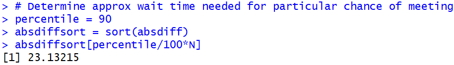
  • c) Determine the probability that the sample mean age of your random sample of 50 pennies would be less than 10 years. (Show your work.)
  • d) Are your answers to parts (b) and (c) approximately valid even if the distribution of penny ages is not normally distributed? Explain.
  • e) Based on the values of the mean and standard deviation of penny ages, there is reason to believe that the distribution of penny ages is not normally distributed.  Explain why.

This quiz is a challenging one, because the Central Limit Theorem is a challenging topic.  Part (a) allows students to earn a fairly easy point.  Those numbers are described as pertaining to all pennies in circulation, so they are parameters.  I’m looking for four things in response to part (b): shape (normal), center (mean 12.3 years), and variability (SD 9.6/sqrt(50) ≈ 1.36 years), along with a sketch that specifies sample mean age as the axis label.  Even if a student group has not answered parts (b) and (c) correctly, they can still realize that the large sample size of 50 means that the distribution of the sample mean will be approximately normal, so the answer to part (d) is that the answers to parts (b) and (c) would be valid.  Part (e) is a very challenging one that brings to mind the AP Statistics question discussed in post #8 (End of alphabet, here).  I have in mind there that the value 0 is only 1.28 standard deviations below the mean, so about 10% of pennies would have a negative age if the penny ages followed a normal distribution, which is therefore not plausible.


9. A study conducted in Dunedin, New Zealand investigated whether wearing socks over shoes could help people to walk confidently down an icy footpath*.  Volunteers were randomly assigned either to wear socks over their usual footwear or to simply wear their usual footwear, as they walked down an icy footpath.  An observer recorded whether or not the participant appeared to be walking confidently.

  • a) Is this an observational study or an experiment?  Explain briefly.
  • b) Identify the explanatory and response variables.
  • c) Does this study make use of random sampling, random assignment, both, or neither?
  • d) Did the researchers use randomness in order to give all walkers in New Zealand the same chance of being selected for the study?  Answer YES or NO.
  • e) Did the researchers use randomness in order to produce groups that were as similar as possible in all respects before the explanatory variable was imposed?  Answer YES or NO.

* This may not be scientific research of the greatest import, but this is a real study, not a figment of my imagination.  That this study was conducted in New Zealand makes it all the more appealing.  I hope my students enjoy this context as much as I do, but they are probably too focused on answering the quiz questions to notice.

Parts (a) – (c) should come as no surprise to students, as I ask these questions all the time in class.  (See post #11, Repeat after me, here.)  I especially like parts (d) and (e), which ask about the purpose of randomness in data collection.  Most students realize that random assignment does not give all walkers the same chance of being selected but does try to produce groups that are as similar as possible.  (See posts #19 and #20, Lincoln and Mandela, here and here, for more about random sampling and random assignment.)


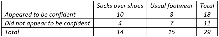
10. Recall that a study conducted in Dunedin, New Zealand investigated whether wearing socks over shoes could help people to walk confidently down an icy footpath*.  Participants were randomly assigned to wear socks over their usual footwear, or to simply wear their usual footwear, as they walked down an icy footpath.  One of the response variables measured was whether an observer considered the participant to be walked confidently.  Results are summarized in the 2×2 table of counts below:

For parts (a) – (c), suppose that you conduct a by-hand simulation analysis to investigate whether wearing socks over shoes increases people’s confidence while walking down an icy footpath.  For parts (d) and (e), consider the results of such a simulation analysis performed with technology.

  • a) What would be the assumption involved with producing the simulation analysis?  Choose one of the following options: A. That wearing socks over shoes has no effect on walkers’ confidence; B. That wearing socks over shoes has some effect on walkers’ confidence; C. That walkers are equally likely to feel confident or not, regardless of whether they wear socks over shoes or not; D. That walkers are more likely to feel confident if they wear socks over shoes
  • b) How many cards would you use in the simulation analysis?  What would the color breakdown be? 
  • c) How many cards would you deal out into groups?  How many times would you repeat this process?
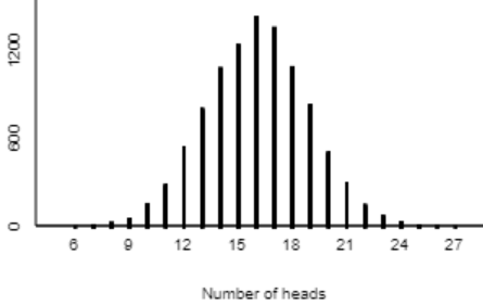
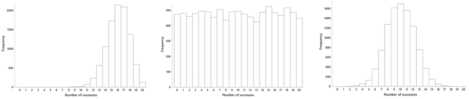
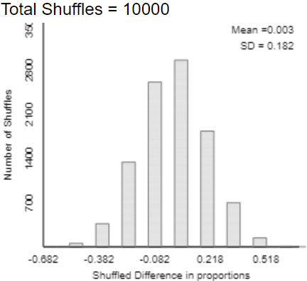
  • d) The graph below displays the results of a simulation analysis with 10,000 repetitions, displaying the distribution of the difference in success proportions between the two groups.  Describe how you would calculate an approximate p-value from this graph (i.e., where would you count?).
  • e) Based on the 2×2 table of data and on this graph of simulation results, how much evidence do the data provide in support of the conjecture that wearing socks over shoes increases people’s confidence while walking down an icy footpath?  Choose one of the following options: A. little or no evidence; B. moderate evidence; C. strong evidence; D. very strong evidence.

* This study is too fascinating to use only once!

This quiz assesses how well students understood a class activity about simulation-based inference for comparing proportions between two groups*.  Part (a) asks for the null hypothesis, without using that term.  Parts (b) – (c) concern the nuts and bolts of conducting a simulation analysis by hand.  Parts (d) and (e) address using the simulation analysis to draw a conclusion.  The hardest part for students is realizing that they need to see where the observed value of the statistic (difference in success proportions between the two groups) falls in the simulated null distribution.  I could have made this more apparent by first asking students to calculate the value of the statistic.  Instead I only give a small hint at the beginning of part (e) by reminding students to use the 2×2 table of observed counts as well as the graph of simulation results.  In this case the observed value of the statistic (10/14 – 8/15 ≈ 0.181) is not a surprising result in the simulated null distribution, so the study provides little or no evidence that wearing socks over shoes is helpful.

* My next blog post (#27) will describe and discuss such a class activity.


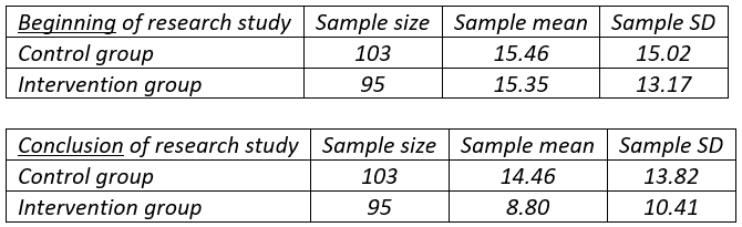
11. Researchers at Stanford University studied whether a curriculum could help to reduce children’s television viewing. Third and fourth grade students at two public elementary schools in San Jose were the subjects. One of the schools, chosen at random, incorporated an 18-lesson, 6-month classroom curriculum designed to reduce watching television and playing video games, whereas the other school made no changes to its curriculum. At the beginning and end of the study, all children were asked to report how many hours per week they spent on these activities, both before the curriculum intervention and afterward.  The tables below summarize reported amounts of television watching, first at the beginning of the study and then at its conclusion:

  • a) Is the response variable in this study categorical or numerical?
  • b) The difference between the groups can be shown not to be statistically significant at the beginning of the study.  Do you think the researchers would be pleased by this result?  Explain why or why not.
  • c) Even if the distributions of reported amounts of television watching per week are sharply skewed, would it still be valid to apply a two-sample t-test on these data?  Explain briefly.
  • d) Calculate the value of the test statistic for investigating whether the two groups differ with regard to average amount of television watching per week.
  • e) Based on the value of the test statistic, summarize your conclusion for the researchers.

Part (a) is quite straightforward, offering an easy point for students.  I really like part (b), which asks students to realize that a non-significant difference between the groups at the beginning of the study is a good thing. The lack of significance suggests that random assignment achieved its goal of producing similar groups prior to the intervention.  For part (c) students should recognize that the large sample sizes establish that the two-sample t-test is valid even with skewed distributions.  Notice that the only calculation in the quiz is part (d).  The value of the test statistic in part (d) turns out to be 3.27, which is large enough to conclude in part (e) that the intervention reduced the mean amount of television watching.


12. Answer the following:

  • a) Would you expect to find a positive or negative correlation coefficient between high temperature on January 1, 2020 and distance from the equator, for a sample consisting of one city from each of the 50 U.S. states?  Explain briefly.
  • b) Suppose that you record the daily high temperature and the daily amount of ice cream sold by an ice cream vendor at your favorite beach next summer, starting on the Friday of Memorial Day weekend and ending on the Monday of Labor Day weekend.  Would you expect to find a positive or negative correlation coefficient between these variables?  Explain briefly.
  • c) Suppose that every student in this class scored 5 points lower on the second exam than on the first exam.  Consider the correlation coefficient between first exam score and second exam score.  What would the value of this correlation coefficient be?  Explain briefly

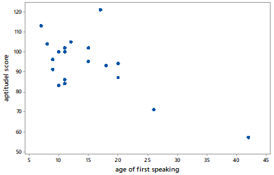
Parts (d) and (e) pertain to the graph below, which displays data on the age (in months) at which a child first speaks and the child’s score on an aptitude test taken later in childhood:

  • d) Is the value of the correlation coefficient between these variables positive or negative?
  • e) Suppose that the child who took 42 months to speak were removed from the analysis.  Would the value of the correlation coefficient between the variables be closest to -1, 0, or 1?

This quiz addresses association and correlation between two numerical variables.  Parts (a) and (b) ask students to think about a context to determine whether an association would be positive or negative.  Part (c) is very challenging, as I discussed in post #21 (Twenty final exam questions, here).  Many students believe that the correlation must be negative, and some even respond that the correlation coefficient will equal -5!  The correct answer is that the correlation would be exactly 1.0, because the data would fall on a straight line with positive slope.

Parts (d) and (e) pertain to one of my all-time favorite datasets, which I encountered in Moore and McCabe’s Introduction to the Practice of Statistics near the beginning of my teaching career.  For this quiz I want students to realize that the correlation coefficient is negative but would be close to zero if the child who took the longest to speak were removed.


13. Some of the statistical inference procedures that we have studied include:

  • A. One-sample z-procedures for a proportion
  • B. Two-sample z-procedures for comparing proportions
  • C. One-sample t-procedures for a mean
  • D. Two-sample t-procedures for comparing means
  • E. Paired-sample t-procedures for comparing means

For each of the following questions, identify (by capital letter) which procedure you would use to address that question.  (Be aware that some letters may be used more than once, others not at all.)

  • a) Do cows tend to produce more milk if their handler speaks to them by name every day than if the handler does not speak to them by name?  A farmer randomly assigned half of her cows to each group and then compared how much milk they produced after one month.
  • b) A baseball coach wants to investigate whether players run more quickly from second base to home plate if they take a wide angle or a narrow angle around third base.  He recruits 20 players to serve as subjects for a study.  Each of the 20 players runs with each method (wide angle, narrow angle) once.
  • c) Does the average length of a sentence in a novel written by John Grisham exceed the average length of a sentence in a novel written by Louise Penny?  Students took a random sample of 100 sentences from each author’s most recent novel and recorded the number of words in each sentence.
  • d) Have more than 25% of Cal Poly students have been outside of California in the year 2019?
  • e) Are Stanford students more likely to have been outside of California in the year 2019 than Cal Poly students?

I give a quiz like this once or twice in every course.  Students need practice with identifying which procedure to use in a particular situation.  It’s easy and appropriate for students to focus on one topic at a time, so I think we teachers need to ask questions like this that require students to synthesize what they’ve learned across topics.

Notice that the words proportion and mean do not appear in any of the five parts of this quiz, so students cannot simply look for those key words.  I tell students that the key to answering questions like this is to start by identifying the variable(s) and their types (categorical or numerical) and roles (explanatory or response).


The last of the six GAISE recommendations (here) is: Use assessments to improve and evaluate student learning.  The improve part of that recommendation can be very challenging to implement successfully.  I have found group quizzes to be very effective for motivating students to help each other with developing and strengthening their understanding of statistical concepts.

P.S. The study about wearing socks over shoes can be found here.  The study about children’s television viewing can be found here.  The data on age of first speaking can be found here.

P.P.S. The following link contains a Word file with the thirteen quizzes from this post and the previous one, along with solutions.  Teachers should feel free to modify this file for use with their own students.

#25 Group quizzes, part 1

I tell my students in my syllabi that they will take lots of quizzes in my course.  That raises an obvious question: How many is lots?  Let’s look at some data. This graph shows the distribution of number of quizzes that I have given in 25 courses over the past several years:

The median is 18 and mean is 18.72 quizzes per course.  My courses meet for ten weeks (on the quarter system), so my students take an average of slightly fewer than 2 quizzes per week.  Many of my courses meet twice per week for 110 minutes per class meeting, so this amounts to about one quiz per class meeting.

Why do I give so many quizzes?  I tell students in my syllabi that the quizzes provide them with opportunities to:

  • improve their understanding of the material
  • assess how well they understand the material
  • prepare for the kinds of questions that will be on exams

With few exceptions these are group quizzes.  Even though I encourage students to work together and help each other as we work through in-class activities, I find that they engage much more concertedly during these group quizzes. Apparently the precious commodity of points toward their course grade provides a strong motivation.  Conversations that I overhear as students work on group quizzes convince me that they are truly helping each other to learn at these times.

Students usually form groups by self-selection.  Sometimes I mix things up by randomly assigning students to groups for a given quiz.  I typically limit group sizes to three students, but I allow them to form groups of any size for one quiz near the end of the course.  I emphasize that by putting their name on a quiz, they are attesting that they made a good-faith effort to help the group with the quiz.  Once in a while students abuse this rule by including the name of a classmate who was not even in class that day, but I don’t think this occurs too much.

These quizzes typically ask about topics that students are to have learned in class that day.  Students are almost always allowed to use their notes during the quiz. This policy encourages them to take good notes during class and also alleviates some of the stress of taking a quiz.  Once in a while, when I run out of class time, I’ll ask students to complete a quiz outside of class, but students are much less likely to work together on take-home quizzes.

Every quiz consists of five parts, each worth one point.  The lowest two (sometimes three) quiz scores in the course are dropped before the calculation of each student’s overall quiz percentage.  The quizzes usually contribute only 10% to the calculation of the overall course score.  I tell students on the first day of class that most students’ overall course score is helped by their quiz percentage.  The distribution of overall quiz percentages from one of my recent courses, shown in the graph below, is quite typical. The distribution is sharply skewed to the left, largely due to some students who miss more than a few quizzes, with a median of 87.35 percent and mean of 81.89 percent:

The remainder of this blog post, and all of the next one, consists of quizzes that I have given in introductory statistics courses, along with comments on each.  I will present thirteen quizzes, six in this post and seven to come next week.  The order of topics will reveal that I introduce simulation-based inference for a proportion early in the course.


1. For parts (a) and (b), consider the research question of whether students at Cal Poly – San Luis Obispo are more likely to wear clothing that says “Cal Poly” than students at Cal Poly – Pomona.  Suppose that you were to collect data for a statistical study of this question. 

  • a) Identify the explanatory variable, and classify it as numerical or categorical.
  • b) Identify the response variable, and classify it as numerical or categorical.

For parts (c) – (e), consider the patients who went to the emergency room at the local hospital last week as the observational units in a statistical study.

  • c) Identify one categorical variable that could be recorded on these observational units.
  • d) Identify one numerical variable that could be recorded on these observational units.
  • e) State a research question that you could investigate about these observational units, using at least one of the variables that you gave in part (c) or (d).

As I said in post #11 (here), I ask students about observational units and variables in nearly every example that we discuss in the entire course.  Not surprisingly, an early quiz focuses on this topic.  Most students do fine with parts (a) and (b), although some express the response variable poorly by saying something like “wearing Cal Poly clothing” instead of “whether or not the student wears Cal Poly clothing.”  Parts (c)-(e) are more challenging, as they ask students to think of their own variables. Part (e) is especially difficult; I have found that it’s much easier for students to describe variables than to state a research question to be investigated with those variables.  A good answer to part (e) does not need to be complicated.  For example, a fine answer is: “How long is the average waiting time to see a medical professional after arriving at the emergency room?”


2. Recall that you took samples of words from the population of words in the Gettysburg Address, for which the average length of a word is 4.295 letters.  Parts (a)-(d) refer to this situation.

  • a) Is the number 4.295 a parameter or a statistic? 
  • b) When you first selected your sample of 10 (circled) words, what was the variable?  Was it categorical or numerical?
  • c) What aspect of the first graph on the board indicated that the sampling method was biased?
  • d) Would selecting words by closing your eyes and pointing at the page 10 times produce an unbiased sampling method?  Explain briefly.
  • e) In general, does taking a very large sample (say, of millions of people) produce an unbiased sampling method?   Explain briefly.

Based on the Gettysburg Address activity that I described in post #19 (here), this quiz assesses whether students have understood the activity that they worked through in class that day.  They can answer parts (a)-(d) directly from their notes, so this quiz should provide easy points for students.  Part (e) requires students to stop and think a bit. I hope they’ll remember our class discussion of the infamous Literary Digest poll from 1936, which illustrates that a very large sample size does not guarantee an unbiased sampling method. I don’t often give quizzes that are this straight-forward and can be answered with little new thinking, but I believe this makes for a nice change-of-pace. I also think it’s okay now and then for a quiz to reward students for being in class and paying attention.


3. Researchers investigated whether they could correctly predict the outcome of an election, more often than not, by selecting the candidate whose face is judged (by a majority of people interviewed) to be more competent-looking.  They applied this prediction method to 32 U.S. Senate races in 2004.  The “competent face” method correctly predicted the winner in 23 of the 32 races.

  • a) What are the observational units in this study, and what is the sample size?
  • b) Describe (in words) the null hypothesis to be tested.

Consider the following results of a simulation analysis with 10,000 repetitions, for testing whether the competent face method would correctly predict the winner in more than half of all races:

  • c) Describe how you would use the simulation results to approximate the p-value of the test.
  • d) The p-value turns out to be approximately 0.01.  Write a sentence interpreting this p-value in context (probability of what, assuming what?).
  • e) Do the sample data provide strong evidence in support of the “competent face” prediction method?  Justify your answer, based on the simulation analysis.

This quiz assesses students’ understanding of simulation-based inference as presented early in the course.  Students would have seen an example such as the one presented in post #12 (here) before taking this quiz.

The second question in part (a) is meant to help students answer the first question.  If they realize that the sample size is 32, they can stop and ask themselves: 32 of what?  This should lead them to recognize that the 32 Senate races are the observational units, not the people who were interviewed to determine which candidate’s face is judged to be more competent.

Part (c) requires students to specify how they would use the applet to determine the approximate p-value, without needing to give them access to the applet.

Notice that part (d) gives a big hint about the two things (in addition to context) that students should include in their interpretation of a p-value: probability of obtaining 23 or more correct predictions in 32 races, assuming that the competent-face method would be correct for 50% of all races in the long run.  I do not give these hints later in the course, when I expect students to have a firmer grasp of interpreting a p-value, but I think such a hint is appropriate and helpful early on.


4. Suppose that a tire manufacturer believes that the lifetimes of its tires follow a normal distribution with mean 50,000 miles and standard deviation 5,000 miles.

  • a) Based on the empirical rule, 95% of tires last for between what two values?
  • b) How many standard deviations above the mean is a tire that lasts for 58,500 miles?
  • c) Determine the probability that a randomly selected tire lasts for more than 58,500 miles.
  • d) Determine the mileage for which only 25% of all tires last longer than that mileage.  Show how you arrive at your answer.
  • e) Suppose the manufacturer wants to issue a money-back guarantee for its tires that fail to achieve a certain number of miles.  If they want 99% of the tires to last for longer than the guaranteed number of miles, how many miles should they guarantee?  Show how you arrive at your answer.

Parts (a)-(d) are routine questions about the empirical rule, z-scores, and calculating probabilities and percentiles from normal distributions.  I think these provide good practice of the basics of what students are to have learned in class that day.  Students can use a table of standard normal probabilities, or a calculator with a normal probability function, or a software tool to answer parts (c) and (d).

Part (e) is not especially hard, but it does trip up a few students.  Can you guess a fairly common mistake that I find very disheartening?  The correct z-score is -2.326, so the correct answer for the lifetime to be guaranteed is 50,000 – 2.326×5000 ≈ 38,370 miles.  But some students look up the z-score for the 99th percentile and obtain positive 2.326, which produces an answer of 50,000 + 2.326×5000 ≈ 61,630 miles.  I always cringe at this response, because these students have not noticed that their calculation does not make sense: This answer would mean that the company would give 99% of customers their money back!  I also cringe because these students have neglected to follow my first piece of advice about calculations involving normal distributions: Start with a sketch!  If they included with a sketch, they would have seen that only 1% of tire lifetimes exceed 61,630 miles, and 38,370 miles is the value for which 99% exceed that lifetime:


5. Recall the formula for the z-test statistic when conducting a hypothesis test about a proportion:

  • a) What does the symbol p-hat* represent?  (Be as specific as possible.)
  • b) What does the symbol pi_0* represent?  (Be as specific as possible.)
  • c) What does the symbol n represent?
  • d) For a given value of n, what happens to the absolute value of the test statistic as the difference between p-hat and pi_0 increases?
  • e) For a given value of n, what happens to the p-value as the difference between p-hat and pi_0 increases?

* Students see the symbols rather than the words p-hat and pi_0 here.

Parts (a)-(c) simply ask students to explain what three symbols represent.  I grade parts (a) and (b) very strictly.  Full credit for part (a) requires saying that the p-hat symbol represents a sample proportion.  A response to part (b) must mention a hypothesized value of the population proportion, with all three italicized words required for full credit.  I think these are worthwhile questions, because it’s crucial for students to recognize what these symbols mean in order to understand hypothesis testing about a proportion.

Students can think about parts (d) and (e) either conceptually or mathematically.  The z-statistic measures the difference between the sample proportion and the hypothesized value of the population proportion in terms of number of standard deviations.  A larger difference produces a larger absolute value of the test statistic.  A larger difference also provides stronger evidence against the null hypothesis and therefore a smaller p-value.


6. A Harris Poll that surveyed 2225 adult Americans on October 14-19, 2015 found that 29% reported having at least one tattoo.

  • a) Is 29% (.29) a parameter or a statistic?  What symbol do we use for it?
  • b) Determine (by hand) a 95% confidence interval for the relevant parameter.
  • c) Interpret this interval: You’re 95% confident that __________ is between ____ and ____ .
  • d) How would a 99% confidence interval differ (if at all) from the 95% one?  Comment on both the midpoint and width of the interval.  (Do not bother to calculate a 99% confidence interval.)
  • e) The same Harris Poll also found that 47% of respondents between the ages of 18-35 reported having at least one tattoo.  How would a 95% confidence interval for this age group, based on this survey, compare to the 95% confidence interval that you found in part (b)?  Comment on both the midpoint and width of the interval.

Parts (a)-(c) ask students to apply what they learned in class to a new study.  Notice that I avoid identifying the parameter for them in part (b), because I want students to describe the parameter clearly in their interpretation in part (c), not just repeat back what I’ve already said.  I do not always provide the structure for interpreting a confidence interval as in part (c), but I think this is helpful in a quiz setting.

In part (d) most students realize that the confidence interval would become wider with a larger confidence level, and I also want them to note that the midpoint would stay at .29, the value of the sample proportion with a tattoo.  Part (e) makes students think, as we did not answer a question like this in class.  They need to recognize that the sample size would be smaller for the restricted group, so the confidence interval would become wider.  They also need to see that the sample proportion (with a tattoo) is larger for the subgroup, so the midpoint of this interval would be larger than for the original interval.


The word quiz can be very valuable when playing Scrabble, and I find group quizzes to be very valuable for my students’ learning.  I fulfill the promise in my syllabi to give lots of quizzes.  Most students respond admirably by engaging with each other to support their learning as they discuss and respond to the quiz questions.  In next week’s blog post I will provide seven more quizzes, again with five parts each, that I have used with my students.

P.S. The article about predicting elections can be found here.  A report on the Harris poll about tattoos can be found here.

P.P.S. I will provide a link to a Word file with these quiz questions, which teachers can modify as they’d like for use with their students, at the end of next week’s post.

#24 Random rendezvous, part 2

In last week’s post (here), I described one of my favorite probability problems: Two people plan to meet for lunch, their arrival times are independent and uniformly distributed over an hour, and they agree to wait fifteen minutes for the other to arrive.  I ask my students to determine the probability that they successfully meet, first using intuition, then simulation, and finally mathematics.

This post will consider a modification to this problem: Suppose that the arrival times follow normal (Gaussian) rather than uniform distributions.  Again I ask a series of questions that lead my students to tackle this extension with intuition, simulation, and mathematics.  Now the necessary mathematics will involve properties of random variables rather than geometry.  (As always, questions for students appear in italics.)


Let’s name this week’s lunch companions Michael and LeBron.  Just like Eponine and Cosette last week, they agree to wait 15 minutes for the other to arrive.  Suppose that Michael and LeBron’s arrival times at the restaurant follow independent normal distributions, each with mean 30 minutes (after noon) and standard deviation 10 minutes.  First I ask students to think about this scenario and make some predictions:

  • Do you think Michael and LeBron are more likely, less likely, or equally likely to successfully meet, as compared to Eponine and Cosette whose arrival times were uniform between noon and 1pm?
  • Make a guess for the probability that Michael and LeBron successfully meet. 
  • Draw a rough sketch of what you expect the joint distribution of their arrival times to look like.

Then I ask: How can we investigate the joint distribution of their arrival times and approximate the probability that they successfully meet?  I hope that the class erupts in response with a chorus of: Simulate!


Let’s begin the simulation analysis by asking: What lines of code do we need to change from last week’s simulation analysis?  I think it’s fair to ask this of students even If they have no coding experience themselves.  If they need a hint: What was the name of the probability distribution of the arrival times last week?  The only lines of code that need changing are the ones for simulating uniformly distributed arrival times (on the left below, where N represents the number of repetitions), and you can show them the new code to simulate normally distributed arrival times (on the right):

Other than this change, the rest of the program used for last week’s analysis (see the end of that post here) can be used without modification.  Before running the code, I ask: What do you expect the distributions of arrival times, difference in arrival times, and absolute difference in arrival times to look like?  Running the code for 10,000 repetitions produces results such as:

Describe what these graphs reveal.  As expected, the distributions of arrival times closely resemble normal distributions, centered around 30 minutes, with almost all the times between 0 and 60 minutes (after noon).  The distribution of differences in arrival times also appears to follow a normal distribution, with a mean close to 0 minutes and most values between -40 and 40 minutes.  The distribution of absolute differences is sharply skewed to the right, centered around 10 minutes or so.

The most informative graph is a scatterplot of arrival times, coded by whether a successful meeting occurs (green for yes, red for no).  What do you expect the scatterplot to look like?  How (if at all) will it differ from the scatterplot when we assumed uniform distributions for arrival times?  Here is a result from 10,000 repetitions:

How is this joint distribution different from the case with uniform arrival times?  These (joint) arrival times are not evenly spread out throughout a 60×60 square.  Instead they are concentrated around the point (30,30), and they become gradually less dense as they move away from that center point in any direction.

How does the region of arrival times for which they successfully meet compare to the uniform case?  The successful meetings, coded in green, occur within 15 minutes on either side of the y = x diagonal line.  It looks like more than half of the dots are green, signaling successful meetings, but it’s hard to tell from the graph.  We need to count how many of the 10,000 repetitions resulted in success.  For these 10,000 repetitions we obtain:

Use a margin-of-error to calculate a 95% confidence interval for the exact probability.  The margin-of-error is approximately 1/sqrt(10,000) = .01, so we can be about 95% confident that the exact probability of a successful meeting is between ( .7071 → .7271).


Now suppose that Michael and LeBron want to increase their chance of successfully meeting to 90%.  Would they need to wait for more or less than 15 minutes?  Explain.  Nearly all students realize that they’ll need to increase their waiting time to more than 15 minutes in order to increase their probability of a successful meeting.

How can you use your simulation results to approximate how many minutes they need to wait to have a 90% chance of meeting?  This question is harder than a similar one in the previous post about a 50% chance of meeting.  In that case we simply calculated the median of the 10,000 simulated values for the absolute difference in arrival times.  But the same idea will work here: instead of the 50th percentile we need to determine the 90th percentile of the absolute differences.  We can use R to do this by sorting the vector of absolute differences and then picking out the 9000th value among the 10,000 simulated values in that sorted vector:

We can approximate that Michael and LeBron should agree to wait for a bit more than 23 minutes in order to have a 90% chance of successfully meeting.


Now let’s turn to a mathematical solution.  We cannot use geometry as we did when the arrival times followed uniform distributions (here), because the (joint) arrival times are not equally likely to fall throughout the 60×60 square.  The key now is to use properties of random variables.

Let’s introduce some notation: Let the random variable X represent Michael’s arrival time and Y represent LeBron’s arrival time.  Express the probability of a successful meeting in terms of these random variables.  We can see from the labeled scatterplot of simulation results above that they successfully meet when their arrival times are within 15 minutes of each other, so we want Pr(|X – Y| < 15).

The bad news is that it’s not easy to determine the probability distribution of the absolute difference |X – Y|.  But the good news is that we can use probability rules to determine the distribution of the difference (X – Y).  Rewrite the probability of a successful meeting without the absolute value.  This is a challenging part for many students, who need to recall how to work with inequalities involving absolute values.  We can re-express Pr(|X – Y| < 15) as Pr(-15 < X – Y < 15).

Determine the name and parameter values of the probability distribution of the difference in arrival times (X – Y).  The first rule we need is that the sum or difference (or any linear combination) of normally distributed random variables also follows a normal distribution.  Then we can determine the mean, variance, and standard deviation of (X – Y) as follows:

As a way to check their work, and as a good practice to model for students, I ask: Calculate the mean and SD of the 10,000 simulated differences.  Are they close to these theoretical values?  Students find that the simulation did produce reasonable approximations, helping to confirm that these theoretical calculations are correct.

Now we have a straightforward normal probability calculation.  We could calculate z-scores (they turn out to be z ≈ ± 1.06) and use a normal probability table, or we could use an applet (here, output shown below), or we could use R (output shown further below):

We see that Michael and LeBron have a 71.12% probability of meeting successfully.  Is the theoretical probability from the normal distribution within the margin-of-error of the approximate probability from the simulation analysis?  Yes, because 0.7112 is within the interval ( .7071 → .7271) that we calculated from the simulation.

Use the normal distribution to determine how long Michael and LeBron must agree to wait in order to have a 90% chance of meeting.  We need to calculate the 5th and 95th percentiles of the (normal) distribution of the difference (X – Y).  We could use an applet or R (see output below), or we could realize that the relevant z-scores are z = ±1.645.  The necessary waiting time is therefore 1.645 standard deviations above the mean: 0 + 1.645×14.142 ≈ 23.264 minutes.  Once again I ask: Compare this to the approximate value that we determined from simulation.  This is quite close to the approximate value of 23.132 minutes that we found with simulation.


A natural extension is to investigate the effect of changing the means and/or standard deviations of the arrival times.  For example: Suppose that Michael and LeBron could make their arrival times more consistent by reducing their standard deviations from 10 to 5 minutes.  How would this change the probability that they successfully meet?  First predict, then simulate, then use mathematics.

Intuition: Most students realize that with less variability (more consistency) in their arrival times, Michael and LeBron are more likely to meet than they were before.

Simulation: A simulation analysis with the smaller standard deviations produces a graph such as the one below.  The arrival times are much less spread out than before, with almost all arrival times between 15 and 45 minutes (after noon), so Michael and LeBron are much more likely to meet.

Mathematics: The standard deviation of the difference (X – Y) becomes sqrt(5^2+5^2) = sqrt(50) ≈ 7.071 minutes.  Then Pr(-15 < (X – Y) < 15) becomes ≈ 0.9661 (z-scores are ±2.12).  As expected, this probability is a considerably larger, because of the smaller standard deviations of arrival times, than with the original scenario.


Ready for a more complicated extension? The calculations for this one go beyond the scope of most introductory statistics courses.  Nevertheless, the intuition here should make sense for introductory students.  How would you expect the probability of successfully meeting to change if Michael and LeBron’s arrival times are not independent but rather are positively correlated?  What if their arrival times are negatively correlated?  Here’s a hint: First think about what the scatterplot of arrival times would look like with a positive (or negative) correlation.

To make this more concrete, let’s go back to assuming that each person’s arrival time follows a normal distribution with mean 30 minutes (after noon) and standard deviation 10 minutes.  Now let’s assume that the arrival times of Michael and LeBron have a correlation coefficient of 0.7.  Later we’ll change the correlation coefficient to -0.7. Once again, let’s approach this problem with intuition, then simulation, and then mathematics.

Intuition: A positive correlation between Michael’s and LeBron’s arrival times means that one is more likely to arrive early when the other arrives early, and one is more likely to arrive late when the other arrives late.  Therefore, we expect less variability in the distribution of differences, and we expect the probability of successfully meeting to increase with a positive correlation.  On the other hand, a negative correlation means that one is more likely to arrive late when the other arrives early, and vice versa.  With a negative correlation, we expect a smaller probability of successfully meeting.

Simulation: Below is some R code for simulating arrival times from a bivariate normal distribution.  Below that are some results for 10,000 repetitions, with the positive correlation on the left and negative correlation on the right:

We see from the graph on the left that a positive correlation makes Michael and LeBron more likely to arrive at similar times, which increases their probability of successfully meeting (approximately 0.9486 from these 10,000 repetitions).  Similarly, we see from the graph on the right that a negative correlation makes Michael and LeBron much less likely to successfully meet (approximately 0.5859 from these 10,000 repetitions).

Mathematics: We know that the difference in arrival times (X – Y) follows a normal distribution with mean 30 – 30 = 0, as when the arrival times were independent.  The non-zero correlation changes the standard deviation of (X – Y), as shown in the following histograms of simulated differences in arrival times:

You might ask students: Which graph do you think goes with which value of the correlation coefficient (0, 0.7, -0.7)?  The answer is that the positive correlation produced the graph on the left, negative correlation for the one on the right, and zero correlation for the middle graph.  Why does this make sense?  As mentioned above, a positive correlation in arrival times produces less variability in differences, and a negative correlation produces more variability in differences.

Now let’s proceed to calculations, which go well beyond the scope of most introductory statistics courses.  The difference (X – Y) still follows a normal distribution with mean 0, but the standard deviation is different from the case of independent arrival times.  The key result is:

With a correlation coefficient of 0.7, this produces Cov(X, Y) = 0.7×10×10 = 70 and Var(X – Y) = 10^2 + 10^2 -2(70) = 60, so SD(X – Y) = sqrt(60) ≈ 7.746 minutes.  As expected, this is a smaller SD than in the case of independent (correlation zero) arrival times.  We can then calculate Pr(-15 < (X – Y) < 15) ≈ 0.9472 (with z-scores ≈ ±1.94).  As expected, this probability is larger than before.  Note that this is quite close to the approximate probability from the simulation results, which is reassuring to see after such an involved calculation.

For the case of an equally strong but negative correlation between the two arrival times, we obtain SD(X – Y) = sqrt(340) ≈ 18.439, which is much larger than before.  This leads to Pr(-15 < (X – Y) < 15) ≈ 0.5841 (with z-scores ≈ ±0.81), which is a considerably smaller probability than before, quite consistent with the approximation from simulation.

These calculations are summarized in the table:


This extension of the “random rendezvous” probability problem replaces uniform with normal distributions for the arrival times.  This change gives students a chance to practice calculations related to normal distributions and also to apply properties of random variables.  This extension also allows students to develop their intuition and to perform more simulation analyses.  Changing the means and/or standard deviations of arrival times offers more questions that require intuition, simulation, and mathematics.  Allowing the arrival times to be positively or negatively correlated adds another dimension to this problem, which can be tackled with intuition and simulation even if the mathematics might be beyond typical students of introductory statistics.

We could analyze even more extensions of this problem, such as using probability distributions other than uniform or normal.  The simulation analysis would involve minimal changes to the code we’ve already written.  The mathematical analysis would require calculating double integrals to determine the volume under a joint probability density function over the region in which the two people meet.

Oh, but look at the time!  I’m running late for a lunch engagement and would hate to miss meeting my friend, so I really must be going …

#23 Random rendezvous, part 1

This post describes one of my favorite examples for teaching probability*.  This activity makes use of three approaches to probability: intuition, simulation, and mathematics.  I especially like that the mathematics involved is not combinatorics or calculus, as is so often the case with probability problems, but rather geometry.  Because it involves coding and geometry as well as probability, I hope that this activity might be especially applicable in high school classrooms.  This post will also feature pretty pictures that help to develop and confirm intuition. As always, questions that I ask students appear in italics.

* I have a complicated relationship with probability. I greatly enjoy studying and teaching it, not only for applications to statistics but also other applications and for its own sake.  Nevertheless, I advocate teaching minimal probability content in Stat 101 courses, only what’s essential for understanding statistical concepts.  On the other hand, I also believe that understanding randomness, uncertainty, and probability is an important quantitative reasoning skill for all students to develop, including at the high school level.  I teach basic probability ideas in a statistical literacy course, more probability topics in an introductory course for engineering students, and an entire course on probability for students majoring in statistics, mathematics, and other quantitative fields.


Suppose that two people plan to meet for lunch at a certain restaurant.  (Let’s call them Eponine and Cosette, in memory of my first two cats*.)  They are both very busy professionals, so they cannot know for sure what time they will arrive.  Let’s assume that their arrival times are independent random variables with each uniformly distributed between 0 and 60, measured in minutes after noon.  Eponine and Cosette agree in advance that the first to arrive will only wait 15 minutes for the other to arrive.  The driving question is: How likely is it that they will successfully meet?

* You can read about my cats Eponine and Cosette, and see their photos, at the end of post #16, titled Questions about cats (here).

I start by asking students to use their intuition to make some predictions.  I want them to put some thought into, but not attempt to devise any solutions for, answering these questions: Do you think they are more likely to meet or not, or do you think it’s 50/50 for whether they meet or not?  Make a guess for the probability that they successfully meet.  In other words, if they were to repeat this random process for a very large number of days, on what percentage of days do you think they would successfully meet?


Next I engage students in a discussion about what steps we need to implement a simulation analysis:

  • Generate arrival times for both people.
  • Determine whether they successfully meet by calculating the absolute difference in arrival times, seeing whether that absolute difference is 15 minutes or less.
  • Repeat this a large number of times.
  • Calculate the proportion of repetitions in which they successfully meet, by counting how often they meet and dividing by the number of repetitions.

We also discuss what graphs would be informative:

  • Histograms of distributions of individual arrival times
  • Scatterplot of joint distribution of arrival times
    • Labeled scatterplot, color-coded according to whether or not they successfully meet
  • Histogram of distribution of difference in arrival times
  • Histogram of distribution of absolute difference in arrival times

Depending on your student audience and course goals, you might want students to write their own code to conduct this simulation analysis, or you might provide them with partial code and ask them to fill in the rest, or you might provide them with full code to run.

Here I will present code written in R*.  I like to use N for the number of repetitions, which the user specifies before running the code.  We can generate the random arrival times, with a vector of length N for each person, so we do not need to use a loop.  We can also produce graphs of the individual and joint distributions using:

* I confess at the outset that I am a novice programmer.

Before running this code, I ask students: Predict what the graphs, both the histograms and the scatterplots, will look like.  Here are some results with 10,000 repetitions:

Describe what the histograms and scatterplots reveal.  There’s not a lot to see here, but the histograms do confirm our expectations about uniform distributions.  Also as expected, the scatterplot reveals random scatter throughout the 60×60 square of possible (joint) arrival times.

How can we calculate vectors of differences and absolute differences in arrival times?  What do you expect histograms of these distributions to look like?  The following code calculates these vectors and produces these graphs, and results are shown for 10,000 repetitions:

Describe what these graphs reveal.  The distribution of differences in the graph on the left is quite symmetric about the value zero.  This makes sense because the two people have the same distribution of arrival times.  The graph on the right of the absolute differences results from folding the left side of the graph on the left about the zero axis.  The distribution of absolute differences is certainly not symmetric.  Smaller values for the absolute difference are more likely than larger values.

Now we’re ready to calculate an approximate probability to answer the question we started with.  We just need to count how many of the repetitions produced an absolute difference in arrival times of 15 minutes or less.  We can do this by creating a vector of true/false values, with TRUE meaning that they successfully met and FALSE meaning that they did not.  We can do this with one line of code as follows, where the user needs to enter wait, the number of minutes that they agree to wait, before running the code:

Next I like to re-produce the scatterplot above, making it more informative (and prettier!) by using different colors for whether the people successfully meet or not.  Let’s use green for repetitions in which Eponine and Cosette successfully met and red for those in which they arrive so far apart that they do not meet.  First I ask students: What do you expect the colored scatterplot to look like?  In other words, where in the 60×60 square do you expect to see the green dots (where they successfully meet), and where do you expect to see the red dots (where they do not meet)?  This question can be challenging, so I offer a hint: Where in the graph do they arrive at precisely the same time, in which case they certainly meet?  Then I follow up with another hint: How far from that line can they arrive and still successfully meet?  Here is some code and resulting graph for 10,000 repetitions:

I think this is a beautiful graph*.  It shows that Eponine and Cosette successfully meet if their joint arrival times are within 15 minutes above or below the y = x diagonal line.  Next I ask: Based on this graph, make a guess for the probability that they successfully meet.

* I always tell my students that this graph would look great on a t-shirt, but so far none have taken the hint to produce such a t-shirt for me.

Now we are ready to calculate this probability (approximately) from the simulation results.  We need to count how many repetitions result in a successful meeting.  We can accomplish this by summing the vector of TRUE/FALSE values, because R treats TRUE as 1 and FALSE as 0.  Then we divide by the number of repetitions to calculate the approximate probability.  Here is the code and sample output for 10,000 repetitions:

Calculate the margin-of-error associated with this approximate probability.  Use the margin-of-error to determine a confidence interval for the actual long-run probability.  In the beginning of a probability course, I give students the short-hand formula 1/sqrt(N) for the margin-of-error of an approximate probability based on a simulation analysis with N repetitions.  With 10,000 repetitions, this produces a margin-of-error of .01, so we can be confident that the actual long-run probability is within the interval 0.4394 ± 0.0100, which is the interval (0.4294 à 0.4494).  Eponine and Cosette have a slightly less than 50% chance of successfully meeting for lunch.


Eponine and Cosette might be disheartened to learn that they are more likely not to meet than to meet.  Suppose that they want to change their waiting time to produce a 50% chance of meeting.  Again I ask students to start with intuition: Do they need to increase or decrease their waiting time to achieve this 50% goal?  Make a guess for how long they need to wait to have a 50% chance of successfully meeting.

Then I ask students: How can we use the simulation results to approximate how long they need to wait to produce a 50% chance of successfully meeting?  This can be challenging, so I have hints ready: Which of the vectors that we generated is most relevant to this question?  What aspect of that vector will approximate a 50% probability?  Students eventually recognize that they can approximate the necessary waiting time with the median of the absolute differences in arrival times.  Here’s the code and some sample output:

Because waiting 15 minutes produced a slightly smaller than 50% chance of a successful meeting, it makes sense that the approximate wait time for a 50% chance is a bit larger than 15 minutes.


Before we move on from simulation to a mathematical analysis, I return to a 15-minute wait time and ask: How can we improve the approximate probability?  Students are quick to respond that using more repetitions should improve the approximation.  Simulating one million repetitions produced an approximate probability of 0.437847.  The margin-of-error is 1/sqrt(1,000,000) = 0.001, so a 95% confidence interval for the exact probability of a successful meeting is 0.437847 ± 0.001, which is the interval (0.436847 à 0.438847).  The approximate wait time needed for a 50% chance of meeting turned out to be 17.60137 minutes.

With one million repetitions, the colored scatterplot of arrival times looks like:

There are so many green and red dots in this graph that you cannot see the individual dots, but you can see a very clear image of the (green) region for which a successfully meeting occurs.  This region provides the key to using geometry to calculate the exact probability.


Because the arrival distributions are independent and uniform, we can determine the exact probability of a successful meeting by calculating the area of the region in which they meet as a fraction of the total area of the region of possible (joint) arrival times.  In other words, we need to calculate the probability that a point selected at random from the 60×60 square falls within the green region rather than one of the red regions.

Determine the area of the overall square.  I often advise students that the denominator is typically easier to calculate with such probability questions.  The area of the 60×60 square of possible (joint) arrival times is 60×60 = 3600 (in units of minutes squared). 

Determine the area of the green region where they successfully meet.  When students do not think of a shortcut from themselves, I offer a hint that makes this much easier: First determine the area of the red regions where they do not meet. The two red triangles have the same area, because both have a length of 45 minutes and height of 45 minutes.  The area of each triangle is therefore 45×45/2 = 1012.5 (again in units of minutes squared), so the combined area of the two red triangles is 45×45 = 2025.  The area of the green region is therefore 3600 – 2025 = 1575.

Use the areas to calculate the (exact, theoretical) probability that Eponine and Cosette successfully meet.  This probability is 1575/3600 = 7/16 = 0.4375.

Are the two approximate probabilities from the simulation analyses above within the margin-of-error of the exact probability?  Yes, the simulation with 10,000 repetitions produced an interval estimate of .4394 ± .0100, which is the interval (.4294 à .4494).  The simulation with 1,000,000 repetitions produced an interval estimate of .437847 ± .001, which is the interval (.436847 à .438847).  Both of these intervals include the exact probability of .4375.


Now let’s use geometry and algebra to determine how many minutes they must agree to wait, in order to have a 50% chance of successfully meeting.  First I ask students: Express the probability of a successful meeting as a function of the number of minutes that each person agrees to wait.  I suggest that students use Pr(S) to denote the probability of a successful meeting, and let m represent the number of minutes that each person agrees to wait.  Again I have a hint ready: Start with a sketch of the 60×60 square.  Then sketch the region where they meet, much like before, but using m rather than 15 as the number of minutes that they wait.  Here’s a sketch:

Each triangle now has length (60 – m) and height (60 – m), so its area is (60-m)×(60-m)/2.  The combined area of the two triangles is therefore (60-m)×(60-m).  The area of the non-triangular region where they successfully meet is then 3600 – (60-m)×(60-m).  The probability of a successful meeting can be expressed as:

Graph this probability as a function of m, for values of m from 0 to 60 minutes.  Some R code and output for this graph are:

Describe the behavior of this function.  Students should comment that this function is increasing, which certainly makes sense because waiting longer increases the probability of meeting.  They should also observe that the rate of increase diminishes as the number of minutes increases.  I also ask students to check that the probability for a 15-minute wait looks to be consistent with what we calculated earlier: .4375.

Now we are ready to do the algebra to solve for how long to wait in order to have a 50% chance of meeting.  Setting Pr(S) = 0.5 produces (60-m)×(60-m) = 1800.  Solving gives: m ≈ 17.5736 minutes.  This value is very consistent with our approximate values from the simulation analyses above.


This activity can lead students to use intuition, simulation, and mathematics to solve probability problems.  Unlike many probability problems that rely on combinatorics or calculus, geometry provides the solution to this one.  Depending on your student audience and course goals, you could also ask students to do some coding themselves with this activity. You might also use this as an assignment rather than an in-class activity.

More extensions to this random rendezvous naturally present themselves.  For example, we need not have assumed that Eponone’s and Cosette’s arrival times were uniformly distributed.  How would the probability of a successful meeting change if their arrival times followed independent normal distributions?  That depends on the means and standard deviations, which could be the same for both people or not.  What if those normal distributions were not independent?  We’ll consider those extensions in next week’s post, in which we will again use intuition, simulation, and mathematics to tackle probability questions.


P.S. This activity was inspired by problem #26, called The Hurried Duelers, in Frederick Mosteller’s wonderful book Fifty Challenging Problems in Probability.

P.P.S. The link below contains a file with the R code used above.

#22 Four more exam questions

In last week’s post (here), I presented twenty multiple choice questions, all conceptual in nature, none based on real data.  This week I present four free-response questions that I have used on exams, all based on real data from genuine studies.  These questions assess students’ abilities to draw and justify appropriate conclusions.  Topics covered include confounding, biased sampling, simulation-based inference, statistical inference for comparing two groups, and cause-and-effect conclusions.  All of these questions have multiple parts*.  I also provide comments on the goal of each question and common student errors. I do not intend these four questions to comprise a complete exam.  As always, questions for students appear in italics.

* I could have titled this post “Twenty more exam questions” if I had counted each part separately.


1. (6 pts) Researchers found that people who used candy cigarettes as children were more likely to become smokers as adults, compared to people who did not use candy cigarettes as children.

  • (a) (1 pt) Identify the explanatory variable.
  • (b) (1 pt) Identify the response variable.
  • (c) (4 pts) When hearing about this study, a colleague of mine said: “But isn’t the smoking status of the person’s parents a confounding variable here?”  Describe what it means for smoking status to be a confounding variable that provides an alternative to drawing a cause/effect explanation in this context.

Describing what confounding means can be very challenging for students.  The key is to suggest a connection between the confounding variable and both the explanatory and response variables. I’ve tried to make this task as straight-forward as possible here.  Students do not need to suggest a confounding variable themselves, and the context does not require specialized knowledge to explain the confounding.

Parts (a) and (b) are meant to be helpful by directing students to think about the explanatory and response variables in this study (and also offering an opportunity to earn two relatively easy points).  The explanatory variable is whether or not the person used candy cigarettes as a child, and the response variable is whether or not the person became a smoker as an adult.

To earn full credit for part (c), students need to say something like:

  • Parents who smoke are more likely to allow their children to use candy cigarettes than parents who do not smoke.
  • Children of parents who smoke are more likely to become smokers as adults than children of parents who do not smoke.

It would be nice for students to add that these two connections would result in a higher proportion of smokers among those who used candy cigarettes as children than among those who did not use candy cigarettes, but I do not require such a statement.

Many students earn partial credit by giving only one of the two connections.  Such a response fails to explain confounding fully and falls short of providing an alternative explanation for the observed association.  Another common error is that some students focus on conjectured explanations, such as proposing only that children of smokers want to emulate their parents by using candy cigarettes, or that a genetic predisposition leads children of smokers to become smokers themselves.  Both of these explanations come up short because they only address one of the two connections.

I sometimes make this question a bit easier by provide one of the connections for students: My colleague also pointed out that children of smokers are more likely to become smokers as adults than children of non-smokers.  What else does the colleague need to say to complete the explanation of how parents’ smoking status is a confounding variable in this study?  At other times I make this question harder by asking students to propose a potential confounding variable and also explain how the confounding could provide an alternative to a cause-and-effect explanation.

I sometimes make this question a bit easier by provide one of the connections for students: My colleague also pointed out that children of smokers are more likely to become smokers as adults than children of non-smokers.  What else does the colleague need to say to complete the explanation of how parents’ smoking status is a confounding variable in this study?  At other times I make this question harder by asking students to propose a potential confounding variable and also explain how the confounding could provide an alternative to a cause-and-effect explanation.


2. (8 pts) The news website CNN.com has posted poll questions that people who view the website can respond to.  The following results were posted on January 10, 2012:

The margin-of-error, for 95% confidence, associated with this poll can be calculated to be ± .003, or ± 0.3%.

  • a) (1 pt) Are the percentages reported here (62%, 25%, 13%) parameters or statistics?  Explain briefly.
  • b) (1 pt) Explain (using no more than ten words) why the margin-of-error is so small.
  • c) (3 pts) Would you be very confident that between 61.7% and 62.3% of all employed Americans surf the Web often while on the job?  Circle YES or NO.  Also explain your answer.

Part (a) provides an easy point for students to earn by responding that these are statistics, because they are based on the sample of people who responded to the poll.  Part (b) is also fairly easy; an ideal answer has only four words: very large sample size.  I do not require that students report the sample size of 111,938.  They can omit the word “very” and still earn full credit.

Part (c) is the key question.  I want students to recognize that this poll relies on a very biased sampling method.  Any online poll like this is prone to sampling bias, but the topic of this poll question especially invites bias.  Only by surfing the web can a person see this poll question, so the sampling method favors those who surf the web often while at work.  Because of this biased sampling method, students should not be the least bit confident that the population proportion is within the margin-of-error of the sample result.

I’ve learned to require students to circle YES or NO along with their explanation.  Otherwise, several students try to have it both ways with a vague answer that tries to cover all possibilities, such as: I would be very confident of this, but I would also be cautious not to conclude anything too conclusively.

I used to present this poll result graphic to students and then ask specifically about sampling bias.  But I changed to the above version, as I decided that it’s important for students to be able to spot sampling bias without being prompted to look for it.


3. (12 pts)  Researchers presented young children with a choice between two toy characters who were offering stickers.  One character was described as mean, and the other was described as nice.  The mean character offered two stickers, and the nice character offered one sticker.  Researchers wanted to investigate whether infants would tend to select the nice character over the mean character, despite receiving fewer stickers.  They found that 16 of the 20 children in the study selected the nice character.

  • a) (2 pts) Describe (in words) the null hypothesis in this study.
  • b) (3 pts) Suppose that you were to conduct a simulation analysis of this study to investigate whether the observed result provides strong evidence that children genuinely prefer the nice character with one sticker over the mean one with two stickers.  Indicate what you would enter for the following three inputs: i) Probability of success, ii) Sample size, iii) Number of samples.
  • c) (1 pt) One of the following graphs was produced from a correct simulation analysis.  The other two were produced from incorrect simulation analyses.  Circle the correct one.
  • d) (1 pt) Based on the correct graph, which of the following is closest to the p-value of this test: 5.000, 0.500, 0.050, 0.005?  (Circle your answer.)
  • e) (2 pts) Write an interpretation of the p-value in the context of this study.
  • f) (3 pts) Summarize your conclusion from this research study and simulation analysis.

I am often asked about how to assess students’ knowledge of simulation-based inference* without using technology during the exam.  This question shows one strategy for achieving this.  Students need to specify the input values that they would use for the simulation, pick out what the simulation results would look like, estimate the p-value from the simulation results, and summarize an appropriate conclusion.

* See post #12 (here) for an introduction to simulation-based inference.

For part (a), I am looking for students to say that the null hypothesis is that children have no preference for either character.  At this point I am not asking for students to express this hypothesis in terms of a parameter.  It’s fine for them to state that children are equally likely to select either character, or that children select a character at random.

Correct responses for part (b) are to use 0.5 for the probability of success, 20 for the sample size, and a large number such as 1000 or 10,000 for the number of samples.  Some students enter 0.8 for the probability of heads, based on the sample proportion of successes.  A few students enter 20 for the number of repetitions.

Part (c) requires some thought, because my students have not seen such a question before.  Some mistakenly think that the simulation results should be centered at the observed value, so they incorrectly select the graph on the left.  The simulation results should be centered on what’s expected under the null hypothesis, as in graphs in the middle and on the right.  Most students realize that they’ve never seen a simulation result look like the nearly-uniform distribution in the middle graph.  Most recognize that they have frequently seen simulation results that look like the bell-shaped graph on the right, so they correctly select it.

To answer part (d) correctly, students need to be looking at the correct graph.  For the graph on the right, very few of the repetitions produced 16 or more successes in 20 trials, so the p-value is very small.  The smallest p-value among the options, .005, is the correct answer.

Many students struggle somewhat with part (e).  One of the things that I like about the simulation-based approach to statistical inference is that I think it makes the interpretation of p-value as clear as possible.  Students do not need to memorize an interpretation; they just need to describe what they see in the graph and remember the assumption behind the simulation analysis: If children had no preference between the characters, then only about 5 in 1000 (.005) repetitions would produce 16 or more successes.  Many students get the second part of this interpretation correct but forget to mention the “if there were no preference” assumption; such a response earns partial credit.  Sometimes I make this part of the question easier by giving a parenthetical hint: probability of what, assuming what?

Part (f), which is much more open-ended than previous parts, asks students to draw an appropriate conclusion.  This study provides very strong evidence that children genuinely prefer the nice character over the mean character despite receiving fewer stickers from the nice character.  This conclusion follows from the very small p-value, which establishes that it would be very surprising for 16 or more of 20 children to select the nice character, if in fact children had no preference for either character.


4. (16 pts) The Gallup organization released a report on October 20, 2014 that studied the daily lives and well-being of a random sample of American adults.  The report compared survey responses between adults with children under age 18 living in the home and those without such children living in the home.  The following table was provided in the report:

  • a) (2 pts) Does this study involve random sampling, random assignment, both, or neither?  Explain briefly.
  • b) (2 pts) State the appropriate null and alternative hypotheses (using appropriate symbols) for testing whether the two populations of adults differ with regard to the proportion who smiled or laughed a lot on the previous day.
  • c) (2 pts) The value of the test statistic turns out to be z = 18.5.  Write a sentence interpreting the value of this z-test statistic.  (This is not asking for a test decision or conclusion based on the z-test statistic.)
  • d) (2 pts) Would you reject the null hypothesis at the .01 significance level?  Explain how your answer follows from the value of the z-test statistic.
  • e) (2 pts) A 99% confidence interval based on the sample data turns out to be (.039 à .051).  Interpret what this interval says in this context.
  • f) (2 pts) Is this confidence interval consistent with your test decision (from part d)?  Explain how you know.
  • g) (2 pts) Give a very brief explanation for why this confidence interval is very narrow.
  • h) (2 pts) Suppose that someone reads about this study and says that having children in the household causes a very large increase in the likelihood of smiling or laughing a lot.  Would you agree with this conclusion?  Explain why or why not.

Presenting the sample statistics in the form of this table is a bit non-conventional.  This is certainly not a 2×2 table of counts that students are accustomed to seeing.   This can confuse some at first, but I think it’s worthwhile for students to see and grapple with information presented in multiple ways.

Part (a) revisits the theme of posts #19 and #20, titled Lincoln and Mandela (here and here), about the distinction between random sampling and random assignment.  Students should note that the question states that the sample was selected randomly.  But the Gallup organization certainly did not perform random assignment, because it would not be sensible or practical to randomly assign which people have children in their household and which do not.

To answer part (b) correctly, students need to realize that the test requires comparing proportions between two groups.  The null hypothesis is that American adults with children in their household have the same proportion who smiled or laughed a lot on the previous day as those without children in their household.  This null hypothesis can be expressed in symbols* as:

* Recall from post #13, titled A question of trust (here), that I like to use Greek letters for all parameter symbols, so I use π for a population proportion.

I could have asked students to calculate the z-test statistic, but part (c) provides this value and asks for an interpretation.  I try to ward off a common error by cautioning students not to provide a test decision or conclusion.  But many students do not know what interpreting the z-score means, even though we’ve done that often in class*.  I want students to respond that the sample proportions (who smiled or laughed a lot on the previous day) in the two groups (those with/without children under age 18 in the household) are 18.5 standard deviations (or standard errors) apart.  This is a huge difference.  Students do not need to comment on the huge-ness until the next part, though.  Despite my caution, many students draw a conclusion from the z-score here rather than interpret it.  This could be because they do not read carefully enough, or it could well be that they do not understand what interpreting a z-score entails.

* See post #8, titled End of alphabet (here), for more thoughts and examples about z-scores.

For part (d), students should note that because the z-score of 18.5 is enormous, the p-value will be incredibly small, very close to zero.  The tiny p-value leads to an emphatic rejection of the null hypothesis.  Notice that I do not ask for an interpretation of this test decision in context here, only because parts (c) and (e) ask for interpretations.

Students need to realize that the confidence interval presented in part (e) estimates the difference in population proportions.  I think this is fair to expect in part because that’s the conventional confidence interval to produce when comparing proportions between two groups, and also because the reported difference in sample proportions between the groups (.045) is the midpoint of the interval.  We can be 95% confident that the proportion of American adults with a child under age 18 in the household is greater than the proportion among those without a child by between .039 and .051 (in other words by between 3.9 and 5.1 percentage points).  Some students interpret this interval only as a difference without specifying direction (that those with a child are more likely to have smiled or laughed a lot).  Such a response is only worth partial credit, because they’re leaving out an important element by not specifying which group has a higher proportion who smile or laugh a lot.

Part (f) is intended to be straightforward.  Students should have rejected the null hypothesis that the population proportions are the same in the two groups.  They should also notice that the confidence interval, containing only positive values, does not include zero as a plausible value for the difference in population proportions.  These two procedures therefore give consistent results*.

* I hope that some students will remember the cat households example from post #16, titled Questions about cats (here), when they read this part.  If they do, this recollection might also help with part (h) coming up.

Part (g) is asking about the very large sample size producing a narrow confidence interval. This is the same issue that I asked about in part (b) of question #2 about the CNN.com poll*.

* It’s certainly possible that I over-emphasize this point with my students.

I must admit that I really like part (h).  The previous seven parts have been leading up to this part, which asks about the scope and type of conclusion students can draw from this survey.  Notice that I use bold font for both causes and very large increase.  This as a big hint that I want students to comment on both aspects.  Most students correctly note that this is an observational study and not a randomized experiment, so a cause-and-effect conclusion (between having children in the household and being more likely to smile or laugh) is not justified.  Relatively few students go on to address whether the difference between the groups is very large.  I hope that they’ll look at the two sample proportions, and also at the confidence interval for the difference in population proportions, and then conclude that 3.9 to 5.1 percentage points does not indicate a very large difference between the two groups.


I hope these four exam questions, which aim to assess students’ abilities to draw and justify conclusions, provide a nice complement to last week’s multiple choice questions (here).  See below for a link to a Word file containing these questions.

P.S. I thank my Cal Poly colleague Kevin Ross for introducing me to the Gallup poll and some good questions to ask about it.  Kevin and his wife Amy have five children under age 18 in their household.  I suspect that Kevin and his wife smile and laugh quite often.

P.P.S. The journal article on candy cigarette use can be found here.  The article on children’s choices of toy characters can be found here; this is a follow-up study to a more well-known one that I often use in class, described here.  A report on the Gallup survey about smiling and laughing can be found here.

P.P.P.S. Follow the link below for a Word file containing these four questions, and feel free to use or revise them for use with your own students.