Skip to content

Archive for

#34 Reveal human progress, part 2

In the previous post (here), I put my Ask good questions mantra on a temporary hold as I argued for another three-word exhortation that I hope will catch on with statistics teachers: Reveal human progress.  In this post I will merge these two themes by presenting questions for classroom use about data that reveal human progress.

The first three of these questions present data that reveal changes over time.  I think these questions are appropriate not only for introductory statistics but also for courses in quantitative reasoning and perhaps other mathematics courses.  The fourth question concerns probability, and the last two involve statistical inference.

As always, questions that I pose to my students appear in italics.


1. The following graph displays how life expectancy has changed in South Africa over the past few decades:

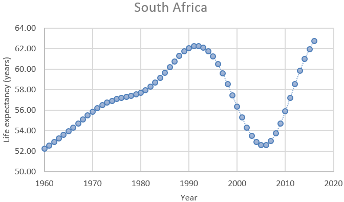
  • a) Describe how life expectancy has changed in South Africa over these years. 
  • b) In which of these three time periods did life expectancy change most quickly, and in which did it change most slowly: 1960 – 1990, 1990 – 2005, 2005 – 2016?
  • c) Explain what happened in South Africa in 1990 – 2005 that undid so much progress, and also explain what happened around 2005 to restart the positive trend.  (You need to use knowledge beyond what’s shown in the graph to answer this.  Feel free to use the internet.)

Question (a) is meant to be straightforward.  I expect students to comment on the gradual increase in life expectancy from 1960 – 1990, the sudden reversal into a dramatic decline from 1990 – 2005, and then another reversal with an even more rapid increase from 2005 – 2016.  A more thorough response would note that the life expectancy in 2005 had plunged to a level about equal to that of 1965, and the life expectancy in 2016 had rebounded to exceed the previous high in 2005.

Question (b) addresses rates of change.  I have in mind that students simply approximate these values from the graph.  Life expectancy increased from about 52 to 62 years between 1960 and 1990, which is an increase of about 10 life expectancy years over a 30-year time period, which is a rate of about 0.33 life expectancy years per year*.  From 1990 – 2005, life expectancy decreased by almost 10 years, for a rate of about 0.67 life expectancy years per year.  The years between 2005 – 2016 saw an increase in life expectancy of about 10 years, which is a rate of about 1 life expectancy year per year.  So, the quickest rate of change occurred in the most recent time period 2005 – 2016, and the slowest rate of change occurred in the most distant time period: 1960 – 1990.

* Unfortunately, the units here (life expectancy years per year of time) are tricky for students to express clearly.  This can be one of the downsides of using real data in an interesting context.

It usually takes students a little while to think of the explanation in part (c), but some students eventually suggest the HIV/AIDS epidemic that devastated South Africa in the 1990s.  Fortunately, effective medication became more available, helping to produce the dramatic improvement that began around the year 2005.


2. The following graph adds to the previous one by including the life expectancy for Ghana, as well as South Africa, over these years:

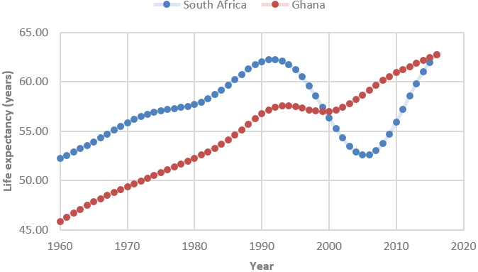
  • a) Compare and contrast how life expectancy changed in these two countries over these years.
  • b) Which country had a larger percentage increase in life expectancy over these years?  Explain your answer without performing any calculations.
  • c) Suppose that you were to calculate the changes in life expectancy for each year by subtracting the previous year’s value.  Which country would have a larger mean of its yearly changes?  Which country would have a larger standard deviation of its yearly changes?  Explain your answers.

For part (a), I expect students to respond that Ghana did not experience the dramatic reversals that South Africa did.  More specifically, Ghana experienced only a slight decline from about 1995 – 2000, much less dramatic and briefer than South Africa’s precipitous drop from 1990 – 2005.  For full credit I also look for students to mention at least one other aspect, such as:

  • Ghana had a much lower life expectancy than South Africa in 1960 and had a very similar life expectancy in 2016.
  • Ghana’s increase in life expectancy since 2005 has been much more gradual than South Africa’s steep increase over this period.

The key to answering part (b) correctly is to realize that the two countries ended with approximately the same life expectancy, but Ghana began with a much smaller life expectancy, so the percentage increase is larger for Ghana than for South Africa.

Part (c) is not at all routine, requiring a lot of thought.  Because Ghana had a larger increase in life expectancy over this time period, Ghana would have a larger mean for the distribution of its yearly changes.  But South Africa had steeper increases and decreases than Ghana, so South Africa would have more variability (and therefore a larger standard deviation) in its distribution of yearly changes*.

* The means of the yearly changes turn out to be 0.302 years for Ghana, 0.188 years for South Africa.  The standard deviations of the yearly changes are 0.625 years for South Africa, 0.174 years for Ghana.


3. Consider the following graph of energy-related carbon dioxide (CO2) emissions (in million metric tons) in the United States from 1990 – 2005:

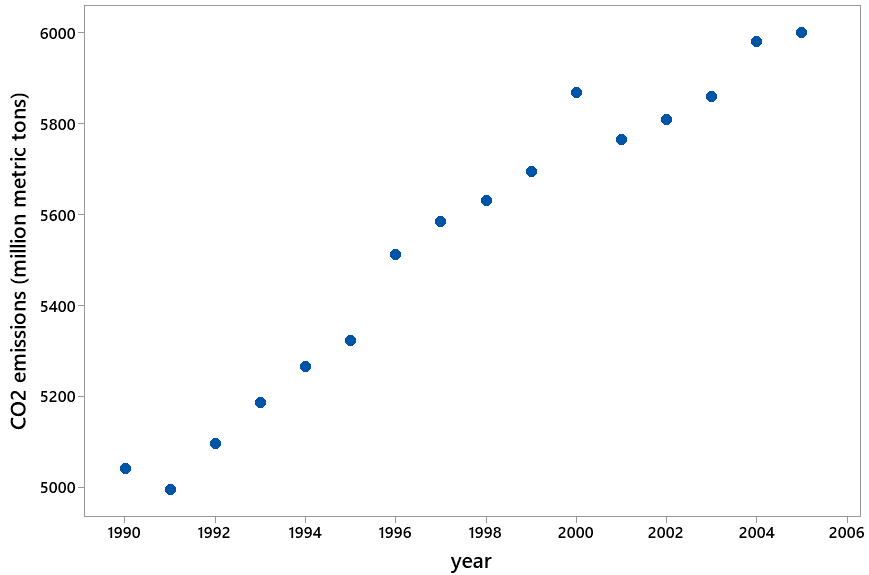
  • a) Describe what the graph reveals.
  • b) Determine the least-squares line for predicting CO2 emissions from year.
  • c) Interpret the value of the slope coefficient.
  • d) Use the line to predict CO2 emissions for the year 2018.
  • e) The actual value for CO2 emissions in 2018 was 5269 million metric tons.  Calculate the percentage error of the prediction from the actual value.
  • f) Explain what went wrong, why the prediction did so poorly.

Students have little difficulty with part (a), as they note that CO2 emissions are increasing at a fairly steady rate from about 5000 million metric tons in 1990 to about 6000 million metric tons in 2005.  I intend for students to use technology to determine the least squares line in (b), the equation of which turns out to be: predicted CO2 emissions = -135,512 + 70.61 × year. 

To interpret the slope coefficient in part (c), students should respond that the predicted CO2 emissions increases by 70.61 million metric tons for each additional year.  Using this line to predict CO2 emissions for the year 2018 in part (d) gives: -135,512 + 70.61 × 2018 ≈ 6979 million metric tons.

This prediction is not very close to the actual value of CO2 emissions in 2018, as it over-predicts by more than 1700 million metric tons.  The percentage error for part (e) is: (6979 – 5269) / 5269 × 100% ≈ 32.5%. 

The explanation in part (f) is that we should have been cautious about extrapolation.  By using the least squares line to make a prediction thirteen years into the future, we assumed that the linear increasing trend would continue in the years following 2005.  We did not have a good justification for making this assumption.

In fact, a graph of the entire dataset from 1990 – 2018 reveals that the increasing trend from 1990 – 2005 actually reversed into a decreasing trend from 2005 – 2018:

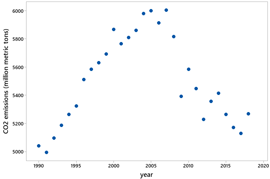
Students find these data to be very surprising.  I hope the surprise aspect helps to make the caution about extrapolation memorable for them.


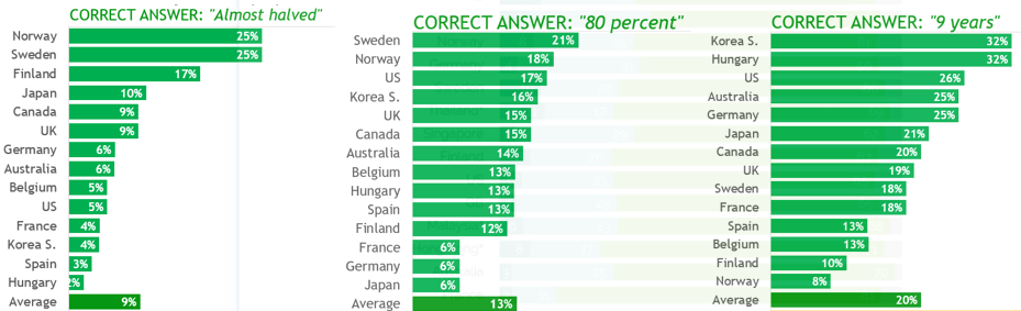
The next three questions concern Hans Rosling’s Gapminder/Ignorance Test.  I presented three of the twelve questions on this test in the previous post (here).  Each of the twelve questions asks respondents to select one of three options.  The correct answer for each question is the most optimistic of the three options presented.

4. Suppose that all people select randomly among the three options on all twelve questions.  Let the random variable X represent the number of questions that a person would answer correctly.

  • a) Describe the probability distribution of X.  Include the parameter values as well as the name of the distribution.
  • b) Determine and interpret the expected value of X.
  • c) Determine the probability that a person would obtain exactly the expected value for the number of correct answers.
  • d) Determine and compare the probabilities of correctly answering fewer than the expected value vs. more than the expected value. 
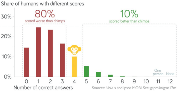
  • e) Discuss how the actual survey results, as shown in the following graph, compare to the binomial distribution calculations.

Under the assumption of random selection among the three options on all twelve questions, the probability distribution of X, the number of correct answers, would follow a binomial distribution with parameters n = 12 and p = 1/3.  A graph of this probability distribution is shown here:

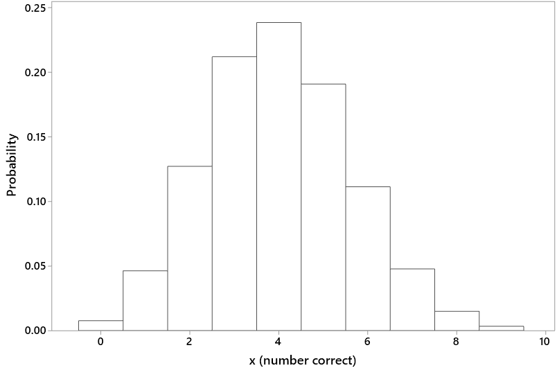
The expected value of X can be calculated as: E(X) = np = 12×(1/3) = 4.0.  This means that if the questions were asked of a very large number of people, all of whom selected randomly among the three options on all twelve questions, then the average number of correct answers would be very close to 4.0.

The binomial probabilities in (c) and (d) can be calculated to be 0.2384 for obtaining exactly 4 correct answers, 0.3931 for 4 or fewer correct, and 0.3685 for more than 4 correct.

The survey data reveal that people do much worse on these questions that they would with truly random selections.  For example, about 80% of respondents got fewer than four correct answers, whereas random selections would produce about 39.31% with fewer than four correct answers.  On the other side, about 10% of people answered more than four questions correctly, compared with 36.85% that would be expected from random selections.


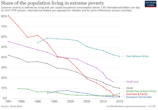
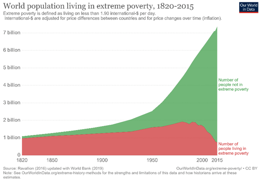
5. When the question about how the proportion of the world’s population living in extreme poverty has changed over the past twenty years, only 5% of a sample of 1005 respondents in the United States gave the correct answer (cut in half), while 59% responded with the option furthest from the truth (doubled).

  • a) Determine the z-score for testing whether the sample data provide strong evidence that less than one-third of all Americans would answer correctly.
  • b) Summarize your conclusion from this z-score, and explain the reasoning process behind your conclusion.
  • c) Determine a 95% confidence interval for the population proportion who would answer that the rate has doubled.
  • d) Interpret this confidence interval.

The z-score in (a) is calculated as: z = (0.05 – 1/3) / sqrt[(1/3)×(2/3)/1005] ≈ -19.1.  This is an enormous z-score, indicating that the sample proportion who gave the correct response is more than 19 standard deviations less than the value one-third.  Such an extreme result would essentially never happen by random chance, so the sample data provide overwhelming evidence that less than one-third of all adult Americans would have answered correctly.

The 95% confidence interval for the population proportion in part (c) is: .59 ± 1.96 × sqrt(.59×.41/1005), which is .59 ± .030, which is the interval (.560 → .620).  We can be 95% confident that if this question were asked of all adult Americans, the proportion who would give the most wrong answer (doubled) would be between .560 and .620.  In other words, we can be 95% confident that between 56% and 62% of all adult Americans would give the most wrong answer to this question.


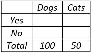
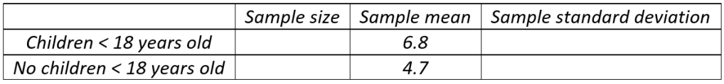
I asked my students the question about how the extreme poverty rate has changed, before revealing the answer.  The table below shows the observed counts for the three response options in a recent class:

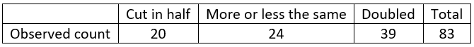
6. Conduct a hypothesis test of whether the sample data provide strong evidence against the hypothesis that the population of students at our school would be equally likely to choose among the three response options.

The null hypothesis is that students in the population would be equally likely to select among the three options (i.e., that one-third of the population would respond with each of the three options).  The expected counts (under this null hypothesis) are 83/3 ≈ 27.667 for each of the three categories.  All of these expected counts are larger than five, so a chi-square goodness-of-fit test is appropriate.  The chi-square test statistic turns out to equal 7.253, as shown in the following table:

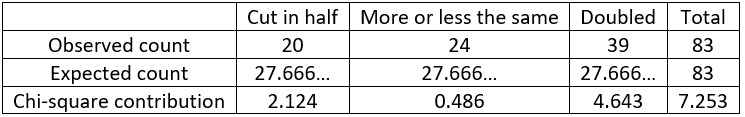
The p-value, from a chi-square distribution with 2 degrees of freedom, is ≈ 0.027.  This p-value is fairly small (less than .05) but not very small (larger than .01), so we can conclude that the sample data provide fairly strong evidence against the hypothesis that students in the population would be equally likely to select among the three options.  The sample data suggest that students are more likely to give the most pessimistic answer (doubled) and less likely to give the most optimistic, correct answer (cut in half).  This conclusion should be regarded with caution, though, because the sample (students in my class) was not randomly selected from the population of all students at our school.


The six questions that I have presented here only hint at the possibilities of asking questions that help students to learn important statistical content while also exposing them to data that reveal human progress.  I also encourage teachers to point their students toward resources that empower them to ask their own questions, and analyze data of their own choosing, about the state of the world.  I listed several websites with such data at the very end of the previous post (here).

P.S. The life expectancies for South Africa and Ghana were obtained from the World Bank’s World Development Indicators dataset, accessed through google (here).  Life expectancy is defined here as “the average number of years a newborn is expected to live with current mortality patterns remaining the same.”  The data on CO2 emissions were obtained from the United States Energy Information Administration (here).  The data on the Gapminder/Ignorance Test were obtained from a link here.

Files containing the data on life expectancies and CO2 emissions can be downloaded from the links below:

#33 Reveal human progress, part 1

This post will feature many quotes that I find inspirational, starting with:

Quote #1: How can we soundly appraise the state of the world?  The answer is to count. …  A quantitative mindset, despite its nerdy aura, is actually the morally enlightened one, because it treats every human life as having equal value rather than privileging the people who are closest to us or most photogenic. – Steven Pinker, Enlightenment Now, pages 42-43

I am going to show some data that appraise the state of the world and how things have changed over the years.  First I will ask a few questions that Hans Rosling liked to ask his audiences, which I also ask of my students:

  • A: In the last twenty years, how has the proportion of the world’s population living in extreme poverty changed?  [Options: Almost doubled, Remained more or less the same, Almost halved]
  • B: What percentage of the world’s one-year-old children today have been vaccinated against some disease?  [Options: 20 percent, 50 percent, 80 percent]
  • C: Worldwide, 30-year-old men have spent an average of 10 years in school.  How many years have women of the same age spent in school, on average?  [Options: 9 years, 6 years, 3 years]

Are you ready for the answers?  Here’s a quote to reveal the correct answer for question A:

Quote #2: Over the past twenty years, the proportion of the global population living in extreme poverty has halved.  This is absolutely revolutionary.  I consider it to be the most important change that has happened in the world in my lifetime. – Hans Rosling, Factfulness, page 6

The correct answers for questions B and C are also the most optimistic of the options presented: 80 percent of one-year-old children have been vaccinated, and 30-year-old women have spent 9 years in school, on average.

Looking at data on a wide range of human experiences, Pinker uses even stronger language than Rosling to declare:

Quote #3: Here is a shocker: The world has made spectacular progress in every single measure of human well-being.  Here is a second shocker: Almost no one knows about it. – Steven Pinker, Enlightenment Now, page 52.


Can this really be true – that the world has made great progress, and that very few know about it?  Let’s return to questions A, B, and C, which were asked of people in many countries.  Rosling and his colleagues produced the following graphs of the percentage of correct responses for these questions:

Remember that these were multiple choice questions with three options.  Rosling pointed out that complete ignorance would lead to random guessing, which would produce roughly 33% correct responses in a large sample.  I’m sure you’ve noticed that for all three questions, in every country, respondents failed to achieve the level of complete ignorance.

Rosling and his colleagues asked twelve questions of this type.  For every question, the correct answer was the most optimistic of the three options provided.  Here is the distribution of number correct, where Rosling uses a chimpanzee to represent the expected value under the assumption of complete ignorance:

Do people really think the world is getting worse instead of better?  Further evidence is provided by the following survey results from asking this question directly in the year 2015:

Only in China did a higher percentage say that the world is getting better rather than worse.  In the United States, more than 10 times as many people responded worse than better


Why are people so pessimistic and ignorant (actually, worse than ignorant) about the state of the world?  Pinker argues that the negative nature of news, combined with cognitive biases such as the availability heuristic, explain much of this phenomenon:

Quote #4: Whether or not the world is actually getting worse, the nature of news will interact with the nature of cognition to make us think that it is. – Steven Pinker, Enlightenment Now, page 41

Rosling offers many explanations for this disconnect between perception and reality, starting with what he calls the gap instinct:

Quote #5: I’m talking about that irresistible temptation we have to divide all kinds of things into two distinct and often conflicting groups, with an imagined gap – a huge chasm of injustice – in between.  – Hans Rosling, Factfulness, page 21

Consider the following graph, from Rosling’s Gapminder site (here), of a country’s child mortality rate vs. the average number of babies per woman (color indicates region of the world, and the size of the circle represents the country’s population):

The countries in the bottom left of this graph have low child mortality rates and small families, while those in the upper right experience high child mortality rates and large families.  This graph displays Rosling’s gap instinct: Many people see the world as separated into two distinct groups of countries, which are often labeled developed and developing.   

But have you noticed the catch?  This graph shows the world in 1968, more than 50 years ago!  The following graph displays the same variables on the same scale in the year 2018:

The world has changed dramatically in these 50 years!  Child mortality rates have dropped substantially, which is undeniably good news.  Despite the fact that more and more babies live past age 5 (in fact, probably because of that fact), women have fewer and fewer babies than previously.  Sure, there’s still variability, and the African countries (shown in light blue) still have some catching up to do.  But the separation of countries into two clusters with a gap in between is a relic of the past.  The gap instinct that many people hold is not consistent with current data.


Next I will offer some data and graphs that reveal human progress.  Such data and visualizations abound*, but I will confine myself here to seven graphs. 

* I provide a partial list of resources in a P.S. at the end of this post.  The seven graphs shown below come from the Our World in Data site (here).

The first three graphs show decreases, for all regions of the world, in child mortality rates, average number of babies per woman, and extreme poverty rates:

The next three graphs show dramatic increases in life expectancy, literacy rates, and mean years of schooling:

The final graph displays raw counts rather than rates or averages.  Because the population of the world has been growing over time, you might wonder whether a decreasing rate of extreme poverty means that fewer people are living in extreme poverty.  The following graph shows that the number of people living in extreme poverty has indeed decreased dramatically over the past two decades, while the number of people not living in extreme poverty has increased sharply:


What does this have to do with teaching introductory statistics?  I think we (teachers of introductory statistics) have a tremendous opportunity to make our students aware of human progress.  Here’s my plea: I urge you to use data, examples, activities, and assignments that reveal* human progress to your students.

* I like the word reveal here, because we can expose students to human progress in dramatic fashion, as a plot twist providing the climax of a suspenseful narrative.

Why do I consider this so important?  I’ll call on Rosling to answer:

Quote #6: When we have a fact-based worldview, we can see that the world is not as bad as it seems – and we can see what we have to do to keep making it better.  – Hans Rosling, Factfulness, page 255

I hasten to add an important caveat: By no means am I arguing that statistics teachers should refrain from presenting examples and data that reveal problems and injustices.  Such examples can motivate students to take action for making the world a better place.  But I suspect that many statistics teachers, who are susceptible to the same inherent biases and heuristics that affect all people*, have a tendency to overdo the negative and understate the positive.  I also believe that good news about human progress can motivate students to do their part in continuing to make the world better. I am not asking teachers to recenter their entire course around data of human progress, just to show a few examples.

* I include myself here, of course.


How can we reveal the good news about human progress to students?  You know my answer: Ask good questions!

This post is something of an anomaly for this blog, as it contains few questions.  But some previous posts have already posed questions for students that use data on human progress:

  • In post #11 (Repeat after me, here), I suggested providing students with scatterplots (bubble graphs) from Rosling’s site and asking basic questions about observational units, variables, and association. 
  • I proposed asking students to calculate the percentage decrease in the extreme poverty rate between 1990 and 2015 in post #28 (A pervasive pet peeve, here). 
  • I recommended conducting a hypothesis test of whether Americans’ responses to the extreme poverty rate question are worse than would be expected by random chance in post #8 (End of the alphabet, here).

I will continue this theme in next week’s post by providing several more examples of how I have asked questions about data on human progress to teach statistical thinking in my courses.


An encouraging development is that as the year and decade came to a close in December of 2019, several columns appeared in the news to trumpet the good news of human progress.  Two examples are:

  • “This Has Been the Best Year Ever,” by Nicholas Kristof in The New York Times (here)
  • “We’ve just had the best decade in human history, seriously,” by Matt Ridley in The Spectator (here)

Finally, I offer with one more quote that I find insightful and inspiring:

Quote #7: If you could choose a moment in history to be born, and you didn’t know ahead of time who you were going to be, you’d choose now.  Because the world has never been less violent, healthier, better educated, more tolerant, with more opportunity for more people, and better connected, than it is today.  – To be revealed soon

What’s your guess – is this quote from Pinker or Rosling?  Rosling or Pinker?  I used three quotes from each above.  Does this quote break the tie?  Or do you suspect that I slipped in a quote from Kristof or Ridley here? Are you ready for the big reveal?

No, this quote does not break the tie, because these words are neither Pinker’s nor Rosling’s. They are also not Kristof’s or Ridley’s.  Who said this?  President Barack Obama, at the White House Summit on Global Development, on July 20, 2016 (here).


P.S. I highly recommend Pinker’s book Enlightenment Now (here) and Rosling’s book Factfulness (here).  These books inspired this post and provided the first six quotes above.

The project that produced the data and graphs for survey questions about the state of the world is summarized here, and the data can be found here.  The graph of survey results for the “getting better or worse” question came from the YouGov site (here).  The graph of perceived happiness levels came from the the Our World in Data site (here).  The graphs displaying Rosling’s gap instinct came from his Gapminder site (here).  The seven graphs of human progress came from the Our World in Data site: child mortality (here), babies per woman (here), poverty (here), life expectancy (here), literacy (here), and years of schooling (here).

I recommend the following resources for data and tools to explore human progress.  I relied most heavily on the first two sites in preparing this post:

#32 Create your own example, part 2

In last week’s post (here), I presented examples of questions that ask students to create their own example that satisfies a particular property, such as the mean exceeding the mean and inter-quartile range equaling zero.  I proposed that such questions can help students to think more carefully and deepen their understanding of statistical concepts.  All of last week’s examples concerned descriptive statistics.

Now I extend this theme to the realm of statistical inference concepts and techniques.  I present six create-your-own-example questions (each with multiple parts) concerning hypothesis tests and confidence intervals for proportions and means, with a chi-square test appearing at the end.  I believe these questions lead students to develop a stronger understanding of concepts such as the role of sample size and sample variability on statistical inference.

I encourage students to use technology, such as the applet here, to calculate confidence intervals, test statistics, and p-values.   This enables them to focus on underlying concepts rather than calculations.

The numbering of these questions picks up where the previous post left off.  As always, questions for students appear in italics.


6. Suppose that you want to test the null hypothesis that one-third of all adults in your county have a tattoo, against a two-sided alternative.  For each of the following parts, create your own example of a sample of 100 people that satisfies the indicated property.  Do this by providing the sample numbers with a tattoo and without a tattoo.  Also report the test statistic and p-value from a one-proportion z-test.

  • a) The two-sided p-value is less than 0.001.
  • b) The two-sided p-value is greater than 0.20.

Students need to realize that sample proportions closer to one-third produce larger p-values, while those farther from one-third generate smaller p-values.  Clever students might give the most extreme answers, saying that all 100 have a tattoo in part (a) and that 33 have a tattoo in part (b).

Instead of asking for one example in each part, you could make the question more challenging by asking students to determine all possible sample values that satisfy the property.  It turns out that for part (a), the condition is satisfied by having 17 or fewer, or 49 or more, with a tattoo.  For part (b), having 28 to 39 (inclusive) with a tattoo satisfies the condition.  Instead of trial-and-error, you could ask students to determine these values algebraically from the z-test statistic formula, but I would only ask this in courses for mathematically inclined students.


7. Suppose that you want to estimate the proportion of all adults in your county who have a tattoo. For each of the following parts, create your own example to satisfy the indicated property.  Do this by specifying the sample size and the number of people in the sample with a tattoo.  Also determine the confidence interval.

  • a) The sample proportion with a tattoo is 0.30, and a 95% confidence interval for the population proportion includes the value 0.35.
  • b) The sample proportion with a tattoo is 0.30, and a 99% confidence interval for the population proportion does not include the value 0.35.

The key here is to understand the impact of sample size on a confidence interval.  The confidence interval in both parts will be centered at the value of the sample proportion value of 0.30, so the interval in part (b) needs to be narrower than the interval in part (a).  A larger sample size produces a narrower confidence interval, so a smaller sample size is needed in part (a).

One example that works for part (a) is a sample of 100 people, 30 of whom have a tattoo, for part (a), which produces a 95% confidence interval of (0.210 → 0.390).  Similarly, creating a sample of 1000 people, 300 of whom have a tattoo, satisfies part (b), as the 99% confidence interval is (0.263 → 0.337).

Again you could consider asking students to determine all sample sizes that work.  Restricting attention to multiples of 10 (so the sample proportion with a tattoo equals 0.30 exactly), it turns out that a sample size of 340 or fewer suffices for part (a), and a sample size of 560 or more is needed for part (b).


8. Suppose that you want to estimate the population mean body temperature of a healthy adult with a 95% confidence interval.  For each of the following parts, create your own example of a sample of 10 body temperature values that satisfy the indicated property.  Do this by listing the ten values and also producing a dotplot that displays the ten values.  Report the sample standard deviation, and determine the confidence interval.

  • a) The sample mean is 98.0 degrees, and a 95% confidence interval for the population mean includes the value 98.6.
  • b) The sample mean is 98.0 degrees, and a 99% confidence interval for the population mean does not include the value 98.6.

This question is similar to the previous one, but dealing with a mean instead of a proportion brings the variability of the sample data into consideration.  This question removes sample size from consideration by stipulating that n = 10. 

The confidence interval for both parts will be centered at the value of the sample mean temperature: 98.0 degrees.  For the confidence interval in part (a) to include the value 98.6, the sample data need to display a good bit of variability.  A student might try a fairly simple example containing five values of 97.0 and five values of 99.0, which produces a sample standard deviation of 1.054 and a 95% confidence interval of (96.92 → 99.08) degrees.

In contrast, part (b) requires less sample variability, for the confidence interval to fall short of the value 98.6.  A student might use a fairly extreme example, such as one value of 97.9, eight values of 98, and one value of 98.1.  This results in a sample standard deviation of 0.047 and a 99% confidence interval of (97.95 → 98.05) degrees.

As with the previous questions, you could ask students to determine all values of the sample standard deviation that will work, either with trial-and-error or algebraically.  It turns out that the sample standard deviation needs to be at least 0.839 (to three decimal places) degrees in part (a), at most 0.583 degrees in part (b).


9. Suppose that you ask dog and cat owners whether their pet has been to a veterinarian in the past twelve months.  You organize the resulting counts in a 2×2 table as follows:

For each of the following parts, create your own example of a sample that satisfies the indicated property.  Do this by filling in the counts of the 2×2 table.  Also report the two sample proportions and the test statistic and p-value from a two-proportions z-test.

  • a) The two-sided p-value is less than 0.001.
  • b) The two-sided p-value is between 0.2 and 0.6.

Students need to produce a large difference in proportions for part (a) and a fairly small difference for part (b).  They could give a very extreme answer in part (a) by having 100% of dogs and 0% of cats visit a veterinarian.  A less extreme response that 80 of 100 dogs and 20 of 50 cats have been to a veterinarian produces a z-statistic of 4.90 and a p-value very close to zero.   

Stipulating that the p-value in part (b) must be less than 0.6 forces students not to use identical success proportions in the two groups.  One example that works is to have 80 of 100 dogs and 36 of 50 cats with a veterinarian visit. This produces a z-statistic of 1.10 and a p-value of 0.270.


10. The Gallup organization surveyed American adults about how many times they went to a movie at a movie theater in the year 2019.  They compared results for people with at least one child under age 18 in their household and those without such a child in their household.  Suppose that you reproduce this study by interviewing a random sample of adults in your county, and suppose that the sample means are the same as in the Gallup survey: 6.8 movies for those with children, 4.7 movies for those without, as shown in the table below:

For each of the following parts, create your own example that satisfies the indicated property.  Do this by filling in the sample size and sample standard deviation for each group.  Also report the value of the two-sample t-test statistic and the two-sided p-value.

  • a) The two-sample t-test statistic is less than 1.50.
  • b) The two-sample t-test statistic is greater than 2.50.

Students have considerable latitude in their answers here, as they can focus on sample size or sample variability.  They need to realize that large sample sizes and small standard deviations will generally produce larger test statistic values, as for part (a).  To produce a smaller test statistic value in part (b) requires relatively small sample sizes or large standard deviations.

For example, sample sizes of 10 and sample standard deviations of 4.0 for each group produce t = 1.17 to satisfy part (a).  The condition for part (b) can be met with the same standard deviations but larger sample sizes of 50 for each group, which gives t = 2.62.


11. Suppose that you interview a sample of 100 adults, asking for their political viewpoint (classified as liberal, moderate, or conservative) and how often they eat ice cream (classified as rarely, sometimes, or often).  Also suppose that you obtain the marginal totals shown in the following 3×3 table:

For each of the following parts, create your own example that satisfies the indicated property.  Do this by filling in the counts of the 3×3 table.  Also report the value of the chi-square statistic and p-value.  For part (b), also describe the nature of the association between the variables (i.e., which political groups tend to eat ice cream more or less frequently?).

  • b) The chi-square p-value is between 0.4 and 0.8.
  • c) The chi-square p-value is less than 0.001.

Like the previous questions, this one also affords students considerable leeway with their responses.  They need to supply nine cell counts in the table, but the fixed margins mean that they only have four degrees of freedom* to play around with.

* Once a student has filled in four cell counts (provided that they are not all in the same row or same column), the other five cell counts are then determined by the need to make counts add up to the marginal totals.

First students need to realize that to obtain a large p-value in part (a), the counts need to come close to producing independence between political viewpoint and ice cream frequency.  They also need to know that independence here would mean that all three political groups have 20% rarely, 50% sometimes, and 30% often eating ice cream.  Independence would produce this table of counts:

This table does not satisfy the condition for part (a), though, because the p-value is 1.0.  A correct response to part (a) requires a bit of variation from perfect independence.  The following table, which shifts two liberals from rarely to often and two conservatives from often to rarely, produces a chi-square statistic of 2.222 and a p-value of 0.695:

On the other hand, a table that successfully satisfies part (b) needs to reveal a clear association between the two variables.  Consider the following example:

The chi-square test statistic equals 13.316 for this example, and the p-value is 0.010.  This table reveals that makes liberals much more likely to eat ice cream often, and much less likely to eat ice cream rarely, compared to conservatives.


Students can use create-your-own-example questions to demonstrate and deepen their understanding of statistical concepts.  The previous post provided many examples that concerned descriptive statistics, and this post has followed suit with topics of statistical inference.

I also like to ask create-your-own-example questions that ask students, for instance, to identify a potential confounding variable in a study, or to suggest a research question for which comparative boxplots would be a relevant graph.  Perhaps a future post will discuss those kinds of questions.

As with the previous post, I leave you with a (completely optional, of course) take-home assignment: Create your own example of a create-your-own-example question to ask of your students.

P.S. A recent study (discussed here) suggests that average body temperature for humans, as discussed in question 8, has dropped in the past century and is now close to 97.5 degrees Fahrenheit.  The Gallup survey mentioned in question 10 can be found here.

#31 Create your own example, part 1

I like asking questions that prompt students to create their own example to satisfy some property.  I use these questions in many settings: class activities, homework assignments, quizzes, and exams.  Such questions prompt students to engage in higher-level thinking than rote calculations.  I also believe that these questions can lead students to deepen their understanding about properties of statistical measures and methods.

I presented one such question in post #3 (here), in which I asked students to create their own example to illustrate Simpson’s paradox.  That’s a very challenging question for most students.  In this post, I will provide five examples (each with multiple parts) of create-your-own-example questions, most of which are fairly straight-forward but nevertheless (I believe) worthwhile.  I will also discuss the statistical concepts, all related to the topic of descriptive statistics, that the questions address.  As always, questions for students appear in italics.


1. Suppose that you record the age of 10 customers who enter a movie theater.  For each of the following parts, create an example of 10 ages that satisfy the indicated property.  (In other words, produce a list of 10 ages for each part.)  Also, report the values of the mean and median for parts (c) – (e).  Do not bother to calculate the standard deviation in part (b).

  • a) The standard deviation equals zero.
  • b) The inter-quartile range equals zero, and the standard deviation does not equal zero. 
  • c) The mean is larger than the median.
  • d) The mean exceeds the median by at least 20 years.   
  • e) The mean exceeds the median by at least 10 years, and the inter-quartile range equals zero.

Part (a) simply requires that all 10 customers have the same age.  A correct answer to part (b) needs the 3rd through 8th values (in order) to be the same, in order for the IQR to equal zero, with at least one different value to make the standard deviation positive.  The easiest way to answer (b) correctly would make nine of the ages the same and one age different.

Part (c) requires knowing that the mean will be affected by a few unusually large ages.  An example that works for (d), which is more challenging than (c), is to have six ages of 10, so the median is 10, and four ages of 60, which pulls the mean up to 30. 

Part (e) is more challenging still.  An IQR of 0 again requires the 3rd through 8th values to be the same.  Two large outliers can inflate the mean enough to satisfy the property.  For example, eight ages of 10 and two ages of 60 makes the IQR 0, median 10, and mean 20.

Ideally, students think about properties of mean and median as they answer questions like this.  I think it’s fine for students to use some trial-and-error, but then I hope they can explain why an example works.  You could assess this by asking students to describe their reasoning process, perhaps for part d) or e), along with submitting their example.  

I want students to consider the context here (and always), so I only give partial credit if an example uses an unrealistic age such as 150 years.

For an in-class activity or homework assignment, I ask all five parts of this question, and I encourage students to use software (such as the applet here) to facilitate the calculations.  On a quiz or exam, I only ask one or two parts of this question.  I do think it’s important to give students practice with this kind of question prior to asking it on an exam.


2. Consider the following dotplot, which displays the distribution of margin of victory in a sample of 10 football games (mean 11.0, median 9.5, standard deviation 6.04 points):

For each of the following parts, create your own example by proposing an eleventh value along with these ten to satisfy the indicated property.  (Notice that the context here requires that the new value must be a positive integer.)  For each part, add your new data value to the dotplot.

  • a) The mean, median, and standard deviation all increase.
  • b) The mean, median, and standard deviation all decrease.
  • c) The median increases, and the mean decreases.

Students should realize immediately that part (a) requires that the new value be fairly large.  The new value must be larger than the mean and median, of course, but it needs to be considerably larger in order for the standard deviation to increase.  It turns out that any integer value of 18 or higher works.  (I do not expect students to determine the smallest value that works, although you could make the question harder by asking for that.)

Part (b) requires that the new value be less than the mean and median, but fairly close to the mean in order for the standard deviation to decrease.  A natural choice that works is 9.  (It turns out that any integer from 5 through 9, inclusive, works.)  Part (c) has a unique correct answer, which is the only integer between the median and mean: 10 points.

I provide a separate copy of the dotplot for each part of this question.  If students have access to technology as they answer these questions, you could ask them to report the new values of the statistics.


3. The Gallup organization surveyed American adults about how many times they went to a movie at a movie theater in the year 2019.  They compared results for people with at least one child under age 18 in their household and those without such a child in their household.  Suppose that you recreate this study by interviewing faculty at you school, and suppose that your sample contains 8 people in each group.For each of the following parts, create your own example that satisfies the given property.  Do this by producing dotplots on the axes provided, making sure to include 8 data values in each group.  Do not bother to calculate the values of the means and standard deviations.

  • a) The mean for those with children is larger than the mean for those without children.
  • b) The standard deviation for those with children is larger than the standard deviation for without children.
  • c) The mean for those with children is larger than the mean for those without, and the standard deviation for those with children is smaller than the standard deviation for those without.

Parts (a) and (b) are very straight-forward, simply assessing whether students understand that the mean measures center and standard deviation measures variability.  Part (c) is a bit more complicated, as students need to think about both aspects (center and variability) at the same time.  I provide a separate copy of the axes for each part.


4. Suppose that you ask dog and cat owners whether their pet has been to a veterinarian in the past twelve months.  You organize the resulting counts in a 2×2 table as follows:

For each of the following parts, create your own example of counts that satisfy the indicated property.  Do this by filling in the appropriate cells of the table with counts.  Also report the values for all relevant proportions, differences in proportions, and ratios of proportions.

  • a) The difference in proportions who answer yes is exactly 0.2.
  • b) The ratio of proportions who answer yes is exactly 2.0.
  • c) The difference in proportions who answer yes is greater than 0.2, and the ratio of proportions who answer yes is greater than 2.0.
  • d) The difference in proportions who answer yes is greater than 0.2, and the ratio of proportions who answer yes is less than 2.0.
  • e) The difference in proportions who answer yes is less than 0.2, and the ratio of proportions who answer yes is greater than 2.0.

You could make these questions easier by using the same sample size for both groups, but I prefer this version that requires students to think proportionally.  Part (c) requires one of the proportions to be fairly small, so the ratio can exceed 2.0.  Part (e) requires both proportions to be on the small side, so the ratio can exceed 2 without a large difference.  The following tables show examples (by no means unique) that work for parts (c), (d), and (e):


5. Consider the following scatterplot of sale price (in thousands of dollars) vs. size (in square feet) for seven houses that sold in Arroyo Grande, California:

The seven ordered pairs of (size, price) data points are: (1014, $474K), (1176, $520K), (1242, $459K), (1499, $470K), (1540, $575K), (1545, $500K), (1755, $580K).  The correlation coefficient between price and size is r = 0.627.  For each of the following parts, create your own example to satisfy the indicated property.  Do this by adding one point to the scatterplot and also reporting the values of the size (square feet) and price for the house that you add.  Also give a very brief description of the house (e.g., a very small and inexpensive house), and report the value of the correlation coefficient.

  • a) The correlation coefficient is larger than 0.8.
  • b) The correlation coefficient is between 0.2 and 0.4.
  • c) The correlation coefficient is negative.

Notice that I extended the scales on the axes of this graph considerably, as a hint to students that they need to consider using some small or large values for size or price.  I reproduce the graph for students in all three parts. Using technology (such as the applet here) is essential for this question.  You could ask part (a) or (c) on an exam with no technology, as long as you ask for educated guesses and do not require calculating the correlation coefficient.

The key in part (a) is to realize that the new house must reinforce the positive association considerably, which requires a house that is either considerably larger and more expensive, or else much smaller and less expensive.  Two points that work are a 500-square-foot house for $350K (r = 0.858), or a 2500-square-foot house for $650K (r = 0.846).  Students could think even bigger (or smaller) and produce a correlation coefficient even closer to 1.  For instance a 4000-square-foot house for two million dollars generates r = 0.978.

Part (b) calls for a new house that diminishes the positive association considerably, so students need to think of a house that goes against the prevailing tendency.  Students should try a small but expensive, or large but inexpensive, house.  One example that works is a 1000-square-foot-house for $550K (r = 0.374).   Part (c) is similar but requires an even more unusual house to undo the positive association completely.  For instance, a small-but-expensive house with 500 square feet for $650K achieves a negative correlation of r = -0.324.


I believe that create-your-own-example questions can help students to assess and deepen their understanding of statistical concepts related to measures of center, variability, and association.  Next week’s post will continue this theme by presenting five create-your-own-example questions that address properties of statistical inference procedures.

Are you ready for your take-home assignment*?  I bet you can guess what it is.  Ready?  Here goes: Create your own example of a create-your-own-example question that leads students to assess and deepen their understanding of a statistical concept.

* Needless to say, this assignment is optional!

P.S. The sample of 10 football games in question 2 consists of the NFL post-season games in January of 2020, prior to Super Bowl LIV, gathered from here, here, and here.  Results from the Gallup survey mentioned in question 3 can be found here.