Skip to content

Archive for

#21 Twenty final exam questions

My mantra of “ask good questions” applies to exams as well as in-class learning activities.  This week I present and discuss twenty multiple-choice questions that I have used on final exams.  All of these questions are conceptual in nature.  They require no calculations, they do not refer to actual studies, and they do not make use of real data.  I certainly do not intend these questions to comprise a complete exam; I strongly recommend asking many free-response questions based on real data and genuine studies as well.

At the end of this post I provide a link to a file containing these twenty questions, in case that facilitates using them with your students.  Correct answers are discussed throughout and also reported at the end.


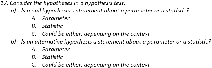
I like to think that this question assesses some basic level of understanding, but frankly I’m not sure.  Do students ever say that a standard deviation and a p-value can sometimes be negative?  Not often, but yes.  Do I question my career choice when I read those responses?  Not often, but yes.


I think it’s valuable to ask students to apply what they’ve learned to a new situation or a bew statistic.  This question is not nearly as good for this goal as my favorite question (see post #2 here), but I think this assesses something worthwhile.  The questions about resistance are fairly straightforward.  The mid-hinge is resistant because it relies only on quartiles, but the mid-range is very non-resistant because it depends completely on the most extreme values.  Both of these statistics are measures of center.  This is challenging for many students, perhaps because they have seen that the difference between the maximum and minimum, and the difference between the quartiles, are measures of variability.  One way to convince students of this is to point out that adding a constant to every value in the dataset (in other words, shifting all of the data values by the same amount) would cause the mid-hinge and mid-range to increase (or shift) by exactly that constant.


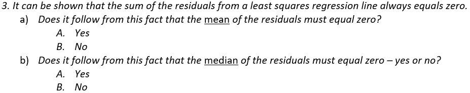
This question should be very easy for all students, but some struggle.  The question boils down to: If the sum of values equals zero, does the mean have to equal zero, and does the median have to equal zero?  The answer is yes to the first, because the mean is calculated as the sum divided by the number of values.  But the answer is no to the second, as seen in this counterexample where the mean is 0 but the median is not: -20, 5, 15.  The fact that this question is stated about residuals is completely irrelevant to answering the question, but the mention of residuals leads some students to think in unhelpful directions.

I sometimes ask an open-ended version of this question where I ask students to provide a counter-example if their answer is no.


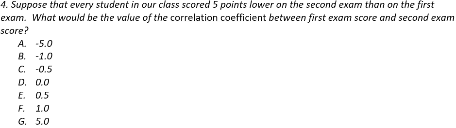
This question has been extremely challenging for my students.  I used to ask it without providing options, and the most common response was “the same.”  That’s right: Many students did not realize that they should provide a number when asked for the value of a correlation coefficient.  Among these options, it’s very discouraging when a student selects -5, apparently not knowing that a correlation coefficient needs to be between -1 and +1 (inclusive), but this answer is tempting to some students because of the “5 points lower” wording in the question.  Another commonly selected wrong answer is -1.  I think students who answer -1 realize that the data would fall on a perfectly straight line, so the correlation coefficient must be -1 or +1, but the “lower” language fools them into thinking that the association is negative.

I sometimes offer a hint, advising students to start by drawing a sketch of some hypothetical data that satisfy the description.  I have also started to ask and discuss this question in class when we first study correlation, and then include the exact same question on the final exam.  This has improved students’ performance, but many still struggle.


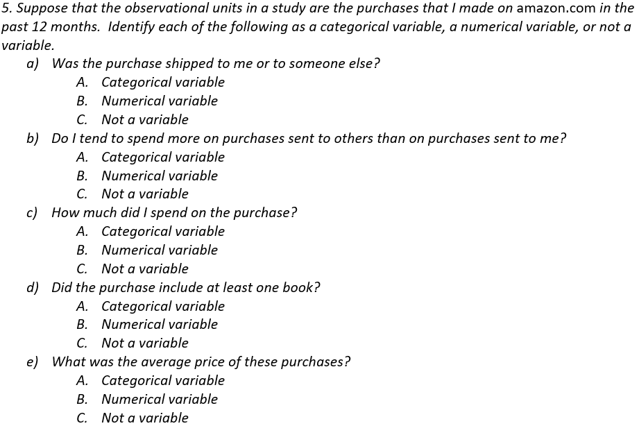
Most students correctly identify (a) and (d) as categorical variables and (c) as a numerical variable.  The most challenging parts are (b) and (e), which are not variables for these observational units.  I try to emphasize that variables are things that can be recorded for each observational unit, not an overall question or measure that pertains to the entire dataset.


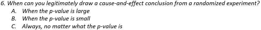
I started asking this question after I noticed that some of my students believe that conducting a randomized experiment always justifies drawing a cause-and-effect conclusion, regardless of how the data turn out!  The good news is that very few students give answer A.  The bad news is that more than a few give answer C.


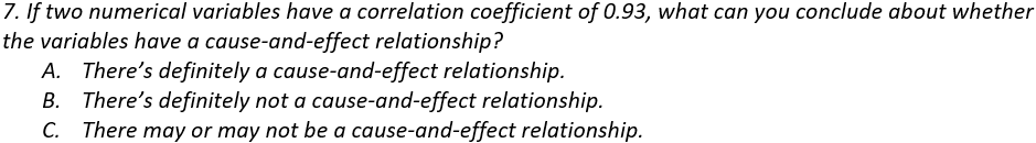
Some students take the “correlation does not imply causation” maxim to an inappropriate higher level by believing that “correlation implies no causation.”  Of course, I want them to know that a strong correlation does not establish a cause-and-effect relationship but also does not preclude that possibility.


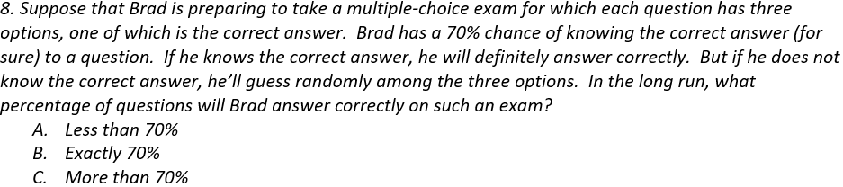
I often ask this question as a calculation to be performed in my courses for mathematically inclined students.  To calculate the correct percentage, note that Brad will get 70% right because he knows the answer, and he’ll guess correctly on 1/3 of the other 30%.  So, his long-run percentage correct will be 70% + 1/3(30%) = 80%.

When I ask for this calculation, I’ve been surprised by students giving an answer less than 70%.  I understand that mistakes happen, of course, or that a student would not know how to solve this, but I can’t understand why they wouldn’t realize immediately that the answer has to be larger than 70%.  I decided to ask this multiple-choice version of the question, which does not require a numerical answer or any calculation.  I’m still surprised that a few students get this wrong.


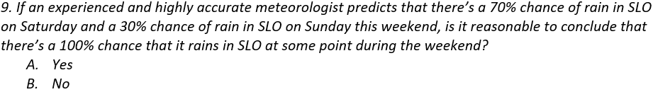
This is essentially the same question as I asked in post #16 (here) about whether the percentage of American households with a pet dog plus the percentage with a pet cat equals the percentage with either a pet dog or a pet cat.  Adding these percentages is not legitimate because the events are not mutually exclusive: It’s possible that it could rain on both Saturday and Sunday.  I hope that choosing 70% and 30% as the percentages is helpful to students, who might be tipped off by the 100% value that something must be wrong because rain cannot be certain.

It might be interesting to ask this question with percentages of 70% and 40%, and also with percentages of 60% and 30%.  I hope that the version with 70% and 40% would be easier, because all students should recognize that there could not be a 110% chance of rain.  I suspect that the version with 60% and 30% would be harder, because it might be more tempting to see 90% as a reasonable chance.


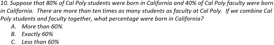
The main point here is that you cannot just take the average of 80% and 40%, because the group sizes are not the same.  Because there are many more students than faculty, the overall percentage will be much closer to the student percentage of 80%, so the correct answer is that the overall percentage would be more than 60%.


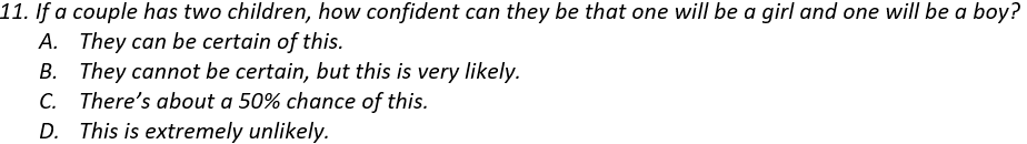
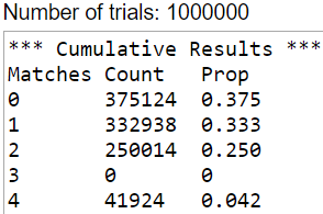
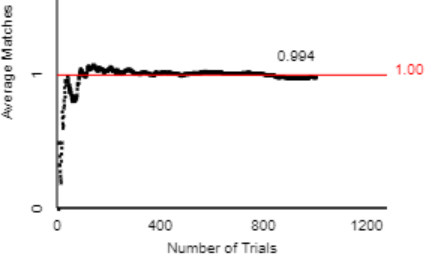
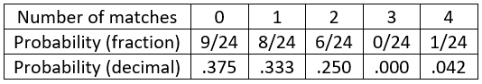
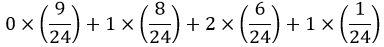
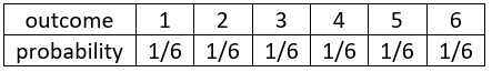
The goal here is to assess whether students realize that a probability such as 0.5 refers to a long-run proportion and does not necessarily hold in the short-run.  A sample size of two children definitely falls into the short-run and not long-run category, so it’s not guaranteed or even very likely to have one child of each sex.

A student does not need to enumerate the sample space and calculate the exact probability to answer this question correctly.  The sample space of four equally likely outcomes is {B1B2, B1G2, G1B2, G1G2}, so the probability of having one child of each sex is indeed 2/4 = 0.5.  But a student only needs to realize that this event is neither very likely nor very unlikely in order to answer correctly.  In fact, even if a student has the misconception that the three outcomes {2 boys, 2 girls, 1 of each} are equally likely, so they think the probability is 1/3, they should still give the correct answer of C.


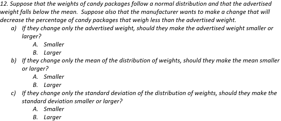
Students expect to perform normal distribution calculations after they read the first sentence.  But they cannot do this, because the mean and standard deviation are not provided.  For that matter, we also don’t know the value of the advertised weight.  Students are left with no option but to think things through.  I hope that they’ll remember and follow the advice that I give for any question involving normal distributions: Start with a sketch!

Part (a) can be answered without ever having taken a statistics course.  To reduce the percentage of packages that weigh less than advertised, without changing the mean or standard deviation, the manufacturer would need to decrease the advertised weight.

To answer part (b), students should realize that decreasing the percentage of underweight packages would require putting more candy in each package, so the mean of the distribution of weights would need to increase.

Part (c) is the most challenging part.  Decreasing the percentage of underweight packages, without changing the advertised weight or the mean, would require a taller and skinnier normal curve.  So, the standard deviation of the weights would need to decrease.


Most students get this wrong by answering yes.  These students have missed the whole point of the Central Limit Theorem (CLT), which describes the distribution of the sample mean.  Many students believe that whenever a sample size reaches 30 or more, that guarantees an approximately normal distribution.  Of what?  They don’t give that question any thought.  They mistakenly believe that the CLT simply guarantees a normal distribution when n ≥ 30.

I usually ask for an explanation along with a yes/no answer here.  But the explanation is almost always the same, boiling down to: Yes, because n ≥ 30.  Some students do give a very good answer, which demonstrates that they’ve learned something important (and also gives me much pleasure).  I think this question helps to identify students with a very strong understanding of the CLT from those with a less strong understanding.

You could ask a version of this question that does not refer to the Central Limit Theorem by asking: Does the sample size of 200 houses establish that


This is one of my very favorite questions, which I ask on almost every final exam.  I think this is a very important idea for students to understand.  But my students perform very poorly on this question that I like so much.  Not many give the correct answer (B, 1000), and many think that the answer is 100,000 or more.

It’s fine for students to perform a sample size calculation to answer this question, but that’s not my intent.  I hope that they will have noticed that many examples in the course involved surveys with about 1000 people and that the margin-of-error turned out to be in the ballpark of 3 percentage points.

Unfortunately, many students are misled by the 325 million number that appears in the first sentence of the question.  The population size is not relevant here.  Margin-of-error depends critically on sample size but hardly at all on population size, as long as the population is much larger than the sample.  A sample size of 1000 people has the same margin-of-error whether the population of interest is all Americans or all New Zealanders or all residents of San Luis Obispo.

I suppose you could argue that I am deliberately misleading students by leading off with an irrelevant piece of information, but that’s precisely what’s being assessed: Do they realize that the population size is irrelevant here?  It’s quite remarkable that a sample size of 1000 is sufficient to obtain a margin-of-error of only 3.5 percentage points in a population as numerous as the United States.  One of my principal goals in the course is for students to appreciate the wonder of random sampling!

I sometimes give half-credit to answers of 100 and 10,000, because they are somewhat in the ballpark.  On the opposite extreme, I am tempted to deduct 2 points (even on a 1-point question!) when a student answers 1,000,000 or 10,000,000.


This question is about as straight-forward as they come, and my students generally do well.  Some of the questions above are quite challenging, so it’s good to include some easier ones as well.


This is another straightforward one on which my students do well.  I hope that the answer to this question is second-nature to students by the end of the course, and I like to think that they silently thank me for the easy point when they read this question.


You might be expecting me to say that this one is also straight-forward, but it is always more problematic for students than I anticipate.  Maybe some students out-smart themselves by applying an exam-testing strategy that cautions against giving the same answer for both parts of a two-part question.


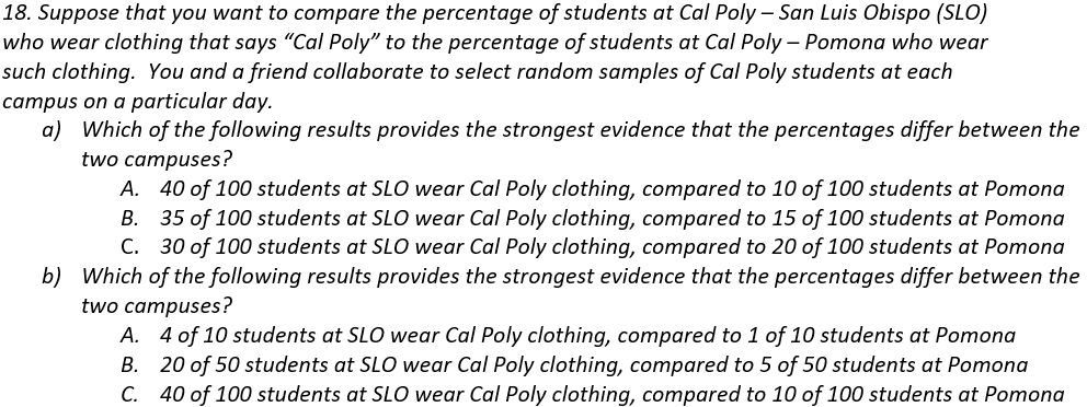
Part (a) is very clear-cut.  In fact, this is another question for which there’s no need to have ever set foot in a statistics classroom to answer correctly.  All that’s needed is to look for the result with the biggest difference between the success proportions in the two groups.

It does help to have been in a statistics classroom for part (b), although many students have correct intuition that larger sample sizes produce stronger evidence of a difference between the groups, when the difference in success proportions is the same.


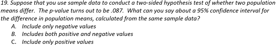
I like questions about hypothesis tests and confidence intervals providing complementary and consistent results.  In this case students need to realize that the p-value is greater than 0.05, so the difference in the groups means is not statistically significant at the .05 level, so a 95% confidence interval for the difference in population means should include both positive and negative values (and zero).


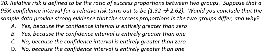
This is another example of asking students to think through a statistic that they may not have encountered in class.  They should recognize that a relative risk greater than one indicates that one group has a higher success proportion than the other.  In this case, a confidence interval consisting entirely of values greater than one provides strong evidence that the success proportions differ between the two groups.


Because this is the post #21 in this blog series, I will include a twenty-first question for extra credit*.  Be forewarned that this is not really a statistics question, and it does not align with any conventional learning objective for a statistics course.

* I rarely offer extra credit to my students, but I happily extend this opportunity to blog readers.

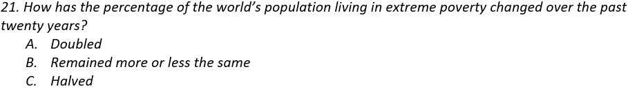
I mentioned in post #8 (here) that this percentage has halved and that only 5% of a sample of Americans gave the correct answer.  Hans Rosling liked to point out that this represents a far worse understanding than pure ignorance, which would suggest that one-third would answer correctly.  Of course, knowing this fact is not a learning objective of an introductory statistics course, but I truly hope that statistics teachers can lead their students to learn about the world by presenting real data on many topics.  Later I will write a blog post arguing that statistics teachers can present data that help to make students aware of many measurable ways in which the world is becoming a better and better place.


P.S. More information for Rosling’s claim and survey data about the global extreme poverty rate (question #21) can be found here and here and here.

P.P.S. I thank Beth Chance for introducing me question #14 above (about the sample size needed to obtain a reasonable margin-of-error for the population of all U.S. residents).  Beth tells me that she borrowed this question from Tom Moore, so I thank him also.

I also thank Beth and Tom for kindly serving as two reviewers who very read drafts of my blog posts and offer many helpful suggestions for improvement before I post them.

Speaking of giving thanks, to those in the U.S. who read this during the week that it is posted, let me wish you a Happy Thanksgiving!

To all who are reading this in whatever country and at whatever time: Please accept my sincere thanks for taking the time to follow this blog.

P.P.P.S. Answers to these questions are: 1a) A, 1b) A, 1c) B, 1d) B, 1e) A; 2a) A, 2b) A, 2c) B, 2d) A; 3a) A, 3b) B; 4) F; 5a) A, 5b) C, 5c) B, 5d) A, 5e) C; 6) B; 7) C; 8) C; 9) B; 10) A; 11) C; 12a) A, 12b) B, 12c) A; 13) B; 14) B; 15) A; 16) C; 17a) A, 17b) A; 18a) A, 18b) C; 19) B; 20) B; 21) C.

A Word file with these twenty questions, which you may use to copy/paste or modify questions for use with your students, can be found here:

#20 Lincoln and Mandela, part 2

In last week’s post (here) I discussed sampling bias and random sampling with an activity that made use of Lincoln’s Gettysburg Address.  Now I present an activity using random assignment that mentions another great leader: Nelson Mandela.


This activity starts by asking students to answer two questions about Mandela.  Unbeknownst to my students, I distribute two versions of the questions:

  • Version A:
    • Was Nelson Mandela, first president of South Africa following apartheid, younger or older than 16 years old when he died?
    • Make a guess for Mandela’s age when he died.
  • Version B:
    • Was Nelson Mandela, first president of South Africa following apartheid, younger or older than 160 years old when he died?
    • Make a guess for Mandela’s age when he died.

Did you notice the subtle difference between the two versions?  They are identical except for one occurrence of the 0 character.  Version A asks about an age of 16, and version B asks about an age of 160.  Both of these questions are ridiculous; everyone knows that Mandela was older than 16 and younger than 160 when he died.  Why ask these silly questions at all?  The research question here is whether people’s age guesses are subconsciously affected by first seeing the number 16 or 160.  The psychological phenomenon known as anchoring suggests that those numbers, despite being completely irrelevant, nevertheless affect subsequent responses.

How do I present these questions to students?  Sometimes I prepare and distribute strips of paper in class, with the two versions mixed up randomly beforehand.  At other times I distribute the questions to students electronically, using either a google form or our course management system.  In this latter case I post both versions and ask students to determine which version to answer by adding the year, date, and month (as a number) of their birthdate. I tell them to use version A if this sum is odd and version B if this sum is even.


After we’ve collected students’ responses, I reveal the two versions to students and describe the research question.  Then I ask:

  • (a) What are the observational units?  This one is easy: The students themselves are the observational units, because the data were collected on them.
  • (b) What are the variables?  Which is explanatory, and which is response?  Classify each variable as categorical or numerical.  This one takes some thought.  The answer to the first question on the survey (older or younger than …) is actually not relevant here.  The explanatory variable is which “anchor” value the student was given: 16 or 160.  This is a categorical (and binary) variable.  The response variable is the guess for Mandela’s age when he died, which is numerical.
  • (c) Is this an observational study or an experiment?  This is an experiment, because the explanatory variable groups (i.e., whether a student read the question with 16 or 160 as the anchor value) were actively imposed on the students, not passively observed.  Thinking about the explanatory variable is key here, because some students are tempted to respond that this is an observational study because it feels like only answering survey questions.
  • (d) Did this study make use of random sampling, random assignment, both, or neither?  This is an important question, because one of my primary goals with this activity is to reinforce that random sampling and random assignment have different goals and benefits.  I advise students to take this one question at a time:
    • Did we make use of random sampling?  After some time for thought, I often ask a follow-up question as a hint: Who constitutes the sample, and did we choose these people randomly?  Students realize that they comprise the sample.  They were not selected randomly from the population of all students at our university (or from any other population), because they’re all students in my class.
    • Did we make use of random assignment?  Again I provide a hint after allowing some time to think about this: How did students come to be in group A or group B?  Students recognize that they were randomly assigned to a group.
  • (e) Some students know more about world history than others.  Is this a confounding variable here?  If not, how was this variable (knowledge of world history) controlled for?  This is a tough question for many students.  But this is a key question that gets at the purpose of random assignment.  The answer is no, this is not a confounding variable, because random assignment should have balanced out those who know lots of world history (or a moderate amount, or not much at all) between the two groups.  That’s what random assignment is all about: creating groups that are as similar as possible in all respects, except for the explanatory variable being studied.
  • (f) If it turns out that the age guesses in group B are statistically significantly greater than the age guesses in group A, would it be appropriate to draw a cause-and-effect conclusion?  If so, between what and what?  This is the other key question, as it addresses the scope of conclusion that can potentially be drawn from a randomized experiment.  Because students were randomly assigned to one value or the other for the anchor, it would be legitimate to draw a cause-and-effect conclusion if the age guesses differ significantly, in the conjectured direction, between the two groups.  In other words, it would be appropriate to conclude that the value of the anchor had an effect on these students’ age guesses.

I often end this activity there, keeping students’ atention solely on data collection issues.  But you could extend the activity further, or come back to it later in the course, by asking students to analyze and draw conclusions from their data:

  • (g) Produce appropriate graphs and calculate relevant statistics.  Summarize what these reveal about the research question.
  • (h) Conduct a test to assess the strength of evidence that the data provide for the research hypothesis.  Also calculate and interpret an appropriate confidence interval for comparing the two groups.

Here are results from a recent class of mine, analyzed with Minitab statistical software:

This analysis reveals that the sample data provide strong evidence to support the anchoring phenomenon.  The mean age guesses differ by almost 18 years (68.80 for version A, 86.86 for version B) in the conjectured direction.  The medians, which are not affected by outliers, differ by 11.5 years (75.5 for version A, 87.0 for version B).  The p-value for the t-test comparing the group means is essentially zero, indicating that the class data provide strong evidence to support the hypothesis that responses are affected by the “anchor” number that they see first.  We can be 95% confident that those who see an anchor of 160 produce an average age guess that is between 9.4 and 26.7 years greater than those who see an anchor of 16.


These data also provide a good opportunity to ask about whether any values should be removed from the analysis.  Many students believe that outliers should always be discarded, but it’s important to consider whether there is ample justification for removing them. In this case the age guesses of 14 years in group A and 140 years in group B are so implausible as to suggest that the students who gave those responses did not understand the question, or perhaps did not take the question seriously.  Let’s re-analyze the data without those values.  But first let’s ask students to think through what will happen:

  • (i) Predict the effect of removing the two extreme data values on:
    • Mean age guess in each group,
    • Standard deviations of the age guesses in each group,
    • Value of the t-test statistic
    • p-value
    • Confidence interval for the difference in population means
  • (j) Remove these two data values, and re-analyze the data.  Comment on how (if at all) these quantities change.  Also re-summarize your conclusions, and comment on how (if at all) they change.

After removing the two extreme data values, we produce the following output:

We see that even without the extreme data values, the data still provide strong evidence for the anchoring phenomenon.  As most students will have predicted, the mean age guess increased in version A and decreased in version B.  The standard deviations of the age guesses decreased in both groups.  The smaller difference in group means would move the t-value toward zero, but the smaller within-group standard deviations would produce a larger (in absolute value) t-statistic.  The net effect here is that the value of the t-statistic is slightly less negative. The p-value is the same as before to three decimal places (0.000) but is actually a tad larger due to the smaller (in absolute value) t-statistic.  Similarly, the confidence interval is centered on a smaller difference and is a bit narrower.  Without the extreme data values, we are 95% confident that the average age guess with the 160 anchor is between 7.4 and 23.4 years larger than with the 16 anchor.


Before concluding this analysis, I think it’s important to return to two key questions that get at the heart of the different purposes of random sampling and random assignment:

  • (k) Is it appropriate to draw a cause-and-effect conclusion from these data?  Justify your answer, and state the conclusion in context.
  • (l) To what population is it reasonable to generalize the results of this study?  Justify your answer.

Yes, it is appropriate to draw a cause-and-effect conclusion that the larger anchor number tends to produce greater age guesses than the smaller anchor number.  This conclusion is warranted, because the study design made use of random assignment and the resulting data revealed a highly statistically significant difference in the average age guesses of the two groups.

But this study only included students from my class, which is not a random sample from any population.  We should be careful not to generalize this conclusion too broadly.  Perhaps other students at my university would react similarly, and perhaps students in general would respond similarly, but we do not have data to address that.


I mentioned in post #11, titled “Repeat after me” (here), that I ask questions about observational units and variables over and over in almost every example throughout the entire course.  After we’ve studied random sampling and random assignment, I also ask questions about this, like questions (c) and (d) above, for virtually every example.  I also ask questions about scope of conclusions, like questions (k) and (l) above, for almost every example also.

To assess students’ understanding of the distinction between random sampling and random assignment, I also ask questions such as:

  • You want to collect data to investigate whether teenagers in the United States have read fewer Harry Potter books (from the original series of seven books) than teenagers in the United Kingdom.  Would you make use of random sampling, random assignment, both, or neither?  Explain.
  • An instructor wants to investigate whether using a red pen to grade assignments leads to lower scores on exams than using a blue pen to grade assignments.  Would you advise the professor to make use of random sampling, random assignment, both, or neither?  Explain.
  • A student decides to investigate whether NFL football games played in indoor stadiums tend to have more points scored than games played outdoors.  The student examines points scored in every NFL game of the 2019 season. Has the student used random sampling, random assignment, both, or neither?

The Harry Potter question cannot involve random assignment, because it makes no sense to randomly assign teenagers to live in either the U.S. or U.K.  But it would be good to use random sampling to select the teenagers in each country to be asked about their Harry Potter reading habits.  On the other hand, it’s important to use random assignment for the question about red vs. blue pen, because the research question asks for a cause-and-effect conclusion.  It’s less important to select a random sample of the instructor’s students, and the instructor would probably want to include all of his or her students who agreed to participate in the study.  For the football question, the student investigator would use neither random assignment nor random sampling.  NFL games are not assigned at random to be played in an indoor stadium or outdoors, and the games from the 2019 season do not constitute a random sample from any population.


The Lincoln and Mandela activities aim to help students understand that despite the common word random, there’s actually a world of difference between random sampling and random assignment:

The textbook titled The Statistical Sleuth, by Fred Ramsey and Dan Schafer, presents the following graphic, illustrating the different scopes of conclusions that can be drawn from a statistical study, depending on whether random sampling and/or random assignment were employed:

I recommend emphasizing this distinction between random sampling and random assignment at every opportunity.  I also think we do our students a favor by inviting Lincoln and Mandela into our statistics courses for a brief visit.


P.S. Nelson Mandela (1918 – 2013) was 95 years old when he died. You can read about the anchoring phenomenon here, and an article about using the effect of implausible anchors appears here.  The data on age guesses used above can be found in the Excel file below.

#19 Lincoln and Mandela, part 1

Two great leaders will be featured in this post and the next: Abraham Lincoln and Nelson Mandela.  Well, to be honest, featured is too strong, but these men provide the background for in-class activities that help students to understand two very important concepts in statistics: random sampling and random assignment.

When I first mention these two terms in class, I suspect that many students only hear random and don’t pay much attention to sampling versus assignment.  I admit that I did not make a big deal of this distinction myself when I started teaching.  But now I try to emphasize that random sampling and random assignment are very different ideas with very different goals.  In a nutshell:

  • Random sampling concerns how to select observational units for a sample.  Random sampling allows for generalizing the results of a sample to the larger population.
  • Random assignment pertains to how observational units come to be in groups to be compared.  Random assignment allows for the possibility of drawing a cause-and-effect conclusion.

This post will discuss random sampling with reference to Lincoln, and the next will concern random assignment while mentioning Mandela.  Along the way we’ll sneak in a touch of history and also some psychology.  As always, questions for students appear in italics.


I begin this activity by asking students to consider the 268 words in this speech as the population of interest:

The natural first question is: What speech is this, and who wrote it?  I’m glad that most students recognize this as Lincoln’s Gettysburg Address.  Then I give these instructions:

  • Circle ten words as a representative sample from this population.
  • For each word in your sample, record how many letters are in the word.
  • Calculate the average (mean) number of letters per word in your sample.
  • Plot your sample average on a dotplot on the board, along with the sample averages of your classmates.

Those who remember post #11 (here) will not be surprised that I next ask students: Identify the observational units and variable, first in your sample and then for the graph on the board.  For the students’ samples of ten words, the observational units are words, and the variable is the length of the word, as measured by number of letters.  But for the dotplot that students produce on the board, the observational unit are samples of 10 words, and the variable is the average length of a word.

All of this is prelude to the important question: How can we use the dotplot on the board to tell whether this sampling method (my telling students to circle ten words) is any good?  Before a student will respond, I often have to add: What additional information would you like to know to help you decide whether this sampling method was good?  At this point a student usually responds that they would like to know the average word length in the entire population of 268 words.  I reply: Great idea, and before class I calculated this population average to be 4.295 letters per word.  Then I draw a vertical line through the dotplot at this value.  Here are results from a recent class:

At this point I define sampling bias as a systematic tendency for a sampling method to over-represent some observational units and under-represent others.  Then I ask: Would you say that this sampling method (my asking students to circle ten words) is biased?  If so, in which direction?  How can you tell from the dotplot?

Students recognize that a large majority of the sample averages are greater than the population average.  This means that there’s a systematic tendency for this sampling method to over-represent large words and under-represent small words.  In other words, this sampling method is biased toward over-estimating the average length of a word in the Gettysburg Address.

I emphasize to students that sampling bias is a property of the sampling method, not of any one sample generated by the method.  One illustration of this is to ask: Whose idea was it to select a sample by circling ten words based solely on human judgment?  Students reply, somewhat sheepishly, that it was my idea.  I respond that this is absolutely right: The sampling bias here is my fault, not theirs, because the sampling method was my idea.

Then I ask: Suggest some reasons for why this sampling method turned out to be biased in this way.  Students are quick to suggest good explanations for this sampling bias.  They mention that longer words (such as government, battlefield, and consecrate) convey the meaning of the speech better than smaller words (such as a, by, and for).  Students also suggest that longer words are more likely to be selected because they are just more interesting than smaller words.

Next I ask whether sample size is the problem: Would asking people to circle twenty words (rather than ten) eliminate, or at least reduce, the sampling bias?  Most students realize that taking a larger sample of words would not help with this problem, because people would still be prone to select larger words rather than smaller ones.

Before we conclude this discussion of biased sampling, I ask students to give me a chance to redeem myself by proposing a new sampling method: Suppose that I ask you to close your eyes and point at the page ten times in order to select words for your sample.  Would this sampling method be unbiased?  (After all, doesn’t closing your eyes guarantee a lack of bias?)  Explain.  Most students correctly realize that this sampling method is still biased toward longer words.  You would be more likely to select longer words than shorter ones, because longer words take up more space on the page.

Finally, I ask: Suggest a different sampling method that would be unbiased.  Some students immediately respond with a magic word: random!  So I follow up with: What does it mean to select a random sample of words in this situation?  This question is harder, but eventually a student says that random sampling gives every word, whether it is an interesting word such as dedicate or a boring word like of, the same chance of being selected.


We then proceed to examine properties of random sampling.  Sometimes I ask students to generate their own random samples of words from this population.  One option for doing this is to give them a numbered list of the 268 words and then use a random number generator (such as the one at random.org) to select their sample.  They can then calculate their sample mean word length and put a dot on a new dotplot on the board, using the same scale as the original dotplot.

Another option is to move directly to using an applet (available here) to select random samples of words.  This applet starts by showing the distribution of word lengths in the population, which is skewed to the right:

You can select random samples by first clicking on Show Sampling Options.  I ask students to start by selecting one random sample of 5 words, which produces a result such as:

The applet calculates the sample mean word length for this sample and plots that on a graph.  Then asking the applet to select 999 more samples results in a graph of sample means that looks like:

Now we’re ready for the key questions: Does this distribution of sample means indicate sampling bias or unbiasedness of this random sampling method?  What aspect of the distribution leads you to this conclusion?  The shape and variability in this distribution are completely irrelevant to the issue of sampling bias.  To address this issue, we focus on the center of the distribution.  We see that the center of the distribution of sample means is very close to the population mean.  We can quantify this by noting that the mean of the 1000 sample means is 4.336 letters/word, which is quite close to the population mean of 4.295 letters/word. Therefore, this random sampling method appears to be unbiased.

Before moving on, I want to point out how challenging the following statement can be for students:

The mean of the sample means is the population mean.

This sentence contains only ten words, but three of them are the word mean(s)!  We can rewrite this statement mathematically, using common notation, as:

Notice that this equation contains only three symbols (in addition to the equals sign), but all three of them describe a mean!  It takes considerable time and careful thought for students to recognize and understand what these three means are and how they relate to each other:

  • The population mean.  For the population of 268 words in the Gettysburg Address, the value of the population mean is 4.295 letters/word.
  • The sample mean, which varies from sample to sample.  Each student calculated his/her own sample mean and represented it with a dot on the board. The first random sample generated by the applet above had a sample mean of 3.6 letters/word.  The applet then generated 999 more random samples and calculated the sample mean number of letters/word for each one.
  • The mean of the sample means.  We could have calculated this for the students’ sample means in class; we did not bother, but we know from the graph that the mean of the sample means would have been much greater than 4.295.  The applet did calculate the mean of the 1000 sample means that it generated; the mean of these sample means turned out to be 4.336 letters/word.  If we went on to generate all possible random samples, in the long run the mean of the sample means would be 4.295, the same value as the population mean.

My next question for students: Consider taking random samples of size 20 words per sample, rather than 5 words per sample.  How (if at all) would you expect the distribution of sample means to change, in terms of center, variability, and shape?  After students think about this, discuss it among themselves, and record their predictions, we use the applet to make this change, which produces a result such as:

We see that the center of this distribution is still close to the population mean of 4.295 letters/word.  Most students expect this, because this simply shows that random sampling is still unbiased with a larger sample size.  The key finding is that the variability of sample means is smaller with a larger sample size.  How can we tell?  One way is that the sample means now range from about 3 to 6 letters/word, whereas before (with a smaller sample size of 5) they ranged from about 2 to 8 letters/word.  Even better, we can note that the standard deviation of the sample means is now about 0.463, which is much less than its value of 0.945 with the smaller sample size.  The shape of the distribution of sample means is a bit more symmetric and normal-looking with the larger sample size than with the smaller sample size, much less skewed than the distribution of the population.

This last point foreshadows the concept of a sampling distribution of a sample mean and the Central Limit Theorem.  I think this context and applet provide a great opportunity to study those ideas*, but at this point I prefer to keep the focus on the topics of sampling bias and random sampling.

* One feature that I particularly like about this applet is that it displays three distributions at once, which are crucial (and challenging) for students to keep in mind when studying sampling distributions:

  • Population distribution (of word lengths)
  • Sample distribution (of word lengths)
  • Sampling** distribution (of average word lengths in a sample)

** It’s very unfortunate that the modifier words sample and sampling are so similar, yet the distributions they describe are precisely a key distinction to understand.  Perhaps we should avoid using the term sampling distribution and instead say distribution of sample averages.  It’s nice to be able to use shorthand when speaking with colleagues who understand the ideas, but in this case the extra words provide clarity for students who are just beginning to consider the ideas.


Before leaving the topic of sampling bias and random sampling, I ask a few more questions of my students, all in the context of selecting a sample of students at our university to complete a survey:

  • Would it be easy or hard to select a random sample of 50 Cal Poly students?

It takes a while for some students to realize that selecting such a random sample would be very hard to achieve.  It’s unlikely that university administrators would provide a list of all students at the university.  Having access to such a list would enable us to select a random sample of students’ names, but we would still face the challenges of contacting them successfully and then, even more problematic, convincing them to respond to our survey.

  • Suppose that you select a sample of Cal Poly students by standing in front of the library or recreation center and approaching 50 students who pass by.  Would this constitute a random sample of Cal Poly students?  What if you stand in front of the recreation center and approach 50 students who pass by?

Most students realize that this sampling method (standing in one location and recruiting passersby) does not constitute random sampling.  Some students would be more likely to be selected than others, in part because they are out-and-about on campus more often.  It’s also likely that you would be more likely to approach students who appear to be …, well, …, approachable, as opposed to students who look more intimidating or less friendly.  Even though the word random is used in an everyday sense to mean anything that is unplanned or unstructured, random sampling has a technical meaning.

  • Even though the convenience sampling described above is not random, could it nevertheless result in a sample that is representative of the population of Cal Poly students?  Identify a variable for which you would not be willing to consider such a convenience sample (as described above) to be representative of the population of Cal Poly students.  Also identify a variable for which you would be willing to consider such a sample (as described above) to be representative of the population of Cal Poly students.

We should certainly not consider a convenience sample, selected from students who pass by the library or recreation center, to be representative of the population for most variables, such as how often a student uses the recreation center per week, and whether or not a student knows where the library is on campus.  We should also be wary for variables about the student’s major, or how many hours they study per week, or how much sleep they get per night.  But there’s probably no reason to doubt that such a sample is representative of the population for a variable such as blood type.


I have used far more than 268 words to write this post.  Clearly I am much less economical with words than Abraham Lincoln in his Gettysburg Address.  I look forward to name-dropping Nelson Mandela into the next post, which will feature random assignment and discuss how that is quite different from random sampling.

P.S. Beth Chance and I developed the Gettysburg Address activity based the famous “random rectangles” activity developed by Dick Scheaffer and others.  As I told Dick when I interviewed him for the Journal of Statistics Education (here), I suspect that random rectangles is the most widely used activity for teaching statistics of all time, at least among activities that do not involve M&M candies.  You can read more about the genesis of the random rectangles activity in this JSE article (here).

P.P.S. This website (here) provides six different versions of the Gettysburg Address, with minor variations (and slightly different numbers of words) among them.  The one used above is the Hay copy.

#18 What do you expect?

I argued in post #6 (here) that the most dreaded two-word term in statistics is standard deviation.  In this post I discuss the most misleading two-word term in statistics.  There’s no doubt in my mind about which term holds this distinction.  What do you expect me to say?

If you expect me to say expected value, then your expectation is correct.

Below are four examples for helping students to understand the concept of expected value and avoid being misled by its regrettable name.  You’ll notice that I do not even use that misleading name until the end of the second example.  As always, questions that I pose to students appear in italics.


1. Let’s return to the random babies activity from post #17 (here).  I used the applet (here) to generate one million repetitions of distributing four babies to their mothers at random, with the following results:

I ask students: Calculate the average number of matches per repetition.  I usually get some blank stares, so I ask: Remind me how to calculate an average.  A student says to add up the values and then divide by the number of values.  I respond: Yes, that’s all there is to it, so please do that with these one million values.  At this point the blank stares resume, along with mutterings that they can’t possibly be expected* to add a million values on their own.

* There’s that word again.

But of course adding these one million values is not so hard at all: Adding the 375,124 zeroes takes no time, and then adding the 332,938 ones takes barely a moment.  Then you can make use of a wonderful process known as multiplication to calculate the entire sum: 0×(375,124) + 1×(332,938) + 2×(250,014) + 4×(41,924) = 1,000,662.  Dividing by 1,000,000 just involves moving the decimal point six places to the left.  This gives 1.000662 as the average number of matches in the one million simulated repetitions of this random process of distributing four babies to their mothers at random.

Then I ask: What do you think the long-run average (number of matches per repetition) will be if we continue to repeat this random process forever and ever?   Most students predict that the long-run average will be 1.0, and I tell them that this is exactly right.  I also show the applet’s graph of the average number of matches as a function of number of repetitions (for the first 1000 repetitions), which shows considerable variation at first but then gradual convergence toward a long-run value:


At this point we discuss how to calculate the theoretical long-run average based on exact probabilities rather than simulation results.  To derive the formula, let’s rewrite the calculation of the average number of matches in one million repetitions from above:

Notice that this calculation is a weighted average, where each possible value (0, 1, 2, 4) is weighted by the proportion of repetitions that produced the value.  Now recall the exact probabilities that we calculated in post #17 (here) for this random process:

and then replace the proportions in the weighted average calculation with the exact, theoretical probabilities:

This expression works out to be 24/24, which is better known as the value 1.0.  This is the theoretical long-run average number of matches that would result from repeating this random process forever and ever.  In general, a theoretical long-run average is the weighted average of the possible values of the random process, using probabilities as weights.  We can express this in a formula as follows, where LRA represents long-run average, x represents the possible values, and p(x) represents their probabilities:

Back to the random babies context, next I ask:

  • Is this long-run average the most likely value to occur?  Students recognize that the answer is no, because we are slightly more likely to obtain 0 matches than 1 match (because probability 9/24 is greater than 8/24).
  • How likely is the long-run average value to occur?  We would obtain exactly 1 match one-third (about 33.33%) of the time, if we were to repeat the random process over and over.
  • Do you expect the long-run average value to occur if you conduct the random babies process once?  Not really, because it’s twice as likely that we will not obtain 1 match than it is that we will obtain 1 match.

2. Now a very generic example: Consider rolling a fair, ordinary, six-sided die (or number cube), and then observing the number of dots on the side that lands up.  Calculate and interpret the long-run average value from this random process.

Saying that the die is fair means that the six possible outcomes should be equally likely, so the possible values and their probabilities are:

We can calculate the long-run average to be: LRA = 1×(1/6) + 2×(1/6) + 3×(1/6) + 4×(1/6) + 5×(1/6) + 6×(1/6) = 21/6 = 3.5.  This means that if we were to roll the die for a very large number of rolls, the average number of dots appearing on the side that lands up would be very close to 3.5.

Now I ask the same three questions from the end of the previous example:

  • Is this long-run average the most likely value to occur in the die-rolling process?  Of course not, because it’s downright impossible to obtain 3.5 dots when rolling a die. 
  • How likely is the long-run average value to occur?  Duh, like I just said, it’s impossible!  The probability is zero.
  • Do you expect the long-run average value to occur if you roll a die once?  Once more, with feeling: Of course not!

Students naturally wonder why I asked these seemingly pointless questions for the die-rolling example.  Here’s where things get a bit dicey (pun intended).  I sheepishly reveal to students that the common term for this quantity that we have been calculating and interpreting is expected value, abbreviated as EV or E(X).

Let’s ask those questions again about the die-rolling process, but now using standard terminology:

  • Is the expected value the most likely value to occur in the die-rolling process? 
  • How likely is the expected value to occur? 
  • Do you expect the expected value to occur if you conduct the die rolling process once? 

The answers to these questions are the same as before: No, of course not, the expected value (3.5 dots) is certainly not expected, because it’s impossible!

Isn’t this ridiculous?  Can we blame students for getting confused between the expected value and what we expect to happen?  As long as we’re stuck with this horribly misleading term, it’s incumbent on us to help students understand that the expected value of a random process does not in any way, shape, or form mean the value that we expect to occur when we conduct the random process.  How can we do this?  You already know my answer: Ask good questions!


3. Now let’s consider the gambling game of roulette.  When an American roulette wheel (as shown below) is spun, a ball eventually comes to rest in one of its 38 numbered slots.  The slots have colors: 18 red, 18 black, and 2 green.

The simplest version of the game is that you can bet on either a number or a color:

  • If you bet $1 on a color (red or black) and the ball lands in a slot of that color, then you get $2 back for a net profit of $1.  Otherwise, your net profit is -$1.
  • If you bet $1 on a number and the ball lands in that number’s slot, then you get $36 back for a net profit of $35.  Otherwise, your net profit is -$1.

I ask students to work through the following questions in groups, and then we discuss the answers:

  • a) List the possible values of your net profit from a $1 bet on a color, and also report their associated probabilities.  The possible values for net profit are +1 (if the ball lands on your color) and -1 (if it lands on a different color).  The wheel contains 18 slots of your color, so the probability that your net profit is +1 is 18/38, which is about 0.474.  The probability that your net profit is -1 is therefore 20/38, which is about 0.526.  Not surprisingly, it’s a little more likely that you’ll lose than win.
  • b) Determine the expected value of the net profit from betting $1 on a color.  The expected value is $1×(18/38) + (-$1)×(20/38) = -$2/38, which is about -$0.053.
  • c) Interpret what this expected value means.  If you were to bet $1 on a color for a large number of spins of the wheel, then your average net profit would be very close to a loss of $0.053 (about a nickel) per spin.
  • d) Repeat (a)-(c) for betting $1 on a number.  The possible values of net profit are now +35 (if the balls lands on your number) and -1 (otherwise).  The respective probabilities are 1/38 (about 0.026) and 37/38 (about 0.974).  The expected value of net profit is $35×(1/38) + (-$1)×(37/38) = -$2/38, which is about -$0.053.  If you were to bet $1 on a number for a large number of spins of the wheel, then your average net profit would be very close to a loss of $0.053 (about a nickel) per spin.
  • e) How do the expected values of the two types of bets compare?  Explain what this means.  The two expected values are identical.  This means that if you bet for a large number of spins, your average net profit will be to lose about a nickel per spin, regardless of whether you bet on a color or number.
  • f) Are the two types of bets identical?  (Would you get the same experience by betting on a color all evening vs. betting on a number all evening?)  If not, explain their primary difference.  No, the bets are certainly not identical, even though their expected values are the same.  If you bet on a number, you will win much less often than if you bet on a color, but your winning amount will be much larger when you do win.
  • g) The expected value from a $1 bet might seem too small to form the basis for the huge gambling industry.  Explain how casinos can make substantial profits based on this expected value.  Remember that the expected value is the average net profit per dollar bet per spin.  Casinos rely on attracting many customers and keeping them gambling for a large number of spins.  For example, if 1000 gamblers make $1 bets on 1000 spins each, then the expected value* of the casino’s income would 1000×1000×($2/38) ≈ $52,638.58.

* I have resisted the temptation to use a shorthand term such as expected income or expected profit throughout this example.  I believe that saying expected value every time might help students to avoid thinking of “expected” in the everyday sense of the word when we intend its technical meaning.


4. I like to use this question on exams to assess students’ understanding of expected value: At her birthday party, Sofia swings at a piñata repeatedly until she breaks it.  Her mother tells Sofia that she has determined the probabilities associated with the possible number of swings that could be needed for Sofia to break the piñata, and she has calculated the expected value to be 2.4.  Interpret what this expected value means.

A good answer is: If Sofia were to repeat this random process (of swinging until she breaks a piñata) for a very large number of piñatas, then the long-run average number of swings that she would need will be very close to 2.4 swings per piñata.

I look for three components when grading students’ interpretations: 1) long-run, 2) average, and 3) context.  Let’s consider each of these:

  1. The phrase long-run does not need to appear, but the idea of repeating the random process over and over for a large number of repetitions is essential.  I strongly prefer that the interpretation describe what “long run” means by indicating what would be repeated over and over (in this case, the process of swinging at a piñata until it breaks).  
  2. The idea of “average” is absolutely crucial to interpreting expected value, but it’s not uncommon for students to omit this word from their interpretations.   The interpretation makes no sense if it says that Sofia will take 2.4 swings in the long run.
  3. As is so often the case in statistics, context is key.  If a student interprets the expected value as “long-run average” with no other words provided, then the student has not demonstrated an ability to apply the concept to this situation.  In fact, a student could respond “long-run average” without bothering to read a single word about the context.

I also think it’s helpful to ask students, especially those who are studying to become teachers themselves, to critique hypothetical responses to interpreting the expected value, such as:

  • A. The long-run average is 2.4 swings.
  • B. The average number of swings that Sofia needs to break the piñata is 2.4 swings.
  • C. If Sofia were to repeat this random process (of swinging until she breaks a piñata) for a very large number of piñatas, then she would need very close to 2.4 swings in the long run.

I would assign partial credit to all three of these responses. Response A is certainly succinct, and it includes the all-important long-run average.  But the only mention of context in response A is the word “swings,” which I do not consider sufficient for describing the process of Sofia swinging at a piñata until it breaks.  Response B sounds pretty good, as it mentions average and describes the context well, but it is missing the idea of long-run.  Adding “if she were to repeat this process with a large number of piñatas” to response B would make it worthy of full credit.  Response C is so long and generally on-point that it might be hard to see what’s missing.  But response C makes no mention of the word or idea of average.  All that’s needed for response C to deserve full credit is to add “on average” at the end or insert “an average of” before “2.4 swings.”


Can we expect students to understand what expected value means?  Sure, but the unfortunate name makes this more of a challenge than it should be, as it practically begs students to confuse expected value with the value that we expect to occur.  As much as I would like to replace this nettlesome term with long-run average and its abbreviation LRA, I don’t expect* this alternative to catch on in the short term.  But I do hope that this change catches on before the long run arrives.

* Sorry, I can’t stop using this word!

P.S. I borrowed the scenario of Sofia swinging at a piñata from my colleague John Walker, who proposed this context in an exam question with more involved probability calculations.