Skip to content

Archive for

#86 Cars, dogs, tweets

Once again I have not found time to write a full essay for this week’s blog post*.  I’m behind on preparing for my classes for Monday, and I have several other items on my “to do” list, and I’d rather not think about my “should have been done by now” list.  I’ll also be giving an exam at the end of this week, and I’ve learned that I need to devote several days to prepare for giving an exam online.

* I almost titled this No blog post today, as I did with post #79 (here).

But I really like to have something to read on Monday mornings for everyone who has been so kind to sign up to have this delivered to your inbox.  So, please allow me to ramble on for a bit* about two datasets that I have gathered in the past couple of weeks, related to topics of correlation, regression, and prediction.  The first one is very straightforward but has some appealing aspects.  The second one might introduce you to a fun website, especially if you’re a dog person.

* Please remember that I do not have the time to strive for a coherent, well-argued essay this week.


In last week’s post (here), I described an assignment that I recently gave to my students, asking them to perform chi-square, ANOVA, and correlation analyses.  My students are currently working on a follow-up assignment in which they apply one-predictor regression analysis.  I grew tired of using the same dataset for years, so I collected some new data for them to analyze.  I went to cars.com and recorded the price, age (in years), and miles driven for a sample of pre-owned Toyota Prius cars*.

* Notice how deftly I avoided using a plural word for Prius in that sentence.  I read that Toyota sponsored a survey for people to vote on the appropriate plural term (here).  Apparently, “Prii” was the most popular of five options presented, but with only 25% of the vote.

Here are graphs and output from JMP for predicting price from miles and from age:

My students needed to produce this output and then answer a series of fairly straightforward questions.  These included identifying the better predictor of price and then:

  • identifying and interpreting the value of r2;
  • identifying and interpreting the residual standard error;
  • conducting and drawing a conclusion from a t-test about the slope coefficient;
  • determining and interpreting a confidence interval for the population slope coefficient;
  • predicting the price of a pre-owned Prius with 100,000 miles;
  • producing and commenting on a confidence interval for the mean price in the population of all pre-owned Prius cars with 100,000 miles, and a prediction interval for the price of an individual pre-owned Prius with 100,000 miles;
  • describing how the midpoints and widths of these two intervals compare.

Then I asked whether residual plots reveal any patterns that suggest a non-linear relationship (miles is the predictor on the left, age on the right):

I followed by directing students to apply a log transformation to price and re-conduct their analysis:

Notice that age is more strongly correlated with log(price) than miles, even though miles was more strongly correlated with price than age.  I asked students to predict the price of a pre-owned five-year-old Prius, both with a point estimate and a prediction interval, which required them to back-transform in their final step.

I plan to return to this dataset as we study multiple regression.  It’s not surprising that miles driven is strongly correlated with age, as shown in the graph on the left below.  Considering that, it is a bit surprising that both predictors (age and miles) are useful in a multiple regression model for predicting log(price), even after controlling for the other, as shown in the output on the right:


As I began preparing to write my exam for this coming Friday, I started looking for data and contexts that I have not used before.  I went to the website for one of my favorite twitter accounts, Thoughts of Dog* (here).  I recorded the number of likes and number of retweets for a sample of 20 tweets from this account.

* Even though I am most assuredly a cat person (see a post filled with statistics questions about cats here), I have nothing against dogs and their people.  This particular dog tweeter even cites statistics on occasion.  For example, the dog recently reported (here) that cuddles with their human have increased by 147% during the pandemic.

Here is a scatterplot of the data, with both variables measured in thousands:

I plan to ask my students fairly straightforward questions about these data, using both open-ended and auto-graded formats.  For example, I want to assess whether students can write their own interpretations for quantities such as r2 and a slope coefficient, as well as seeing whether they can pick out correct versus incorrect interpretations from a list of multiple choice options.  I also want to ask a question or two about residuals, which is a fundamental concept that I often neglect to ask about.  I might write multiple versions of questions from this dataset simply by switching which variable to treat as explanatory and which as response.


I have to admit that I probably re-use datasets in my classes more than I should.  Sometimes I feel a bit guilty for using examples that still seem fairly recent to me but are more than half a lifetime ago for most of my students.  The two datasets presented here have the benefit of being from February of 2021.  There’s nothing especially distinctive about them, but I think they can be useful for developing and assessing students’ understanding of correlation, regression, and prediction.  They have also provided me with a (brief) blog post when I thought I might have to do without for this week. 

P.S. These two datasets can be downloaded from the links below:

#85 Three assignments in one

I give a lot of quizzes in my classes.  I have been giving even more than usual this year while teaching remotely, and I’ve revised them to an auto-graded format.  I’ve written about such quizzes in many posts*. 

* My most recent post of this type was #83, titled Better, not necessarily good, here.

I also give longer assignments that ask students to analyze data and submit a report that answers a series of questions.  This post discusses my most recent assignment of this type.

At the risk of prompting you to stop reading now, I confess that the questions in this assignment are quite straight-forward.  I think this assignment is worthwhile for my students, because it asks them to use JMP software to analyze raw data for themselves, as compared to quizzes and exams on which I provide students with output and summaries.

Although there’s nothing particularly original or clever about this assignment, I do like two aspects.  One is that it covers several topics with one dataset.  Students apply a chi-square test, analysis of variance, and a test about correlation on different pairs of variables.  They also produce appropriate graphs and summary statistics prior to conducting those tests.  Students need to select the correct procedure to address a particular question, although JMP software provides a big assist with that. 

I also like that the results of two of the three tests do not come close to achieving statistical significance.  I sometimes worry that I present too many examples with very small p-values, so this assignment can remind students that not all studies discover significant differences among groups.

As always, questions that I pose to students appear in italics.


Here’s background information about the study that I provided to students:

An article* reported on a study in which 160 volunteers were randomly assigned to one of four popular diet plans: Atkins, Ornish, Weight Watchers, and Zone (40 subjects per diet).  These subjects were recruited through newspaper and television advertisements in the greater Boston area; all were overweight or obese with body mass index values between 27 and 42. Among the variables recorded were:

  • which diet the subject was assigned to
  • whether or not the subject completed the twelve-month study
  • the subject’s initial weight (in kilograms)
  • the degree to which the subject adhered to the assigned diet, taken as the average of 12 monthly ratings, each on a 1-10 scale (with 1 indicating complete non-adherence and 10 indicating full adherence)
  • the subject’s weight after 12 months (in kilograms)
  • the subject’s weight loss after twelve months (in kilograms, with a negative value indicating weight gain)

* You can find the JAMA article about this study here.  A link to the dataset appears at the end of this post.

  • a) For each of the six variables (in the bullet points above), indicate whether the variable is categorical (also binary?) or numerical.

My students are used to this question, as are regular readers of this blog*.  I’m trying to set students up in good position to decide which technique to apply for each of the three sets of questions to come.  Frankly, I doubt that many students think that through.  When they ask questions in office hours about how to proceed with a given question, they often seem to be surprised when I point out that earlier questions in an assignment often prepare them to answer later questions.

* See post #11, titled Repeat after me, here, in which I argue for asking these questions at the beginning of (almost) every example in the course.

The first two variables listed here are categorical, with the second one binary and the first one not.  The other four variables are numerical.

I probably should have asked two additional questions, with which my students are also very familiar, at this point: Was this an observational study or an experiment?  Did this study make use of random sampling, random assignment, both, or neither?  I decided not to ask these questions in this assignment only because it grew to be quite long.


First we will investigate whether the sample data provide strong evidence that different diets produce different amounts of weight loss, on average.

  • b) Use JMP to produce dotplots and boxplots of the distributions of weight loss for the four diet groups. 
  • c) Use JMP to calculate means and standard deviations of weight loss for the four diet groups.
  • d) Do the technical conditions for the ANOVA F-test appear to be satisfied?  Explain.
  • e) Use JMP to produce the ANOVA table.
  • f) Report the null hypothesis being tested, using appropriate symbols.  Report the value of the F-test statistic and p-value.  Would you reject the null hypothesis at the α = 0.10 significance level?  Summarize your conclusion from the ANOVA F-test.

This is the first course in which I have used JMP, which I am learning for the first time myself.  I provided my students with a data file and fairly detailed instructions about how to use JMP to generate the requested output.  Here are the graphs and summary statistics:

For the technical conditions of the ANOVA F-test, I want students to check three things: 1) This experiment made use of random assignment. 2) The dotplots and boxplots do not suggest strong skewness or outliers, so assuming that the weight loss amounts follow normal distributions is reasonable. 3) The ratio of the largest group SD to the smallest group SD is 9.29/5.39 ≈ 1.72 is less than 2, so it’s reasonable to assume that the standard deviations of weight loss among the groups are the same.

JMP produces the following ANOVA table:

The null hypothesis to be tested is that all four diets have the same population mean weight loss: μA = μO = μW = μZ.  The value of the test statistic is F = 0.5361, and the p-value is 0.6587.  This p-value is not small in the least, so the sample data are not at all inconsistent with the null hypothesis that the four diets have the same population mean weight loss.  We would not reject the null hypothesis at the α = 0.10 level, or at any other reasonable significance level.  The sample data from this experiment provide no evidence that the four diets differ with regard to population mean weight loss.


Next we will investigate whether subjects were more or less likely to complete the study depending on which diet they had been assigned.

  • g) Identify the name of the appropriate test to investigate this question.
  • h) Use JMP to produce an appropriate graph and table to investigate this question. 
  • i) Which diet group(s) had the largest percentage of subjects who completed the study?  What was the value for that percentage?
  • j) Report the null hypothesis being tested.  Also report the value of the test statistic and p-value.  Would you reject the null hypothesis at the α = 0.10 significance level?  Summarize your conclusion from this test.

I received more questions in office hours about part (g) than about any other part.  I always responded by asking about the types of variables involved.  When students told me that both variables are categorical, and only one variable is binary, I asked what test is appropriate for such data.  For the students who answered that they did not know, I directed them to the appropriate section of their notes.  The answer I’m looking for is a chi-square test for comparing proportions between multiple groups*.

* I really dislike the phrase “homogeneity of proportions.”  I don’t see the value of asking students to use a six-syllable word that they might not even understand the meaning of.  I like “chi-square test of homogeneity” even less, because that leaves open the question: homogeneity of what?

Here are a graph and table of counts:

Once again I think it’s a bit unfortunate that JMP automatically selects an appropriate graph after the user indicates the two variables of interest.  The answer to (i) is that the Weight Watchers and Zone diets both had the largest completion percentages: 26/40 = 0.65, so 65% of those assigned to one of these diets completed the study.

JMP produces the following output for the chi-square test:

The usual chi-square statistic is the Pearson value 3.158, with a p-value of 0.3678.  Once again the sample data do not provide evidence to conclude that the four diets differ, this time with regard to likelihood of completion.


Finally, we will investigate whether the data reveal a significant positive association between degree of adherence to the diet and weight loss.

  • k) Use JMP to produce an appropriate graph to investigate this question. 
  • l) Use JMP to calculate the value of the correlation coefficient between these variables.
  • m) Calculate the value of the appropriate t-test statistic by hand.  Also report the p-value from the JMP output.  Summarize your conclusion.

Here’s a scatterplot of weight loss vs. adherence score, with a correlation coefficient of r = 0.533:

Calculating the value of this t-statistic is the only test statistic calculation that students complete by hand in this assignment.  I could have asked them to produce regression output with this test statistic, but we had not yet studied regression when I gave this assignment.  The calculation is:

This test statistic reveals that the sample correlation coefficient of 0.533 is about six standard errors away from zero, so the p-value is extremely small, very close to zero.  (The very small p-value can also be seen in the output above.)  The sample data provide very strong evidence that weight loss is positively associated with adherence level in the population of all overweight people looking to lose weight with a popular diet.

Several students asked in office hours about the sample size to use in this calculation.  They noted that the overall sample size for the chi-square test was 160, but they realized that using 160 for n in the correlation test statistic calculation did not seem right.  I simply asked how many people have values of weight loss and adherence level that went into calculating the correlation coefficient.  Students quickly realized that this calculation restricts attention to the 93 subjects who completed the study.


In case you might be wondering about how this assignment is graded, I will now show the grading guidelines that I provided to my grader*.  I encouraged my students to work in groups of 2-3 students on this assignment, but many students opted to work alone.  This assignment generated 75 submissions among my 131 students, so there’s a lot of grading to be done.  I tried to make the guidelines clear and specific, but I also tried to avoid making them so detailed that they would take a lot of time to apply.

* My grader Melissa in a third-year business major who is minoring in statistics.  She has been extremely helpful to me, including catching an error in my solution to this assignment as she started her grading.

Here are my grading guidelines, for a total of 20 points:

  • a) 1.5 pts.  Take -.5 if 1-2 of the 6 answers are incorrect.  Take -1 if 3-5 of the 6 answers are incorrect.
  • b) 1 pt.  Give .5 pt for the dotplots, .5 pt for the boxplots.  It’s ok if the graphs are horizontal rather than vertical.  Take -1 if the graphs are not separated by diet.
  • c) 1 pt.  Take -.5 if any values are missing or incorrect.  Do not bother to check their values closely.
  • d) 2 pts.  Give .5 pt for overall answer of yes. Give.5 pt for mentioning random assignment (if they say random sampling but not random assignment, take -.5). Give .5 pt for mentioning normality; it’s fine if they say that the data do not look close enough to normal. Give .5 pt for comparing rato of largest/smallest SD to 2; if they just say “SD condition ok” without checking this ratio, take -.5.
  • e) 1 pt.
  • f) 2.5 pts.  Give .5 pt for null (either symbols or words are ok, don’t need both), .5 pt for F and p, .5 pt for “do not reject null,” 1 pt for conclusion in context
  • g) 1 pt.  It’s ok to say just “chi-square test” or “chi-square test of independence” or “chi-square test of equal proportions.”  Take -.5 pt for saying “chi-square test of goodness-of-fit.”  Take -1 for not mentioning “chi-square” at all.
  • h) 2 pts.  Give 1 pt for graph, 1 pt for table.  Take -.5 pt if variables are switched in graph.
  • i) 1 pt.  Give .5 pt for identifying WW and Zone as the two diets.  Give .5 pt for correct proportion or percentage.
  • j) 2.5 pts.  Give .5 pt for null (either symbols or words are ok, don’t need both), .5 pt for X2 and p (it’s ok if these are off a bit due to rounding), .5 pt for “do not reject null,” 1 pt for conclusion in context
  • k) 1 pt.
  • l) 1 pt.  It’s ok to have some rounding discrepancy.
  • m) 2.5 pts.  Give 1 pt for test stat (take -.5 for right idea but a mistake somewhere, such as using the wrong sample size), .5 pt for p-value (ok to say approx. zero), 1 pt for conclusion in context

P.S. The data file can be downloaded from the link below:

#84 Giving oral exams

This guest post has been contributed by Paul Roback and Kelly McConville.  Paul and Kelly both teach statistics at top-notch liberal arts college – St. Olaf College for Paul and Reed College for Kelly.  In fact, Kelly was a student of Paul’s at St. Olaf.  Paul and Kelly are both exceptional teachers who are making substantial contributions to statistics and data science education.  I am very pleased that they agreed to write a guest blog post about their experiences with giving oral exams to their students while teaching online in the fall term.  You can contact them at roback@stolaf.edu and mcconville@reed.edu.


What was your motivation for giving oral exams/quizzes?

Paul: For years I’ve had the conversation with other statistics teachers that “you can often tell within a few minutes of talking with a student how well they understand the material.”  In these conversations, we’ve often fantasized about administering oral exams to get a more accurate read on students in a shorter amount of time.  But when assessment time came, I always retreated to the tried-and-true written exam, usually in-person but sometimes take-home.  This fall, since I was teaching fully online due to the pandemic and things were already pretty different, I decided to take the plunge to oral exams, both to see how effective they could be, and to build in an opportunity for one-on-one connections with my (virtual) students.  Of course, when I say “take the plunge,” you’ll see it’s more like getting wet up to my knees in the shallow end rather than a cannonball off the high dive into the deep end, but it was a start!

Kelly: Teaching online gave me the push I needed to really rethink my forms of assessment, especially my exams.  In the past, I would give in-person exams that were mostly short-answer questions with a strong focus on conceptual understanding and on drawing conclusions from real data*.

* If you are looking for good conceptual questions, they are all over Allan’s blog, such as post #21 (here).  I have borrowed many a question from Allan!

I didn’t feel that these exams would translate well to a take home structure, partly because now students could just read Allan’s blog to find the correct answers!  I also figured an assessment shake-up would help me fix some of the weaknesses of my in-person exams.  For example, I struggled to assess a student’s ability to determine which methods to use. I didn’t give them access to a computer and so I had to do most of the analysis heavy-lifting and then leave them to explain my work and draw sound conclusions. 

Another strong motivator was the one-on-one interaction component of the oral exam.  During my in-person class, I make an effort to learn all students’ names by the start of Week 2, and I try to interact with every student regularly.  I struggled to translate these practices to the online environment, so I appreciated that the oral exam allowed the lab instructors and me to check-in and engage with each student.


In which course did you use an oral exam, and at what stage?

Kelly: This fall I was teaching introductory statistics and for the first time ever, I was teaching it online.  Across the two sections, my two lab instructors and I had a total of 74 students. We administered two exams, each of which included two parts: a two-hour, open-book, open-notes, take-home exam followed by a ten-minute oral exam.  During the take-home part, students were presented with a dataset and asked questions that required them to draw insights from the data.  This part required them to complete all their computations in R and document their work using R Markdown. The oral exam built from the data context on the take-home and focused more on their conceptual understanding of relevant statistical ideas.

Paul: I used an oral quiz in our Statistical Modeling course.  This course has an intro stats prerequisite, and it mostly covers multiple linear and logistic regression.  In addition to the usual assessments from weekly homework, exams, and a project, I added two “mini-tests” this semester, each worth 10% of the total grade.  The first allowed me to give extensive feedback to early written interpretations of modeling results; the second was an oral quiz following students’ first assignment (available here) on logistic regression.


Describe your oral quiz/exam in more detail.

Paul: Students had weekly written homework assignments due on Friday, and then they signed up for 15-minute slots on the following Monday or Tuesday to talk through the assignment.  I posted an answer key over the weekend, in addition to oral quiz guidelines (here) that we had discussed in class.  With the mini-test, I wanted students to (a) talk through their homework assignment, (b) make connections to larger concepts, and (c) apply newfound knowledge and understanding to new but similar questions.  Students could start by selecting any problem they wanted from their homework assignment and walk me through their approach and answer. They were encouraged to “try to add some nuance and insight that goes beyond the basic answer in the key.”  Next, I would ask about other questions in the homework assignment, focusing on concepts and connections more than ultra-specific responses.  For example, from the sample questions I listed in the oral quiz guidelines, I asked students to describe, “What is the idea behind a drop-in-deviance test?” or “Why do we create a table of empirical logits for a numeric predictor?”  Finally, if students seemed to have a good handle on the assignment they completed, I would show them output from the same dataset but with a different explanatory variable, and then ask them to interpret a logistic regression coefficient or suggest and interpret exploratory plots.  Not all students made it to the final stage, which was just fine, but it also capped their possible score.

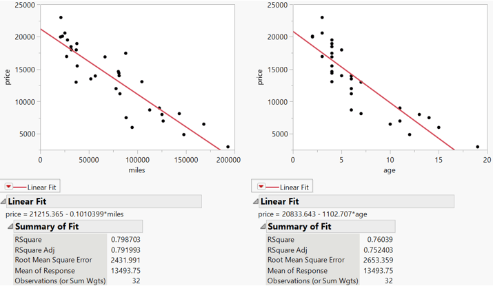
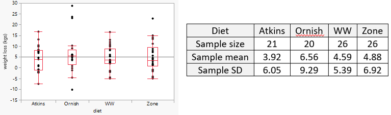
Kelly: For the midterm exam, the students analyzed data related to the Flint water crisis (here). The oral exam questions asked about identifying the type of study, interpreting coefficients in a linear model they built for the take-home component, and drawing conclusions from the “How blood lead levels changed in Flint’s children” graph in the FiveThirtyEight article by Anna Maria Barry-Jester (here).

For the final exam, the students explored the police stops data presented in the Significance article “Racial disparities in police stops in US cities” by Roberto Rivera and Janet Rossenbaum.  The original data can be grabbed from the Stanford Open Policing Project (here), and wrangled data can be found in their github repository (here).  My exam focused on traffic stops in June of 2016 in San Francisco. For the take-home component, students explored the relationship between a driver’s race and whether or not they were searched.   Then, the oral component focused on assessing students’ conceptual understanding of key statistical inference ideas.  This included interpreting a p-value in their own words, grappling with types of errors, and explaining how the accuracy and precision of a confidence interval are affected as the sample size or confidence level are increased.


How did you address student anxiety about oral exams?

Kelly: Even though I only had ten precious minutes with each student, I used two of those minutes to combat student unease.  At the beginning of the oral exam, I talked through what to expect and reassured students that: a) brief pauses to consider the question were completely allowed, and b) they could think out loud and I would take the answer they ended on, not where they began.  I spent the last minute of the exam (if we still had time) with light-hearted pleasantries.  Throughout the exam, I was very mindful to maintain a cheerful expression and to nod (regardless of the quality of their answer) so that they felt comfortable and like I was “cheering them on.”

Paul: If I think about my undergraduate self taking an oral exam in statistics, I would have been a sweaty, stammering mess, at least in the first few minutes.  Therefore, I wanted to try to create an atmosphere that was as “un-intimidating” as possible.  I actually did two things along these lines: a) ask students to reflect on their recent course registration experience, which everyone had a strong opinion on because we had a rocky debut of a new system, and b) let each student pick any problem to start with, where I asked them to talk me through their thought process and share insights instead of just quoting an answer.  Letting them choose their own problem to start with worked really well.  Most thought carefully about which one to choose and were clearly prepared.  I think this gave them confidence right off the bat.  For those who hadn’t prepared, well, that was usually a sign of things to come.


How did you assess student responses?

Paul: I created a scoring rubric based on one used by Allison Theobold at Cal Poly:

  • 4 = Outstanding ability to articulate and connect logistic regression concepts, with comprehensive and thoughtful understanding of topics.
  • 3 = Good ability to articulate and connect logistic regression concepts, with clear understanding of most topics.
  • 2 = Limited ability to articulate and connect logistic regression concepts, with an understanding of some big ideas but also some misconceptions. 
  • 1 = Little to no ability to articulate and connect logistic regression concepts, with a limited understanding of big ideas and many misconceptions. 
  • 0 = Wait, have we talked about logistic regression??

I assigned scores in half-steps from 4.5 down to 2.0.  Because we were on zoom, I recorded every discussion (with student permission), just in case I needed to go back and review my assigned score.  As it turns out, I didn’t go back and review a single conversation!  I was able to assign a score to each student immediately after our conversation.  I received no complaints from students and did not second-guess myself. 

Kelly: The lab instructors and I did all the 10-minute oral exams via Zoom over the course of two days.  I recorded my sessions (with student permission), in case I wanted to review them afterward, though I didn’t end up needing to.  During the oral exam, I typed terse notes.  While likely indecipherable to anyone else, these were enough for me to be able to go back and fill in later.  I didn’t want my notetaking to get in the way of our statistical conversation or to cause additional anxiety for the student.

Between sets of 6-9 oral exams, I gave myself 30-minute breaks to fill in my feedback on Gradescope, assign a score, and take a breather so that I could start the next set with a high level of engagement. (I didn’t want any of the students to realize I felt like Bill Murray’s character did when he experienced Groundhog Day for the 27th time.)

My assessment rubric was pretty simple and reflected the accuracy and completeness of the student’s answer for each question.  As I stated earlier, I gave each student feedback on the components they got wrong, along with encouraging feedback about what they got right.  I definitely didn’t give points for eloquence.  Overall, the oral exam represented about 25% of each student’s exam grade.


What would you do differently in the future, and what aspects would you maintain?

Kelly: In the future, I will consider having a question bank instead of asking each student the same set of questions. I like to think there wasn’t much cheating on the oral exams, but a student definitely could have shared the questions they were asked with a friend who took the exam at a later time.  I will also increase the testing slots to 15 minutes to allow for a bit more in-depth discussion of a concept.

I think I need to develop a clearer idea upfront of how much the instructors should lead students who are missing the mark.  I firmly believe that learning can happen during an exam, and an instructor’s leading questions can help a student who has strayed off the path to get back on and connect ideas.  For consistency, the lab instructors and I did very little leading this first time around.  When a student didn’t have much of an answer to a question, we just moved on to the next question.  I think that led to some missed learning opportunities.

In terms of what I’ll keep, I liked that the exam built off a data context that the students had already explored, so we didn’t have to spend time setting up the problem.  I will also continue asking questions that require explanations, requiring them to verbalize their thought process.

Paul: Although I plan to keep learning from others’ experiences and from researchers who have systematically studied oral exams, aspect that I’d like to keep include:

  • Basing the exam on a recently completed assignment.  To me, this provided a good base from which to launch into discussions of concepts and connections.
  • Allowing students to choose ahead of time the first question they’ll answer.  More than one student admitted how nervous they were when we were just starting, but they seemed to calm down after successfully going through their prepared response. Several admitted at the end that the oral exam went much faster and was not nearly as scary as they feared.
  • Having an adaptive and loose script.  I believe I was able to fairly evaluate students even without a fixed set of questions (and there’s no risk that fixed script can get out), and the conversation felt more genuine, authentic, and personal, adapted to a student’s level of understanding.
  • Conducting it over zoom.  Even though this is less personal than meeting in person, it’s great for sharing screens back and forth, for maintaining a tight timeline and extending into evening hours, and for recording the conversation.
  • Keeping the length at 15 minutes.  Anything less seems too rushed and not conversational enough, but anything more seems unnecessary for establishing a proper assessment.
  • Grading with the 4-point rubric.  I’m convinced that the total time spent developing, administering, and grading the exam was significantly less than with a conventional written test, and the grades were just as reflective of students’ learning.

Aspects that I’d likely change up include:

  • I would not include the “non-stats” ice-breaker question.  I think a little friendly chit-chat, followed by an initial question that the student has prepared, suffices to alleviate a lot of oral-exam anxiety.
  • I might stretch 44 15-minute exams over three days instead of just two days, but I felt pretty energized throughout, and I preferred to bite the bullet and keep things to a short timeframe.
  • Give students a chance to practice talking aloud through their thought processes beforehand, not just for an oral exam in my class, but for future technical interviews.
  • Keep thinking about effective questions.  For example, I could give students data with a context and ask them to talk me through an analysis, from EDA to ultimate conclusions.
  • I really didn’t provide students with much feedback other than comments during the exam and their final score.  I would love to find a way to provide a little more feedback, but I would not want to sacrifice being fully present during the conversation.

Did the oral exam/quiz meet your aspirations?  Once you return to face-to-face classes, will you continue to give oral exams/quizzes?

Paul: Yes!  This spring my challenge is to adapt this idea to courses in Statistical Theory, where I’ve always wanted to do oral exams, and Intro to Data Science, where I haven’t previously imagined oral exams).

Kelly: I really feel like I was better able to assess a student’s comprehension of statistical concepts with the oral exam than I have been with my in-class exams.  On a paper exam, you often just see the final answer, not the potentially winding road that got the student there and, for incorrect answers, where faulty logic seeped into the student’s thought process.

However, at the same time, I didn’t get to ask nearly as many conceptual questions this way.  I could see using both types of exams when I am back to the in-person classroom, which I am looking forward to!

#83 Better, not necessarily good

In this post I will describe a five-question, auto-graded quiz that I recently gave my students.  I modified a longer assignment that I have used in the past to create this quiz.  I will describe my thinking behind each of these questions, and I will also mention some questions that I decided not to ask.  My favorite question on this quiz is the last one, because it tries to assess whether students can take a step back and think about the big picture rather than apply a particular procedure.  As always, questions that I pose to students appear in italics.


The quiz begins with this background information:

Helping smokers to quit is a very important and challenging public health goal.  In a study of the effectiveness of a nicotine lozenge, smokers who wanted to quit were randomly assigned to one of two groups: one group received nicotine lozenges and the other group received placebo lozenges.  At the end of the 52-week study, 17.9% of the 459 subjects in the nicotine group had successfully abstained from smoking, compared to 9.6% of the 458 subjects in the placebo group. 

I realize that I have not presented a question yet, but I want to interrupt myself already.  I usually present students with a 2×2 table of counts for questions like this about comparing proportions between two groups. But this time I provided the sample sizes and sample proportions (presented as percentages) instead.  I think it’s worthwhile to present information in different ways at different times, in the hope that students learn to recognize the underlying structure without becoming too attached to a particular presentation. 

To help with recognizing the underlying structure, I repeatedly advise students to start with identifying the observational units and variables*.  In this case the observational units are smokers who want to quit, the explanatory variable is whether the person receives a nicotine lozenge or placebo lozenge, and the response variable is whether or not the person successfully abstains from smoking for a year.  Both variables are categorical and binary, so that lets students know that they are analyzing a scenario that involves comparing two proportions.

* See post #11, titled Repeat after me, here.


1. How many times more likely was a smoker who received the nicotine lozenge to quit, as compared to a smoker who received a placebo lozenge?  Report your answer with two decimal places of accuracy.

This question asks for the ratio of the success proportions, also known as the relative risk.  The answer is: 0.179 / 0.096 ≈ 1.86.  I specified an error tolerance of 0.02, so students could receive full credit even with some rounding error.

I often ask this question in an alternate form, asking students to fill in the blank in the following sentence: Those who received the nicotine lozenge were ___ % more likely to quit, compared to those who received a placebo lozenge.  The answer is 86%, which can be determined by subtracting 1 from the ratio and then multiplying by 100%.

I realize that working with the difference in success proportions is more conventional than calculating the ratio, and the next two questions will ask about this difference.  But I think working with percentage differences is an important and challenging skill for students, so I ask this type of question often*.

* See post #28, titled A pervasive pet peeve, here.


2. Calculate the value of the z-test statistic for comparing the success proportions.  Report your answer with two decimal places of accuracy.

Students had the option of calculating this by hand or using software, such as the applet (here) that I have used in class.  If they are calculating this by hand, they need to use:

The only component of this calculation that has not been provided is the value of the combined proportion of successes for the two groups.  To determine this, students could first produce the 2×2 table of counts:

When some students asked about how to determine the combined sample proportion of successes, I mentioned that they could first determine the 2×2 table of counts, but I also pointed them to a shortcut by asking: In what situation does the combined proportion equal the average of the two group proportions?  I wanted them to realize that using the average works when the two groups have the same sample size.  In this case the two sample sizes are so similar that the average gives a very close approximation for the combined proportion of successes. 

The test statistic turns out to be z = 3.63.  I allowed an error tolerance of 0.05 to account for rounding errors.

I often ask students to interpret the value of a z-test statistic.  Here they could say that the success proportion in the nicotine group is 3.63 standard errors larger than the success proportion in the placebo group.  But with only five questions on my quizzes, I omitted that question this time.


3. What kinds of values are in a 95% confidence interval for the difference in population proportions (nicotine minus placebo) who would successfully abstain from smoking for a year?  [Options: A. Both negative and positive values; B. Only negative values; C. Only positive values]

Students could answer this question be calculating the confidence interval, either by hand or with software.  But they could also answer this based on the z-statistic.  A z-statistic of 3.63 is quite far out in the tail of a standard normal distribution, so the p-value is quite close to zero, so the null hypothesis should be resoundingly rejected at the 0.05 significance level.  That means that a 95% confidence interval for the difference in population proportions will not include the value zero.  Because I stipulated the order of subtraction to be (nicotine minus placebo), and because the nicotine group had a larger proportion of successes than the placebo group, this 95% confidence interval will include only positive values.

I was tempted to ask about a confidence interval for the relative risk, to see whether students would realize that such a confidence interval would include only values larger than one.  In hindsight I wish that I had turned question #3 into a two-part matching-style question, with one part asking about a confidence interval for the difference in population proportions and the other asking about a confidence interval for the ratio of population proportions.


4. What conclusion would you draw from this study?  [Options: A. Not enough evidence to conclude that the nicotine lozenge is more effective than the placebo lozenge; B. Very strong evidence that the nicotine lozenge is equally effective as the placebo lozenge; C. Very strong evidence that the nicotine lozenge is more effective than the placebo lozenge]

This is the bottom-line question about this study, so I did not consider leaving this out.  The correct answer is C. I have been including a version of option B on many questions, to see whether students might be tempted into (inappropriately) accepting the null hypothesis for cases with a larger p-value.


Finally, we arrive at the question that I’ve been intending to highlight all along:

5. If we consider the smokers in this study to be representative of the population of all smokers who want to quit, what would you conclude about the percentage of smokers who would successfully abstain from smoking for one year if they were to take nicotine lozenges?  [Options: A. Substantially greater than 50%, B. Substantially less than 50%, C. Very close to 50%]

It’s very tempting to conclude that more than half of all smokers would successfully quit with the nicotine lozenge.  After all, the previous questions have led to concluding that the nicotine lozenge is substantially better than the placebo.  The z-statistic is very large, so the p-value is very small, so the data provide very strong evidence that the nicotine lozenge is better than the placebo. 

It’s also reasonable to conclude that the nicotine lozenge is a good bit better than the placebo.  Our point estimate from question #1 is that smokers are 1.86 times more likely to quit if they use the nicotine lozenge rather than the placebo.  A 95% confidence interval for the population relative risk extends from 1.32 to 2.62, well above the value 1.

Several students asked me for help with this question.  My advice to them was:

  1. Don’t calculate anything.
  2. Re-read the sentence about how effective the nicotine lozenge was for the smokers in this study. 
  3. Re-read the question and options. 
  4. Think

I wanted students to realize that only 17.9% of the smokers who received the nicotine lozenge succeeded in quitting for a year.  That’s a lot less than 50%.  A 95% confidence interval runs from 14.4% to 21.4%, which is still a lot less than 50%.  So, the take-away message is: Being a lot better than a placebo does not necessarily mean being good in an absolute sense.  This study indicates that smokers who want to quit have a better chance of success with a nicotine lozenge than with a placebo.  But those smokers should not be fooled into thinking that nicotine lozenges move the odds in favor of their successfully quitting. Unfortunately, even with nicotine lozenges, the odds appear to be substantially against successful quitting.

When I used this context on longer, non-auto-graded assignments in the past, I asked students to determine the confidence interval for the population proportion who would successfully quit if given a nicotine lozenge.  I think it’s worthwhile to ask students to conduct one-sample inference as part an assignment that’s primarily about two-sample inference.  But I like question #5 on this quiz version better, because this just asks students to think without calculating anything.  I also like that this quiz version presents the sample percentages of success rather than a table of counts at the outset, so students do not even need to calculate the relevant percentage (17.9%) for themselves.


There you have it: a five-question, auto-graded quiz that I hope leads students to think and not just apply a procedure mindlessly. 

Speaking of thinking, may I be so bold as to ask what you think of this quiz?  Is it better than asking nothing at all?  I hope you do not hesitate to answer yes.  Ah, but of course you can truthfully say that this quiz is better than nothing without necessarily thinking that the quiz is good.  I’ll be disappointed if you think this, but I’ll also appreciate that you not only grasped my point but also seized an immediate opportunity to apply it.

P.S. The article about the nicotine lozenge study can be found here.