#87 It’s about time, part 1

Today’s post is about a fun topic that I teach only occasionally. I’ll be introducing my students to this topic a few minutes after this post appears on Monday morning.
Let me dispense with any more of a preamble and jump right in with the first of 3.5 examples. As always, questions that I pose to students appear in italics.
This post will feature many graphs that I consider to be interesting and informative, but this is not one of them:
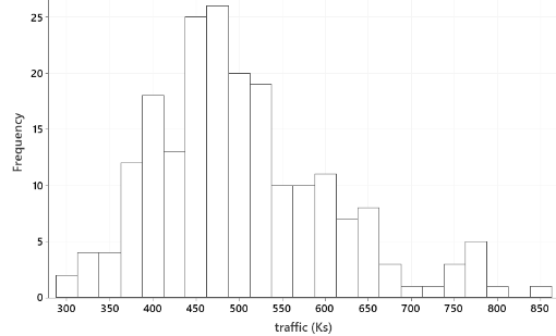
This histogram displays the distribution of number of vehicles (in thousands) crossing the Peace Bridge, a scenic bridge connecting the United States and Canada near Niagara Falls, for each month from January 2003 through December 2019.
Describe what this histogram reveals about this distribution. This distribution is skewed to the right, with a center near about 500,000 vehicles per month. Some months had as few as 300,000 vehicles making the crossing; on the other extreme one month had about 850,000 vehicles making the crossing.
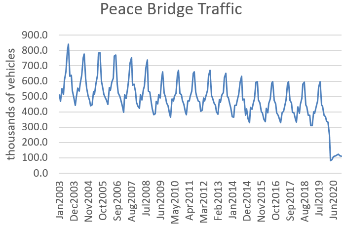
But none of that is very interesting. Remember that I said this is monthly data over many years, so it would be much more informative to look for patterns in month-to-month and year-to-year variation of the crossing numbers over time:

Describe and explain the recurring pattern that this graph reveals. The most obvious feature of this graph is the consistent pattern of increasing and then decreasing numbers of bridge crossings, over and over. Looking a bit more closely reveals that each of these cycles occurs over a one-year period. The increase occurs every spring, culminating in a peak in the summer. The decrease occurs every fall, reaching a nadir in the winter. Examining the actual data (available at the end of this post) indicates that the maximum occurs in August for most years, the minimum in February. This pattern makes sense, of course, because people tend to travel more in summer months than winter months.
After taking the recurring pattern into account, has the number of bridge crossings been increasing or decreasing over time? The number of bridge crossings has been decreasing slightly but steadily over these years. For example, the peak number of crossings exceeded 800,000 in the summer of 2003 but fell short of 600,000 in the summer of 2019. This is more than a 25% decrease over this 16-year period. The numbers of crossing seem to have levelled off in the five most recent years.
In which year does the decrease appear to be most pronounced? Can you offer an explanation based on what was happening in the world then? The biggest drop occurred between 2008 and 2009, during the global financial crisis that followed the bursting of the U.S. housing bubble.
When introducing a new topic, I typically start a class session with an example like this before I define terms for my students. At this point I tell them that data such as these are called time series data, which is a fairly self-explanatory term. The two most important aspects to look for in a graph of time series data are trend and seasonality. These data on monthly numbers of vehicles crossing the Peace Bridge provide a good example of both features.
I have mentioned before that I am currently teaching the second course in a two-course introductory sequence for first-year business students. This course includes a brief introduction to time series data. I enjoy teaching this topic, because it gives rise to interesting examples like this, and I think students see the relevance.
A downside of this topic for me is that it requires more preparation time, partly because I only teach time series every few years and so have to re-learn things each time. Another reason is that I feel a stronger obligation to find and present current data when teaching this topic.
Speaking of keeping time series examples up-to-date: What do you expect to see when the Peace Bridge crossing data are updated to include the year 2020? I don’t think any of my students will be surprised to see this:
A slightly harder question is: What do you expect the histogram to look like, when data for the year 2020 are included? Here is the updated histogram, with a cluster of values on the low end:
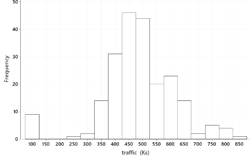
A moral here is that even long-established and consistent trends may not continue forever. Extraordinary events can and do occur. We and our students have lived through one such event for the past year.
Another of my favorite examples is this graph of a country’s life expectancy for the years 1960 – 2018:
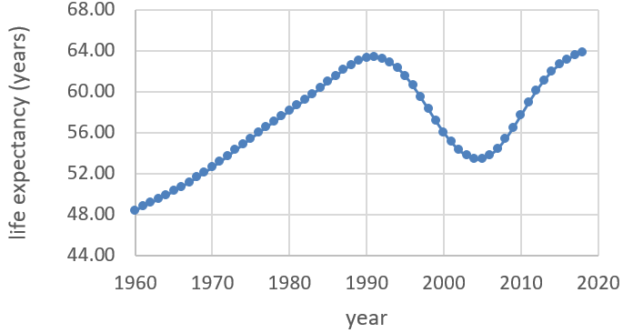
Describe what the graph reveals. There are three distinct patterns here. Life expectancy increased steadily, from about 48 to 64 years, between 1960 and 1990. Then life expectancy decreased dramatically until 2005, falling back to about 53 years. The years since 2005 have seen another increase, more steep than the gradual increase from the 1960s through 1980s, although the rate of increase has levelled off a bit since 2015. Life expectancy in 2018 slightly surpassed the previous high from 1990.
Make a guess for which country this is. It usually takes a few guesses before a student thinks of the African continent, and then a few more guesses until they arrive at the correct country: South Africa.
What might explain the dramatic decrease in life expectancy for this country between 1990-2005? Why do you think the trend has reversed again since then? Some students guess that apartheid is the cause, but then someone suggests the more pertinent explanation: Sub-Saharan Africa experienced an enormous and catastrophic outbreak of HIV/AIDS in the 1990s. Things have improved considerably in large part because of effective and inexpensive treatments.
When I present this example to my students this week, I plan to point out three morals that are quite relevant to our current situation:
- Trends don’t always continue indefinitely.
- Bad things happen. (This includes devastating viruses.)
- Good things happen. (Medical innovations can help a lot.)
Especially because I am teaching business students, I like to include some time series examples of stock prices, which are easy to download from many sites including the Yahoo finance site (here). Let’s make this another guessing game: The daily closing prices of what company’s stock are represented in the following graph? I’ll give you a hint: I know that all of my students use this company’s product. I’m also willing to bet that all of your students have heard of this company, even if they have not used its product.
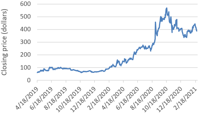
Would you have liked to have owned stock in this company in 2020? Duh! By what percentage did the closing price change from the last day of 2019 (closing price: $68.04) to the last day of 2020 (closing price: $337.32)? I really like my students to become comfortable working with percentage changes*. This example provides another good opportunity. The percentage increase in this company’s stock price during 2020 works out to be a (337.31 – 68.04) / 68.04 × 100% ≈ 395.75% increase! Make a guess for what company this is. I bet you guessed correctly: Zoom**.
* See posts #28 (A pervasive pet peeve, here) and #83 (Better, not necessarily good, here).
** When I published my first blog post on July 8, 2019, I meant to include a postscript advising all of my readers to invest in Zoom. I just re-read that post (here) and am dismayed to realize that I forgot to include that stock tip. Oh well, I also forgot to invest in Zoom myself.
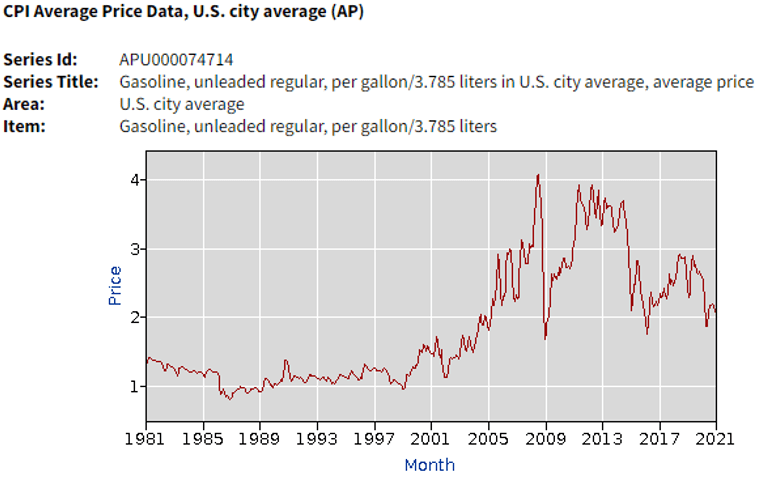
Data on consumer prices obtained by the Bureau of Labor Statistics (BLS) can make for interesting time series data and are also easy to download (for example, from here). Below is a graph from the BLS website, displaying the national average price for a gallon of unleaded gasoline, by month, starting with January of my first year in college* and ending with January of my students’ first year in college:
* Another downside to teaching time series is that it draws attention to how much time has gone by in your life!
The national average price of a gallon of unleaded gasoline increased from $1.298 in January of 1981 to $2.326 forty years later. Calculate the percentage increase*. This works out to be a (2.326 – 1.298) / 1.298 × 100% ≈ 79.2% increase. Does gasoline really cost this much more now than in my first year of college?
* Like I said, I seldom pass up an opportunity to ask about this.
For now, the answer I’d like for that last question is: Hold on, not so fast. This leads to another of my favorite topics to teach, but I am going to stop now and pick up here next week in part 2 of this post.
P.S. Data on crossing of the Peace Bridge can be found here. Data on life expectancy in South Africa was obtained here. Links to all of the datafiles in this post appear below.
P.P.S. Many thanks to Robin Lock for giving me a personalized crash course on the fundamentals of time series analysis when I first started to teach this topic. Robin also introduced me to the Peace Bridge data, a more thorough analysis of which can be found in the chapter on time series that he wrote for the Stat2 textbook (here).


Trackbacks & Pingbacks