#43 Confounding, part 1

The topic of confounding is high on the list of most confounding topics in introductory statistics. Dictionary.com provides these definitions of confound (here):
- to perplex or amaze, especially by a sudden disturbance or surprise; bewilder; confuse: The complicated directions confounded him.
- to throw into confusion or disorder: The revolution confounded the people.
- to throw into increased confusion or disorder
- to treat or regard erroneously as identical; mix or associate by mistake: Truth confounded with error.
- to mingle so that the elements cannot be distinguished or separated
- to damn (used in mild imprecations): Confound it!
Definition #5 comes closest to how we use the term in statistics. Unfortunately, definitions #1, #2, and #3 describe what the topic does to many students, some of whom respond in a manner that illustrates definition #6.
In this post I will present two activities that introduce students to this important but difficult concept, along with some follow-up questions for assessing their understanding. One example will involve two categorical variables, and the other will feature two numerical variables. As always, questions that I pose to students appear in italics.
I have used a variation of the following example, which I updated for this post, for many years. I hold off on defining the term confounding until students have anticipated the idea for themselves. Even students who do not care about sports and know nothing about basketball can follow along.
1. During the 2018-19 National Basketball Association season, the Sacramento Kings won 13 home games and lost 16 when they had a sell-out crowd, compared to 11 home wins and 1 loss when they had a smaller crowd.
a) Identify the observational units, explanatory variable, and response variable in this study. Also classify each variable as categorical or numerical.
As I argued in post #11 (Repeat after me, here), I think these questions are important to ask at the start of nearly every activity, to orient students to the context and the type of analysis required. The observational units are games, more specifically home games of the Sacramento Kings in the 2018-19 season. The explanatory variable is crowd size, and the response variable is game outcome. As presented here, both variables are categorical (and binary). Crowd size could be studied as a numerical variable, but that information is presented here as whether or not the crowd was a sell-out or smaller.
b) Organize the data into a table of counts, with the explanatory variable groups in columns.
First we set up the table as follows:
Then I suggest to students that we work with each number as we encounter it in the sentence above, so I first ask where the number 2018 should go in the table. This usually produces more groans than laughs, and then we proceed to fill in the table as follows:
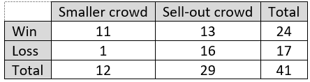
Some optional questions for sports fans: Does the number 41 make sense in this context? Basketball fans nod their heads, knowing that an NBA team plays an 82-game season, with half of the games played at home. Did the Kings win more than half of their home games? Yes, they won 24 of 41 home games, which is 58.5%. Does this mean that the Kings were an above-average team in that season? No. In fact, after including data from their games away from home, they won only 39 of 82 games (47.6%) overall.
c) Calculate the proportion of wins for each crowd size group. Do these proportions suggest an association (relationship) between the explanatory and response variables? Explain.
The Kings won 11/12 (.917, or 91.7%) of games with a smaller crowd. They won 13/29 (.448, or 44.8%) of games with a sell-out crowd. This seems like a substantial difference (almost 48 percentage points), which suggests that there is an association between crowd size and game outcome. The Kings had a much higher winning percentage with a smaller crowd than with a sell-out crowd.
d) Produce a well-labeled segmented bar graph to display these proportions.
Here’s a graph generated by Excel:
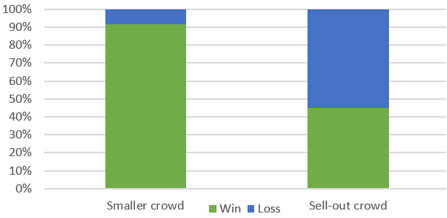
e) Is it reasonable to conclude that a sell-out crowd caused the team to play worse? If not, provide an alternative explanation that plausibly explains the observed association.
This is the key question of the entire activity. I always find that some students have been anticipating this question and are eager to respond: Of course not! These students explain that the Kings are more likely to have a sell-out crowd when they’re playing against a good team with superstar players, such as the Golden State Warriors with Steph Curry. I often have to prod students to supply the rest of the explanation: What else is true about the good teams that they play against? The Kings are naturally less likely to win against such strong teams.
At this point I introduce the term confounding variable as one whose potential effects on a response variable cannot be distinguished from those of the explanatory variable. I also point out that a confounding variable must be related to both the explanatory and response variable. Finally, I emphasize that because of the potential for confounding variables, one cannot legitimately draw cause-and-effect conclusions from observational studies.
f) Identify a confounding variable in this study, and explain how this confounding variable is related to both the explanatory and response variable.
This is very similar to question (e), now asking students to express their explanation with this new terminology. Some students who provide the alternative explanation well nevertheless struggle to specify a confounding variable clearly. A good description of the proposed confounding variable is: strength of opponent. It seems reasonable to think that a stronger opponent is more likely to generate a sell-out crowd, and a stronger opponent also makes the game less likely to result in a win for the home team.
I usually stop this in-class activity there, but you could ask students to dig deeper in a homework assignment or quiz. For example, we can look at more data to explore whether our conjectures about strength of opponent hold true.
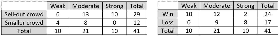
It seems reasonable to use the opposing team’s percentage of games won in that season as a measure of its strength. Let’s continue to work with categorical variables by classifying teams with a winning percentage of 40% and below as weak, between 40% and 60% as moderate, 60% and above as strong. This leads to the following tables of counts:
Do these data support the two conjectures about how strength of opponent relates to crowd size and to game outcome? Support your answer with appropriate calculations and graphs.
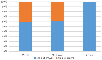
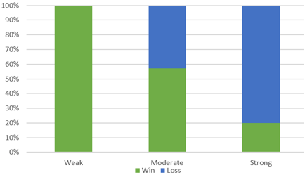
The first conjecture was that stronger opponents are more likely to generate a sell-out crowd. This is supported by the data, as we see that 100% (10/10) of strong opponents produced a sell-out crowd, compared to 61.9% (13/21) of moderate opponents and 60% (6/10) of weak opponents. These percentages are shown in this segmented bar graph:
The second conjecture was that stronger opponents are less likely to produce a win by the home team. This is clearly supported by the data. The home team won 100% (10/10) of games against weak opponents, which falls to 57.1% (12/21) of games against moderate teams, and only 20% (2/10) of games against strong teams. These percentages are shown in this segmented bar graph:
Here’s a quiz question based on a different candidate for a confounding variable. It also seems reasonable to think that games played on weekends (let’s include Fridays with Saturdays, and Sundays) are more likely to attract a sell-out crowd that games played on weekdays. What else would have to be true about the weekend/weekday breakdown in order for that to be a confounding variable for the observed association between crowd size and game outcome? What remains is for students to mention a connection with the response variable: Weekend games would need to be less likely to produce a win for the home team, as compared to weekday games.
Again we can look at the data on this question. Consider the following tables of counts:
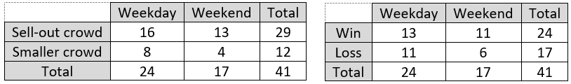
Do the data support the argument for the weekday vs. weekend variable as a confounding variable? Cite relevant calculations to support your response. Only half of the argument is supported by the data. Weekend games were slightly more likely to produce a sell-out crowd than a weekday game (13/17 ≈ 0.765 vs. 16/24 ≈ 0.667). But weekend games were not less likely to produce a home team win than weekday games (11/17 ≈ 0.647 vs. 13/24 ≈ 0.542). Therefore, the day of week variable does not provide an alternative explanation for why sell-out crowds are less likely to see a win by the home team than a smaller crowd.
Students could explore much more with these data*. For example, they could analyze opponent’s strength as a numerical variable rather than collapsing it into three categories as I did above.
* I provide a link to the datafile at the end of this post.
The second example is based on an activity that I have used for more than 25 years. My first contribution to the Journal of Statistics Education, from 1994 (here), presented an example for distinguishing association from causation based on the relationship between a country’s life expectancy and its number of people per television. In updating the example for this post, I chose a different variable and used data as of 2017 and 2018 from the Word Bank (here and here)*.
* Again, a link to the datafile appears at the end of this post.
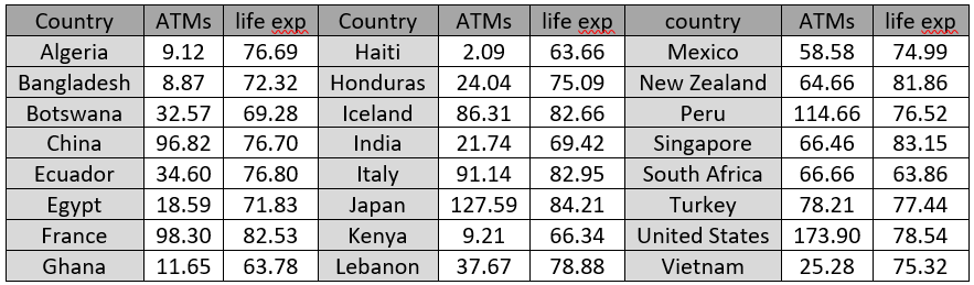
2. The following table lists the life expectancy (in years) and the number of automatic teller machines (ATMs per 100,000 adults) in 24 countries around the world:
a) Identify the observational units and variables. What type of variable are these? Which is explanatory and which is response?
Yes, I start with these fundamental questions yet again. The observational units are countries, the explanatory variable is number of ATMs per 100,000 adults, and the response is life expectancy. Both variables are numerical.
b) Which of the countries listed has the fewest ATMs per 100,000 adults? Which has the most?
This question is unnecessary, I suppose, but I think it helps students to engage with the data and context. Haiti has the fewest ATMs: about 2 per 100,000 adults. The United States has the most: about 174 ATMs per 100,000 adults.
c) Produce a scatterplot of the data, with the response variable on the vertical axis.
Here’s the scatterplot:
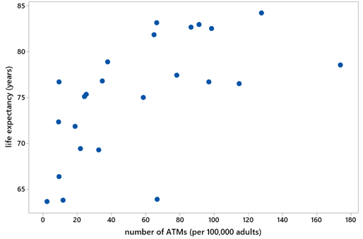
d) Does the scatterplot indicate an association between life expectancy and number of ATMs? Describe its direction, strength, and form.
Yes, the scatterplot reveals a positive association between a country’s life expectancy and its number of ATMs per 100,000 adults. This association is moderately strong but not linear. The form follows a curved pattern.
e) Do you believe that installing more ATM machines in countries such as Haiti, Bangladesh, Algeria, and Kenya would cause their inhabitants to live longer? If not, provide a more plausible, alternative (to cause-and-effect) explanation for the observed association.
This is the key question in the activity, just as with the question in the previous activity about whether sell-out crowds cause the home team to play worse. Students realize that the answer here is a resounding no. It’s ridiculous to think that installing more ATMs would cause Haitians to live longer. Students can tell you the principle that association is not causation.
Students can also suggest a more plausible explanation for the observed association. They talk about how life expectancy and number of ATMs are both related to the overall wealth, or technological sophistication, of a country.
f) Identify a (potential) confounding variable, and explain how it might relate to the explanatory and response variables.
This is very similar to the previous question. Here I want students to use the term confounding variable and to express their suggestion as a variable. Reasonable answers include measures of a country’s wealth or technological sophistication.
This completes the main goal for this activity. At the risk of detracting from this goal, I often ask an additional question:
g) Would knowing a country’s number of ATMs per 100,000 adults be helpful information for predicting the life expectancy of the country? Explain.
The point of this question is much harder for students to grasp than with the preceding questions. I often follow up with this hint: Would you make different life expectancy predictions depending on whether a country has 10 vs. 100 ATMs per 100,000 adults? Students confidently answer yes to this one, so they gradually come to realize that they should also answer yes to the larger question: Knowing a country’s number of ATMs per 100,000 adults is helpful for predicting life expectancy. I try to convince them that the association is real despite the lack of a cause-and-effect connection. Therefore, predictions can be enhanced from additional data even without a causal* relationship.
* I greatly regret that the word causal looks so much like the word casual. To avoid this potential confusion, I say cause-and-effect much more than causal. But I had just used cause-and-effect in the previous sentence, so that caused me to switch to causal in the last sentence of the paragraph.
This example also leads to extensions that work well on assignments. For example, I ask students to:
- take a log transformation of the number of ATMs per 100,000 adults,
- describe the resulting scatterplot of life expectancy vs. this transformed variable,
- fit a least squares line to the (transformed) data,
- interpret the value of r^2,
- interpret the slope coefficient, and
- use the line to predict the life expectancy of a country that was not included in the original list.
Here is a scatterplot of life expectancy vs. log (base 10) of number of ATMs per 100,000 adults, with the least squares line:
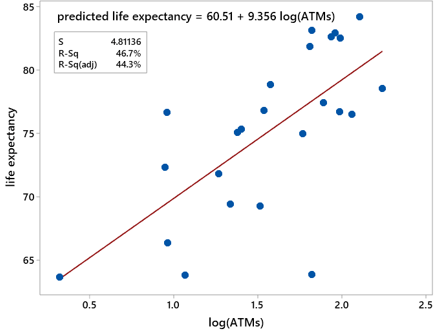
The relationship between life expectancy and this transformed variable is positive, moderately strong, and fairly linear. With this log transformation, knowing a country’s number of ATMs per 100,000 adults explains 46.7% of the variability in countries’ life expectancy values. The slope coefficient of 9.356 means that the model predicts an increase of 9.356 years in life expectancy for a tenfold increase in number of ATMs per 100,000 adults. Using this line to predict the life expectancy of Costa Rica, which has 74.41 ATMs per 100,000 adults produces: predicted life expectancy = 60.51 + 9.356×log(74.41) ≈ 60.51 + 9.356×1.87 ≈ 78.02 years. The actual life expectancy reported for Costa Rica in 2018 is 80.10, so the prediction underestimated by only 2.08 years.
Two earlier posts that focused on multivariable thinking also concerned confounding variables. In post #3 (here), the graduate program was a confounding variable between an applicant’s gender and the admission decision. Similarly, in post #35 (here), age was a confounding variable between a person’s smoking status and their lung capacity.
In next week’s second part of this two-part series, I will address more fully the issue of drawing causal conclusions. Along the way I will present two more examples that involve confounding variables, with connections to data exploration and statistical inference. I hope these questions can lead students to be less confounded by this occasionally vexing* and perplexing topic.
* I doubt that the term vexing variable will catch on, but it does have a nice ring to it!
P.S. The two datafiles used in this post can be downloaded from the links below:


Allan, Thanks for another great “Ask Good Questions” on a tough topic for many students – your blog continues to be a highlight of my Monday! Paul **************************** Paul L. Myers Mathematics Department AP Statistics Consultant The Paideia School Atlanta, GA 678-876-9195 ****************************
On Mon, Apr 27, 2020 at 11:10 AM Ask Good Questions wrote:
> allanjrossman posted: ” The topic of confounding is high on the list of > most confounding topics in introductory statistics. Dictinary.com provides > these definitions of confound (here): to perplex or amaze, especially by a > sudden disturbance or surprise; bewilder; confu” >
LikeLike
Thanks very much, Paul. Hope all is well with you and yours.
LikeLike