#42 Hardest topic, part 2

In last week’s post (here), I suggested that sampling distributions constitute the hardest topic to teach in introductory statistics. I provided five recommendations for teaching this challenging topic, including an exhortation to hold off on using the term sampling distribution until students understand the basic idea. I also gave many examples of questions that can help students to develop their understanding of this concept.
In this post I present five more suggestions for teaching the topic of sampling distributions, along with many more examples of questions for posing to students. As always, such questions appear in italics. Let’s continue the list …
6. Pay attention to the center of a sampling distribution as well as its shape and variability.
We teachers understandably devote a lot of attention to the shape and variability of a sampling distribution*. I think we may neglect to emphasize center as much we should. With a sample proportion or a sample mean, the mean of its sampling distribution is the population proportion or population mean. Maybe we do not make a big deal of this result because it comes as no surprise. But this is the very definition of unbiasedness, which is worth our drawing students’ attention to.
* I’ll say more about these aspects in upcoming suggestions.
We can express the unbiasedness of a sample mean mathematically as:

As I have argued before (in post #19, Lincoln and Mandela, part 1, here), this seemingly simple equation is much more challenging to understand than it appears. The three symbols in this equation all stand for a different mean. Ask students: Express what this equation says in a sentence. This is not easy, so I lead my students thorough this one symbol at a time: The mean of the sample means is the population mean. A fuller explanation requires some more words: If we repeatedly take random samples from the population, then the mean of the sample means equals the population mean. This is what it means* to say that the sample mean is an unbiased estimator of the population mean.
* Oops, sorry for throwing another mean at you!
I emphasize to students that this result is true regardless of the population distribution and also for any sample size. The result is straight-forward to derive from properties of expected values. I show students this derivation in courses for mathematically inclined students but not in a typical Stat 101 course, where I rely on simulations to convince students that the result is believable.
I suspect that we take unbiasedness of a sample proportion and sample mean for granted, but you don’t have to study obscure statistics in order to discover one that is not unbiased. For example, the sample standard deviation is not unbiased when sampling from a normal distribution*.
* The sample variance is unbiased in this case, but the unbiasedness does not survive taking the square root.
The following graph of sample standard deviations came from simulating 1,000,000 random samples of size 10 from a normal distribution with mean 100 and standard deviation 25:

What aspect of this distribution reveals that the sample standard deviation is not an unbiased estimator of the population standard deviation? Many students are tempted to point out the slight skew to the right in this distribution. That’s worth noting, but shape is not relevant to bias. We need to notice that the mean of these sample standard deviations (≈ 24.32) is not equal to the value that we used for the population standard deviation (σ = 25). Granted, this is not a large amount of bias, but this difference (24.32 vs. 25) is much more than you would expect from simulation variability with one million repetitions*.
* Here’s an extra credit question for students: Use the simulation results to determine a 95% confidence interval for the expected value of the sample standard deviation, E(S). This confidence interval turns out to be approximately (24.31 → 24.33), an extremely narrow interval thanks to the very large number of repetitions.
7. Emphasize the impact of sample size on sampling variability.
Under suggestion #1 in the previous post (here), I emphasized the key idea that averages vary less than individual values. The corollary to this is that averages based on larger samples vary less than averages based on smaller samples. You don’t need to tell students this; you can lead them to tell you by asking them to … (wait for it) … simulate! Returning to the context of sampling Reese’s Pieces candies, consider these two graphs from simulation analyses (using the applet here), based on a sample size of 25 candies on the left, 100 candies on the right:
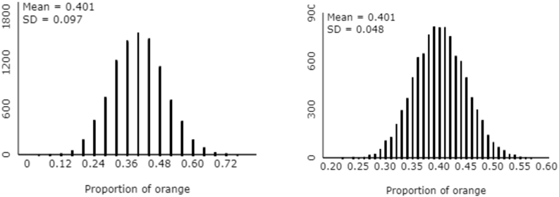
What’s the most striking difference between these two distributions? Some students comment that the distribution on the right is more “filled in” that the one of the left. I respond that this is a good observation, but I think there’s a more important difference. Then I encourage students to focus on the different axis scales between the graphs. Most students recognize that the graph on the right has much less variability in sample proportions than the one on the right. How do the standard deviations (of the sample proportions) compare between the two graphs? Students respond that the standard deviation is smaller on the right. How many times larger is the standard deviation on the left than the one on the right? Students reply that the standard deviation is about twice as big on the left as the right. By how many times must the sample size increase in order to cut the standard deviation of the sample proportion in half? Recalling that the sample sizes were 25 and 100, students realize that they need to quadruple the sample size in order to cut this standard deviation in half.
I lead students through a similar set of questions based on simulating the sampling distribution of a sample mean. Students again come to realize that the standard deviation of a sample mean decreases as the sample size increases, and also that a four-fold increase in sample size cuts this standard deviation in half. This leads us to the result:
I follow up by asking: Explain the difference between SD(X-bar) and σ. Even students who somewhat understand the idea can have difficulty with expressing this well. The key is that σ represents the standard deviation of the individual values in the population (penny ages, or word lengths, or weights, or whatever), but SD(X-bar) is the standard deviation of the sample means (averages) that would result from repeatedly taking random samples from the population.
Here’s an assessment question* about the impact of sample size on a sampling distribution: Suppose that a region has two hospitals. Hospital A has about 10 births per day, and hospital B has about 50 births per day. About 50% of all babies are boys, but the percentage who are boys varies at each hospital from day to day. Over the course of a year, which hospital will have more days on which 60% or more of the births are boys – A, B, or negligible difference between A and B?
* This is a variation of a classic question posed by psychologists Kahneman and Tversky, described here.
Selecting the correct answer requires thinking about sampling variability. The smaller hospital will have more variability in the percentage of boys born on a day, so Hospital A will have more days on which 60% or more of the births are boys. Many students struggle with this question, not recognizing the important role of sample size on sampling variability.
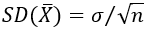
This principle that the variability of a sample statistic decreases as sample size increases applies to many other statistics, as well. For example, I ask students to think about the sampling distribution of the inter-quartile range (IQR), comparing sample sizes of 10 and 40, under random sampling from a normally distributed population. How could you investigate this sampling distribution? Duh, with simulation! Describe how you would conduct this simulation. Generate a random sample of 10 values from a normal distribution. Calculate the IQR of the 10 sample values. Repeat this for a large number of repetitions. Produce a graph and summary statistics of the simulated sample IQR values. Then repeat all these steps with a sample size of 40 instead of 10.
I used R to conduct such a simulation analysis with 1,000,000 repetitions. Using a normally distributed population with mean 100 and standard deviation 25, I obtained the following graphs (sample size of 10 on the left, 40 on the right):
Compare the variability of the sample IQR with these two sample sizes. Just as with a sample mean, the variability of the sample IQR is smaller with the larger sample size. Does the sampling variability of the sample IQR decrease as much by quadrupling the sample size as with the sample mean? No. We know that the SD of the sample mean is cut in half by quadrupling the sample size. But the SD of the sample IQR decreases from about 10.57 to 5.96, which is a decrease of 43.6%, a bit less than 50%.
8. Note that population size does not matter (much).
As long as the population size is considerably larger than the sample size, the population size has a negligible impact on the sampling distribution. This revelation runs counter to most students’ intuition, so I think it fails to sink in for many students. This minimal role of population size also stands in stark contrast to the important role of sample size described under the previous suggestion.
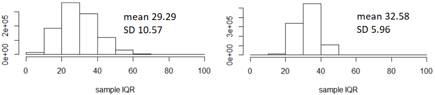
How can we help students to appreciate this point? Simulation, of course. In post #19 (Lincoln and Mandela, part 1, here), I described a sampling activity using the 268 words in the Gettysburg Address as the population. The graph on the left below displays the distribution of word lengths (number of letters) in this population (obtained from the applet here). For the graph on the right, the population has been expanded to include 40 copies of the Gettysburg Address, producing a population size of 268×40 = 10,720 words.
How do these two population distributions compare? These distributions are identical, except for the population sizes. The proportions of words at each length value are the same, so the population means and standard deviations are also the same. The counts on the vertical axis are the only difference in the two graphs.
Now let’s use the applet to select 10,000 samples, with a sample size of 10 words per sample, from each of these two populations. The graphs below display the resulting distributions of sample means, on the left from the original population and the right from the 40-times-larger-population:
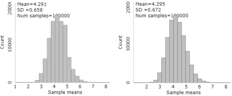
How do these two distributions of sample means compare? These two sampling distributions are essentially the same. They both have a very slight skew to the right. Both means are very close to the population mean of 4.295 letters per word. The standard deviations of the sample means are very similar in the two sampling distributions, with a slightly smaller standard deviation from the smaller population. Here’s the bottom-line question: Did the very different population sizes have much impact on the distribution of the sample means? No, not much impact at all.
Would the variability in a sample mean or a sample proportion differ considerably, depending on whether you were selecting a random sample of 1000 people in California (about 40 million residents) or Montana (about 1 million residents)? Once again, the population size barely matters, so the (probably surprising) answer is no.
Speaking of large populations, you might also let students know that sampling from a probability distribution is equivalent to sampling from an infinite population. This is a subtle point, tricky for many students to follow. You could introduce this idea of sampling from an infinite process with the Reese’s Pieces applet (here).
Depending on your student audience, you could use this as an opening to discuss the finite population correction factor, given by the following expression, where n represents sample size and N population size:

This is the factor by which the standard deviation of the sampling distribution should be adjusted when sampling from a finite population, rather than from an infinite process represented by a probability distribution. When the population size N is considerably larger than the sample size n, this factor is very close to 1, so the adjustment is typically ignored. A common guideline is that the population size should be at least 20 (some say 10) times larger than the sample size in order to ignore this adjustment.
9. Celebrate the wonder!
Sampling variability means that the value of a sample statistic varies from sample to sample. But a sampling distribution reveals a very predictable pattern to that variation. We should not be shy about conveying to students how remarkable this is!
Consider three populations represented by the following probability distributions:
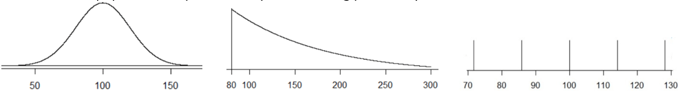
Are these three probability distributions similar? Certainly not. On the left is a normal distribution, in the middle a shifted exponential distribution, and on the right a discrete distribution with five equally spaced values. These distributions are not similar in the least, except that I selected these populations to have two characteristics in common: They all have mean 100 and standard deviation 20.
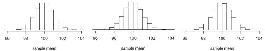
Now let’s use software (R, in this case) to select 100,000 random samples of n = 40 from each population, calculating the sample mean for each sample. Here are the resulting distributions of 100,000 sample means:
That example is very abstract, though, so many students do not share my enthusiasm for how remarkable that result is. Here’s a more specific example: In post #36 (Nearly normal, here), I mentioned that birthweights of babies in the U.S. can be modelled by a normal distribution with mean 3300 grams and standard deviation 500 grams. Consider selecting a random sample of 400 newborns from this population. Which is larger: the probability that a single randomly selected newborn weighs between 3200 and 3400 grams, or the probability that the sample mean birthweight in the random sample of 400 newborns is between 3200 and 3400 grams? Explain your answer.
The second probability is much larger than the first. The distribution of sample means is much less variable than the distribution of individual birthweights. Therefore, a sample mean birthweight is much more likely to be within ±100 grams of the mean than an individual birthweight. These probabilities turn out to be about 0.1585 (based on z-scores of ±0.2) for an individual baby, compared to 0.9999 (based on z-scores of ±4.0) for the sample mean birthweight.
I think this is remarkable too: Even when we cannot predict an individual value well at all, we can nevertheless predict a sample average very accurately.
Now let’s work with with a categorical variable. Here is the distribution of sample proportions that results from simulating 1,000,000 samples of sample size 1000 per sample, assuming that the population proportion with the characteristic is 0.4 (using Minitab software this time):
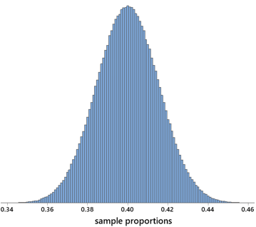
What’s remarkable here? Well, for one thing, this does look amazingly like a bell-shaped curve. More importantly, let me ask: About what percentage of the sample proportions are within ±0.03 of the assumed population proportion? The answer is very close to 95%. So what, why is this remarkable? Well, let’s make the context the proportion of eligible voters in the United States who prefer a particular candidate in an election. There’s about a 95% chance that the sample proportion preferring that candidate would be within ±0.03 of the population proportion with that preference. Even though there are more 250 million eligible voters in the U.S., we can estimate the proportion who prefer a particular candidate very accurately (to within ±0.03 with 95% confidence) based on a random* sample of only 1000 people! Isn’t this remarkable?!
* I hasten to add that random is a very important word in this statement. Selecting a random sample of people is much harder to achieve than many people believe.
10. Don’t overdo it.
I stated at the outset of this two-part series that sampling distributions comprise the hardest topic to teach in introductory statistics. But I’m not saying that this is the most important topic to teach. I think many teachers succumb to the temptation to spend more time on this topic than is necessary*.
* No doubt I have over-done it myself in this long, two-part series.
Sampling distributions lie at the heart of fundamental concepts of statistical inference, namely p-values and confidence intervals. But we can lead students to explore and understand these concepts* without teaching sampling distributions for their own sake, and without dwelling on mathematical aspects of sampling distributions.
* Please see previous posts for ideas and examples. Posts #12, #13, and #27 (here, here, and here) use simulation-based inference to introduce p-values. Posts #14 and #15 (here and here) discuss properties of confidence intervals.
This lengthy pair of posts began when I answered a student’s question about the hardest topic to teach in introductory statistics by saying: how the value of a sample statistic varies from sample to sample, if we were to repeatedly take random samples from a population. I conclude by restating my ten suggestions for teaching this challenging topic:
- Start with the more basic idea of sampling variability.
- Hold off on using the term sampling distribution, and then always add of what.
- Simulate!
- Start with the sampling distribution of a sample proportion, then a sample mean.
- Emphasize the distinctions among three different distributions: population distribution, sample distribution, sampling distribution.
- Pay attention to the center of a sampling distribution as well as its shape and variability.
- Emphasize the impact of sample size on sampling variability.
- Note that population size does not matter (much).
- Celebrate the wonder!
- Don’t over-do it.


Trackbacks & Pingbacks