#81 Power, part 2
In last week’s post (here), I presented an extended series of questions that used a simulation analysis to introduce students to the concept of statistical power. The simulation analysis used an applet (here) to produce graphs like this:
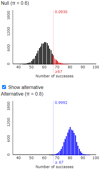
In the context of last week’s example, this pair of graphs shows that there’s about a 63% that Tamika will perform well enough to convince her coach that she has improved, based on a sample size of 100 shots, a significance level of 0.05, and an improvement in her probability of success from 0.6 to 0.7.
Needless to say, I believe that the questions I presented can be helpful for developing students’ understanding of the concept of power. I hasten* to add that this activity is far from fool-proof. In this post, I will discuss a few common difficulties and misunderstandings.
* Well, it took me a week, so perhaps I have not really hastened to add this, but I like the sound of the word.
A big part of my point in last week’s post was that we can help students to focus on the concept of power by postponing the use of statistical terminology. I waited until we had completed the simulation activity before defining the terms power and also type I error and type II error. Of course, this required me to move beyond simply talking about whether Tamika had improved or not, and whether her coach was convinced or not. At this point I mentioned terms such as null hypothesis and alternative hypothesis, rejecting the null hypothesis and failing to reject the null hypothesis. Then I asked my students to state the null and alternative hypotheses that Tamika’s coach was testing, both in words and in terms of a parameter.
Most students seemed to realize quickly that the null hypothesis was that Tamika had not improved, and the alternative was that she had improved. But they struggled with expressing these hypotheses in terms of a parameter. To point them in the right direction, I asked whether the parameter is a proportion or a mean, but this did not seem to help. I took a conceptual step back and asked whether the variable is categorical or numerical. This time several students answered quickly but incorrectly in the zoom chat that the variable was numerical.
This is a very understandable mistake, because graphs such as the ones above display the distribution of a numerical variable. But I pointed out that the variable for Tamika is whether or not she successfully makes a shot, which is categorical. The parameter is therefore the long-run proportion of shots that she would make, which my students know to represent with the symbol π. The hypotheses are therefore H0: π = 0.6 (no improvement) versus Ha: π > 0.6 (improvement).
This difficulty reveals a common problem when using simulation to introduce students to concepts of statistical inference. To understand what the simulation analysis and resulting graphs reveal, it’s crucial to realize that such graphs are not displaying the results not of a single sample, which is what we would observe in practice. Rather, the graphs are showing results for a large number of made-up samples, under certain assumptions, in order to investigate how the procedure would perform in the long run. This is a big conceptual leap. I strongly recommend using physical devices such as coins and cards for students’ first encounters with simulation (see posts #12 and #27, here and here), in order to help them with recognizing this step and taking it gradually. When you rely on technology to conduct simulations later, students must follow this step in their minds to make sense of the results.
As I presented the activity for my students via zoom, I also encouraged them to use the applet to carry out simulation analyses themselves. I should not have been surprised by the most common question I received from my students, but I was surprised at the time. Several students expressed concern about getting slightly different values than I did. For example, they might have gotten 0.6271 or 0.6343 rather than the 0.6317 that I obtained in the graphs above. I responded that this was a good question but nothing to worry about. Those differences, I said, were due to the random nature of simulation and therefore to be expected. I added that using a large number of repetitions for the simulation analysis, such as 10,000, should ensure that we all obtain approximately the same value.
Some students followed up by asking how such responses will be graded on assignments and exams. I had been thinking that some students resist a simulation-based approach because they are uncomfortable with approximate answers rather than a single correct answer. But this question made me realize that some students may be skeptical of simulation analyses not for intellectual or psychological reasons but rather out of concern about their grades.
I tried to assure my students that with simulation analyses, reasonable values in the right ballpark would earn full credit, for both open-ended and auto-graded responses. I should have also thought to respond that many questions will instead ask about the simulation process and the interpretation of results.
My pledge that students would receive full credit for reasonable approximations was called into question less than half an hour after class ended. Here are the questions that I asked in the (auto-graded) follow-up quiz:
Suppose that I have regularly played Solitaire on my computer with a 20% chance of winning any one game. But I have been trying hard lately to improve my probability of winning, and now I will play a series of (independent) games to gather data for testing whether I have truly improved.
1. What is the alternative hypothesis to be tested? [Options: That I have improved; That I have not improved; That I have doubled my probability of winning a game]
2. Suppose that I have not improved, but the data provide enough evidence to conclude that I have improved. What type of error would this represent? [Options: Type I error; Type II error; Type III error; Standard error]
Now suppose that I really have improved, and my success probability is now 25% rather than 20%. Also suppose that I plan to play 40 independent games and that my test will use a significance level of 0.05. Use the Power Simulation applet to conduct a simulation analysis of this situation.
3. What is the rejection region of the test? [Options: Winning 13 or more times in the 40 games; Winning 20 or more times in the 40 games; Winning 8 or more times in the 40 games; Winning 10 or more times in the 40 games]
4. Which of the following comes closest to the probability that these 40 games will provide convincing evidence of my improvement? [Options 0.18; 0.25; 0.40; 0.75; 0.99]
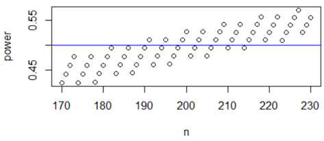
5. Continue to assume that my success probability is now 25% rather than 20% and that the test uses a significance level of 0.05. About how many games would I have to play in order to have a 50% chance that the games will provide convincing evidence of my improvement? Enter your answer as an integer. (Hint: Use the applet, and feel free to use trial-and-error.)
For questions #3 and #4, I spaced the options far enough apart to leave no doubt about the correct answers, as long as the student conducted the simulation correctly and used a reasonably large number of repetitions. Question #5 is the most interesting and problematic one. Asking students to determine a sample size that would achieve a particular value of power went a bit beyond what we had done in the class activity. Students were supposed to realize that increasing sample size generally increases power, and I gave them the hint to feel free to use trial-and-error. I thought I had allowed for a reasonably large interval of answers to receive full (auto-graded) credit, but a student came to my virtual office hours to ask why her answer had not received credit. She showed me that her sample size did indeed produce a power value close to 0.5, so I expanded the interval of values to receive full credit*. I also let her know that I greatly appreciate students who begin assignments early and draw concerns to my attention quickly.
* The discrete-ness of the binomial distribution is more of an issue here than variability of simulation results. I will discuss this further in part 3 of this series, but for now I’ll show a graph of power (calculated from the binomial distribution) as a function of sample size for the values that I decided to accept as reasonable. This graph shows that power does generally increase with sample size, but the discrete-ness here makes the function more interesting and non-monotonic:
I believe that the simulation activity that I presented last week is effective for introducing students to the concept of power. But I also acknowledge that this is a challenging topic, so in this post I have tried to point out some difficulties that students encounter.

