#41 Hardest topic, part 1
As I recounted in post #38 (here), a student recently asked what I think is the hardest topic to teach in an introductory statistics course. My response was: how the value of a sample statistic varies from sample to sample, if we were to repeatedly take random samples from a population. As you no doubt realize, I could have answered much more succinctly: sampling distributions.
Now I will offer suggestions for helping students to learn about this most challenging topic. Along the way, in keeping with the name and spirit of this blog, I will sprinkle in many questions for posing to students, as always in italics.
1. Start with the more basic idea of sampling variability.
Just as you can’t run before you can walk, you also can’t understand the long-run pattern of variation in a statistic until you first realize that the value of a statistic varies from sample to sample. I think many teachers consider sampling variability to be so obvious that it does not warrant mentioning. But have you heard the expression, widely but mistakenly attributed to Einstein*, that “the definition of insanity is doing the same thing over and over and expecting different results”? Well, if you take a random sample of 10 Reese’s Pieces candies from a large bag, and then do that over and over again, is it crazy to expect to obtain different values for the sample proportions of candies that are orange? Of course not! In fact, you would be quite mistaken to expect to see the same result every time.
* To read about this debunking, see here and here.
I think this is a key idea worth emphasizing. One way to do that is to give students samples of Reese’s Pieces candies*, ask them to calculate the proportion that are orange in their sample, and produce a dotplot on the board to display the variability in these sample proportions.
* Just for fun, I often ask my students: In what famous movie from the 1980s did Reese’s Pieces play a role in the plot? Apparently the Mars company that makes M&Ms passed on this opportunity, and Hershey Foods jumped at the chance to showcase its lesser-known Reese’s Pieces**. The answer is E.T. the Extra-Terrestrial.
** See here for a discussion of this famous product-placement story.
As we study sampling variability, I also ask students: Which do you suspect varies less: averages or individual values? This question is vague and abstract, so I proceed to make it more concrete: Suppose that every class on campus calculates the average height of students in the class. Which would vary less: the heights of individual students on campus, or the average heights in these classes? Explain your answer.
I encourage students to discuss this in groups, and they usually arrive at the correct answer: Averages vary less than individual values. I want students to understand this fundamental property of sampling variability before we embark on the study of sampling distributions.
2. Hold off on using the term sampling distribution, and then always add of what.
The term sampling distribution is handy shorthand for people who already understand the idea*. But I fear that using this term when students first begin to study the concept is unhelpful, quite possibly harmful to their learning.
* For this reason, I will not hesitate to use the term throughout this post.
I suggest that we keep students’ attention on the big idea: how the value of a sample statistic would vary from sample to sample, if random samples were randomly selected over and over from a population. That’s quite a mouthful, consisting of 25 words with a total of 118 letters. It’s a lot easier to say sampling distribution, with only 2 words and 20 letters. But the two-word phrase does not convey meaning unless you already understand, whereas the 25-word description reveals what we’re studying. I’ll also point out that the 25 words are mostly short, with an average length of only 4.72 letters per word, compared to an average length of 10.0 letters per word in the two-word phrase*.
* I’m going to resist the urge to determine the number of Scrabble points in these words. See post #37 (What’s in a name, here) if that appeals to you.
I don’t recommend withholding the term sampling distribution from students forever. But for additional clarity, I do suggest that we always add of what. For example, we should say sampling distribution of the sample mean, or of the sample proportion, or of the chi-square test statistic, rather than expecting students to figure out what we intend from the context.
3. Simulate!
Sampling distributions address a hypothetical question: what would happen if … This hypothetical-ness is what makes the topic so challenging to understand. I realize, of course, that the mathematics of random variables provides one approach to studying sampling distributions, but I think the core idea of what would happen if … comes alive for students with simulation. We can simulate taking thousands of samples from a population to see what the resulting distribution of the sample statistic looks like.
What do I recommend next, after you and your students have performed such a simulation? That’s easy: Simulate again. What next? Simulate again, this time perhaps by changing a parameter value, asking students to predict what will change, and then running the simulation to see what does change in the distribution of the sample statistics. Then what? Simulate some more! Now change the sample size, ask students to predict what will change in the sampling distribution, and then examine the results.
I hope that students eventually see so many common features in simulation results that they start to wonder if there’s a way to predict the distribution of a sample statistic in advance, without needing to run the simulation. At this point, we teachers can play the hero’s role by presenting the mathematical results about approximate normality. This is also a good time, after students have explored lots of simulation analyses of how a sample statistic varies from sample to sample, to introduce the term sampling distribution.
I think simulation is our best vehicle for helping students to visualize the very challenging concept of what would happen if … But I hasten to add that simulation is not a panacea. Even extensive use of simulation does not alter my belief that sampling distributions are the hardest topic in Stat 101.
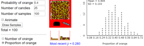
How can we maximize the effectiveness of simulation for student learning of this topic? One answer is to make the simulation as visual as possible. For example, my colleague Beth Chance designed an applet (here) that simulates random selection of Reese’s Pieces by showing candies emerging from a machine:

Students see the candies coming out of the machine and the resulting value of the sample proportion that are orange. Then they see the graph of sample proportions on the right being generated sample-by-sample as the candy machine dispenses more and more samples.
Another way to make sure that simulation is effective for student learning is to ask (good) questions that help students to understand what’s going on with the simulation. For example, about the Reese’s Pieces applet: What are the observational units in a single sample? What is the variable, and what kind of variable is it? What are the observational units in the graph on the right? What is the variable, and what kind of variable is it? In a single sample, the observational units are the individual pieces of candy, and the variable is color, which is categorical. About the graph on the right, I used only 100 samples in the simulation above so we can see individual dots. For a student who has trouble identifying the observational units, I give a hint by asking: What does each of the 100 dots represent? The observational units are the samples of 25 candies, and the variable is the sample proportion that are orange, which is numerical. These questions can help students to focus on this important distinction between a single sample and a sampling distribution of a statistic.
What do you expect to change in the graph when we change the population proportion (probability) from 0.4 to 0.7? Most students correctly predict that the entire distribution of sample proportions will shift to the right, centering around 0.7. Then changing the input value and clicking on “Draw Samples” confirms this prediction. What do you expect to change in the graph when we change the sample size from 25 to 100? This is a harder question, but many students have the correct intuition that this change reduces the variability in the distribution of sample proportions.
Here’s another question that tries to draw students’ attention to how simulation works: Which of the inputs has changed between the graph on the left and the graph on the right below – probability, sample size, or number of samples? What is the impact of that change?
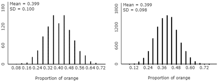
A hint for students who do not spot the correct answer immediately: Do these distributions differ much in their centers or their variability? The answer here is no, based on both the graph and the means and standard deviations. (Some students need to be convinced that the difference between the standard deviations here – 0.100 vs. 0.098 – is negligible and unimportant.) This suggests that the population proportion (probability) and sample size did not change. The only input value that remains is the correct answer: number of samples. The scale on the vertical axis makes clear that the graph on the right was based on a larger number of samples than the graph on the left. This is a subtle issue, the point being that the number of samples, or repetitions, in a simulation analysis is not very important. It simply needs to be a large number in order to display the long-run pattern as clearly as possible. The graph on the right is based on 10,000 samples, compared to 1000 samples for the graph on the left.
4. Start with the sampling distribution of a sample proportion, then a sample mean.
Simulating a sampling distribution requires specifying the population from which the random samples are to be selected. This need to specify the population is a very difficult idea for students to understand. In practice, we do not know the population. In fact, the reason for taking a sample is to learn about the population. But we need to specify a population to sample from in order to examine the crucial question of what would happen if … When studying a yes/no variable and therefore a sample proportion, you only need to specify one number in order to describe the entire population: the population proportion. Specifying the population is more complicated when studying a sample mean of a numerical variable, because you need to think about the shape and variability of the distribution for that population. This relative simplicity is why I prefer to study the sampling distribution of a sample proportion before moving to the sampling distribution of a sample mean.
5. Emphasize the distinctions among three different distributions: population distribution, sample distribution, sampling distribution*.
* It’s very unfortunate that those last two sound so similar, but that’s one of the reasons for suggestion #2, that we avoid using the term sampling distribution until students understand the basic idea.
The best way to emphasize these distinctions is to display graphs of these three distributions side-by-side-by-side. For example, the following graphs, generated from the applet here, show three distributions:
- ages (in years) in a population of 1000 pennies
- ages in a random sample of 25 pennies
- sample mean ages for 10,000 random samples of 25 pennies each
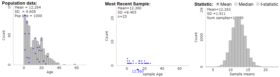
Which of these graphs has different observational units and variables from the other two graphs? The graph on the right is the odd one out. The observational units on the right are not pennies but samples of 25 pennies. The variable on the right is sample mean age, not individual age. Identify the number of observational units in each of these graphs. I admit that this is not a particularly important question, but I want students to notice that the population (on the left) consists of 1000 pennies, the sample (in the middle) has 25 pennies, and the distribution of sample means (on the right) is based on 10,000 samples of 25 pennies each.
Which of the following aspects of a distribution do the three graphs have in common – shape, center, or variability? The similar mean values indicate that the three graphs have center in common. Describe how the graphs differ on the other two aspects. The distribution of sample means on the right has much less variability than the distributions of penny ages on the left and in the middle, again illustrating the principle that averages vary less than individual values. The distribution of sample means on the right is also quite symmetric and bell-shaped, as compared to the skewed-right distributions of penny ages in the other two graphs.
This issue reminds me of an assessment question that I discussed in post #16 (Questions about cats, here): Which is larger – the standard deviation of the weights of 1000 randomly selected people, or the standard deviation of the weights of 10 randomly selected cats? This question is not asking about the mean weight of a sample. It’s simply asking about the standard deviation of individual weights, so the sample size is not relevant. Nevertheless, many students mistakenly respond that cats’ weights have a larger standard deviation than people’s weights.
Here’s a two-part assessment question that address this issue: Suppose that body lengths of domestic housecats (not including the tail) have mean 18 inches and standard deviation 3 inches. a) Which would be larger – the probability that the length of a randomly selected cat is longer than 20 inches, or the probability that the average length in a random sample of 50 cats is longer than 20 inches, or are these probabilities the same? b) Which would be larger – the probability that the length of a randomly selected cat is between 17 and 19 inches, or the probability that the average length in a random sample of 50 cats is between 17 and 19 inches, or are these probabilities the same? To answer these questions correctly, students need to remember that averages vary less than individual values. So, because a length of 20 inches is greater than the mean, the probability of exceeding 20 inches is greater for an individual cat than for a sample average. Similarly, the probability of being between 17 and 19 inches is greater for a sample average than for an individual cat, because this interval is centered on the population mean.
I find that I have more to say about teaching what I consider to be the hardest topic in an introductory statistics course, but this post is already on the long side. I will provide five more suggestions and several more examples about teaching sampling distributions next week.


Trackbacks & Pingbacks