#33 Reveal human progress, part 1
This post will feature many quotes that I find inspirational, starting with:
Quote #1: How can we soundly appraise the state of the world? The answer is to count. … A quantitative mindset, despite its nerdy aura, is actually the morally enlightened one, because it treats every human life as having equal value rather than privileging the people who are closest to us or most photogenic. – Steven Pinker, Enlightenment Now, pages 42-43
I am going to show some data that appraise the state of the world and how things have changed over the years. First I will ask a few questions that Hans Rosling liked to ask his audiences, which I also ask of my students:
- A: In the last twenty years, how has the proportion of the world’s population living in extreme poverty changed? [Options: Almost doubled, Remained more or less the same, Almost halved]
- B: What percentage of the world’s one-year-old children today have been vaccinated against some disease? [Options: 20 percent, 50 percent, 80 percent]
- C: Worldwide, 30-year-old men have spent an average of 10 years in school. How many years have women of the same age spent in school, on average? [Options: 9 years, 6 years, 3 years]
Are you ready for the answers? Here’s a quote to reveal the correct answer for question A:
Quote #2: Over the past twenty years, the proportion of the global population living in extreme poverty has halved. This is absolutely revolutionary. I consider it to be the most important change that has happened in the world in my lifetime. – Hans Rosling, Factfulness, page 6
The correct answers for questions B and C are also the most optimistic of the options presented: 80 percent of one-year-old children have been vaccinated, and 30-year-old women have spent 9 years in school, on average.
Looking at data on a wide range of human experiences, Pinker uses even stronger language than Rosling to declare:
Quote #3: Here is a shocker: The world has made spectacular progress in every single measure of human well-being. Here is a second shocker: Almost no one knows about it. – Steven Pinker, Enlightenment Now, page 52.
Can this really be true – that the world has made great progress, and that very few know about it? Let’s return to questions A, B, and C, which were asked of people in many countries. Rosling and his colleagues produced the following graphs of the percentage of correct responses for these questions:
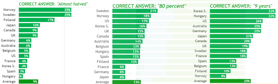
Remember that these were multiple choice questions with three options. Rosling pointed out that complete ignorance would lead to random guessing, which would produce roughly 33% correct responses in a large sample. I’m sure you’ve noticed that for all three questions, in every country, respondents failed to achieve the level of complete ignorance.
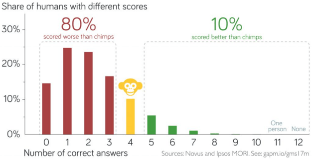
Rosling and his colleagues asked twelve questions of this type. For every question, the correct answer was the most optimistic of the three options provided. Here is the distribution of number correct, where Rosling uses a chimpanzee to represent the expected value under the assumption of complete ignorance:
Do people really think the world is getting worse instead of better? Further evidence is provided by the following survey results from asking this question directly in the year 2015:
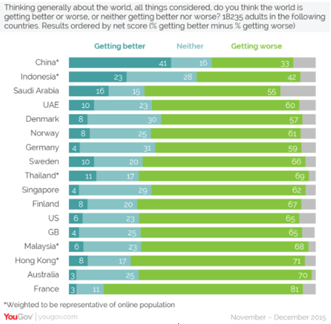
Only in China did a higher percentage say that the world is getting better rather than worse. In the United States, more than 10 times as many people responded worse than better.
Why are people so pessimistic and ignorant (actually, worse than ignorant) about the state of the world? Pinker argues that the negative nature of news, combined with cognitive biases such as the availability heuristic, explain much of this phenomenon:
Quote #4: Whether or not the world is actually getting worse, the nature of news will interact with the nature of cognition to make us think that it is. – Steven Pinker, Enlightenment Now, page 41
Rosling offers many explanations for this disconnect between perception and reality, starting with what he calls the gap instinct:
Quote #5: I’m talking about that irresistible temptation we have to divide all kinds of things into two distinct and often conflicting groups, with an imagined gap – a huge chasm of injustice – in between. – Hans Rosling, Factfulness, page 21
Consider the following graph, from Rosling’s Gapminder site (here), of a country’s child mortality rate vs. the average number of babies per woman (color indicates region of the world, and the size of the circle represents the country’s population):
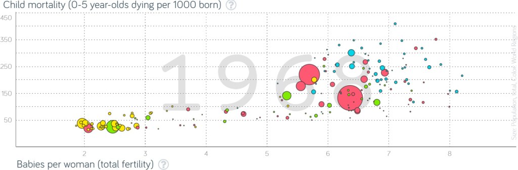
The countries in the bottom left of this graph have low child mortality rates and small families, while those in the upper right experience high child mortality rates and large families. This graph displays Rosling’s gap instinct: Many people see the world as separated into two distinct groups of countries, which are often labeled developed and developing.
But have you noticed the catch? This graph shows the world in 1968, more than 50 years ago! The following graph displays the same variables on the same scale in the year 2018:
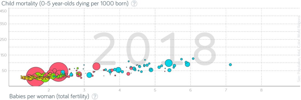
The world has changed dramatically in these 50 years! Child mortality rates have dropped substantially, which is undeniably good news. Despite the fact that more and more babies live past age 5 (in fact, probably because of that fact), women have fewer and fewer babies than previously. Sure, there’s still variability, and the African countries (shown in light blue) still have some catching up to do. But the separation of countries into two clusters with a gap in between is a relic of the past. The gap instinct that many people hold is not consistent with current data.
Next I will offer some data and graphs that reveal human progress. Such data and visualizations abound*, but I will confine myself here to seven graphs.
* I provide a partial list of resources in a P.S. at the end of this post. The seven graphs shown below come from the Our World in Data site (here).
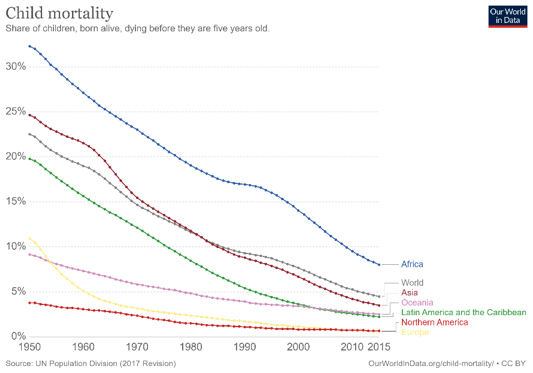
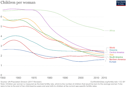
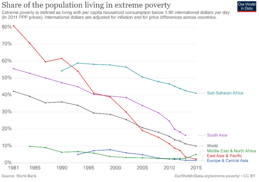
The first three graphs show decreases, for all regions of the world, in child mortality rates, average number of babies per woman, and extreme poverty rates:
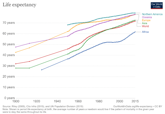
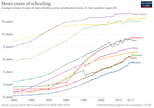
The next three graphs show dramatic increases in life expectancy, literacy rates, and mean years of schooling:

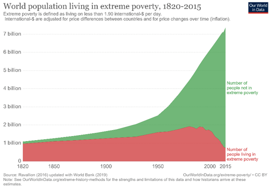
The final graph displays raw counts rather than rates or averages. Because the population of the world has been growing over time, you might wonder whether a decreasing rate of extreme poverty means that fewer people are living in extreme poverty. The following graph shows that the number of people living in extreme poverty has indeed decreased dramatically over the past two decades, while the number of people not living in extreme poverty has increased sharply:
What does this have to do with teaching introductory statistics? I think we (teachers of introductory statistics) have a tremendous opportunity to make our students aware of human progress. Here’s my plea: I urge you to use data, examples, activities, and assignments that reveal* human progress to your students.
* I like the word reveal here, because we can expose students to human progress in dramatic fashion, as a plot twist providing the climax of a suspenseful narrative.
Why do I consider this so important? I’ll call on Rosling to answer:
Quote #6: When we have a fact-based worldview, we can see that the world is not as bad as it seems – and we can see what we have to do to keep making it better. – Hans Rosling, Factfulness, page 255
I hasten to add an important caveat: By no means am I arguing that statistics teachers should refrain from presenting examples and data that reveal problems and injustices. Such examples can motivate students to take action for making the world a better place. But I suspect that many statistics teachers, who are susceptible to the same inherent biases and heuristics that affect all people*, have a tendency to overdo the negative and understate the positive. I also believe that good news about human progress can motivate students to do their part in continuing to make the world better. I am not asking teachers to recenter their entire course around data of human progress, just to show a few examples.
* I include myself here, of course.
How can we reveal the good news about human progress to students? You know my answer: Ask good questions!
This post is something of an anomaly for this blog, as it contains few questions. But some previous posts have already posed questions for students that use data on human progress:
- In post #11 (Repeat after me, here), I suggested providing students with scatterplots (bubble graphs) from Rosling’s site and asking basic questions about observational units, variables, and association.
- I proposed asking students to calculate the percentage decrease in the extreme poverty rate between 1990 and 2015 in post #28 (A pervasive pet peeve, here).
- I recommended conducting a hypothesis test of whether Americans’ responses to the extreme poverty rate question are worse than would be expected by random chance in post #8 (End of the alphabet, here).
I will continue this theme in next week’s post by providing several more examples of how I have asked questions about data on human progress to teach statistical thinking in my courses.
An encouraging development is that as the year and decade came to a close in December of 2019, several columns appeared in the news to trumpet the good news of human progress. Two examples are:
- “This Has Been the Best Year Ever,” by Nicholas Kristof in The New York Times (here)
- “We’ve just had the best decade in human history, seriously,” by Matt Ridley in The Spectator (here)
Finally, I offer with one more quote that I find insightful and inspiring:
Quote #7: If you could choose a moment in history to be born, and you didn’t know ahead of time who you were going to be, you’d choose now. Because the world has never been less violent, healthier, better educated, more tolerant, with more opportunity for more people, and better connected, than it is today. – To be revealed soon
What’s your guess – is this quote from Pinker or Rosling? Rosling or Pinker? I used three quotes from each above. Does this quote break the tie? Or do you suspect that I slipped in a quote from Kristof or Ridley here? Are you ready for the big reveal?
No, this quote does not break the tie, because these words are neither Pinker’s nor Rosling’s. They are also not Kristof’s or Ridley’s. Who said this? President Barack Obama, at the White House Summit on Global Development, on July 20, 2016 (here).
P.S. I highly recommend Pinker’s book Enlightenment Now (here) and Rosling’s book Factfulness (here). These books inspired this post and provided the first six quotes above.
The project that produced the data and graphs for survey questions about the state of the world is summarized here, and the data can be found here. The graph of survey results for the “getting better or worse” question came from the YouGov site (here). The graph of perceived happiness levels came from the the Our World in Data site (here). The graphs displaying Rosling’s gap instinct came from his Gapminder site (here). The seven graphs of human progress came from the Our World in Data site: child mortality (here), babies per woman (here), poverty (here), life expectancy (here), literacy (here), and years of schooling (here).
I recommend the following resources for data and tools to explore human progress. I relied most heavily on the first two sites in preparing this post:


It looks like many of the points of progress illustrated in your graphs and histograms could have been fairly accurately anticipated in advance (especially if we take into account contextual statistics and not statistics on an isolated factor). How well are people able to anticipate events generally from current and past data, as well as contextual information? Are we just seeing something like “cherry-picking” data here, plus, perhaps the operation of “hidden agendas”, or is there something deeper? For example, there is a lot of hype surrounding quantum computing these days, plus some significant progress seems to have been made. Could we cut through some of this fog, and make some accurate predictions about the technology?
LikeLike