#31 Create your own example, part 1
I like asking questions that prompt students to create their own example to satisfy some property. I use these questions in many settings: class activities, homework assignments, quizzes, and exams. Such questions prompt students to engage in higher-level thinking than rote calculations. I also believe that these questions can lead students to deepen their understanding about properties of statistical measures and methods.
I presented one such question in post #3 (here), in which I asked students to create their own example to illustrate Simpson’s paradox. That’s a very challenging question for most students. In this post, I will provide five examples (each with multiple parts) of create-your-own-example questions, most of which are fairly straight-forward but nevertheless (I believe) worthwhile. I will also discuss the statistical concepts, all related to the topic of descriptive statistics, that the questions address. As always, questions for students appear in italics.
1. Suppose that you record the age of 10 customers who enter a movie theater. For each of the following parts, create an example of 10 ages that satisfy the indicated property. (In other words, produce a list of 10 ages for each part.) Also, report the values of the mean and median for parts (c) – (e). Do not bother to calculate the standard deviation in part (b).
- a) The standard deviation equals zero.
- b) The inter-quartile range equals zero, and the standard deviation does not equal zero.
- c) The mean is larger than the median.
- d) The mean exceeds the median by at least 20 years.
- e) The mean exceeds the median by at least 10 years, and the inter-quartile range equals zero.
Part (a) simply requires that all 10 customers have the same age. A correct answer to part (b) needs the 3rd through 8th values (in order) to be the same, in order for the IQR to equal zero, with at least one different value to make the standard deviation positive. The easiest way to answer (b) correctly would make nine of the ages the same and one age different.
Part (c) requires knowing that the mean will be affected by a few unusually large ages. An example that works for (d), which is more challenging than (c), is to have six ages of 10, so the median is 10, and four ages of 60, which pulls the mean up to 30.
Part (e) is more challenging still. An IQR of 0 again requires the 3rd through 8th values to be the same. Two large outliers can inflate the mean enough to satisfy the property. For example, eight ages of 10 and two ages of 60 makes the IQR 0, median 10, and mean 20.
Ideally, students think about properties of mean and median as they answer questions like this. I think it’s fine for students to use some trial-and-error, but then I hope they can explain why an example works. You could assess this by asking students to describe their reasoning process, perhaps for part d) or e), along with submitting their example.
I want students to consider the context here (and always), so I only give partial credit if an example uses an unrealistic age such as 150 years.
For an in-class activity or homework assignment, I ask all five parts of this question, and I encourage students to use software (such as the applet here) to facilitate the calculations. On a quiz or exam, I only ask one or two parts of this question. I do think it’s important to give students practice with this kind of question prior to asking it on an exam.
2. Consider the following dotplot, which displays the distribution of margin of victory in a sample of 10 football games (mean 11.0, median 9.5, standard deviation 6.04 points):
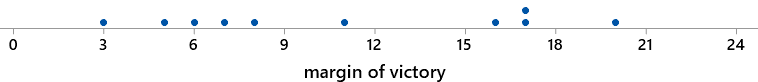
For each of the following parts, create your own example by proposing an eleventh value along with these ten to satisfy the indicated property. (Notice that the context here requires that the new value must be a positive integer.) For each part, add your new data value to the dotplot.
- a) The mean, median, and standard deviation all increase.
- b) The mean, median, and standard deviation all decrease.
- c) The median increases, and the mean decreases.
Students should realize immediately that part (a) requires that the new value be fairly large. The new value must be larger than the mean and median, of course, but it needs to be considerably larger in order for the standard deviation to increase. It turns out that any integer value of 18 or higher works. (I do not expect students to determine the smallest value that works, although you could make the question harder by asking for that.)
Part (b) requires that the new value be less than the mean and median, but fairly close to the mean in order for the standard deviation to decrease. A natural choice that works is 9. (It turns out that any integer from 5 through 9, inclusive, works.) Part (c) has a unique correct answer, which is the only integer between the median and mean: 10 points.
I provide a separate copy of the dotplot for each part of this question. If students have access to technology as they answer these questions, you could ask them to report the new values of the statistics.
3. The Gallup organization surveyed American adults about how many times they went to a movie at a movie theater in the year 2019. They compared results for people with at least one child under age 18 in their household and those without such a child in their household. Suppose that you recreate this study by interviewing faculty at you school, and suppose that your sample contains 8 people in each group.For each of the following parts, create your own example that satisfies the given property. Do this by producing dotplots on the axes provided, making sure to include 8 data values in each group. Do not bother to calculate the values of the means and standard deviations.
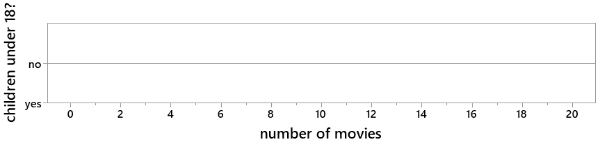
- a) The mean for those with children is larger than the mean for those without children.
- b) The standard deviation for those with children is larger than the standard deviation for without children.
- c) The mean for those with children is larger than the mean for those without, and the standard deviation for those with children is smaller than the standard deviation for those without.
Parts (a) and (b) are very straight-forward, simply assessing whether students understand that the mean measures center and standard deviation measures variability. Part (c) is a bit more complicated, as students need to think about both aspects (center and variability) at the same time. I provide a separate copy of the axes for each part.
4. Suppose that you ask dog and cat owners whether their pet has been to a veterinarian in the past twelve months. You organize the resulting counts in a 2×2 table as follows:
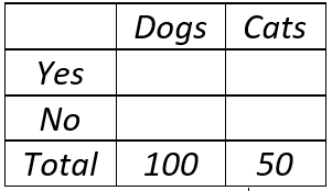
For each of the following parts, create your own example of counts that satisfy the indicated property. Do this by filling in the appropriate cells of the table with counts. Also report the values for all relevant proportions, differences in proportions, and ratios of proportions.
- a) The difference in proportions who answer yes is exactly 0.2.
- b) The ratio of proportions who answer yes is exactly 2.0.
- c) The difference in proportions who answer yes is greater than 0.2, and the ratio of proportions who answer yes is greater than 2.0.
- d) The difference in proportions who answer yes is greater than 0.2, and the ratio of proportions who answer yes is less than 2.0.
- e) The difference in proportions who answer yes is less than 0.2, and the ratio of proportions who answer yes is greater than 2.0.
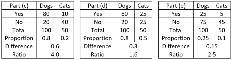
You could make these questions easier by using the same sample size for both groups, but I prefer this version that requires students to think proportionally. Part (c) requires one of the proportions to be fairly small, so the ratio can exceed 2.0. Part (e) requires both proportions to be on the small side, so the ratio can exceed 2 without a large difference. The following tables show examples (by no means unique) that work for parts (c), (d), and (e):
5. Consider the following scatterplot of sale price (in thousands of dollars) vs. size (in square feet) for seven houses that sold in Arroyo Grande, California:
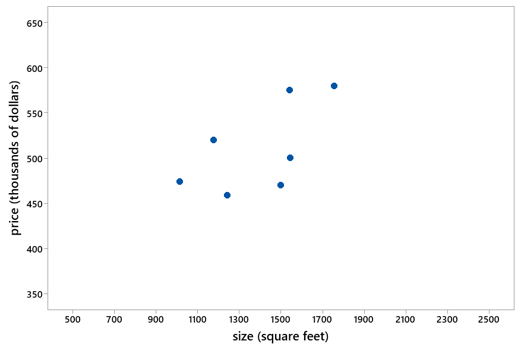
The seven ordered pairs of (size, price) data points are: (1014, $474K), (1176, $520K), (1242, $459K), (1499, $470K), (1540, $575K), (1545, $500K), (1755, $580K). The correlation coefficient between price and size is r = 0.627. For each of the following parts, create your own example to satisfy the indicated property. Do this by adding one point to the scatterplot and also reporting the values of the size (square feet) and price for the house that you add. Also give a very brief description of the house (e.g., a very small and inexpensive house), and report the value of the correlation coefficient.
- a) The correlation coefficient is larger than 0.8.
- b) The correlation coefficient is between 0.2 and 0.4.
- c) The correlation coefficient is negative.
Notice that I extended the scales on the axes of this graph considerably, as a hint to students that they need to consider using some small or large values for size or price. I reproduce the graph for students in all three parts. Using technology (such as the applet here) is essential for this question. You could ask part (a) or (c) on an exam with no technology, as long as you ask for educated guesses and do not require calculating the correlation coefficient.
The key in part (a) is to realize that the new house must reinforce the positive association considerably, which requires a house that is either considerably larger and more expensive, or else much smaller and less expensive. Two points that work are a 500-square-foot house for $350K (r = 0.858), or a 2500-square-foot house for $650K (r = 0.846). Students could think even bigger (or smaller) and produce a correlation coefficient even closer to 1. For instance a 4000-square-foot house for two million dollars generates r = 0.978.
Part (b) calls for a new house that diminishes the positive association considerably, so students need to think of a house that goes against the prevailing tendency. Students should try a small but expensive, or large but inexpensive, house. One example that works is a 1000-square-foot-house for $550K (r = 0.374). Part (c) is similar but requires an even more unusual house to undo the positive association completely. For instance, a small-but-expensive house with 500 square feet for $650K achieves a negative correlation of r = -0.324.
I believe that create-your-own-example questions can help students to assess and deepen their understanding of statistical concepts related to measures of center, variability, and association. Next week’s post will continue this theme by presenting five create-your-own-example questions that address properties of statistical inference procedures.
Are you ready for your take-home assignment*? I bet you can guess what it is. Ready? Here goes: Create your own example of a create-your-own-example question that leads students to assess and deepen their understanding of a statistical concept.
* Needless to say, this assignment is optional!
P.S. The sample of 10 football games in question 2 consists of the NFL post-season games in January of 2020, prior to Super Bowl LIV, gathered from here, here, and here. Results from the Gallup survey mentioned in question 3 can be found here.


Trackbacks & Pingbacks