#27 Simulation-based inference, part 2

I believe that simulation-based inference (SBI) helps students to understand the underlying concepts and logic of statistical inference. I described how I introduce SBI back in post #12 (here), in the scenario of inference for a single proportion. Now I return to the SBI theme* by presenting a class activity that concerns comparing proportions between two groups. As always, questions that I pose to students appear in italics.
* Only 15 weeks after part 1 appeared!
I devote most of a 50-minute class meeting to the activity that I will describe here. The research question is whether metal bands* used for tagging penguins are actually harmful to their survival.
* Some students, and also some fellow teachers, tell me that they initially think that I am referring to penguins listening to heavy metal bands.
I begin by telling students that the study involved 20 penguins, of which 10 were randomly assigned to have a metal band attached to their flippers, in addition to an RFID chip for identification. The other 10 penguins did not receive a metal band but did have an RFID chip. Researchers then kept track of which penguins survived for the 4.5-year study and which did not.
I ask students a series of questions before showing any results from the study: Identify and classify the explanatory and response variables. The explanatory variable is whether or not the penguin had a metal band, and the response is whether or not the penguin survived for at least 4.5 years. Both variables are categorical and binary. Is this an experiment or an observational study? This is an experiment, because penguins were randomly assigned to wear a metal band or not. Did this study make use of random sampling, random assignment, both,or neither? Researchers used random assignment to put penguins in groups but (presumably) did not take a random sample of penguins. State the null and alternative hypotheses, in words. The null hypothesis is that metal bands have no effect on penguin survival. The alternative hypothesis is that metal bands have a harmful effect on penguin survival.
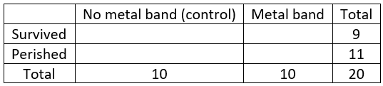
Then I tell students that 9 of the 20 penguins survived, 3 with a metal band and 6 without. Organize these results into the following 2×2 table:
The completed table becomes:
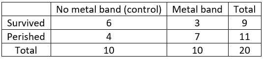
Calculate the conditional success proportions for each group. The proportion in the control group who survived is 6/10 = 0.6, and the proportion in the metal band group who survived is 3/10 = 0.3*. Calculate the difference in these success proportions. I mention that students could subtract in either order, but I want us all to be consistent so I instruct them to subtract the proportion for the metal band group from that of the control group: 0.6 – 0.3 = 0.3.
* I cringe when students use their calculator or cell phone for these calculations.
Is it possible that this difference could have happened even if the metal band had no effect, simply due to the random nature of assigning penguins to groups (i.e., the luck of the draw)? I often give my students a silly hint that the correct answer has four letters. Realizing that neither no nor yes has four letters, I get many befuddled looks before someone realizes: Sure, it’s possible! Joking aside, this is a key question. This question gets at why we need to conduct inference in the first place. We cannot conclude that metal bands are harmful simply because a smaller proportion survived with metal bands than without them. Why not? Because this result could have happened even if metal bands are not harmful.
What question do we need to ask next? Students are surprised that I ask them to propose the next question. If they ask for a hint, I remind them of our earlier experience with SBI. To analyze a research study of whether a woman with brain damage experienced a phenomenon known as blindsight, we investigated how surprising it would be to correctly identify the burning house in 14 of 17 pairs of drawings, if in fact she was choosing randomly between the two houses (one burning, one not) presented. For this new context I want students to suggest that we ask: How likely, or how surprising, is it to obtain a difference in success proportions of 0.3 or greater, if in fact metal bands are not harmful?
How will we investigate this question? With simulation!
Once again we start with by-hand simulation before turning to technology. Like always, we perform our simulation assuming that the null hypothesis is true: that the metal band has no effect on penguin survival. More specifically, we assume that the 9 penguins who survived would have done so with the metal band or not, and the 11 penguins who did not survive would have perished with the metal band or not.
We cannot use a coin to conduct this simulation, because unlike with the blindsight study, we are not modeling a person’s random selections between two options. Now we want our simulation to model the random assignment of penguins to treatment groups. We can use cards to do this.
How many cards do we need? Each card will represent a penguin, so we need 20 cards. Why do we need two colors of cards? How many cards do we need of each color? We need 9 cards of one color, to represent the 9 penguins who survived, and we need 11 cards of the other color, to represent the 11 penguins who perished. After shuffling the cards, how many will we deal into how many groups? One group of cards will represent the control group, and a second group of cards will represent penguins who received a metal band. We’ll deal out 10 cards into each group, just as the researchers randomly assigned 10 penguins to each group. What will we calculate and keep track of for each repetition? We will calculate the success proportion for each group, and then calculate the difference between those two proportions. I emphasize that we all need to subtract in the same order, so students must decide in advance which group is control and which is not, and then subtract in the same order: (success proportion in control group minus success proportion in metal band group).
I provide packets of 20 ordinary playing cards to my students, pre-arranged with 9 red cards and 11 black ones per packet. Students shuffle the cards and deal them into two piles of 10 each. Then they count the number of red and black cards in each pile and fill in a table in which we already know the marginal totals:
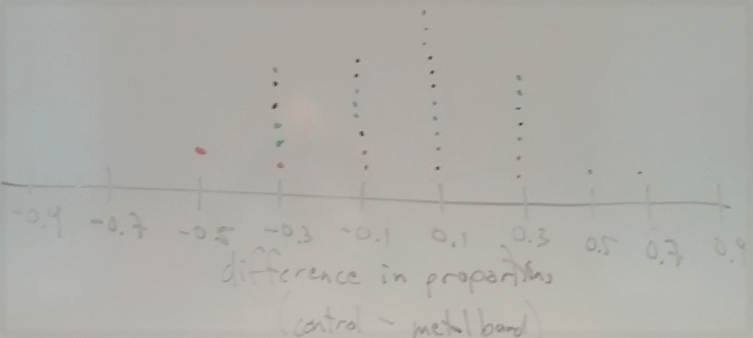
Next we need to decide: What (one) statistic should we calculate from this table? A very reasonable choice is to use the difference in survival proportions as our statistic*. I remind students that it’s important that we all subtract in the same order: (proportion who survived in control group) minus (proportion who survived in metal band group). Students then come to the whiteboard to put the value of their statistic (difference in proportions) on a dotplot. A typical result for a class of 35 students looks like**:
* I will discuss some other possible choices for this statistic near the end of this post.
** Notice that the distribution of this statistic (difference in proportions) is discrete. Only a small number of values are possible, because of the fixed margins of the 2×2 table. When I draw an axis on the board, I put tick marks on these possible values before students put their dots on the graph. Occasionally a student will obtain a value that does not fall on one of these tick marks, because they have misunderstood the process or made a calculation error.
Where is this distribution centered? Why does this make sense? This distribution is centered near zero. This makes sense because the simulation assumed that there’s no effect of the metal band, so we expect this difference to be positive about half the time and negative about half the time*.
* Some students are tempted to simply take the larger proportion minus the smaller proportion, so I repeat often that they should subtract in the agreed order: (control minus metal band). Otherwise, the center of this distribution will not be near zero as it should be.
What is important to notice in this graph, to address the key question of whether the data provide strong evidence that the metal bands are harmful to penguin survival? This brings students back to the goal of the simulation analysis: to investigate whether the observed result would have been surprising if metal bands have no effect. Some students usually point out that the observed value of the statistic was 0.3, so we want to see how unusual it is to obtain a statistic of 0.3 or greater. Does the observed value of the statistic appear to be very unusual in our simulation analysis? No, because quite a few of the repetitions produced a value of 0.3 or more. What proportion of the repetitions produced a statistic at least as extreme as the observed value? Counting the occurrences at 0.3 and higher reveals that 9/35 ≈ 0.257 of the 35 repetitions produced a difference in success proportions of 0.3 or more. What does this reveal about the strength of evidence that metal bands are harmful? Because a result as extreme as in the actual study occurred about 26% of the time in our simulation, and 26% is not small enough to indicate a surprising result, the study does not provide strong evidence that metal bands are harmful.
By what term is this 0.257 value known? This is the (approximate) p-value. How can we produce a better approximation for the p-value? Repeat the process thousands of times rather than just 35 times. In order to produce 10,000 repetitions, should we use cards or technology? Duh!
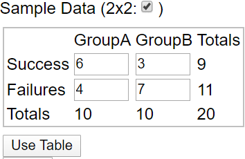
Now we turn to an applet (here) to conduct the simulation analysis. First we click on 2×2 and then enter the table of counts and then click on Use Table:
Next we check Show Shuffle Options on the right side of the applet screen. I like to keep the number of shuffles set at 1 and click “Shuffle” several times to see the results. By leaving the Cards option selected, you see 20 colored cards (blue for survival, green for perishing) being shuffled and re-randomized, just as students did with their own packet of 20 cards in class. You can also check Data or Plot to see different representations of the shuffling. You might remind students that the underlying assumption behind the simulation analysis is that the metal bands have no effect on penguin survival (i.e., that the null hypothesis is true).
Eventually I ask for 10,000 shuffles, and the applet produces a graph such as:
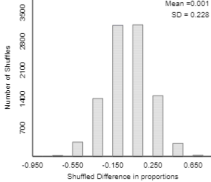
Once again I ask students to notice that the distribution (of shuffled differences in proportions) is centered near zero. But again the key question is: Does the simulation analysis indicate that the observed value of the statistic would be very surprising if metal bands have no effect? Students are quick to say that the answer is no, because the observed value (0.3) is not very far out in the tail of this distribution. How can we calculate the (approximate) p-value? By counting the number of repetitions that produced a difference of 0.3 or more, and then dividing by 10,000. The applet produces something like:
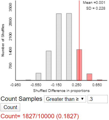
What conclusion do you draw? Results as extreme as the one observed (a difference in survival proportions between the two groups of 0.3 or more) would not be surprising (p-value ≈ 0.1827) if the metal band had no effect on penguin survival. Therefore, the experimental data do not provide strong evidence that metal bands are harmful to penguin survival.
I have a confession to make. I confess this to students at this point in the class activity, and I also confess this to you now as you read this. The sample size in this experiment was not 20 penguins. No, the researchers actually studied 100 penguins, with 50 penguins randomly assigned to each group. Why did I lie*? Because 100 cards would be far too many for shuffling and counting by hand. This also gives us an opportunity to see the effect of sample size on such an analysis.
* I chose my words very carefully above, saying I begin by telling students that the study involved 20 penguins … While I admit to lying to my students, I like to think that I avoided telling an outright lie to you blog readers. If you don’t want to lie to your students, you could tell them at the outset that the data on 20 penguins are based on the actual study but do not comprise the complete study.
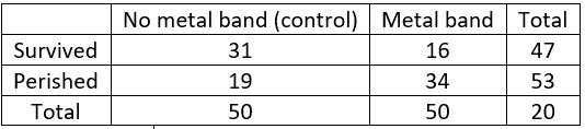
Now that I have come clean*, let me show the actual table of counts:
* Boy, does my conscience feel better for it!
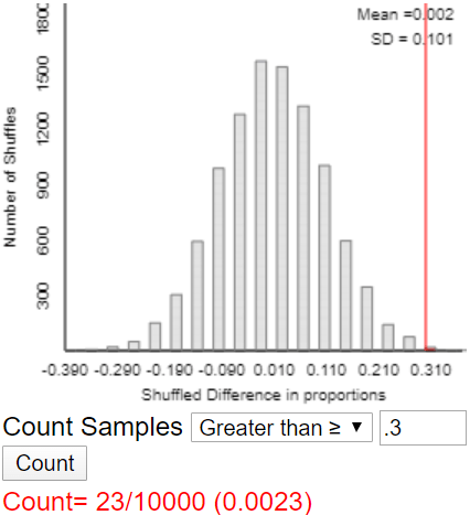
We need to redo the analysis, but this goes fairly quickly in class because we have already figured out what to do. Calculate the survival proportions for each group and their difference (control minus metal band). The survival proportions are 31/50 = 0.62 in the control group and 16/50 = 0.32 in the metal band group, for a difference of 0.62 – 0.32 = 0.30*. Before we re-run the simulation analysis, how do you expect the p-value to change, if at all? Many students have good intuition that the p-value will be much smaller this time. Here is a typical result with 10,000 repetitions:
* I try to restore my credibility with students by pointing out that I did not lie about the value of this statistic.
What conclusion would you draw? Explain. Now we have a very different conclusion. This graph shows that the observed result (a difference in survival proportions of 0.3) would be very surprising if the metal band has no harmful effect. A difference 0.3 or larger occurred in only 23 of 10,000 repetitions under the assumption of no effect. The full study of 100 penguins provides very strong evidence that metal bands are indeed harmful to penguin survival.
Before concluding this activity, a final question is important to ask: The word harmful in that conclusion is a very strong one. Is it legitimate to draw a cause-and-effect conclusion here? Why or why not? Yes, because researchers used random assignment, which should have produced similar groups of penguins, and because the results produced a very small p-value, indicating that such a big difference between the survival proportions in the two groups would have been unlikely to occur if metal bands had no effect.
That completes the class activity, but I want to make two additional points for teachers, which I also explain to mathematically inclined students:
1. We could have used a different statistic than the difference in success proportions. For a long time I advocated using simply the number of success in group A (in this case, the number of survivors in the control group). Why are these two statistics equivalent? Because we are fixing the counts in both margins of the 2×2 table (9 who survived and 11 who perished, 10 in each treatment group), there’s only one degree of freedom. What does this mean? Once you specify the count in the upper left cell of the table (or any other cell, for that matter), the rest of the counts are then determined, and so the difference in success proportions is also determined. In other (mathematical) words, there’s a one-to-one correspondence between the count in the upper left cell and the difference in success proportions.
Why did I previously use the count in the upper left cell as the statistic in this activity? It’s easier to count than to calculate two proportions and the difference between them, so students are much more likely to make a mistake when they calculate a difference in success proportions. Why did I change my mind, now favoring the difference in success proportions between the two groups? My colleagues persuaded me that calculating proportions is always a good step when dealing with count data, and considering results from both groups is also a good habit to develop.
Those two statistics are not the only possible choices, of courses. For example, you could calculate the ratio of success proportions rather than the difference; this ratio is called the relative risk. You could even calculate the value of a chi-square statistic, but I certainly do not recommend that when you are introducing students to 2×2 tables for the first time. Because of the one degree of freedom, all of these statistics would produce the same (approximate) p-value from a given simulation analysis. The applet used above allows for choosing any of these statistics, in case you want students to explore this for themselves.
2. Just as we can use the binomial distribution to calculate an exact p-value in the one-proportion scenario, we can also calculate an exact p-value for the randomization test in this 2×2 table scenario. The relevant probability distribution is the hypergeometric distribution, and the test is called Fisher’s exact test. The calculation involves counting techniques, namely combinations. The exact p-values can be calculated as (on the left for the sample size of 20 penguins, on the right for the full sample of 100 penguins):

There you have it: simulation-based inference for comparing success proportions between two groups. I emphasize to students throughout this activity that the reasoning process as the same as it was with one proportion (see post #12 here). We simulate the data-collection process assuming that the null (no effect) hypothesis is true. Then if we find that the observed result would have been very surprising, we conclude that the data provide strong evidence against the null hypothesis. In this case we saw that the observed result would not have been surprising, so we do not have much evidence against the null hypothesis.
This activity can reinforce what students learned earlier in the course about the reasoning process of assessing strength of evidence. You can follow up with more traditional techniques, such a two-sample z-test for comparing proportions or a chi-square test. I think the simulation-based approach helps students to understand what a p-value means and how it relates to strength of evidence.
P.S. You can read about the penguin study here.
P.P.S. I provided several resources and links about teaching simulation-based inference at the end of post #12 (here).
Trackbacks & Pingbacks
- #29 Not enough evidence | Ask Good Questions
- #37 What's in a name? | Ask Good Questions
- #38 Questions from prospective teachers | Ask Good Questions
- #42 Hardest topic, part 2 | Ask Good Questions
- #45 Simulation-based inference, part 3 | Ask Good Questions
- #52 Top thirteen topics | Ask Good Questions
- #53 Random champions | Ask Good Questions
- #56 Questioning causal evidence | Ask Good Questions
- #81 Power, part 2 | Ask Good Questions


Hello Allan, enjoying the blog from the start.
Question – regarding “How likely, or how surprising, is it to obtain a difference in success proportions of 0.3 or greater, if in fact metal bands are not harmful?” … what if students interpret the “not harmful” to mean an even split … in other words with the 20 obs the 2×2 table should have 5 observations in each of the four cells. Hope this makes sense, Thanks!
LikeLike
Thanks, Kevin. You raise a good question/point. I do think some students stay in the 50/50 mindset when first exposed to this scenario of comparing two groups. It sometimes takes some extra prodding to point them in the right direction, that “not harmful” means the same proportion who survive in both the control and treatment groups.
LikeLike
I’ve been enjoying your posts Allan. I’ve got two thoughts on this one that I would like to share.
This first idea I got from Ruth Carver. When first presenting the data, I would just tell them that 9 penguins survived out of the 20. Then ask the students, if the metal bands were not harmful, how they think these 9 survivors might be distributed between the banded group and control group. Then ask, if the metal bands were harmful, how might the 9 survivors be distributed. This gets the students to think of what results might look like in these two situations and it also leads to a bit of discussion about the variability that we might expect in these results.
The second idea involves the use of colors to distinguish between survivors and those that don’t survive. While I’m not color blind, I think that I must be color intolerant (okay, I just made that term up). My brain does not seem to have a place where associating a certain color to some concept will stick. It all seems quite abstract to me and it is a level of abstraction that I don’t want to add to this process. So, instead of using playing cards, I make my own cards and put words on them, like survived and died. I know this doesn’t allow for much flexibility, but I find it worth the trouble of preparing these cards in advance. Doing it this way, I can always say that we put values or categories of the response variable on the cards. This works for a quantitative response as well as a categorical response.
Thanks for your work on this project Allan. I hope to be able to talk to you soon.
LikeLike
Thanks very much, Todd. Both of your points are excellent.
LikeLike