#30 Minimize what?

What does least squares mean? Students in an introductory statistics course typically encounter this term in the context of fitting a line to bivariate numerical data. We tell students that among all possible lines, the least squares line is the one that makes the sum of squared vertical deviations (i.e., the sum of squared residuals) from the line as small as possible.
In this post I explore how students can use least squares and other criteria to determine optimal measures of center for a single numerical variable. I will describe an activity that I use with mathematically inclined students, primarily those majoring in statistics, mathematics, or economics. I do not use this activity with typical Stat 101 students, but I do hope that this activity might be fun and worthwhile as a “beyond the exam” topic in an AP Statistics course. As always, questions that I pose to students appear in italics.
I carry a pedometer in my pocket to record the number of steps that I take each day. Below are the data for a recent week, along with a dotplot (generated with the applet here):

Let’s start with a question meant to provoke students’ thought: Propose a number to represent the center of this distribution. This is a very vague question, so I encourage students to just pick a value based on the graph, without giving it too much thought, and certainly without performing any calculations. I also emphasize that there’s not a right-or-wrong answer here.
Then I ask a few students to share the values that they selected, which leads to the question: How can we decide whether one value (for the center of this distribution) is better than another? This is a very hard question. I try to lead students to understand that we need a criterion (a rule) for deciding. Then I suggest that the criterion should take into account the differences (or deviations) between the data values and the proposed measure of center. Do we prefer that these differences be small or large? Finally, this is an easy question with a definitive answer: We prefer small differences to large ones. I point out that with seven data values, we’ll have seven deviations to work with for each proposed measure of center. How might we combine those seven deviations? Would it work to simply add them? Some students respond that this would not work, because we could have positive and negative differences cancelling out. How can we get around that problem? We could take absolute values of the deviations, or square them, before we add them.
Let’s get to work, starting with the least squares criterion. Let m represent a generic measure of center. Write out the function for sum of squares deviations (call this SSD) as a function of m. When students need a hint, I say that there’s nothing clever about this, just a brute-force calculation. In general terms, we could express this function as:

For these particular data values, this function becomes:

Predict what the graph of this function will look like. If students ask for a hint, I suggest that they think about whether to expect to see a line, parabola, exponential curve, or something else. Then I either ask students to use Excel, or ask them to talk me through its use, to evaluate this function. First enter the seven data values into column A. Then set up column B to contain a whole bunch of (integer) values of m, from 8000 to 16000, making use of Excel’s fill down feature. Finally, enter this formula into column C*:

* The $ symbol in the formula specifies that those data cells are fixed, as opposed to the B2 cell that fills down to produce a different output for all of the m values.
The first several rows of output look like this:
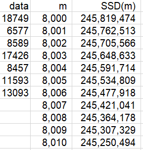
A graph of this function follows:
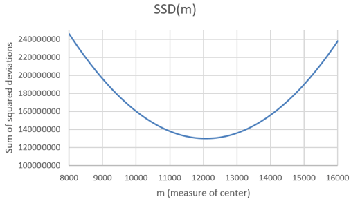
What is the shape of this graph? A parabola. Explain why this makes sense. Because the function is quadratic, of the form a×m^2 + b×m + c. Where does the function appear to be minimized? Slightly above 12,000 steps. How can we determine where the minimum occurs more precisely? We can examine the SSD values in the Excel file to see where the minimum occurs. Here are the values near the minimum:
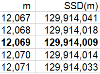
We see that the minimum occurs at 12,069 steps. Is it possible that SSD is minimized at a non-integer value of m? Sure, that’s possible. Can we zoom in further to identify the value of m that minimizes this function more exactly? Yes, we can specify that Excel use multiples of .001, rather than integers, for the possible values of m, restricting our attention to the interval from 12,068 to 12,070 steps. This produces the following graph:
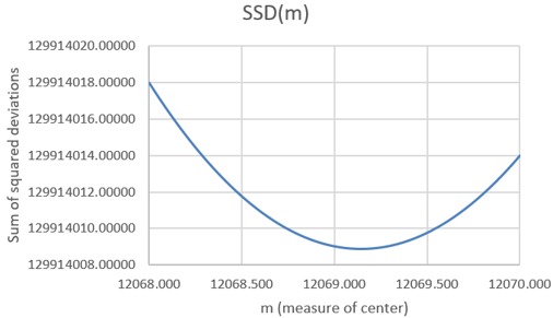
Now we can examine the SSD values in the Excel file to identify where the minimum occurs:
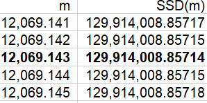
The sum of squared deviations is minimized at the value 12,069.143. Is this one of the seven data values? No. Is this the value of a common measure of center for these data? Yes, it turns out that this is the mean of the data. Do you think this is a coincidence? No way, with so many decimal places of accuracy here, that would be an amazing coincidence!
If your students have studied a term of calculus, you can ask them to prove that SSD(m) is minimized by the mean of the data. They can take the derivative, with respect to m, of the general form of SSD(m), set that derivative equal to zero, and solve for m.
Why should we confine our attention to least squares? Let’s consider another criterion. Instead of minimizing the sum of squared deviations between the data values and the measure of center, let’s minimize the sum of absolute deviations.
We’ll call this function SAD(m)*. When written out, this function looks just like SSD(m) but with absolute values instead of squares. Again we can use Excel to evaluate this function for a wide range of values of m, using the formula:

* Despite the name of this function, I implore students to be happy, not sad, as they expand their horizon beyond least squares.
What do you expect the graph of this SAD(m) function to look like? This is a much harder question than with the SSD(m) function. Students could have realized in advance that the SSD(m) function would follow a parabola. But what will they expect the graph of a function that sums absolute values to look like? What do you expect this to look like? Ready? Here’s the result:
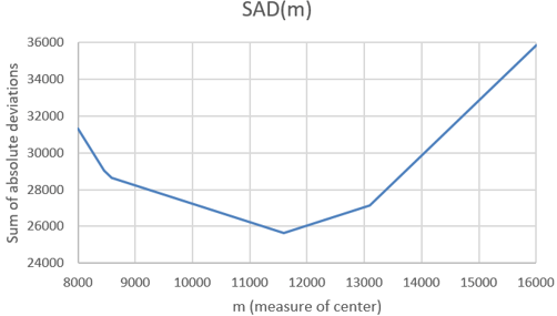
Describe the behavior of this function. This graph can be described as piece-wise linear. It consists of connected line segments with different slopes. Where do the junction points (where the line segments meet) of this function appear to occur? Examining the SAD values in the Excel file, we find that the junction points in this graph occur at the m values 8457, 8589, 11593, and 13093*.
* The values 8457 and 8589 are so close together that it’s very hard to distinguish their junction points in the graph. If we expanded the range of m values, we would see that all seven data values produce junction points.
Where does the minimum occur? The minimum clearly occurs at one of these junction points: m = 11,593 steps. Does this value look familiar? Yes, this is one of the data values, specifically the median of the data. Does this seem like a coincidence? Again, no way, this would be quite a coincidence! The sum of absolute deviations is indeed minimized at the median of the data values*.
* The mathematical proof for this result is a bit more involved than using calculus to prove that the mean minimizes the sum of squared deviations.
Some students wonder: What if there had been an even number of data values? I respond: What a terrific question! What do you predict will happen? Please explore this question and find out.
Let’s investigate this question now. On Sunday, January 19, I walked for 14,121 steps. Including this value in the dataset gives the following ordered values:

How will the mean and median change? The mean will increase, because we’ve included a value larger than the previous mean. The median will also increase, as it will now be the average of the 4th and 5th values, and the value we’ve inserted is larger than those values. It turns out that the mean is now 12,325.625 steps, and the median is (11,593 + 13,093) / 2 = 12,343 steps.
Predict what will change in the graphs of these functions and the values of m that minimize these functions. Ready to see the results? Here is the graph for the SSD function:
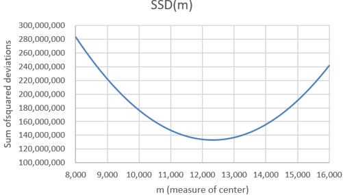
This SSD function behaves as you expected, right? It’s still a parabola, and it’s still minimized at the mean, which is now a bit larger than the previous mean. Now let’s look at the SAD function:
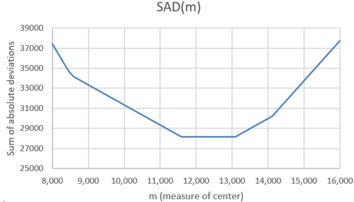
Whoa, did you expect this? We still have a piece-wise linear function, with junction points still at the data values. The median does still minimize the function, but the median no longer uniquely minimizes the function. The SAD function is now minimized by any value between the two middle values of the dataset. For this dataset, all values from 11,593 → 13,093 steps minimize the SAD function*.
* While the common convention is to declare the median of an even number of values to be the midpoint of the middle two values, an alternative is to regard any value between the two middle values as a median.
Are these two criteria (sum of squared or absolute deviations) the only ones that we could consider? Certainly not. These are the two most popular criteria, with least squares the most common by far, but we can investigate others. For example, if you’re a very cautious person, you might want to minimize the worst-case scenario. So, let’s stick with absolute deviations, but let’s seek to minimize the maximum of the absolute deviations rather than their sum. We’ll call this function MAXAD(m), and we can evaluate it in Excel with:

What do you predict this function to look like? The resulting graph (based on the original seven data values) is:
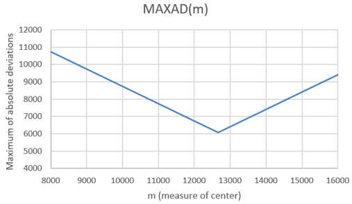
This MAXAD function is piece-wise linear, just as the SAD function was. But there are only two linear pieces to this function. The unique minimum occurs at m = 12,663 steps. How does this minimum value relate to the data values? It turns out that the minimum occurs at the average of the minimum and maximum values, also known as the midrange. It makes sense that we use the midpoint of the most extreme values in order to minimize the worst-case scenario.
Now let’s continue with the idea of minimizing a worst-case scenario, but let’s work with squared differences rather than absolute values. What do you expect the maximum of squared deviations function to look like, and where do you expect the minimum to occur?
Here’s the graph, again based on the original seven data values:
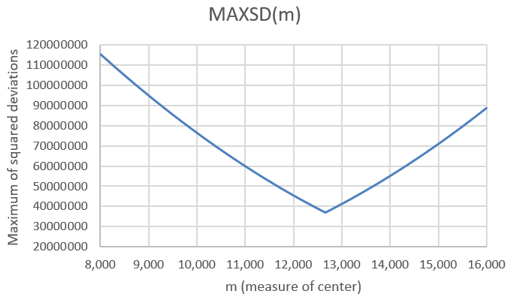
It’s hard to see, but the two pieces are not quite linear this time. Because we are minimizing the worst-case scenario, the minimum again occurs at the midrange of the data values: m = 12,663 steps.
Would including the 8th data value that we used above affect the midrange? No, because that 8th value did not change the minimum or maximum. Is the midrange resistant to outliers? Not at all! The midrange is not only strongly affected by very extreme values, it takes no data values into account except for the minimum and maximum.
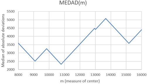
Could we ask students to investigate other criteria? Sure. Here’s a weird one: How about the median of the absolute deviations, rather than the sum or maximum of them? I have no idea why you would want to minimize this function, but it produces a very interesting graph, and the median occurs at m = 10,775 steps:
The concept of least squares can apply to one-variable data as well as its more typical use with lines for bivariate data. Students can use software to explore not only this concept but other minimization criteria, as well. Along the way they can make some surprising (and pretty) graphs, and also discover some interesting results about summary statistics.
P.S. This activity was inspired by George Cobb and David Moore’s wonderful article “Mathematics, Statistics, and Teaching” (available here), which appeared in The American Mathematical Monthly in 1997. The last section of the article discussed optimization properties of measures of center, mentioning several of the criteria presented in this post.
The very last sentence of George and David’s article (This is your take-home exam: design a better one-semester statistics course for mathematics majors) inspired Beth Chance and me to develop Investigating Statistical Concepts, Applications, and Methods (more information available here).
P.P.S. You can download the Excel file that I used in these analyses from the link below. Notice that the file contains separate tabs for the original analysis of seven data values, a zoomed-in version of that analysis, and the analysis of eight data values.

Thanks, Allan, for another great lesson, which also works well with high school teachers.
Here’s another optimal measure of center. The difference/deviation, d, is defined as
d(x – m) = 0 if x = m
d(x – m) = 1 if x not= m
For example, what is m for the ages of every resident of San Luis Obispo, a college town, if you want to minimize the sum of the differences (or squared differences or absolute differences)?
Practical example: A merchant is preparing a window display downtown. What measure of center for customer age do you suppose that they are thinking about?
LikeLike
Like your post.
LikeLike