#9 Statistics of illumination, part 3
I started a series of posts a few weeks ago (here and here) with examples to demonstrate that statistics can shed light on important questions without requiring sophisticated mathematics. I use these examples on the first day of class in a statistical literacy course and also in presentations for high school students. A third example that I use for this purpose is the well-known 1970 draft lottery.
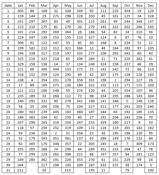
Almost none of my students were alive when the draft lottery was conducted on December 1, 1969. I tell them that I was alive but not old enough to remember the event, which was televised live. The purpose was to determine which young men would be drafted to serve in the U.S. armed forces, perhaps to end up in combat in Vietnam. The draft lottery was based on birthdays, so as not to give any advantage or disadvantage to certain groups of people. Three hundred and sixty-six capsules were put into a bin, with each capsule containing one of the 366 dates of the year. The capsules were drawn one-at-a-time, with draft number 1 being assigned to the birthday drawn first (which turned out to be September 14), meaning that young men born on that date were the first to be drafted.
Let’s look at the results:
Students are naturally tempted to find the draft number assigned to their own birthday, and I encourage them to do this first. Then we see who has the smallest draft number in the class. I always look up the draft number for today’s date before class begins, and then in class I ask if anyone has that draft number. Students always look perplexed about why that draft number is noteworthy, until I wish a happy birthday to anyone with that draft number*.
* If you are reading this blog entry on the day that it is first posted, and your draft number is 161: Happy birthday!
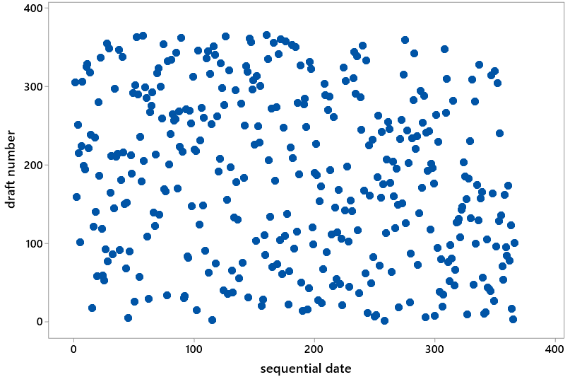
Then I show students the following scatterplot, which has sequential date on the horizontal axis (e.g., January 1 has date #1, February 1 has date #32, and so on through December 31 with date #366) and draft number on the vertical axis. I ask students: What would you expect this graph to look like with a truly fair, random lottery process? They quickly respond that the graph should display nothing but random scatter. Then I ask: Does this graph appear to display random scatter, as you would expect from a fair, random lottery? Students almost always respond in the affirmative.
I suggest to students that we dig a little deeper, just to be thorough because the stakes in this lottery were so high. I propose that we proceed month-by-month, calculating the median draft number for each month. Students agree that this sounds reasonable, and then I ask: What do we first need to do with the table of draft numbers in order to calculate medians? Many will respond immediately that we need to put the draft numbers in order for each month. Then I offer a silly follow-up question: Would the process of doing that by hand be quick and easy, or time-consuming and tedious? After they answer that, I provide them with the following table, where the draft numbers have been sorted from smallest to largest within each month:
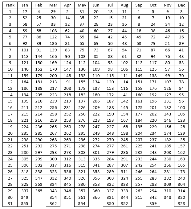
Just to get warmed up, we calculate January’s median draft number together as a class. Of course, this requires finding the (31+1)/2 = 16th value in order, which is 211. Then I ask each student to determine the median draft number for their own birth month. I point out that those born in a 30-day month have more work to do, because they must calculate the average of the 15th and 16th ordered values. I write the medians on the board as students call them out. Here they are:
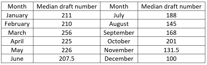
Now I ask: Do you see any pattern in these medians, or do they look like random scatter? Students are quick to respond that, to their surprise, they do see a pattern! There’s a tendency for larger medians in earlier months, smaller medians in later months. In fact, every median in the first six months is larger than every median in the second six months. Then I present the same scatterplot as before, but with the medians superimposed:
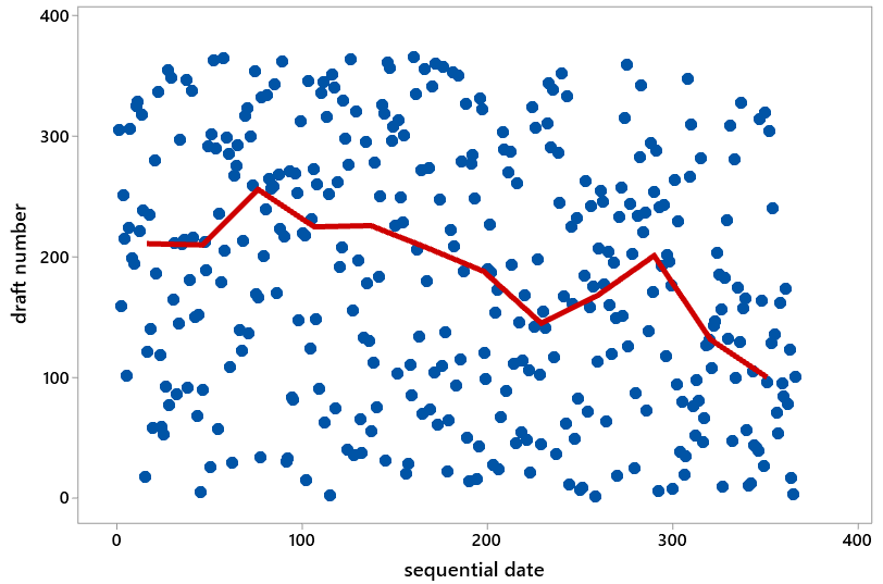
Now that we have the medians to help guide us, students are quick to see an abundance of dots in the top left and bottom right (high draft numbers early in the year, low draft numbers late in the year) of the graph. They also point out a shortage of dots in the bottom left and top right. At this point I recommend showing students portions of this video of how the lottery was conducted: link. You might then explain that the problem was inadequate mixing of the capsules. For example, the January and February capsules were added to the bin first and so settled near the bottom and tended to be drawn later. The November and December capsules were added to the bin last and so remained near the top and tended to be drawn earlier.
On the first day of class I end this example there, but you could ask more questions. For example: We now think we see a pattern in the scatterplot, but how can we investigate how unlikely such a pattern would be with a truly fair, random lottery? The approach to answering this is quite straightforward, at least in principle: Use software to conduct a large number of random lotteries and see how often we get a result as extreme as the actual 1970 draft lottery. But this leads to another question: How can we measure this extremeness, how different the actual lottery results are from what would be expected with a fair, random lottery? One answer: Use the correlation coefficient between sequential date and draft number. What would this correlation value be for a truly fair, random lottery? Zero. With the actual 1970 draft lottery results, this correlation equaled -0.226. How often would a random lottery produce a correlation coefficient of with an absolute value of 0.226 or higher? To answer this I simulated 10,000 random lotteries, calculated the correlation coefficient for each one, and produced the following graph of the 10,000 correlation values:
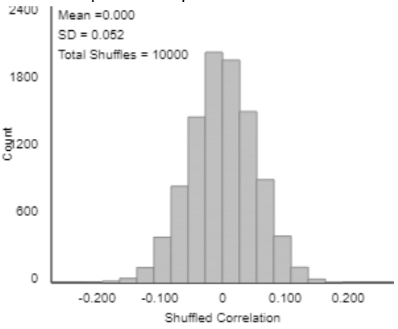
What does this graph reveal about our question of the fairness of the 1970 draft lottery? First notice what is not relevant: the approximate normality of the sampling distribution of the correlation coefficient. That this graph is centered at 0 is also not relevant, although that does indicate that the simulation was performed correctly. What matters is that none of the 10,000 simulated random lotteries produces a correlation coefficient of 0.226 or higher in absolute value. This indicates that the 1970 draft lottery result would be extremely unlikely to happen from a truly fair, random lottery. Therefore, we have extremely strong evidence that the process underlying the 1970 results was not a fair, random lottery.
Fortunately, many improvements were made in the process for the following year’s lottery. The capsules were mixed much more thoroughly, and the process included random selection of draft numbers as well as random drawing of birthdates. In other words, a birthdate pulled out of one bin was matched up with a draft number drawn from another bin. The correlation coefficient for that lottery’s results turned out to be 0.014. Looking at the simulation results, we see that such a correlation value is not at all surprising from a fair, random lottery.
Another extension of this example is to classify the birthdates and draft numbers into three categories and then summarize the 1970 draft lottery results in a 3×3 table of counts as follows:
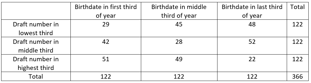
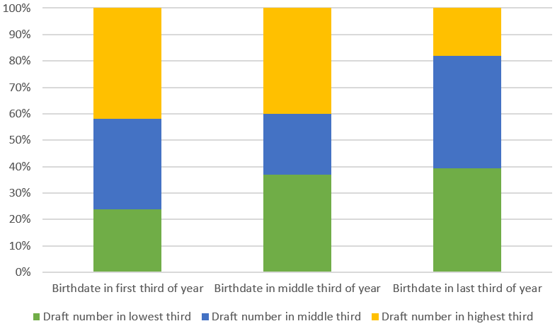
You could then ask students to produce and describe a segmented bar graph of these results. You could also ask them to conduct a chi-square test and summarize their conclusion. The graph below gives another view of the association between birthdate and draft number. The chi-square test results in a test statistic of 25.18 and a p-value of 0.00005.
I think this draft lottery example fits nicely with the “statistics of illumination” theme. The context here is extremely important, and the straightforward calculation of medians sheds considerable light on a problem that could easily have gone unnoticed. I recommend discussing this example in conjunction with the earlier one about readability of cancer pamphlets (link). With the cancer pamphlets, calculating medians was an unhelpful distraction that diverted attention from the more pressing issue of comparing distributions. But with the draft lottery, it’s very hard to see much in the scatterplot until you calculate medians, which are quite helpful for discerning a pattern amidst the noise. I also emphasize to students that achieving true randomness can be much more difficult than you might expect.
P.S. The simulation analysis above was performed with the Corr/Regression applet available at: http://www.rossmanchance.com/ISIapplets.html. Even though my name appears first in the name of this applet collection, Beth Chance deserves the vast majority* of the credit for imagining and designing and programming these applets. I’ll have much more to say about simulation-based inference in future posts.
* Whatever percentage of the credit you may think “vast majority” means here, your thought is almost surely an underestimate.
P.P.S. You can read more about the 1970 draft lottery in many places, including here.
Trackbacks & Pingbacks
- #12 Simulation-based inference, part 1 | Ask Good Questions
- #29 Not enough evidence | Ask Good Questions
- #35 Statistics of illumination, part 4 | Ask Good Questions
- #45 Simulation-based inference, part 3 | Ask Good Questions
- #52 Top thirteen topics | Ask Good Questions
- #63 My first video | Ask Good Questions
- #64 My first week | Ask Good Questions


How do you use the Corr/Regression applet to create the simulation?
LikeLike
Thanks for asking, Marilyn. Great question! The first step is click on “Clear” to clear out the data that are in the applet by default. Then you need to paste in the draft lottery data. You can get the data at this website: http://www.isi-stats.com/isi/data/chap10/DraftLottery.txt. Copy and paste that data into the applet and then click on “Use Data.” That finishes the hard part. Then click on the box next to “Show Shuffle Options,” at the top of the applet a bit to the right. Then click on “Correlation coefficient,” and then enter the number of shuffles (say, 1000 or 10000). Finally, click on “Shuffle Y-values.” That will create 1000 (or 10,000, or however many you ask for) repetitions of a draft lottery, keeping track of the correlation coefficient each time, and producing a graph of all of those correlation coefficients. I hope this makes sense. Thanks again for asking.
LikeLike
May i please ask that you give a clear and succinct definition of simulation.
Also, may I please ask for examples of activities that can be used to teach hypothesis testing to first-year undergraduate using simulation.
LikeLike
Thanks for your comment. I would define simulation as an artificial re-creation of a random process. Sometimes the artificial re-creation is accomplished with devices such as coins or cards. More often simulation is accomplished with software.
I have described some simulation activities for introducing students to hypothesis testing in posts #12 and #13 (involving a single proportion) and in post #27 (for comparing proportions between two groups). At the very end of post #12, I mention several resources and textbooks that adopt a simulation-based approach to statistical inference.
I hope this is helpful Best wishes to you and your students.
LikeLike