#86 Cars, dogs, tweets
Once again I have not found time to write a full essay for this week’s blog post*. I’m behind on preparing for my classes for Monday, and I have several other items on my “to do” list, and I’d rather not think about my “should have been done by now” list. I’ll also be giving an exam at the end of this week, and I’ve learned that I need to devote several days to prepare for giving an exam online.
* I almost titled this No blog post today, as I did with post #79 (here).
But I really like to have something to read on Monday mornings for everyone who has been so kind to sign up to have this delivered to your inbox. So, please allow me to ramble on for a bit* about two datasets that I have gathered in the past couple of weeks, related to topics of correlation, regression, and prediction. The first one is very straightforward but has some appealing aspects. The second one might introduce you to a fun website, especially if you’re a dog person.
* Please remember that I do not have the time to strive for a coherent, well-argued essay this week.
In last week’s post (here), I described an assignment that I recently gave to my students, asking them to perform chi-square, ANOVA, and correlation analyses. My students are currently working on a follow-up assignment in which they apply one-predictor regression analysis. I grew tired of using the same dataset for years, so I collected some new data for them to analyze. I went to cars.com and recorded the price, age (in years), and miles driven for a sample of pre-owned Toyota Prius cars*.
* Notice how deftly I avoided using a plural word for Prius in that sentence. I read that Toyota sponsored a survey for people to vote on the appropriate plural term (here). Apparently, “Prii” was the most popular of five options presented, but with only 25% of the vote.
Here are graphs and output from JMP for predicting price from miles and from age:
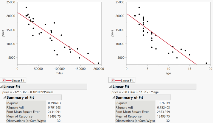
My students needed to produce this output and then answer a series of fairly straightforward questions. These included identifying the better predictor of price and then:
- identifying and interpreting the value of r2;
- identifying and interpreting the residual standard error;
- conducting and drawing a conclusion from a t-test about the slope coefficient;
- determining and interpreting a confidence interval for the population slope coefficient;
- predicting the price of a pre-owned Prius with 100,000 miles;
- producing and commenting on a confidence interval for the mean price in the population of all pre-owned Prius cars with 100,000 miles, and a prediction interval for the price of an individual pre-owned Prius with 100,000 miles;
- describing how the midpoints and widths of these two intervals compare.
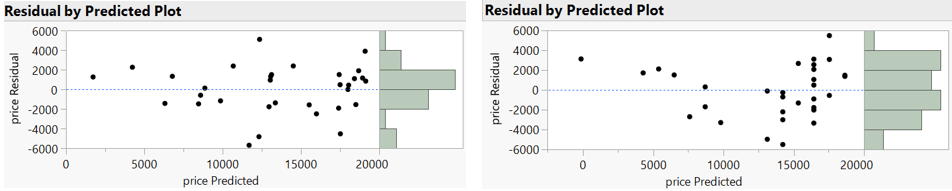
Then I asked whether residual plots reveal any patterns that suggest a non-linear relationship (miles is the predictor on the left, age on the right):
I followed by directing students to apply a log transformation to price and re-conduct their analysis:

Notice that age is more strongly correlated with log(price) than miles, even though miles was more strongly correlated with price than age. I asked students to predict the price of a pre-owned five-year-old Prius, both with a point estimate and a prediction interval, which required them to back-transform in their final step.
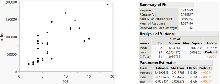
I plan to return to this dataset as we study multiple regression. It’s not surprising that miles driven is strongly correlated with age, as shown in the graph on the left below. Considering that, it is a bit surprising that both predictors (age and miles) are useful in a multiple regression model for predicting log(price), even after controlling for the other, as shown in the output on the right:
As I began preparing to write my exam for this coming Friday, I started looking for data and contexts that I have not used before. I went to the website for one of my favorite twitter accounts, Thoughts of Dog* (here). I recorded the number of likes and number of retweets for a sample of 20 tweets from this account.
* Even though I am most assuredly a cat person (see a post filled with statistics questions about cats here), I have nothing against dogs and their people. This particular dog tweeter even cites statistics on occasion. For example, the dog recently reported (here) that cuddles with their human have increased by 147% during the pandemic.
Here is a scatterplot of the data, with both variables measured in thousands:
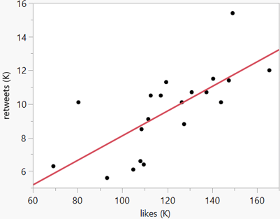
I plan to ask my students fairly straightforward questions about these data, using both open-ended and auto-graded formats. For example, I want to assess whether students can write their own interpretations for quantities such as r2 and a slope coefficient, as well as seeing whether they can pick out correct versus incorrect interpretations from a list of multiple choice options. I also want to ask a question or two about residuals, which is a fundamental concept that I often neglect to ask about. I might write multiple versions of questions from this dataset simply by switching which variable to treat as explanatory and which as response.
I have to admit that I probably re-use datasets in my classes more than I should. Sometimes I feel a bit guilty for using examples that still seem fairly recent to me but are more than half a lifetime ago for most of my students. The two datasets presented here have the benefit of being from February of 2021. There’s nothing especially distinctive about them, but I think they can be useful for developing and assessing students’ understanding of correlation, regression, and prediction. They have also provided me with a (brief) blog post when I thought I might have to do without for this week.
P.S. These two datasets can be downloaded from the links below:


Trackbacks & Pingbacks