Skip to content

#15 How confident are you? part 2

How confident are you that your students can interpret a 95% confidence interval (CI) correctly?  This post continues the previous one (here) by considering numerical data and highlighting a common misconception about interpreting a CI for a population mean.

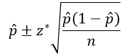
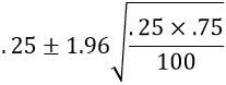
Here is the formula for a one-sample t-interval for a population mean μ, using conventional notation:

It’s worth making sure that students understand this notation.  Two quiz questions that I often ask are: 1.Remind me: what’s the difference between μ and x-bar?  2. Remind me of what the symbol s stands for, and be sure to use three words in your response.  Of course,I want students to say that μ is the symbol for a population mean and x-bar for a sample mean.  I also hope they’ll say that s stands for a sample standard deviation.  If they respond only with standard deviation, I tell them that this response is too vague and does not earn full credit.


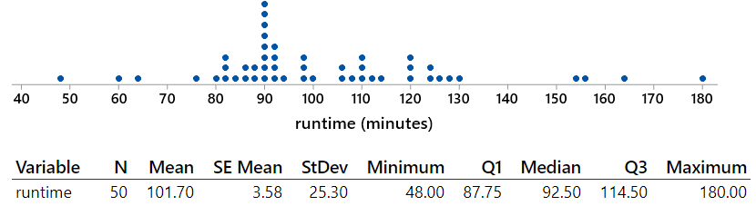
Let’s dive in to an example that we’ll use throughout this post: I’d like to estimate the average runtime of a feature film in the thriller genre.  I selected a simple random sample of 50 thriller films from the population of 28,369* thrillers listed at IMDb (here).

* There are actually 41,774 feature films in the thriller genre listed at IMDb on October 13, 2019, but runtimes are provided for only 28,369 of them.

Consider the following (Minitab) output of the sample data:

My questions for students are:

  • (a) What are the observational units and variable?  What type of variable is this?
  • (b) Describe the relevant population and parameter.  Also indicate an appropriate symbol for this parameter.
  • (c) Identify the appropriate confidence interval procedure.
  • (d) Are the technical conditions for this procedure satisfied?  Explain.
  • (e) Calculate a 95% confidence interval for the population mean.
  • (f) Interpret this interval.
  • (g) What percentage of the films in the sample have times that fall within this interval?
  • (h) Is this percentage close to 95%?  Should it be?  Explain what went wrong, or explain that nothing went wrong.

Here are my answers:

  • (a) The observational units are the films.  The variable is the runtime of the film, measured in minutes, which is a numerical variable.
  • (b) The population is all feature films in the thriller genre listed at IMDb for which runtimes are provided.  The parameter is the mean (average) runtime among these flims, denoted by μ.
  • (c) We will use a one-sample t-interval procedure to estimate the population mean μ.
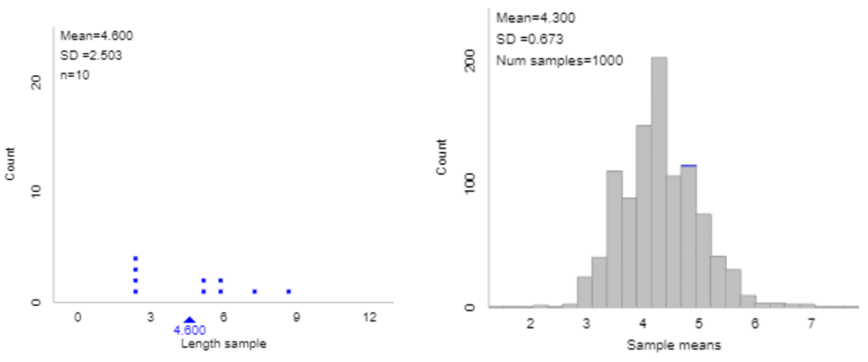
  • (d) The dotplot of the sample data reveals that the distribution of runtimes is skewed to the right.  But the skewness is not extreme, so the sample size of 50 films should be large enough for the t-interval procedure to be valid.
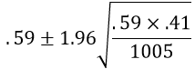
  • (e) The 95% CI for μ is calculated as: 101.70 ± 2.010×25.30/sqrt(50), which is 101.70 ± 7.19, which is the interval (94.51 → 108.89) minutes.
  • (f) We are 95% confident that the population mean runtime of a feature film in the thriller genre in IMDb is between 94.51 and 108.89 minutes.
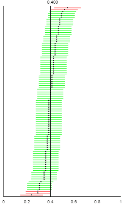
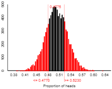
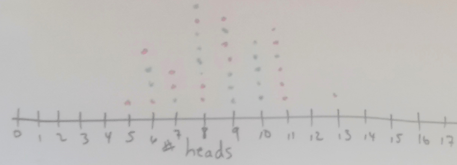
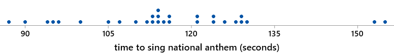
  • (g) Only 7 of the 50 films (14%) run for more than 94.51 minutes and less than 108.89 minutes, as shown in red in this dotplot:
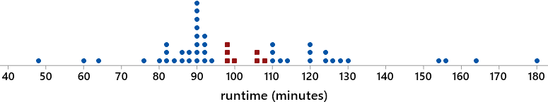
  • (h) This percentage (14%) is nowhere close to 95%.  Moreover, there’s no reason to expect this percentage to be close to 95%.  Nothing went wrong here.  Remember that the CI is estimating the population mean (average), not individual values.  We do not expect 95% of the individual films’ runtimes to be within this CI.  Rather, we are 95% confident that the population mean of the runtimes is within this CI.

Question (h) indicates a very common and troublesome student misconception.  Many students mistakenly believe that a 95% CI for a population mean is supposed to contain 95% of the data values.  These students are confusing confidence about a parameter with prediction about an individual.  How can we help them to see the mistake here?  I hope that questions (g) and (h) help with this, as students should see for themselves that only 7 of the 50 films (14%) in this sample fall within the CI.  You might also point out that as the sample size increases, the CI for μ will continue to get narrower, so the interval will include fewer and fewer data values.  We can also be sure to ask students to identify parameters in words as often as possible, because I think this misconception goes back to not paying enough attention to what a parameter is in the first place.

Something else we could consider doing* to help students to distinguish between confidence and prediction is to teach them about prediction intervals, which estimate individual values rather than the population mean.  In many situations the relevant question is one of prediction.  For example, you might be much more interested in predicting how long the next thriller film that you watch will take, as opposed to wanting to estimate how long a thriller film lasts on average.

* I confess that I do not typically do this, except in courses for mathematically inclined students such as those majoring in statistics, mathematics, or economics.

Here is the formula for a prediction interval:

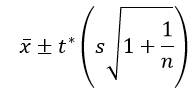
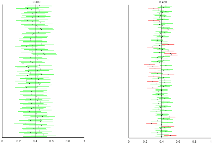
Comparing this to the confidence interval formula above, we see that the prediction interval formula has an extra s (sample standard deviation) term. This accounts for variability from individual to individual, which makes the prediction interval much wider than the confidence interval.  For the sample data on runtimes of thriller films, the 95% prediction interval is: 101.70 ± 2.010×25.30×sqrt(1+1/50), which is 101.70 ± 51.36, which is the interval (50.34 → 153.06) minutes.  Notice how wide this interval is: Its half-width is 51.36 minutes (nearly an hour), compared to a half-width of just 7.19 minutes for the confidence interval above.  This prediction interval captures 45 of the 50 runtimes in this sample (90%).

An important caveat is that unlike the t-confidence interval procedure for a population mean, this prediction interval procedure relies heavily on the assumption of a normally distributed population, regardless of sample size.  The runtime distribution is skewed to the right, so this t-prediction interval procedure is probably not valid.  A simpler alternative is to produce a prediction interval by using the (approximate) 2.5th and 97.5th percentiles of the sample data.  For this sample, we could use the second-smallest and second-largest runtime values, which gives a prediction interval of (60 → 163) minutes.  This interval contains 48/50 (96%) of the runtimes in the sample.


Now let’s re-consider question (f), which asked for an interpretation of the confidence interval.  Below are four possible student answers.  As you read these, please think about whether or not you would award full credit for that interpretation:

  • 1. We are 95% confident that μ is between 94.5 and 108.9.
  • 2. We are 95% confident that the population mean is between 94.5 and 108.9 minutes.
  • 3. We are 95% confident that the population mean runtime of a thriller film in the IMDb list is between 94.5 and 108.9 minutes.
  • 4. We are 95% confident that the population mean runtime of a thriller film in the IMDb list is between 94.5 and 108.9 minutes.  This confidence stems from knowing that 95% of all confidence intervals generated by this procedure would succeed in capturing the actual value of the population mean.

I hope we agree that none of these interpretations is flat-out wrong, and they get progressively better as we progress from #1 through #4.  Where would you draw the line about deserving full credit?  I would regard #3 as good enough.  I think #1 and #2 fall short by not providing context.  I view #4 as going beyond what’s needed because the question asked only for an interpretation of the interval, not for the meaning of the 95% confidence level.  I suggest asking a separate question specifically about interpreting confidence level*, in order to assess students’ understanding of that concept.

* I have asked: Explain what the phrase “95% confidence” means in this interpretation. This is a challenging question for most students.


Continuing this deep dive into into interpreting a confidence interval for a population mean, please consider the following incorrect answers.  Think about which you consider to be more or less serious than others, and also reflect on which interpretations deserve full credit, partial credit, or no credit.

  • A. We are 95% confident that a thriller film in the IMDb list runs for between 94.5 and 108.9 minutes.
  • B. There’s a 95% chance that a thriller film in the IMDb list runs for between 94.5 and 108.9 minutes.
  • C. About 95% of all thriller films in the IMDb list run for between 94.5 and 108.9 minutes.
  • D. We are 95% confident that the mean runlength of a thriller film in this sample from the IMDb list was between 94.5 and 108.9 minutes.
  • E. We are 95% confident that the mean runlength of a thriller film in a new random sample from the IMDb list would be between 94.5 and 108.9 minutes.
  • F. There’s a 95% chance (or a 0.95 probability) that the population mean runlength of a thriller film in the IMDb list is between 94.5 and 108.9 minutes.

I contend that A, B, and C are all egregiously wrong.  They all make the same mistake of thinking that the interval predicts the runtime of individual films rather than estimating a mean.  I suppose you could say that A is better than B and C because it uses the word “confident.” In fact, simply inserting “on average” at the end of the sentence would be sufficient to fix A.  But the idea of “on average” is a crucial one to have omitted!

I believe that D and E are slightly less wrong than A, B, and C, because they do include the idea of mean.  But they refer to a sample mean instead of the population mean.  This is also a serious error and so would receive no credit in my class.  I might say that D is worse than E, because we know for sure that the mean runtime in this sample is the midpoint of the confidence interval.

What about F?  It’s not quite correct, because it uses the language of chance and probability rather than confidence.  The population mean μ is a fixed value, so it’s not technically correct* to refer to the probability or chance that μ falls in a particular interval.  What’s random is the confidence interval itself, because the interval obtained from this procedure would vary from sample to sample if we were to take repeated random samples from the population**.  But I consider this distinction between confidence and probability to be fairly minor, especially compared to the much more substantive distinction between confidence and prediction.  I would nudge a student who produced F toward more appropriate language but would award full credit for this interpretation.

* Unless we take a Bayesian approach, which I will discuss in a future post.

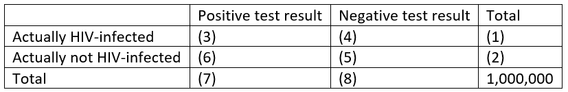
** As we saw in the previous post (here) by using the Simulating Confidence Intervals applet (here).


I ask a version of the “do you expect 95% of the data to fall within the CI” question almost every time I ask about interpreting a confidence interval.  I remember one student from many years ago who seemed to be either tickled or annoyed by my repeating this question so often.  In response to such a question on the final exam, he wrote something like: “Boy, some students must get this wrong a lot because you keep asking about it.  Okay, once again, my answer is …”  You might be expecting me to conclude this post on an ironic note by saying that the student then proceeded to give a wrong answer.  But no, he nailed it.  He knew that we do not expect anywhere near 95% of the data values to fall within a 95% confidence interval for the population mean.  I hope that this student would be tickled, and not annoyed, to see that I have now devoted most of a blog post to this misconception.

P.S. The sample data on runtimes can be found in the file below.

#14 How confident are you? part 1

How confident are you that your students understand what “95% confidence” means?  Or that they realize why we don’t always use 99.99% confidence?  That they can explain the sense in which larger samples produce “better” confidence intervals than smaller samples?  For that matter, how confident are you that your students know what a confidence interval is trying to estimate in the first place?  This blog post, and the next one as well, will focus on helping students to understand basic concepts of confidence intervals. (As always, my questions to students appear in italics below.)


I introduce confidence intervals (CIs) to my students with a CI for a population proportion, using the conventional method given by:

Let’s apply this to a surveyed that we encountered in post #8 (here) about whether the global rate of extreme poverty has doubled, halved, or remained about the same over the past twenty years.  The correct answer is that the rate has halved, but 59% of a random sample of 1005 adult Americans gave the (very) wrong answer that they thought the rate had doubled (here). 

Use this sample result to calculate a 95% confidence interval.  This interval turns out to be:

This calculation becomes .59 ± .03, which is the interval (.56, .62)*.  Interpret what this confidence interval means.  Most students are comfortable with concluding that we are 95% confident that something is between .56 and .62.  The tricky part is articulating what that something is.  Some students mistakenly say that we’re 95% confident that this interval includes the sample proportion who believe that the global poverty rate has doubled.  This is wrong, in part because we know that the sample proportion is the exact midpoint of this interval.  Other students mistakenly say that if researchers were to select a new sample of 1005 adult Americans, then we’re 95% confident that between 56% and 62% of those people would answer “doubled” to this question.  This is incorrect because it is again trying to interpret the confidence interval in terms of a sample proportion.  The correct interpretation needs to make clear what the population and parameter are: We can be 95% confident that between 56% and 62% of all adult Americans would answer “doubled” to the question about how the global rate of extreme poverty has changed over the past twenty years.

* How are students supposed to know that this (.56, .62) notation represents an interval?  I wonder if we should use notation such as (.56 → .62) instead?

Now comes a much harder question: What do we mean by the phrase “95% confident” in this interpretation?  Understanding this concept requires thinking about how well the confidence interval procedure would perform if it were applied for a very large number of samples.  I think the best way to explore this is with … (recall from the previous post here that I hope for students to complete this sentence with a joyful chorus of a single word) … simulation!


To conduct this simulation, we use one of my favorite applets*.  The Simulating Confidence Intervals applet (here) does what its name suggests:

  • simulates selecting random samples from a probability distribution,
  • generates a confidence interval (CI) for the parameter from each simulated sample,
  • keeps track of whether or not the CI successfully captures the value of the population parameter, and
  • calculates a running count of how many (and what percentage of) intervals succeed.

* Even though this applet is one of my favorites, it only helps students to learn if you … (wait for it) … ask good questions!

The first step in using the applet is to specify that we are dealing with a proportion, sampling from a binomial model, and using the conventional z-interval, also known as the Wald method:

The next step is to specify the value of the population proportion.  The applet needs this information in order to produce simulated samples, but it’s crucial to emphasize to students that you would not know the value of the population proportion in a real study.  Indeed, the whole point of selecting a random sample and calculating a sample proportion is to learn something about the unknown value of the population proportion.  But in order to study properties of the CI procedure, we need to specify the value of the population proportion.  Let’s use the value 0.40; in other words we’ll assume that 40% of the population has the characteristic of interest.  Let’s make this somewhat more concrete and less boring: Suppose that we are sampling college students and that 40% of college students have a tattoo.  We also need to enter the sample size; let’s start with samples of n = 75 students.  Let’s generate just 1 interval at first, and let’s use 95% confidence:

Here’s what we might observe* when we click the “Sample” button in the applet:

* Your results will vary, of course, because that’s the nature of randomness and simulation.

The vertical line above the value 0.4 indicates that the parameter value is fixed.  The black dot is the value of the simulated sample proportion, which is also the midpoint of the interval (0.413* in this case).  The confidence interval is shown in green, and the endpoint values (0.302 → 0.525) appear when you click on the interval.  You might ask students to use the sample proportion and sample size to confirm the calculation of the interval’s endpoints.  You might also ask students to suggest why the interval was colored green, or you might ask more directly: Does this interval succeed in capturing the value of the population proportion (which, you will recall, we stipulated to be 0.4)?  Yes, the interval from 0.302 to 0.525 does include the value 0.4, which is why the interval was colored green.

* This simulated sample of 75 students must have included 31 successes (with a tattoo) and 44 failures, producing a sample proportion of 31/75 ≈ 0.413).

At this point I click on “Sample” several times and ask students: Does the value of the population proportion change as the applet generates new samples?  The answer is no, the population proportion is still fixed at 0.4, where we told the applet to put it.  What does vary from sample to sample?  This a key question.  The answer is that the intervals vary from sample to sample.  Why do the intervals vary from sample to sample?  Because the sample proportion, which is the midpoint of the interval, varies from sample to sample.  That’s what the concept of sampling variability is all about.

I continue to click on “Sample” until the applet produces an interval that appears in red, such as:

Why is this interval red?  Because it fails to capture the value of the population proportion.  Why does this interval fail when most succeed?  Because random chance produced an unusually small value of the sample proportion (0.253), which led to a confidence interval (0.155 → 0.352) that falls entirely below the value of the population proportion 0.40.

Now comes the fun part and a pretty picture.  Instead of generating one random sample at a time, let’s use the applet to generate 100 samples/intervals all at once.  We obtain something like:

This picture captures what the phrase “95% confidence” means.  But it still takes some time and thought for students to understand what this shows.  Let’s review:

  • The applet has generated 100 random samples from a population with a proportion value of 0.4.
  • For each of the 100 samples, the applet has used the usual method to calculate a 95% confidence interval.
  • These 100 intervals are displayed with horizontal line segments.
  • The 100 sample proportions are represented by the black dots at the midpoints of the intervals.
  • The population proportion remains fixed at 0.4, as shown by the vertical line. 
  • The confidence intervals that are colored green succeed in capturing the value 0.4.
  • The red confidence intervals fail to include the value 0.4.

Now, here’s the key question: What percentage of the 100 confidence intervals succeed in capturing the value of the population proportion?  It’s a lot easier to count the red ones that fail: 5 out of 100.  Lo and behold, 95% of the confidence intervals succeed in capturing the value of the population proportion.  That is what “95% confidence” means.

The applet also has an option to sort the intervals, which produces:

This picture illustrates why some confidence intervals fail: The red intervals were the unlucky ones with an unusually small or large value of the sample proportion, which leads to a confidence interval that falls entirely below or above the population proportion value of 0.4.

A picture like this appears in many statistics textbooks, but the applet makes this process interactive and dynamic.  Next I keep pressing the “Sample” button in order to generate many thousands of samples and intervals.  The running total across thousands of samples should reveal that close to 95% of confidence intervals succeed in capturing the value of the population parameter.

An important question to ask next brings this idea back to statistical practice: Survey researchers typically select only one random sample from a population, and then they produce a confidence interval based on that sample.How do we know whether the resulting confidence interval is successful in capturing the unknown value of the population parameter?  The answer is that we do not know.  This answer is deeply unsatisfying to many students, who are uncomfortable with this lack of certainty.  But that’s the unavoidable nature of the discipline of statistics.  Some are comforted by this follow-up question: If we can’t know for sure whether the confidence interval contains the value of the population parameter, on what grounds can we be confident about this?  Our 95% confidence stems from knowing that the procedure produces confidence intervals that succeed 95% of the time in the long run.  That’s what the large abundance of green intervals over red ones tells us.  In practice we don’t know where the vertical line for the population value is, so we don’t know whether our one confidence interval deserves to be colored green or red, but we do know that 95% of all intervals would be green, so we can be 95% confident that our interval deserves to be green.


Whew, that’s a lot to take in!  But I must confess that I’m not sure that this long-run interpretation of confidence level is quite as important as we instructors often make it out to be.  I think it’s far more important that students be able to describe what they are 95% confident of: that the interval captures the unknown value of the population parameter.  Both of those words are important – population parameter – and students should be able to describe both clearly in the context of the study.

I can think of at least three other aspects of confidence intervals that I think are more important (than the long-run interpretation of confidence level) for students to understand well.


1. Effect of confidence level – why don’t we always use 99.99% confidence?

Let’s go back to the applet, again with a sample size of 75.  Let’s consider changing the confidence level from 95% to 99% and then to 80%.  I strongly encourage asking students to think about this and make a prediction in advance: How do you expect the intervals to change with a larger confidence level?  Be sure to cite two things that will change about the intervals.  Once students have made their predictions, we use the applet to explore what happens:

99% confidence on the left, 80% confidence on the right

The results for 99% confidence are on the left, with 80% confidence on the right.  A larger confidence level produces wider intervals and a larger percentage of intervals that succeed in capturing the parameter value.  Why do we not always use 99.99% confidence?  Because those intervals would typically be so wide as to provide very little useful information*.

* Granted, there might be some contexts for which this level of confidence is necessary.  A very large sample size could prevent the confidence interval from becoming too wide, as the next point shows.


2. Effect of sample size – in what sense do larger samples produce better confidence intervals than smaller samples? Let’s return to the applet with a confidence level of 95%.  Now I ask: Predict what will change about the intervals if we change the sample size from 75 to 300.  Comment on both the intervals’ widths and the percentage of intervals that are successful.  Most students correctly predict that the larger sample size will produce intervals that are more narrow.  But many students mistakenly predict that the larger ample size will result in a higher percentage of successful intervals.  Results such as the following (n = 75 on the left, n = 300 on the right) convince them that they are correct about narrower intervals, but the percentage of successful ones remains close to 95%, because that is controlled by the confidence level:

n = 75 on the left, n = 300 on the right

This graph (and remember that students using the applet would see many such graphs dynamically, rather than simply seeing this static image) confirms students’ intuition that a larger sample size produces narrower intervals.  That’s the sense in which larger sample sizes produce better confidence intervals, because narrower intervals indicate a more precise (i.e., better) estimate of the population parameter for a given confidence level.

Many students are surprised, though, to see that the larger sample size does not affect the green/red breakdown.  We should still expect about 95% of confidence intervals to succeed in capturing the population proportion, for any sample size, because we kept the confidence level at 95%.


3. Limitations of confidence intervals – when should we refuse to calculate a confidence interval?

Suppose that an alien lands on earth and wants to estimate the proportion of human beings who are female*.  Fortunately, the alien took a good statistics course on its home planet, so it knows to take a sample of human beings and produce a confidence interval for this proportion.  Unfortunately, the alien happens upon the 2019 U.S. Senate as its sample of human beings.  The U.S. Senate has 25 women senators (its most ever!) among its 100 members in 2019.

* I realize that this context is ridiculous, but it’s one of my favorites.  In my defense, the example does make use of real data.

a) Calculate the alien’s 95% confidence interval.  This interval is:

This calculation becomes .25 ± .085, which is the interval (.165 → .335).

b) Interpret the interval.  The alien would be 95% confident that the proportion of all humans on earth who are female is between .165 and .335.

c) Is this consistent with your experience living on this planet?  No, the actual proportion of humans who are female is much larger than this interval, close to 0.5.

d) What went wrong?  The alien did not select a random sample of humans.  In fact, the alien’s sampling method was very biased toward under-representing females.

e) As we saw with the applet, about 5% of all 95% confidence intervals fail to capture the actual value of the population parameter.  Is that the explanation for what went wrong here?  No!  Many students are tempted to answer yes, but this explanation about 5% of all intervals failing is only relevant when you have selected random samples over and over again.  The lack of random sampling is the problem here.

f) Would it be reasonable for the alien to conclude, with 95% confidence, that between 16.5% and 33.5% of U.S. senators in the year 2019 are female?  No.  We know (for sure, with 100% confidence) that exactly 25% of U.S. senators in 2019 are female.  If that’s the entire population of interest, there’s no reason to calculate a confidence interval.  This question is a very challenging one, for which most students need a nudge in the right direction.

The lessons of this example are:

  • Confidence intervals are not appropriate when the data were collected with a biased sampling method.  A confidence interval calculated from such a sample can provide very dubious and misleading information.
  • Confidence intervals are not appropriate when you have access to the entire population of interest.  In this unusual and happy circumstance, you should simply describe the population.

I feel a bit conflicted as I conclude this post.  I have tried to convince you that the Simulating Confidence Intervals applet provides a great tool for leading students to explore and understand what the challenging concept of “95% confidence” really means.  But I also have also aimed to persuade you that many instructors over-emphasize this concept at the expense of more important things for students to learn about confidence intervals.

I will continue this discussion of confidence intervals in the next post, moving on to numerical variables and estimating a population mean.

#13 A question of trust

Which do you trust more: a simulation-based* or normal-based analysis of an inference question?  In other words, if a simulation analysis and normal approximation give noticeably different p-values, which would you believe to be closer to the correct p-value?  Please think about this question in the abstract for a moment.  Soon we’ll come back to it in specific example.

* If you’re not familiar with simulation-based inference, I recommend reading post #12 (here) first.


Here’s the example that we’ll consider throughout this post: Stemming from concern over childhood obesity, researchers investigated whether children might be as tempted by toys as by candy for Halloween treats (see abstract of article here).  Test households in five Connecticut neighborhoods offered two bowls to trick-or-treating children: one with candy and one with small toys.  For each child, researchers kept track of whether the child selected the candy or the toy.  The research question was whether trick-or-treaters are equally likely to select the candy or toy.  More specifically, we will investigate whether the sample data provide strong evidence that trick-or-treaters have a tendency to select either the candy or toy more than the other.

In my previous post (here) I argued against using terminology and formalism when first introducing the reasoning process of statistical inference.  In this post I’ll assume that students have now been introduced to the structure of hypothesis tests, so we’ll start with a series of background questions before we analyze the data (my questions to students appear in italics):

  • What are the observational units?  The trick-or-treaters are the observational units.
  • What is the variable, and what type of variable is it?  The variable is the kind of treat selected by the child: candy or toy.  This is a binary, categorical variable.
  • What is the population of interest?  The population is all* trick-or-treaters in the U.S.  Or perhaps we should restrict the population to all trick-or-treaters in Connecticut, or in this particular community.
  • What is the sample?  The sample is the trick-or-treaters in these Connecticut neighborhoods whose selections were recorded by the researchers.
  • Was the sample selected randomly from the population?  No, it would be very difficult to obtain a list of trick-or-treaters from which one could select a random sample.  Instead this is a convenience sample of trick-or-treaters who came to the homes that agreed to participate in the study.  We can hope that these trick-or-treaters are nevertheless representative of a larger population, but they were not randomly selected from a population.
  • What is the parameter of interest?  The parameter is the population proportion of all* trick-or-treaters who would select the candy if presented with this choice between candy and toy.  Alternatively, we could define the parameter to be the population proportion who would select the toy.  It really doesn’t matter which of the two options we designate as the “success,” but we do need to be consistent throughout our analysis.  Let’s stick with candy as success.
  • What is the null hypothesis, in words?  The null hypothesis is that trick-or-treaters are equally likely to select the candy or toy.  In other words, the null hypothesis is that 50% of all trick-or-treaters would select the candy.
  • What is the alternative hypothesis, in words?  The alternative hypothesis is that trick-or-treaters are not equally likely to select the candy or toy.  In other words, the alternative hypothesis is that the proportion of all trick-or-treaters who would select the candy is not 0.5.  Notice that this is a two-sided hypothesis.
  • What is the null hypothesis, in symbols?  First we have to decide what symbol to use for a population proportion.  Most teachers and textbooks use p, but I prefer to use π.  I like the convention of using Greek letters for parameters (such as μ for a population mean and σ for a population standard deviation), and I see no reason to abandon that convention for a population proportion.  Some teachers worry that students will immediately think of the mathematical constant 3.14159265… when they see the symbol π, but I have not found this to be a problem.  The null hypothesis is H0: π = 0.5.
  • What is the alternative hypothesis, in symbols?  The two-sided alternative hypothesis is Ha: π ≠ 0.5.

* I advise students that it’s always a nice touch to insert the word “all” when describing a population and parameter.

Whew, that was a lot of background questions!  Notice that I have not yet told you how the sample data turned out.   I think it’s worth showing students that the issues above can and should be considered before looking at the data.  So, how did the data turn out?  The researchers found that 148 children selected the candy and 135 selected the toy.  The value of the sample proportion who selected the candy is therefore 148/283 ≈ 0.523.

Let’s not lose sight of the research question here: Do the sample data provide strong evidence that trick-or-treaters have a tendency to select either the candy or toy more than the other?  To pursue this I ask: How can we investigate whether the observed value of the sample statistic (.523 who selected the candy) would be very surprising under the null hypothesis that trick-or-treaters are equally likely to select the candy or toy?  I hope that my students will erupt in a chorus of, “Simulate!”*

* I tell my students that if they ever drift off to sleep in class and are startled awake to find that I have called on them with a question, they should immediately respond with: Simulate!  So many of my questions are about simulation that there’s a reasonable chance that this will be the correct answer.  Even if it’s not correct, I’ll be impressed.


Here is a graph of the distribution of sample proportions resulting from 10,000 repetitions of 283 coin flips (using the One Proportion applet here):

I ask students: Describe the shape, center, and variability of the distribution of these simulated sample proportions.  The shape is very symmetric and normal-looking.  The center appears to be near 0.5, which makes sense because our simulation assumed that 50% of all children would choose the candy.  Almost all of the sample proportions fall between 0.4 and 0.6, and it looks like about 90% of them fall between 0.45 and 0.55.

But asking about shape, center, and variability ignores the key issue.  Next I ask this series of questions:

  • What do we look for in the graph, in order to assess the strength of evidence about the research question?  We need to see whether the observed value of the sample statistic (0.523) is very unusual.
  • Well, does it appear that 0.523 is unusual?  Not unusual at all.  The simulation produced sample proportions as far from 0.5 as 0.523 fairly frequently.
  • So, what do we conclude about the research question, and why?  The sample data (0.523 selecting the candy) would not be surprising if children were equally likely to choose the candy or toy, so the data do not provide enough evidence to reject the (null) hypothesis that children are equally likely to choose the candy or toy.

We could stop there, absolutely.  We don’t need to calculate a p-value or anything else in order to draw this conclusion.  We can see all we need from the graph of simulation results.  But let’s go ahead and calculate the (approximate) p-value from the simulation.  Because we have a two-sided alternative, a sample proportion will be considered as “extreme” as the observed one if it’s at least as far from 0.5 as 0.523 is.  In other words, the p-value is the probability of obtaining a sample proportion of 0.477 or less, or 0.523 or more, if the null hypothesis were true.  The applet reveals that 4775 of the 10,000 simulated sample proportions are that extreme, as shown in red below:

The approximate p-value from the simulation analysis is therefore 0.4775.  This p-value is nowhere near being less than 0.05 or 0.10 or any reasonable significance level, so we conclude that the sample data do not provide sufficient evidence to reject the null hypothesis that children are equally likely to choose the candy or toy.


When I first asked about how to investigate the research question, you might have been thinking that we could use a normal approximation, also known as a one-proportion z-test.  Let’s do that now: Apply a one-proportion z-test to these data, after checking the sample size condition.  The condition is certainly satisfied: 283(.5) = 141.5 is far larger than 10.  The z-test statistic can be calculated as:

This z-score tells us that the observed sample proportion who selected candy (0.523) is less than one standard deviation away from the hypothesized value of 0.5.  The two-sided p-value from the normal distribution to be ≈ 2×0.2198 = 0.4396.  Again, of course, the p-value is not small and so we conclude that the sample data do not provide sufficient evidence to reject the null hypothesis of equal likeliness.


But look at the two p-values we have generated: 0.4775 and 0.4396.  Sure, they’re in the same ballpark, but they’re noticeably different.  On a percentage basis, they differ by 8-9%, which is non-trivial.  Which p-value is correct?  This one is easy: Neither is correct!  These are both approximations.

Finally, we are back to the key question of the day, alluded to the title of this post and posed in the first paragraph: Which do you trust more: the (approximate) p-value based on simulation, or the (approximate) p-value based on the normal distribution?  Now that we have a specific example with two competing p-values to compare, please think some more about your answer before you read on.


Many students (and instructors) place more trust in the normal approximation.  One reason for this is that the normal distribution is based on a complicated formula and sophisticated mathematics.  Take a look at the probability density function* of a normal distribution:

* Oh dear, I must admit that in this expression the symbol π does represent the mathematical constant 3.14159265….

How could such a fancy-looking formula possibly go wrong?  More to the point, how could this sophisticated mathematical expression possibly do worse than simulation, which amounts to just flipping a coin a whole bunch of times?

An even more persuasive argument for trusting the normal approximation, in many students’ minds, is that everyone gets the same answer if they perform the normal-based method correctly.  But different people get different answers from a simulation analysis.  Even a single person gets different answers if they conduct a simulation analysis a second time.  This lack of exact replicability feels untrustworthy, doesn’t it?


So, how can we figure out which approximation is better?  Well, what does “better” mean here?  It means closer to the actual, exact, correct p-value.  Can we calculate that exact, correct p-value for this Halloween example? If so, how? Yes, by using the binomial distribution.

If we let X represent a binomial distribution with parameters n = 283 and π = 0.5, the exact p-value is calculated as Pr(X ≤ 135) + Pr(X ≥ 148)*.  This probability turns out (to four decimal places) to be 0.4757.  This is the exact p-value, to which we can compare the approximate p-values.

* Notice that the values 135 and 148 are simply the observed number who selected toy and candy, respectively, in the sample.

So, which approximation method does better?  Simulation-based wins in a landslide over normal-based:

This is not a fluke.  With 10,000 repetitions, it’s not surprising that the simulation-based p-value* came so close to the exact binomial p-value.  The real question is why the normal approximation did so poorly, especially in this example where the validity conditions were easily satisfied, thanks to a large sample size of 283 and a population proportion of 0.5.

* I promise that I only ran the simulation analysis once; I did not go searching for a p-value close to the exact one. We could also calculate a rough margin-of-error for the simulation-based p-value to be about 1/sqrt(10,000) ≈ .01.


The problem with the normal approximation, and a method for improving it, go beyond the scope of a typical Stat 101 course, but I do present this in courses for mathematically inclined students.  First think about it: Why did the normal approximation do somewhat poorly here, and how might you improve the normal approximation?

The problem lies in approximating a discrete probability distribution (binomial) with a continuous one (normal).  The exact binomial probability is the sum of the heights of the red segments in the graph below, whereas the normal approximation calculates the area under the normal curve to the left of 135 and the right of 148:

The normal approximation can be improved with a continuity correction, which means using 135.5 and 147.5, rather than 135 and 148, as the endpoints for the area under the curve.  This small adjustment leads to including a bit more of the area under the normal curve.  The continuity-corrected z-score becomes 0.713 (compared to 0.773 without the correction) and the two-sided normal-based p-value (to four decimal places) becomes 0.4756, which differs from the exact binomial p-value by only 0.0001.  This seemingly minor continuity correction greatly improves the normal approximation to the binomial distribution.


My take-away message is not that normal-based methods are bad, and also not that we should teach the continuity correction to introductory students.  My point is that simulation-based inference is good!  I think many teachers regard simulation as an effective tool for studying concepts such as sampling distributions and for justifying the use of normal approximations.  I agree with this use of simulation wholeheartedly, as far as it goes.  But we can help our students to go further, recognizing that simulation-based inference is very valuable (and trustworthy!) in its own right.

#12 Simulation-based inference, part 1

We have had tastes of simulation-based inference (abbreviated SBI) in earlier posts.  Post #2 (here), about my all-time favorite question, presented simulation results for the statistic (mean/median) as a measure of skewness.  Post #9 (here), about the 1970 draft lottery, presented a simulation analysis of the correlation coefficient as a measure of lottery fairness.  Now let’s take a step back and consider how one might first introduce students to the concept of statistical inference, more specifically the concept of strength of evidence, through simulation.  You could do this near the very beginning of a course as an introduction to statistical thinking, or you could present this as an introduction to a unit on statistical inference.

Let’s start with real data from a genuine research study in brain science* (described here).  A patient suffered brain damage that caused a loss of vision on the left side of her visual field.  A researcher showed two cards to this patient.  Each card showed a simple line drawing of a house.  However, one of the drawings showed flames coming out of the left side of the house.  The researcher shuffled the two cards, placed them down on a table with one card above the other, and asked the patient which house she would rather live in.  The patient replied that this was a silly question because “they are the same.”  The researcher asked her to choose anyway. The cards were shuffled and placed on the table a total of 17 times. The patient chose the non-burning house in 14 of those 17 showings.  The researcher investigated whether these data provide strong evidence that this patient has a condition known as “blindsight,” meaning that she responds to information from the blind part of her visual field even though she cannot “see” those stimuli.

* I learned about this study from a presentation by Rob Kass at the 2017 U.S. Conference on Teaching Statistics, and I saw Doug Tyson give a workshop presentation about using this context to introduce simulation-based inference.

After I present the background of this study, I first ask students*: Identify the observational units and variable in this study.  The observational units are the 17 showings of pairs of cards, and the variable is which house the patient chose, a binary categorical variable.  Then I ask an obvious question: Did the patient identify the non-burning house for more than half of the showings?  Of course the answer is yes, but I think this question helps to prepare students for the challenging question that comes next: Identify two possible explanations for this result.

* Those of you who read post #11 (here) will not be surprised by this.

I often have to nudge students in the direction I’m looking for.  I have in mind that one explanation is that this patient truly has blindsight, so she really is more likely to choose the non-burning house.  The other explanation, which is surprisingly difficult for students to consider without prompting, is that the patient’s selections are simply the result of random chance. In other words, this second explanation asserts that the patient is equally likely to choose either version of the house on each showing.

Then I ask: Which of these two explanations is easier to investigate, and how might we investigate it with a common device?  Most students realize that the “random chance” explanation is fairly easy to investigate by tossing a coin.  How many coin tosses do we need?  Seventeen, one for each showing of a pair of houses to the patient.  What will heads and tails represent?  Heads will represent choosing the non-burning house, tails will represent choosing the burning house.  (Or you could swap these, it doesn’t matter which is which.)

At this point I ask each student in the class to toss a coin* 17 times and count the number of heads.  As the students finish their tosses, they go to the board and put a dot on a dotplot to indicate how many heads they obtained in their 17 tosses.  In this manner a class of 35 students produces a graph** such as:

* I recommend taking coins to class with you, because carrying coins is not very common for today’s students!

** You might ask students about the observational units and variable in this graph.  The variable is fairly clear and should appear in the axis label: number of heads in 17 coin tosses.  But the observational units are trickier to think about: 35 sets of 17 coin tosses.  I often wait until the end of the activity to ask students about this, because I don’t want to distract attention from the focus on understanding strength of evidence.

What can we learn from this graph, about whether the study’s result provides strong evidence that this patient has blindsight?  The important aspect of the graph for addressing this question is not the symmetric shape or the center near 8.5 (half of 17), although those are worth pointing out as what we expect in this situation.  Our goal is to assess whether the observed result for this patient (14 selections of the non-burning house in 17 showings) would be surprising, if in fact the subject’s selections were random.  What’s important in the graph is that none of these 35 repetitions of the study produced 14 or more heads in 17 simulated coin tosses.  This suggests that it would be pretty surprising to obtain a result as extreme as the one in this study, if the subject was making selections at random.  So, this suggests that the patient’s selections were not random, that she was actually more likely to select the non-burning house.  In other words, our simulation analysis appears to provide fairly strong evidence that this subject truly has blindsight.

Now I hope that a student will ask: Wait a minute, is 35 repetitions enough to be very informative?  Good question! We really should conduct this simulation analysis with thousands of repetitions, not just 35, in order to get a better sense for what would happen if the subject’s selections are random.  I jokingly ask students whether they would like to spend the next several hours tossing coins, but we agree that using software would be much quicker.

We turn to an applet from the RossmanChance* collection to perform the simulation (link; click on One Proportion).  First we need to provide three inputs for the simulation analysis:

* As I have mentioned before, Beth Chance deserves virtually all of the credit for these applets.

One of my favorite aspects of this applet is that it mimics the tactile simulation.  The applet shows coins being tossed, just as students have already done with their own coins:

Here are the results of 10,000 repetitions:

With so many repetitions, we now have a very good sense for what would happen with 17 selections made at random, if this study were repeated over and over.  We see a symmetric distribution centered around 8.5 heads.  We also notice that getting 14 heads in 17 tosses is not impossible with a random coin.  But we see (and this is the key) that it’s very unlikely to obtain 14 or more heads in 17 tosses of a random coin.  We can take this one step further by counting how many of the 10,000 repetitions produced 14 or more heads:

In 10,000 simulated repetitions of this study, under the assumption that only random chance controlled the patient’s selections, we find that only 59 of those repetitions (less than one percent) resulted in 14 or more selections of the non-burning house.  What can we conclude from this, and why?  Well, this particular patient really did select the non-burning house 14 times.  That would be a very surprising result if she were making selections randomly.  Therefore, we have very strong evidence that the patient was not making selections randomly, in other words that she does have this ability known as blindsight.

There you have it: the reasoning process of statistical inference as it relates to strength of evidence, presented in the context of real data from a genuine research study.  I think students can begin to grasp that reasoning process after a half-hour activity such as this.  I think it’s important not to clutter up the presentation with unnecessary terminology and formalism.  Some of the most important decisions a teacher makes concern what to leave out.  We have left out a lot here: We have not used the terms null and alternative hypothesis, we have not identified a parameter, we have not calculated a test statistic, we have not used the term p-value, we have not spoken of a test decision or significance level or rejecting a null hypothesis.  All of that can wait for future classes; keep the focus for now on the underlying concepts and reasoning process.

Before the end of this class period, I like to introduce students to a new study to see whether they can reproduce such a simulation analysis, draw the appropriate conclusion about strength of evidence, and explain the reasoning process behind their conclusion.  Here’s a fun in-class data collection, based again on a genuine research study: A phenomenon called facial prototyping suggests that people tend to associate certain facial characteristics with certain names.  I present students with two faces from the article here), tell them that the names are Bob and Tim, and ask who (Bob or Tim) is on the left:

In a recent class, 36 of 46 students associated the name Tim with the face on the left.  I asked my students: Conduct a simulation analysis to investigate whether this provides strong evidence that college students have a tendency to associate Tim with the face on the left.  Summarize your conclusion, and explain your reasoning.

First students need to think about what values to enter for the applet inputs:

Just as with the blindsight study, we again need 0.5 for the probability of heads, because if people attach names to faces at random, they would put Tim on the left 50% of the time.  We need 46 tosses, one for each student in the sample.  Any large number will suffice for the number of repetitions; I like to use 10,000. Here are the results:

We see that it’s incredibly unlikely to obtain 36 or more heads in 46 tosses of a random coin.  So, it would be extremely surprising for 36 or more of 46 students to attach Tim to the face on the left, if in fact students make selections purely at random.  Therefore, our class data provide very strong evidence that college students do have a genuine tendency to associate the name Tim with the face on the left.

I like starting with the blindsight example before facial prototyping, because I find it comforting to know in advance that the data are 14 successes in 17 trials for the first example.  I also like that the p-value* turns out to be less than .01 in the blindsight example.  Collecting data from students in class is fun and worthwhile, but you never know in advance how the data will turn out.  The Bob/Tim example is quite dependable; I have used it with many classes and have found consistent results that roughly 65-85% put Tim on the left.

* I’m very glad to be able to use this term with you, even though I hold off on using it with my students.  Having a common language that your readers understand can save a lot of time!

Simulation-based inference (SBI) has become a prominent aspect of my teaching, so it will be a common theme throughout this blog.  Part 2 of this post will introduce SBI for comparing two groups, but I will hold off on that post for a while.  Next week’s post will continue the SBI theme by asking which you put more trust in: simulation-based inference or normal-based inference?

P.S. Simulation-based inference has become much more common in introductory statistics textbooks over the past decade.  One of the first textbooks to put SBI front-and-center was Statistics: Learning in the Presence of Variation, by Bob Wardrop.  I consider Wardrop’s book, published in 1993, to have been ahead of its time.  Beth Chance and I focused on SBI in Investigating Statistical Concepts, Applications, and Methods (ISCAM), which is an introductory textbook aimed at mathematically inclined students (link).  Intended for a more general audience, Introduction to Statistical Investigations presents SBI beginning in chapter 1.  I contributed to this textbook, written by an author team led by Nathan Tintle (link) and making use of Beth’s applets (link). The Lock family has written a textbook called Statistics: Unlocking the Power of Data in which SBI figures prominently (link), using StatKey software (link).  Josh Tabor and Chris Franklin have written Statistical Reasoning in Sports, which uses SBI extensively (link) and has an accompanying collection of applets (link). Andy Zieffler and the Catalysts for Change group at the University of Minnesota have also developed a course and textbook for teaching statistical thinking with SBI (link), making use of TinkerPlots software (link). This list is by no means exhaustive, and instructors can certainly use other software tools, such as R, to implement SBI.  Dozens of instructors have contributed advice to a blog about teaching SBI (link).

#11 Repeat after me

I often repeat myself in class to emphasize a particular point.  A prominent example of this is that I ask the same series of questions at the outset of almost every example throughout the entire course, from the first day of class to the last.  No doubt some of my students roll their eyes as I ask these same questions over and over and over again.  I join in the fun by poking fun at myself as I ask these questions, time after time after time.

What are these questions that I ask so repeatedly as I introduce every example?  The answer is so boring that it’s bound to be a big letdown after this long lead-in.  I’m almost too embarrassed to tell you.  Okay, here goes: What are the observational units and variables in this study?  I also ask students to classify the type of variable (categorical or numerical*).  If there is more than one variable, I also ask about the role of each variable (explanatory or response).  Like I said, very boring.  But I ask these questions in class every single day.

* Until very recently, I always said quantitative rather than numerical.  But now I have decided that just as many of us have retired qualitative in favor of categorical, we can keep things simpler and more consistent by abandoning quantitative for numerical.

Why do I make such a big deal of repeating these questions for every example?  Because students often struggle with knowing what kind of analysis to perform on a given dataset, and the first step toward answering this question is to identify what the observational units and variables are.  These questions are fundamental to knowing how to analyze the data: what kind of graph to produce, which statistic(s) to calculate, and what inference procedure to use.

Very early in the course, I ask my students: Consider yourselves as the observational units in a statistical study; classify the following variables as categorical or numerical:

  • Whether or not you were born in California
  • The day of the week on which you were born
  • How many miles you are from where you were born
  • How many of the original seven Harry Potter books you have read
  • The hand you use to write
  • How many minutes of sleep you have gotten in the past 24 hours
  • Whether or not you have gotten at least 7 hours of sleep in the past 24 hours

Most students find classifying these variables to be straight-forward, but then I ask: Explain why the following are not variables (still considering yourselves to be observational units):

  • Average amount of sleep in the past 24 hours among students in our class
  • Proportion of students in our class who are left-handed

Most students find this question to be difficult.  I explain that these are summaries that describe our class as a whole, not something that can vary from student to student.  If we were to consider classes at our school as the observational units, then we could legitimately consider these to be variables, because these quantities would vary from class to class.

Then I ask: Explain why this question is not a variable:

  • Have left-handers read more Harry Potter books, on average, compared to right-handers?

My point here is that this is a research question, not a variable that can be recorded for each student in the class. This research question involves two variables: handedness (categorical) and number of Harry Potter books read (numerical).

I proceed to give students a series of research questions and ask: What are the observational units and variable(s) in a study to address these questions?  Here are five examples:

1. How long do singers take to sing the national anthem at the start of the Super Bowl?  The observational units here are Super Bowl games.  The variable is the time taken for singing the national anthem at the game, which is numerical.  Here’s a graph of the data from 1991 through 2019:

2. What percentage of kissing couples lean their heads to the right?  The observational units are kissing couples, not individual people.  The variable is the direction in which the couple leans their heads while kissing, which is categorical and binary.  A study of this phenomenon published in Nature in 2003 found that 80 of 124 kissing couples leaned their heads to the right, as shown in this graph:

3. Can a cat’s percent body fat be used to predict its takeoff velocity when jumping?  The observational units are cats, the explanatory variable is percent body fat, and the response variable is takeoff velocity.  Both variables are numerical.  Some students get tripped up by percent body fat being numerical, because they mistakenly think that percents are only associated with categorical variables.  Researchers investigated this question by collecting data on a sample of domestic housecats, producing the following graph:

4. Do people display different amounts of creativity depending on whether they experience intrinsic or extrinsic motivation?  People with extensive experience with creative writing were randomly assigned to one of two groups: 24 people answered a survey about intrinsic motivations for writing (such as the pleasure of self-expression) and the other 23 people answered a survey about extrinsic motivations (such as public recognition).  Then all 47 people were instructed to write a Haiku poem, and these poems were evaluated for creativity on a numerical scale of 0-30 by a panel of judges.  The observational units here are the writers.  The explanatory variable is the motivation type – intrinsic or extrinsic, which is categorical and binary.  The response variable is the creativity score of their Haiku poem, which is numerical.  The resulting data are displayed in the following graph*:

* Links to data sources can be found in a P.S. at the end of this post.  For now I want to say that I came across these data in The Statistical Sleuth by Ramsey and Schafer.  In addition to having the best title of any statistics textbook, the Sleuth also includes this wonderful sentence: Statistics is like grout – the word feels decidedly unpleasant in the mouth, but it describes something essential for holding a mosaic in place.

5. Were eight-hour hospital shifts on which Kristen Gilbert worked as a nurse more likely to have a patient death than shifts on which Gilbert did not work?  Data on this question were presented in the murder case of Kristen Gilbert, a nurse accused of being a serial killer of patients.  Many students are tempted to say that the observational units are patients, but the shifts are the observational units here.  The explanatory variable is whether or not Gilbert was working on the shift, which is categorical and binary.  The response variable is whether or not a patient died on the shift, which is also categorical and binary. The data are summarized in the table and displayed in the graph below:

Notice that these research questions involve five different scenarios: one numerical variable, one categorical variable, two numerical variables, one variable of each type, and two categorical variables.  I draw students’ attention to how the type of graph is different for each scenario.  You might also notice that one of these studies (#4) is a randomized experiment, but the others are observational.  Another question that I ask repeatedly at the outset of most examples is whether the study involved random sampling, random assignment, both, or neither.  I will return to this theme in a future post.

I also like to show Hans Rosling’s video about human progress across 200 countries in 200 years in 4 minutes, and then I present the following “bubble” graph from Rosling’s gapminder software:

Before we get to interesting questions about this graph, I start with these (boring, repetitive) questions: a) What are the observational units in this graph? b) What variable does Rosling use to represent health?  What type of variable is this?  Is this the explanatory or response variable in the graph? c) What variable does Rosling use to represent wealth?  What type of variable is this?  ?  Is this the explanatory or response variable in the graph? d) What variable is represented by the color of the dots?  What type of variable is this e) What variable is represented by the size of the dots?  What type of variable is this?

Everything I’ve described here happens very early in the course, but these questions about observational units and variables keep coming and coming throughout the entire term.  When we study five-number summaries and boxplots, first I ask about the observational units and variables in the dataset.  When I am ready to introducing scatterplots and correlation and regression, first I ask about the observational units and variables in the dataset.  When it’s time to study chi-square tests, first I ask about the observational units and variables in the dataset.  You get the idea.

Observational units and variables are especially important when studying sampling distributions.  Consider these two graphs, from an activity about sampling words from the Gettysburg Address:

The graph on the left shows the distribution of word length, as measured by number of letters, in a random sample of 10 words.  The observational units are words, and the variable (that varies from word to word) is word length.  On the other hand, the graph on the right displays the distribution of sample mean word lengths in 1000 random samples of size 10.  The observational units now are not individual words but samples of 10 words each, and the variable (that varies from sample to sample) is the sample mean word length.  This distinction can be challenging for students to follow, but it’s crucial for understanding what a sampling distribution is.

To assess how well students understand observational units and variables, I ask questions such as the following on assignments, quizzes, and exams:

A1. Suppose that the observational units in a study are patients who entered the emergency room at French Hospital in the previous week.  For each of the following, indicate whether it is a categorical variable, a numerical variable, or not a variable with regard to these observational units. a) How long the patient waits to be seen by a medical professional b) Whether or not the patient has health insurance c) Day of the week on which the patient arrives d) Average wait time before the patient is seen by a medical professional e) Whether or not wait times tend to be longer on weekends than weekdays f) Total cost of the emergency room visit

These are fairly straightforward for most students, but some struggle with the ones that are not variables at all (d, e).

A2. Select either all Super Bowl games that have been played or all movies that have won the Academy Award for Best Picture as the observational units in a study.  Identify one categorical variable and one numerical variable that could be recorded for these observational units.

This can be a bit tricky for students, in part because the observational units are not people.  It’s also naturally harder for students to think up variables for themselves rather than answer questions about variables provided to them.

A3. Researchers studied whether metal bands used for tagging penguins are harmful to their survival.  Researchers tagged 100 penguins with RFID chips, and then they randomly assigned half of the penguins to also receive a metal band.  Researchers then kept track of which penguins survived throughout the study and which did not. a) Identify the observational units. b) Identify and classify the explanatory variable. c) Identify and classify the response variable.

This question is not especially challenging, but some students have trouble with providing a clear description of the variables.  I prefer language such as “whether or not the penguin received a metal band” and “whether or not the penguin survived.”  If a student writes “metal band” and “survival,” it’s not clear whether they are describing the variables or one of the outcomes for each variable.

A4. Consider transactions at the on-campus snack bar to be the observational units in a statistical study.  State a research question that involves a categorical variable and a numerical variable for these observational units.  Also clearly identify and classify the two variables.

I have found that this question is very challenging for students.  I now realize that they need lots of practice with coming up with their own research questions.  I have in mind answers such as: Do people who pay with cash take longer to serve, on average, compared to people who pay with a card?  The explanatory variable is whether the customer pays with cash or card, which is categorical and binary. The response variable is how long the transaction takes to complete, which is numerical.

Let me wrap this up: I know these are boring questions.  I frequently say to my students: Like always, let’s answer the boring questions before we get to the interesting parts.  I’m truly reluctant to publish this blog post about such boring questions!  But I do think these are important questions to ask, and I am convinced that it’s helpful to ask them over and over and over again.  I have also come to believe that answering these questions is not as straightforward for students as I used to think.  In addition, I hope that students appreciate the interesting research questions and datasets and contexts, which we revisit later in the course, in which I pose these questions.

I forget: Did I mention that I often repeat myself in class to emphasize a particular point?

P.S. The data on Super Bowl national anthem singing times came from here and here. The article about kissing couples can be found here. The article about cat jumping is here. The abstract for the article about motivation and creativity is here. The data about the Kristen Gilbert case came from an article written for Statistics: A Guide to the Unknown (described here) by George Cobb and Steven Gelbach, who were statistical expert witnesses on opposite sides of the case. The Rosling video is available here, and the gapminder software is here. The study about penguin survival can be found here.

#10 My favorite theorem

This blog does not do suspense*, so I’ll come right out with it: Bayes’ Theorem is my favorite theorem.  But even though it is my unabashed favorite, I introduce Bayes’ Theorem to students in a stealth manner.  I don’t present the theorem itself, or even its name, until after students have answered an important question by essentially deriving the result for themselves.  The key is to use a hypothetical table of counts, as the following examples illustrate.  As always, questions that I pose to students appear in italics.

* See question #8 in post #1 here.

1. The ELISA test for HIV was developed in the mid-1980s for screening blood donations.  An article from 1987 (here) gave the following estimates about the ELISA test’s effectiveness in the early stages of its development:

  • The test gives a (correct) positive result for 97.7% of blood samples that are infected with HIV.
  • The test gives a (correct) negative result for 92.6% of blood samples that are not infected with HIV.
  • About 0.5% of the American public was infected with HIV.

First I ask students: Make a prediction for the percentage of blood samples with positive test results that are actually infected with HIV.  Very few people make a good prediction here, but I think this prediction step is crucial for creating cognitive dissonance that leads students to take a closer look at what’s going on.  Lately I have rephrased this question as multiple choice, asking students to select whether their prediction is closest to 10%, 30%, 50%, 70%, or 90%.  Most students respond with 70% or 90%.

Then I propose the following solution strategy: Assume that the given percentages hold exactly for a hypothetical population of 1,000,000 people, and use the percentages fill in the following table of counts:

The numbers in parentheses indicate the order in which we can use the given percentages to complete the table of counts.  I insist that all of my students get out their calculators, or use their phone as a calculator, as we fill in the table together, as follows:

  1. 005 × 1,000,000 = 5,000
  2. 1,000,000 – 5,000 = 995,000
  3. 0.977 × 5,000 = 4,885
  4. 5,000 – 4,885 = 115
  5. 0.926 × 995,000 = 921,370
  6. 995,000 – 921,370 = 73,630
  7. 4,885 + 73,630 = 78,515
  8. 115 + 921,370 = 921,485

These calculations produce the following table:

Then I say to my students: That was fun, and it filled 10 minutes of class time, but what was the point?  What do we do now with this table to answer the original question?  Many students are quick to point out that we can determine the percentage of positive results that are actually HIV-infected by starting with 78,515 (the total number of positive results) as the denominator and using 4,885 (the number of these positive results that are actually HIV-infected) as the numerator.  This produces: 4,885 / 78,515 ≈ 0.062, or 6.2%.

At this point I act perplexed* and say: Can this really be right?  Why would this percentage be so small when the accuracy percentages for the test are both greater than 90%?  This question is much harder for students, but I encourage them to examine the table and see what’s going on.  A student eventually points out that there are a lot more false positives (people who test positive but do not have the disease) than there are true positives (people who test positive and do have the disease).  Exactly! And why is that?  I often need to direct students’ attention to the base rate: Only half of one percent have the disease, so a very large percentage of them are outnumbered by a fairly small percentage of the 99.5% who don’t have the disease.  In other words, 7.4% of 995,000 people greatly outnumbers 97.7% of 5,000 people.

* I am often truly perplexed, so I have no trouble with acting perplexed to emphasize a point.

I like to think that most students understand this explanation, but there’s no denying that this is a difficult concept.  Simply understanding the question, which requires recognizing the difference between the two conditional percentages (percentage of people with disease who test positive versus percentage of people with positive test result who have disease), can be a hurdle.  To help with this I like to ask: What percentage of U.S. Senators are American males?  What percentage of American males are U.S. Senators?  Are these two percentages the same, fairly close, or very different?  The answer to the first question is a very large percentage: 80/100 = 80% in 2019, but the answer to the second question is an extremely small percentage: 80 / about 160 million ≈ 0.00005%.  These percentages are very different, so it shouldn’t be so surprising that the two conditional percentages* with the ELISA test are also quite different.  At any rate I am convinced that the table of counts makes this more understandable than plugging values into a formula for Bayes’ Theorem would.

* I have avoided using the term conditional probability here, because I think the term conditional percentage is less intimidating to students, suggesting something that can be figured out from a table of counts rather than requiring a mathematical formula.

Some students think this fairly small percentage of 6.2% means that the test result is not very informative, so I ask: How many times more likely is a person to be HIV-infected if they have tested positive, as compared to a person who has not been tested?  This requires some thought, but students recognize that they need to compare 6.2% with 0.5%.  The wording how many times can trip some students up, but many realize that they must take the ratio of the two percentages: 6.2% / 0.5% = 12.4. Then I challenge students with: Write a sentence, using this context, to interpret this value.  A person with a positive test result is 12.4 times more likely to be HIV-infected than someone who has not yet been tested.

I also ask students: Can a person who tests negative feel very confident that they are free of the disease?  Among the blood samples that test negative, what percentage are truly not HIV-infected?  Most students realize that this answer can be determined from the table above: Among the 921,485 who test negative, 921,370 do not have the disease, which is a proportion of 0.999875, or 99.9875%.  A person who tests negative can be quite confident that they do not have the disease.  Such a very high percentage is very important for screening blood donations.  It’s less problematic that only 6.2% of the blood samples that are rejected (due to a positive test result) are actually HIV-infected.

You might want to introduce students to some terminology before moving on.  The 97.7% value is called the sensitivity of the test, and the 92.6% value is called the specificity.  You could also tell students that they have essentially derived a result called Bayes’ Theorem as they produced and analyzed the table of counts.  You could give them a formula or two for Bayes’ Theorem.  The one on the left, presented in terms of H for hypothesis and E for evidence, has a two-event partition (such as disease, not).  A more general of Bayes’ Theorem appears on the right.

I present these versions of Bayes’ Theorem in probability courses and in courses for mathematically inclined students, but I do not show any formulas in my statistical literacy course.  For a standard “Stat 101” introductory course, I do not present this topic at all, as the focus is exclusively on statistical concepts and not probability.

Before we leave this example, I remind students that these percentages were from early versions of the ELISA test in the 1980s, when the HIV/AIDS crisis was first beginning.  Improvements in testing procedures have produced much higher sensitivity and specificity (link).  Running more sophisticated tests on those who test positive initially also greatly decreases the rate of false positives.

I have debated with myself whether to change this HIV testing context for students’ first introduction to these ideas.  One argument against using this context is that the information about sensitivity and specificity is more than three decades old.  Another argument is that 97.7% and 92.6% are not convenient values to work with; perhaps students would be more comfortable with “rounder” values like 90% and 80%.  But I continue to use this context, partly to remind students of how serious the HIV/AIDS crisis was, and because I think the example is compelling.  An alternative that I found recently is to present these ideas in terms of a 2014 study of diagnostic accuracy of breathalyzers sold to the public (link).

Where to next?  With my statistical literacy course, I give students more practice with constructing and analyzing tables of counts to calculate reverse conditional percentages, as in the following example.

A national survey conducted by the Pew Research Center in late 2018 produced the following estimates about educational attainment and Twitter use among U.S. adults:

  • 10% have less than a high school diploma; 8% of these adults use Twitter
  • 59% have a high school diploma but no college degree; 20% of these adults use Twitter
  • 31% have a college degree; 30% of these adults use Twitter

What percentage of U.S. adults who use Twitter have less than a high school diploma?  What percentage have a high school degree but no college degree?  What percentage have a college degree?Which age groups are more likely than they were initially?  Which are less likely?

Again we can answer these questions (about reverse conditional percentages from what was given) by constructing a table of counts for a hypothetical population.  This time we need three rows rather than two, in order to account for the three education levels. I recommend providing students with the outline of the table, but without indicating the order in which to fill it in this time:

With numbers in parentheses again indicating the order in which the cells can be calculated, the completed table turns out to be:

From this table we can calculate that 8/219 ≈ .037, or 3.7% of Twitter users have less than a high school degree, 118/219 ≈ .539, or 53.9% of Twitter users have a high school but not college degree, and 93/219 ≈ .425, or 42.5% of Twitter users have a college degree.  These percentages have increased from the base rate only for the college degree holders, as 31% of the public has a college degree but 42.5% of Twitter users do.

3. A third application that I like to present concerns the famous Monty Hall Problem.  Suppose that a new car is hidden behind one door on a game show, while goats are hidden behind two other doors.  A contestant picks a door, and then (to heighten the suspense!) the host reveals what’s behind a different door that he knows to have a goat.  Then the host asks whether the contestant prefers to stay with the original door or switch to the remaining door.  The question for students is: Does it matter whether the contestant stays or switches?  If so, which strategy is better, and why?

Most people believe that staying or switching does not matter.  I recommend that students play a simulated version of the game many times, with both strategies, to get a sense for how the strategies compare.  An applet that allows students to play simulated games appears here.  The following graph shows the results of 1000 simulated games with each strategy:

It appears that switching wins more often than staying!  We can determine the theoretical probabilities of winning with each strategy by using Bayes’ Theorem.  More to the point, we can use our strategy of constructing a table of hypothetical counts.  Let’s suppose that the contestant initially selects door #1, so the host will show a goat behind door #2 or door #3.  Let’s use 300 for the number of games in our table, just so we’ll have a number that’s divisible by 3.  Here’s the outline of the table:

How do we fill in this table? Let’s proceed as follows:

  1. Row totals: If the car is equally likely to be placed behind any of the three doors, then the car should be behind each door for 100 of the 300 games.
  2. Bottom (not total) row: Remember that the contestant selected door #1, so when the car is actually behind door #3, the host has no choice but to reveal door #2 all 100 times.
  3. Middle row: Just as with the bottom row, now the host has no choice but to reveal door #3 all 100 times.
  4. Top row: When the car is actually behind the same door that the contestant selected, the host can reveal either of the other doors, so let’s assume that he reveals each 50% of the time, or 50 times in 100 games.

The completed table is therefore:

We can see from the table that for the 150 games where the host reveals door #2, the car is actually behind door #3 for 100 of those 150 games, which is 2/3 of the games.  In other words, if the contestant stays with door #1, they will win 50/150 times, but by switching to door #3, they win 100/150 times. Equivalently, for the 150 games where the host reveals door #3, the car is actually behind door #2 for 100 of those games, which is again 2/3 of the games.  Bottom line: Switching gives the contestant a 2/3 chance of winning the car, whereas staying only gives a 1/3 chance of winning the car.  The easiest way to understand this, I think, is that by switching, the contestant only loses if they picked the correct door to begin with, which happens one-third of the time.

This post is already quite long, but I can’t resist suggesting a follow-up question for students: Now suppose that the game show producers place the car behind door #1 50% of the time, door #2 40% of the time, and door #3 10% of the time.  What strategy should you use?  In other words, which door should you pick to begin, and then should you stay or switch?  What is your probability of winning the car with the optimal strategy in this case?  Explain.

Encourage students to remember the bottom line from above: By switching, you only lose if you were right to begin with.  So, the optimal strategy here is to select door #3, the least likely door, and then switch after the host reveals a door with a goat.  Then you only lose if you were right to begin with, so you only lose 10% of the time.  This optimal strategy gives you a 90% chance of winning the car.  Students who can think this through and describe the correct optimal strategy have truly understood the resolution of the famous Monty Hall Problem.

One final question for this post: Why is Bayes’ Theorem my favorite?  It provides the mechanism for updating uncertainty in light of partial information, which enables us to answer important questions, such as the reliability of medical diagnostic tests, and also fun recreational ones, such as the Monty Hall Problem.  More than that, Bayes’ Theorem provides the foundation for an entire school of thought about how to conduct statistical inference.  I’ll discuss that in a future post.

P.S. Tom Short and I wrote a JSE article (link) about this approach to teaching Bayes’ Theorem in 1995, but the idea is certainly not original with us.  Gerd Gigerenzer and his colleagues introduced the term “natural frequencies” for this approach; they have demonstrated its effectiveness for improving people’s Bayesian reasoning (link).  The Monty Hall Problem is discussed in many places, including by Jason Rosenhouse in his book (link) titled The Monty Hall Problem.  While I’m mentioning books, I will also point out Sharon Bertsch McGrayne’s wonderful book about Bayesian statistics (link), titled The Theory That Would Not Die.

#9 Statistics of illumination, part 3

I started a series of posts a few weeks ago (here and here) with examples to demonstrate that statistics can shed light on important questions without requiring sophisticated mathematics.  I use these examples on the first day of class in a statistical literacy course and also in presentations for high school students.  A third example that I use for this purpose is the well-known 1970 draft lottery.

Almost none of my students were alive when the draft lottery was conducted on December 1, 1969.  I tell them that I was alive but not old enough to remember the event, which was televised live.  The purpose was to determine which young men would be drafted to serve in the U.S. armed forces, perhaps to end up in combat in Vietnam.  The draft lottery was based on birthdays, so as not to give any advantage or disadvantage to certain groups of people.  Three hundred and sixty-six capsules were put into a bin, with each capsule containing one of the 366 dates of the year. The capsules were drawn one-at-a-time, with draft number 1 being assigned to the birthday drawn first (which turned out to be September 14), meaning that young men born on that date were the first to be drafted.

Let’s look at the results:

Students are naturally tempted to find the draft number assigned to their own birthday, and I encourage them to do this first.  Then we see who has the smallest draft number in the class.  I always look up the draft number for today’s date before class begins, and then in class I ask if anyone has that draft number.  Students always look perplexed about why that draft number is noteworthy, until I wish a happy birthday to anyone with that draft number*.

* If you are reading this blog entry on the day that it is first posted, and your draft number is 161: Happy birthday!

Then I show students the following scatterplot, which has sequential date on the horizontal axis (e.g., January 1 has date #1, February 1 has date #32, and so on through December 31 with date #366) and draft number on the vertical axis.  I ask students: What would you expect this graph to look like with a truly fair, random lottery process?  They quickly respond that the graph should display nothing but random scatter.  Then I ask: Does this graph appear to display random scatter, as you would expect from a fair, random lottery?  Students almost always respond in the affirmative.

I suggest to students that we dig a little deeper, just to be thorough because the stakes in this lottery were so high.  I propose that we proceed month-by-month, calculating the median draft number for each month.  Students agree that this sounds reasonable, and then I ask: What do we first need to do with the table of draft numbers in order to calculate medians?  Many will respond immediately that we need to put the draft numbers in order for each month.  Then I offer a silly follow-up question: Would the process of doing that by hand be quick and easy, or time-consuming and tedious?  After they answer that, I provide them with the following table, where the draft numbers have been sorted from smallest to largest within each month:

Just to get warmed up, we calculate January’s median draft number together as a class.  Of course, this requires finding the (31+1)/2 = 16th value in order, which is 211.  Then I ask each student to determine the median draft number for their own birth month.  I point out that those born in a 30-day month have more work to do, because they must calculate the average of the 15th and 16th ordered values.  I write the medians on the board as students call them out.  Here they are:

Now I ask: Do you see any pattern in these medians, or do they look like random scatter?  Students are quick to respond that, to their surprise, they do see a pattern!  There’s a tendency for larger medians in earlier months, smaller medians in later months.  In fact, every median in the first six months is larger than every median in the second six months.  Then I present the same scatterplot as before, but with the medians superimposed:

Now that we have the medians to help guide us, students are quick to see an abundance of dots in the top left and bottom right (high draft numbers early in the year, low draft numbers late in the year) of the graph.  They also point out a shortage of dots in the bottom left and top right.  At this point I recommend showing students portions of this video of how the lottery was conducted: link.  You might then explain that the problem was inadequate mixing of the capsules.  For example, the January and February capsules were added to the bin first and so settled near the bottom and tended to be drawn later.  The November and December capsules were added to the bin last and so remained near the top and tended to be drawn earlier.

On the first day of class I end this example there, but you could ask more questions.  For example:  We now think we see a pattern in the scatterplot, but how can we investigate how unlikely such a pattern would be with a truly fair, random lottery?  The approach to answering this is quite straightforward, at least in principle: Use software to conduct a large number of random lotteries and see how often we get a result as extreme as the actual 1970 draft lottery.  But this leads to another question: How can we measure this extremeness, how different the actual lottery results are from what would be expected with a fair, random lottery?  One answer: Use the correlation coefficient between sequential date and draft number.  What would this correlation value be for a truly fair, random lottery?  Zero.  With the actual 1970 draft lottery results, this correlation equaled -0.226.  How often would a random lottery produce a correlation coefficient of with an absolute value of 0.226 or higher?  To answer this I simulated 10,000 random lotteries, calculated the correlation coefficient for each one, and produced the following graph of the 10,000 correlation values:

What does this graph reveal about our question of the fairness of the 1970 draft lottery?  First notice what is not relevant: the approximate normality of the sampling distribution of the correlation coefficient.  That this graph is centered at 0 is also not relevant, although that does indicate that the simulation was performed correctly.  What matters is that none of the 10,000 simulated random lotteries produces a correlation coefficient of 0.226 or higher in absolute value.  This indicates that the 1970 draft lottery result would be extremely unlikely to happen from a truly fair, random lottery.  Therefore, we have extremely strong evidence that the process underlying the 1970 results was not a fair, random lottery.

Fortunately, many improvements were made in the process for the following year’s lottery.  The capsules were mixed much more thoroughly, and the process included random selection of draft numbers as well as random drawing of birthdates.  In other words, a birthdate pulled out of one bin was matched up with a draft number drawn from another bin.  The correlation coefficient for that lottery’s results turned out to be 0.014.  Looking at the simulation results, we see that such a correlation value is not at all surprising from a fair, random lottery.

Another extension of this example is to classify the birthdates and draft numbers into three categories and then summarize the 1970 draft lottery results in a 3×3 table of counts as follows:

You could then ask students to produce and describe a segmented bar graph of these results.  You could also ask them to conduct a chi-square test and summarize their conclusion.  The graph below gives another view of the association between birthdate and draft number.  The chi-square test results in a test statistic of 25.18 and a p-value of 0.00005.

I think this draft lottery example fits nicely with the “statistics of illumination” theme.  The context here is extremely important, and the straightforward calculation of medians sheds considerable light on a problem that could easily have gone unnoticed.  I recommend discussing this example in conjunction with the earlier one about readability of cancer pamphlets (link).  With the cancer pamphlets, calculating medians was an unhelpful distraction that diverted attention from the more pressing issue of comparing distributions.  But with the draft lottery, it’s very hard to see much in the scatterplot until you calculate medians, which are quite helpful for discerning a pattern amidst the noise. I also emphasize to students that achieving true randomness can be much more difficult than you might expect.

P.S. The simulation analysis above was performed with the Corr/Regression applet available at: http://www.rossmanchance.com/ISIapplets.html.  Even though my name appears first in the name of this applet collection, Beth Chance deserves the vast majority* of the credit for imagining and designing and programming these applets.  I’ll have much more to say about simulation-based inference in future posts.

* Whatever percentage of the credit you may think “vast majority” means here, your thought is almost surely an underestimate.

P.P.S. You can read more about the 1970 draft lottery in many places, including here.

#8 End of the alphabet

As you might imagine, considering the first letter of my first name, I am rather partial to the first letter of the alphabet.  Students also seem to be quite fond of this letter, perhaps because it represents the grade that they are working toward.  Nevertheless, despite the attractions of the letter A, I often draw my students’ attention to the very end of the alphabet, because I think z-scores represent an important and underappreciated concept in introductory statistics.

Some believe that the sole purpose of a z-score is to provide an intermediate step in a normal probability calculation.  Moreover, this step has been rendered obsolete by technology.  But the idea of measuring distance in terms of number of standard deviations is very useful and relevant in many situations.  This is what z-scores do, and this enables us to compare proverbial apples and oranges.  Four examples follow. As always, my questions to students appear in italics.

1. I introduce students to this concept in a context that they are quite familiar with: standardized exams such as the SAT and ACT.  Suppose that Bob achieves a score of 1250 on the SAT, and his sister Kathy scores 29 on the ACT.  Who did better, relative to their peers?  What more information do you need?

Students realize that it’s meaningless to compare scores of 1250 and 29, because the two exams are scored on completely different scales.  I provide some more information:

  • SAT scores have a mound-shaped distribution with a mean of about 1050 and a standard deviation (SD) of about 200.
  • ACT scores have a mound-shaped distribution with a mean of about 21 and an SD of about 5.5.

Now what can you say about who did better relative to their peers – Bob or Kathy?

At this point some students come up with the key insight: compare the two siblings in terms of how many standard deviations above the mean their test scores are.  It’s fairly easy to see that Bob’s score is exactly 1 SD above the mean on the SAT.  We can also see that Kathy’s score is more than 1 SD above the mean on the ACT, because 21 + 5.5 = 26.5 is less than Kathy’s score of 29.  With a little more thought and effort, we can calculate that Kathy’s score is (29 – 21) / 5.5 ≈ 1.45 SDs above the mean.  Therefore, it’s reasonable to conclude that Kathy did better than Bob relative to their peers.

Next I introduce the term z-score (also known as a standard score or standardized score) for what we have calculated here: the number of standard deviations above or below the mean a value is.  I’m tempted not to give a formula for calculating a z-score, but then I succumb to orthodoxy and present: z = (x – mean) / SD.

Now let’s consider two more siblings, Peter and Kellen.  Peter scores 650 on the SAT, and Kellen scores 13 on the ACT.  Who did better, relative to their peers?  Explain.

Having figured out a reasonable approach with Bob and Kathy, students are on much firmer ground now.  Peter’s score is exactly 2 SDs below the mean on the SAT, and Kellen’s score is between 1 and 2 SDs below the mean on the ACT.  In fact, Kellen’s z-score can be calculated to be (13 – 21) / 5.5 ≈ -1.45, so his ACT score is 1.45 SDs below average.  Because Kellen’s score is closer to average than Peter’s, and because both scored below average, Kellen did somewhat better relative to his peers than Peter.

We could produce graphs to compare these distributions and siblings:

The graphs help to make clear that Kathy’s score is farther out than Bob’s in the right tail of their distributions and that Peter’s score is farther out in the left tail than Kellen’s.  You could take the natural next step here and calculate percentiles from normal distributions for each sibling, but I usually stop short of that step to keep the focus on z-scores.

Next I’d like to show you one of my favorite* questions from an AP Statistics exam.  This question, taken from the 2011 exam, is about evaluating players based on speed and strength.  Even though the question mentions no particular sport or position, I’ll always think of this as the “linebacker” question.

* I discussed my all-time favorite question in post #2 (link).

Here’s the first part of the question:

This is a very challenging question to start the exam.  Rather than ask for a routine calculation or interpretation, this question requires students to think things through.  Students need to realize that the minimum time is too close to the mean for the normal distribution to provide a reasonable model.  What does “too close” mean here?  That’s the whole point: Let’s measure that closeness in number of standard deviations.  In other words, let’s look to the end of the alphabet and calculate a z-score for the minimum time: z = (4.40 – 4.60) / 0.15 ≈ -1.33.  What does this z-score tell us?  The minimum time is only 1.33 standard deviations below the mean.  Why does this indicate that a normal distribution would be unreasonable?  As shown in the graph below, with a normal distribution, about 9% of the data would fall more than 1.33 SDs below the mean, so we would expect the minimum time to be farther below the mean than that.

On to the second part of the question:

This part is very straight-forward, allowing students to do something routine that they might have practiced repeatedly, and there’s certainly nothing wrong with that.  This z-score can be calculated to be: z = (370 – 310) / 25 = 2.40.   Notice that the interpretation is as important as the calculation: This z-score tells us that a player who can lift 370 pounds is lifting 2.4 SDs more than average.  Saying that this weight is 2.4 SDs away from the average would leave out important information about direction; students who gave this response did not receive full credit.

Here’s the final part of the question:

Most students saw that Player A was faster but less strong than Player B.  Students then needed to realize that z-scores would be an effective way to compare the players on the two criteria.  Some students had the intuition that a 5-pound difference in weightlifting amount (B’s advantage over A) is less impressive than a 0.15-second difference in running time (A’s advantage over B), but they needed to justify this conclusion by looking at SDs.  A savvy student might have recognized that part (b) pointed them in a helpful direction by asking explicitly for a z-score calculation and interpretation.

The z-scores for speed turn out to be -1.2 for Player A, -0.2 for Player B.  (Smaller values for time are better, indicating faster speed.)  The z-scores for strength turn out to be 2.4 for Player A, 2.6 for Player B.  Comparing these allows us to say that Player B is only slightly stronger than Player A, but Player A is considerably faster than Player B.  Because the question advised us to consider both criteria as equally valuable, Player A is the better choice.

3. I also want students to have a sense for what constitutes a large z-score.  For example, z-scores larger than 3 in absolute value do not come along very often.  This is especially relevant when conducting significance tests for population proportions.  It’s easy for students (and instructors) to get so caught up in blindly following the steps of a significance test that they lose sight of interpreting and drawing a conclusion from a z-score.  A favorite example of mine concerns Hans Rosling, who dedicated his life to increasing public awareness of global health issues and achieved some internet fame for his entertaining and informative TED talks (link).  Rosling and his colleagues liked to ask groups of people: Has the percentage of the world’s population who live in extreme poverty doubled, halved, or remained about the same over the past twenty years?  The correct answer is that this percentage has halved, but only 5% of a sample of 1005 U.S. adults in 2017 got this right.  Rosling liked to say that chimpanzees would do better than people: With only three options, we would expect 33.33% of chimpanzees to answer correctly.

I ask students: How far apart are these proportions: .05 for a sample of U.S. adults versus .3333 for blind guessing? What conclusion about Rosling’s hypothesis can you draw?  Explain how your conclusion follows from that calculation.

This is exactly what a z-score can tell us.  First we need to know the standard deviation of the sample proportion, assuming that people are guessing among the three options.  We could use a simulation analysis to estimate this standard deviation, or we could use the familiar formula that results in:

At this point many students would not pause for a moment before proceeding to use software or a graphing calculator or a normal probability table to determine the p-value, but I strongly encourage pausing to think about that enormous z-score!   The observed value of the sample proportion (5% who answered correctly) is 19.1 standard deviations below the value one-third that would be expected from random guessers such as chimpanzees!!*  We don’t need statistical software or an applet or a normal probability table to tell us that this is a HUGE discrepancy.  This means that there’s (essentially) no way in the world that as few as 5% of a random sample would have answered correctly in a population where everyone blindly guesses.  We have overwhelming evidence in support of Rosling’s claim that humans (at least U.S. adults) do worse than guessing (like chimpanzees would) on this question.

* With a z-score of -19.1, I joke with students that writing a correct interpretation with no exclamation points is only worth half-credit.

Some normal curve graphs might help to put this in perspective.  The graph on the left below shows the distribution of sample proportions with a sample size of 1005, assuming that the population proportion equals one-third.  We can see that a sample proportion of .05 is extremely far out in the tail.  Equivalently, the graph on the right shows a z-score of -19.1 with a standard normal distribution:

4. Suppose that Arturo and Bella take an exam for which the mean score is 70 and standard deviation of scores is 8.  Arturo’s score on the exam is 75, and Bella’s score is 1.5 standard deviations above Arturo’s score.  What is Bella’s score on the exam?  Show your work.

Notice that this question is not asking for a z-score calculation.  I have recently started to ask this question on exams, because I began to worry that students were simply memorizing the mechanics of calculating a z-score and interpreting the result by rote.  I figured that they might be able to do that without really understanding the concept of “number of standard deviations” away.  By asking for a value that is 1.5 standard deviations away from a value that is not the mean, I think this question assesses student understanding.  I’m happy to say that most of my students were able to answer this question correctly: Bella’s score is 75 + 1.5×8 = 75 + 12 = 87.

Where does this leave us?  Whether your first name is Abel or Allison, Zachary or Zoya, or (most likely) something in between, I hope we can agree that when it comes to teaching introductory statistics, the last letter of the alphabet is not least important.

#7 Two dreaded words, part 2

Last week (here) I suggested that the term standard deviation inspires the most dread in introductory statistics students.  I argued that this is very unfortunate because standard deviation (SD) is simply a measure of variability, the most fundamental concept in statistics.  I proposed some questions that might help students to develop a better understanding of what SD measures.  But none of my questions made use of real data, so l will fix that deficiency here in part two.

But first I want to mention a textbook exercise with real data that I encountered near the beginning of my teaching career in the early 1990s.  The question gave seat belt usage percentages for each of the fifty states.  The data were real, and the context was interesting.  The textbook question asked: Calculate the standard deviation of these 50 seat belt usage percentages.  That’s it.  Students were not asked to interpret the value of the SD.  They were not asked to graph the data and describe the distribution.  They were just asked to calculate the value of an SD for some unspecified reason.  I joked to myself that a student would deserve full credit for answering this textbook exercise not with the requested calculation but with a one-word response: Why?

This reminds me that I used to collect data from my students by asking how many keys they were carrying.  My students would then analyze the data and describe the distribution.  A friend eventually worked up the nerve to ask me that devastating one-word question: Why?  I had to admit that I had no motivating question in mind behind collecting these data, so I realized that it was a pointless exercise and abandoned it.

What’s my point behind these digressions?  First, as I tried to demonstrate in the previous post, I think you can ask good questions without real data.  Second, my point now is that you can ask bad questions with real data. In mathematicians’ words, I believe that using real data is neither necessary nor sufficient for asking good* questions.

* I have not forgotten that I promised in my first post (link) to consider the issue of what makes a question good.  I still promise to come back to that eventually.

Don’t get me wrong: I’m a big proponent of using real data.  Let’s get to some good questions using real data that address the dreaded topic of standard deviation (SD).  As always, questions that I pose to students appear in italics.

People love to talk about the weather as one of the most variable, changeable aspects of the world around us.  In many locations around the world one can hear local residents advise: “If you don’t like the weather right now, just wait an hour.”  But how variable is the weather in different locations?  I went to weather.com to look up the high temperatures for the 28 days of February 2019 for four locations: San Luis Obispo, California; Juneau, Alaska; Princeville, Hawaii; and Sedona, Arizona.  Before we look at the data, make a prediction for the ordering of these four locations in terms of the SD of their February high temperatures.

I don’t really care whether students know much about the weather in these places, although I encourage them to discuss this with each other.  Then I show them this graph of the data:

Based on what this graph reveals, put these locations in order from smallest to largest SD of their daily February temperatures.

Now I do care that students can read the graphs properly and understand the relative amounts of variability in these distributions.  San Luis Obispo (SLO) and Princeville clearly have less variability in temperatures than Juneau and Sedona, despite having higher temperatures on average.  Princeville has slightly less variability than SLO.  If you do not like high temperatures between 70 and 80 degrees, then do not spend February in Princeville!  On the other hand, if you want to experience a variety of temperatures, consider spending February in Sedona, where high temperatures ranged from 35 to 66 degrees, giving Sedona the most variability among these locations.  Here are the SDs, in order from smallest to largest:

What if we looked at daily high temperatures in July instead of February?  Would we see a very different story or a similar one?  More specifically: Which of these four locations would you predict to have a larger SD in July than in February?  Which would you predict to have a smaller SD?  What is your predicted ordering of the four locations by SD of daily July temperatures?

Let’s look at a graph of the data:

With the benefit of seeing this graph, re-answer the previous questions.

Now you’d better avoid Princeville if you cannot abide high temperatures between 82 and 85 degrees!  In fact, the variability in Princeville’s high temperatures has gone from small in February to miniscule in July, with an SD of less than 1 degree.  Sedona’s variability has also decreased considerably, even as its temperatures have soared into the 90s and low 100s.  On the flip side, temperatures in San Luis Obispo and Juneau are more variable (substantially for SLO, slightly for Juneau) in July than they were in February.

Here are the new SDs, which reveal that Sedona’s temperature variability has dropped from the highest to second lowest:

One final observation and question for students before we leave these data behind: Sedona’s smallest high temperature in July 2019 was 82 degrees, which occurred on the very last day of the month.  What would happen to Sedona’s SD of July temperatures – decrease or increase or remain pretty much the same – if we were to remove the 82 value?

Removing that outlier would decrease the variability considerably and so would decrease the SD.  It turns out that the decrease in SD would be from 4.69 degrees to 3.73 degrees, less than half of the SD value from February in Sedona.

Students can be encouraged to extend this analysis outside of class.  They could use weather.com to collect their own data to analyze, perhaps from other locations across the country or other parts of the world.  They could also analyze temperatures for different months, or for the same month across different years.  They could also analyze weather data other than daily high temperatures.

Now let’s move to sports, where a popular word is parity.  This means that teams in a league are roughly evenly matched, which allows fans of many teams to entertain somewhat realistic hopes of winning a championship.  Do some sports and some leagues/conferences have more parity than others?

I investigated this question by recording the win proportion* for each team in the 2018 Major League Baseball season.  Then I grouped the teams according to whether they are in the National League (NL) or American League (AL).  The purpose is to see whether one league or the other has substantially more parity among its teams’ win proportions.

* For example, the Boston Red Sox achieved the best win-loss record of 108-54, for a win proportion of 108/162 ≈ 0.667.  On the other extreme, the Baltimore Orioles had the worst win-loss record of 47-115, for a win proportion of 47/162 ≈ 0.290.

The first question for students is: Would a smaller or larger SD of win proportions indicate greater parity in a sports league?  Most students realize that greater parity means less variability, which requires a smaller SD.

The next question is for baseball fans only: Make an educated guess for which league – NL or AL – had a smaller SD of its teams’ win proportions in the 2018 season.

Let’s look at a graph of the distributions of win proportions for the two leagues:

Now we arrive at the key question for all students, not just baseball fans: Based on the graph, which league had a smaller SD of win proportions?

Most students correctly realize that the National League (NL) has a considerably smaller SD of win proportions, and therefore more parity, than the American League (AL).  Teams were generally much closer in their win proportions, and therefore more middle-of-the-pack in quality, in the NL.  In fact, 14 of 15 teams in the NL won between 40% and 60% of their games.  (Only the Miami Marlins missed out, and just barely, with their 0.391 win proportion.)  In contrast, only 8 of 15 AL teams won between 40% and 60% of their games.  The AL was more of a feast-or-famine league, as it was home to the four teams with the best win proportions (Boston Red Sox, Houston Astros, New York Yankees, Oakland Athletics) and the three teams with the worst win proportions (Baltimore Orioles, Kansas City Royals, Chicago White Sox).

The SDs of the win proportions turn out to be .065 in the NL, .113 in the AL.  Then I ask students: Calculate the percentage difference in these SD values.  This is not trivial for most introductory students, and I plan to devote a future post to this under-appreciated topic.  The calculation of this percentage difference is: (.113 – .065) / .065 ≈ .738 × 100% = 73.8%.  Interpret this value in this context.  The SD of win proportions in the AL was 73.8% larger than the SD of win proportions in the NL.  This seems like a very large discrepancy in parity between the two leagues.

Let’s look at two other sports: football and basketball.  I gathered the same kind of data on win proportions for the 2018 National Football League (NFL) season and the 2018-19 National Basketball Association (NBA) season.  Let’s start with some questions for sports fans: How do you expect the SDs of win proportions to compare across the three sports: baseball, football, basketball?  Within football and basketball, do you expect to see much of a difference in the SDs of win proportions between the two conferences?  In which of the three sports do you expect to see the largest discrepancy in SDs of win proportions between the two leagues/conferences?

Then I ask all students to answer these questions based on the following graph of the data (where the top two dotplots are for the two baseball leagues, the next two are for the two football conferences, and the bottom two are for the two basketball conferences):

What do we see here?  First, baseball has the least variability in win proportions, and football has the most variability. This makes sense in terms of the number of games in each sport’s season: Baseball has the longest season (162 games), followed by basketball (82 games) and finally football (16 games).  Second, football and basketball do not have the large discrepancy in SDs between their conferences that baseball has between its leagues.  The AFC appears to have a slightly smaller SD than the NFC in football, and the Western conference appears to have a slightly smaller SD than the Eastern conference in basketball.  The following SD values bear this out:

As with the weather data, students could be encouraged to extend this analysis to other sports data that they could collect.  They could analyze other sports, perhaps at college or high school levels, or other years, or use a different variable than win proportions.

Almost all of these questions, for both weather and sports, have boiled down to asking: Look at the graph of the distributions, and arrange the groups in order according to magnitude of their SDs.  So, if that’s all the questions asked, why is the length of this post surpassing 2000 words?  I like to think that this illustrates one of the great things about using real data: The context can pull you in, inspiring you* to explore more aspects and analyze additional data in the hope of gaining more insights.

* And your students!

P.S. The datasets that I analyzed in this post can be downloaded from the links below.

#6 Two dreaded words, part 1

Which two-word term produces more anxiety and negative feelings among introductory statistics students than any other?

I don’t think correlation coefficient produces the most negative feelings, or confidence interval, or even hypothesis test.  I don’t think random sample achieves maximum anxiety, or observational study, or expected value, or even confounding variable.  No, my bet is that standard deviation makes students shiver with fear and cringe with distaste more than any other two-word term, perhaps even long after they have completed their statistics course*.

Why is this so unfortunate?  Because variability is the single most fundamental concept in statistics, and the most common measure of variability is … (brace yourself) … standard deviation.

* If you would vote for sampling distribution, I see your point.  But I don’t think sampling distribution comes up outside of a statistics classroom nearly as much as standard deviation.  Trust me: I’ll have lots to say about teaching sampling distributions in later posts.

The formula for standard deviation (allow me to abbreviate this as SD for the rest of this post) can certainly look intimidating:

Expressing this as an algorithm does not make it any more palatable:

  1. Subtract the mean from each data value.
  2. Square each difference.
  3. Add them up.
  4. Divide by one less than the sample size.
  5. Take the square root.

What to do?  I recommend asking questions that help students to understand what SD is all about, rather than wasting their time with calculating SD by hand.  Here are ten questions that try to do this:

1. Suppose that Samira records the ages of customers at the Snack Bar on a college campus from 12-2pm tomorrow, while Mary records the ages of customers at the McDonald’s near the highway at the same time.  Who will have the larger SD of their ages – Samira or Mary?  Explain why.

Mary is likely to encounter people of all ages at McDonald’s – from toddlers to senior citizens and every age in between.  Samira might run into some toddlers and senior citizens at the on-campus snack bar, but she’ll mostly find a lot of people in the 18-25-year-old age group.  Because the ages of McDonald’s customers will vary more than ages of Snack Bar customers, Mary will have a larger SD of ages than Samira will.

2. Suppose that Carlos and Hector visit their local humane society animal shelter.  Carlos records the weights of the 25 cats that they find there, and Hector records the weights of the 25 human beings that they encounter.  Who will have the larger SD of their weights Carlos or Hector?

This question is getting at the same understanding as the previous one*. Most students are quick to realize that the weights of human beings vary much more than the weights of ordinary domestic cats, so Hector will have a larger SD than Carlos.

* But this question involves cats, and I like cats!  I plan to devote a future post to nothing but questions that involve cats in one way or another.

3. Draw four rectangles so that the SD of their widths is greater than the SD of their heights.  This question was sent to me by Camille Fairbourn and John Keane in their proposal to conduct a breakout session at the 2019 U.S. Conference on Teaching Statistics* (link).  They later told me that the original source for the question is the Illustrative Mathematics project (link). I especially like this question because if you understand the concept of SD, you can answer this question correctly with a moment’s thought and less than a minute of time to draw the rectangles.  But if you do not understand the concept, you’re not going to succeed by (accidentally) drawing the rectangles correctly by random chance.

* If you want to impress me with a proposal for a session in a conference that I am chairing: Ask good questions!

4. Consider the following dotplots of customer ratings (on a scale of 1 – 5) of four restaurants (A – D).  Arrange the four restaurants in order from smallest SD to largest SD, without performing any calculations.

First notice that all four restaurants have an average (mean) rating of 3, right in the middle of the scale.  I hope that this helps students to focus on variability as the key idea here.

Let’s start with ratings of restaurant B, which display no variability whatsoever, because all 10 customers gave a mediocre rating of 3.  On the other extreme, customers disagree very strongly about restaurant C, with half giving a stellar rating of 5 and the other half giving a lousy rating of 1.  These extreme cases reveal that the SD is smallest for B and largest for C.

What about restaurants A and D?  Remember that the average (mean) rating is 3 for both, and notice that A has more ratings near the middle while D has more ratings on the ends.  In fact, you could produce the distribution for A by starting with D and moving one of the 1s and one of the 5s to 3.  Therefore, the SD is smaller for A than for D.   The correct ordering, from smallest SD to largest SD, is: B – A – D – C.

Many students struggle with this question, even when I encourage them to discuss it in groups.  I think one of their primary difficulties is appreciating that I am asking about the variability in the ratings.  Some students seem to think that the question is about variability in the frequencies (counts), so they think D shows no variability because the frequency is the same for each rating score (2 customers gave each possible rating score from 1 – 5).  Other students seem to think that variability refers to the number of different rating scores used, so they think that A has more variability than C because A’s customers used all five ratings scores whereas C’s customers only used the values 1, 3, and 5.

If you’re really intent on having students calculate an SD or two by hand, you might do that for the ratings of restaurants B and C here.  The calculation is very easy for B, because every customer gave a rating of 3, so the mean is 3, so all of the deviations from the mean are 0, so the SD = 0.  For restaurant C, the five ratings of 5 all have a squared deviation of 22 = 4, and the five ratings of 1 all have a squared deviation of (-2)2 = 4.  The sum of squared deviations is therefore 10×4 = 40.  Dividing by one less than the sample size gives 40/9 ≈ 4.444.  Taking the square root gives SD ≈ 2.108.  We often say the SD “sorta-kinda” represents a typical deviation from the mean, so close to 2 seems about right for the SD of ratings in restaurant C.

The numerical values of these SDs turn out to be 0.000 for B, 1.115 for A, 1.491 for D, and 2.108 for C.

5. Now let’s throw a fifth restaurant into the mix.What about the SD of ratings for restaurant E below – where does that fall in the ordering among restaurants A-D?

Some students are fooled by the “bumpiness” of the distribution of ratings for restaurant E, because the frequencies/counts bounce up from a rating of 1 to a rating of 2, and then down to a rating of 3, and then back up to 4 and back down to 5.  But as we noted above, we need to focus on the variability of the ratings, not the variability of the frequencies.  Restaurant E’s ratings have more variability than B’s and less than C’s, but how do they compare to A and D?  Notice that you could create E’s distribution from D’s by moving a rating of 1 to a rating of 2 and a rating of 5 to a rating of 4.  So, E has less variability than D.  But E has more variability than A, because you could also create E’s distribution from A’s by moving one rating of 3 to 2 and another rating of 3 to 4.  The SD of the ratings for restaurant E turns out to be 1.247.

6. Can SD ever equal zero?  Under what circumstances?

Sure.  All that’s needed for an SD to equal zero is for the data to display no variability whatsoever.  In other words, SD = 0 when all of the data values equal the same value, as we saw with ratings of restaurant B above.

7. Can SD ever be negative?  Under what circumstances?

No, an SD value can never be negative.  Data cannot have less than no variability, so 0 is the smallest possible value for an SD.  Mathematically, the formula for SD involves squaring deviations from the mean; those squared values can never be negative.

8. If I were to add 5 points to the exam score of every student in my class, would the SD of the exam scores increase, decrease, or remain the same?  Explain why.

Adding 5 points to every exam score would shift the distribution of scores to the right by 5 points, and it would increase the average (mean) score by 5 points.  But the amount of variability in the exam scores would not change, so the SD would not change.

9. If I were to double the exam score of every student in my class, would the SD of the exam scores increase, decrease, or remain the same?  Explain why.

Doubling the exam scores increase their variability, so the SD would increase*.  To be more precise, the SD would double.  If you’re teaching a course for mathematically inclined students, you could ask them to derive this result from the formula, but I don’t recommend that for students in a typical “Stat 101” course.

* Some of you may be thinking that if every student earned identical exam scores in the first place, then doubling the scores would not increase the SD, because the SD would still equal zero.

10. If I were to add 500 points to the exam score for one lucky student in my class, would the SD of the exam scores change very much?  Explain your answer.

Yes, such an incredibly extreme outlier would have a massive impact on the SD.  How can you tell?  Because the mean would be greatly affected by the enormous outlier, and so deviations from the mean would also be affected, and so squared deviations would be all the more affected.  In other words, SD is not at all resistant to outliers.

There you have it – ten questions to help students make sense of standard deviation.  But wait a minute – there’s no real data in any of these examples!  That’s a fair criticism, but I think these questions can nevertheless be effective for developing conceptual understanding (recommendation #2 in the GAISE report, link).  Of course, we can ask good questions that develop conceptual understanding and use real data (GAISE recommendation #3).  But this post has already gotten pretty long.  Please stay tuned for next week’s installment, which will feature questions with real data that seek to develop students’ understanding of the dreaded standard deviation.