Skip to content

#55 Classroom assessment with clicker questions

This guest post has been contributed by Roxy Peck.  You can contact her at rpeck@calpoly.edu.

I consider Roxy Peck to be one of the most influential statistics educators of the past 30 years.  Her contributions extend beyond her widely used and highly regarded textbooks, encompassing the teaching and learning of statistics at secondary and undergraduate levels throughout California, the United States, and beyond.  Roxy has been an inspiration and role model throughout my career (and for many others, I’m sure). I greatly appreciate Roxy’s taking the time to write this guest post about the use of clicker questions for classroom assessment.


Asking good questions is key to effective and informative assessment. Faculty use tests and quizzes to help them assess student learning, often for the purposes of assigning course grades. In post #25 of this blog (Group quizzes, part 1, here), Allan says he uses lots of quizzes in his classes because they also provide students with the opportunity to improve their understanding of the material and to assess how well they understand the material, and no one would argue with the importance of those assessment goals. But in this blog post, I want to talk about another form of assessment – classroom assessment. Classroom assessment is the systematic collection and analysis of information for the purpose of improving instruction. The more you know about what your students know and understand, the better you can plan and adjust your classroom practice.

I think that the best types of classroom assessments are timely and inform teaching practice, sometimes in real time. For me, the worst-case scenario is to find out when I am grading projects or final exams that students didn’t get something important. That’s too late for me to intervene or to do anything about it but hang my head and pout. That’s why I think good classroom assessment is something worth thinking carefully about.

My favorite tool for classroom assessment is the use of “clicker questions.” These are quick, usually multiple choice, questions that students can respond to in real time. The responses are then summarized and displayed immediately to provide quick feedback to both students and the instructor. There are many ways to implement the use of clicker questions, ranging from low tech to high tech. I will talk a little about the options toward the end of this post, but first I want to get to the main point, and that’s what I think makes for a good clicker question.


Clicker questions can be used to do real-time quizzes, and also as a way create and maintain student engagement and to keep students involved during class even in situations where class sizes are large. But if the goal is to also use them to inform instruction, they need to be written to reveal more than just whether a student knows or understands a particular topic. They need to be written in a way that will help in the decision of what to do next, especially if more than a few students answer incorrectly. That means that if I am writing a clicker question, I need to write “wrong” answers that capture common student errors and misconceptions.

Clicker questions can be quick and simple. For example, consider the following question:

Seventy-five (75) college students were asked how many units of coursework they were enrolled in during the current semester. The resulting data are summarized in the following frequency table:

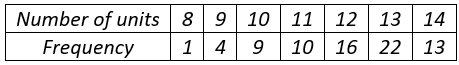
What is the median for this dataset?  Options: A) 10; B) 11; C) 12

For this question, the correct answer is 12. What are students who answer 10 or 11 thinking? A common student error is for students to confuse the frequencies with the actual data. A student who makes this error would find the median of the frequencies, which is 10. Another common student error is to confuse the possible values for number of units given in the frequency table with the actual data. A student who makes this error would find the median of the possible values (the numbers in the “Number of Units” column) and answer 11. The main thing to think about when putting a question like this together are these common student errors. That’s not a new idea when writing good multiple choice questions for student assessment, but the goal in writing for classroom assessment is to also think about what I am going to do if more than a few students pick one of the incorrect options. With this question, if almost all students get this correct, I can move on. But if more than a few students select incorrect answer (A), I can immediately adapt instruction to go back and address the particular student misunderstanding that leads to that incorrect answer. And I can do that in real time, not two weeks later after I have graded the first midterm exam.

Another example of a good clicker question that is related to the same student misunderstanding where frequencies are mistaken for data values is the following:

Which of the three histograms summarizes the dataset with the smallest standard deviation?

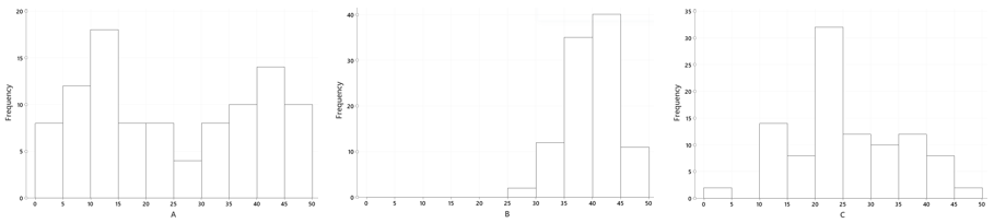
Students choosing either answers (A) or (C) are focusing on variability in the frequencies rather than variability in the data values. If I see students going for those answers, I can address that immediately, either through classroom discussion or by having students talk in small groups about the possibilities and come to an understanding of why answer choice (B) is the correct one.

Here is another example of a simple question that gets at understanding what is being measured by the interquartile range:

Which of the two dotplots displays the dataset with the smaller IQR?

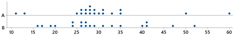
What is the error in thinking for the students who choose answer (B)? What would you do next if you asked this question in class and more than a few students selected this incorrect option?


I will only use a clicker question if I have a plan for what I will do as an immediate reaction to how students respond. Often, I can see that it is safe to move on, knowing that students are with me and that further discussion is not needed. In other cases, I find that I have some work to do!

So what is the difference between a clicker question and a multiple choice question? I think that pretty much any well-written multiple choice question can be used as a clicker question, so strategies for writing good multiple choice questions apply here as well. But I think of a good clicker question as a good multiple choice question that I can deliver in real time AND that is paired with a plan for how student responses will inform and change what I do next in class. I have used multiple choice questions from sources like the LOCUS and ARTIST projects (described at the end of this post) as clicker questions.

Consider the following question from the ARTIST question bank:

A newspaper article claims that the average age for people who receive food stamps is 40 years. You believe that the average age is less than that. You take a random sample of 100 people who receive food stamps, and find their average age to be 39.2 years. You find that this is significantly lower than the age of 40 stated in the article (p < 0.05). What would be an appropriate interpretation of this result?

  • (A) The statistically significant result indicates that the majority of people who receive food stamps is younger than 40.
  • (B) Although the result is statistically significant, the difference in age is not of practical importance.
  • (C) An error must have been made. This difference is too small to be statistically significant.

This is a multiple choice question that makes a great clicker question because students who choose answer (A) or answer (C) have misconceptions (different ones) that can be addressed in subsequent instruction.

The same is true for the following clicker question:

In order to investigate a claim that the average time required for the county fire department to respond to a reported fire is greater than 5 minutes, county staff determined the response times for 40 randomly selected fire reports.  The data was used to test H0:  μ = 5 versus Ha:  μ > 5 and the computed p-value was 0.12.  If a 0.05 level of significance is used, what conclusions can be drawn?

  • (A) There is convincing evidence that the mean response time is 5 minutes (or less).
  • (B) There is convincing evidence that the mean response time is greater than 5 minutes.
  • (C) There is not convincing evidence that the mean response time is greater than 5 minutes.

If very many students choose response (A), I need to revisit the meaning of “fail to reject the null hypothesis.” If many students go for (B), I need to revisit how to reach a conclusion based on a given p-value and significance level. And if everyone chooses (C), I am happy and can move on. Notice that there is a reason that I put the incorrect answer choice (A) before the correct answer choice (C). I did that because I need to know that students recognize answer choice (A) as wrong and want to make sure that they understand that answer is incorrect. If the correct choice (C) came first, they might just select that because it sounds good without understanding the difference between what is being said in (A) – convincing evidence for the null hypothesis – and what is being said in answer choice (C) – not convincing evidence against the null hypothesis.


I have given some thought about whether to have clicker question responses count toward the student’s grade and have experimented a bit with different strategies. Some teachers give participation points for answering a clicker question, whether the answer is correct or not. But because the value of clicker questions to me is classroom assessment, I really want students to try to answer the question correctly and not just click a random response. I need to know that students are making a sincere effort to answer correctly if I am going to adapt instruction based on the responses. But I also don’t want to put a heavy penalty for an incorrect answer. If students are making an effort to answer correctly, then I share partial responsibility for incorrect answers and may need to declare a classroom “do-over” if many students answer incorrectly. I usually include 3 to 4 clicker questions in a class period, so what I settled on is that students could earn up to 2 points for correct responses to clicker questions in each class period where I use clicker questions. While I use them in most class meetings, some class meetings are primarily activity-based and may not incorporate clicker questions (although clicker questions can sometimes be a useful in the closure part of a classroom activity as a way to make sure that students gained the understanding that the activity was designed to develop). Of course, giving students credit for correct answers assumes that you are not using the low-tech version of clicker questions described below, because that doesn’t keep track of individual student responses to particular questions.


Teachers can implement clicker questions in many ways. For example, ABCD cards can be used for clicker questions if you are teaching in a low tech or no tech environment:

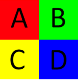
With ABCD cards, each student has a set of cards (colored cards make it easier to get a quick read on the responses). The instructor poses a question, provides time to think, and then has each student hold up the card corresponding to the answer. By doing a quick look around the classroom, the instructor gets a general idea of how the students responded.

The downside of ABCD cards is that there is no way to collect and display the responses or to record the responses for the purpose of awarding credit for correct responses. Students can also see which students chose which answers, so the responses are not anonymous to other students. In a big lecture class, it is also difficult for the instructor to “read” the class responses.

Physical clickers are small devices that students purchase. Student responses are picked up by a receiver and once polling is closed responses can be summarized and displayed immediately to provide quick feed back to both students and instructor. Several companies market clickers with educational discounts, such as TurningPoint (here) and iClickers (here).

There are also several web apps for polling that can be used for clicker questions if your students have smart phones or web access. A free app that is popular with teachers is Kahoot! (free for multiple choice; more question types, tools and reports for $3 or $6 per month, here). Another possibility is Poll Everywhere (free up to 25 students, then $120 per year for up to 700 students, here).

And finally, Zoom and some classroom management systems have built-in polling. I have used Zoom polls now that I am delivering some instruction online, and Zoom polls allow you to summarize and share results of polling questions. Zoom also has a setting that tracks individual responses if you want to use it for the purposes of assigning credit for correct answers.


I think incorporating good clicker questions has several benefits. It provides immediate feedback to students (they can see the correct answer and how other students answered), and it has changed the way that I interact with students and how students interact with the course. Students are more engaged and enjoy using this technology in class. They pay more attention because they never know when a clicker question is coming, and they want to get it right. And if they get it wrong, they want to see how other students answered.

But one important final note: If you are going to use clicker questions, it is really important to respond to them and be willing to modify instruction based on the responses. If students see that many did not get the right answer and you just say “Oh wow. Lots of you got that wrong, the right answer is C” and then move on as if you had never asked the question, students will be frustrated. On the other hand, if you respond and adjust instruction, students see that you are making student understanding a top priority!


P.S. LOCUS (Levels of Conceptual Understanding in Statistics, here) is a collection of multiple-choice and free-response assessment items that assess conceptual understanding of statistics. Items have all been tested with a large group of students, and the items on the website include commentary on student performance and common student errors. Designed to align with the Common Core State Standards, they follow the K-12 statistics curriculum. Because there is a great deal of overlap in the high school standards with the current college intro statistics course, there are many items (those for level B/C) that are usable at the college level.

ARTIST (Assessment Resource Tools for Improving Statistical Thinking, here) is a large bank of multiple-choice and free-response assessment items, which also includes several scales that measure understanding at the course level and also at a topic level. At the course level, the CAOS test (Comprehensive Assessment of Outcomes for a First Course in Statistics) consists of 40 conceptual multiple-choice questions. The topic scales are shorter collections of multiple-choice questions on a particular topic. There are more than 1000 items in the item bank, and you can search by topic and by question type, select items to use in a test and download them as a word document that you can edit to suit your own needs. You must register to use the item bank, but there is no cost.

This guest post has been contributed by Roxy Peck.  You can contact her at rpeck@calpoly.edu.

#54 Probability without calculus or computation

This guest post has been contributed by Kevin Ross.  You can contact him at kjross@calpoly.edu.

Kevin Ross is a faculty colleague of mine in the Statistics Department at Cal Poly – San Luis Obispo.  Kevin is a probabilist who excels at teaching introductory statistics as well as courses in probability and theoretical statistics.  Kevin is a co-developer of a Python package called Symbulate (here) that uses the language of probability to conduct simulations involving probability models (described in a JSE article here).  I have borrowed examples and exam questions from Kevin on many occasions, so I am very glad that he agreed to write this guest post describing some of his ideas for assessing students’ knowledge of probability concepts without asking for calculations or derivations.


Allan still hasn’t officially defined what a “good question” is (see the very end of post #52, Top thirteen topics, here), but he’s certainly given many examples.  I’ll try to add to the collection by presenting four types of questions for assessing knowledge of probability:

  1. Which is greater?
  2. How would you simulate?
  3. Sketch a plot
  4. “Don’t do what Donny Don’t does”

I frequently use each type of question in class, on homework assignments, on quizzes, and on exams. I use questions like the ones throughout this post in introductory statistics courses and in upper division probability courses typically taken by majors in statistics, mathematics, engineering, and economics. One common theme is that the questions require no probability calculations.  I think these questions facilitate and assess understanding of probability concepts much better than questions that require calculus derivations or formulaic computations.


1. Which is greater?

This type of multiple choice question was first inspired by “Linda is a bank teller” and other studies of Daniel Kahneman and Amos Tversky that Allan mentioned in post #51 (Randomness is hard, here).  The following example illustrates the basic structure:

a) Which of the following – A or B – is greater? Or are they equal? Or is there not enough information to decide? (A) The probability that a randomly selected Californians likes to surf; (B) The probability that a randomly selected American is a Californian who likes to surf; (C) A and B are exactly the same; (D) Not enough information to determine which of A or B is greater

The structure is simple – two quantities A and B and the same four answer choices – but this framework can be used to assess a wide variety of concepts in probability. In all of the following examples, the prompt is: Which of the following – A or B – is greater? Or are they equal? Or is there not enough information to decide?

b) Randomly select a U.S. resident. Let R be the event that the person is a California resident, and let G be the event that the person is a Cal Poly graduate. (A) P(G|R); (B) P(R|G); (C) A and B are exactly the same; (D) Not enough information to determine which of A or B is greater

The answer to (a) is A because the sample space for A (Californians) is a subset of the sample space for B (Americans). The answer to (b) is B because although the two conditional probabilities have the same numerator, the denominator is smaller for the conditional probability in B than for the one in A.

I ask many versions of “what is the denominator?” questions like (a) and (b). Symbols can easily be interchanged with words. Also, “probability” can be replaced with “proportion” to assess proportional reasoning in introductory courses.

c) A fair coin is flipped 10 times. (A) The probability that the results are, in order, HHHHHHTTTT; (B) The probability that the results are, in order, HHTHTHHTT; (C) A and B are exactly the same; (D) Not enough information to determine which of A or B is greater

d) A fair coin is flipped 10 times. (A) The probability that the flips result in 6 Hs and 4 Ts; (B) The probability that the results are, in order, HHTHTHHTT; (C) A and B are exactly the same; (D) Not enough information to determine which of A or B is greater

Questions like (c) and (d) can assess the ability to differentiate between specific outcomes (six Hs followed by four Ts) and general events (six Hs in ten flips). Many students select B in (c) because the sequence “looks more random”, but the outcomes in A and B are equally likely. The answer to (d) is A because the sequence in B is only one of many outcomes that satisfy the event in A.

e) Shuffle a standard deck of 52 playing cards (of which 4 are aces) and deal 5 cards, without replacement. (A) The probability that the first card dealt is an ace; (B) The probability that the fifth card dealt is an ace; (C) A and B are exactly the same; (D) Not enough information to determine which of A or B is greater

Students find this question very tricky, but it gets at an important distinction between conditional versus unconditional probability (or independence versus “identically distributed”).  The correct answer is C, because in the absence of any information about the first 4 cards dealt, the unconditional probability that the fifth card is an ace is 4/52. (I like to use five cards rather than just two or three to discourage students from enumerating the results of the draws.)

f) A box contains 30 marbles, about half of which are green and the rest gold.  A sample of 5 marbles is selected at random with replacement.  X is the number of green marbles in the sample and Y is the number of gold marbles in the sample. (A) Cov(X, Y); (B) 0; (C) A and B are exactly the same; (D) Not enough information to determine which of A or B is greater

Many students select C, thinking that “with replacement” implies independence.  But while the individual draws are independent, the random variables X and Y have a negative correlation: If there is a large number of green marbles in the sample, then there must be necessarily a small number of gold ones.

g) E and F are events (defined on the same probability space) with P(E) = 0.7 and P(F) = 0.6. (A) 0.42; (B) P(E ꓵ F); (C) A and B are exactly the same; (D) Not enough information to determine which of A or B is greater

The answer would be C if the events E and F were independent. But that is not necessarily true, and without further information all we can say is that P(E ꓵ F) is between 0.3 and 0.6, so the correct answer is D.  I frequently remind students to be careful about assuming independence.

h) X, Y, and Z are random variables, each following a Normal(100, 10) distribution. (A) P(X + Y > 200); (B) P(X + Z > 200); (C) A and B are exactly the same; (D) Not enough information to determine which of A or B is greater

Some students select C, thinking that because Y and Z have the same distribution, then so do X + Y and X + Z.  However, X and Y do not necessarily have the same joint distribution as X and Z, and the joint distribution affects the distribution of the sum.  If X, Y, and Z were independent, then the answer would be C, but without that information (remember to be careful about assuming independence!) the answer is D.

i) X and Y are independent random variables, each following a Normal(100, 10) distribution. (A) X; (B) Y; (C) A and B are exactly the same; (D) Not enough information to determine which of A or B is greater

Some students select C, because X and Y have the same distribution.  But there are (infinitely) many potential values these random variables can take, so it’s impossible to know which one will be greater.  The following is a more difficult version of this idea; again, students often choose C but the correct answer is D.

j) X, Y, and Z are independent random variables, with X ~ Poisson(1), Y ~ Poisson(2), and Z~Poisson(3). (A) X + Y; (B) Z; (C) A and B are exactly the same; (D) Not enough information to determine which of A or B is greater

The last four examples illustrate two major themes behind many of the questions I ask in probability courses:

  • Marginal distributions alone are not enough to determine joint distributions.
  • Do not confuse a random variable with its distribution.

Many common mistakes in probability result from not heeding these two principles, so I think it’s important to give students lots of practice with these ideas and assess them frequently.


2. How would you simulate?

In virtually every probability problem I introduce, one of the first questions I ask is “how would you simulate?” Such questions are a great way to assess student understanding of probability distributions and their properties, and concepts like expected value or conditional probability, without doing any calculations.

a) Describe in detail how you could, in principle, perform by hand a simulation involving physical objects (coins, dice, spinners, cards, boxes, etc.) to estimate P(X = 5 | X > 2), where X has a Binomial distribution with parameters n=5 and p=2/7.  Be sure to describe (1) what one repetition of the simulation entails, and (2) how you would use the results of many repetitions.  Note: You do NOT need to compute any numerical values.

Here is a detailed response:

  1. To simulate a single value of X, we can use the “story” for a Binomial distribution and think of X as counting the number of successes in 5 Bernoulli trials with probability of success 2/7.  To simulate a single trial, construct a spinner with 2/7 of the area shaded as success*.  To simulate a single value of X, spin the spinner 5 times and count the number of successes. If X > 2, record the value of X.  Otherwise, discard it and try again to complete step (1)**.
  2. Repeat step (1) 10,000 times, to obtain 10000 values of X with X > 2.  Count the number of simulated values of X that are equal to 5 and divide by 10,000 to approximate P(X = 5 | X > 2).

* There are many possible randomization devices, including a seven-sided die or a deck of seven cards with two labeled as success.  However, it’s important that students implement independent trials, so they must indicate that cards are drawn with replacement.

** I also accept an answer that omits the “discard” part of step (1) and replaces step (2) with: Repeat step (1) 10,000 times to obtain 10,000 values of X.  Divide the number of simulated values of X that are equal to 5 by the number of simulated values of X that are greater than 2 to approximate P(X = 5 | X > 2).  Each method provides a point estimate of the conditional probability, but they differ with respect to simulation margin-of-error.  I discuss in class how the method which includes the “discard” part of step (1) is less computationally efficient but results in a smaller margin-of-error.

Students often write vague statements like “repeat this many times.”  But “this” could be a single spin of the spinner or a generating a single value of X. Therefore, it’s important that students’ responses clearly distinguish between (1) one repetition and (2) many repetitions. 

(b) Repeat (a) for the goal of estimating Cov(V, W), where V = X + Y, W = max(X, Y), and X, Y are i.i.d. Normal(100, 15). Assume that you have access to a Normal(0, 1) spinner.

Part (b) illustrates how tactile simulation can be used even with more advanced concepts like continuous or joint distributions.  I repeatedly use the analogy that every probability distribution can be represented by a spinner, like the following picture corresponding to a Normal(0, 1) distribution:

Notice how the values on the spinner are not evenly spaced; the sector corresponding to the range [0, 1] comprises 34.1% of the area while [1, 2] comprises 13.6%. (With more mathematically inclined students I discuss how to create such spinners by inverting cumulative distribution functions.) I have many clear plastic spinners that can be overlaid upon pictures like the above so students can simulate by hand values from a variety of distributions.

Here is a detailed response to part (b):

  1. To simulate a single (V, W) pair: Spin the Normal(0, 1) spinner to obtain Z1, and let X = 100 + 15 × Z1. Spin the Normal(0, 1) spinner again to obtain Z2, and let Y = 100 + 15 × Z2. Add the X and Y values to obtain V = X + Y, and take the larger of X and Y to obtain W = max(X, Y). Record the values of V, W, and their product VW.
  2. Repeat step (1) 10,000 times to obtain 10,000 values each of V, W, and VW.  Average the values of VW and subtract the product of the average of the V values and the average of the W values to approximate Cov(V, W).

I do think it’s important that students can write their own code to implement simulations.  But I generally prefer “describe in words” questions to “write the code” to avoid syntax issues, especially during timed exams.  When I want to assess student understanding of actual code on an exam, I provide the code and ask what the output would be. Of course, after discussing how to simulate and simulating a few repetitions by hand, we then carry out a computer simulation.  But before looking at the results, I often ask students to sketch a plot, as described in the next section.


3. Sketch a plot

As students progress in probability and statistics courses, they encounter many probability distributions but often have difficulty understanding just what all these distributions are.  Asking students to sketch plots, as in the following example, helps solidify understanding of random variables and distributions without any difficult calculus.

Suppose that X has a Normal(0, 1) distribution, U has a Uniform(-2, 2) distribution, X and U are independent, and Y = UX. For each of the following, sketch a plot representing the distribution.  The sketch does not have to be exact, but it should explicitly illustrate the most important features.  Be sure to clearly label any axes with appropriate values.  Explain the important features your plot illustrates and your reasoning*. (a) the conditional distribution of Y given U = -0.5; (b) the joint distribution of X and Y.

* I usually give full credit to well-drawn and carefully labeled plots regardless of the quality of explanation.  But “explaining in words” can help students who have trouble translating ideas into pictures.

Part (a) is not too hard once students realize they should draw a Normal(0, 0.5) density curve*, but it does take some thought to get to that point.  Even though the answer is just a normal curve, the question still assesses understanding of conditioning (treating U as constant) and the effect of a linear transformation.  The question also assesses the important difference between operations on random variables versus operations on distributions; it is X that is multiplied by -0.5, not its density. (Unfortunately, some students forget this and draw an upside-down normal curve.)

* However, I do deduct points if the variable axis isn’t labeled, or if the inflection points are not located at -0.5 and 0.5.  (The values on the density axis are irrelevant.)

Part (b) is much harder. Here is an excellent student solution:

Students tend to find this type of question challenging, even after encountering examples in class activities and assignments. Here are some questions that I pose during class examples, which I hope students ask of themselves on assessments, to help them unpack these problems:

  1. What is one possible plot point?  A few possible points? Students often have trouble even starting these problems, so just identifying a few possibilities can help.
  2. What type of plot is appropriate? Since X and Y are two continuous random variables, a scatterplot or joint density plot is appropriate.
  3. What are the possible values of the random variable(s)? After identifying a few possible values, I ask students to identify all the possible values and start labeling axes. Since X ~ Normal(0, 1), 99.7% of the values of X will fall between -3 and 3, so we can label the X-axis from -3 to 3.  (Remember, it doesn’t have to be perfect.) The value of Y depends on both X and U; identifying a few examples in step 1 helps students see how.  Given X = x, Y has a Uniform(-2|x|, 2|x|) distribution, so larger values of |x| correspond to more extreme values of Y.  Since most values of X lie between -3 and 3, most values of Y lie between -6 and 6, so we can label the Y-axis from -6 to 6.  But not all (X, Y) pairs are possible; only pairs within the region bounded by the lines y = 2x and y = -2x have nonzero density.  If students can make it to this point, drawing a plot with well-labeled axes and the “X-shaped” region of possible values, then they’ve made great progress.
  4. What ranges of values are more likely?  Less likely? Values of X near 0 are more likely, and far from 0 are less likely.  Within each vertical strip corresponding to an x value, the Y values are distributed uniformly, so the density is stretched thinner over longer vertical strips. These observations help us shade the plot as in the example.

Determining an expression for the joint density in part (b) is a difficult calculus problem involving Jacobians.  Even students who are able to do the calculus to obtain the correct density might not be able to interpret what it means for two random variables to have this joint density.  Furthermore, even if students are provided the joint density function, they might not be able to sketch a plot or understand what it means. But I’m pretty confident that students who draw plots like the above have a solid understanding of concepts including normal distributions, uniform distributions, joint distributions, and transformations.


4. “Don’t do what Donny Don’t does”

This title is an old Simpson’s reference (see here). In these questions, Donny Don’t represents a student who makes many common mistakes. Students can learn from the common mistakes that Donny makes by identifying what is wrong and why, and also by helping Donny understand and correct his mistakes.

At various points in his homework, Donny Don’t writes the following expressions. Using simple examples, explain to Donny which of his statements are nonsense, and why. (A represents an event, X a random variable, P a probability measure, and E an expected value.) a) P(A = 0.5); b) P(A)∪ P(B); c) P(X); d) P(X = E(X)).

I’ll respond to Donny using tomorrow’s weather as an example, with A representing the event that it rains tomorrow, X tomorrow’s high temperature (in degrees F), and B the event that tomorrow’s high temperature is above 80 degrees.

(a) It doesn’t make sense to say “it rains tomorrow equals 0.5.” If Donny wants to say “the probability that it rains tomorrow equals 0.5” he should write P(A) = 0.5. (Mathematically, A is a set and 0.5 is a number, so it doesn’t make sense to equate them.)

(b) What Donny has written reads as “the probability that it rains tomorrow or the probability that tomorrow’s high temperature is above 80 degrees F,” which doesn’t make much sense.  Donny probably means “the probability that (it rains tomorrow) or (tomorrow’s high temperature is above 80 degrees),” which he should write as P(A ∪ B). (Mathematically, P(A) and P(B) are numbers while union is an operation on sets, so it doesn’t make mathematical sense to take a union of numbers.) Donny might have meant to write P(A) + P(B), which is valid expression since P(A) and P(B) are numbers. However, he should keep in mind that P(A) + P(B) is not necessarily a probability of anything; this sum could even be greater than one.  In particular, since there are some rainy days with high temperatures above 80 degrees, P(A) + P(B) is greater than P(A ∪ B).

(c) Donny has written “the probability that tomorrow’s high temperature,” which is a subject in need of a predicate.  We assign probabilities to things that could happen (events) like “tomorrow’s high temperature is above 80 degrees,” which has probability P(X > 80).

(d) Donny’s notation is actually correct!  Students often find this expression strange at first, but since E(X) represents a single number, P(X = E(X)) makes just as much sense as P(X = 80). Even if we don’t know the value of E(X), it still makes sense to consider “the probability that tomorrow’s high temperature is equal to the average high temperature.” Some students might object that X is continuous and so P(X = E(X)) = 0, but P(X = E(X)) is still a valid expression even when it equals 0.

Questions like this do more than encourage and assess proper use of notation.  Explaining to Donny why he is wrong helps students better understand the probabilistic objects that symbols represent and how they connect to real-world contexts.


I hope these examples demonstrate that even in advanced courses in probability or theoretical statistics, instructors can ask a variety of probability questions that don’t require any computation or calculus.  Such questions can not only assess students’ understanding of probability concepts but also help them to develop their understanding in the first place.  I have many more examples that I’d be happy share, so please feel free to contact me (kjross@calpoly.edu)!

P.S. Many thanks to Allan for having me as a guest, and thanks to you for reading!

This guest post has been contributed by Kevin Ross.  You can contact him at kjross@calpoly.edu.

#53 Random champions

This guest post has been contributed by Josh Tabor. You can contact him at TaborStats@gmail.com.

Josh Tabor teaches AP Statistics at Canyon del Oro High School in Oro Valley, Arizona, near Tucson*.  He is a co-author of a widely used textbook for AP Statistics, titled The Practice of Statistics.  He also co-wrote Statistical Reasoning in Sports, a textbook that uses simulation-based inference from the very first chapter.  Josh and I have worked together for many years at the AP Statistics Reading, and we have also presented at some of the same workshops and conferences.  Even more fun, we have attended some pre-season baseball games together in Arizona.  Josh is a terrific presenter and expositor of statistical ideas, so I am delighted that he agreed to bat lead-off for this series of guest bloggers.  Sticking with the baseball theme, he has written a post about randomness, simulation, World Series champions, teaching statistical inference, and asking good questions.

* Doesn’t it seem like the letters c and s are batting out of order in Tucson?


I am a big believer in the value of simulation-based inference, particularly for introducing the logic of significance testing. I start my AP Statistics class with a simulation-based inference activity, and try to incorporate several more before introducing traditional inference. Many of these activities foreshadow specific inference procedures like a two-sample z-test for a difference in proportions, but that isn’t my primary goal. Instead, my goal is to highlight how all significance tests follow the same logic, regardless of the type of data being collected. The example that follows doesn’t align with any of the tests in a typical introductory statistics class, but it is a fun context and helps achieve my goal of developing conceptual understanding of significance testing.


In a 2014 article in Sports Illustrated (here), author Michael Rosenberg addresses “America’s Wait Problem.” That is, he discusses how fans of some teams have to wait many, many years for their team to win a championship. In Major League Baseball, which has 30 teams, fans should expect to wait an average of 30 years for a championship—assuming all 30 teams are equally likely to win a championship each season. But is it reasonable to believe that all teams are equally likely to win a championship?

Rosenberg doesn’t think so. As evidence, he points out that in the previous 18 seasons, only 10 different teams won the World Series. Does having only 10 different champions in 18 seasons provide convincing evidence that the 30 teams are not equally likely to win a championship?

Before addressing whether the evidence is convincing, I start my students off with a (perhaps) simpler question:

  • Rosenberg suggests that having 10 different champions in 18 seasons is evidence that teams are not equally likely to win a championship. How does this evidence support Rosenberg’s claim?

This isn’t the first time I have asked such a question to my students. From the beginning of the year, we have done a variety of informal significance tests, like the ones Allan describes in posts #12, #27, and #45 (here, here, and here). In most previous cases, it has been easy for students to identify how the given evidence supports a claim. For example, if we are testing the claim that a population proportion p > 0.50 and obtain a sample proportion of p-hat = 0.63, then recognizing that p-hat = 0.63 > 0.50 is very straightforward.

In this case, the statistic presented as evidence is quite different from a simple proportion or mean or even a correlation coefficient. Here the statistic is the number of different champions in an 18-year period of time. Some students will naively suggest that if teams are equally likely to win a championship, there should be 18 different champions in 18 seasons. And because 10 < 18, these data provide the evidence we are looking for. If students go down this path, you might ask a follow-up question: If you were to roll a die 6 times, would you expect to get 6 different results? If you have the time, you might even pull out a die and give it 6 rolls. (If you are nervous, there is less than a 2% chance of getting 6 different outcomes in 6 rolls of a fair die*.)

* This calculation is:

Once students are convinced that 18 is the wrong number to compare to, I pose a new question:

  • If all 30 teams are equally likely to win a championship, what is the expected value of the number of different champions in 18 seasons?

There is no formula that I know of that addresses this question. Which leads to another question:

  • What numbers of different champions (in 18 seasons) are likely to happen by chance alone, assuming all 30 teams are equally likely to win a championship?

Upon hearing the words “by chance alone,” my students know how to determine an answer: Simulation! Now for more questions:

  • How can you simulate the selection of a World Series champion, assuming all teams are equally likely to win the championship?
  • How do you conduct 1 repetition of your simulation?
  • What do you record after each repetition of your simulation?

If we have time, I like students to work in groups and discuss their ideas. There are a variety of different approaches that students take to answer the first question: rolling a 30-sided die, with each side representing a different team; putting the names of the 30 teams in a hat, mixing them up, and choosing a team; or spinning 30-section spinner, with each section having the same area and representing one of the teams. I am happy when students think of physical ways to do the simulation, as that is what I have modeled since the beginning of the year. But I am also happy when they figure out a way to use technology: Generate a random integer from 1–30, where each integer represents a different team.

Assuming that students settle on the random integer approach, they still need to figure out how to complete one repetition of the simulation. In this case, they would need to generate 18* integers from 1–30, one integer (champion) for each season, allowing for repeated integers**. To complete the repetition, they must determine the value of the simulated statistic by recording the number of different integers in the set of 18. For example, there are 14 different champions in the following set of 18 random integers (repeat champions underlined): 22, 24, 17, 14, 8, 1, 11, 9, 25, 17, 17, 24, 16, 7, 18, 16, 30, 19.

* As I was brainstorming for this post, I started by counting the number of champions in the previous 30 MLB seasons, rather than the 18 seasons mentioned in the article. I didn’t want to be guilty of cherry-picking a boundary to help make my case. And 30 seemed like a nice number because it would allow for the (very unlikely) possibility of each team winning the championship once (not because of the central limit theorem!). But, using the same number in two different ways (30 teams, 30 seasons) is sure to create confusion for students. So I stuck with the 18-season window from the article.  Also, I realized that an 18-season window captures an entire lifetime for my students.

** Early in my teaching career (2001 to be precise), there was a simulation question on the AP Statistics exam that required students to account for sampling without replacement. Until then, we had always done examples where this wasn’t an issue. After 2001, I made a big deal about “ignoring repeats” until I realized that students were now including this phrase all the time, even when it wasn’t appropriate. I now try include a variety of examples, with only some requiring students to “ignore repeats.”  In this context of sports champions, of course, repeats are at the very heart of the issue we’re studying.


Once students have had the opportunity to share their ideas, we turn to technology to run the simulation. My software of choice for simulation is Fathom (here), but there are many alternatives. Here are the results of 10,000 repetitions of the simulation. That is, the results of 10,000 simulated sets of 18 seasons, assuming all 30 teams are equally likely to win the championship each year:

In this simulation of 10,000 seasons, the mean number of different champions is 13.71, and the standard deviation is 1.39. The minimum value is 9, and the maximum is 18, which indicates that every season had a different champion for at least one of the 10,000 simulated seasons.

Back to the questions:

  • There is a dot at 9. What does this dot represent?

This is one of my very favorite questions to ask anytime we do a simulation. In this case, the dot at 9 represents one simulated 18-year period where there were 9 different champions.

  • Using the results of the simulation, explain how having 10 champions in 18 seasons is evidence for Rosenberg’s claim that teams are not equally likely to win a championship.

Note that I am not asking whether the evidence is convincing. Yet. For now, I want students to notice that the expected number of different champions is 13 or 14 (expected value  13.71) when each team is equally likely to win the championship over an 18-year period. And most importantly, 10 is less than 13 or 14. So, Rosenberg’s intuition was correct when he cited the value of this statistic as evidence for his claim. Now that we have identified the evidence, I ask the following:

  • What are some explanations for the evidence? In other words, what are some plausible explanations for why we got a value less than 14?

My students have already been through this routine several times, so they are pretty good about answering this question. And if they can provide the explanations in my preferred order*, I am especially happy.

  • Explanation #1: All teams are equally likely to win the championship each year, and the results in our study happened by chance alone. Note that both clauses of this sentence are very important. My students always get the second half (“it happened by chance!”), but they also need the first part to have a complete explanation.
  • Explanation #2: Teams aren’t equally likely to win the championship. In other words, some teams are more likely to win championships than others (sorry, Seattle Mariners fans!).

* This is my preferred order because it parallels the null and alternative hypotheses that we will discuss later in the year.

Once these two explanations are identified, we return to the original question:

  • Does having 10 different champions in 18 seasons provide convincing evidence that all teams are not equally likely to win a championship?

For evidence to be convincing, we must be able to essentially rule out Explanation #1. Can we? To rule out Explanation #1, we need to know how likely it is to get evidence as strong or stronger than the evidence we found in our study, assuming that all teams are equally likely to win the championship each year.

  • How can you use the dotplot to determine if the evidence is convincing?

When I am leading students through this discussion, there are usually a few who correctly respond “See how often we got a result of 10 or fewer by chance alone.” But when I ask similar questions on exams, many students don’t provide the correct answer. Instead, they give some version of the following: “Because nearly half of the dots are less than the mean, it is possible that this happened by chance alone.”* The use of the word “this” in the previous sentence points to the problem: students aren’t clear about what event they are supposed to consider. Once I started asking students to state the evidence at the beginning of an example, this error has occurred less often.  

* This is even more common when there is a clearly stated null hypothesis like H0: p1p2 = 0 and students are tempted to say “because about half of the dots are positive…”

  • In the simulation, 98 of the 10,000 simulated seasons resulted in 10 or fewer different champions, as highlighted in the graph below.  Based on this result, what conclusion would you make?

In the simulation, getting a result of 10 or fewer different champions was pretty rare, occurring only 98 times in 10,000 repetitions* (probability  0.0098). Because it is unlikely to get 10 or fewer different champions by chance alone when all 30 teams are equally likely to win the championship, there is convincing evidence that teams in this 18-year period were not equally likely to win the championship.

* Of course, this describes a p-value. I don’t call it a p-value until later in the year, but I am careful to use correct language, including the assumption that the null hypothesis is true.


As always, the scope of inference is important to consider. I also like to give students experience with raw data that allows them to determine the value of the statistic for themselves.  I remind students that the conclusion above was about “this 18-year period.” That is, the 18-year period prior to the article’s publication in November 2014. Here are the World Series champions for the 18-year period from 2002–2019*:

* In addition to matching the 18-year period length from the article, this allows me to include my favorite team in the list of World Series champions: Go Angels! It also makes me feel old as most of my current students weren’t even alive in 2002!

  • What are the observational units for these sample data?  What is the variable?  What statistic will we determine from this sample?  What is the value of that statistic for this sample?

The observational units are the 18 seasons, and the variable is the World Series champion for that season. The statistic is the number of different champions in these 18 seasons. There were 12 different champions in this 18-year period. The repeat champions were the Boston Red Sox (4 times), San Francisco Giants (3 times), and St. Louis Cardinals (twice).

  • To determine if these data provide convincing evidence that all teams are not equally likely to win a championship in 2002–2019, do we need to conduct a different simulation?

No. Because the number of seasons (18) and the number of teams (30) are still the same, we can use the results of the previous simulation to answer the question about 2002–2019.

  • For the 18-year period from 2002–2019, is there convincing evidence that all teams are not equally likely to win a championship?

No. The graph of simulation results shows that a result of 12 or fewer different champions in 18 seasons is not unusual (probability  0.1916). Because it is not unlikely to get 12 or fewer different champions by chance alone, when all 30 teams are equally likely to win the championship each season, the data do not provide convincing evidence that teams in this 18-year period were not equally likely to win the championship. In other words, it is plausible that all 30 teams were equally likely to win the championship in the period from 2002–2019*.

* To avoid the awkward double negative in their conclusions, it is very tempting for students to include statements like the final sentence in the preceding paragraph. Unfortunately, they usually leave out wiggle phrases like “it is plausible that” or “it is believable that.” Once your students have had some experience making conclusions, it is important to caution them to never “accept the null hypothesis” by suggesting that there is convincing evidence for the null hypothesis.  In this context, no sports fan really believes that all teams are equally likely to win the championship each season, but the small sample size does not provide convincing evidence to reject that claim.


If you have the time and students seem interested in this topic, you can expand into other sports. Here are some questions you might ask about the National Football League:

  • Do you think there would be stronger or weaker evidence that NFL teams from the previous 18 seasons aren’t equally likely to win a championship?

Most people expect the evidence to be stronger for the NFL. Even though the NFL tries to encourage parity, the New England Patriots seem to hog lots of Super Bowl titles.

  • If we were to simulate the number of different champions in an 18-year period for the NFL, assuming all 32 teams are equally likely to win a championship, how would conducting the simulation differ from the earlier baseball simulation?

Instead of generating 18 integers from 1–30, we would generate 18 integers from 1–32.

  • How do you think the results of the simulation would differ?

With more teams available to win the championship, the expected value of the number of different champions should increase.

  • It just so happens that 12 different NFL teams have won a championship in the previous 18 seasons, the same as the number of MLB teams that have won a championship in the previous 18 seasons. (The Patriots won 5 of these championships.) Based on your answer to the previous question, would the probability of getting 12 or fewer NFL champions by chance alone be larger, smaller, or about the same as the probability in the MLB simulation (0.1916)?

This probability will be smaller, as the expected number of different champions in the NFL is greater than in MLB, so values of 12 or fewer will be less likely in the NFL simulation.

Here are the results of 10,000 simulated 18-season periods for the NFL:

The most common outcome is still 14 different champions, but the mean number of different champions increases from about 13.71 with MLB to about 13.94 with NFL. (The standard deviation also increases from 1.39 to 1.41).

The p-value for the NFL data is about 0.1495, smaller (as expected) than the p-value of 0.1916 for the MLB data. However, because the  p-value is not small, these data do not provide convincing evidence that the 32 NFL teams are not equally likely to win the championship each season.


Each time we do an informal significance test like this one, I rehearse the logic with my students:

  1. Identify the statistic to be used as evidence, and explain why it counts as evidence for the claim being tested.
  2. Describe the two explanations for the evidence.
  3. Use simulation to explore what is likely to happen by chance alone.
  4. Compare the evidence to what is likely to happen by chance alone. If it is unlikely to get evidence as strong as or stronger than the observed evidence, then the evidence is convincing.

P.S. Thanks to Allan for letting me share some thoughts in this post. And thanks for each of the 52 entries that precede this one!

This guest post has been contributed by Josh Tabor. You can contact him at TaborStats@gmail.com.

#52 Top thirteen topics

After I present an activity on a particular statistical topic while conducting a workshop for teachers, I often say something like: I think this is one of the top ten things for students to learn in introductory statistics.  Naturally enough, a workshop participant always asks me to provide my complete “top ten” list.  My sheepish response has always been to beg off, admitting that I have never taken the time to sit down and compile such a list*.

* Workshop participants have always been too polite to ask how, in that case, I can be so sure that the topic in question is actually on that imaginary list of mine.

To mark the 52nd post and one-year milestone for this weekly blog, I have finally persuaded myself to produce my list of most important topics for students to learn in introductory statistics.  I hope you will forgive me for expanding the number of topics to a lucky thirteen*.  Commenting on this list also provides an opportunity for me to reflect on several earlier posts from my year of blogging. * I also recommend the “top seven” list produced by Jessica Utts in an article for The American Statistician in 2003 (here), to which she added an additional four topics at an ICOTS presentation in 2010 (here).

Unlike previous posts, this one poses no questions for students to appear in italics.  Instead I focus on the question that has often been asked of me: What are the most important topics for students to learn in introductory statistics?


1. Identifying observational units and variables points the way.

In post #11 (Repeat after me, here), I repeated over and over again that I ask students to identify observational units and variables for almost every example that we study throughout the entire course.  Along with identifying the variables, I ask students to classify them as categorical or numerical, explanatory or response.  Thinking through these aspects of a statistical study helps students to understand how the study was conducted and what its research questions were.  These questions also point the way to knowing what kind of graph to produce, what kind of statistic to calculate, and what kind of inference procedure to conduct.  I have found that identifying observational units and variables is more challenging for students than I used to think.

One of my favorite examples to illustrate this concerns the murder trial of Kristen Gilbert, a nurse accused of being a serial killer of patients.  The following data were presented at her trial:

The observational units here are hospital shifts, not patients.  The explanatory variable is whether or not Gilbert was working on the shift, which is categorical and binary.  The response variable is whether or not a patient died on the shift, which is also categorical and binary.  Students need to understand these basic ideas before they can analyze and draw conclusions from these data.


2. Proportional reasoning, and working with percentages, can be tricky but are crucial.

I suspect that at least two-thirds of my blog posts have included proportions or percentages*.  Proportions and percentages abound in everyday life.  Helping students to work with percentages, and to recognize the need for proportional reasoning, is a worthy goal for introductory statistics courses.

* This very sentence contains a proportion, even if it is only a guess.

Look back at the table of counts from the Kristen Gilbert trial.  Students who do not think proportionally simply compare the counts 40 and 34, which suggests a small difference between the groups.  But engaging in proportional reasoning reveals a huge discrepancy: 40/257 ≈ 0.156 and 34/1384 ≈ 0.025.  In other words, 15.6% of shifts on which Gilbert worked saw a patient death, compared to 2.5% of shifts on which Gilbert did not work.  These percentages are displayed in the segmented bar graph:

What’s so tricky about this?  Well, converting the proportions to statements involving percentages is non-trivial, particularly as these are conditional percentages.  More challenging is that many students are tempted to conclude that the death rate on Gilbert shifts is 13.1% higher than the death rate on non-Gilbert shifts, because 0.156 – 0.025 = 0.131.  But that’s not how percentage difference works, as I ranted about at length in post #28 (A pervasive pet peeve, here).  The actual percentage difference in the death rates between these groups is (0.156 – 0.025) / 0.025 × 100% ≈ 533.6%.  Yes, that’s right: The death rate on a Gilbert shift was 533.6% higher than the death rate on a non-Gilbert shift!  This gives quite a different impression that the incorrect claim of a 13.1% difference.

The importance of proportional reasoning also arises when working with probabilities.  I strongly recommend producing a table of hypothetical counts to help students work with conditional probabilities.  For example, I used that technique in post #10 (My favorite theorem, here) to lead students to distinguish between two conditional probabilities: (1) the probability that a person with a positive test result has the disease, and (2) the probability that the test result is positive among people who have the disease, as shown in the table:


3. Averages reveal statistical tendencies.

The concept of a statistical tendency is a fundamental one that arises in all aspects of life.  What do we mean when we say that dogs are larger than cats?  We certainly do not mean that every dog is larger than every cat.  We mean that dogs tend to be larger than cats.  We also express this idea by saying that dogs are larger than cats on average.  We can further explain that if you encounter a dog and a cat at random, it’s more likely than not that the dog will be larger than the cat*.

Understanding statements of statistical tendencies, and learning to write such statements clearly, is an important goal for introductory statistics students.  Is this an easy goal to achieve?  Not at all.  I mentioned in post #37 (What’s in a name? here) that psychologist Keith Stanovich has described this skill, and probabilistic reasoning more generally, as the “Achilles Heel” of human cognition.

The dogs and cats example is an obvious one, but averages can also help us to see a signal in the midst of considerable noise.  Post #9 (Statistics of illumination, part 3, here) about the infamous 1970 draft lottery illustrates this point.  The scatterplot on the left, displaying draft number versus day of the year, reveals nothing but random scatter (noise) on first glance.  But calculating the median draft number for each month reveals a clear pattern (signal), as shown on the right:

You might be thinking that students study averages beginning in middle school or even sooner, so do we really need to spend time on averages in high school or college or courses?  In post #5 (A below-average joke, here), I argued that we can help students to develop a deeper understanding of how averages work by asking questions such as: How could it happen that the average IQ dropped in both states when I moved from Pennsylvania to California?


4. Variability, and distributional thinking, are fundamental.

Averages are important, but variability is at the core of statistical thinking.  Helping students to regard a distribution of data as a single entity is important but challenging.  For example, post #4 (Statistics of illumination, part 2, here) described an activity based on data about readability of cancer pamphlets.  I ask students to calculate medians for a dataset on pamphlet readability and also for a dataset on patient reading levels.  The medians turn out to be identical, but that only obscures the more important point about variability and distribution.  Examining a simple graph reveals the underlying problem that many patients lack the skill to read the simplest pamphlet:

In posts #6 and #7 (Two dreaded words, here and here), I suggested that we can help students to overcome their dread of the words standard deviation by focusing on the concept of variability rather than dreary calculations that are better performed by technology.  I also argued in post #8 (End of the alphabet, here) that z-scores are an underappreciated idea that enable us to compare proverbial apples and oranges by taking variability into account.


5. Visual displays of data can be very illuminating.

In light of the graphs presented above, I trust that this point needs no explanation.


6. Association is not causation; always look for other sources of variability.

Distinguishing causation from association often prompts my workshop comment that I mentioned in the first sentence of this post.  I want students to emerge from their introductory statistics course knowing that inferring a cause-and-effect relationship from an observed association is often unwarranted.  Posts #43 and #44 (Confounding, here and here) provide many examples.

The idea of confounding leads naturally to studying multivariable thinking.  Post #3 (Statistics of illumination, part 1, here) introduced this topic in the context of graduate admission decisions.  Male applicants had a much higher acceptance rate than female applicants, but the discrepancy disappeared, and even reversed a bit, after controlling for the program to which they applied.  For whatever reason, most men applied to the program with a high acceptance rate, while most women applied to the program with a very low acceptance rate.

Post #35 (Statistics of illumination, part 4, here) continued this theme in the context of comparing lung capacities between smokers and non-smokers.  Surprisingly enough, smokers in that study tended to have larger lung capacities than non-smokers.  This perplexing result was explained by considering the ages of the people, who were all teenagers and younger.  Smokers were much more likely to be older than younger, and older kids tended to have larger lung capacities than younger ones.  The following graph reveals the relationships among all three variables:


7. Randomized experiments, featuring random assignment to groups, allow for cause-and-effect conclusions.

Some students take the previous point too far, leaving their course convinced that they should never draw cause-and-effect conclusions.  I try to impress upon them that well-designed randomized experiments do permit drawing cause-and-effect conclusions, as long as the difference between the groups turns out to be larger than can plausibly be explained by random chance.  Why are the possible effects of confounding variables less of a concern with randomized experiments?  Because random assignment of observational units to explanatory variable groups controls for other variables by balancing them out among the groups.

Post #20 (Lincoln and Mandela, part 2, here) describes a class activity that investigates the psychological phenomenon known as anchoring by collecting data from students with a randomized experiment.  Students are asked to guess the age at which Nelson Mandela died, but some students first see the number 16 while others see the number 160.  The following graph displays the responses for one of my classes. These data strongly suggest that those primed with 160 tend to make larger guesses than those primed with 16:

Posts #27 and #45 (Simulation-based inference, parts 2 and 3, here and here) also featured randomized experiments.  We used simulation-based inference to analyze and draw conclusions from experiments that investigated effects of metal bands on penguin survival and of fish oil supplements on weight loss.


8. Random sampling allows for generalizing, but it’s very hard to achieve.

Random sampling is very different from random assignment.  These two techniques share an important word, but they have different goals and consequences.  Random sampling aims to select a representative sample from a population, so results from the sample can be generalized to the population.

I described how I introduce random sampling to my students in post #19 (Lincoln and Mandela, part 1, here).  In this activity, students select samples of words from the Gettysburg Address.  First students select their sample simply by circling ten words that appeal to them.  They come to realize that this sampling method is biased toward longer words.  Then they use genuine random sampling to select their sample of words, finding that this process is truly unbiased.  The following graphs (from the applet here) help students to recognize the difference between three distributions: 1) the distribution of word lengths in the population, 2) the distribution of word lengths in a random sample from that population, and 3) the distribution of sample mean word lengths in 1000 random samples selected from the population:

I emphasize to students that while selecting a random sample of words from a speech is straight-forward, selecting a random sample of human beings is anything but.  Standing in front of the campus library or recreation center and selecting students in a haphazard manner does not constitute random sampling.  Even if you are fortunate enough to have a list of all people in the population of interest from which to select a random sample, some people may choose not to participate, which leaves you with a non-random sample of people for your study.


9. Analyzing random phenomena requires studying long-run behavior.

There’s no getting around the fact that much of statistics, and all of probability, depends on asking: What would happen in the long run?  Such “long run” concepts are hard to learn because they are, well, conceptual, rather than concrete.  Fortunately, we can make these concepts more tangible by employing the most powerful tool in our pedagogical toolbox: simulation!

Post #17 (Random babies, here) presents an activity for introducing students to basic ideas of randomness and probability.  Students use index cards to simulate the random process of distributing four newborn babies to their mothers at random.  Then they use an applet (here) to conduct this simulation much more quickly and efficiently.  Post #18 (What do you expect? here) follows up by introducing the concept of expected value.  The following graph shows how the average number of correct matches (of babies to mothers) changes for the first 1000 repetitions of simulating the random process, gradually approaching the long-run average of 1.0:

The usefulness of simulation for studying and visualizing randomness permeates all of the posts about probability.  For example, post #23 (Random rendezvous, part 1, here) presents the following graph of simulation results to display the probability that two people successfully meet for lunch, when their arrival times are independent uniform distributions and they agree to wait fifteen minutes for each other:


10. Sampling distributions lay the foundation for statistical inference.

One of the questions posed by prospective teachers in post #38 (here) asked me to identify the most challenging topic for introductory statistics students.  My response was: how the value of a sample statistic varies from sample to sample, if we were to repeatedly take random samples from a population.  Of course, for those who know the terminology*, I could have answered with just to words: sampling distributions.  I expanded on this answer in posts #41 and #42 (Hardest topic, here and here).

* Dare I say jargon?

Understanding how a sample statistic varies from sample to sample is crucial for understanding statistical inference. I would add that the topic of randomization distributions deserves equal status with sampling distributions, even though that term is much less widely used.  The difference is simply that whereas the sampling distribution of a statistic results from repeated random sampling, the randomization distribution of a statistic results from repeated random assignment.  In his classic article titled The Introductory Statistics Course: A Ptolemaic Curriculum? (here), George Cobb argued that statistics teachers have done a disservice to students by using the same term (sampling distributions) to refer to both types, which has obscured the important distinction between random sampling and random assignment.

You will not be surprised that I consider the key to studying both sampling distributions and randomization distributions to be … drumroll, please … simulation!


11. Confidence intervals estimate parameters with a margin-of-error.

The need for interval estimation arises from the fundamental idea of sampling variability, and the concept of sampling distributions provides the underpinning on which confidence interval procedures lie.  I described activities and questions for investigating confidence intervals in a three-part series of posts #14, #15, and #46 (How confident are you? here, here, and here).

In post #15 (here), I argued that many students fail to interpret confidence intervals correctly because they do not think carefully about the parameter being estimated.  Instead, many students mistakenly interpret a confidence interval as a prediction interval for an individual observation.  Helping students to recognize and define parameters clearly is often overlooked but time well spent.

As with many other topics, interactive applets can lead students to explore properties of confidence intervals.  The following graph, taken from post #14 (here) using the applet here, illustrates the impact of confidence level, while revealing that confidence level refers to the proportion of intervals (in the long run, under repeated random sampling) that successfully capture the value of the population parameter:


12. P-values indicate how surprising the sample result would be if a hypothesized model were true.

The p-value has been the subject of much criticism and controversy in recent years (see the 2019 special issue of The American Statistician here).  Some have called for eliminating the use of p-values from scientific inquiry and statistical inference.  I believe that p-values are still essential to teach in introductory statistics, along with the logic of hypothesis testing.  I think the controversy makes clear the importance of helping students to understand the concept of p-value in order to avoid misuse and misinterpretation.

Yet again I advocate for using simulation as a tool for introducing students to p-values.  Many posts have tackled this topic, primarily the three-part series on simulation-based inference in posts #12, #27, and #45 (here, here, and here).  This topic also featured in posts #2 (My favorite question, here), #9 (Statistics of illumination, part 3, here), and #13 (A question of trust, here).

The basic idea behind a p-value is to ask how likely an observed sample result would be if a particular hypothesis about a parameter were true.  For example, post #12 (here) described a study that investigated whether people are more likely to attach the name Tim (rather than Bob) to the face on the left below:

When I asked this question of my students in a recent class, 36 of 46 students associated Tim with the face on the left.  A simulation analysis of 10,000 coin flips (using the applet here) reveals that such an extreme result would happen very rarely with a 50-50 random process, as shown in the graph below.  Therefore, we conclude that the sample result provides strong evidence against the 50-50 hypothesis in favor of the theory that people are more likely to attach the name Tim to the face on the left.


13. Statistical inference does not reveal, or account for, everything of interest.

It’s imperative that we statistics teachers help students realize that statistical inference has many, many limitations.  This final topic on my list is a catch-all for many sub-topics, of which I describe a few here.

I mentioned the importance of interval estimates earlier, but margin-of-error does not account for many things that can go wrong with surveys.  Margin-of-error pertains to variability that arises from random sampling, and that’s all.  For example, margin-of-error does not take into account the possibility of a biased sampling method.  I described one of my favorite questions for addressing this, with an admittedly ridiculous context, in post #14 (How confident are you? Part 1, here).  If an alien lands on earth, sets out to estimate the proportion of humans who identify as female, and happens upon the U.S. Senate as its sample, then the resulting confidence interval will drastically underestimate the parameter of interest.

Margin-of-error also fails to account for other difficulties of conducting surveys, such as the difficulty of wording questions in a manner that does not influence responses, and the distinct possibility that some people may exaggerate or lie outright in their response.

The distinction between statistical significance and practical importance is also worth emphasizing to students.  One of my favorite questions for addressing this is a somewhat silly one from post #16 (Questions about cats, here).  Based on a large survey of households in the U.S., the proportion of households with a pet cat differs significantly from one-third but is actually quite close to one-third.  Reporting a confidence interval is much more informative than simply producing a p-value in this context and many others.

Another misuse of p-values is to mindlessly compare them to 0.05 as a “bright line” that distinguishes significant results from insignificant ones.  In fact, the editorial (here) in the special issue of The American Statistician mentioned above calls for eliminating use of the term statistical significance in order to combat such “bright line” thinking.

A related and unfortunately common misuse is the practice of p-hacking, which means to conduct a very large number of hypothesis tests on the same dataset and then conclude that those with a p-value less than 0.05 are noteworthy.  A terrific illustration of p-hacking is provided in the xkcd comic here (with explanation here).


Writing this blog for the past year and compiling this list have helped me to realize that my own teaching is lacking in many respects.  I know that if I ever feel like I’ve got this teaching thing figured out, it will be time for me to retire, both from teaching and from writing this blog.

But I am far from that point.  I look forward to returning to full-time teaching this fall after my year-long leave*.  I also look forward to continuing to write blog posts that encourage statistics teachers to ask good questions

* I picked a very, shall we say, eventful academic year in which to take a leave, didn’t I?

In the short term, though, I am going to take a hiatus in order to catch my breath and recharge my batteries.  I am delighted to announce that this blog will continue uninterrupted, featuring weekly posts by a series of guest bloggers over the next couple of months.

Oh wait, I just realized that I still have not answered a question that I posed in post #1 (here) and promised to answer later: What makes a question good?  I hope that I have illustrated what I think makes a question good with lots and lots and lots of examples through the first 51 posts.  But other than providing examples, I don’t think I have a good answer to this question yet.  This provides another motivation for me to continue writing this blog.  I will provide many, many more examples of what I think constitute good questions for teaching and learning introductory statistics.  I will also continue to reflect on this thorny question (what makes a question good?), and I vow once again to answer the question in a later* post.

* Possibly much later


P.S. I greatly appreciate Cal Poly’s extending a professional leave to me for the past year, which has afforded me the time to write this blog.  

I extend a huge thanks to Beth Chance and Tom Moore, who have read draft posts and offered helpful comments every week*.

* Well, except for the weeks in which I was unable to produce a draft in time.

My final and sincere thanks go to all of you who have read this blog and encouraged me over the past year.

#51 Randomness is hard

I enjoy three-word sentences, such as: Ask good questions. I like cats*. What about lunch**?  Here’s another one: Randomness is hard.

* See post #16 (Questions about cats, here).

** I borrowed this one from Winnie-the-Pooh (see here).

What do I mean when I say that randomness is hard? I mean several things: Randomness is hard to work with, hard to achieve, hard to study.  For the purpose of this post, I mean primarily that randomness is hard to predict, and also that it’s hard to appreciate just how hard randomness is to understand.

Psychologists have studied people’s misconceptions about randomness for decades, and I find these studies fascinating.  I try not to overuse class examples that emphasize misunderstandings, but I do think there’s value in helping students to realize that they can’t always trust their intuition when it comes to randomness.  Applying careful study and thought to the topic of randomness can be worthwhile.

In this post, I discuss some examples that reveal surprising aspects of how randomness behaves and lead students to recognize some flaws in most people’s intuition about randomness.  As always, questions that I pose to students appear in italics.


I ask my students to imagine a light that flashes every few seconds.  The light randomly flashes a green color with probability 0.75 and red with probability 0.25, independently from flash to flash.  Then I ask: Write down a sequence of G’s (for green) and R’s (for red) to predict the colors for the next 40 flashes of this light.  Before you read on, please take a minute to think about how you would generate such a sequence yourself.

Most students produce a sequence that has 30 G’s and 10 R’s, or close to those proportions, because they are trying to generate a sequence for which each outcome has a 75% chance for G and a 25% chance for R.  After we discuss this tendency, I ask: Determine the probability of a correct prediction (for one of the outcomes in the sequence) with this strategy.

We’ll figure this out using a table of hypothetical counts*.  Suppose that we make 400 predictions with this strategy.  We’ll fill in the following table by assuming that the probabilities hold exactly in the table:

* For more applications of this method, see post #10 (My favorite theorem, here).

First determine the number of times that the light flashes green and the number of times that the light flashes red:

Now fill in the counts for the interior cells of the table.  To do this, remember that the strategy is to predict green 75% of the time and to predict red 25% of the time, which gives:

Fill in the remaining totals.  This gives:

How many times is your prediction correct?  You correctly predict a green light 225 times (top left cell of the table), and you correctly predict a red light 25 times (bottom right), so you are correct 250 times.  These counts are shown in bold here:

For what proportion of the 400 repetitions is your prediction correct?  You are correct for 250 of the 400 repetitions, which is 250/400 = 5/8 = 0.625, or 62.5% of the time. 

Here’s the key question: This is more than half the time, so that’s pretty good, right?  Students are tempted to answer yes, so I have to delicately let students know that this percentage is actually, well, not so great. 

Describe a method for making predictions that would be correct much more than 62.5% of the time.  After a few seconds, I give a hint: Don’t overthink.  And then: In fact, try a much more simple-minded approach.  For students who have not yet experienced the aha moment, I offer another hint: How could you be right 75% of the time?

This last question prompts most students to realize that they could have just predicted green for all 40 flashes.  How often will your prediction be correct with this simple-minded strategy?  You’ll be correct whenever the light flashes green, which is 75% of the time.  Fill in the table to analyze this strategy.  The resulting table is below, with correct predictions again shown in bold.  Notice that your prediction from this simple-minded strategy is correct for 300 of the 400 repetitions:

I learned of this example from Leonard Mlodinow’s book The Drunkard’s Walk: How Randomness Rules Our Lives.  I recount for my students the summary that Mlodinow provides: “Humans usually try to guess the pattern, and in the process we allow ourselves to be outperformed by a rat.”  Then I add: Randomness is hard*.

* At least for humans!

What percent better does the simple-minded (rat) strategy do than the guess-the-pattern (human) strategy?  Well, we have determined these probabilities to be 0.750 for rats and 0.625 for humans, so some students respond that rats do 12.5% better.  Of course, that’s not how percentage change works*.  The correct percentage difference is [(0.750 – 0.625) / 0.625] × 100% = 20.0%.  Rats do 20% better at this game than humans.

* I discussed this at length in post #28 (A persistent pet peeve, here).


For more mathematically inclined students taking a probability course, I often ask a series of questions that generalizes this example: Now let p represent the probability that the light flashes green.  Let’s stipulate that the light flashes green more often than red, so 0.5 < p < 1.  The usual (human) strategy is to guess green with probability p and red with probability (1 – p).  Determine the probability of guessing correctly with this strategy, as a function of p.

We could use a table of hypothetical counts again to solve this, but instead let’s directly use the law of total probability, as follows:

Graph this function.  Here’s the graph:

Describe the behavior of this function.  This function is increasing, which makes sense, because your probability of guessing correctly increases as the lop-sidedness of the green-red breakdown increases.  The function equals 0.5 when p = 0.5 and increases to 1 when p = 1.  But the increase is more gradual for smaller values of p than for larger values of p, so the curve is concave up.

Determine the probability of a correct guess for our rat friends, as a function of p.  This one is easy, right?  Pr(correct) = p.  That’s all there is to it.  Rats will always guess green, so they guess correctly at whatever probability green appears.

Graph these two functions (probability of guessing correctly for humans and rats) on the same scale.  Here goes, with the human graph in black and the rat graph in blue:

For what values of p does the rat do better (i.e., have a higher probability of success) than the human?  That’s also easy: All of them!*  Randomness is hard.

* Well, okay, if you want to be technical: Rats and humans tie at the extremes of p = 0.5 and p = 1.0, in case that provides any consolation for your human pride.

Where is the difference between the human and rat probabilities maximized?  Examining the graph that presents both functions together, it certainly looks like the difference is maximized when p = 0.75.  We can confirm this with calculus, by taking the derivative of p2 + (1-p)2p, setting the derivative equal to zero, and solving for p.


The “rats beat humans” example reminds me of a classic activity that asks students: Produce a sequence of 100 H’s and T’s (for Heads and Tails) that you think could represent the results of 100 flips of a fair coin. 

Your prediction will be correct 50% of the time no matter how you write your sequence of Hs and Ts.  This activity focuses on a different aspect of randomness, namely the consequence of the independence of the coin flips.  Only after students have completed their sequence do I reveal what comes next: Determine the longest run of consecutive heads in your sequence.  Then I have students construct a dotplot on the board of the distribution of their values for longest run of heads.

How can we investigate how well students performed their task of producing a sequence of coin flip outcomes?  Yet again the answer I am fishing for is: Simulate!  The following graph displays the resulting distribution of longest runs of heads from simulating one million repetitions of 100 flips of a fair coin:

The mean of these one million results is 5.99 flips, and the standard deviation is 1.79 flips.  The maximum value is 25.  The proportion of repetitions that produced a longest run of 5 or more flips is 0.810, and the proportion that produced a longest run of 8 or more flips is 0.170.

How do you anticipate students’ results to differ from simulation results?  Student-generated sequences almost always have a smaller mean, a smaller standard deviation, and a smaller proportion for (5 or more) and for (8 or more).  Why?  Because people tend to overestimate how often the coin alternates between heads and tails, so they tend to underestimate the average length for the longest consecutive run of heads.  In other words, people generally do a poor job of producing a plausible sequence of heads and tails.  Randomness is hard.

As a class activity, this is sometimes conducted by having half the class generate a sequence of coin flips in their head and the other half use a real coin, or a table of random digits, or a calculator, or a computer.  The instructor leaves the room as both groups put a dotplot of their distributions for longest runs of heads on the board.  When the instructor returns to the room, not knowing which graph is which, they can usually make a successful prediction for which is which by guessing that the student-generated graph is the one with a smaller average and less variability.


As another example that illustrates the theme of this post, I ask my students the “Linda” question made famous by cognitive psychologists Daniel Kahneman and Amos Tversky: Linda is 31 years old, single, outspoken, and very bright.  She majored in philosophy.  As a student, she was deeply concerned with issues of discrimination and social justice, and also participated in anti-nuclear demonstrations.  Which is more probable? (1) Linda is a bank teller. (2) Linda is a bank teller and is active in the feminist movement.

Kahneman and Tversky found that most people answer that (2) is more probable than (1), and my students are no exceptions.  This is a classic example of the conjunction fallacy: It’s impossible for the conjunction (intersection) of two events to be more probable than either of the events on its own.  In other words, there can’t be more feminist bank tellers in the world than there are bank tellers overall, feminist or otherwise.  In more mathematical terms, event (2) is a subset of event (1), so (2) cannot be more likely than (1).  But most people respond with the impossibility that (2) is more likely than (1).  Randomness is hard.


When I present these examples for students, I always hasten to emphasize that I am certainly not trying to make them feel dumb or duped.  I point out repeatedly that most people are fooled by these questions.  I try to persuade students that cognitive biases such as these are precisely why it’s important to study randomness and probability carefully. 

I also like to think that these examples help students to recognize the importance of humility when confronting randomness and uncertainty.  Moreover, because randomness and uncertainty abound in all aspects of human affairs, I humbly suggest that a dose of humility might be helpful at all times. That thought gives me another three-word sentence to end with: Let’s embrace humility.


P.S. I learned of the activity about longest run of heads from Activity-Based Statistics (described here) and also an article by Mark Schilling (here).

I highly recommend Daniel Kahneman’s book Thinking: Fast and Slow and also Michael Lewis’s book about Kahneman and Tversky’s collaboration and friendship, The Undoing Project: A Friendship that Changed Our Minds.

#50 Which tire?

Perhaps you and your students have heard the campus legend* about two students who miss an exam due to excessive partying, but they tell their professor that they had a flat tire.  They realize that this sounds like a flimsy excuse, so they are pleasantly surprised when the professor accepts their explanation and offers a make-up exam on the following morning.  When they arrive for the make-up exam, they are sent to two separate rooms.  They find question 1, worth 5 points, to be quite straight-forward.  Then they turn the page to find question 2, worth 95 points: Which tire was it?

* I first heard of this story from the “Ask Marilyn” column in the Parade section of the Sunday newspaper on March 3, 1996.  Laurie Snell wrote about this for Chance News (here).  Laurie wrote to the professor involved, a chemist named Dr. Bonk at Duke University.  Dr. Bonk confirmed that something of the sort had happened, but he could not remember the details and suspected that they had been embellished over time.

I ask my students to imagine themselves in this nerve-wracking situation, even though I know that none of them would ever tell a lie to a professor.  I ask them to think about which tire they would say – left front, left rear, right front, or right rear – and write down their answer.  Before I continue with this post, let me ask you to decide on your answer.

Then I predict that one particular tire tends to be selected more often than random chance would expect – the right front tire.  Next we gather data on their response with a simple show of hands.  Telling the story and collecting the data takes less than five minutes of class time.

Here’s the great thing: In addition to getting a laugh from a fun story, you can use these data to introduce or review several topics in an introductory statistics course.  Below I will present and describe six extended exercises, all with different learning objectives, based on this fun and quick data collection exercise.  The topics* of these exercises are:

  1. Simulation-based inference
  2. Binomial distribution
  3. Sample result in opposite direction from conjecture
  4. One-proportion z-test and z-interval
  5. Impact of sample size on p-value, confidence interval
  6. Chi-square goodness-of-fit test

* If you do not have time to read all of these, I recommend #3 and #5 as the least routine.

As always, questions that I pose to students appear in italics.


The first exercise uses class data from this activity to practice applying simulation-based inference with a null hypothesis other than 50/50 in which to apply simulation-based inference, unlike the studies on blindsight and facial prototyping (as in post #12 here) and choice of Halloween treats (as in post #13 here).

1. In the spring quarter of 2018, 17 of 44 students in my class selected the right front tire.

  • a) Identify the observational units and variable.  Also classify the variable as categorical or numerical.
  • b) State (in words) the null and alternative hypotheses to be tested.
  • c) Calculate the sample proportion of students who selected the right front tire.
  • d) Specify the input values for a simulation analysis to assess the strength of evidence for my claim provided by the data.
  • e) Run the simulation analysis, and describe the resulting null distribution of the sample proportion.
  • f) Report and interpret the approximate p-value.
  • g) Summarize your conclusion, and explain how it follows from the p-value.

As I described in post #11 (Repeat after me, here), I like to ask part (a) repeatedly (as I described in post #Z).  The observational units are students, and the variable is which tire they pick.  This variable is categorical, not binary except that my conjecture treats it as binary.  The null hypothesis is that 25% of all students would pick the right front tire, in other words that there’s nothing special about the right front tire.  The alternative hypothesis is that more than 25% of all students would pick the right front tire, that there’s something special about the right front tire that makes it pop into minds first.  The sample proportion who selected the right front tire is 17/44 ≈ 0.386.

To conduct a simulation analysis, the input values are a success probability of 0.25, sample size of 44, and a large number such as 1000 or 10,000 repetitions.  Using an applet (here) to run this simulation produces an approximate null distribution as shown on the left:

The graph on the right reveals that the approximate p-value is 0.0311.  This means that if students only had a 25% chance of picking the right front tire, then there’s a little more than a 3% chance that 17 or more of 44 students would have picked the right front tire.  Less than 0.05 but greater than 0.01, this is a fairly small, but not very small, p-value.  We conclude that the sample data provide fairly strong, but not very strong, evidence for the theory that students pick the right front tire more than would be expected by random chance.


I also use these data to give students experience with recognizing and applying the binomial probability distribution.

2. Let the random variable X represent the number of students in a class of 44 who select the right front tire.  Assume that each student makes their selection independently. Also assume (for now) that each student selects randomly from the four tire options.

  • a) Describe the probability distribution of X by giving its name and specifying its parameter values.
  • b) Calculate Pr(X ≥ 17).  Feel free to use software or a calculator.  Show how you calculate this.
  • c) In the spring quarter of 2018, 17 of 44 students in my class selected the right front tire.  What conclusion would you draw?  Explain how this conclusion follows from the probability in (b).

The probability distribution of X is binomial with parameters n = 44 and p = 0.25.  We can calculate Pr(X ≥ 17) by taking 1 – Pr(X ≤ 16) ≈ 1 – 0.9682 = 0.0318.  This is a fairly small probability, so the observed result would be fairly surprising if the assumption that p = 0.25 were true, so the sample data provide fairly strong evidence that students have a higher probability than 0.25 for selecting the right front tire.


The “which tire” in-class data collection activity is not foolproof, in that the sample data does not always turn out as predicted.  But a disappointing result can provide an opportunity for a worthwhile lesson.

3. At a recent workshop for college professors, 8 of 36 workshop participants selected the right front tire.

  • a) Explain why it’s not necessary to carry out calculations for a hypothesis test of whether the sample data provide strong evidence that people select the right front tire more often than would be expected by random chance.
  • b) Without performing an analysis, what can you say about how the p-value would turn out? 
  • c) Based on this sample result, would you reject the null hypothesis?  Explain.
  • d) Based on this sample result, would you accept the null hypothesis?  Explain.

Before we jump in to perform a full hypothesis test, I encourage students to look at the sample result: Only 8/36 ≈ 0.222 of the sample selected the right front tire.  This is less than one-fourth, so this is in the wrong direction from our conjecture and the alternative hypothesis.  In light of this, we already know (of course!) that the sample data do not provide strong evidence to suggest that more than one-fourth of all people would select the right front tire.  There’s no need to conduct a formal test to realize and conclude this. 

I think this is a fruitful conversation to have with students, who are often tempted to follow a procedure, or plug into a formula, without thinking things through in advance.

If we were to calculate a p-value here, we know that it would be greater than 0.5.  (In fact, the binomial p-value turns out to be 0.710.)  We certainly do not reject the null hypothesis.  But we also cannot accept the null hypothesis, because there are many other potential values of the parameter than are also consistent with the sample result.


I also like to use a larger sample size, by combining results across several classes, to give students practice with applying a one-proportion z-test.

4. In the winter quarter of 2017, 56 of 120 students across my several classes selected the right front tire.

  • a) Calculate the proportion of these students who selected the right front tire.  Is this a parameter or a statistic?  Explain.
  • b) Write a sentence describing the parameter of interest.
  • c) State the null and alternative hypotheses to be tested.
  • d) Check whether the sample size conditions for a one-proportion z-test are satisfied.
  • e) Calculate and interpret the value of the test statistic.
  • f) Summarize your conclusion, and provide justification based on the test statistic.
  • g) Calculate and interpret a 95% confidence interval for the parameter.
  • h) To what population would you feel comfortable generalizing the results of this analysis?

The proportion who selected the right front tire is 56/120 ≈ 0.467.  This is a statistic, because it’s based on the sample of students in my classes.  The parameter of interest is the proportion of all students at my university who would select the right front tire.  I’m assuming here that the population of interest is all students at my university, but you could also take the population to be a broader group.  Of course, the students in my class were not randomly selected from any population, so we should be cautious about generalizing the results of this analysis.

The null hypothesis is that one-fourth of all students would select the right front tire.  The alternative hypothesis is that more than one-fourth would select the right front tire.  The sample size condition is satisfied because 120×1/4 = 30 and 120×3/4 = 90 are both larger than 10.  The test statistic is:

The observed value of the sample proportion who selected the right front tire (0.467) is about 5.5 standard deviations above the hypothesized value of 0.25.  Being 5.5 standard deviations away is a huge distance that would almost never occur by random chance.  There’s no need to consult a z-table or use software to know that the p-value is extremely close to zero.  The sample data provide extremely strong evidence that the population proportion who would select the right front tire is greater than 0.25.

A 95% confidence interval for the population proportion who would say right front is:

This calculation becomes 0.467 ± 0.089, which is the interval (0.378 → 0.556).  We can be 95% confident that between 37.8% and 55.6% of all students at the university would answer right front.  Notice that this interval lies completely above the value 0.25, consistent with our having rejected the null value of 0.25. 

Part (h) is an important question, as it prompts students to pause and consider that the sample of students in my class (or your class, if you try this activity) was not randomly selected from any population, so we should not take any of these inferences too seriously.  We should even be cautious about generalizing to all students at the university.  I recommend that students say that then results can be generalized only to a population of students similar to those in the sample.


I also use hypothetical data with the “which tire?” context to lead students to investigate the impact of sample size on hypothesis tests and confidence intervals.

5. Suppose that 30% of the people in a random sample from a population select the right front tire. 

  • a) What more information do you need to conduct a hypothesis test and determine a confidence interval?
  • b) Suppose that the sample size is n = 100.  Determine the value of the test statistic, p-value, and 95% confidence interval.
  • c) Repeat for a sample size of n = 500.
  • d) Summarize the role of sample size on these hypothesis tests and confidence intervals.  

Most students realize in part (a) that we need to know the sample size.  I encourage them to express this in context: We need to know how many people answered the “which tire” question.  I also encourage students to use technology (such as the applet here) for the calculations in parts (b) and (c), so they can focus on the underlying concept.

With a sample size of 100 in part (b), the z-test statistic is 1.15 with a p-value of 0.1241.  The sample result (30% saying “right front”) does not provide much evidence to conclude that right front would be selected more than by random chance.  The 95% confidence interval for the population proportion who would select the right front tire is (0.210 → 0.390), so we can be 95% confident that between 21.0% and 39.0% of all people would select the right front tire.  Notice that this interval includes the value 0.25.

With a sample size of 500 in part (c), the z-test statistic is 2.58 with a p-value of 0.0049.  The sample result (30% saying “right front”) provides strong evidence to conclude that right front would be selected more than by random chance.  The 95% confidence interval for the population proportion is (0.260 → 0.340), so we can be 95% confident that between 26.0% and 34.0% of all people would select the right front tire.  Notice that this interval is entirely above the value 0.25.

For part (d), I hope students say that when the sample result remains proportionally the same, a larger sample size produces a larger z-test statistic and smaller p-value.  This means that a larger sample size produces stronger evidence against the null hypothesis, in favor of the alternative that people tend to select the right front tire more often than would be expected by random chance.  A larger sample size also generates a more narrow confidence interval.


You have no doubt noticed that in the previous exercises, I converted the non-binary variable (which tire was picked) into a binary variable (right front or not).  The non-binary nature of the original variable provides a good opportunity for students to practice with applying chi-square goodness-of-fit tests.

6. Consider testing the null hypothesis that students are equally likely to select any of the four tires.  Here are the responses (counts) for my 120 students in the Winter quarter of 2017:

  • a) Determine the expected counts for testing this hypothesis.
  • b) Calculate the value of the test statistic.
  • c) Determine the p-value.
  • d) Summarize your conclusion.
  • e) Identify the category (tire) with the largest contribution to test statistic, and comment on what the data reveal about this tire.
  • f) Now test a new hypothesis: Students are twice as likely to select the right front tire as any other tire, and the rest are equally likely.  Report the hypothesis, test statistic, and p-value.  Summarize your conclusion.

The expected counts, under the null hypothesis of equal likeliness, are 120×(1/4) = 30 for each tire.  The chi-square test statistic turns out to be 0.533 + 5.633 + 22.533 + 2.700 = 31.4.  The p-value, based on 3 degrees of freedom, is 0.0000007.  With such a very small p-value, we conclude that the sample data provide overwhelming evidence to reject the hypothesis that students are equally likely to select among the four tire choices.  Not surprisingly, the largest contribution to the test statistic comes from the right front tire, where the observed count (56) considerably exceeds the expected count (30).  This reveals that the popularity of the right front tire is the biggest contributor to rejecting the null hypothesis of equal likeliness.

For part (f), students must first figure out that the proportions in the null hypothesis are now 0.4 for right front and 0.2 for each of the other tires.  Students then produce the following table as they conduct the test:

Now the p-value turns out to be 0.271, so the sample data do not provide convincing evidence to reject the 20-20-40-20 hypothesis.  Some students take this a step too far by concluding that the sample data provide evidence in favor of the 20-20-40-20 hypothesis*.  I like having students use a single dataset to test one hypothesis that produces a very small p-value and another that yields a not-so-small p-value. 

* See post #29 (Not enough evidence, here) for more examples and discussion about the perils of drawing conclusions when the p-value is not small.


This “which tire” question provides a fun context in which to gather data from students.  The data collection takes very little time.  You can then ask students to ponder several questions about the data that illustrate various aspects of statistical inference.

Before I close, I want to emphasize a concern that I mentioned, but only briefly, above: Needless to say, students in your class constitute only a convenience sample of students from your school.  You could make a strong case that performing statistical inference on such data is inappropriate.  I do think it’s important to draw students’ attention to this issue and caution them not to take their findings too seriously or generalize their results very broadly.  Nevertheless, I think this is a fun context that can be memorable for students, while allowing you to ask good questions about important topics in statistical inference.

#49 My favorite problem, part 3

In the past two posts (here and here), I have described my favorite problem and how I present it to students at many levels.  The problem is to determine the optimal strategy for hiring an employee subject to several restrictive conditions, and also to examine what happens to the probability of successfully choosing the best candidate as the number of candidates increases.  Here’s a reminder of the outline for this three-part series:

In part 1, we experienced a revelation that I termed the Key Insight: We can optimize our probability of choosing the best by using information about the quality of candidates who appear early in the interviewing process.  We followed this up in part 2 by deriving a probability function for any number of candidates, and we used some R code to evaluate this function for several specific values.  What we learned provided a hint of a Remarkable Result, in that the probability of success remained as high as 0.368 even with 5000 candidates to choose among, as shown in the following table:

As we conclude this series in this post, we will explore how the optimal strategy, and its probability of success change as the number of candidates becomes extremely large.  To do this, we’ll use some ideas and tools from single-variable calculus.  For students who have not studied calculus, I ask them to follow along as best they can.  They can still experience the Remarkable Result even if they do not follow all of the mathematical details that confirm it.

As always, questions that I pose to students appear in italics.


8. Approximating the probability function with calculus

Here’s the probability function that we derived (recall that n represents the number of candidates, and (r – 1) is the number of candidates that you let go by before you start to consider hiring one):

For very large values of n, we have many terms in that sum, and we also need to evaluate this function for many values of r.  These calculations can take a while even with a fast computer.  It would be very helpful to find a simpler function that could approximate our exact probability function well.

What calculus tool can we use to approximate that sum?  When students need a hint, I ask: What are the primary calculus “things” that you learn about in the first term or two of your calculus series?  Most students identify derivatives and integrals as two of the most prominent things they learn about in calculus, and some realize that an integral can be thought of as the continuous version of a discrete sum.  We can use the following approximation:

Evaluate this integral.  Some students remember that this integral leads to a natural log function, as follows:

Use this result to approximate the probability function.  Substituting this log function for the sum gives:

How well does this function approximate the exact probability function?  I used R to evaluate both functions, for all values of r, with a few different values of n.  The graphs below display the exact probabilities with a solid dot, the approximate probabilities with an open diamond:

The graphs in the top row show that the approximation does poorly when n = 12, better but not great when n = 50.  The graphs in the bottom row reveal that the approximation performs very well when n = 500 and n = 5000.  We can feel quite comfortable using the approximation for our purpose, which involves much larger values than n = 5000.


9. Confirming the Remarkable Result

Remember our goal: For a given number of candidates (n), we want to determine the value of r that maximizes the probability of successfully choosing the best.  Now we have an approximate function for this probability, which we need to maximize.  What calculus tool can we use to determine the value of r that maximizes this function?  At this point, most of my students know that we can use the derivative for this purpose.  Consider again this function:

Take the derivative of this function with respect to r.  When students give me a blank stare, I ask: What derivative rule do we need to use?  If they still do not respond, I follow up with: Remind me what the × symbol means.  Some students roll their eyes and say times.  I ask for a slightly bigger word and wait for someone to say product, and then someone calls out that we need the product rule.  When students get to the part with the natural log, I again ask what rule we need and wait until someone says the chain rule.  Finally, we need the quotient rule to work with the argument of the natural log function*.

* I think it’s a lot of fun that we get to use the product, quotient, and chain rules to take this derivative.  Not all of my students agree.

I give students a few minutes to evaluate this derivative and check their answers with each other.  After applying the product, quotient, and chain rules, the derivative simplifies to:

What do we do next with this derivative?  Some students need a reminder: Why did we bother to evaluate this derivative in the first place?  We’re trying to determine the value of r that maximizes this function.  What do we do with the function’s derivative to determine where the function is maximized?  Set the derivative equal to zero.  And then …?  Solve.  Solve for what?  Solve for the value of r.  Then I give students a few minutes to do this.

Setting this derivative equal to zero produces:

Solving for r gives:

Based on this result, describe the optimal strategy with a very large number of candidates.  Remember that (r – 1) is the number of candidates that we let pass before we consider hiring one.  This result says that the optimal strategy is to let n/e of the candidates go by.  Because 1/e ≈ 0.3679, this means that we should let 36.79% go by, and then hire the first candidate you see who is the best so far.

Describe how to determine the probability of successfully choosing the best with this optimal strategy.  We can approximate this probability very well by plugging the optimal value of r into the function f(r).  In other words, we need to evaluate f(n/e + 1).

Evaluate this probability.  This function gives:

Interpret this probability.  By using the optimal strategy, even with an extremely large number of candidates, you have a 36.79% chance of successfully choosing the best.  In other words, if you use this strategy over and over again, you will successfully choose the best candidate in about 36.79% of all job searches.

Is this finding remarkable?  Yes!!*  I urge students not to allow all of this mathematics and calculus to divert their attention from what we’ve just discovered: The probability of successfully choosing the best candidate does not approach zero as the number of candidates gets very large.  In fact, this probability does not even come close to zero.  Instead, it approaches, and never dips below, 1/e, which is about 0.3679.  This is very close to the optimal probability with 5000 candidates that we discovered at the end of the previous post.  So, the probability that you successfully choose the best candidate is essentially the same whether you have 5 thousand candidates or 7.8 billion candidates.  Yes, most emphatically, that’s remarkable!

* Earning full credit for this answer requires using at least two exclamation points!

This finding is all the more amazing when you consider that there’s about a 37% chance that the best candidate will be in the initial group that you do not even consider hiring.  The conditional probability that you successfully choose the best candidate, given that the best candidate does not appear in that initial group, is therefore .3679 / .6321 ≈ 0.582.  In other words, given that this strategy allows you any chance to find the best candidate, there’s a 58.2% chance that you will succeed.


10. Extensions, including how to find your soulmate in life

We’ve now completed the solution to my favorite problem, but I’m enjoying this too much to stop just yet.  Now I’ll present two fun applications to situations other than hiring an employee.  With the first one, you can amaze your friends.  The second one just might help you to find your soulmate in life.

Consider this game: Give 50 blank index cards to some friends, and ask them to write one number, unseen by you, on each card.  The numbers can be as small or as large as they like.  When they have the 50 cards with 50 numbers, they need to remember what the largest number is and then shuffle the cards thoroughly.  The game is that your friends will reveal the numbers on the cards to you one at a time, and your task is to tell them immediately when you think you’ve seen the largest number in the whole stack.  Before you start, make sure that your friends appreciate how remarkable it will be if you can succeed at this!  Remind them that you have no idea how large or small the numbers are, and you’re trying to identify the largest one at the very moment that you first see it.

What strategy should you use?  Well, this game is essentially the same as the “choosing the best” problem, right?  We found in the previous post (here) that the optimal value is r = 19 when n = 50.  So, you should let the first 18 numbers go by.  All you have to keep track of is the largest number you see among those first 18.  Then as soon as you see a larger number than that, immediately declare in dramatic fashion: That’s the largest number in the whole stack! 

What’s the probability that you’ll be right?  According to the R code we ran for the previous post, this probability is about 0.3743.  Granted, if you play this game repeatedly, you’ll be right less than half the time in the long run, but you’ll be right more than one-third of the time.  Considering how challenging the task sounds, that success rate should be often enough to amaze your friends. 

* If you’re so inclined, you could ask for 2-to-1 odds on a small wager, and you’ll come out with a positive profit if you play enough times.  You might even persuade your friends to offer higher odds than that.


Now consider a much more important challenge in life: finding your soulmate.  Everyone wants to find the very best person in the whole world for them, right?  Nobody sets out to find someone among the top 40% of all possible life partners; you want the very best.  Think about how this process plays out: You meet people one at a time, and you have to decide somewhat quickly about whether you’d like to spend substantial time with the person.  The optimal strategy that we discovered says that you should let the first 37% of potential soulmates go by, and then propose to the first one you find who is the best so far. 

One complication is that you don’t know in advance exactly how many potential soulmates you’ll meet.  But you might consider ages 18-36 to be your years for conducting this search, and 18/e ≈ 6.62 years.  So, you should let potential soulmates pass between the ages of 18 and 24.62 years.  After that age, once you find one who is the best so far, try to convince them that they should consider you as their soulmate.  Of course, this points out a second and more important complication: Even if you succeed in finding the very best person for you, they may or may not reciprocate your assessment.


Thanks very much for joining me on this very long* journey through my favorite problem.  I admitted at the outset that this problem is not particularly realistic, but I find it a lot of fun to explore.  I particularly enjoy that we employed many aspects of probabilistic and mathematical thinking.  We used “brute force” enumeration and counting to analyze small cases, which led to the Key Insight that propelled us through the rest of the analysis.  Then we used more counting principles to figure out the general case, and we wrote some code that enabled us to tackle a large number of cases.  The resulting graphs pointed to a Remarkable Result, which we confirmed by applying some calculus.

* This series has exceeded 9000 words.

P.S. I mentioned in section 1 of this series that I first heard about this problem from Morrie DeGroot.  You can read more about this problem in his textbooks Optimal Statistical Decisions and Probability and Statistics.  I also recommend the article “Who Solved the Secretary Problem?” by Thomas Ferguson (here).

#48 My favorite problem, part 2

Now we continue with the analysis of my favorite problem, which I call “choosing the best,” also known as the “secretary problem.”  This problem entails hiring a job candidate according to a strict set of rules.  The most difficult rules are that you can only assess candidates’ quality after you have interviewed them, you must decide on the spot whether or not to hire someone and can never reconsider someone that you interviewed previously, and you must hire the very best candidate or else you have failed in your task.

Here’s a reminder of the outline for this three-part series:

In the previous post (here), we analyzed some small cases by hand and achieved the Key Insight that led to the general form of the optimal solution: Let a certain number of candidates go by, and then hire the first candidate you see who is the best so far.  The question now is how many candidates to let pass before you begin to consider hiring one.  We’ll tackle the general case of that question in this post, and we’ll consider cases as large as 5000 candidates. 

I tell students that the derivation of the probability function in section 4 is the most mathematically challenging section of this presentation.  But even if they struggle to follow that section, they should be able to understand the analysis in sections 6 and 7.  This will provide a strong hint of the Remarkable Result that we’ll confirm in the next post.

Before we jump back in, let me ask you to make predictions for the probability of successfully choosing the best candidate, using the optimal strategy, for the numbers of candidates listed in the table (recall that the last number is the approximate population of the world):

As always, questions that I pose to students appear in italics.


4. Deriving the probability function

We need to figure out, for a given number of candidates, how many candidates you should let pass before you actually consider hiring one.  This is where the math will get a bit messy.  Let’s introduce some symbols to help keep things straight:

  • Let n represent the number of candidates.
  • Let i denote the position in line of the best candidate.
  • Let r be the position of first “contender” that we actually consider hiring.
    • The strategy is to let the first (r – 1) candidates go by, before you genuinely consider hiring one.

We will express the probability of successfully choosing the best candidate as a function of both n and r.  After we have done that, then for any value of n, we can evaluate this probability for all possible values of r to determine the value that maximizes the probability.

First we will determine conditional probabilities for three different cases.  To see why breaking this problem into cases is helpful, let’s reconsider the n = 4 situation that we analyzed in the previous post (here).  We determined that the “let 1 go by” strategy is optimal, leading to success with 11 of the 24 possible orderings.  What value of r does this optimal strategy correspond to?  Letting 1 go by means that r = 2 maximizes the probability of success when n = 4.

These 24 orderings are shown below.  The ones that lead to successfully choosing the best with the “let 1 go by” strategy are displayed in green:

Looking more closely at our analysis of the 24 orderings with the “let 1 go by” (r = 2) strategy, we can identify different cases for how the position of the best candidate (i) compares to the value of r.  I’ve tried to use cute names (in italics below) to help with explaining what happens in each case:

  • Case 1, Too soon (i < r): The best candidate appears first in line.  Because our strategy is to let the first candidate go by, we do not succeed for these orderings.  Which orderings are these?  A, B, C, D, E, and F.
  • Case 2, Just right (i = r): The best candidate appears in the first position that we genuinely consider hiring, namely second in line.  We always succeed in choosing the best candidate in this circumstance.  Which orderings are these?  G, H, M, N, S, and T.
  • Case 3a, Got fooled (i > r): The best candidate appears after the first spot at which we consider hiring someone.  But before we get to the best candidate, we get fooled into hiring someone else who is the best we’ve seen so far.  Which orderings are these?  O, P, R, U, V, W, and X.
  • Case 3b, Patience pays off (also i > r): Again the best candidate appears after the first spot at which we consider hiring someone.  But now we do not get fooled by anyone else and so we succeed in choosing the best.  Which orderings are these?  I, J, K, L, and Q.

As we move now from the specific n = 4 case to the general case for any given value of n, we will consider the analogous three cases for how the position of the best candidate (i) compares to the value of r:

  • Case 1: i < r, so the best candidate is among the first (r – 1) in line.  What is the probability that you successfully choose the best candidate in this case?  Remember that the strategy is to let the first (r – 1) go by, so the probability of success equals zero.  In other words, this is the unlucky situation in which the best candidate arrives while you are still screening candidates solely to gain information about quality.
  • Case 2: i = rWhat is the probability that you successfully choose the best candidate in this case? When the best candidate is in position r, then that candidate will certainly be better than the previous ones you have seen, so the probability of success equals one.  This is the ideal situation, because the best candidate is the first one that you actually consider hiring.
  • Case 3: i > r, so the best candidate arrives after you have started to consider hiring candidates*.  What is the probability that you successfully choose the best candidate in this case?  This is the most complicated of the three situations by far.  The outcome is not certain.  You might succeed in choosing the best, but you also might not.  Remember from our brute force analyses by enumeration that the problem is that you might get fooled into hiring someone who is the best you’ve seen but not the overall best.  What has to happen in order for you to get fooled like this?  In this situation, then you will succeed in choosing the best unless the best of the first (i – 1) candidates occurs after position (r – 1).  In this situation, you will be fooled into hiring that candidate rather than the overall best candidate.  In other words, you will succeed when the best among the first (i – 1) candidates occurs among the first (r – 1) that you let go by.  Because we’re assuming that all possible orderings are equally likely, the probability of success in this situation is therefore (r – 1) / (i – 1).

* This is the hardest piece for students to follow in the entire three-part post.  I always encourage them to take a deep breath here.  I also reassure them that they can follow along again after this piece, even if they do not understand this part completely.

The following diagrams may help student to think through these three cases.  The * symbol reveals the position of the best candidate.  The red region indicates candidates among the first (r – 1) who are not considered for hiring.  The blue region for case 3 contains candidates who could be hired even though they are not the very best candidate.

How do we combine these conditional probabilities to determine the overall probability of success?  When students need a hint, I remind them that candidates arrive in random order, so the best candidate is equally likely to be in any of the n positions.  This means that we simply need to take the average* of these conditional probabilities:

* This is equivalent to using the law of total probability.

This expression simplifies to:

The above works for values of r ≥ 2.  The r = 1 situation means hiring the first candidate in line, so the probability of success is 1/n when r = 1.  Using S to denote the event that you successfully choose the best candidate, the probability function can therefore be written in general as:

Our task is now clear: For a given value of n, we evaluate this function for all possible values of r (from 1 to n).  Then we determine the value of r that maximizes this probability.  Simple, right?  The only problem is that those sums are going to be very tedious to calculate.  How can we calculate those sums, and determine the optimal value, efficiently?  Students realize that computers are very good (and fast) at calculating things over and over and keeping track of the results.  We just need to tell the computer what to do.


5. Coding the probability function

If your students have programming experience, you could ask them to write the code for this task themselves.  I often give students my code after I first ask some questions to get them thinking about what the code needs to do: How many loops do we need?  Do we need for loops or while loops?  What vectors do we need, and how long are the vectors? 

We need two for loops, an outer one that will work through values of r, and an inner one that will calculate the sum term in the probability function.  We also need a vector in which to store the success probabilities for the various values of r; that vector will have length n.

I also emphasize that this is a different use of computing than we use in much of the course.  Throughout my class, we make use of computers to perform simulations.  In other words, we use computers to generate random data according to a particular model or process.  But that’s not what we’re doing here.  Now we are simply using the computer to speed up a very long calculation, and then produce a graph of the results, and finally pick out the maximum value in a list.

Here is some R code* that accomplishes this task:

* A link to a file containing this code appears at the end of this post.

We figured out the n = 4 case by analyzing all 24 orderings in the last post (here), so let’s first test this code for that situation.  Here’s the resulting output:

Explain how this graph is consistent with what we learned previously.  We compared the “let 1 go by” and “let 2 go by” strategies.  We determined the probabilities of successfully choosing the best to be 11/24 ≈ 0.4583 and 10/24 ≈ 0.4167, respectively.  The “let 1 go by” strategy corresponds to r = 2, and “let 2 go by” means r = 3.  Sure enough, the probabilities shown in the graph for r = 2 and r = 3 look to be consistent with these probabilities.  Why does it make sense that r = 1 and r = 4 give success probabilities of 0.25?  Setting r = 1 means always hiring the first candidate in line.  That person will be the best with probability 1/4.  Similarly, r = 4 means always hiring the last of the four candidates in line, so this also has a success probability of 1/4.

Let’s do one more test, this time with n = 5 candidates, which I mentioned near the end of the previous post.  Here’s the output:

Based on this output, describe the optimal strategy with 5 candidates.  Is this consistent with what I mentioned previously?  Now the value that maximizes the success probability is r = 3.  The optimal strategy is to let the first two candidates go by*; then starting with the third candidate, hire the first one you encounter who is the best so far.  This output for the n = 5 case is consistent with what I mentioned near the end of the previous post.  The success probabilities are 24/120, 50/120, 52/120, 42/120, and 24/120 for r = 1, 2, 3, 4, and 5, respectively.

* Even though I keep using the phrase “go by,” this means that you assess their quality when you interview those candidates, because later you have to decide whether a candidate is the best you’ve seen so far.


6. Practice with a particular case

Now consider the case of n = 12 candidates, which produces this output:

Describe the optimal strategy.  The value r = 5 maximizes the success probability when n = 12.  The optimal strategy is therefore to let the first 4 candidates go by and then hire the first one you find who is the best so far.  What percentage of the time will this strategy succeed in choosing the best?  The success probability with this strategy is 0.3955, so this strategy will succeed 39.55% of the time in the long run.  How does this probability compare to the n = 5 case?  This probability (of successfully choosing the best) continues to get smaller as the number of candidates increases.  But the probability has dropped by less than 4 percentage points (from 43.33% to 39.55%) as the number of candidates increased from 5 to 12.

To make sure that students understand how the optimal strategy works, I ask them to apply the strategy to the following 25 randomly generated orderings (from the population of 12! = 479,001,600 different orderings with 12 candidates).  This exercise can also be helpful for understanding the three cases that we analyzed in deriving the probability function above.  For each ordering, determine whether or not the optimal strategy succeeds in choosing the best candidate. 

I typically give students 5-10 minutes or so to work on this, and I encourage them to work in groups.  Sometimes we work through several orderings together to make sure that they get off to a good start.  With ordering A, the best candidate appears in position 3, so our let-4-go-by strategy means that we’ll miss out on choosing the best.  The same is true for ordering B, for which the best candidate is in position 2.  With ordering C, we’re fooled into hiring the second-best candidate sitting in position 6, and we never get to the best candidate, who is back in position 10.  Orderings D and E are both ideal, because the best candidate is sitting in the prime spot of position 5, the very first candidate that we actually consider hiring.  Ordering F is another unlucky one in which the best candidate appears early, while we are still letting all candidates go by. 

I like to go slowly through ordering G with students.  Is ordering G a winner or a loser?  It’s a winner!  Why is it a winner when the best candidate is the very last one in line?  Because we got lucky with the second-best candidate showing up among the first four, which means that nobody other than the very best would be tempting enough to hire.

The following table shows the results of this exercise.  The numbers in bold color indicate which candidate would be hired.  Green letters and numbers reveal which orderings lead to successfully choosing the best.  Red letters and numbers indicate orderings that are not successful.

In what proportion of the 25 random orderings does the optimal strategy succeed in choosing the best candidate?  Is this close to the long-run probability for this strategy?  The optimal strategy resulted in success for 10 of these 25 orderings.  This proportion of 0.40 is very close to the long-run probability of 0.3955 for the n = 12 case from the R output.


7. Analyzing graphs, with a hint of the Remarkable Result

Now let’s run the code to analyze the probability function, and determine the optimal strategy, for larger numbers of candidates.  Here’s the output for n = 50 candidates:

Describe the optimal strategy.  What is its probability of success?  How has this changed from having only 12 candidates?  The output reveals that the optimal value is r = 19, so the optimal strategy is to let the first 18 candidates go by and then hire the first one who is the best so far.  The probability of success is 0.3743, which is only about two percentage points smaller than when there were only 12 candidates.  How were your initial guesses for this probability?  Most students find that their initial guesses were considerably lower than the actual probability of success with the optimal strategy.

The graph on the left below shows how the optimal value of r changes as the number of candidates ranges from 1 to 50, and the graph on the right reveals how the optimal probability of success changes:

Describe what each graph reveals.  The optimal value of r increases roughly linearly with the number of candidates n.  This optimal value always stays the same for two or three values of n before increasing by one.  As we expected, the probability of success with the optimal strategy decreases as the number of candidates increases.  But this decrease is very gradual, much slower than most people expect.  Increasing the number of candidates from 12 to 50 only decreases the probability of success from 0.3955 to 0.3743, barely more than two percentage points.


Now consider output for the n = 500 (on the left) and n = 5000 (on the right) cases*:

* The n = 5000 case takes only one second on my laptop.

What do these functions have in common?  All of these functions have a similar shape, concave-down and slightly asymmetric with a longer tail to the high end.   How do the optimal values of r compare?  The optimal values of r are 185 when n = 500 and 1840 when n = 5000.  By increasing the number of candidates tenfold, the optimal value of r increases almost tenfold.  In both cases, the optimal strategy is to let approximately 37% of the candidates go by, and then hire the first you see who is the best so far.  How quickly is the optimal probability of success decreasing?  This probability is decreasing very, very slowly.  Increasing the number of candidates from 50 to 500 to 5000 only results in the success probability (to three decimal places) falling from 0.374 to 0.369 to 0.368.

The following graphs display the optimal value of r, and the probability of success with the optimal strategy, as functions of the number of candidates:

Describe what these graphs reveal.  As we noticed when we examined the graph up to 50 candidates, the optimal value of r continues to increase roughly linearly.  The probability of success with the optimal strategy continues to decrease at a very, very slow rate.

Some students focus so intently on answering my questions that they miss the forest for the trees, so I ask: Do you see anything remarkable here?  Yes!  What’s so remarkable?  The decrease in probability is so gradual that it’s hard to see with the naked eye in this graph.  Moreover, if 5000 candidates apply for your job, and your hiring process has to decide on the spot about each candidate that you interview, with no opportunity to ever go back and consider someone that you previously passed on, you can still achieve a 36.8% chance of choosing the very best candidate in the entire 5000-person applicant pool.


How were your guesses, both at the start of the previous post and the start of this one?

Let’s revisit the following table again, this time with probabilities filled in through 5000 candidates.  There’s only one guess left to make.  Even though the probability of choosing the best has decreased only slightly as we increase the number of candidates from 50 to 500 to 5000 candidates, there’s still a very long way to go from 5000 to almost 7.8 billion candidates!  Make your guess for the probability of successfully choosing the best if every person in the world applies for this job.

In the next post we will determine what happens as the number of candidates approaches infinity.  This problem provides a wonderful opportunity to apply some ideas and tools from single-variable calculus.  We will also discuss some other applications, including how you can amaze your friends and, much more importantly, find your soulmate in life!


P.S.  Here is a link to a file with the R code for evaluating the probability function:

#47 My favorite problem, part 1

I described my favorite question in post #2 (here) and my favorite theorem in post #10 (here). Now I present my favorite problem and show how I present this to students.  I have presented this to statistics and mathematics majors in a probability course, as a colloquium for math and stat majors at other institutions, and for high school students in a problem-solving course or math club.  I admit that the problem is not especially important or even realistic, but it has a lot of virtues: 1) easy to understand the problem and follow along to a Key Insight, 2) produces a Remarkable Result, 3) demonstrates problem-solving under uncertainty, and 4) allows me to convey my enthusiasm for probability and decision-making.  Mostly, though, this problem is: 5) a lot of fun!

I take about 50 minutes to present this problem to students.  For the purpose of this blog, I will split this into a three-part series.  To enable you to keep track of where we’ve been and where we’re going, here’s an outline:

I believe that students at all levels, including middle school, can follow all of part 1, and the Key Insight that emerges in section 3 is not to be missed.  The derivation in section 4 gets fairly math-y, so some students might want to skim or skip that section.  But then sections 6 and 7 are widely accessible, providing students with practice applying the optimal strategy and giving a hint at the Remarkable Result to come.  Sections 8 and 9 require some calculus, both derivatives and integrals.  Students who have not studied calculus could skip ahead to the confirmation of the Remarkable Result at the end of section 9.

As always, questions that I pose to students appear in italics.


1. A personal story

Before we jump in, I’ll ask for your indulgence as I begin with an autobiographical digression*.

* Am I using this word correctly here – is it possible to digress even before the story begins?  Hmm, I should look into that.  But I digress …

In the fall of 1984, I was a first-year graduate student in the Statistics Department at Carnegie Mellon University.  My professors and classmates were so brilliant, and the coursework was so demanding, that I felt under-prepared and overwhelmed.  I was questioning whether I had made the right decision in going to graduate school.  I even felt intimidated in the one course that was meant to be a cakewalk: Stat 705, Perspectives on Statistics.  This course consisted of faculty talking informally to new graduate students about interesting problems or projects that they were working on, but I was dismayed that even these talks went over my head.  I was especially dreading going to class on the day that the most renowned faculty member in the department, Morrie DeGroot, was scheduled to speak.  He presented a problem that he called “choosing the best,” which is more commonly known as the “secretary problem.”  I thought it was a fascinating problem with an ingenious solution.  Even better, I understood it!  Morrie’s talk went a long way in convincing me that I was in the right place after all.

When I began looking for undergraduate teaching positions several years later, I used Morrie’s “choosing the best” problem for my teaching demonstration during job interviews.  It didn’t go very well.  One reason is that I did not think carefully enough about how to adapt the problem for presenting to undergraduates.  Another reason is that, being a novice teacher, I had not yet come to realize the importance of structuring my presentation around … (wait for it) …. asking good questions!

A few years later, I revised my “choosing the best” presentation to make it accessible and (I hope) engaging for students at both undergraduate and high school levels.  Since the, I have enjoyed giving this talk to many groups of students.  This is my first attempt to put this presentation in writing.


2. The problem statement, and making predictions

Here’s the background of the problem: Your task is to hire a new employee for your company.  Your supervisor imposes the following restrictions on the hiring process:

  1. You know how many candidates have applied for the position.
  2. The candidates arrive to be interviewed in random order.
  3. You interview candidates one at a time.
  4. You can rank the candidates that you have interviewed from best to worst, but you have no prior knowledge about the quality of the candidates.  In other words, after you’ve interviewed one person, you have no idea whether she is a good candidate or not.  After you’ve interviewed two people, you know who is better and who is worse (ties are not allowed), but you do not know how they compare to the candidates yet to be interviewed.  And so on …
  5. Once you have interviewed a candidate, you must decide immediately whether to hire that person.  If you decide to hire, the process ends, and all of the other candidates are sent home.  If you opt not to hire, the process continues, but you can no longer consider any candidates that you have previously interviewed.  (You might assume that some other company has snatched up the candidates that you decided to pass on.)
  6. Your supervisor will be satisfied only if you hire the best candidate.  Hiring the second best candidate is no better than hiring the very worst.

The first three of these conditions seem very reasonable.  The fourth one is a bit limiting, but the last two are incredibly restrictive!  You have to make a decision immediately after seeing each candidate?  You can never go back and reconsider a candidate that you’ve seen earlier?  You’ve failed if you don’t hire the very best candidate?  How can you have any chance of succeeding at this seemingly impossible task?  That’s what we’re about to find out.


To prompt students to think about how daunting this task is, I start by asking: For each of the numbers of candidates given in the table, make a guess for the optimal probability that you will succeed at hiring the best candidate.

Many students look at me blankly when I first ask for their guesses.  I explain that the first entry means that only two people apply for the job.  Make a guess for the probability that you successfully select the best candidate, according to the rules described above.  Then make a guess for this probability when four people apply.  Then increase the applicant pool to 12 people, and then 24 people.  Think about whether you expect this probability to increase, decrease, or stay the same as the number of candidates increases.  Then what if 50, or 500, or 5000 people apply – how likely are you to select the very best applicant, subject to the harsh rules we’ve discussed?  Finally, the last entry is an estimate of the total number of people in the world (obtained here on May 24, 2020).  What’s your guess for the probability of selecting the very best candidate if every single person on the planet applies for the job?

I hope that students guess around 0.5 for the first probability and then make smaller probability guesses as the number of candidates increases.  I expect pretty small guesses with 24 candidates, extremely small guesses with 500 candidates, and incredibly small guesses with about 7.78 billion candidates*.

* With my students, I try to play up the idea of how small these probabilities must be, but some of them are perceptive enough to realize that this would not be my favorite problem unless it turns out that we can do much, much better than most people expect.


We’ll start by using brute-force enumeration to analyze this problem for small numbers of candidates. 

Suppose that only one candidate applies: What will you do?  What is your probability of choosing the best candidate?

This is a great situation, right?  You have no choice but to hire this person, and they are certainly the best candidate among those who applied, so your probability of successfully choosing the best is 1!*

* I joke with students that the exclamation point here really does mean one-factorial.  I have to admit that in a typical class of 35 or so students, the number who appreciate this joke is usually no larger than 1!

Now suppose that two candidates apply.  In how many different orderings can the two candidates arrive?  There are two possible orderings: A) The better candidate comes first and the worse one second, or B) the worse candidate comes first and the better one second.  Let me use the notation 12 for ordering A, 21 for the ordering B.

What are your options for your decision-making process here?  Well, you can hire the first person in line, or you can hire the second person in line.  Remember that rule #4 means that after you have interviewed the first candidate, you have no idea as to whether the candidate was a strong or weak one.  So, you really do not gain any helpful information upon interviewing the first candidate. 

What are the probabilities of choosing the best candidate with these options?  There’s nothing clever or complicated here.  You succeed if you hire the first person with ordering A, and you succeed if you hire the second person with ordering B.  These two orderings are equally likely, so your probability of choosing the best is 0.5 for either option.

I understand that we’re not off to an exciting start.  But stay tuned, because we’re about to discover the Key Insight that will ratchet up the excitement level.


Now suppose that three candidates apply.  How many different orderings of the three candidates are possible?  Here are the six possible orderings:

What should your hiring strategy be?  One thought is to hire the first person in line.  Then what’s your probability of choosing the best?  Orderings A and B lead to success, and the others do not, so your probability of choosing the best is 2/6, also known as 1/3.  What if you decide to hire the second person in line?  Same thing: orderings C and E produce success, so the probability of choosing the best is again 2/6.  Okay, then how about deciding to hire the last person in line?  Again the same: 2/6 probability of success (D and F produce success).

Well, that’s pretty boring.  At this point you’re probably wondering why in the world this is my favorite problem.  But I’ll let you in on a little secret: We can do better.  We can adopt a more clever strategy that achieves a higher success probability than one-third.  Perhaps you’ve already had the Key Insight. 

Let’s think through this hiring process one step at a time.  Imagine yourself sitting at your desk, waiting to interview the three candidates who have lined up in the hallway.  You interview the first candidate.  Should you hire that person?  Definitely not, because you’re stuck with that 1/3 probability of success if you do that.  So, you should thank the first candidate but say that you will continue looking.  Move on to interview the second candidate. 

Should you hire that second candidate?  This is the pivotal moment.  Think about this.  The correct answer is …  Wait, I really want you to think about this before you read on.  You’ve interviewed the second candidate. What should you decide? Are you ready with your answer?  Okay, then …  Wait, have you really thought this through before you read on?

The optimal answer to whether you should hire the second candidate consists of two words : It depends.  On what does it depend?  On whether the second candidate is better or worse than the first one.  If the second person is better than the first one, should you hire that person?  Sure, go ahead.  But if the second person is worse than the first one, should you hire that person?  Absolutely not!  In this case, you know for sure that you’re not choosing the best if you hire the second person knowing that the first one was better.  The only sensible decision is to take your chances with the third candidate.

You caught that, right?  That was the Key Insight I’ve been promising.  You learn something by interviewing the first candidate, because that enables you to discern whether the second candidate is better or worse than the first.  You can use this knowledge to increase your probability of choosing the best.

To make sure that we’re all clear about this, let me summarize the strategy: Interview the first candidate but do not hire her.  Then if the second candidate is better than the first, hire the second candidate.  But if the second candidate is worse than the first, hire the third candidate.

Determine the probability of successfully choosing the best with this strategy.  For students who need a hint: For each of the six possible orderings, determine whether or not this strategy succeeds at choosing the best.

First notice that orderings A (123) and B (132) do not lead to success, because the best candidate is first in line.  But ordering C (213) is a winner: The second candidate is better than the first, so you hire her, and she is in fact the best.  Ordering D (231) takes advantage of the key insight: The second candidate is worse than the first, so you keep going and hire the third candidate, who is indeed the best.  Ordering E (312) is also a winner.  But with ordering F (321), you hire the second person, because she is better than the first person, not knowing that the best candidate is still waiting in the wings.  The orderings for which you succeed in choosing the best are shown with + in bold green here:

The probability of successfully choosing the best is therefore 3/6 = 0.5.  Increasing the number of candidates from 2 to 3 does not reduce the probability of choosing the best, as long as you use the strategy based on the Key Insight.


Now let’s consider the case with 4 candidates.  How many different orderings are possible?  The answer is 4! = 24, as shown here:

Again we’ll make use of the Key Insight.  You should certainly not hire the first candidate in line.  Instead use the knowledge gained from interviewing that candidate to assess whether subsequent candidates are better or worse.  Whenever you find a candidate who is the best that you have encountered, hire her. We still need to decide between these two hiring strategies:

  • Let the first candidate go by.  Then hire the next candidate you see who is the best so far.
  • Let the first two candidates go by.  Then hire the next candidate you see who is the best so far.

How can we decide between these two hiring strategies?  For students who need a hint, I offer: Make use of the list of 24 orderings.  We’re again going to use a brute force analysis here, nothing clever.  For each of the two strategies, we’ll go through all 24 orderings and figure out which lead to successfully choosing the best.  Then we’ll count how many orderings produce winners for the first strategy and how many do so for the second strategy. 

Go ahead and do this.  At this point I encourage students to work in groups and give them 5-10 minutes to conduct this analysis.  I ask them to mark the ordering with * if it produces a success with the first strategy and with a # if it leads to success with the second strategy.  After a minute or two, to make sure that we’re all on the same page, I ask: What do you notice about the first row of orderings?  A student will point out that the best candidate always arrives first in that row, which means that you never succeed in choosing the best with either of these strategies.  We can effectively start with the second row.

Many students ask about ordering L (2431), wondering whether either strategy calls for hiring the third candidate because she is better than the second one.  I respond by asking whether the third candidate is the best that you have seen so far.  The answer is no, because the first candidate was better.  Both strategies say to keep going until you find a candidate who is better than all that you have seen before that point.

When most of the student groups have finished, I go through the orderings one at a time and ask them to tell me whether or not it results in success for the “let 1 go by” strategy.  As we’ve already discussed, the first row, in which the best candidate arrives first, does not produce any successes.  But the second row tells a very different story.  All six orderings in the second row produce success for the “let 1 go by” strategy.  Because the second-best candidate arrives first in the second row, this strategy guarantees that you’ll keep looking until you find the very best candidate.  The third row is a mixed bag.  Orderings M and N are winners because the best candidate is second in line.  Orderings O and P are instructive, because we are fooled into hiring the second-best candidate and leave the best waiting in the wings.  Ordering Q produces success but R does not.  In the fourth row, the first two orderings are winners but the rest are not.  Here’s the table, with successes marked by $ in bold green:

How about the “let 2 go by” strategy?  Again the first row produces no successes.  The first two columns are also unlucky, because the best candidate was second in line and therefore passed over.  Among the orderings that are left, all produce successes except R and X, where we are fooled into hiring the second-best candidate.  Orderings O, P, U, V, and W are worth noting, because they lead to success for the “let 2 go by” strategy but not for “let 1 go by.”  Here’s the table for the “let 2 go by” strategy, with successes marked by # in bold green:

So, which strategy does better?  It’s a close call, but we see 11 successes with “let 1 go by” (marked with $) and 10 successes with ”let 2 go by” (indicated by #).  The probability of choosing the best is therefore 11/24 ≈ 0.4583 by using the optimal (let 1 go by) strategy with 4 candidates.

How does this probability compare to the optimal strategy with 3 candidates?  The probability has decreased a bit, from 0.5 to 0.4583.  This is not surprising; we knew that the task gets more challenging as the number of candidates increases.  What is surprising is that the decrease in this probability has been so small as we moved from 2 to 3 to 4 candidates.  How does this probability compare to the naïve strategy of hiring the first person in line with 4 candidates?  We’re doing a lot better than that, because 45.83% is a much higher success rate than 25%.

These examples with very small numbers of candidates suggest the general form of the optimal* strategy:

  • Let a certain number of candidates go by. 
  • Then hire the first candidate you see who is the best among all you have seen thus far.

* I admit to mathematically inclined students that I have not formally proven that this strategy is optimal.  For a proof, see Morrie DeGroot’s classic book Optimal Statistical Decisions.


Ready for one more? Now suppose that there are 5 candidates.  What’s your guess for the optimal strategy – let 1 go by, or let 2 go by, or let 3 go by?  In other words, the question is whether we want to garner information from just one candidate before we seriously consider hiring, or if it’s better to learn from two candidates before we get serious, or perhaps it’s best to take a look at three candidates.  I don’t care what students guess, but I do want them to reflect on the Key Insight underlying this question before they proceed.  How many possible orderings are there?  There are now 5! =120 possible orderings.  Do you want to spend your time analyzing these 120 orderings by brute force, as we did with 24 orderings in the case of 4 candidates?  I am not disappointed when students answer no, because I hope this daunting task motivates them to want to analyze the general case mathematically.  Just for fun, let me show the 120 orderings:

We could go through all 120 orderings one at a time. For each one, we could figure out whether it’s a winner or a loser with the “let 1 go by” strategy, and then repeat for “let 2 go by,” and then again for “let 3 go by.”  I do not ask my students to perform such a tedious task, and I’m not asking you to do that either.  How about if I just tell you how this turns out?  The “let 1 go by” strategy produces a successful outcome for 50 of the orderings, compared to 52 orderings for “let 2 go by” and 42 orderings for “let 3 go by.” 

Describe the optimal strategy with 5 candidates.  Let the first 2 candidates go by.  Then hire the first candidate you see who is the best you’ve seen to that point.  What is the probability of success with that strategy?  This probability is 52/120 ≈ 0.4333.  Interpret this probability.  If you were to use the optimal strategy with 5 candidates over and over and over again, you would successfully choose the best candidate in about 43.33% of those situations.  Has this probability decreased from the case with 4 candidates?  Yes, but only slightly, from 45.83% to 43.33%.  Is this probability larger than a naïve approach of hiring the first candidate?  Yes, a 43.33% chance is much greater than a 1/5 = 20% chance.


We’ve accomplished a good bit, thanks to the Key Insight that we discovered in the case with three candidates.  Here is a graph of the probability of choosing the best with the optimal strategy, as a function of the number of candidates:

Sure enough, this probability is getting smaller as the number of candidates increases.  But it’s getting smaller at a much slower pace than most people expect.  What do you think will happen as we increase the number of candidates?  I’ll ask you to revise your guesses from the beginning of this activity, based on what we have learned thus far.  Please make new guesses for the remaining values in the table:

I hope you’re intrigued to explore more about this probability function.  We can’t rely on a brute force analysis any further, so we’ll do some math to figure out the general case in the next post.  We’ll also practice applying the optimal strategy on the 12-candidate case, and we’ll extend this probability function as far as 5000 candidates.  This will provide a strong hint of the Remarkable Result to come.

#46 How confident are you? Part 3

How confident are you that your students can explain:

  • Why do we use a t-distribution (rather than the standard normal z-distribution) to produce a confidence interval for a population mean? 
  • Why do we check a normality condition, when we have a small sample size, before calculating a t-interval for a population mean? 
  • Why do we need a large enough sample size to calculate a normal-based confidence interval for a population proportion?

I suspect that my students think we invent these additional complications – t instead of z, check normality, check sample size – just to torment them.  It’s hard enough to understand what 95% confidence means (as I discussed in post #14 here), and that a confidence interval for a mean is not a prediction interval for a single observation (see post #15 here).

These questions boil down to asking: What goes wrong if we use a confidence interval formula when the conditions are not satisfied?  If nothing bad happens when the conditions are not met, then why do we bother checking conditions?  Well, something bad does happen.  That’s what we’ll explore in this post.  Once again we’ll use simulation as our tool.  In particular, we’ll return to an applet called Simulating Confidence Intervals (here).  As always, questions for students appear in italics.


1. Why do we use a t-distribution, rather than a z-distribution, to calculate a confidence interval for a population mean? 

It would be a lot easier, and would seem to make considerable sense, just to plug in a z-value, like this*:

* I am using standard notation: x-bar for sample mean, s for sample standard deviation, n for sample size, and z* for a critical value from a standard normal distribution.  I often give a follow-up group quiz in which I simply ask students to describe what each of these four symbols means, along with μ.

Instead we tell students that we need to use a different multiplier, which comes from a completely different probability distribution, like so:

Many students believe that we do this just to make their statistics course more difficult.  Other students accept that this adjustment is necessary for some reason, but they figure that they are incapable of understanding why.

We can inspire better reactions than these.  We can lead students to explore what goes wrong if we use the z-interval and how the t-interval solves the problem.  As we saw in post #14 (here), the key is to use simulation to explore how confidence intervals behave when we randomly generate lots and lots of them (using the applet here).

To conduct this simulation, we need to assume what the population distribution looks like.  For now let’s assume that the population has a normal distribution with mean 50 and standard deviation 10.  We’ll use a very small sample size of 5, a confidence level of 95%, and we’ll simulate selecting 500 random samples from the population.  Using the first formula above (“z with s”), the applet produces output like this:

The applet reports that 440 of these 500 intervals (88.0%, the ones colored green) succeed in capturing the population mean.  The success percentage converges to about 87.8% after generating tens and hundreds of thousands of these intervals.  I ask students:

  • What problem with the “z with s” confidence interval procedure does this simulation analysis reveal?  A confidence level of 95% is supposed to mean that 95% of the confidence intervals generated with the procedure succeed in capturing the population parameter, but the simulation analysis reveals that this “z with s” procedure is only succeeding about 88% of the time.
  • In order to solve this problem, do we need the intervals to get a bit narrower or wider?  We need the intervals to get a bit wider, so some of the intervals that (barely) fail to include the parameter value of 50 will include it.
  • Which of the four terms in the formula – x-bar, z*, s, or n – can we alter to produce a wider interval?  In other words, which one does not depend on the data?  The sample mean, sample standard deviation, and sample size all depend on the data.  We need to use a different multiplier than z* to improve this confidence interval procedure.
  • Do we want to use a larger or smaller multiplier than z*?  We need a slightly larger multiplier, in order to make the intervals a bit wider.

At this point I tell students that a statistician named Gosset, who worked for Guinness brewery, determined the appropriate multiplier, based on what we call the t-distribution.  I also say that:

  • The t-distribution is symmetric about zero and bell-shaped, just like the standard normal distribution.
  • The t-distribution has heavier tails (i.e., more area in the tails) than the standard normal distribution.
  • The t-distribution is actually an entire family of distributions, characterized by a number called its degrees of freedom (df).
  • As the df gets larger and larger, the t-distribution gets closer and closer to the standard normal distribution.
  • For a confidence interval for a population mean, the degrees of freedom is one less than the sample size: n – 1.

The following graph displays the standard normal distribution (in black) and a t-distribution with 4 degrees of freedom (in blue).  Notice that the blue curve has heavier tails than the black one, so capturing the middle 95% of the distribution requires a larger critical value.

With a sample size of 5 and 95% confidence, the critical value turns out to be t* = 2.776, based on 4 degrees of freedom.  How does this compare to the value of z* for 95% confidence?  Students know that z* = 1.96, so the new t* multiplier is considerably larger, which will produce wider intervals, which means that a larger percentage of intervals will succeed in capturing the value of the population mean.

That’s great that the new t* multiplier produces wider intervals, but: How can we tell whether this t* adjustment is the right amount to produce 95% confidence?  That’s easy: Simulate!  Here is the result of taking the same 500 samples as above, but using the t-interval rather than the z-interval:

How do these intervals compare to the previous ones?  We can see that these intervals are wider.  Do more of them succeed in capturing the parameter value?  Yes, more are green, and so fewer are red, than before.  In fact, 94.6% of these 500 intervals succeed in capturing the value of 50 that we set for the population mean.  Generating many thousands more samples and intervals reveals that the long-run success rate is very close to 95.0%.

What happens with larger sample sizes?  Ask students to explore this with the applet.  They’ll find that the percentage of successful intervals using the “z with s” method increases as the sample size does, but continues to remain less than 95%.  The coverage success percentages increase to approximately 93.5% with a sample size of n = 20, 94.3% with n = 40, and 94.7% with n = 100.  With the t-method, these percentages hover near 95.0% for all sample sizes.

Does t* work equally well with other confidence levels?  You can ask students to investigate this with simulation also.  They’ll find that the answer is yes.

By the way, why do the widths of these intervals vary from sample to sample?  I like this question as a check on whether students understand what the applet is doing and how these confidence interval procedures work.  The intervals have different widths because the value of the sample standard deviation (s in the formulas above) varies from sample to sample.

Remember that this analysis has been based on sampling from a normally distributed population.  What if the population follows a different distribution?  That’s what we’ll explore next …


2. What goes wrong, with a small sample size, if the normality condition is not satisfied?

Students again suspect that we want them to check this normality condition just to torment them.  It’s very reasonable for them to ask what bad thing would happen if they (gasp!) use a procedure even when the conditions are not satisfied.  Our strategy for investigating this will come as no surprise: simulation!  We’ll simulate selecting samples, and calculating confidence intervals for a population mean, from two different population distributions: uniform and exponential.  A uniform distribution is symmetric, like a normal distribution, but is flat rather than bell-shaped.  In contrast, an exponential distribution is sharply skewed to the right.  Here are graphs of these two probability distributions (uniform in black, exponential in blue), both with a mean of 50:

The output below displays the resulting t-intervals from simulating 500 samples from a uniform distribution with sample sizes of 5 on the left, 20 on the right:

For these 500 intervals, the percentages that succeed are 92.8% on the left, 94.4% on the right.  Remind me: What does “succeed” mean here?  I like to ask this now and then, to make sure students understand that success means capturing the actual value (50, in this case) of the population mean.  I went on to use R to simulate one million samples from a uniform distribution with these sample sizes.  I found success rates of 93.4% with n = 5 and 94.8% with n = 20.  What do these percentages suggest?  The t-interval procedure works well for data from a uniform population even with samples as small as n = 20 and not badly even with sample sizes as small as n = 5, thanks largely to the symmetry of the uniform distribution.

Sampling from the highly-skewed exponential distribution reveals a different story.  The following output comes from sample sizes (from left to right) of 5, 20, 40, and 100:

The rates of successful coverage in these graphs (again from left to right) are 87.8%, 92.2%, 93.4%, and 94.2%.  The long-run coverage rates are approximately 88.3%, 91.9%, 93.2%, and 94.2%.  With sample data from a very skewed population, the t-interval gets better and better with larger sample sizes, but still fails to achieve its nominal (meaning “in name only”) confidence level even with a sample size as large as 100.

The bottom line, once again, is that when the conditions for a confidence interval procedure are not satisfied, that procedure will successfully capture the parameter values less often than its nominal confidence level.  How much less often depends on the sample size (smaller is worse) and population distribution (more skewed is worse). 

Also note that there’s nothing magical about the number 30 that is often cited for a large enough sample size.  A sample size of 5 from a uniform distribution works as well as a sample size of 40 from an exponential distribution, and a sample size of 20 from a uniform distribution is comparable to a sample size of 100 from an exponential distribution.

Next we’ll shift gears to explore a confidence interval for a population proportion rather than a population mean …


3. What goes wrong when the sample size conditions are not satisfied for a confidence interval for a population proportion?

The conventional method for estimating a population proportion π is*:

* I adhere to the convention of using Greek letters for parameter values, so I use π (pi) for a population proportion.

We advise students not to use this procedure with a small sample size, or when the sample proportion is close to zero or one.  A typical check is that the sample must include at least 10 “successes” and 10  “failures.”  Can students explain why this check is necessary?  In other words, what goes wrong if you use this procedure when the condition is not satisfied?  Yet again we can use simulation to come up with an answer.

Let’s return to the applet (here).  Now we’ll select Proportions, Binomial, and the Wald method (which is one of the names for the conventional method above).  Let’s use a sample size of n = 15 and a population proportion of π = 0.1.  Here is some output for 500 simulated samples and the resulting confidence intervals:

Something weird is happening here.  I only see two red intervals among the 500, yet the applet reports that only 78.6% of these intervals succeeded in capturing the value of the population proportion (0.1).  How do you explain this?  When students are stymied, I direct their attention to the graph of the 500 simulated sample proportions that also appears in the applet:

For students who need another hint: What does the red bar at zero mean?  Those are simulated samples for which there were zero successes.  The resulting confidence “interval” from those samples consists only of the value zero.  Those “intervals” obviously do not succeed in capturing the value of the population proportion, which we stipulated to be 0.1 for the purpose of this simulation.  Because those “intervals” consist of a single value, they cannot be seen in the graph of the 500 confidence intervals.

Setting aside the oddity, the important point here is that less than 80% of the allegedly 95% confidence intervals succeeded in capturing the value of the population parameter: That is what goes wrong with this procedure when the sample size condition is not satisfied.  It turns out that the long-run proportion* of intervals that would succeed, with n = 15 and π = 0.1, is about 79.2%, far less than the nominal 95% confidence level.

* You could ask mathematically inclined students to verify this from the binomial distribution.

Fortunately, we can introduce students to a simple alternative procedure, known as “plus-four,” that works remarkably well.  The idea of the plus-four interval is to pretend that the sample contained two more “successes” and two more “failures” than it actually did, and then carry on like always.  The plus-four 95% confidence interval* is therefore:

The p-tilde symbol here represents the modified sample proportion, after including the fictional successes and failures.  In other words, if x represents the number of successes, then p-tilde = (x + 2) / (n + 4). 

How does p-tilde compare to p-hat?  Often a student will say that p-tilde is larger than p-hat, or smaller than p-hat.  Then I respond with a hint: What if p-hat is less than 0.5, or equal to 0.5, or greater than 0.5?  At this point, some students realize that p-tilde is closer to 0.5 than p-hat, or equal to 0.5 if p-hat was already equal to 0.5.

Does this fairly simple plus-four adjustment really fix the problem?  Let’s find out with … simulation!  Here are the results for the same 500 simulated samples that we looked at above:

Sure enough, this plus-four method generated a 93.8% success rate among these 500 intervals.  In the long run (with this case of n = 15 and π = 0.1), the success rate approaches 94.4%.  This is very close to the nominal confidence level of 95%, vastly better than the 79.2% success rate with the conventional (Wald) method.  The graph of the distribution of 500 simulated p-tilde values on the right above reveals the cause for the improvement: The plus-four procedure now succeeds when there are 0 successes in the sample, producing a p-tilde value of 2/19 ≈ 0.105, and this procedure fails only with 4 or more successes in the sample.

Because of the discrete-ness of a binomial distribution with a small sample size, the coverage probability is very sensitive to small changes.  For example, increasing the sample size from n = 15 to n = 16, with a population proportion of π = 0.1, increases the coverage rate with the 95% plus-four procedure from 94.4% to 98.3%.  Having a larger coverage rate than the nominal confidence level is better than having a smaller one, but notice that the n = 16 rate misses the target value of 95% by more than the n = 15 case.  Still, the plus-four method produces a coverage rate much closer to the nominal confidence level than the conventional method for all small sample sizes.

Let’s practice applying this plus-four method to sample data from the blindsight study that I described in post #12 (Simulation-based inference, part 1, here).  A patient who suffered brain damage that caused vision loss on the left side of her visual field was shown 17 pairs of house drawings.  For each pair, one of the houses was shown with flames coming out of the left side.  The woman said that the houses looked identical for all 17 pairs.  But when she was asked which house she would prefer to live in, she selected the non-burning house in 14 of the 17 pairs.

The population proportion π to be estimated here is the long-run proportion of pairs for which the patient would select the non-burning house, if she were to be shown these pairs over and over.  Is the sample size condition for the conventional (Wald) confidence interval procedure satisfied?  No, because the sample consists of only 3 “failures,” which is considerably less than 10.  Calculate the point estimate for the plus-four procedure.  We pretend that the sample consisted of two additional “successes” and two additional “failures.”  This gives us p-tilde = (14 + 2) / (17 + 4) = 16/21 ≈ 0.762.  How does this compare to the sample proportion?  The sample proportion (of pairs for which she chose the non-burning house) is p-hat = 14/17 ≈0.824.  The plus-four estimate is smaller, as it is closer to one-half.  Use the plus-four method to determine a 95% confidence interval for the population proportion.  This confidence interval is: 0.762 ± 1.96×sqrt(0.762×0.238/21), which is 0.762 ± 0.182, which is the interval (0.580 → 0.944).  Interpret this interval.  We can be 95% that in the long run, the patient would identify the non-burning house for between 58.0% and 94.4% of all showings.  This interval lies entirely above 0.5, so the data provide strong evidence that the patient does better than randomly guessing between the two drawings.  Why is this interval so wide?  The very small sample size, even after adding four hypothetical responses, accounts for the wide interval.  Is this interval valid, despite the small sample size?  Yes, the plus-four procedure compensates for the small sample size.


We have tackled three different “what would go wrong if a condition was not satisfied?” questions and found the same answer every time: A (nominal) 95% confidence interval would succeed in capturing the actual parameter value less than 95% of the time, sometimes considerably less.  I trust that this realization helps to dispel the conspiracy theory among students that we introduce such complications only to torment them.  On the contrary, our goal is to use procedures that actually succeed 95% of the time when that’s how often they claim to succeed.

As a wrap-up question for students on this topic, I suggest asking once again: What does the word “succeed” mean when we speak of a confidence interval procedure succeeding 95% of the time?  I hope they realize that “succeed” here means that the interval includes the actual (but unknown in real life, as opposed to a simulation) value of the population parameter.  I frequently remind students to think about the green intervals, as opposed to the red ones, produced by the applet simulation, and I ask them to remind me how the applet decided whether to color the interval as green or red.