Skip to content

#45 Simulation-based inference, part 3

I’m a big believer in introducing students to concepts of statistical inference through simulation-based inference (SBI).  I described activities for introducing students to the concepts of p-value and strength of evidence in posts #12 (here) and #27 (here).  The examples in both of these previous posts concerned categorical variables.  Now I will describe an activity for leading students to use SBI to compare two groups with a numerical response.  As always, questions that I pose to students appear in italics.


Here’s the context for the activity: Researchers randomly assigned 14 male volunteers with high blood pressure to one of two diet supplements – fish oil or regular oil.  The subjects’ diastolic blood pressure was measured at the beginning of the study and again after two weeks.  Prior to conducting the study, researchers conjectured that those with the fish oil supplement would tend to experience greater reductions in blood pressure than those with the regular oil supplement*.

* I read about this study in the (wonderfully-titled) textbook The Statistical Sleuth (here).  The original journal article can be found here.

a) Identify the explanatory and response variables.  Also classify each as categorical or numerical.

I routinely ask this question of my students at the start of each activity (see post #11, Repeat after me, here).  The explanatory variable is type of diet supplement, which is categorical and binary.  The response variable is reduction in diastolic blood pressure, which is numerical.

b) Is this a randomized experiment or an observational study?  Explain.

My students know to expect this question also.  This is a randomized experiment, because researchers assigned each participant to a particular diet supplement.

c) State the hypotheses to be tested, both in words and in symbols.

I frequently remind my students that the null hypothesis is typically a statement of no difference or no effect.  In this case, the null hypothesis stipulates that there’s no difference in blood pressure reductions, on average, between those who could be given a fish oil supplement as compared a regular oil supplement.  The null hypothesis can also be expressed as specifying that the type of diet supplement has no effect on blood pressure reduction.  Because of the researchers’ prior conjecture, the alternative hypothesis is one-sided: Those with a fish oil supplement experience greater reduction in blood pressure, on average, than those with a regular oil supplement. 

In symbols, these hypotheses can be expressed as H0: mufish = mureg vs. Ha: mufish > mureg.  Some students use x-bar symbols rather than mu in the hypotheses, which gives me an opportunity to remind them that hypotheses concern population parameters, not sample statistics.

I try to impress upon students that hypotheses can and should be determined before the study is conducted, prior to seeing the data.  I like to reinforce this point by asking them to state the hypotheses before I show them the data.

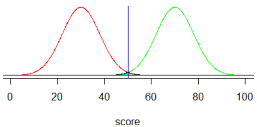
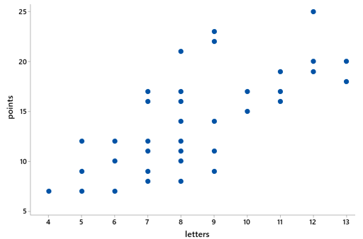
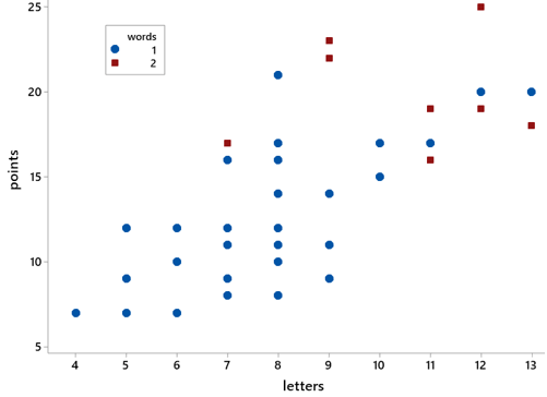
Here are dotplots showing the sample data on reductions in systolic blood pressure (measured in millimeters of mercury) for these two groups (all data values are integers):

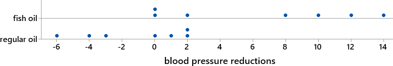
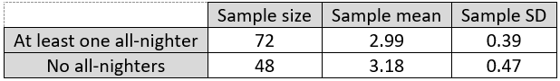
d) Calculate the average blood pressure reduction in each group. What symbols do we use for these averages?  Also calculate the difference in these group means (fish oil group minus regular oil group).  Are the sample data consistent with the researchers’ conjecture?  Explain.

The group means turn out to be: x-barfish = 46/7 ≈ 6.571 mm for the fish oil group, x-barreg = -8/7 ≈ -1.143 for the regular oil group.  This difference is 54/7 ≈ 7.714 mm.  The data are consistent with the researchers’ conjecture, because the average reduction was greater with fish oil than with regular oil.

e) Is it possible that there’s really no effect of the fish oil diet supplement, and random chance alone produced the observed differences in means between these two groups?

I remind students that they’ve seen this question, or at least its very close cousin, before.  We asked this same question about the results of the blindsight study, in which the patient identified the non-burning house in 14 of 17 trials (see post #12, here).  We also asked this about the results of the penguin study, in which penguins with a metal band were 30 percentage points more likely to die than penguins without a metal band (see post #27, here).  My students know that the answer I’m looking for has four letters: Sure, it’s possible.

But my students also know that the much more important question is: How likely is it?  At this point in class I upbraid myself for using the vague word and ask: What does it mean here?  I’m very happy when a student explains that I mean to ask how likely it is to obtain sample mean reductions at least 7.714 mm apart, favoring fish oil, if type of diet supplement actually has no effect on blood pressure reduction.

f) How can we investigate how surprising it would be to obtain results as extreme as this study’s, if in fact there were no difference between the effects of fish oil and regular oil supplements on blood pressure reduction?

Students have seen different versions of this question before also.  The one-word answer I’m hoping for is: Simulate!

g) Describe (in detail) how to conduct the simulation analysis to investigate the question in part f).

Most students have caught on to the principle of simulation at this point, but providing a detailed description in this new scenario, with a numerical response variable, can be challenging.  I follow up with: Can we simply toss a coin as we did with the blindsight study?  Clearly not.  We do not have a single yes/no variable.  Can we shuffle and deal out cards with two colors?  Again, no.  The two colors represented success and failure, but we now have numerical responses.  How can we use cards to conduct this simulation?  Some students have figured out that we can write the numerical responses from the study onto cards.  What does each card represent?  One of the participants in the study.  How many cards do we need?  Fourteen, one for each participant.  What do we do with the cards?  Shuffle them.  And then what?  Separate them into two groups of 7 cards each.  What does this represent?  Random assignment of the 14 subjects into one of the two diet supplement groups.  Then what?  Calculate the average of the response values in each group.  And then?  Calculate the difference in those two averages, being careful to subtract in the same order that we did before: fish oil group minus regular oil group.  Great, what next?  This one often stumps students, until they remember that we need to repeat this process, over and over again, until we’ve completed a large number of repetitions.

Before we actually conduct this simulation, I ask:

h) Which hypothesis are we assuming to be true as we conduct this simulation?  This gives students pause, until they remember that we always assume the null hypothesis to be true when we conduct a significance test.  They can also state this in the context of the current study: that there’s no difference, on average, between the blood pressure reductions that would be achieved with a fish oil supplement versus a regular oil supplement.  I also want them to think about how it applies in this case: How does this assumption manifest itself in our simulation process?  This is a hard question.  I try to tease out the idea that we’re assuming the 14 participants were going to experience whatever blood pressure reduction they did no matter which group they had been assigned to.


Now, finally, having answered all of these preliminary questions, we’re ready to do something.  Sometimes I provide index cards to students and ask them to conduct a repetition or two of this simulation analysis by hand.  But I often skip this part* and proceed directly to conduct the simulation with a computer. 

* I never skip the by-hand simulation with coins in the blindsight study or with playing cards in the penguin study, because I think the tactile aspect helps students to understand what the computer does.  But the by-hand simulation takes considerably more time in this situation, with students first writing the 14 response values on 14 index cards and later having to calculate two averages.  My students have already conducted tactile simulations with the previous examples, so I trust that they can understand what the computer does here.

I especially like that this applet (here), designed by Beth Chance, illustrates the process of pooling the 14 response values and then re-randomly assigning them between the two groups.  The first steps in using the applet are to clear the default dataset and enter (or paste) the data for this study.  (Be sure to click on “Use Data” after entering the data.)  The left side of the screen displays the distributions and summary statistics.  Then clicking on “Show Shuffle Options” initiates simulation capabilities on the right side of the screen.  I advise students to begin with the “Plot” view rather than the “Data” view.

i) Click on “Shuffle Responses” to conduct one repetition of the simulation.  Describe what happens to the 14 response values in the dotplots.  Also report the resulting value of the difference in group means (again taking the fish oil group minus the regular oil group).

This question tries to focus students’ attention on the fact that the applet is doing precisely what we described for the simulation process: pooling all 14 (unchanging) response values together and then re-randomizing them into two groups of 7.

j) Continue to click on “Shuffle responses” for a total of 10 repetitions.  Did we obtain the same result (for the difference in group means) every time?  Are any of the difference in groups means as large as the value observed in the actual study: 7.714 mm?

Perhaps it’s obvious that the re-randomizing does not produce the same result every time, but I think this is worth emphasizing.  I also like to keep students’ attention on the key question of how often the simulation produces a result as extreme as the actual study.

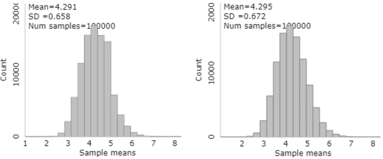
k) Now enter 990 for the number of shuffles, which will produce a total of 1000 repetitions.  Consider the resulting distribution of the 1000 simulated differences in group means.  Is the center where you would expect?  Does the shape have a recognizable pattern?  Explain.

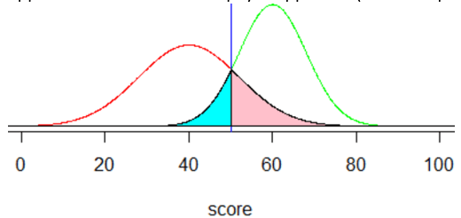
Here is some output from this simulation analysis:

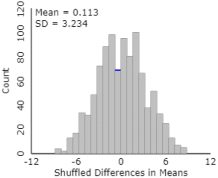
The mean is very close to zero.  Why does this make sense?  The assumption behind the simulation is that type of diet supplement has no effect on blood pressure reduction, so we expect the difference in group means (always subtracting in the same order: fish oil group minus regular oil group) to include about half positive values and half negative values, centered around zero.  The shape of this distribution is very recognizable at this point of the course: approximately normal.

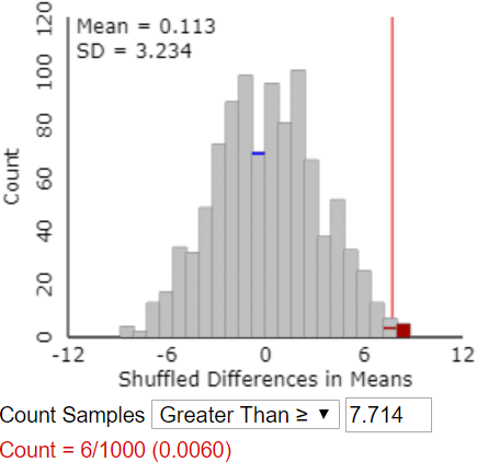
l) Use the Count Samples feature of the applet to determine the approximate p-value, based on the simulation results.  Also describe how you determine this.

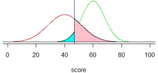
The applet does not have a “Calculate Approximate P-value” button.  That would have been easy to include, of course, but the goal is for students to think through how to determine this for themselves.  Students must realize that the approximate p-value is the proportion of the 1000 simulated differences in group means that are 7.714 or larger.  They need to enter the value 7.714 in the box* next to “Count Samples Greater Than” and then click on “Count.”  The following output shows an approximate p-value of 0.006:

* If a student enters a different value here, the applet provides a warning that this might not be the correct value, but it proceeds to do the count.

m) Interpret what this (approximate) p-value means.

This is usually a very challenging question.  But based on simulation-based inference, students need not memorize this interpretation of a p-value.  Instead, they simply have to describe what’s going on in the graph of simulation results: If there were no effect of diet supplement on blood pressure reductions, then about 0.6% of random assignments would produce a difference in sample means, favoring the fish oil group, of 7.714 or greater.  I also like to model conveying this idea with a different sentence structure, such as: About 0.6% of random assignments would produce a difference in sample means, favoring the fish oil group, of 7.714 or greater, assuming that there were no effect of diet supplement on blood pressure reductions.  The hardest part of this for most students is remembering to include the if or assuming part of this sentence.


Now we are ready to draw some conclusions.

n) Based on this simulation analysis, do the researchers’ data provide strong evidence that the fish oil supplement produces a greater reduction in blood pressure, on average, than the regular oil supplement?  Also explain the reasoning process by which your conclusion follows from the simulation analysis.

The short answer is yes, the data do provide strong evidence that the fish oil supplement is more helpful for reducing blood pressure than the regular oil supplement.  I hope students answer yes because they understand the reasoning process, not because they’ve memorized that a small p-value means strong evidence of …  I do not consider “because the p-value is small” to be an adequate explanation of the reasoning process.  I’m looking for something such as: “It would be very unlikely to obtain a difference in group mean blood pressure reductions of 7.714mm or greater, if fish oil were no better than regular oil.  But this experiment did find a difference in group means of 7.714mm.  Therefore, we have strong evidence against the hypothesis of no effect, in favor of concluding that fish oil does have a beneficial effect on blood pressure reduction.”

At this point I make a show of pointing out that I just used the important word effect, so I then ask:

o) Is it legitimate to draw a cause-and-effect conclusion between the fish oil diet and greater blood pressure reductions?  Justify your answer.

Yes, a cause-and-effect conclusion is warranted here, because this was a randomized experiment and the observed difference in group means is unlikely to occur by random assignment alone if there were no effect of diet supplement type on blood pressure reduction.

Now that I’ve asked about causation, I follow up with a final question about generalizability:

p) To what population is it reasonable to generalize the results of this study?

Because the study included only men, it seems unwise to conclude that women would necessarily respond to a fish oil diet supplement in the same way.  Also, the men in this study were all volunteers who suffered from high blood pressure.  It’s probably best to generalize only to men with high blood pressure who are similar to those in this study. 


Whew, that was a lot of questions*!  I pause here to give students a chance to ask questions and reflect on this process.  I also reinforce the idea, over and over, that this is the same reasoning process they’ve seen before, with the blindsight study for a single proportion and with the penguin study for comparing proportions.  The only difference now is that we have a numerical response, so we’re looking at the difference in means rather than proportions.  But the reasoning process is the same as always, and the interpretation of p-value is the same as always, and the way we assess strength of evidence is the same as always.

* We didn’t make it to part (z) this time, but this post is not finished yet …

Now I want to suggest three extensions that you could consider, either in class or on assignments, depending on your student audience, course goals, and time constraints.  You could pursue any or all of these, in any order.

Extension 1: Two-sample t-test

q) Conduct a two-sample t-test of the relevant hypotheses.  Report the value of the test statistic and p-value.  Also summarize your conclusion.

The two-sample (unpooled) test statistic turns out to be t = 3.06, with a (one-sided) p-value of ≈ 0.007*.  Based on this small p-value, we conclude that the sample data provide strong evidence that fish oil reduced blood pressure more, on average, than regular oil.

* Whenever this fortunate occurrence happens, I tell students that this is a p-value of which James Bond would be proud!

r) How does the result of the t-test compare to that of the simulation analysis?

The result are very similar.  The approximate p-value from the simulation analysis above was 0.006, and the t-test gave an approximate p-value of 0.007. 

Considering how similar these results are, you might be wondering why I recommend bothering with the simulation analysis at all.  The most compelling reason is that the simulation analysis shows students what a p-value is: the probability of obtaining such a large (or even larger) difference in group means, favoring the fish oil group, if there were really no difference between the treatments.  I think this difficult idea comes across clearly in the graph of simulated results that we discussed above.  I don’t think calculating a p-value from a t-distribution helps to illuminate this concept.


Extension 2: Comparing medians

Another advantage of simulation-based inference is that it provides considerable flexibility with regard to the choice of statistic to analyze.  For example, could we compare the medians of the two groups instead of their means?  From the simulation-based perspective: Sure!  Do we need to change the analysis considerably?  Not at all!  Using the applet, we simply select the difference in medians rather than the difference in means from the pull-down list of statistic options on the left side.  If we were writing our own code, we would simply replace mean with median

s) Before we conduct a simulation analysis of the difference in median blood pressure reductions between the two groups, first predict what the distribution of 1000 simulated differences in medians will look like, including the center and shape of the distribution. 

One of these is much easier to anticipate than the other: We can expect that the center will again be near zero, again because the simulation operates under the assumption of no difference between the treatments.  But medians often do not follow a predictable, bell-shaped curve like means often do, especially with such small sample sizes of 7 per group.

t) Use the applet to conduct a simulation analysis with 1000 repetitions, examining the difference in medians between the groups.  Describe the resulting distribution of the 1000 simulated differences in medians.

Here is some output:

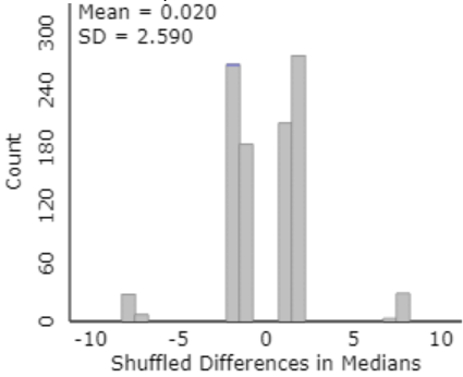
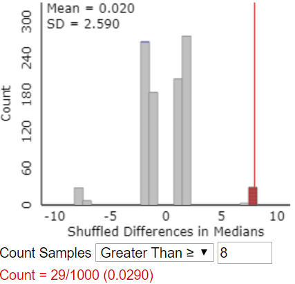
The center is indeed close to zero.  The shape of this distribution is fairly symmetric but very irregular.  This oddness is due to the very small sample sizes and the many duplicate data values.  In fact, there are only eight possible values for the difference in medians: ±8, ±7, ±2, and ±1. 

u) How do we determine the approximate p-value from this simulation analysis?  Go ahead and calculate this.

This question makes students stop and think.  I really want them to be able to answer this correctly, because they’re not really understanding simulation-based inference if they can’t.  I offer a hint: Do we plug in 7.714 again and count beyond that value?  Most students realize that the answer is no, because 7.714 was the difference in group means, not medians, in the actual study.  Then where do we count?  Many students see that we need to count how often the simulation gave a result as extreme as the difference in medians in the actual study, which was 8mm.

Here’s the same graph, with results for which the difference in sample medians is 8 or greater colored in red:

v) Compare the results of analyzing medians rather than means.

We obtained a much smaller p-value when comparing means (0.006) than when comparing medians (0.029).  In both cases, we have reasonably strong evidence that fish oil is better than regular oil for reducing blood pressure, but we have stronger evidence based on means than on medians.


Extension 3: Exact randomization test

What we’ve simulated above is often called a randomization test.  Could we determine the p-value for the randomization test exactly rather than approximately with simulation?  Yes, in principle, but this would involve examining all possible ways to randomly assign subjects between the treatment groups.  In most studies, there are often too many combinations to analyze efficiently.  In this study, however, the number of participants is small enough that we can determine the exact randomization distribution of the statistic.  I only ask the following questions in courses for mathematically inclined students.

w) In many ways can 14 people be assigned to two groups of 7 people each?

This is what the combination (also called a binomial coefficient) 14-choose-7 tells us.  This is calculated as: 14! / (7! ×7!) = 3432.  That’s certainly too many to list out by hand, but that’s a pretty small number to tackle with some code.

x) Describe what to do, in principle, to determine the exact randomization distribution.

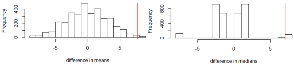
We continue to assume that the 14 participants were going to obtain the same blood pressure reduction values that they did, regardless of which diet supplement group they had been assigned to.  For each of these 3432 ways to split the 14 participants into two groups of 7 each, we calculate the mean/median of data values in each group, and then we calculate the difference in means/medians (fish oil group minus regular oil group).  I’ll spare you the coding details.  Here’s what we get, with difference in means on the left, difference in medians on the right:

y) How would you calculate the exact p-values?

For the difference in means, we need to count how many of the 3432 possible random assignments produce a difference in means of 7.714 or greater.  It turns out that only 31 give such an extreme difference, so the exact p-value is 31/3432 ≈ 0.009.

If we instead compare medians, it turns out that exactly 100 of the 3432 random assignments produce a difference in medians of 8 or greater, for a p-value of 100/3432 ≈ 0.029.  Interestingly, 8 is the largest possible difference in medians, but there are 100 different ways to achieve this value from the 14 data values.

z) Did the simulation results come close to the exact p-values?

Yes.  The approximate p-value based on comparing means was 0.006, very close to the exact p-value of 0.009.  Similarly, the approximate p-value based on comparing medians was 0.029, the same (to three decimal places) as the exact p-value.


If you’re intrigued by simulation-based inference but reluctant to redesign your entire course around this idea, I recommend sprinkling a bit of SBI into your course.  Depending on how many class sessions you can devote to this, I recommend these sprinkles in this order:

  1. Inference for a single proportion with a 50/50 null, as with the blindsight study of post #12 (here)
  2. Comparing two proportions, as with the penguin study of post #27 (here)
  3. Comparing two means or medians, as with the fish oil study in this post
  4. Inference for correlation, as with the draft lottery toward the end of post #9 (here)

For each of these scenarios, I strongly suggest that you introduce the simulation-based approach before the conventional method.  This can help students to understand the logic of statistical inference before getting into the details.  I also recommend emphasizing that the reasoning process is the same throughout these scenarios.  After leading students through the simulation-based approach, you can impress upon students that the conventional methods are merely shortcuts that predict what the simulation results would look like without bothering to conduct the simulation.


P.S. Here is a link to the datafile for this activity:

P.P.S. I provided a list of textbooks that prominently include simulation-based inference at the end of post #12 (here).

P.P.P.S. I dedicate this post to George Cobb, who passed away in the last week.  George had a tremendous impact on my life and career through his insightful and thought-provoking writings and also his kind mentoring and friendship. 

George’s after-dinner address at the inaugural U.S. Conference on Teaching Statistics in 2005 inspired many to pursue simulation-based inference for teaching introductory statistics.  His highly influential article based on this talk, titled “The Introductory Statistics Course: A Ptolemaic Curriculum?,” appeared in the inaugural issue of Technology Innovations in Statistics Education (here).  George wrote: “Before computers statisticians had no choice. These days we have no excuse. Randomization-based inference makes a direct connection between data production and the logic of inference that deserves to be at the core of every introductory course.”

George’s writings contributed greatly as my Ask Good Questions teaching philosophy emerged.  At the beginning of my career, I read his masterful article “Introductory Textbooks: A Framework for Evaluation,” in which he simultaneously reviewed 16 textbooks for the Journal of the American Statistical Association (here).  Throughout this review George repeated the following mantra over and over: Judge a textbook by its exercises, and you cannot go far wrong.  This sentence influenced me not only for its substance – what teachers ask students to do is more important than what teachers tell students – but also for its style – repeating a pithy phrase can leave a lasting impression. 

Another of my favorite sentences from George, which has stayed in my mind and influenced my teaching for decades, is: Shorn of all subtlety and led naked out of the protective fold of education research literature, there comes a sheepish little fact: lectures don’t work nearly as well as many of us would like to think (here).

I had the privilege of interviewing George a few years ago for the Journal of Statistics Education (here).  His wisdom, humility, insights, and humor shine throughout his responses to my questions.

#44 Confounding, part 2

Many introductory statistics students find the topic of confounding to be one of the most confounding topics in the course.  In the previous post (here), I presented two extended examples that introduce students to this concept and the related principle that association does not imply causation.  Here I will present two more examples that highlight confounding and scope of conclusions.  As always, this post presents many questions for posing to students, which appear in italics.


3. A psychology professor at a liberal arts college recruited undergraduate students to participate in a study (here).  Students indicated whether they had engaged in a single night of total sleep deprivation (i.e., “pulling an all-nighter”) during the term.  The professor then compared the grade point averages (GPAs) of students who had and who had not pulled an all-nighter.  She calculated the following statistics and determined that the difference in the group means is statistically significant (p-value < 0.025):

a) Identify the observational units and variables.  What kinds of variables are these?  Which is explanatory, and which is response?

My students know to expect these questions at the outset of every example, to the point that they sometimes groan.  The observational units are the 120 students.  The explanatory variable is whether or not the student pulled at least one all-nighter in the term, which is categorical.  The response variable is the student’s grade point average (GPA), which is numerical.

b) Is this a randomized experiment or an observational study?  Explain how you can tell.

My students realize that this is an observational study, because the students decided for themselves whether to pull an all-nighter.  They were not assigned, randomly or otherwise, to pull an all-nighter or not.

c) Is it appropriate to draw a cause-and-effect conclusion between pulling an all-nighter and having a lower GPA?  Explain why or why not.

Most students give a two-letter answer followed by a two-word explanation here.  The correct answer is no.  Their follow-up explanation can be observational study or confounding variables.  I respond that this explanation is a good start but would be much stronger if it went on to describe a potential confounding variable, ideally with a description of how the confounding variable provides an alternative explanation for the observed association.  The following question asks for this specifically.

d) Identify a (potential) confounding variable in this study.  Describe how it could provide an alternative explanation for why students who pulled an all-nighter have a smaller mean GPA than students who have not.

Students know this context very well, so they are quick to propose many good explanations.  The most common suggestion is that the student’s study skills constitute a confounding variable.  Perhaps students with poor study skills resort to all-nighters, and their low grades are a consequence of their poor study skills rather than the all-nighters.  Another common response is coursework difficulty, the argument being that more difficult coursework forces students to pull all-nighters and also leads to lower grades.  Despite having many good ideas here, some students struggle to express the confounding variable as a variable.  Another common error is to describe the link between their proposed confounding variable and the explanatory variable, neglecting to describe a link with the response.

e) Is it appropriate to rule out a cause-and-effect relationship between pulling an all-nighter and having a lower GPA?  Explain why or why not.

This may seem like a silly question, but I think it’s worth asking.  Some students go too far and think that not drawing a cause-and-effect conclusion is equivalent to drawing a no-cause-and-effect conclusion.  The answer to this question is: Of course not!  It’s quite possible that pulling an all-nighter is harmful to a student’s academic performance, even though we cannot conclude that from this study.

f) Describe how (in principle) you could design a new study to examine whether pulling an all-nighter has a negative impact on academic performance (as measured by grades).

Many students give the answer I’m looking for: Conduct a randomized experiment.  Then I press for more details: What would a randomized experiment involve?  The students in the study would need to be randomly assigned to pull an all-nighter or not. 

g) How would your proposed study control for potential confounding variables? 

I often need to expand on this question to prompt students to respond: How would a randomized experiment account for the fact that some students have better study skills than others, or are more organized than others, or have more time for studying than others?  Some students realize that this is what random assignment achieves.  The purpose of random assignment is to balance out potential confounding variables between the groups.  In principle, students with very good study skills should be balanced out between the all-nighter and no-all-nighter groups, just as students with poor study skills should be similarly balanced out.  The explanatory variable imposed by the researcher should then constitute the only difference between the groups.  Therefore, if the experiment ends up with a significant difference in mean GPAs between the groups, we can attribute that difference to the explanatory variable: whether or not the student pulled an all-nighter.

I end this example there, but you could return to this study later in the course.  You could ask students to conduct a significance test to compare the two groups and calculate a confidence interval for the difference in population means.  At that point, I strongly recommend asking about causation once again.  Some students seem to think that inference procedures overcome concerns from earlier in the course about confounding variables.  I think we do our students a valuable service by reminding them* about issues such as confounding even after they have moved on to study statistical inference. .

* Even better than reminding them is asking questions that prompt students to remind you about these issues.


4. Researchers interviewed parents of 479 children who were seen at a university pediatric ophthalmology clinic.  They asked parents whether the child slept primarily in room light, darkness, or with a night light before age 2.  They also asked about the child’s eyesight diagnosis (near-sighted, far-sighted, or normal vision) from their most recent examination. 

a) What are the observational units and variables in this study?  Which is explanatory, and which is response?  What kind of variables are they?

You knew this question was coming first, right?  The observational units are the 479 children.  The explanatory variable is the amount of lighting in the child’s room before age 2.  The response variable is the child’s eyesight diagnosis.  Both variables are categorical, but neither is binary.

b) Is this an observational study or a randomized experiment?  Explain how you can tell.

Students also know to expect this question at this point.  This is an observational study.  Researchers did not assign the children to the amount of light in their rooms.  They merely recorded this information.

The article describing this study (here) included a graph similar to this:

c) Does the graph reveal an association between amount of lighting and eyesight diagnosis?  If so, describe the association.

Yes, the percentage of children who are near-sighted increases as the amount of lighting increases.  Among children who slept in darkness, about 10% were near-sighted, compared to about 34% among those who slept with a night light and about 55% among those who slept with room light.  On the other hand, the percentage with normal vision decreases as the amount of light increases, from approximately 65% to 50% to 30%.

Here is the two-way table of counts:

d) Were most children who slept in room light near-sighted?  Did most near-sighted children sleep in room light?  For each of these questions, provide a calculation to support your answer. 

Some students struggle to recognize how these questions differ.  The answer is yes to the first question, because 41/75 ≈ 0.547 of those who slept in room light were near-sighted.  For the second question, the answer is no, because only 41/137 ≈ 0.299 of those who were near-sighted slept in room light.

e) Is it appropriate to conclude that light in a child’s room causes near-sightedness?  Explain your answer. 

No.  Some students reflexively say observational study for their explanation.  Others simply say confounding variables.  These responses are fine, as far as they go, but the next question prompts students to think harder and explain more fully.

f) Some have proposed that parents’ eyesight might be a confounding variable in this study.  How would that explain the observed association between the bedroom lighting condition and the child’s eyesight? 

Asking about this specific confounding variable frees students to concentrate on how to explain the confounding.  Most students point out that eyesight is hereditary, so near-sighted parents tend to have near-sighted children.  Unfortunately, many students stop there.  But this falls short of explaining the observed association, because it says nothing about the lighting in the child’s room.  Completing the explanation requires adding that near-sighted parents may tend to use more light in the child’s room than other parents, perhaps so they can more easily check on the child during the night.


The next set of questions continues this example by asking about how one could (potentially) draw a cause-and-effect conclusion on this topic.

g) What would conducting a randomized experiment to study this issue entail?

Children would need to be randomly assigned to have a certain amount of light (none, night light, or full room light) in their bedroom before the age of 2.

h) How would a randomized experiment control for parents’ eyesight? 

This question tries to help students focus on the goal of random assignment: to balance out all other characteristics of the children among the three groups.  For example, children with near-sighted parents should be (approximately) distributed equally among the three groups, as should children of far-sighted parents and children of parents with normal vision.  Even better, we also expect random assignment to balance out factors that we might not think of in advance, or might not be able to observe or measure, that might be related to the child’s eyesight.

i) What would be the advantage of conducting a randomized experiment to study this issue?

If data from a randomized experiment show strong evidence of an association between a child’s bedroom light and near-sightedness, then we can legitimately conclude that the light causes an increased likelihood of near-sightedness.  This cause-and-effect conclusion would be warranted because random assignment would (in principle) account for other potential explanations.

j) Would conducting such a randomized experiment be feasible in this situation?  Would it be ethical?

To make this feasible, parents would need to be recruited who would agree to allow random assignment to determine how much light (if any) to use in their child’s bedroom.  It might be hard to recruit parents who would give up this control over their child’s environment.  This experiment would be ethical as long as parents were fully informed and consented to this agreement.


You can return to this example, and the observational data from above, later in the course to give students practice with conducting a chi-square test.  This provides another opportunity to ask them about the scope of conclusions they can draw.

l) Conduct a chi-square test.  Report the test statistic and p-value.  Summarize your conclusion.  The test statistic turns out to be approximately 56.5.  With 4 degrees of freedom, the p-value is extremely close to zero, about 7.6×10^(-12).  The data provide overwhelming evidence against the null hypothesis of no association, in favor of the alternative that there is an association between amount of light in the child’s room before age 2 and eyesight diagnosis later in childhood.

m) In light of the very large test statistic and extremely small p-value, is it reasonable to conclude that light in a child’s room causes an increased chance of the child becoming near-sighted?  I think it’s very important to ask this again after conducting the hypothesis test.  Some students mistakenly think that hypothesis tests are so advanced that they can override what they learned earlier in the course.  The extremely small p-value in no way compensates for the observational nature of these data and the possibility of confounding variables.  A cause-and-effect conclusion between bedroom light and near-sightedness still cannot be drawn.

n) Why do you think the researchers bothered to collect and analyze these data, considering that no causal conclusion can be drawn?

Some students believe that a cause-and-effect conclusion is the only kind worth drawing. I ask this question to help them realize that establishing evidence of association can be a worthy goal in its own right, apart from the question of causation.

o) Is it reasonable to generalize this study’s finding about an association between room lighting and near-sightedness to the population of all children in the United States?  Explain.

Most students realize that the correct answer is no, but many mistakenly attribute this to the observational nature of the data.  With regard to generalizability, the key point is that the children in this study were not randomly selected from any population.  They were all patients at a university pediatric ophthalmology clinic, so they are not likely to be representative of all U.S. children with regard to issues involving eyesight.  The finding of an association between increased bedroom light and near-sightedness may or may not hold in the larger population of U.S. children in general.

Asking this question can help students who confuse bias and confounding, or who believe that bias and confounding are the same idea.  This can also remind students of the important distinction between random sampling and random assignment, which I discussed in posts #19 and #20 (Lincoln and Mandela, here and here).


Observational studies abound in many fields.  They often produce intriguing results that are discussed in news media.  Accordingly, it’s important for students to understand the topic of confounding and especially how confounding affects the scope of conclusions that can be drawn from observational studies.  The four examples in this two-part series introduce students to these ideas.  They also provide an opportunity to make connections among different parts of the course, spanning topics of data exploration and statistical inference as well as design of studies and scope of conclusions.

P.S. The topic of drawing cause-and-effect conclusions legitimately from observational studies has become widely studied.  I confess that I do not address this topic in my introductory statistics courses, but some argue strongly that I am doing my students a disservice in this regard.  After all, the most important causal conclusion of the twentieth century may have been that smoking causes cancer, which was not determined by randomly assigning humans to smoke or not.

One of the most prominent advocates for causal inference is Judea Pearl, who has co-authored a general-audience book titled The Book of Why: The New Science of Cause and Effect (information and excerpts can be found here).  Statistics educators who argue for including this topic prominently include Milo Schield (here), Danny Kaplan (here), and Jeff Witmer (here).  A recent article in the Journal of Statistics Education by Cummiskey et al (here) also makes this case.

P.P.S. for teachers of AP Statistics: I’ll be conducting some one-hour sessions via zoom in which I lead students through the first five questions on the 2011 exam, discussing what graders looked for and highlighting common student errors.  I hope this provides some helpful practice and preparation for the upcoming 2020 AP Statistics exam.  Please contact me (allanjrossman@gmail.com) if you would like to invite your students to attend one of these sessions.

#43 Confounding, part 1

The topic of confounding is high on the list of most confounding topics in introductory statistics.  Dictionary.com provides these definitions of confound (here):

  1. to perplex or amaze, especially by a sudden disturbance or surprise; bewilder; confuse: The complicated directions confounded him.
  2. to throw into confusion or disorder: The revolution confounded the people.
  3. to throw into increased confusion or disorder
  4. to treat or regard erroneously as identical; mix or associate by mistake: Truth confounded with error.
  5. to mingle so that the elements cannot be distinguished or separated
  6. to damn (used in mild imprecations): Confound it!

Definition #5 comes closest to how we use the term in statistics.  Unfortunately, definitions #1, #2, and #3 describe what the topic does to many students, some of whom respond in a manner that illustrates definition #6.

In this post I will present two activities that introduce students to this important but difficult concept, along with some follow-up questions for assessing their understanding.  One example will involve two categorical variables, and the other will feature two numerical variables.  As always, questions that I pose to students appear in italics.


I have used a variation of the following example, which I updated for this post, for many years.  I hold off on defining the term confounding until students have anticipated the idea for themselves.  Even students who do not care about sports and know nothing about basketball can follow along.

1. During the 2018-19 National Basketball Association season, the Sacramento Kings won 13 home games and lost 16 when they had a sell-out crowd, compared to 11 home wins and 1 loss when they had a smaller crowd.

a) Identify the observational units, explanatory variable, and response variable in this study.  Also classify each variable as categorical or numerical.

As I argued in post #11 (Repeat after me, here), I think these questions are important to ask at the start of nearly every activity, to orient students to the context and the type of analysis required.  The observational units are games, more specifically home games of the Sacramento Kings in the 2018-19 season.  The explanatory variable is crowd size, and the response variable is game outcome.  As presented here, both variables are categorical (and binary).  Crowd size could be studied as a numerical variable, but that information is presented here as whether or not the crowd was a sell-out or smaller.

b) Organize the data into a table of counts, with the explanatory variable groups in columns.

First we set up the table as follows:

Then I suggest to students that we work with each number as we encounter it in the sentence above, so I first ask where the number 2018 should go in the table.  This usually produces more groans than laughs, and then we proceed to fill in the table as follows:

Some optional questions for sports fans: Does the number 41 make sense in this context?  Basketball fans nod their heads, knowing that an NBA team plays an 82-game season, with half of the games played at home.  Did the Kings win more than half of their home games?  Yes, they won 24 of 41 home games, which is 58.5%.  Does this mean that the Kings were an above-average team in that season?  No.  In fact, after including data from their games away from home, they won only 39 of 82 games (47.6%) overall.

c) Calculate the proportion of wins for each crowd size group.  Do these proportions suggest an association (relationship) between the explanatory and response variables?  Explain.

The Kings won 11/12 (.917, or 91.7%) of games with a smaller crowd.  They won 13/29 (.448, or 44.8%) of games with a sell-out crowd.  This seems like a substantial difference (almost 48 percentage points), which suggests that there is an association between crowd size and game outcome.  The Kings had a much higher winning percentage with a smaller crowd than with a sell-out crowd.

d) Produce a well-labeled segmented bar graph to display these proportions.

Here’s a graph generated by Excel:

e) Is it reasonable to conclude that a sell-out crowd caused the team to play worse?  If not, provide an alternative explanation that plausibly explains the observed association.

This is the key question of the entire activity.  I always find that some students have been anticipating this question and are eager to respond: Of course not!  These students explain that the Kings are more likely to have a sell-out crowd when they’re playing against a good team with superstar players, such as the Golden State Warriors with Steph Curry.  I often have to prod students to supply the rest of the explanation: What else is true about the good teams that they play against?  The Kings are naturally less likely to win against such strong teams.

At this point I introduce the term confounding variable as one whose potential effects on a response variable cannot be distinguished from those of the explanatory variable.  I also point out that a confounding variable must be related to both the explanatory and response variable.  Finally, I emphasize that because of the potential for confounding variables, one cannot legitimately draw cause-and-effect conclusions from observational studies.

f) Identify a confounding variable in this study, and explain how this confounding variable is related to both the explanatory and response variable.

This is very similar to question (e), now asking students to express their explanation with this new terminology.  Some students who provide the alternative explanation well nevertheless struggle to specify a confounding variable clearly.  A good description of the proposed confounding variable is: strength of opponent.  It seems reasonable to think that a stronger opponent is more likely to generate a sell-out crowd, and a stronger opponent also makes the game less likely to result in a win for the home team.


I usually stop this in-class activity there, but you could ask students to dig deeper in a homework assignment or quiz.  For example, we can look at more data to explore whether our conjectures about strength of opponent hold true.

It seems reasonable to use the opposing team’s percentage of games won in that season as a measure of its strength.  Let’s continue to work with categorical variables by classifying teams with a winning percentage of 40% and below as weak, between 40% and 60% as moderate, 60% and above as strong.  This leads to the following tables of counts:

Do these data support the two conjectures about how strength of opponent relates to crowd size and to game outcome?  Support your answer with appropriate calculations and graphs.

The first conjecture was that stronger opponents are more likely to generate a sell-out crowd.  This is supported by the data, as we see that 100% (10/10) of strong opponents produced a sell-out crowd, compared to 61.9% (13/21) of moderate opponents and 60% (6/10) of weak opponents.  These percentages are shown in this segmented bar graph:

The second conjecture was that stronger opponents are less likely to produce a win by the home team.  This is clearly supported by the data.  The home team won 100% (10/10) of games against weak opponents, which falls to 57.1% (12/21) of games against moderate teams, and only 20% (2/10) of games against strong teams.  These percentages are shown in this segmented bar graph:

Here’s a quiz question based on a different candidate for a confounding variable. It also seems reasonable to think that games played on weekends (let’s include Fridays with Saturdays, and Sundays) are more likely to attract a sell-out crowd that games played on weekdays.  What else would have to be true about the weekend/weekday breakdown in order for that to be a confounding variable for the observed association between crowd size and game outcome?  What remains is for students to mention a connection with the response variable: Weekend games would need to be less likely to produce a win for the home team, as compared to weekday games.

Again we can look at the data on this question.  Consider the following tables of counts:

Do the data support the argument for the weekday vs. weekend variable as a confounding variable?  Cite relevant calculations to support your response.  Only half of the argument is supported by the data.  Weekend games were slightly more likely to produce a sell-out crowd than a weekday game (13/17 ≈ 0.765 vs. 16/24 ≈ 0.667).  But weekend games were not less likely to produce a home team win than weekday games (11/17 ≈ 0.647 vs. 13/24 ≈ 0.542).  Therefore, the day of week variable does not provide an alternative explanation for why sell-out crowds are less likely to see a win by the home team than a smaller crowd.

Students could explore much more with these data*.  For example, they could analyze opponent’s strength as a numerical variable rather than collapsing it into three categories as I did above. 

* I provide a link to the datafile at the end of this post.


The second example is based on an activity that I have used for more than 25 years.  My first contribution to the Journal of Statistics Education, from 1994 (here), presented an example for distinguishing association from causation based on the relationship between a country’s life expectancy and its number of people per television.  In updating the example for this post, I chose a different variable and used data as of 2017 and 2018 from the Word Bank (here and here)*.

* Again, a link to the datafile appears at the end of this post.

2. The following table lists the life expectancy (in years) and the number of automatic teller machines (ATMs per 100,000 adults) in 24 countries around the world:

a) Identify the observational units and variables.  What type of variable are these?  Which is explanatory and which is response? 

Yes, I start with these fundamental questions yet again.  The observational units are countries, the explanatory variable is number of ATMs per 100,000 adults, and the response is life expectancy.  Both variables are numerical.

b) Which of the countries listed has the fewest ATMs per 100,000 adults?  Which has the most?

This question is unnecessary, I suppose, but I think it helps students to engage with the data and context.  Haiti has the fewest ATMs: about 2 per 100,000 adults.  The United States has the most: about 174 ATMs per 100,000 adults.

c) Produce a scatterplot of the data, with the response variable on the vertical axis.

Here’s the scatterplot:

d) Does the scatterplot indicate an association between life expectancy and number of ATMs?  Describe its direction, strength, and form.

Yes, the scatterplot reveals a positive association between a country’s life expectancy and its number of ATMs per 100,000 adults.  This association is moderately strong but not linear.  The form follows a curved pattern.

e) Do you believe that installing more ATM machines in countries such as Haiti, Bangladesh, Algeria, and Kenya would cause their inhabitants to live longer?  If not, provide a more plausible, alternative (to cause-and-effect) explanation for the observed association.

This is the key question in the activity, just as with the question in the previous activity about whether sell-out crowds cause the home team to play worse.  Students realize that the answer here is a resounding no.  It’s ridiculous to think that installing more ATMs would cause Haitians to live longer.  Students can tell you the principle that association is not causation.

Students can also suggest a more plausible explanation for the observed association.  They talk about how life expectancy and number of ATMs are both related to the overall wealth, or technological sophistication, of a country.

f) Identify a (potential) confounding variable, and explain how it might relate to the explanatory and response variables.

This is very similar to the previous question.  Here I want students to use the term confounding variable and to express their suggestion as a variable.  Reasonable answers include measures of a country’s wealth or technological sophistication.

This completes the main goal for this activity.  At the risk of detracting from this goal, I often ask an additional question:

g) Would knowing a country’s number of ATMs per 100,000 adults be helpful information for predicting the life expectancy of the country?  Explain.

The point of this question is much harder for students to grasp than with the preceding questions.  I often follow up with this hint: Would you make different life expectancy predictions depending on whether a country has 10 vs. 100 ATMs per 100,000 adults?  Students confidently answer yes to this one, so they gradually come to realize that they should also answer yes to the larger question: Knowing a country’s number of ATMs per 100,000 adults is helpful for predicting life expectancy.  I try to convince them that the association is real despite the lack of a cause-and-effect connection.  Therefore, predictions can be enhanced from additional data even without a causal* relationship.

* I greatly regret that the word causal looks so much like the word casual.  To avoid this potential confusion, I say cause-and-effect much more than causal.  But I had just used cause-and-effect in the previous sentence, so that caused me to switch to causal in the last sentence of the paragraph.


This example also leads to extensions that work well on assignments.  For example, I ask students to:

  • take a log transformation of the number of ATMs per 100,000 adults,
  • describe the resulting scatterplot of life expectancy vs. this transformed variable,
  • fit a least squares line to the (transformed) data,
  • interpret the value of r^2,
  • interpret the slope coefficient, and
  • use the line to predict the life expectancy of a country that was not included in the original list.

Here is a scatterplot of life expectancy vs. log (base 10) of number of ATMs per 100,000 adults, with the least squares line:

The relationship between life expectancy and this transformed variable is positive, moderately strong, and fairly linear.  With this log transformation, knowing a country’s number of ATMs per 100,000 adults explains 46.7% of the variability in countries’ life expectancy values.  The slope coefficient of 9.356 means that the model predicts an increase of 9.356 years in life expectancy for a tenfold increase in number of ATMs per 100,000 adults.  Using this line to predict the life expectancy of Costa Rica, which has 74.41 ATMs per 100,000 adults produces: predicted life expectancy = 60.51 + 9.356×log(74.41) ≈ 60.51 + 9.356×1.87 ≈ 78.02 years.  The actual life expectancy reported for Costa Rica in 2018 is 80.10, so the prediction underestimated by only 2.08 years.


Two earlier posts that focused on multivariable thinking also concerned confounding variables.  In post #3 (here), the graduate program was a confounding variable between an applicant’s gender and the admission decision.  Similarly, in post #35 (here), age was a confounding variable between a person’s smoking status and their lung capacity.

In next week’s second part of this two-part series, I will address more fully the issue of drawing causal conclusions.  Along the way I will present two more examples that involve confounding variables, with connections to data exploration and statistical inference.  I hope these questions can lead students to be less confounded by this occasionally vexing* and perplexing topic.

* I doubt that the term vexing variable will catch on, but it does have a nice ring to it!


P.S. The two datafiles used in this post can be downloaded from the links below:

#42 Hardest topic, part 2

In last week’s post (here), I suggested that sampling distributions constitute the hardest topic to teach in introductory statistics.  I provided five recommendations for teaching this challenging topic, including an exhortation to hold off on using the term sampling distribution until students understand the basic idea.  I also gave many examples of questions that can help students to develop their understanding of this concept.

In this post I present five more suggestions for teaching the topic of sampling distributions, along with many more examples of questions for posing to students.  As always, such questions appear in italics.  Let’s continue the list …


6. Pay attention to the center of a sampling distribution as well as its shape and variability.

We teachers understandably devote a lot of attention to the shape and variability of a sampling distribution*.  I think we may neglect to emphasize center as much we should.  With a sample proportion or a sample mean, the mean of its sampling distribution is the population proportion or population mean.  Maybe we do not make a big deal of this result because it comes as no surprise.  But this is the very definition of unbiasedness, which is worth our drawing students’ attention to.

* I’ll say more about these aspects in upcoming suggestions.

We can express the unbiasedness of a sample mean mathematically as:

As I have argued before (in post #19, Lincoln and Mandela, part 1, here), this seemingly simple equation is much more challenging to understand than it appears.  The three symbols in this equation all stand for a different mean.  Ask students: Express what this equation says in a sentence.  This is not easy, so I lead my students thorough this one symbol at a time: The mean of the sample means is the population mean.  A fuller explanation requires some more words: If we repeatedly take random samples from the population, then the mean of the sample means equals the population mean.  This is what it means* to say that the sample mean is an unbiased estimator of the population mean.

* Oops, sorry for throwing another mean at you!

I emphasize to students that this result is true regardless of the population distribution and also for any sample size.  The result is straight-forward to derive from properties of expected values.  I show students this derivation in courses for mathematically inclined students but not in a typical Stat 101 course, where I rely on simulations to convince students that the result is believable.

I suspect that we take unbiasedness of a sample proportion and sample mean for granted, but you don’t have to study obscure statistics in order to discover one that is not unbiased.  For example, the sample standard deviation is not unbiased when sampling from a normal distribution*. 

* The sample variance is unbiased in this case, but the unbiasedness does not survive taking the square root.

The following graph of sample standard deviations came from simulating 1,000,000 random samples of size 10 from a normal distribution with mean 100 and standard deviation 25:

What aspect of this distribution reveals that the sample standard deviation is not an unbiased estimator of the population standard deviation?  Many students are tempted to point out the slight skew to the right in this distribution.  That’s worth noting, but shape is not relevant to bias.  We need to notice that the mean of these sample standard deviations (≈ 24.32) is not equal to the value that we used for the population standard deviation (σ = 25). Granted, this is not a large amount of bias, but this difference (24.32 vs. 25) is much more than you would expect from simulation variability with one million repetitions*.

* Here’s an extra credit question for students: Use the simulation results to determine a 95% confidence interval for the expected value of the sample standard deviation, E(S).  This confidence interval turns out to be approximately (24.31 → 24.33), an extremely narrow interval thanks to the very large number of repetitions.


7. Emphasize the impact of sample size on sampling variability.

Under suggestion #1 in the previous post (here), I emphasized the key idea that averages vary less than individual values.  The corollary to this is that averages based on larger samples vary less than averages based on smaller samples.  You don’t need to tell students this; you can lead them to tell you by asking them to … (wait for it) … simulate!  Returning to the context of sampling Reese’s Pieces candies, consider these two graphs from simulation analyses (using the applet here), based on a sample size of 25 candies on the left, 100 candies on the right:

What’s the most striking difference between these two distributions?  Some students comment that the distribution on the right is more “filled in” that the one of the left.  I respond that this is a good observation, but I think there’s a more important difference.  Then I encourage students to focus on the different axis scales between the graphs.  Most students recognize that the graph on the right has much less variability in sample proportions than the one on the right.  How do the standard deviations (of the sample proportions) compare between the two graphs?  Students respond that the standard deviation is smaller on the right.  How many times larger is the standard deviation on the left than the one on the right?  Students reply that the standard deviation is about twice as big on the left as the right.  By how many times must the sample size increase in order to cut the standard deviation of the sample proportion in half?  Recalling that the sample sizes were 25 and 100, students realize that they need to quadruple the sample size in order to cut this standard deviation in half.

I lead students through a similar set of questions based on simulating the sampling distribution of a sample mean.  Students again come to realize that the standard deviation of a sample mean decreases as the sample size increases, and also that a four-fold increase in sample size cuts this standard deviation in half.  This leads us to the result:

I follow up by asking: Explain the difference between SD(X-bar) and σ.  Even students who somewhat understand the idea can have difficulty with expressing this well.  The key is that σ represents the standard deviation of the individual values in the population (penny ages, or word lengths, or weights, or whatever), but SD(X-bar) is the standard deviation of the sample means (averages) that would result from repeatedly taking random samples from the population.

Here’s an assessment question* about the impact of sample size on a sampling distribution: Suppose that a region has two hospitals.  Hospital A has about 10 births per day, and hospital B has about 50 births per day.  About 50% of all babies are boys, but the percentage who are boys varies at each hospital from day to day.  Over the course of a year, which hospital will have more days on which 60% or more of the births are boys – A, B, or negligible difference between A and B?

* This is a variation of a classic question posed by psychologists Kahneman and Tversky, described here.

Selecting the correct answer requires thinking about sampling variability.  The smaller hospital will have more variability in the percentage of boys born on a day, so Hospital A will have more days on which 60% or more of the births are boys.  Many students struggle with this question, not recognizing the important role of sample size on sampling variability.

This principle that the variability of a sample statistic decreases as sample size increases applies to many other statistics, as well.  For example, I ask students to think about the sampling distribution of the inter-quartile range (IQR), comparing sample sizes of 10 and 40, under random sampling from a normally distributed population.  How could you investigate this sampling distribution?  Duh, with simulation!  Describe how you would conduct this simulation.  Generate a random sample of 10 values from a normal distribution.  Calculate the IQR of the 10 sample values.  Repeat this for a large number of repetitions.  Produce a graph and summary statistics of the simulated sample IQR values.  Then repeat all these steps with a sample size of 40 instead of 10. 

I used R to conduct such a simulation analysis with 1,000,000 repetitions. Using a normally distributed population with mean 100 and standard deviation 25, I obtained the following graphs (sample size of 10 on the left, 40 on the right):

Compare the variability of the sample IQR with these two sample sizes.  Just as with a sample mean, the variability of the sample IQR is smaller with the larger sample size.  Does the sampling variability of the sample IQR decrease as much by quadrupling the sample size as with the sample mean?  No.  We know that the SD of the sample mean is cut in half by quadrupling the sample size.  But the SD of the sample IQR decreases from about 10.57 to 5.96, which is a decrease of 43.6%, a bit less than 50%.


8. Note that population size does not matter (much).

As long as the population size is considerably larger than the sample size, the population size has a negligible impact on the sampling distribution.  This revelation runs counter to most students’ intuition, so I think it fails to sink in for many students.  This minimal role of population size also stands in stark contrast to the important role of sample size described under the previous suggestion.

How can we help students to appreciate this point?  Simulation, of course.  In post #19 (Lincoln and Mandela, part 1, here), I described a sampling activity using the 268 words in the Gettysburg Address as the population.  The graph on the left below displays the distribution of word lengths (number of letters) in this population (obtained from the applet here).  For the graph on the right, the population has been expanded to include 40 copies of the Gettysburg Address, producing a population size of 268×40 = 10,720 words.

How do these two population distributions compare?  These distributions are identical, except for the population sizes.  The proportions of words at each length value are the same, so the population means and standard deviations are also the same.  The counts on the vertical axis are the only difference in the two graphs. 

Now let’s use the applet to select 10,000 samples, with a sample size of 10 words per sample, from each of these two populations.   The graphs below display the resulting distributions of sample means, on the left from the original population and the right from the 40-times-larger-population:

How do these two distributions of sample means compare?  These two sampling distributions are essentially the same.  They both have a very slight skew to the right.  Both means are very close to the population mean of 4.295 letters per word.  The standard deviations of the sample means are very similar in the two sampling distributions, with a slightly smaller standard deviation from the smaller population.  Here’s the bottom-line question: Did the very different population sizes have much impact on the distribution of the sample means?   No, not much impact at all.

Would the variability in a sample mean or a sample proportion differ considerably, depending on whether you were selecting a random sample of 1000 people in California (about 40 million residents) or Montana (about 1 million residents)?  Once again, the population size barely matters, so the (probably surprising) answer is no.

Speaking of large populations, you might also let students know that sampling from a probability distribution is equivalent to sampling from an infinite population.  This is a subtle point, tricky for many students to follow.  You could introduce this idea of sampling from an infinite process with the Reese’s Pieces applet (here).

Depending on your student audience, you could use this as an opening to discuss the finite population correction factor, given by the following expression, where n represents sample size and N population size:

This is the factor by which the standard deviation of the sampling distribution should be adjusted when sampling from a finite population, rather than from an infinite process represented by a probability distribution.  When the population size N is considerably larger than the sample size n, this factor is very close to 1, so the adjustment is typically ignored.  A common guideline is that the population size should be at least 20 (some say 10) times larger than the sample size in order to ignore this adjustment.


9. Celebrate the wonder!

Sampling variability means that the value of a sample statistic varies from sample to sample.  But a sampling distribution reveals a very predictable pattern to that variation.  We should not be shy about conveying to students how remarkable this is!

Consider three populations represented by the following probability distributions:

Are these three probability distributions similar?  Certainly not.  On the left is a normal distribution, in the middle a shifted exponential distribution, and on the right a discrete distribution with five equally spaced values.  These distributions are not similar in the least, except that I selected these populations to have two characteristics in common: They all have mean 100 and standard deviation 20.

Now let’s use software (R, in this case) to select 100,000 random samples of n = 40 from each population, calculating the sample mean for each sample.  Here are the resulting distributions of 100,000 sample means:

That example is very abstract, though, so many students do not share my enthusiasm for how remarkable that result is.  Here’s a more specific example: In post #36 (Nearly normal, here), I mentioned that birthweights of babies in the U.S. can be modelled by a normal distribution with mean 3300 grams and standard deviation 500 grams.  Consider selecting a random sample of 400 newborns from this population.  Which is larger: the probability that a single randomly selected newborn weighs between 3200 and 3400 grams, or the probability that the sample mean birthweight in the random sample of 400 newborns is between 3200 and 3400 grams?  Explain your answer.

The second probability is much larger than the first.  The distribution of sample means is much less variable than the distribution of individual birthweights.  Therefore, a sample mean birthweight is much more likely to be within ±100 grams of the mean than an individual birthweight.  These probabilities turn out to be about 0.1585 (based on z-scores of ±0.2) for an individual baby, compared to 0.9999 (based on z-scores of ±4.0) for the sample mean birthweight.

I think this is remarkable too: Even when we cannot predict an individual value well at all, we can nevertheless predict a sample average very accurately.

Now let’s work with with a categorical variable.  Here is the distribution of sample proportions that results from simulating 1,000,000 samples of sample size 1000 per sample, assuming that the population proportion with the characteristic is 0.4 (using Minitab software this time):

What’s remarkable here?  Well, for one thing, this does look amazingly like a bell-shaped curve.  More importantly, let me ask: About what percentage of the sample proportions are within ±0.03 of the assumed population proportion?  The answer is very close to 95%.  So what, why is this remarkable?  Well, let’s make the context the proportion of eligible voters in the United States who prefer a particular candidate in an election.  There’s about a 95% chance that the sample proportion preferring that candidate would be within ±0.03 of the population proportion with that preference.  Even though there are more 250 million eligible voters in the U.S., we can estimate the proportion who prefer a particular candidate very accurately (to within ±0.03 with 95% confidence) based on a random* sample of only 1000 people!  Isn’t this remarkable?!

* I hasten to add that random is a very important word in this statement. Selecting a random sample of people is much harder to achieve than many people believe.


10. Don’t overdo it.

I stated at the outset of this two-part series that sampling distributions comprise the hardest topic to teach in introductory statistics.  But I’m not saying that this is the most important topic to teach.  I think many teachers succumb to the temptation to spend more time on this topic than is necessary*.

* No doubt I have over-done it myself in this long, two-part series.

Sampling distributions lie at the heart of fundamental concepts of statistical inference, namely p-values and confidence intervals.  But we can lead students to explore and understand these concepts* without teaching sampling distributions for their own sake, and without dwelling on mathematical aspects of sampling distributions.

* Please see previous posts for ideas and examples. Posts #12, #13, and #27 (here, here, and here) use simulation-based inference to introduce p-values. Posts #14 and #15 (here and here) discuss properties of confidence intervals.


This lengthy pair of posts began when I answered a student’s question about the hardest topic to teach in introductory statistics by saying: how the value of a sample statistic varies from sample to sample, if we were to repeatedly take random samples from a population. I conclude by restating my ten suggestions for teaching this challenging topic:

  1. Start with the more basic idea of sampling variability.
  2. Hold off on using the term sampling distribution, and then always add of what.
  3. Simulate!
  4. Start with the sampling distribution of a sample proportion, then a sample mean.
  5. Emphasize the distinctions among three different distributions: population distribution, sample distribution, sampling distribution.
  6. Pay attention to the center of a sampling distribution as well as its shape and variability.
  7. Emphasize the impact of sample size on sampling variability.
  8. Note that population size does not matter (much).
  9. Celebrate the wonder!
  10. Don’t over-do it.

#41 Hardest topic, part 1

As I recounted in post #38 (here), a student recently asked what I think is the hardest topic to teach in an introductory statistics course.  My response was: how the value of a sample statistic varies from sample to sample, if we were to repeatedly take random samples from a population.  As you no doubt realize, I could have answered much more succinctly: sampling distributions.

Now I will offer suggestions for helping students to learn about this most challenging topic.  Along the way, in keeping with the name and spirit of this blog, I will sprinkle in many questions for posing to students, as always in italics.


1. Start with the more basic idea of sampling variability

Just as you can’t run before you can walk, you also can’t understand the long-run pattern of variation in a statistic until you first realize that the value of a statistic varies from sample to sample.  I think many teachers consider sampling variability to be so obvious that it does not warrant mentioning.  But have you heard the expression, widely but mistakenly attributed to Einstein*, that “the definition of insanity is doing the same thing over and over and expecting different results”?  Well, if you take a random sample of 10 Reese’s Pieces candies from a large bag, and then do that over and over again, is it crazy to expect to obtain different values for the sample proportions of candies that are orange?  Of course not!  In fact, you would be quite mistaken to expect to see the same result every time.

* To read about this debunking, see here and here

I think this is a key idea worth emphasizing.  One way to do that is to give students samples of Reese’s Pieces candies*, ask them to calculate the proportion that are orange in their sample, and produce a dotplot on the board to display the variability in these sample proportions.

* Just for fun, I often ask my students: In what famous movie from the 1980s did Reese’s Pieces play a role in the plot?  Apparently the Mars company that makes M&Ms passed on this opportunity, and Hershey Foods jumped at the chance to showcase its lesser-known Reese’s Pieces**.  The answer is E.T. the Extra-Terrestrial.

** See here for a discussion of this famous product-placement story.

As we study sampling variability, I also ask students: Which do you suspect varies less: averages or individual values?  This question is vague and abstract, so I proceed to make it more concrete: Suppose that every class on campus calculates the average height of students in the class.  Which would vary less: the heights of individual students on campus, or the average heights in these classes?  Explain your answer.

I encourage students to discuss this in groups, and they usually arrive at the correct answer: Averages vary less than individual values.  I want students to understand this fundamental property of sampling variability before we embark on the study of sampling distributions.


2. Hold off on using the term sampling distribution, and then always add of what.

The term sampling distribution is handy shorthand for people who already understand the idea*.  But I fear that using this term when students first begin to study the concept is unhelpful, quite possibly harmful to their learning. 

* For this reason, I will not hesitate to use the term throughout this post.

I suggest that we keep students’ attention on the big idea: how the value of a sample statistic would vary from sample to sample, if random samples were randomly selected over and over from a population.  That’s quite a mouthful, consisting of 25 words with a total of 118 letters.  It’s a lot easier to say sampling distribution, with only 2 words and 20 letters.  But the two-word phrase does not convey meaning unless you already understand, whereas the 25-word description reveals what we’re studying.  I’ll also point out that the 25 words are mostly short, with an average length of only 4.72 letters per word, compared to an average length of 10.0 letters per word in the two-word phrase*.

* I’m going to resist the urge to determine the number of Scrabble points in these words.  See post #37 (What’s in a name, here) if that appeals to you.

I don’t recommend withholding the term sampling distribution from students forever.  But for additional clarity, I do suggest that we always add of what.  For example, we should say sampling distribution of the sample mean, or of the sample proportion, or of the chi-square test statistic, rather than expecting students to figure out what we intend from the context.


3. Simulate!

Sampling distributions address a hypothetical question: what would happen if …  This hypothetical-ness is what makes the topic so challenging to understand.  I realize, of course, that the mathematics of random variables provides one approach to studying sampling distributions, but I think the core idea of what would happen if … comes alive for students with simulation.  We can simulate taking thousands of samples from a population to see what the resulting distribution of the sample statistic looks like.

What do I recommend next, after you and your students have performed such a simulation?  That’s easy: Simulate again.  What next?  Simulate again, this time perhaps by changing a parameter value, asking students to predict what will change, and then running the simulation to see what does change in the distribution of the sample statistics.  Then what?  Simulate some more!  Now change the sample size, ask students to predict what will change in the sampling distribution, and then examine the results. 

I hope that students eventually see so many common features in simulation results that they start to wonder if there’s a way to predict the distribution of a sample statistic in advance, without needing to run the simulation.  At this point, we teachers can play the hero’s role by presenting the mathematical results about approximate normality.  This is also a good time, after students have explored lots of simulation analyses of how a sample statistic varies from sample to sample, to introduce the term sampling distribution.

I think simulation is our best vehicle for helping students to visualize the very challenging concept of what would happen if …  But I hasten to add that simulation is not a panacea.  Even extensive use of simulation does not alter my belief that sampling distributions are the hardest topic in Stat 101.

How can we maximize the effectiveness of simulation for student learning of this topic?  One answer is to make the simulation as visual as possible.  For example, my colleague Beth Chance designed an applet (here) that simulates random selection of Reese’s Pieces by showing candies emerging from a machine:

Students see the candies coming out of the machine and the resulting value of the sample proportion that are orange.  Then they see the graph of sample proportions on the right being generated sample-by-sample as the candy machine dispenses more and more samples.

Another way to make sure that simulation is effective for student learning is to ask (good) questions that help students to understand what’s going on with the simulation.  For example, about the Reese’s Pieces applet: What are the observational units in a single sample?  What is the variable, and what kind of variable is it?  What are the observational units in the graph on the right?  What is the variable, and what kind of variable is it?  In a single sample, the observational units are the individual pieces of candy, and the variable is color, which is categorical.  About the graph on the right, I used only 100 samples in the simulation above so we can see individual dots.  For a student who has trouble identifying the observational units, I give a hint by asking: What does each of the 100 dots represent?  The observational units are the samples of 25 candies, and the variable is the sample proportion that are orange, which is numerical.  These questions can help students to focus on this important distinction between a single sample and a sampling distribution of a statistic.

What do you expect to change in the graph when we change the population proportion (probability) from 0.4 to 0.7?  Most students correctly predict that the entire distribution of sample proportions will shift to the right, centering around 0.7.  Then changing the input value and clicking on “Draw Samples” confirms this prediction.  What do you expect to change in the graph when we change the sample size from 25 to 100?  This is a harder question, but many students have the correct intuition that this change reduces the variability in the distribution of sample proportions.

Here’s another question that tries to draw students’ attention to how simulation works: Which of the inputs has changed between the graph on the left and the graph on the right below – probability, sample size, or number of samples?  What is the impact of that change?

A hint for students who do not spot the correct answer immediately: Do these distributions differ much in their centers or their variability?  The answer here is no, based on both the graph and the means and standard deviations.  (Some students need to be convinced that the difference between the standard deviations here – 0.100 vs. 0.098 – is negligible and unimportant.)  This suggests that the population proportion (probability) and sample size did not change.  The only input value that remains is the correct answer: number of samples.  The scale on the vertical axis makes clear that the graph on the right was based on a larger number of samples than the graph on the left.  This is a subtle issue, the point being that the number of samples, or repetitions, in a simulation analysis is not very important.  It simply needs to be a large number in order to display the long-run pattern as clearly as possible.  The graph on the right is based on 10,000 samples, compared to 1000 samples for the graph on the left.


4. Start with the sampling distribution of a sample proportion, then a sample mean.

Simulating a sampling distribution requires specifying the population from which the random samples are to be selected.  This need to specify the population is a very difficult idea for students to understand.  In practice, we do not know the population.  In fact, the reason for taking a sample is to learn about the population.  But we need to specify a population to sample from in order to examine the crucial question of what would happen if … When studying a yes/no variable and therefore a sample proportion, you only need to specify one number in order to describe the entire population: the population proportion.  Specifying the population is more complicated when studying a sample mean of a numerical variable, because you need to think about the shape and variability of the distribution for that population.  This relative simplicity is why I prefer to study the sampling distribution of a sample proportion before moving to the sampling distribution of a sample mean.


5. Emphasize the distinctions among three different distributions: population distribution, sample distribution, sampling distribution*. 

* It’s very unfortunate that those last two sound so similar, but that’s one of the reasons for suggestion #2, that we avoid using the term sampling distribution until students understand the basic idea. 

The best way to emphasize these distinctions is to display graphs of these three distributions side-by-side-by-side.  For example, the following graphs, generated from the applet here, show three distributions:

  • ages (in years) in a population of 1000 pennies
  • ages in a random sample of 25 pennies
  • sample mean ages for 10,000 random samples of 25 pennies each

Which of these graphs has different observational units and variables from the other two graphs?  The graph on the right is the odd one out.  The observational units on the right are not pennies but samples of 25 pennies.  The variable on the right is sample mean age, not individual age.  Identify the number of observational units in each of these graphs.  I admit that this is not a particularly important question, but I want students to notice that the population (on the left) consists of 1000 pennies, the sample (in the middle) has 25 pennies, and the distribution of sample means (on the right) is based on 10,000 samples of 25 pennies each.

Which of the following aspects of a distribution do the three graphs have in common – shape, center, or variability?  The similar mean values indicate that the three graphs have center in common.  Describe how the graphs differ on the other two aspects.  The distribution of sample means on the right has much less variability than the distributions of penny ages on the left and in the middle, again illustrating the principle that averages vary less than individual values.  The distribution of sample means on the right is also quite symmetric and bell-shaped, as compared to the skewed-right distributions of penny ages in the other two graphs.

This issue reminds me of an assessment question that I discussed in post #16 (Questions about cats, here): Which is larger – the standard deviation of the weights of 1000 randomly selected people, or the standard deviation of the weights of 10 randomly selected cats?  This question is not asking about the mean weight of a sample.  It’s simply asking about the standard deviation of individual weights, so the sample size is not relevant.  Nevertheless, many students mistakenly respond that cats’ weights have a larger standard deviation than people’s weights.

Here’s a two-part assessment question that address this issue: Suppose that body lengths of domestic housecats (not including the tail) have mean 18 inches and standard deviation 3 inches.  a) Which would be larger – the probability that the length of a randomly selected cat is longer than 20 inches, or the probability that the average length in a random sample of 50 cats is longer than 20 inches, or are these probabilities the same?  b) Which would be larger – the probability that the length of a randomly selected cat is between 17 and 19 inches, or the probability that the average length in a random sample of 50 cats is between 17 and 19 inches, or are these probabilities the same?  To answer these questions correctly, students need to remember that averages vary less than individual values.  So, because a length of 20 inches is greater than the mean, the probability of exceeding 20 inches is greater for an individual cat than for a sample average.  Similarly, the probability of being between 17 and 19 inches is greater for a sample average than for an individual cat, because this interval is centered on the population mean.


I find that I have more to say about teaching what I consider to be the hardest topic in an introductory statistics course, but this post is already on the long side.  I will provide five more suggestions and several more examples about teaching sampling distributions next week.

#40 Back to normal

I presented some questions for helping students to understand concepts related to normal distributions in post #36 (here).  I return to normal distributions* in this post by presenting an extended activity (or assignment) that introduces the topic of classification and the concept of trade-offs in error probabilities.  This activity also gives students additional practice with calculating probabilities and percentiles from normal distributions.  As always, questions that I pose to students appear in italics.

* I came up with the “back to normal” title of this post many weeks ago, before so much of daily life was turned upside down by the coronavirus pandemic.  I realize that everyday life will not return to normal soon, but I decided to continue with the title and topic for this post.


Suppose that a bank uses an applicant’s score on some criteria to decide whether or not to approve a loan for the applicant.  Suppose for now that these scores follow normal distributions, both for people who would repay to the loan and for those who would not.  Those who would repay the loan have a mean of 70 and standard deviation of 8; those who not repay the loan have a mean of 30 and standard deviation of 8.

  • a) Draw sketches of these two normal curves on the same axis. 
  • b) Write a sentence or two comparing and contrasting these distributions.
  • c) Suggest a decision rule, based on an applicant’s score, for deciding whether or not to give a loan to the applicant.
  • d) Describe the two kinds of classification errors that could be made in this situation.
  • e) Determine the probabilities of the two kinds of error with this rule.

a) Below is a graph, generated with R, of these two normal distributions.  The red curve on the left pertains to people who would not repay the loan; the green curve on the right is for those who would repay the loan:

b) The two distributions have the same shape and variability.  But their centers differ considerably, with a much larger center for those who would repay the loan.  The scores show very little overlap between the two groups.

c) Most students have the reasonable thought to use the midpoint of the two means (namely, 50) as the cutoff value for a decision rule.  Some students need some help to understand how to express the decision rule: Approve the loan for those with a score of 50 or higher, and deny the loan to those with a score below 50.

d) This is the key question that sets up the entire activity.  Students need to recognize and remember that there are two distinct issues (variables) here: 1) whether or not the applicant would in fact repay the loan, and 2) whether the loan application is approved or denied.  Keeping these straight in one’s mind is crucial to understanding and completing this activity.  I find myself reminding students of this distinction often. 

With these two variables in mind, the two kinds of errors are:

  • Denying the loan to an applicant who would repay
  • Approving the loan for an applicant who would not repay

e) The z-scores are (50 – 70) / 8 = -2.50 for one kind of error and (50 – 30) / 8 = 2.50 for the other.  Both probabilities are approximately 0.006.  At this point I prefer that students use software* for these calculations, so they can focus on the concepts of classification and error probability trade-offs.  These probabilities are shown (but hard to see, because they are so small) in the shaded areas of the following graph, with cyan for the first kind of error and pink for the other:

* Software options include applets (such as here), R, Minitab, Excel, …


More interesting questions arise when the two score distributions are not separated so clearly.

Now suppose that the credit scores are normally distributed with mean 60 and standard deviation 8 among those who would repay the loan, as compared to mean 40 and standard deviation 12 among those who would not repay the loan.

  • f) Draw sketches of these two normal curves on the same axis.
  • g) Describe how this scenario differs from the previous one.
  • h) Determine the probabilities of the two kinds of error (using the decision rule based on a cut-off value of 50).
  • i) Write a sentence or two to interpret the two error probabilities in context.

f) Here is the new graph:

g) The primary change is that the centers of these score distributions are much closer than before, which means that the distributions have much more overlap than before.  This will make it harder to distinguish people who would repay their loan and those who would not.  A smaller difference is that the variability now differs in the two scores distributions, with slightly less variability in the scores of those who would repay the loan.

h) These error probabilities turn out to be approximately 0.106 for the probability that an applicant who would repay the loan is denied (shown in cyan in the graph below), 0.202 for the probability that an applicant who would not repay is approved (shown in pink):

i) I think this question is important for assessing whether students truly understand, and can successfully communicate, what they have calculated.  There’s a 10.6% chance that an applicant who would repay the loan is denied the loan.  There’s a 20.2% chance that an applicant who would not repay the loan is approved.


Now let’s change the cutoff value in order to decrease one of the error probabilities to a more acceptable level.

  • j) In which direction – smaller or larger – would you need to change the decision rule’s cutoff value in order to decrease the probability that an applicant who would repay the loan is denied?
  • k) How would the probability of the other kind of error – approving a loan for an applicant who would not repay it – change with this new cutoff value?
  • l) Determine the cutoff value needed to decrease the error probability in (j) to .05.  Does this confirm your answer to (j)?
  • m) Determine the other error probability with this new cut-off rule.  Does this confirm your answer to (k)?
  • n) Write a sentence or two to interpret the two error probabilities in context.

j) This question prompts students to think about the goal before doing the calculation.  This kind of error occurs when the score is less than the cutoff value, and we need the error probability to decrease from 0.106 to 0.050.  Therefore, we need a smaller cutoff value, less than the previous cutoff of 50.  Here is a graph of the situation, with the cyan-colored area reduced to 0.05:

k) Using a smaller cutoff value will produce a larger area above that value under the curve for people who would not repay the loan, as shown in pink in the graph above.  Therefore, the second error probability will increase as the first one decreases.

l) Students need to calculate a percentile here.  Specifically, they need to determine the 5th percentile of a normal distribution with mean 60 and standard deviation 8.  They could use software to determine this, or they could realize that the z-score for the 5th percentile is -1.645.  The new cutoff value needs to be 1.645 standard deviations below the mean: 60 – 1.645×8 = 46.84.  This is indeed smaller than the previous cutoff value of 50.  When students mistakenly add 1.645 standard deviations to the mean, I hope that they realize their error by recalling their correct intuition that the cutoff value should be smaller than before.

m) This probability turns out to be approximately 0.284, which is indeed larger than with the previous cutoff (0.202).

n) Now there’s a 5% chance that an applicant who would repay the loan is denied, because that’s how we determined the cutoff value for the decision rule.  This rule produces a 28.4% chance that an applicant who would not repay the loan is approved.


Now let’s reduce the probability of the other kind of error.

  • o) Repeat parts (j) – (n) with the goal of decreasing the probability that an applicant who would not repay the loan is approved to 0.05.

o) For this goal, the cutoff value needs to become larger than 50, which increases the probability that an applicant who would repay the loan is denied.  The cut-off value is now 1.645 standard deviations above the mean: 40 + 1.645×12 = 59.74.  This increases the other error probability to approximately 0.487.  This means that 48.7% of those who would repay the loan are denied, and 5% of those who would not repay are approved, as depicted in the following graph:


Now that we have come up with three different decision rules, I ask students to think about how we might compare them.

  • p) If you consider the two kinds of errors to be equally serious, how might you decide which of the three decision rules considered thus far is the best?

This open-ended question is a tough one for students.  I give them a hint to think about the “equally serious” suggestion, and some suggest looking at the average (or sum) of the two error probabilities.

  • q) Calculate the average of the two error probabilities for the three cutoff values that we have considered. 
  • r) Which cutoff value is the best, according to this criterion, among these three options?

We can organize our previous calculations in a table:

According to this criterion, the best cutoff value among these three options is 50, because that produces the smallest average error probability.  But of course, these three values are not the only possible choices for the cutoff criterion.  I suggest to students that we could write some code to calculate the two error probabilities, and their average, for a large number of possible cutoff values.  In some courses, I ask them to write this code for themselves; in other courses I provide them with the following R code:

  • s) Explain what each line of code does.
  • t) Run the code and describe the resulting graph.
  • u) Report the optimal cutoff value and its error probabilities.
  • v) Write a sentence describing the optimal decision rule.

Asking students to explain what code does is no substitute for asking them to write their own code, but it can assess some of their understanding:

  • The first line creates a vector of cutoff values from 30 to 70. 
  • The second line calculates the probability that an applicant who would repay the loan has a score below the cutoff value and so would mistakenly be denied. 
  • The third line calculates the probability that an applicant who would not repay the loan has a score above the cutoff value and so would mistakenly be approved. 
  • The fourth line calculates the average of these two error probabilities. 
  • The fifth line produces a graph of average error probability as a function of cutoff value. 
  • The sixth line determines the optimal cutoff value by identifying which minimizes the average error probability. 

Here is the resulting graph:

This graph shows that cutoff values in the neighborhood of 50 are much better (in terms of minimizing average error probability) than cutoff values less than 40 or greater than 60.  The minimum value of average error probability appears to be close to 0.15, achieved at a cutoff value slightly above 50.

The R output reveals that the optimal cutoff value is 50.14, very close to the first cutoff value that we analyzed.  With this cutoff value, the probability of denying an applicant who would repay the load is 0.109, and the probability of approving an applicant who would not repay is 0.199.  The average error probability with this cutoff value is 0.154. 

The optimal decision rule, for minimizing the average of the two error probabilities, is to approve a loan for those with a score of 50.14 or greater, and deny a loan to those with a score of less than 50.14.

  • w) Now suppose that you consider denying an applicant who would repay the loan to be three time worse than approving an applicant who would not repay the loan.  What criterion might you minimize in this case?
  • x) With this new criterion, would you expect the optimal cutoff value to be larger or smaller than before?  Explain.
  • y) Describe how you would modify the code to minimize the appropriate weighted average of the error probabilities. 
  • z) Run the modified code.  Report the optimal cutoff value and its error probabilities.  Also write a sentence describing the optimal decision rule.

We can take the relative importance of the two kinds of errors into account by choosing the cut-off value that minimizes a weighted average of the two error probabilities.  Because we consider the probability of denying an applicant who would repay to be the more serious error, we need to reduce that probability, which means using a smaller cutoff value.

We do not need to change the first three lines of code.  The key change comes in the fourth line, where we must calculate a weighted average instead of an ordinary average.  Then we need to remember to use the weighted average vector in the fifth and sixth lines.  Here is the modified R code:

The graph produced by this code follows:

We see from the graph that the weighted average of error probabilities is minimized with a cutoff value near 45.  The R output reveals the optimal cutoff value to be 45.62.  The associated error probabilities are 0.036 for denying an applicant who would repay, 0.320 for approving an applicant who would not repay, and 0.107 for the weighted average.  The optimal decision rule for this situation is to approve applicants with a score of 45.62 or higher, deny applicants with a score of less than 45.62.


Whew, I have reached the end of the alphabet*, so I’d better stop there!

* You may have noticed that I had to squeeze a few questions into part (z) to keep from running out of letters.

Most teachers like to give their students an opportunity for lots of practice with normal distribution calculations.  With this activity, I have tried to show that you can provide such practice opportunities while also introducing students to ideas such as classification and error probability trade-offs. 

P.S. I have used a version of this activity for many years, but I modified the context for this blog post after watching a session at the RStudio conference held in San Francisco at the end of January.  Martin Wattenberg and Fernanda Viegas gave a very compelling presentation (a recording of which is available here) in which they described an interactive visualization tool (available here) that allows students to explore how different cutoff values affect error probabilities.  Their tool addresses issues of algorithmic fairness vs. bias by examining the impact of different criteria on two populations – labeled as blue and orange people.

P.P.S. I was also motivated to develop this activity into a blog post by a presentation that I saw from Chris Franklin in Atlanta in early February.  Chris presented some activities described in the revised GAISE report for PreK-12 (the updated 2020 version will appear here later this year), including one that introduces the topic of classification.

#39 Batch testing

One of my favorite examples for studying discrete random variables and expected values involves batch testing for a disease.  I would not call this a classic probability problem, but it’s a fairly common problem that appears in many probability courses and textbooks.  I did not intend to write a blog post about this, but I recently read (here) that the Nebraska Public Health Lab has implemented this idea for coronavirus testing.  I hope this topic is timely and relevant, as so many teachers meet with their students remotely in these extraordinary circumstances.  As always, questions that I pose to students appear in italics.


Here are the background and assumptions: The idea of batch testing is that specimens from a group of people are pooled together into one batch, which then undergoes one test.  If none of the people has the disease, then the batch test result will be negative, and no further tests are required.  But if at least one person has the disease, then the batch test result will be positive, and then each person must be tested individually.  Let the random variable X represent the total number of tests that are conducted.  Let’s start with a disease probability of p = 0.1 and a sample size of n = 8.  Assume that whether or not a person has the disease is independent from person to person.

a) What are the possible values of X?  When students need a hint, I say that there are only two possible values.  If they need more of a hint, I ask about what happens if nobody in the sample has the disease, and what happens if at least one person in the sample has the disease.  If nobody has the disease, then the process ends after that 1 test. But if at least one person has the disease, then all 8 people need to undergo individual tests.  The possible values of X are therefore 1 and 9.

b) Determine the probability that only one test is needed.  For students who do not know where to start, I ask: What must be true in order that only one test is needed?  They should recognize that only one test is needed when nobody has the disease.  Because we’re assuming independence, we calculate the probability that nobody has the disease by multiplying each person’s probability of not having the disease.  Each person has probability 0.9 of not having the disease, so the probability that nobody has the disease is (0.9)^8 ≈ 0.430.

c) Determine the probability for the other possible value of X.  Because there are only two possible values, we can simply subtract the other probability from 1, giving 1 – (0.9)^8 ≈ 0.570.  I point out to students that this is the probability that at least one person in the sample has the disease. I also note that it’s often simplest to calculate such a probability with the complement rule: Pr(at least one) = 1 – Pr(none).

d) Interpret these probabilities with sentences that begin “There’s about a _____ % chance that __________ .”  I like to give students practice with expressing probabilities in sentence form: There’s about a 43% chance that only one test is needed, and about a 57% chance that nine tests are needed.

e) Display the probability distribution of X in a table.  For a discrete random variable, a probability distribution consists of its possible values and their probabilities.  We can display this probability distribution as follows:

f) Determine the expected value of the number of tests that will be conducted.  With only two possible values, this is a very straightforward calculation: E(X) = 1×[(.9)^8] + 9×[1–(.9)^8] = 9 – 8×[(.9)^8] ≈ 5.556 tests.

g) Interpret what this expected value means.  In post #18 (What do you expect, here), I argued that we should adopt the term long-run average in place of expected value.  The interpretation is that if we were to repeat this batch testing process for a large number of repetitions, the long-run average number of tests that we would need would be very close to 5.556 tests.

h) Which is more likely – that the batch procedure will require one test or nine tests?  This is meant to be an easy one: It’s more likely, by a 57% to 43% margin, that the procedure will require nine tests.

i) In what sense is batch testing better than simply testing each individual at the outset?  This is the key question, isn’t it?  Part (h) suggests that perhaps batch testing is not helpful, because in any one situation you’re more likely to need more tests with batch testing than you would with individual testing from the outset.  But I point students who need a hint back to part (g): In the long run, you’ll only need an average of 5.562 tests with batch testing, which is fewer than the 8 tests you would always need with individual testing.  If you need to test a large number of people, and if tests are expensive or in limited supply, then batch testing provides some savings on the number of tests needed.


The questions above used particular values for the number of people (n) and the probability that an individual has the disease (p).  Next I ask students to repeat their analysis for the general case.

j) Specify the probability distribution of X, in terms of n and p.  If students need a hint, I remind them that there are still only two possible values of X.  If nobody has the disease, only 1 test is needed.  If at least one person has the disease, then (n+1) tests are needed.  The probability that only 1 test is needed is the product of each individual’s probability of not having the disease: (1–p)^n.  Then the complement rule establishes that the probability of needing (n+1) tests is: 1–(1–p)^n.  The probability distribution of X is shown in the table:

k) Determine the expected value of the number of tests, as a function of n and p.  The algebra gets a bit messy, but setting this up is straightforward: E(X) = 1×[(1–p)^n] + (n+1)×[1–(1-p)^n], which simplifies to n+1–n×[(1–p)^n].

l) Verify that this function produces the expected value that you calculated above when n = 8 and p = 0.1.  I want students to develop the habit of mind to check their work like this on their own, but I can model this practice by asking this question explicitly.  Sure enough, plugging in n = 8 and p = 0.1 produces E(X) = 5.556 tests.

m) Graph E(X) as a function of n, for values from 2 to 50, with a fixed value of p = 0.1.  Students can use whatever software they like to produce this graph, including Excel:

n) Describe the behavior of this function.  This is an increasing function.  This makes sense because having more people produces a greater chance that at least one person has the disease, so this increases the expected number of tests.  The behavior of the function is most interesting with a small sample size.  The function is slightly concave up for sample sizes less than 10, and then close to linear for larger sample sizes.

o) Determine the values of n for which batch testing is advantageous compared to individual testing, in terms of producing a smaller expected value for the number of tests.  Here’s the key question again.  We are looking in the graph for values of n (number of people) for which the expected number of tests (represented by the dots) is less than the value of n.  The gray 45-degree line in the following graph makes this comparison easier to see:

From this graph, we see that the expected number of tests with 25 people is a bit less than 25, and the expected number of tests with 35 people is slightly greater than 35, but it’s hard to tell from the graph with 30 people.  We can zoom in on some values to see where the expected number of tests begins to exceed the sample size:

This zoomed-in table reveals that the expected number of tests is smaller with batch testing, as compared to individual testing, when there are 33 or fewer people.  (Remember that we have assumed that the disease probability is p = 0.1 here.)

p) Now graph E(X) as a function of p, for values from 0.01 to 0.50 in multiples of 0.01, with a fixed value of n = 8.  Here is what Excel produces:

q) Describe the behavior of this function.  This function is also increasing, indicating that we expect to need more tests as the probability of an individual having the disease increases.  The rate of increase diminishes gradually as the probability increases, approaching a limit of 9 tests.

r) Determine the values of p for which batch testing is advantageous compared to individual testing.  Looking at the graph, we see that the expected number of tests is less than 8 for values of p less than 0.2.  We also see that the exact cutoff value is a bit larger than 0.2, but we need to perform some algebra to solve the inequality:

s) Express your finding from the previous question in a sentence.  I ask this question because I worry that students become so immersed with calculations and derivations that they lose sight of the big picture.  I hope they’ll say something like: With a sample size of 8 people, the expected number of tests with batch testing is less than for individual testing whenever the probability that an individual has the disease is less than approximately 0.2289.


Here’s a quiz question that I like to ask following this example, to assess whether students understood the main idea: The following table shows the expected value of the number of tests with batch testing, for several values of n and p:

a) Show how the value 47.15 was calculated.  b) Circle all values in the table for which batch testing is advantageous compared to individual testing.

Students should answer (a) by plugging n = 50 and p = 0.05 into the expected value formula that we derived earlier: 50 + 1 – 50×[(1–0.05)^50] ≈ 47.15.  To answer part (b), students should circle the values in bold below, because the expected number of tests is less than n, the number of people who need testing:


Here is an extension of this example that I like to use on assignments and exams: Suppose that 8 people to be tested are randomly split into two groups of 4 people each.  Within each group of 4 people, specimens are combined into a single batch to be tested.  If anyone in the batch has the disease, then the batch test will be positive, and those 4 people will need to be tested individually.  Assume that each person has probability 0.1 of having the disease, independently from person to person.  a) Determine the probability distribution of Y, the total number of tests needed.  b) Calculate and interpret E(Y).  c) Is this procedure better than batch-testing all 8 people in this case?  Justify your answer.

Some students struggle with the most basic step here, recognizing that the possible values for the total number of tests are 2, 6, and 10.  The total number of tests will be just 2 if nobody has the disease.  If one batch has nobody with the disease and the other batch has at least one person with the disease, then 4 additional tests are needed, making a total of 6 tests.  If both batches have at least one person with the disease, then 8 additional tests are needed, which produces a total of 10 tests.

The easiest probability to calculate is the best-case scenario Pr(Y = 2), because this requires that none of the 8 people have the disease: (.9)^8 ≈ 0.430.  Now students do not have the luxury of simply subtracting this from one, so they must calculate at least one of the other probabilities.  Let’s calculate the worst-case scenario Pr(Y = 10) next, which means that at least one person in each batch has the disease: (1–.9^4)×(1–.9^4) ≈ 0.118. 

At this point students can determine the remaining probability by subtracting the sum of the other two probabilities from one: Pr(Y = 6) = 1 – Pr(Y = 2) – Pr(Y = 10) ≈ 0.452.  For students who adopt the good habit of solving such problems in multiple ways as a check on their calculations, they could also calculate Pr(Y = 6) as: 2×(.9^4)×(1–.9^4).  It’s easy to forget the 2 here, which is necessary because either of the two batches could be the one with the disease. 

The following table summarizes these calculations to display the probability distribution of Y:

The expected value turns out to be: E(Y) = 2×0.430 + 6×0.452 + 8×0.118 ≈ 4.751 tests*.  If we were to repeat this testing procedure a large number of times, then the long-run average number of tests needed would be very close to 4.751.  This is smaller than the expected value of 5.556 tests when all eight specimens are batched together.  This two-batch strategy is better than the one-batch plan, and also better than simply conducting individual tests. In the long run, the average number of tests is smallest with the two-batch plan.

* An alternative method for calculating this expected value is to double the expected number of tests with 4 people from our earlier derivation: 2×[4+1–4×(.9^4)] ≈ 4.751 tests.

This is a fairly challenging exam question, so I give generous partial credit.  For example, I make part (a) worth 6 points, and students earn 3 points for correctly stating the three possible values.  They earn 1 point for any one correct probability, and they also earn a point if their probabilities sum to one.  Part (b) is worth 2 points.  Students can earn full credit on part (b) by showing how to calculate an expected value correctly, even if their part (a) is incorrect.  An exception is that I deduct a point if their expected value is beyond what I consider reasonable in this context.  Part (c) is also worth 2 points, and students can again earn full credit regardless of whether their answer to part (b) is correct, by comparing their expected value to 5.556 and making the appropriate decision.


As I conclude this post, let me emphasize that I am not qualified to address how practical (or impractical) batch testing might be in our current situation with coronavirus.  My point here is that students can learn that probabilistic thinking can sometimes produce effective strategies for overcoming problems.  More specifically, the batch testing example can help students to deepen their understanding of probability rules, discrete random variables, and expected values. 

This example also provides an opportunity to discuss timely and complex issues about testing for a disease when tests are scarce or expensive.  One issue is the difficulty of estimating the value of p, the probability than an individual to be tested has the disease.  In the rapidly evolving case of coronavirus, this probability varies considerably by place, time, and health status of the people to be tested.  Here are some data about estimating the probability that an individual to be tested has the disease:

  • The COVID Tracking Project (here) reports that as of March 29, the United States has seen 139,061 positive results in 831,351 coronavirus tests, for a percentage of 16.7%.  The vast majority who have taken a test thus far have displayed symptoms or been in contact with others who have tested positive, so this should not be regarded as an estimate of the prevalence of the disease in the general public.  State-by-state data can be found here.
  • Also as of the afternoon of March 29, the San Luis Obispo County (where I live) Public Health Department has tested 404 people and obtained 33 positive results (8.2%).  Another 38 positive test results in SLO County have been reported by private labs, but no public information has been released about the number of tests conducted by these private labs.  Information for SLO is updated daily here.
  • Iceland has conducted tests much more broadly than most countries, including individuals who do not have symptoms (see here).  As of March 29, Iceland’s Directorate of Health is reporting (here) that 1020 of 15,484 people (6.6%) have tested positive for coronavirus.

Also note that the assumption of independence in the batch testing example is unreasonable if the people to be tested have been in contact with each other.  In the early days of this pandemic, one criterion for being tested has been proximity to others who have tested positive.  Another note is that the batch testing analysis does not take into account that test results may not always be correct.

Like everyone, I hope that more and more tests for coronavirus become widely available in the very near future.

P.S. For statistics teachers who are making an abrupt transition to teaching remotely, I recommend the StatTLC (Statistics Teaching and Learning Corner) blog (here), which has recently published several posts with helpful advice on this very timely topic.

#38 Questions from prospective teachers

My Cal Poly colleague Anelise Sabbag recently asked me to meet with students in her undergraduate course for prospective teachers of statistics.  Most of the students in the class are majoring in Statistics, Mathematics, or Liberal Studies, the last of which is for students preparing to teach at the elementary or middle school level.

Prior to my visit, Anelise asked her students to pose a question to me about teaching statistics.  I was very impressed with the thoughtfulness of their questions, so much that I decided to write this blog post with some of my responses and reflections.  Breaking from this blog’s custom, questions in italics in this post were posed to me by these students.


1. What is the hardest topic to teach in introductory statistics? 

This is a great question, one that I’ve thought about a lot.  My answer is: how the value of a sample statistic varies from sample to sample, if we were to repeatedly take random samples from a population

Of course, I could have expressed this answer with just two words: sampling distributions.  But while this two-word phrase provides a very handy shorthand for people who already understand the concept, I’m not convinced that using this term is helpful to students who are first learning the idea.

In fact, let me back up and split my answer into two parts: Before we can ask students to learn and understand sampling distributions, we need to begin with the more basic notion of sampling variability.  In other words, first we must help students recognize that the value of a sample statistic varies from sample to sample, before we tackle the more challenging* idea that this variability displays a predictable, long-run pattern.  That predictable, long-run pattern is what we mean by the term sampling distribution.

* This idea is not only challenging, it’s remarkable!  Isn’t it amazing that the long-run variability of a sample mean or a sample proportion turns out (in many circumstances, anyway) to follow a beautiful bell-shaped curve?!

Why is this topic so hard?  I suggest two reasons: First, it’s always difficult to comprehend a hypothetical: What would happen if …?  This hypothetical is central to many concepts in statistics, including probability, p-value, and confidence level, as well as sampling distribution.  Second, we’re asking students to think beyond a sample statistic (such as a mean or a proportion) as a straight-forward calculation that produces a number, to thinking of the statistic as a random variable that varies from sample to sample.  This is a very big cognitive step that requires a lot of careful thought*.

* An analogy from calculus is the large cognitive step from thinking of the slope of a tangent line to a curve at a point as a number, to then considering the slope of the tangent line to the curve at all points as a function.

What can be done to help students overcome their difficulties with this concept?  I will explore this question in a future post, but my one-word answer will come as no surprise: Simulate!


2. What do math majors struggle with when studying statistics?

First, I want to emphasize that math majors, and other students who are comfortable with math, struggle with the same challenging concepts that other students do, such as sampling distributions.  I rely on simulations to introduce math majors to sampling distributions, just as with students who are less mathematically inclined*. 

* I also explore this concept in more mathematical ways with math majors.  For example, I lead them to determine the exact sampling distribution of a sample mean in a sample of size 2 or 3 from a small population or discrete probability distribution.

Math majors can also struggle with the fundamental ideas of uncertainty and variability.  Probabilistic thinking can provide a bit of a shock from the deterministic thinking with which they are likely more comfortable.  A related issue is tolerance for ambiguity, as math majors (and all students) can be uncomfortable with the lack of certainty associated with statistical conclusions.  In their statistics courses, students must learn to write conclusions such as “there is strong evidence that …” and “we can be very confident that …” and “the data reveal a general tendency that …”  These conclusions stand in stark contrast to the kind that might be more in the comfort zone for math majors, such as “the exact answer is …” and “we have therefore proven that …”

Speaking of writing, that’s another aspect of statistics courses that can frustrate some math majors.  Assessments in statistics courses often require students to write sentences, perhaps even paragraphs, rather than provide a single number as an answer.  These questions often begin with verbs – such as describe, compare, explain, justify, interpret – that might intimidate students who are more comfortable responding to prompts that begin with verbs such as calculate, derive, show, or even prove

Another potential source of frustration is that much of mathematics involves abstraction, whereas statistics depends heavily on context.


3. How can teachers provide students with enough knowledge to prepare them to investigate good questions?

This question is a close cousin of one that Beth Chance and I are often asked by teachers who attend our workshops: How do you find time to include activities in class? 

I think many teachers under-estimate students’ ability to create their own understanding through well-designed learning activities.  I do not accept that teachers need to lecture on a topic, or have students watch a video or read a chapter on the topic, before they turn students loose on an activity.  The questions in the activities can lead students to new knowledge.  Necessary terminology and notation can be embedded in the activity.  Teachers can lead a discussion following the activity that reinforces key take-away lessons for students.

Here are three examples:

  • The Gettysburg Address activity described in post #19 (here) is a long one that can take most or all of a 50-minute class session.  But this activity introduces students to many concepts, including sampling bias, random sampling, sampling variability, sampling distribution, and effect of sample size on sampling variability
  • The Random Babies activity described in posts #17 and #18 (here and here) leads students to fundamental ideas of probability as a long-run proportion and expected value as a long-run average, along with topics such as sample space, equally likely outcomes, mutually exclusive events, and the complement rule.
  • The simulation-based inference activities of posts #12 and #27 (here and here) enable students to discover the reasoning process of statistical inference, specifically hypothesis tests and p-values.  Teachers do not need to provide a multi-step outline for how to conduct a hypothesis test prior to engaging students with these activities.  They do not even need to define a null hypothesis or a p-value in advance.  Instead, teachers can introduce those terms after students have encountered the ideas in the context of real data from a genuine study.  

4. What lessons have I learned from students?

I did not expect this question.  I think this is one of the best I’ve ever been asked.  This question truly caused me to pause and reflect. 

But I must admit that despite this considerable reflection, my answer is not the least bit clever or insightful.  Here’s my list of very basic things that I believe students value and teachers should prioritize:

  • Show respect.
  • Be organized.
  • Make expectations clear.
  • Provide timely feedback. 
  • Stay humble. 

The first four items in this list are so obvious that they need no explanation.  About the last one: I like to believe that I have continued to learn more and more as time has gone by.  One thing I have surely learned is that there is so much that I don’t know.  I’m referring to the subject matter, and to how students learn, and everything else involved with teaching statistics.  I have also come to realize that my course is certainly not the center of my students’ world.  I also need to remember that no students will master every detail or retain every skill that they develop in my course.  It’s fine for me to set high expectations for my students, but I also need to keep my expectations reasonable.


5. What advice do I offer to prospective teachers of statistics?

My #1 piece of advice is no secret, but first I’ll offer two other suggestions, which I hope are less predictable.

At the beginning of my teaching career, I learned a great deal about statistics, and formed a lot of ideas about how to teach students about statistical concepts, from reading textbooks for a basic course in statistical literacy: David Moore’s Statistics: Concepts and Controversies, Freedman, Pisani, and Purves’s Statistics, and Jessica Utts’s Seeing Through Statistics.  I have also enjoyed and learned a lot from books aimed at broader audiences that involve statistics and data.  Two examples on the history of statistics are David Salsburg’s The Lady Tasting Tea and Sharon Bertsch McGrayne’s The Theory That Would Not Die.  Examples from other fields include Freakonomics by Steven Levitt and Stephen Dubner and Thinking: Fast and Slow by Daniel Kahneman.  My first piece of advice is: Read non-technical books.

More than two decades ago, I invited Jim Bohan, a high school math teacher and math coordinator for his school district, to speak to students at my college who were considering whether to pursue math teaching as a career.  I’ll never forget Jim’s advice to these students: Don’t go into teaching because you love math; go into teaching because you love working with kids.  He reinforced his point by adding: When people ask me what I teach, I don’t say that I teach math; I say that I teach kids.  Jim’s message resonated with me and leads to my second piece of advice: Pay attention to the human side of teaching and learning.  

Now for the anti-climax …  The final piece of advice that I offered to the prospective teachers in Anelise’s class, the three words that I hoped to impress upon them more than any others, will surprise no one who is reading this blog*: Ask good questions! 

* If this is my first post that you’ve read, please consider reading post #1 (here) that provided an overview of this blog and my teaching philosophy. You can also find a convenient list of all posts (here).

#37 What’s in a name?

Delivered by Juliet on her iconic balcony, Shakespeare’s poetic what’s in a name speech is one of the most famous in the English language. 

What does this have to do with teaching introductory statistics?  Well, there’s a lot of data that one could collect on students’ names.  An obvious but boring example is to count the number of letters in a name.  A more fun, albeit silly, option is to determine the number of Scrabble points in a name.  I often collected these data from students early in my teaching career.

I have abandoned this practice in recent years, primarily because I want students to analyze more important and consequential datasets.  But I am starting to rethink this for two reasons.  First, there’s nothing wrong with occasionally using a dataset that’s silly and fun.  Second, this dataset is rich with potential for achieving pedagogical goals, such as exploring the seemingly simple but actually challenging concept of a statistical tendency

I mentioned in post #35 (Statistics of illumination, part 4, here) that psychologist Keith Stanovich has called probabilistic reasoning “the Achilles heel of human cognition.”  Data on Scrabble points in students’ names can help students to confront misunderstandings about this topic.  The research question to be investigated is: Do people with longer names have more Scrabble points?  The answer is yes, as long as we are careful to regard this as a statistical tendency and not a hard-and-fast rule.  What does this mean?  We’ll explore that question in this post.  As always, questions for posing to students appear in italics.


Here are the Scrabble point values of the 26 letters:

Just to make sure that we’re all clear: Shakespeare has 11 letters and 20 Scrabble points (1 + 4 + 1 + 5 + 1 + 1 + 3 + 1 + 1 + 1 + 1 = 20) in his name.  Juliet has 6 letters and 13 points, and Romeo has 5 letters and 7 points*.  Among these three names, a name with more letters than another always has more Scrabble points.  So far this is a rule and not just a tendency.  But one need not look far to find an exception to this rule: Romeo’s friend Mercutio has 8 letters but only 12 points, so his name has more letters but fewer points than Juliet’s.

* This website (here) is helpful for speeding up these calculations.

Because longer names do tend to produce more points than shorter names, I propose examining the ratio of a name’s points to letters as a measure of the name’s Scrabble-strength.  These ratios are approximately 1.818 for Shakespeare, 2.167 for Juliet, 1.400 for Romeo, and 1.500 for Mercutio.  By this measure, Juliet has the Scrabble-strongest name and Romeo the least.


For the purpose of this post, I will use the names of the fifty states in the U.S. to illustrate the kinds of questions that can be asked and analyses that can be performed.  Before I show you the data: Make a guess for the state with the most letters, the state with the most points, and the state with the largest ratio.  Are your guesses made?  Ready for the answers?  Here’s the list of states, along with region of the country, number of words in the name, number of letters, number of Scrabble points, and ratio of points to letters:

Which states win bragging rights?  As indicated in bold in the table, Massachusetts, North Carolina, and South Carolina tie for the most letters with 13.  New Hampshire takes first place in number of Scrabble points with 25.  In the most coveted ratio category, the winner is Kentucky with 2.625 points per letter.

Now let’s return to the original question: Do states with more letters tend to have more points?  But first we can ask students a more basic question: What kind of graph would you produce to investigate this question?  Because both variables are numerical, we can examine a scatterplot of points versus letters:

Does this graph reveal a tendency for states with more letters to have more points?  How can you tell?  Yes, this graph displays a positive association between points and letters.  For example, states with 10 or more letters all have 15 or more points, whereas states with 6 or fewer letters all have 12 or fewer points.

What statistic could we calculate to quantify this tendency?  Make an educated guess for its value with these data.  Again because these are both numerical variables, we can calculate the correlation coefficient between points and letters.  Its value turns out to be 0.735, indicating a fairly strong, positive association.

Can you identify a pair of states for which the state with more letters has fewer points?  Indicate one such pair of states on the graph.  Many pairs of states buck the overall trend in this way.  One example is that Kentucky has fewer letters (8 vs. 9) but more points (21 vs. 15) than California, as shown here:

Another way to think about a statistical tendency is: Suppose that we select two of the fifty states at random.  Make an educated guess for the probability that the state with more letters also has more points.  This is equivalent to asking: Among all pairs of states, in what percentage does the state with more letters also have more points?  There are 50×49/2 = 1225 pairs of states.  I wrote a small program in R to analyze these 1225 pairs.  It turns out that 161 of the pairs have the same number of letters or the same number of points.  Of the remaining 1064 pairs, 802 satisfy the overall tendency (the state with more letters also has more points), and 262 run counter to that tendency.  So, the probabilities for a randomly selected pair of states are 802/1225 ≈ 0.655 that the state with more letters also has more points, 262/1225 ≈ 0.214 that the state with more letters has fewer points, and 161/1225 ≈ 0.131 that the states have the same number of letters or points.  If we restrict our attention to the pairs of states without ties, the probability is 802/1064 ≈ 0.754 that the state with more letters also has more points.  To simplify: The overall probability is about two-thirds that the state with more letters has more points, and this increases to three-fourths if we eliminate ties.

The following graph displays the least squares regression line for predicting number of points from number of letters:

How many points would this line predict for Puerto Rico, if it were to become a state?  Puerto Rico has 10 letters, so the line would predict 1.611 + 1.460 × 10 = 16.211 points.  Assess the accuracy of this prediction.  Puerto Rico actually has 14 Scrabble points, so the prediction overestimates by 2.211 points, which is an overestimate of about 15.8%.  Repeat for Guam.  Guam has 4 letters, so the line would predict 1.611 + 1.460 × 4 = 7.451 points, compared to 7 actual points for Guam.  This is an overestimate of only 0.451 points, for a percentage error of just 6.4%.


We can also use these data to look for a statistical tendency in comparing two groups.  Do you expect that states with two words in their name will tend to have more Scrabble points than states with one-word names?

Before we investigate this question, here’s a more basic one: What kind of graph can we use to answer these questions?  Most students recognize that this question involves comparing two groups on a numerical response, so we can use comparative dotplots or boxplots.  Consider these graphs:

Do these graphs reveal that two-word states tend to have more points than one-word states?  Yes, absolutely.  From the boxplots, we see that every value in the five-number summary of points is higher for the two-word states than the one-word states.  In particular, the median number of points is 19 for the two-word states, 11.5 for the one-word states.  The dotplots also reveal that every two-word state has at least 16 points, but only 10 of 40 one-word states have 16 or more points. 

Can you identify a pair of states that do not satisfy the overall tendency?  Certainly, there are many such pairs.  The most extreme example is that (one-word) Kentucky has 21 points and (two-word) Rhode Island has 16 points.  I wrote some R code to analyze the 40×10 = 400 pairs of states (with a one-word and a two-word state) and found that 305 follow the overall tendency (meaning that the two-word state has more points than the one-word state), 68 run counter to the tendency, and 27 have a tie for number of points.

Could we incorporate information on number of words in the state’s name into the scatterplot of points versus letters?  If so, how?  What do you expect to see?  Yes, here is a coded scatterplot, with one-word states represented by blue circles and two-word states by red squares:

What does this graph reveal?  As expected, the two-word states appear in the top right part of the graph, indicating that they tend to have more letters and more points than one-word states.  Also, perhaps surprisingly, the association between points and letters is much weaker among the two-word states than the one-word states.


Now let’s bring the ratio (points to letters) variable into the analysis.  Which group – one-word states or two-word states – do you expect to have larger ratio values, on average?  Do you expect the difference between the groups to be substantial or small?  Ready to see the graphs?  Here you go:

Compare and contrast the distributions of ratio values between these groups.  The two-word states have slightly larger ratios, on average, than one-word states.  The medians are approximately 1.73 and 1.57 for the two-word and one-word states, respectively.  The two-word states also have more variability in ratio values than one-word states.  Both distributions appear to be slightly skewed to the right, more so for the two-word states.  The one-word states have two outliers on the high end of the ratio values – Kentucky (2.625 points per letter) and Texas (2.400 points per letter).

Now: What kind of relationship (if any) do you expect to see in a scatterplot of ratio versus letters?  How about in a scatterplot of ratio versus points?  Ready to find out?  Here are the graphs:

Describe what these graphs reveal.  Also make educated guesses for the values of the two correlation coefficients.  As expected, we see that the ratio is positively associated with number of points.  But the association is slightly negative with number of letters.  It turns out that correlation coefficients are 0.554 between ratio and points, -0.142 between ratio and letters.

Which variable – points or letters – would be more helpful for predicting ratio?  Determine the equation of this least squares line.  Also calculate and interpret the value of r-squared.  Number of points will clearly be more helpful for predicting ratio than number of letters.  The equation of the least squares line turns out to be: predicted ratio = 1.034 + 0.04674 × points.  The value of r-squared is 30.7%, indicating that 30.7% of the variability in states’ ratios is explained by knowing their number of points.  This value is perhaps surprisingly small, considering that number of points is used directly in the calculation of ratio.

Do you think the regression model would be substantially improved by adding number of letters, as well as number of points, to the predictors of ratio?  Some students think that the answer is clearly yes, because number of letters is included in the calculation of ratio, just as number of points is included.  Other students believe that the answer is clearly no, because the scatterplot reveals a very weak association (correlation -0.142) between ratio and letters.  Software tells us that the regression model with both predictors is: predicted ratio = 1.6723 + 0.12095 × points – 0.20029 × letters.  It makes sense that the coefficient is positive for number of points and negative for number of letters.  The value of r-squared for this regression model is 96.4%, dramatically greater than the value of 30.7% based only on number of points as a single predictor.  The two predictors together do much better at predicting a state’s ratio value than the sum of their usefulness as individual predictors.


Some students might ask themselves: Hold on, we can calculate a state’s ratio exactly from its number of points and number of letters, so why is r-squared not 100%?  The answer is that multiple regression incorporates variables in the model additively, whereas the calculation of ratio involves dividing points by letters.

Can we find a clever work-around that uses multiple regression to predict ratio from points and letters exactly, with an r-squared value of 100%?  Yes, we can.  The key is to transform all three variables by taking logarithms.  Here are scatterplots of the transformed data:

What do these graphs reveal?  We see a moderate positive association between log(ratio) and log(points), and there’s very little association between log(ratio) and log(letters).  These graphs provide no hint of what the multiple regression model will reveal.

The multiple regression model with these transformed variables turns out to be: log(ratio) = log(points) – log(letters).  The value of r-squared with this model is 100%!  What happens when you back-transform this equation to get rid of the logs*?  The right-hand side of the equation can be expressed as: log(points/letters).  Then exponentiating both sides of the equation produces what we knew it would: ratio = points/letters.

* How about that: a chance to work with properties of logarithms!


Asking your students to analyze data from their own names is more fun than analyzing states’ names.  Let me show you some results from data on my colleagues rather than students.  The following graph comes from data on the 33 faculty members listed on the faculty directory webpage (here) for the Statistics Department at Cal Poly – San Luis Obispo in the Winter quarter of 2020:

The graph reveals who wins bragging rights: Maddie Schroth-Glanz has the most letters (18) and Scrabble points (40) in her name, while Jimmy Doi has the largest ratio of points to letters (23/8 = 2.875 points per letter)*.  The smallest values were proudly achieved by Soma Roy for the fewest letters (7) and Dennis Sun for the fewest points (10) and smallest ratio (1.111)**.

* I used names as they appeared on the faculty directory webpage.  I realize that using James instead of Jimmy, or Madeleine instead of Maddie, would have changed the data.

** Where is my name?  I have slightly more letters than average (12, average 11.4) but many fewer points than average (14, average 21.4).  Needless to say, this makes my points-to-letters ratio one of the smallest among my colleagues (1.167, third smallest of 33 names).

Again we see a statistical tendency here, as names with more letters tend to have more points.  But a longer name does not guarantee more points, which is what makes this a tendency rather than a rule.   Among the 33×32/2 = 528 pairs of names, 327 follow the tendency and 127 run counter to it, with 74 ties.

The regression line for predicting points from letters is also given in the graph, along with the r-squared value of 41.0%.  The line is a bit steeper than with the states’ names (slope 1.773 points per letter for faculty, compared to 1.460 points per letter for the states).  The value of r-squared is smaller for the faculty than for the states: 41.0% versus 54.1%.

Analyzing people’s names provides an opportunity to analyze paired data.  The following graph displays Scrabble points of last names versus first names for these faculty, along with a 45 degree line:

What tendency is revealed by most of the names falling above the 45 degree line? A slight tendency for more points in a faculty member’s last name than first name.


Depending on your course goals and student audience, you could also ask students to do some coding associated with data on Scrabble points.  Such an activity could include scraping names from a webpage, and it might also use a mapping of letters-to-points for games other than Scrabble, such as Words with Friends. I recently attended an inspiring presentation by Paul Myers (9 letters, 16 points, 1.778 ratio), who asks high school students in a data science* class to write code (in both Excel and R) for calculating numbers of letters and Scrabble points in names. 

* Have you noticed that data science has more letters, more Scrabble points, and a larger points-to-letters ratio than statistics?

Recommendation #3 of the GAISE report (here) is: Integrate real data with a context and purpose.  These data on Scrabble points do not have much purpose, other than being fun, but they do provide opportunities to explore statistical concepts.  Chief among these is the concept of a statistical tendency, which is quite fundamental but can prove elusive to many students.

Perhaps if Shakespeare had been a (far-ahead-of-his-time) statistician or data scientist, he might have asked: What tends to be in a name?

P.S. An Excel file with the data on states’ names can be found below.  Graphs in this post were produced with Minitab statistical software.

P.P.S. As so many teachers prepare to teach remotely in the coming weeks, I regret that I have no experience with online teaching and so have no advice to offer*.  Because I am on leave this academic year, I am not embarking on this foray into a brave new world alongside so many of you.  I wish you and your students well in these challenging circumstances.

* Other than: Ask good questions! 🙂

P.P.P.S. I’m a big fan of simulations*.  I highly recommend this article (here) by Harry Stevens, which shows simulations of virus spread under four conditions, illustrating the potential impact of social distancing.

* See posts #12, #13, and #27 (here, here, and here) on simulation-based inference, post #14 (here) on interpreting confidence level, and posts #23 and #24 (here and here) for simulation analyses of a probability problem.

#36 Nearly normal

Some students mistakenly believe that everything follows a normal* distribution.  Much closer to the truth is that nothing follows a normal distribution.  George Box famously said: All models are wrong; some models are useful.  The normal distribution provides a useful model for the pattern of variation in many numerical variables.  It also provides a valuable model for how many sample statistics vary, under repeated random sampling from a population.

* This normal word is not quite as objectionable and misleading as expected value (see post #18 here), but it’s still an unfortunate term.  I try to convince students that so-called normal distributions are not all that normal in any sense, and they certainly do not provide the inevitable shape for the distribution of all, or even most, numerical variables.  I realize that I could use the term Gaussian distribution, but that’s too math-y.  Some people capitalize Normal to distinguish the distribution from the everyday word, but that’s quite subtle.  I’d prefer to simply called them bell-shaped distributions, although I know that’s too vague, for example because t-distributions are also bell-shaped.

In this post, I present questions about normal distributions that my students answer in class.  The first is a straightforward introduction to the basics of normal distribution calculations.  The second tries to make clear that a normal distribution is not an appropriate model for all numerical data.  The third asks students to think through how the mean and standard deviation affect a normal distribution in a manufacturing context.  As always, questions that I pose to students appear in italics.


I use the context of birthweights to lead students through basic questions involving calculations of probabilities and percentiles from normal distributions.  I like to draw students’ attention to two different wordings for these kinds of questions.  You’ll notice that question (b) asks about a proportion of a population, whereas question (c) asks for a probability involving a randomly selected member of the population.

1. Suppose that birthweights of newborn babies in the United States follow a normal distribution with mean 3300 grams and standard deviation 500 grams.  Babies who weigh less than 2500 grams at birth are classified as low birthweight.

  • a) How many standard deviations below the mean is a baby classified as low birthweight?

I realize that calculating a z-score can be considered an unnecessary intermediate step when students are using technology rather than an old-fashioned table of standard normal probabilities.  But I think a z-score provides valuable information*, so I like to start with this question.  Because (2500 – 3300) / 500 = -1.60, a low birthweight baby is at least 1.60 standard deviations below the mean birthweight.

* I discussed z-scores at some length in post #8 (End of the alphabet, here).

Based on the normal model:

  • b) What percentage of newborn babies weigh less than 2500 grams? 
  • c) What is the probability that a randomly selected newborn baby weighs more than 10 pounds?
  • d) What percentage of newborn babies weigh between 3000 and 4000 grams?
  • e) How little must a baby weight to be among the lightest 2.5% of all newborns?
  • f) How much must a baby weigh to be among the heaviest 10%?

Frankly, I don’t care much about whether students carry out these calculations with an old-fashioned table of standard normal probabilities or with technology.  I give my students access to an old-fashioned table and describe how to use it.  I also show students several choices for using technology (e.g., applet, Minitab, R, Excel).  I always encourage students to start with a well-labeled sketch of a normal curve, with the probability of interest shaded as an area under the normal curve.

The answer to part (b) is that the normal model predicts that 5.48% of newborns are of low birthweight, as shown in this applet (here) output:

I like that this applet draws a well-labeled sketch with the correct percentage shown as the shaded (dark blue) under the curve.  I also like that the applet reports the z-score as well as the probability. 

Part (c) requires that students first convert 10 pounds into grams.  They are welcome to use the internet to help with this conversion to approximately 4536 grams.  If they are using a standard table of cumulative probabilities, students must realize that they need to subtract the probability given in the table from one.  The applet reports that this probability that a baby weighs more than ten pounds is only 0.0067, as shown here:

Part (d) requires students to subtract two probabilities if they are using a table.  The applet shows this percentage to be 64.50%, as shown here:

I emphasize to students that parts (e) and (f) ask fundamentally different questions from parts (b)-(d).  The previous parts asked for probabilities from given values; the upcoming parts ask for the birthweight values that produce certain probabilities.  In other words, parts (e) and (f) ask for percentiles, a term with which students are aware but probably need some reinforcement to understand well.

Students can answer part (e) approximately, without a table or software, by remembering the empirical rule.  The cut-off value for the bottom 2.5% of a normal distribution is approximately 2 standard deviations below the mean, which gives 3300 – 2×500 = 2300 grams.  A more precise answer comes from using a z-score of -1.96 rather than -2, which gives 2320 grams, as shown here:

To answer part (f) with a table, students need to realize that the question asks for the 90th percentile.  The applet shows that this value is approximately 3941 grams:

These questions are quite routine.  The more interesting part comes from thinking about this normal distribution as a model for actual birthweight data.  At this point, I show students this table from the National Vital Statistics Reports (here):

  • (g) According to this table, what percentage of newborns in 2018 weighed between 3000 and 3999 grams?  How does this compare with what the normal model predicted in part (d)?

The table reports that 38.76% + 26.44% = 65.20% of newborns weighed between 3000 and 3999 grams, which is very close to the normal model’s prediction of 64.50% from part (d).

  • (h) Compare the predictions from the normal model in parts (b) and (c) to the actual counts.

The normal model’s predictions are less good in the tails of the distribution than near the middle.  The normal model predicted that 5.48% would be of low birthweight, but the actual counts show that 8.28% were of low birthweight.  If we use 4500 rather than 4536 for the approximate ten-pound value, we find that 0.94% + 0.11% = 1.05% of newborns weighed more than 4500 grams, compared to a prediction of about 0.67% from the normal model using 4536 grams.

What’s the bottom line here: Do birthweights follow a normal distribution?  Certainly not exactly, but closely enough that the normal model provides a useful approximation.

I want students in more mathematical courses to become comfortable with the concept of a cumulative distribution function (cdf).  So, I ask these students to use the pnorm (cdf) and qnorm (inverse cdf) commands in R, in addition to using the more visual applet, to perform these calculations.  The following output shows how to answer parts (b)-(f) with these R commands:


2. I recorded the game time (in minutes) until first goal for a sample of 41 National Hockey League games played on October 16-22, 2017.  The distribution of these times is displayed in the following histogram, for which the mean is 11.4 minutes and standard deviation is 10.6 minutes:

  • a) Would it be appropriate to use a normal model for the distribution of times until first goal?  Explain.
  • b) If you were to model these times with a normal distribution (using the sample mean and standard deviation), what is the probability that the time until first goal would be negative?
  • c) Comment on what the calculation in part (b) indicates about the suitability of using a normal model for time until first goal.

Students recognize immediately that this distribution is highly skewed, not bell-shaped in the least, so a normal model is completely inappropriate here.  The calculation in part (b) produces a z-score of (0 – 11.4) / 10.6 ≈ -1.08 and a probability of 0.141.  This means that a normal model would predict that about 1 in 7 hockey games would have a goal scored before the game began!  This calculation provides further evidence, as if any were needed, that a normal model would be highly inappropriate here.

This example takes only 10 minutes of class time, but I think it’s important to remind students that many numerical variables follow distributions that are not close to normal.  I also like that part (b) gives more practice with a routine calculation, even while the focus is on the inappropriateness of the normal model in this case.


The next series of questions asks students to think more carefully about properties of normal curves, particularly how the mean and standard deviation affect the distribution. 

3. Suppose that a candy bar advertises on its wrapper that its weight is 54.5 grams.  The actual weights vary a bit from candy bar to candy bar.  Let’s suppose that the actual weights follow a normal distribution with mean μ = 55.0 grams and standard deviation σ = 0.3 grams.

a) What percentage of candy bars weigh less than advertised?  This is a very routine calculation.  The z-score is -1.67, and the probability is .0478, so 4.78% of candy bars weigh less than advertised, as shown here:

b) Now suppose that the manufacturer wants to reduce this percentage so only 1% of candy bars weigh less than advertised.  If the standard deviation remains at 0.3 grams, would the mean need to increase or decrease?  Explain.  I encourage students to think about this visually: To get a smaller percentage below 54.5 grams, does the mean (and therefore the distribution) need to shift to the right or the left?  Most students realize that the curve needs to shift to the right, so the mean needs to be larger.

c) Determine the value of the mean that would achieve the goal that only 1% of candy bars weigh less than advertised.  Students cannot easily plug given numbers into an applet and press a button to answer this question.  They need to think through how to solve this.  The first step is to determine the z-score for the bottom 1% of a normal distribution, which turns out to be -2.326.  This tells us that the advertised weight (54.5 grams) must be 2.326 standard deviations below the mean.  We can then calculate the mean by adding 2.326 standard deviations to the advertised weight: 54.5 + 2.326 × 0.3 ≈ 55.20 grams.

Normal curves with the original mean (in blue) and the new mean (red dashes) are shown below.  The area to the left of the value 54.5, representing the percentage of candy bars that weigh less than advertised, is smaller with the new mean:

d) What is the downside to the manufacturer of making this change?  I want students to realize that increasing the mean weight means putting more candy in each bar, which will have a cost, perhaps substantial, to the manufacturer.

e) Now suppose that the manufacturer decides to keep the mean at 55.0 grams.  Instead they will change the standard deviation to achieve the goal that only 1% of candy bars weigh less than advertised.  Would the standard deviation need to increase or decrease to achieve this goal?  Explain.  When students need a hint, I ask: Does the original normal curve need to get taller and narrower, or shorter and wider, in order to reduce the area to the left of the value 54.5 grams?  This question is harder than the one about shifting the mean, but most students realize that the curve needs to become taller and narrower, which means that the standard deviation needs to decrease.

f) Determine the value of the mean that would achieve the goal that only 1% of candy bars weigh less than advertised.  Once again we need a z-score of -2.326 to determine the bottom 1% of the distribution, which again means that the advertised weight needs to be 2.326 standard deviations below the mean.  We can express this algebraically as: (54.5 – 55.0) / σ = -2.326.  Solving gives: σ = (55.0 – 54.5) / 2.326 ≈ 0.215 grams.

Normal curves with the original standard deviation (in blue) and the new one (red dashes) are shown below.  The area to the left of the value 54.5 is smaller with the new standard deviation:

g) Why might this be a difficult change for the manufacturer to make?  Decreasing the standard deviation of the weights requires making the manufacturing process less variable, which means achieving more consistency in the weights from candy bar to candy bar.  Reducing variability in a manufacturing setting can be a daunting task.

h) By what percentage does the manufacturer need to decrease the standard deviation of the weights in order to achieve this goal?  Percentage change is a challenging topic for students, so I look for opportunities to ask about it often*.  The manufacturer would need to decrease the standard deviation of the weights by (0.215 – 0.3) /  0.3 × 100% ≈ 28.3% to achieve this goal.

* See post #28 (A persistent pet peeve, here) for many more examples.


Teachers of introductory statistics must decide:

  • Whether to teach normal distributions as models for numerical data or only as approximations for sampling distributions;
  • Whether to include the process of standardization to z-scores when performing calculations involving normal distributions;
  • Whether to ask students to use a table of standard normal probabilities or use only technology for calculating probabilities and percentiles from normal distributions.

You can tell from the examples above that my answers are yes to the first two of these, and I don’t much care about whether students learn to read an old-fashioned normal probability table.  I do care that students learn that a normal curve only provides a model (approximation) for a distribution of real data, and that many numerical variables have a distribution that is not close to normal.  I also expect students to learn how to think carefully through normal distribution calculations that go beyond the basics.

In a follow-up post, I will describe an activity that gives students more practice with normal distribution calculations while also introducing the topic of classification and exploring the concept of trade-offs between different kinds of classification errors.